In early 2020, Aranya Resort invited Studio NOR to design a branch restaurant for their esteemed Beijing restaurant brand Jin-Sheng-Long - known for serving hot pot and quick boiled tripe (a traditional Beijing street cuisine) since the 1890s. The site, located at the street level of a residential building, occupies the footprints of three originally proposed retail stores. As a result, there are at least 21 structural shear walls, either protruding out from the perimeter walls or standing independently, existing in this site. This segregated spatial condition brought to Studio NOR a huge design challenge, for the client had clearly required an open-dining space without any private rooms, plus a bar area with an 8-meter-long table. Therefore, finding a solution to deal with the many shear walls became the key of their design process.
The designers were inspired by Jin-Sheng-Long’s history. Back in the late Qing Dynasty, the founder of the brand started his business by setting up street stalls in Beijing’s famed Old Dong’an Market, a then popular destination full of dazzling attractions and bustling with life and activities. Explain Studio NOR, “We want to recreate the market’s intricate and meandering spatial experience by exaggerating the formal strength of the existing shear walls. By treating the entire dining area as a complete open space with the scattered shear walls as freestanding individual objects, we could visually cut off the shear walls’ rigid connection with the ceiling and floor, thus alleviate the sense of spatial fragmentation and forge a spatial experience not unlike that of a market: while visitors constantly find themselves in intricately confined small zones, they are simultaneously always aware of the single larger background space. Apart from solving the conflict between the client’s needs and the site condition, these walls can also help to separate programs, direct circulations and improve privacy, as well as reflect the cultural and historical background of this Michelin Guide recommended restaurant.”
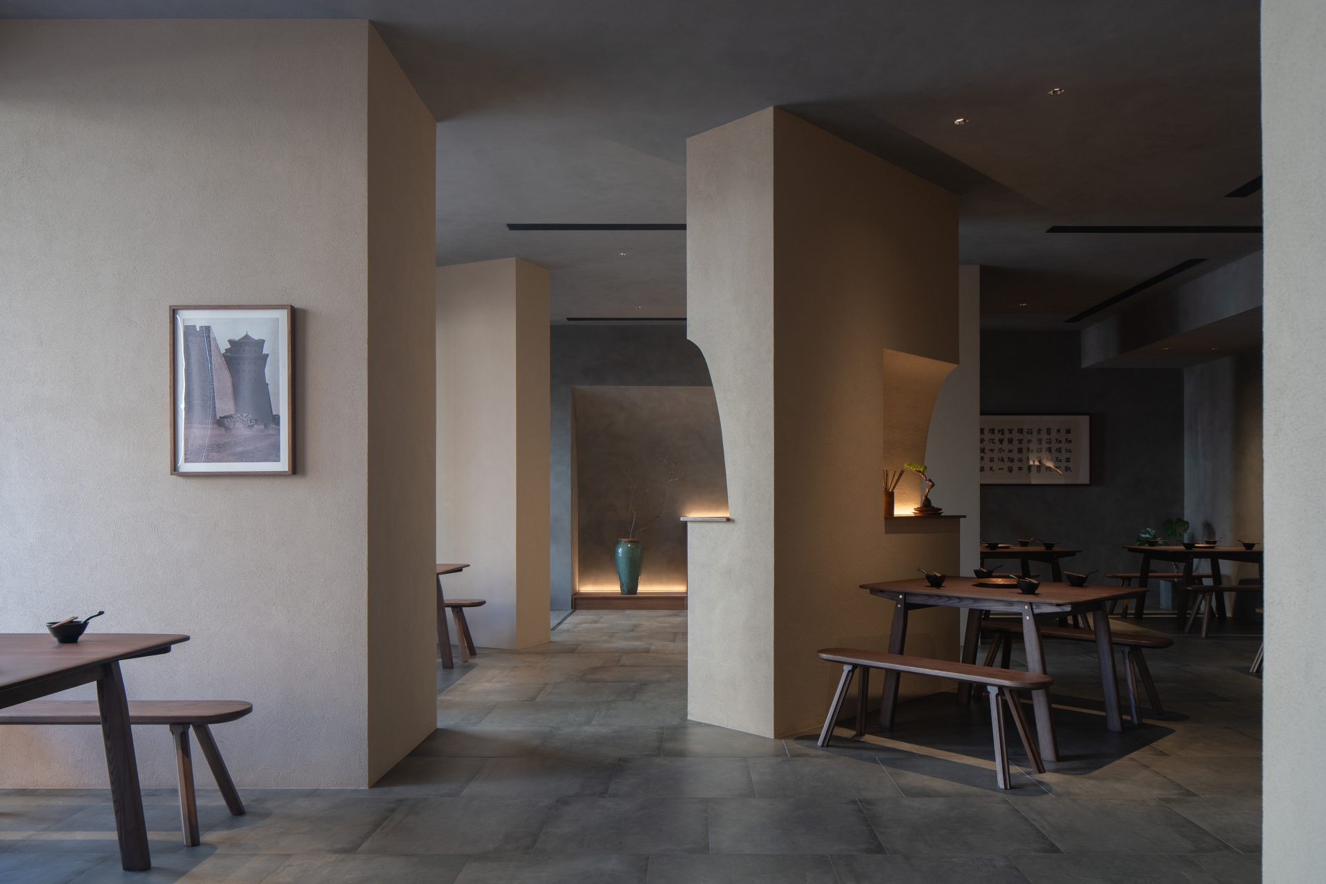
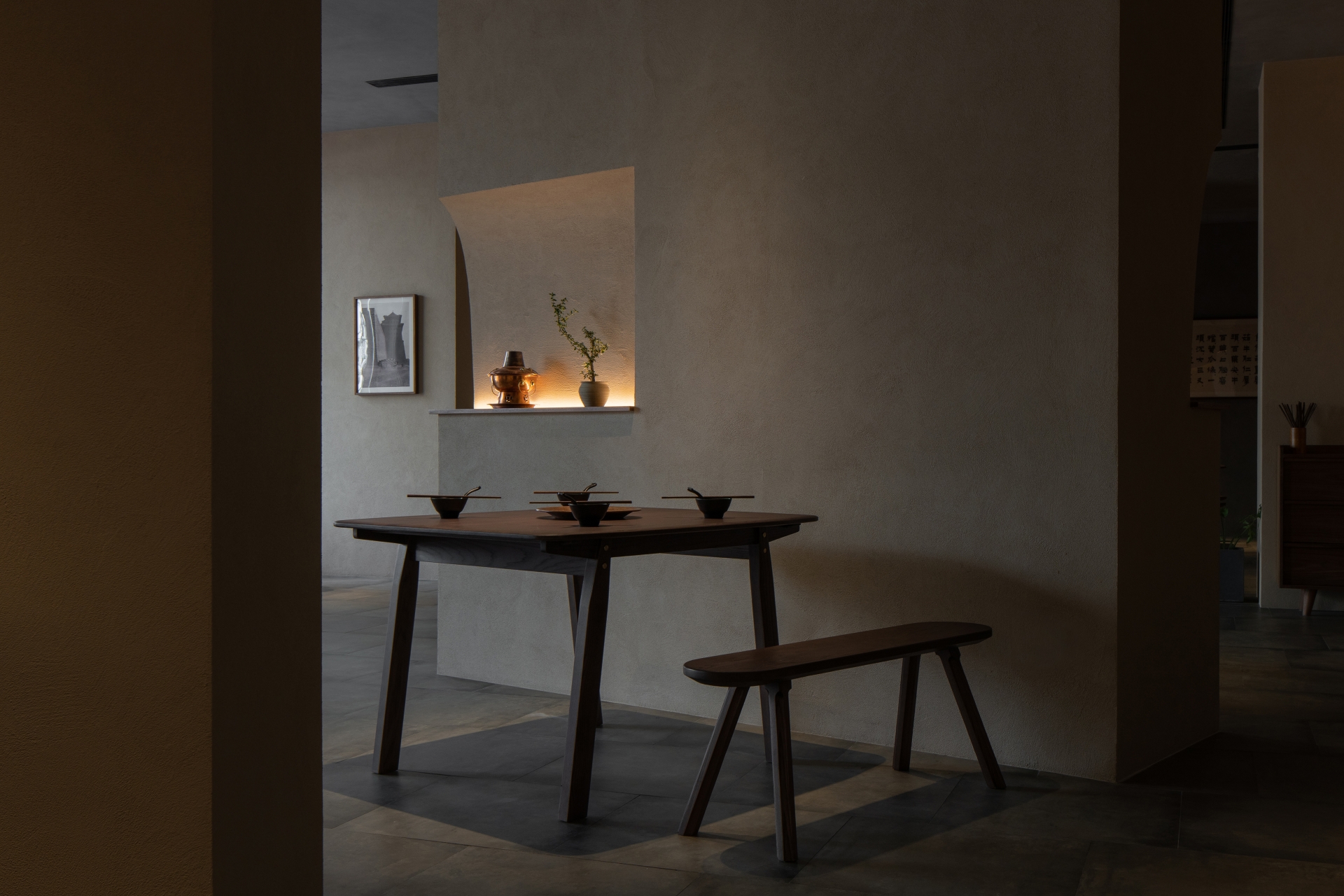
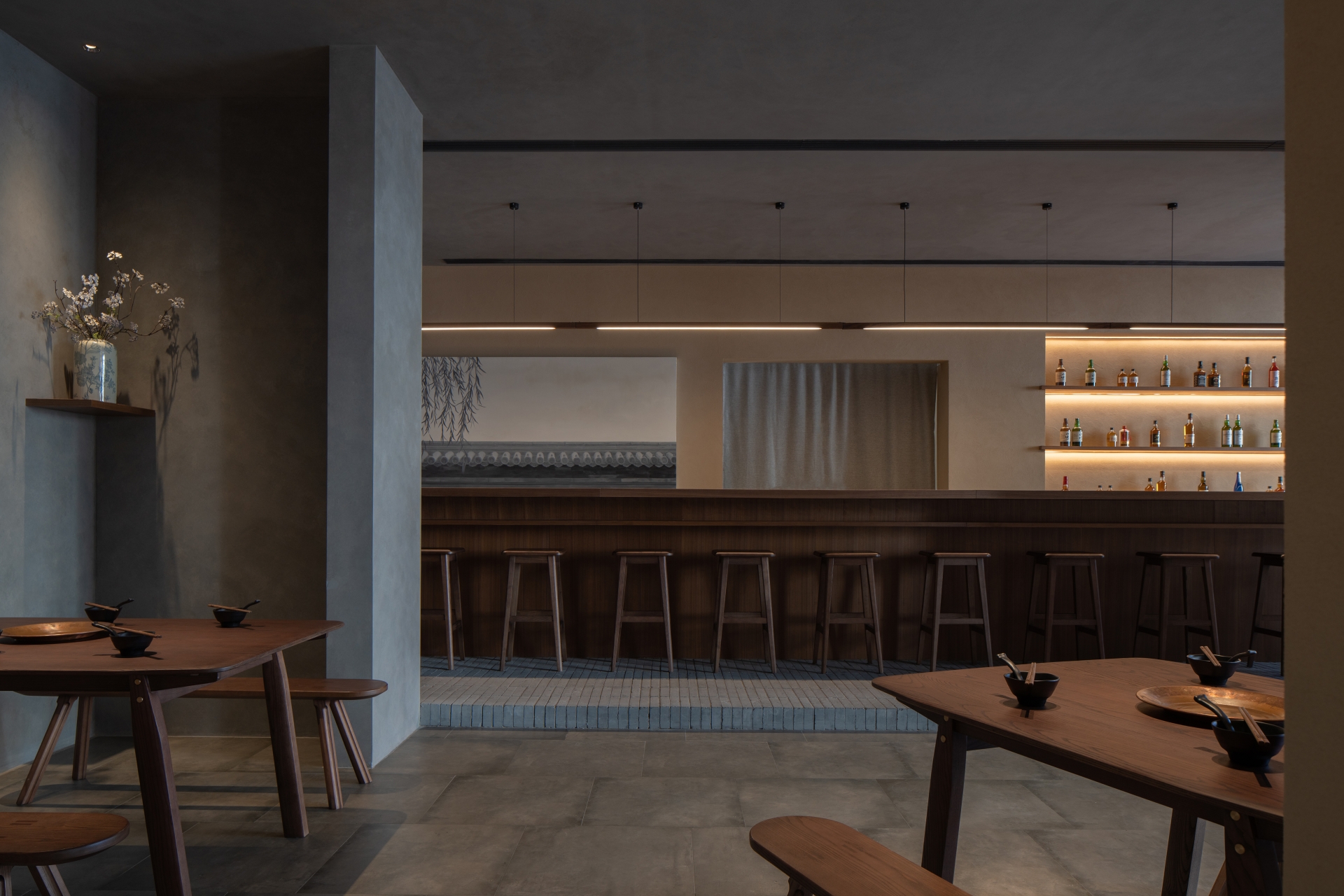
As the bar and kitchen are the two most demanding programs for uninterrupted space, they have been placed in the two longest structural bays to the very north of the site. The bar area, with its raised floor of old bricks and shear-wall-framed opening towards the main dining area, is designed as a proscenium stage where diners and staff become the visual focus of the restaurant. “We managed to utilize about half of the 21 existing shear walls to enclose the bar area, the kitchen and the restroom. The remaining nine shear walls left in the main dining area are each concealed within a new wall. Together with another two added non-structural walls near the main entrance, these 11 walls, camouflaging the original shear walls, become the soul of this project. The dimensions of these new walls vary depending on circulation design needs and the shape of the shear walls contained within the new walls. Some of them also serve as vertical pipe shafts.
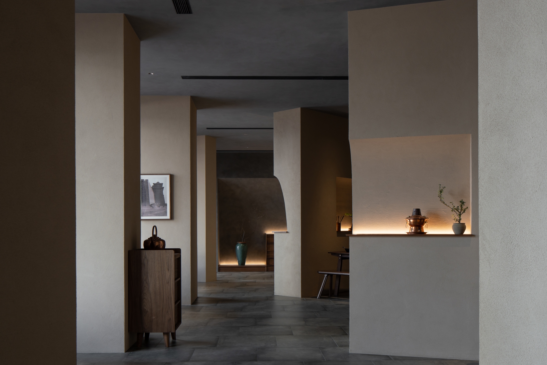
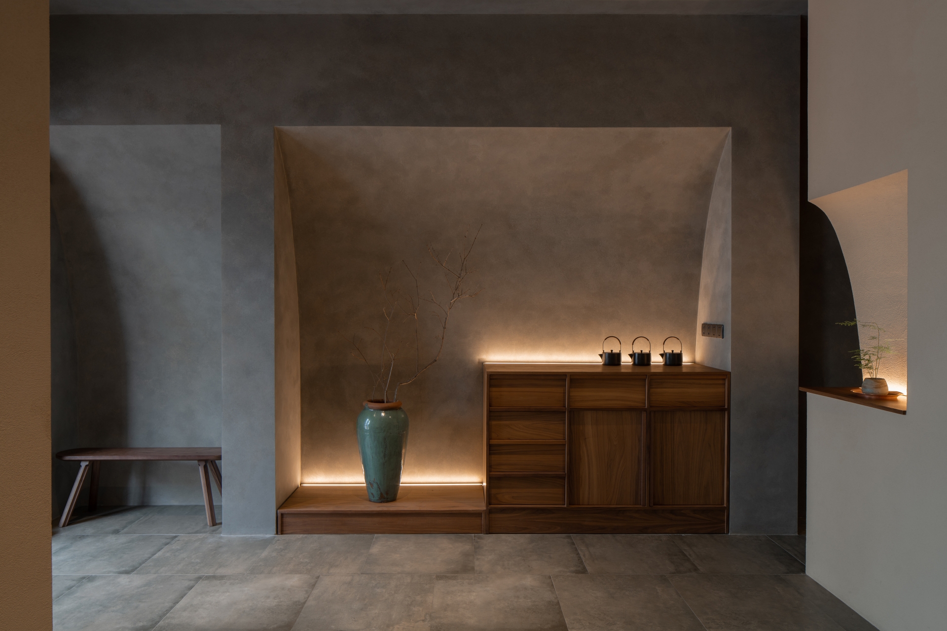
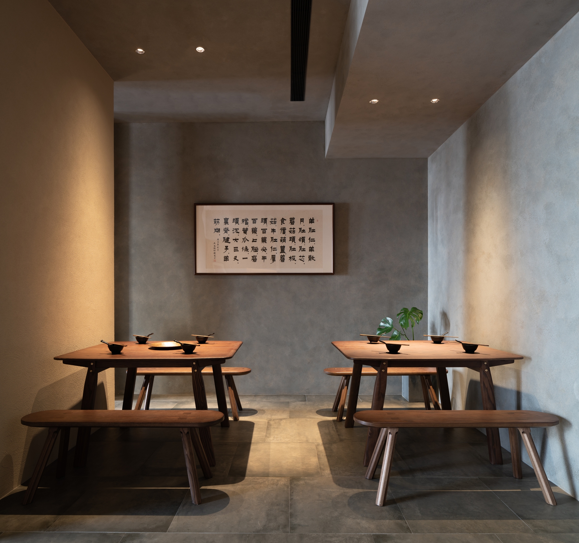
In order to emphasise the independence of the 11 walls from the dining space, Studio NOR applied mud-colour stucco to them while assigning a grey tone to all the rest walls, ceiling and floor tiles. The new walls close to the boundary of the space are separated from the perimeter walls, meanwhile, gaps between the two were deliberately designed so that the viewer cannot see the shear walls connected to the perimeter walls. “We rotated five of the 11 walls at different angles to further contrast them with the orthogonal system defined by the linear air outlets on the ceiling and the tiles on the floor. The niches on the walls make this rotating operation even more confusing, almost completely dispelling visitors' suspicion and perception of the shear walls, strengthening the objectivity of the 11 walls. Benches and dining tables specially selected to restore the characteristics of traditional market stalls are regarded as attachments to these walls, placed and rotated following the 11 walls.”
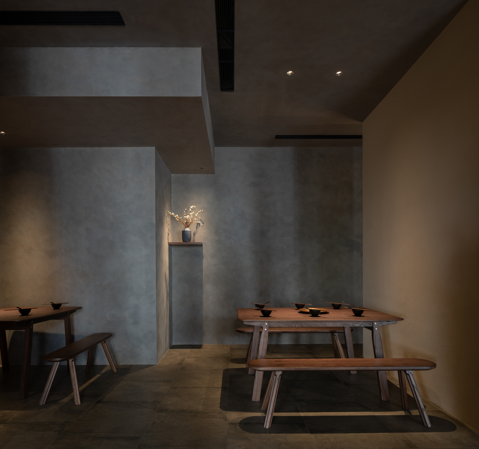
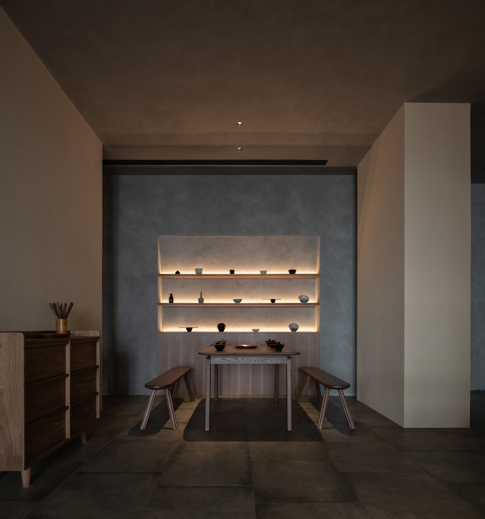
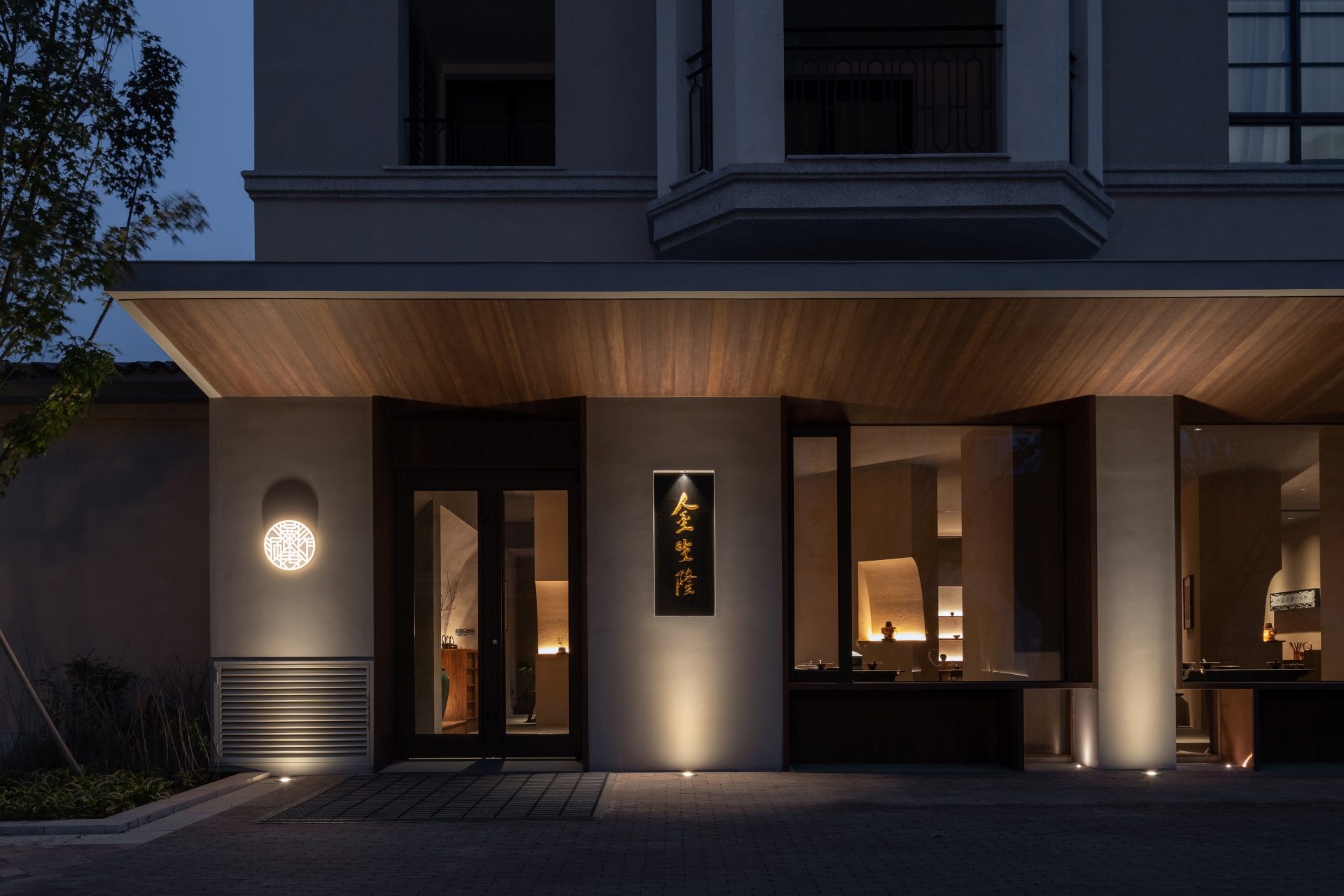
Since the restaurant’s east-facing façade receives no direct sunlight during dining hours, Studio NOR maximised window area to enable more diffused light into the interior space, at the same time ensuring the restaurant’s openness towards the street, complying with the design concept of a market space. The inner frame surface of the small square windows under each large window are specially decorated with copper used for making traditional hotpots, projecting the materiality of indoor appliance to the street viewers.
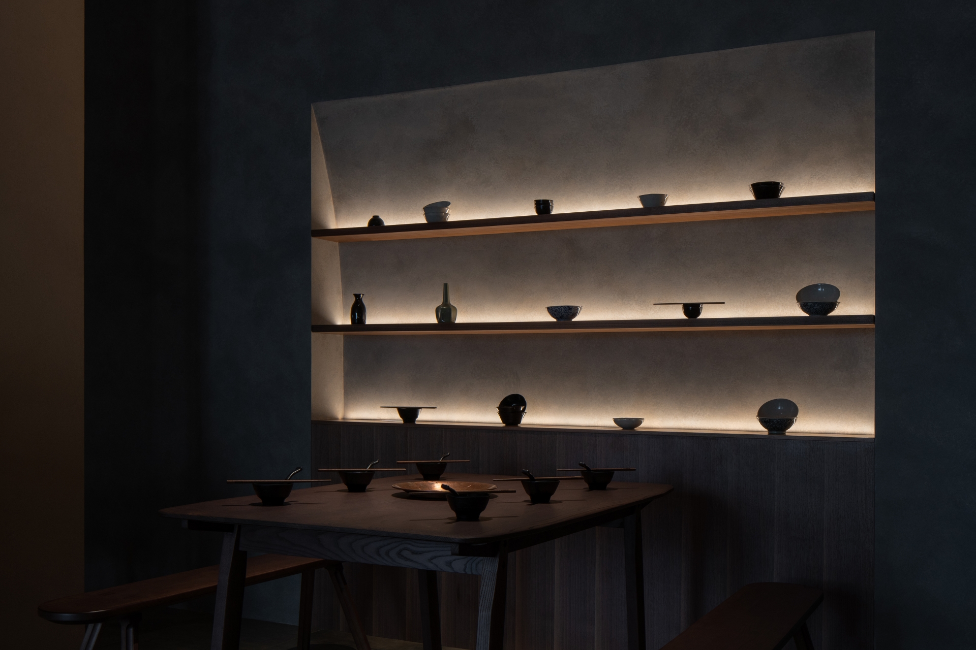
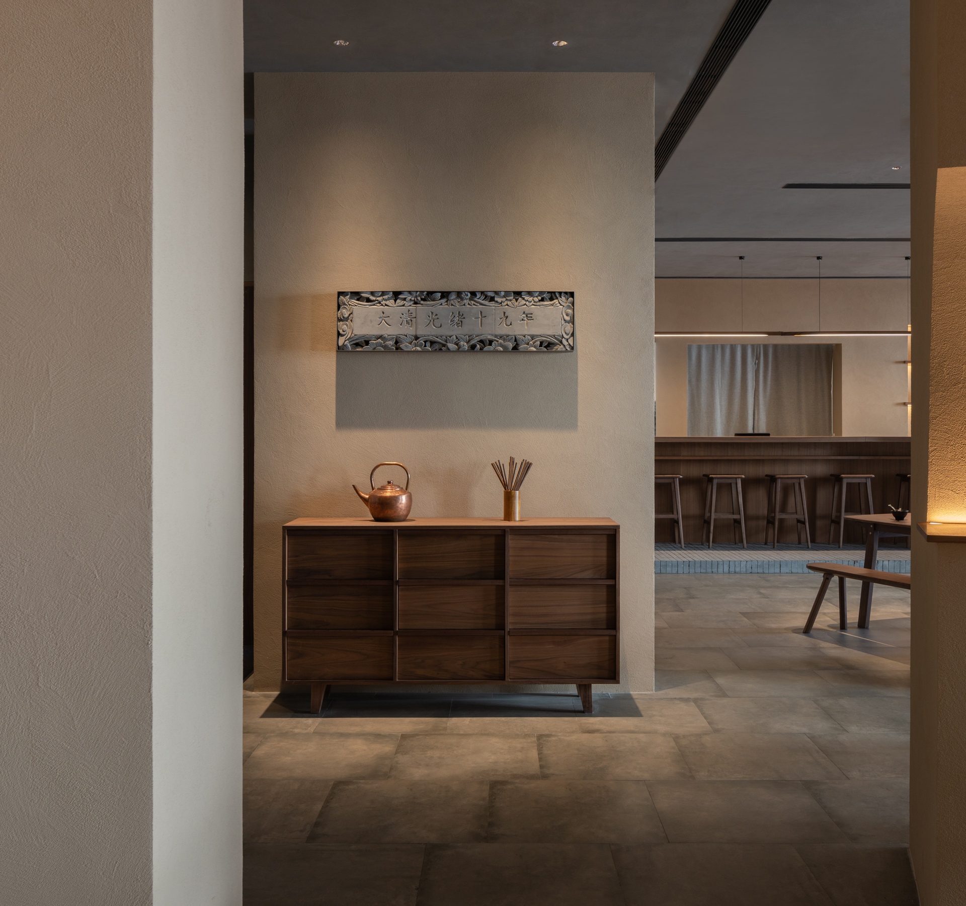
“We worked with a lighting consultant to minimise the number of indoor fixtures, only placing a few spot lights above each dining table, supplemented by the wall washer light in the niches. The scattered walls prevent visitors from getting an overall view of the entire space at a glance, while dim light of unknown sources leak from the wall gaps, constantly luring them to linger and explore,” they reveal. When night falls, the background music of the Traditional Drum Song of Peking (specially selected by the client) starts to sound. For a diner who sits among the 11 walls, surrounded by the decor of cups, bowls, plates, and chopsticks, there might be one moment when he - through the mist rising from the hot pots – can find the scattered walls gradually spreading beyond the restaurant’s facade, into the depth of time, into the noisy and bustling crowds in the Old Dong'an Market, and fading into the dust of history.


