As natural light filters through from the outside and highlights the subtle colors and rich textures of the carefully selected materials, the space of Dentology+ feels warm and welcoming. Conceived by Norm Architects who have played on the sensations and feelings that the selected materials evoke in us, the architecture is a comforting framework around its functions.
As our fast paced and modern lives demand ever more of our attention, so too does the need for calm, considerate moments of self-care - reflection becomes key. When working thoughtfully with architecture, the company therefore has created the opportunity to redefine and reshape human perception and in turn work to create a space of urban refuge. At the core of redefining the dental experience is a sensibility, which identifies and acknowledges the role in which tactility, materiality, and light play in doing so – the interplay between these elements awakens the feelings central to how we experience space.
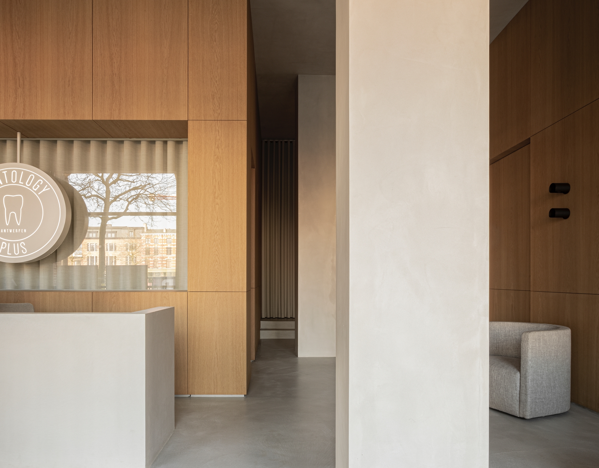
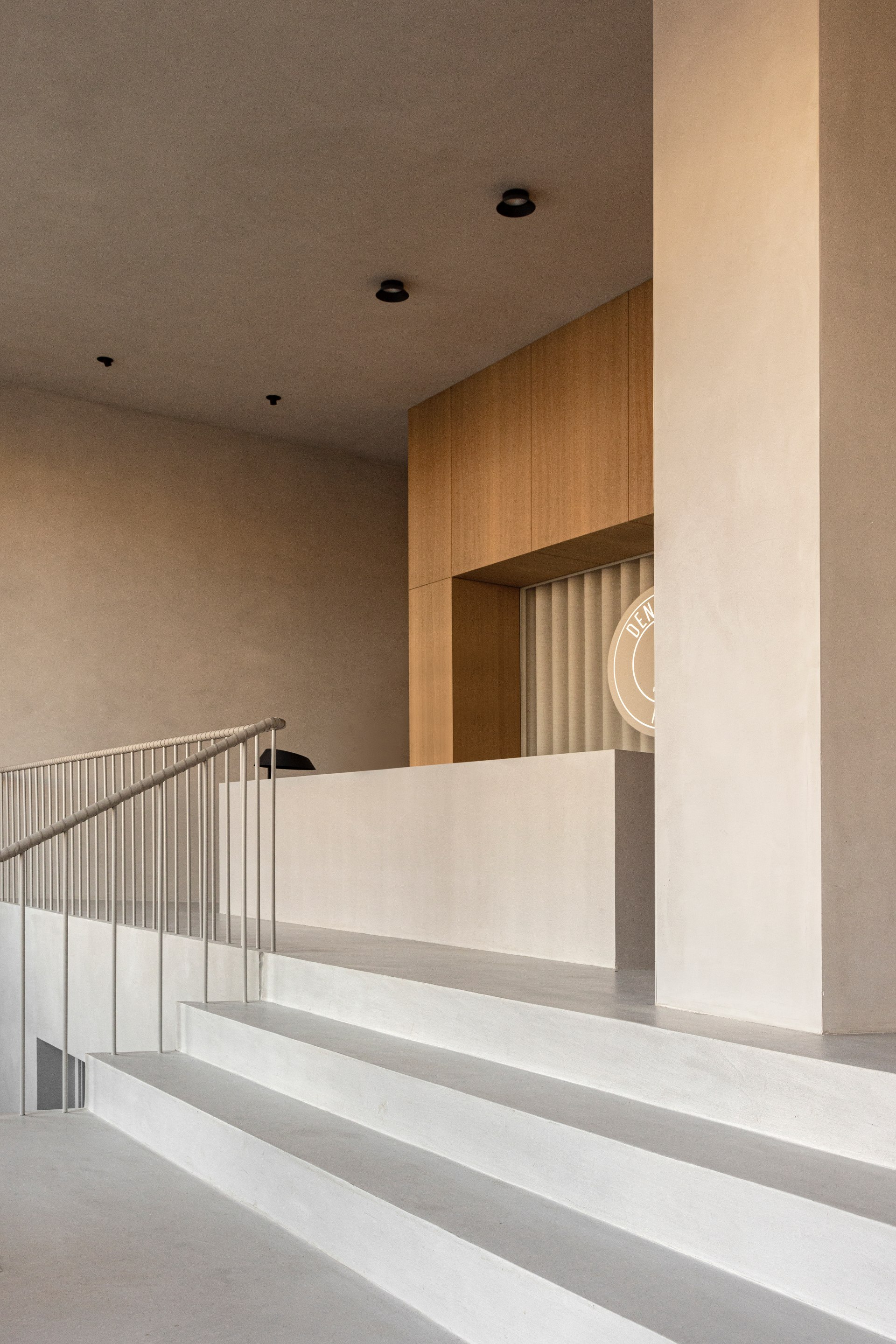
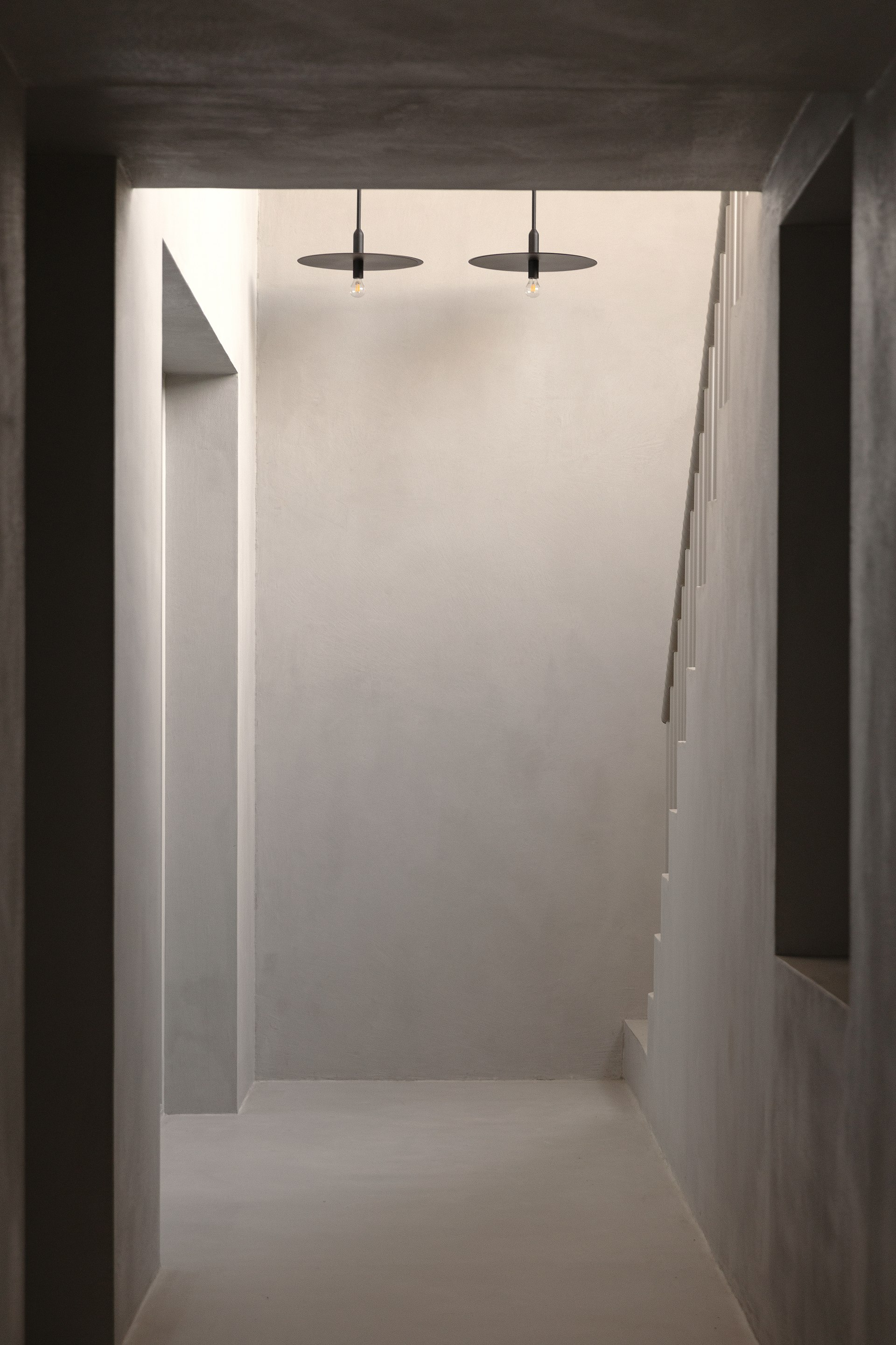
Moving away from the typical institutional look and feel of a dental clinic, the new space is quiet, calm, and warm. The ambition has been to redefine and reshape the dental experience and at the core of that is a sensibility, which acknowledges the importance of the way materials and natural light affect our well-being. Explains Sophie Thorning, architect and partner of Norm Architects, “With the clinic being placed on two floors, we strived to create different moods and functionalities, catering to all the needs of a dental clinic. Still the space should feel and look unified – something we achieved through the repetition of a few selected materials such as oak wood, concrete and light textile.”
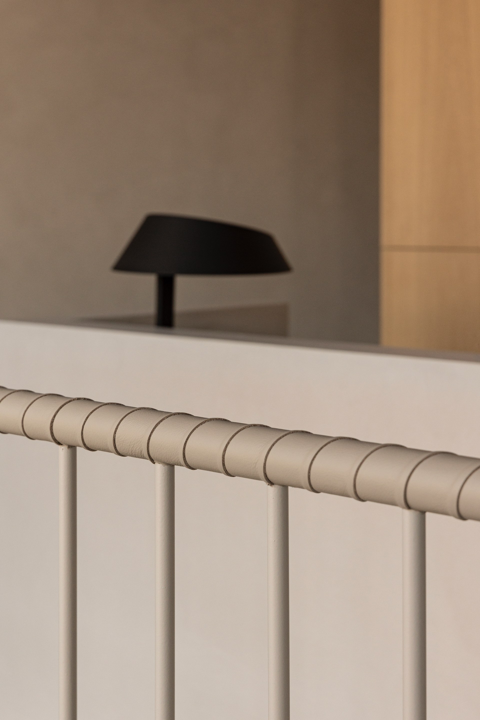
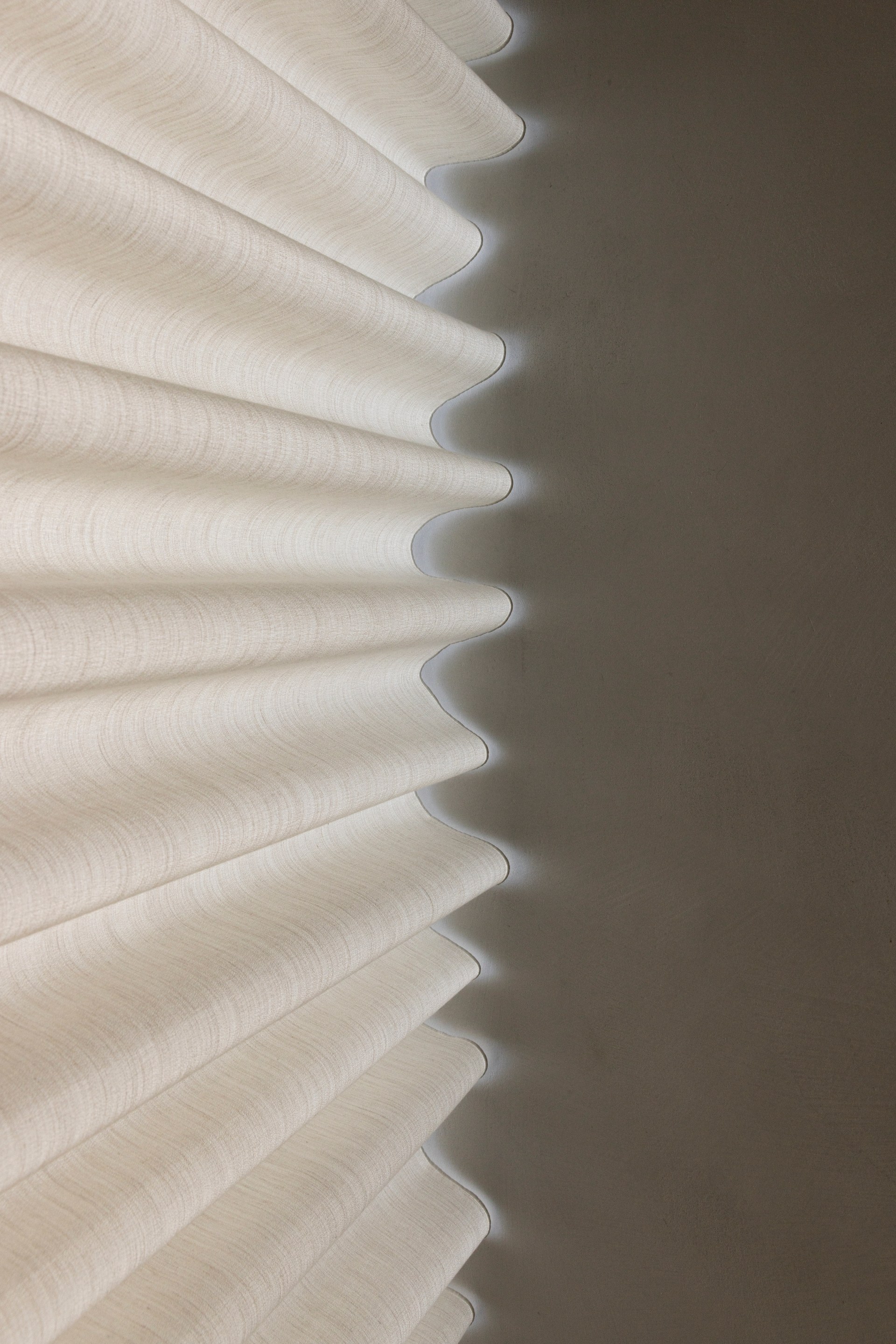
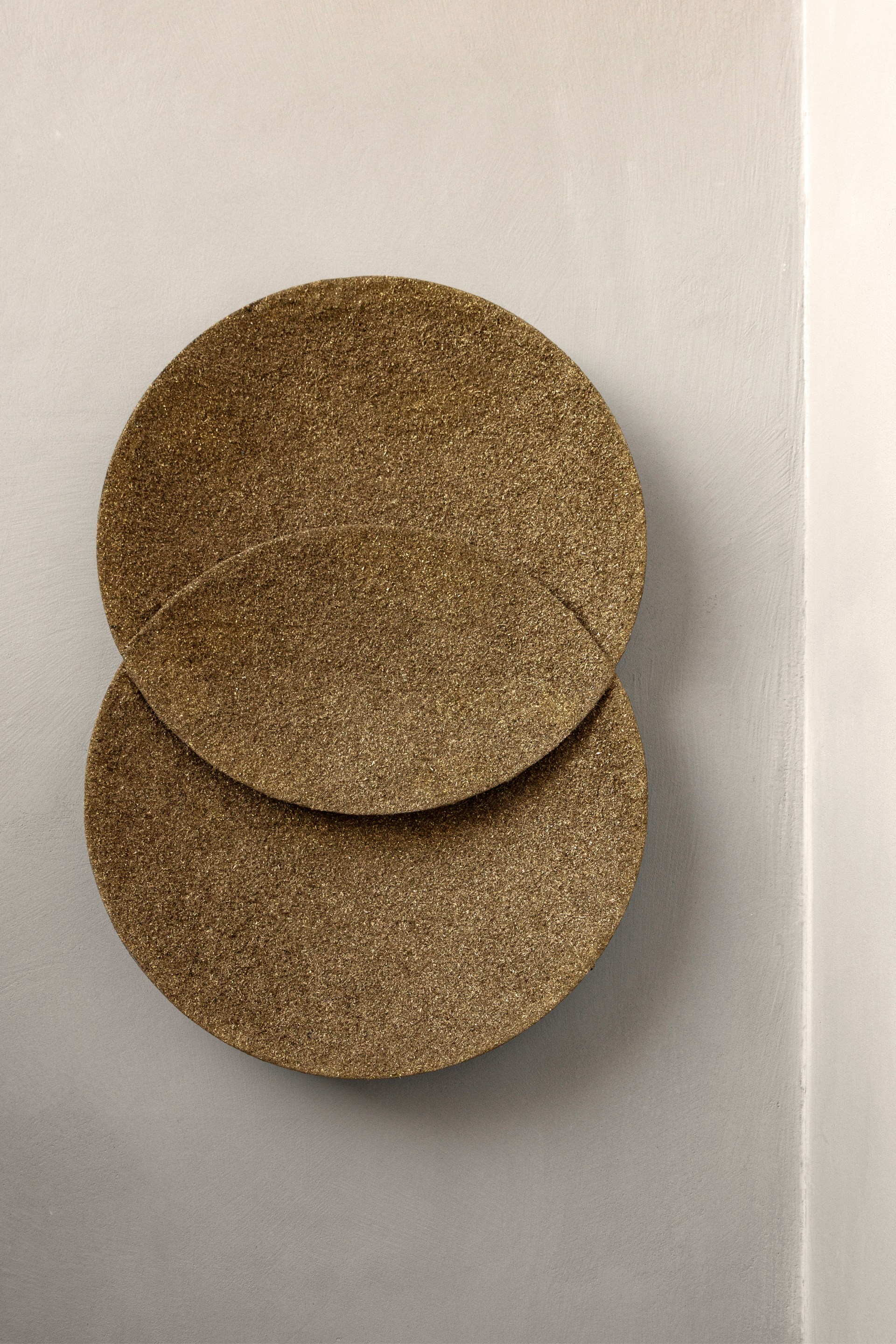
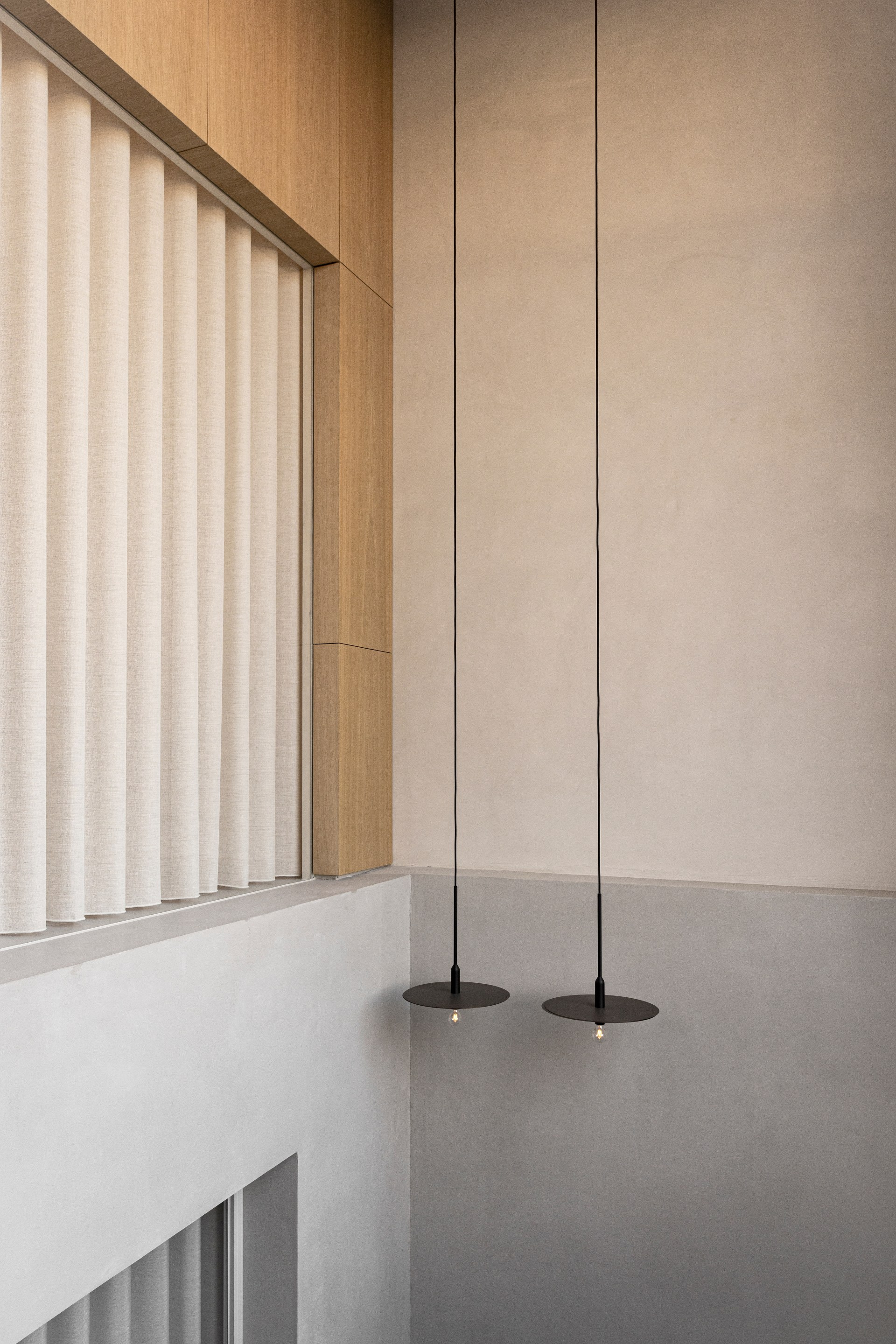
Playing on the dynamics between light and heavy; between the inherent qualities of concrete, wood, and textile, a space was created to speak to all senses and invite exploration. The architects made use of the cave-like features in the low concrete basement to create a grounded atmosphere and the architecture now embraces and protects those within. Heavy, carved out spaces create a dynamic and distinct, luxurious feeling, while material mass and solidity work as a vehicle to construct a patient experience that is rich in warmth, serenity, and calmness.
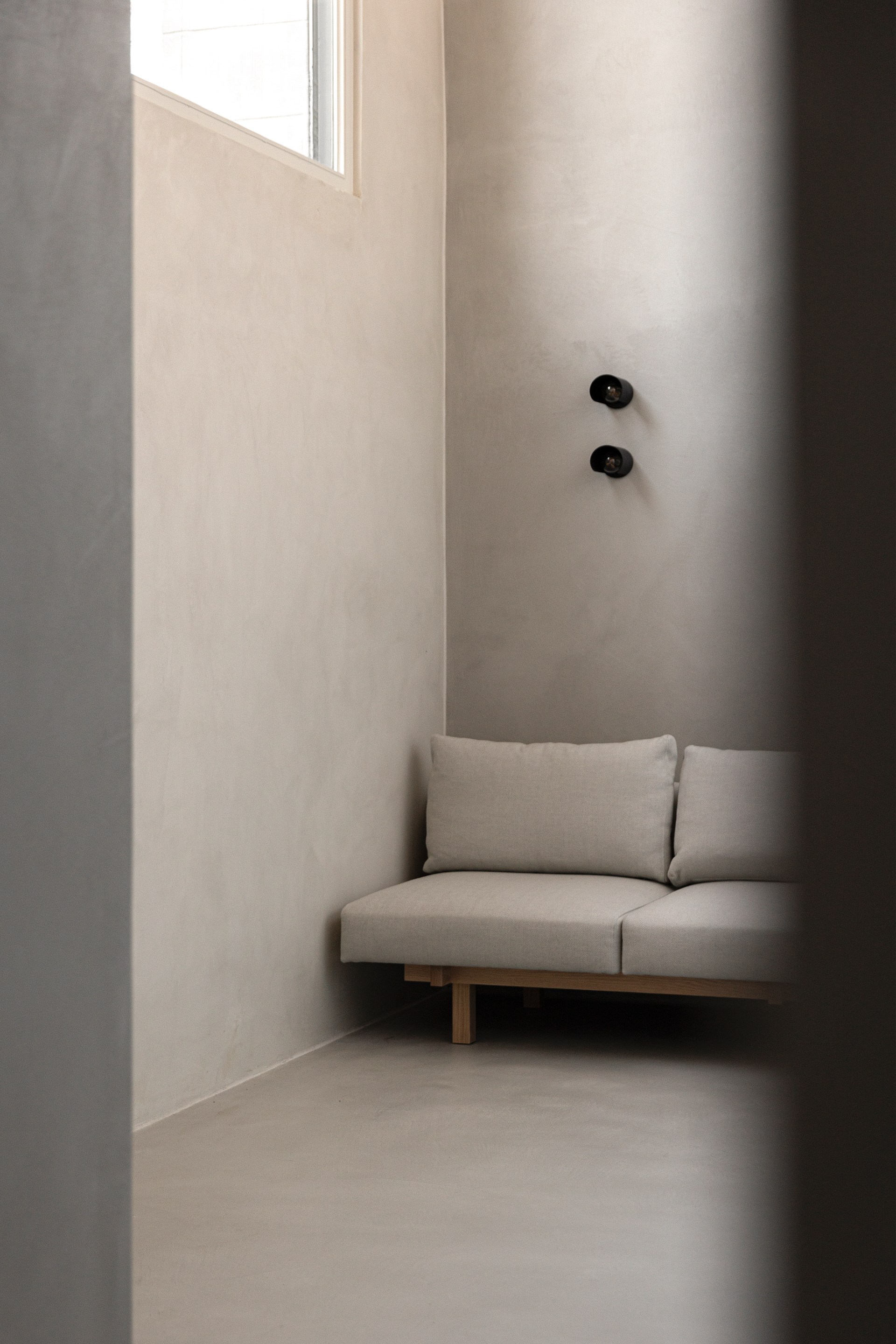
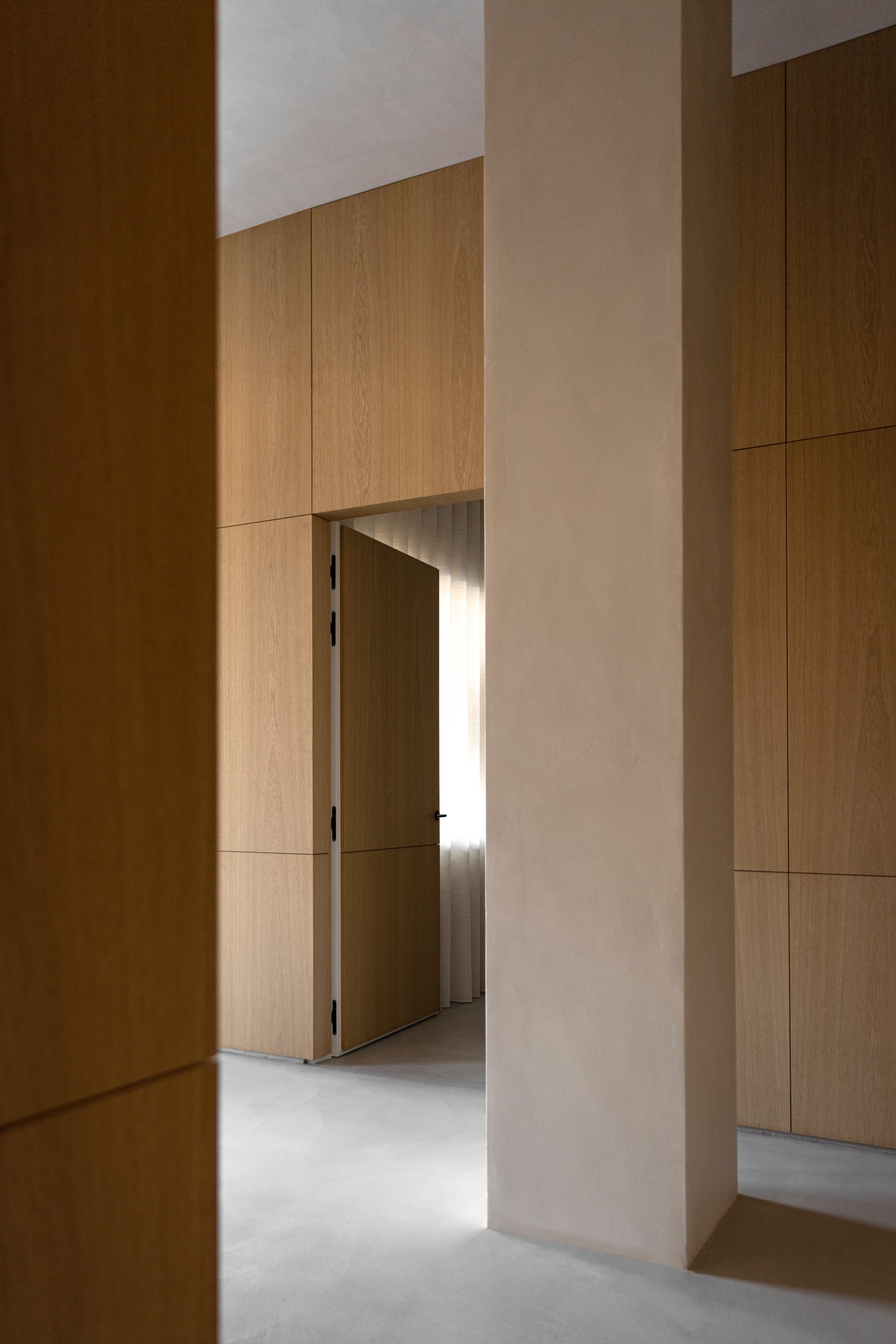
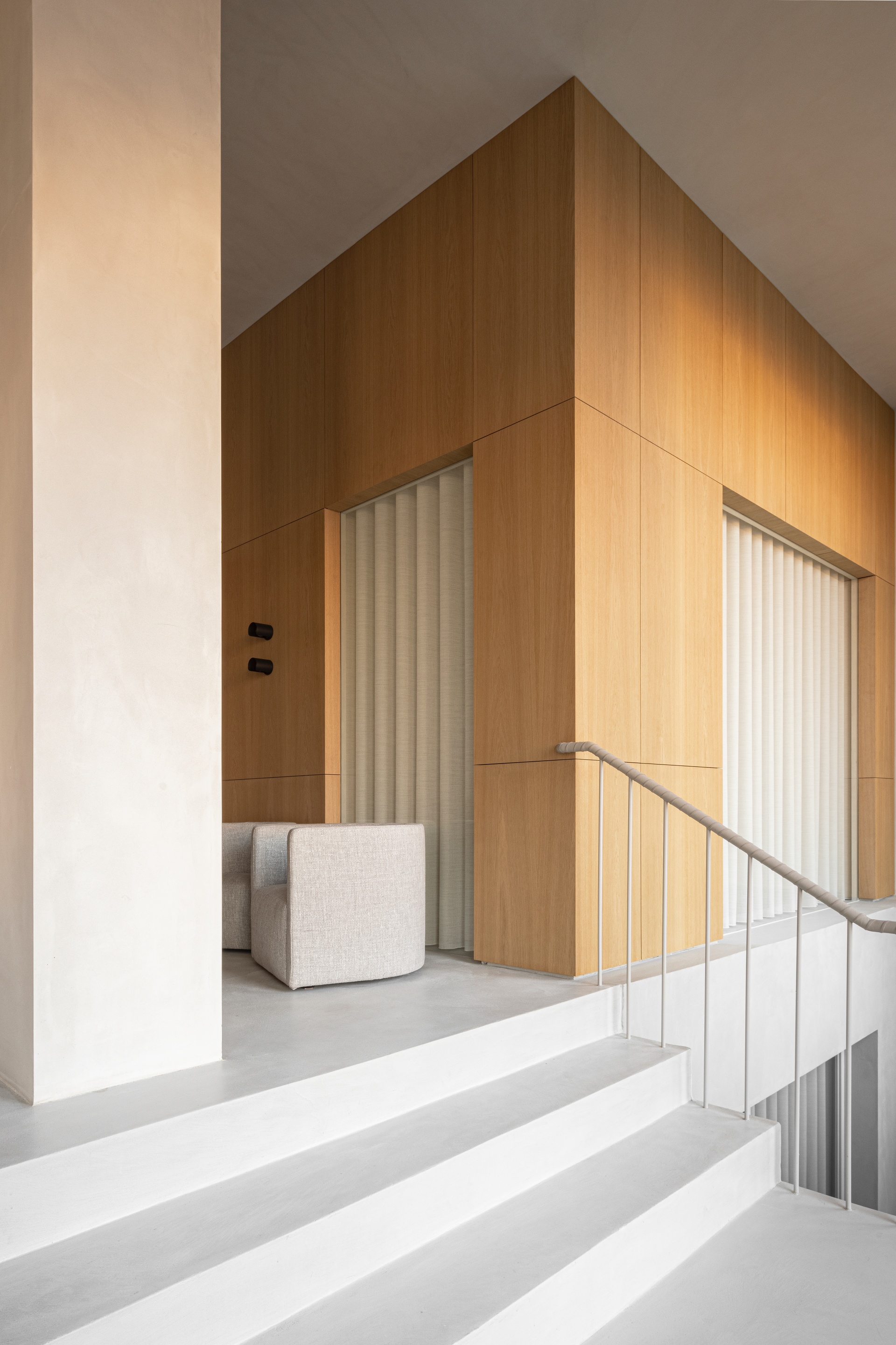
When creating a landscape of volumes and in-between spaces, it feels as if the rooms are carved from a block of concrete. Working with its heaviness, the architects ended up with a solid and calm atmosphere, providing a comfortable setting unusual for dental clinics. Indeed, defining spaces in architecture and design should not merely be considered in terms of the drawn lines, but also in terms of the intervals and moments between them. On top of this heavy base, light wooden cubes are placed, creating rooms both in-between and inside of them on the first floor – creating flow and a natural circulation, while framing the crucial functions within the clinic.
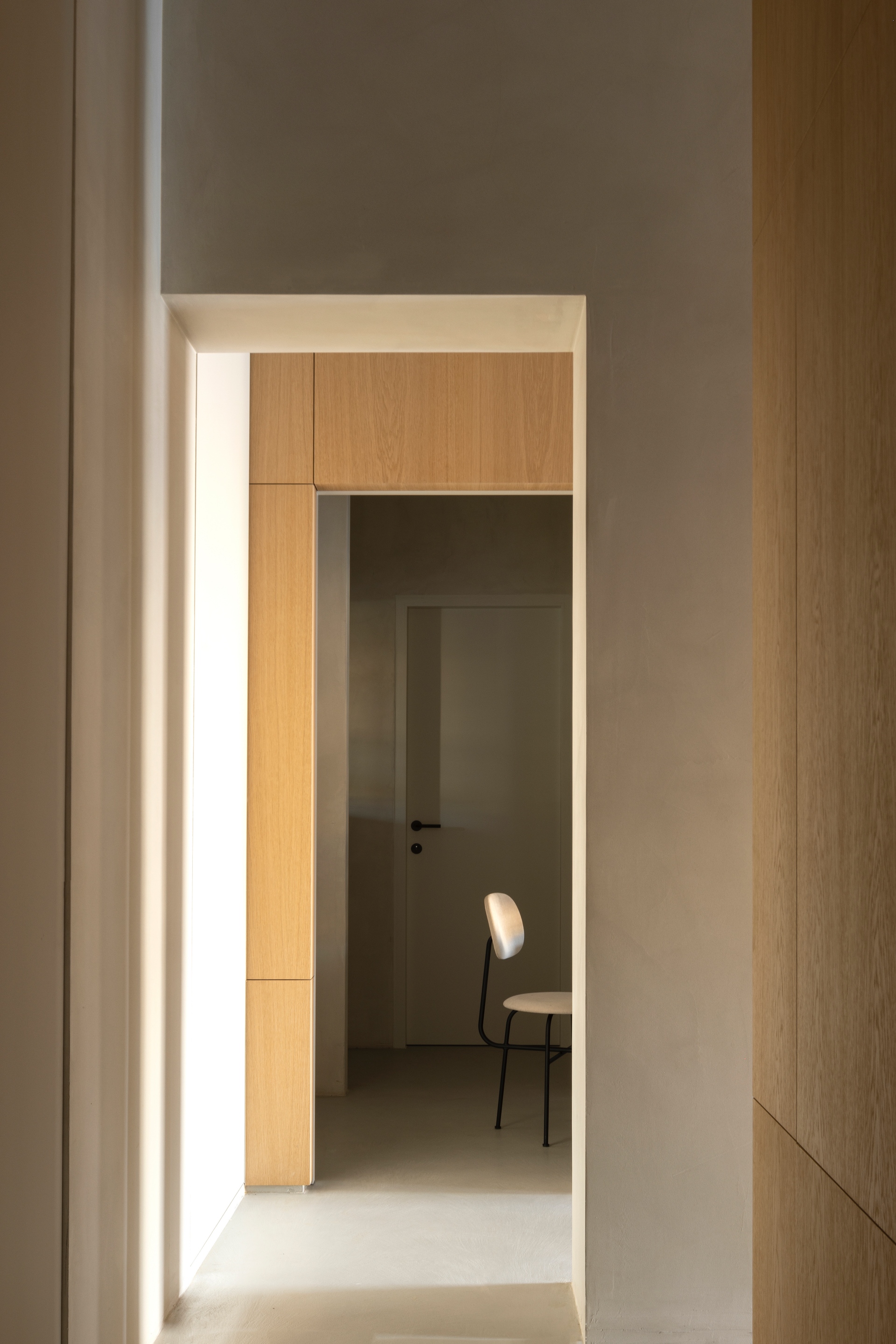
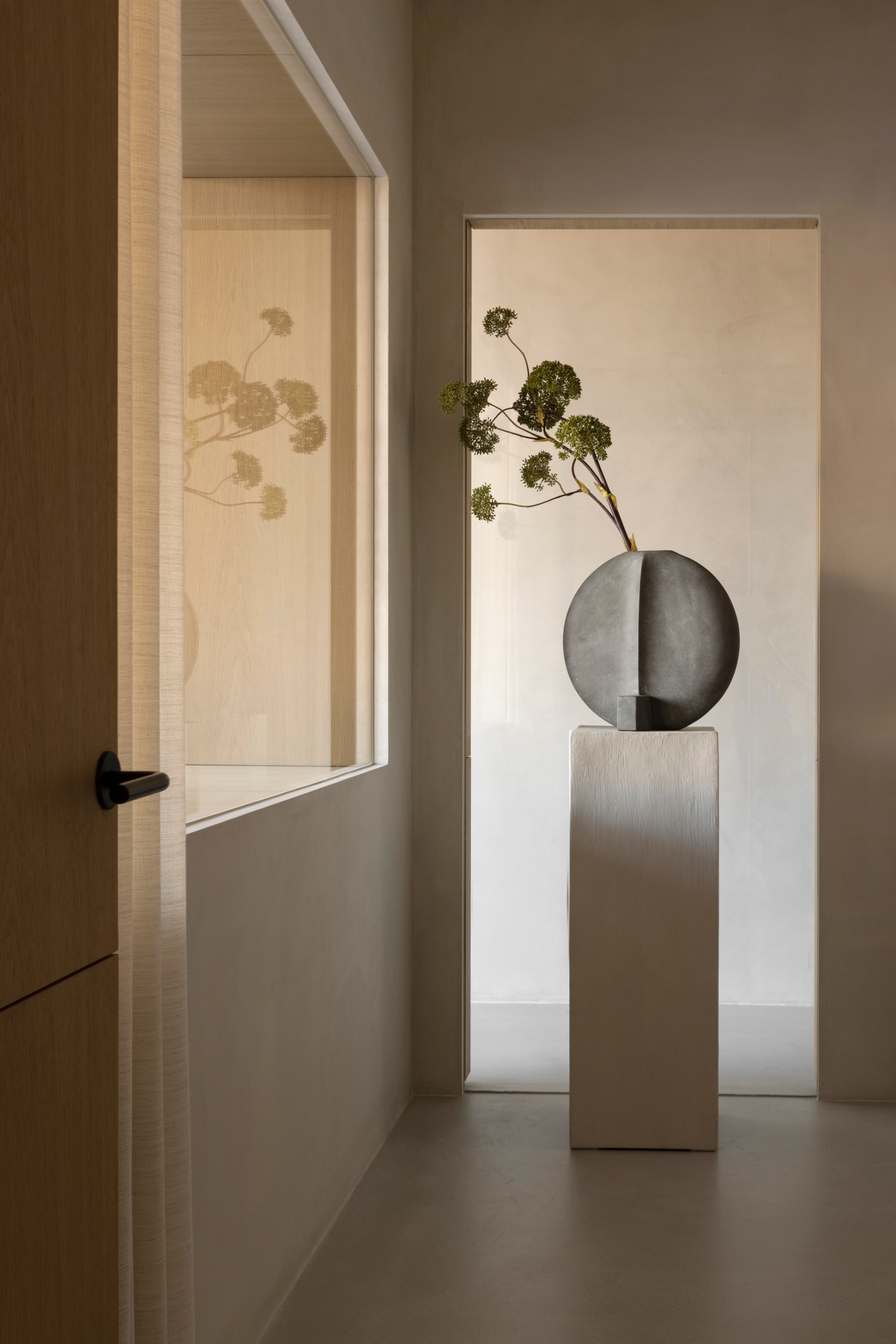
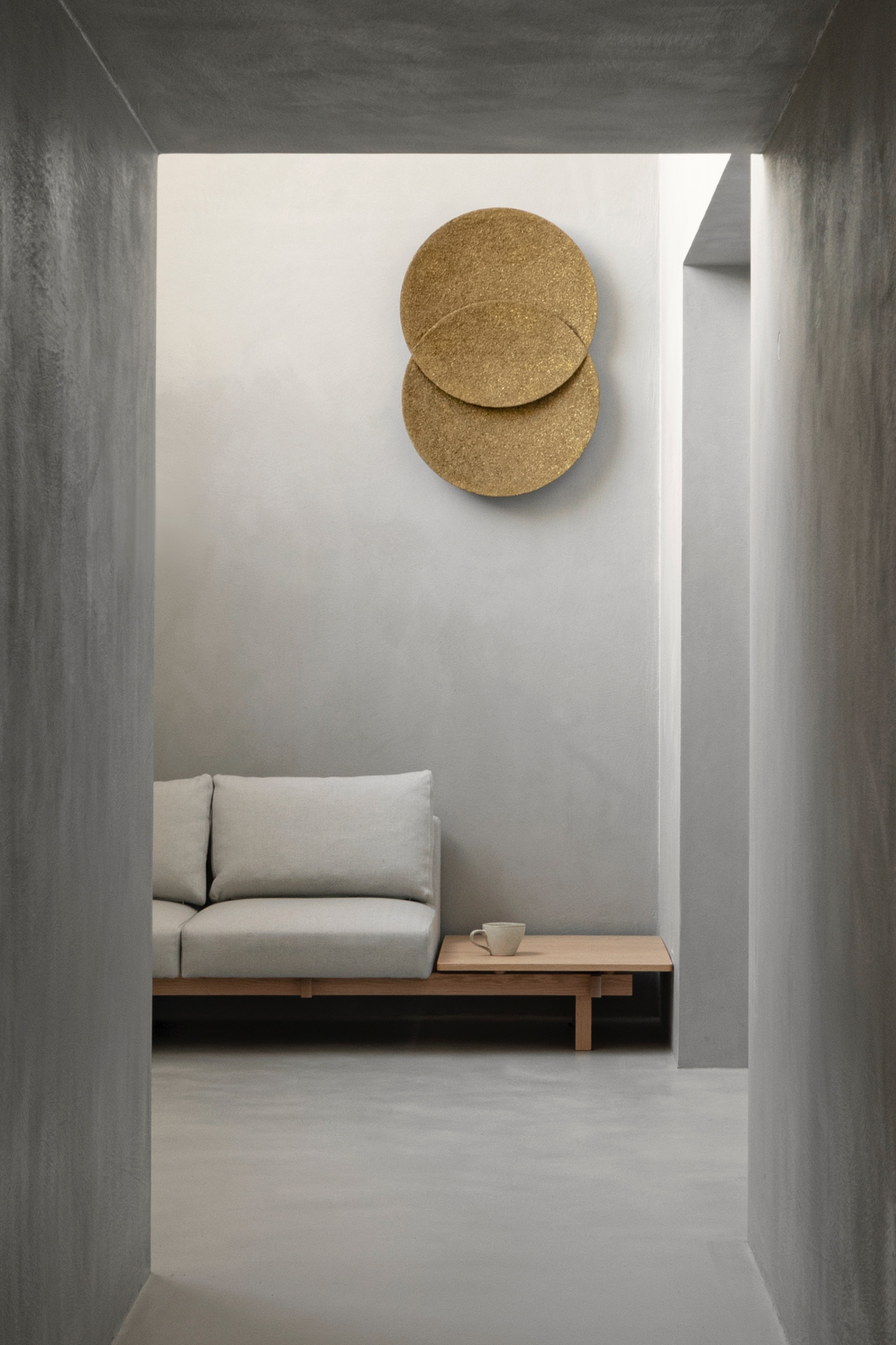
Serving as a stimulating contrast to the basement, the upper floor is light and airy in its expression, welcoming its visitors in the most comfortable way. In many ways resembling the atmosphere of an art gallery with curated objects and natural light, the space bears no resemblance to the typical dental clinic. Continues Thorning, “Acknowledging the importance of the way materials and natural light affect our well-being, we have redefined and reshaped the dental experience. Moreover, as our fast-paced lives demand ever more of our attention, so too does the need for calm surroundings, which is why we have opted for a protecting architecture, encasing those within.”
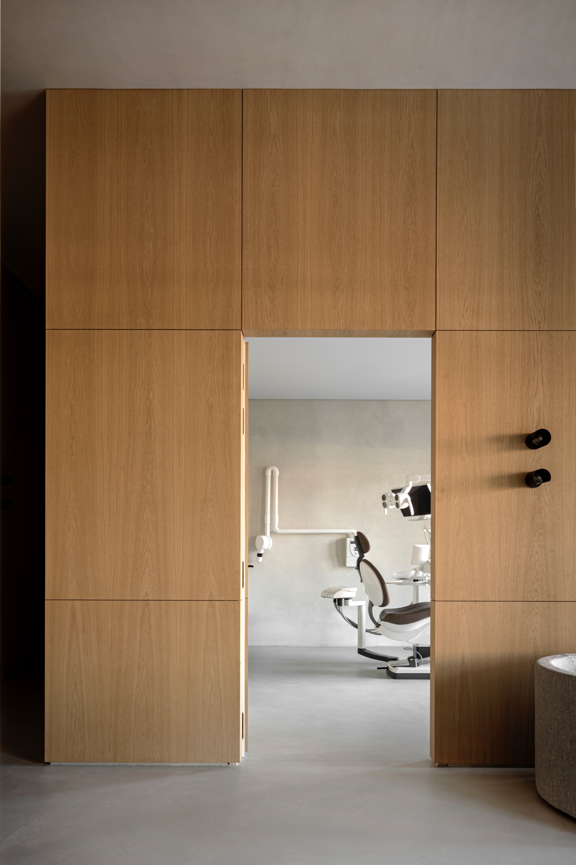
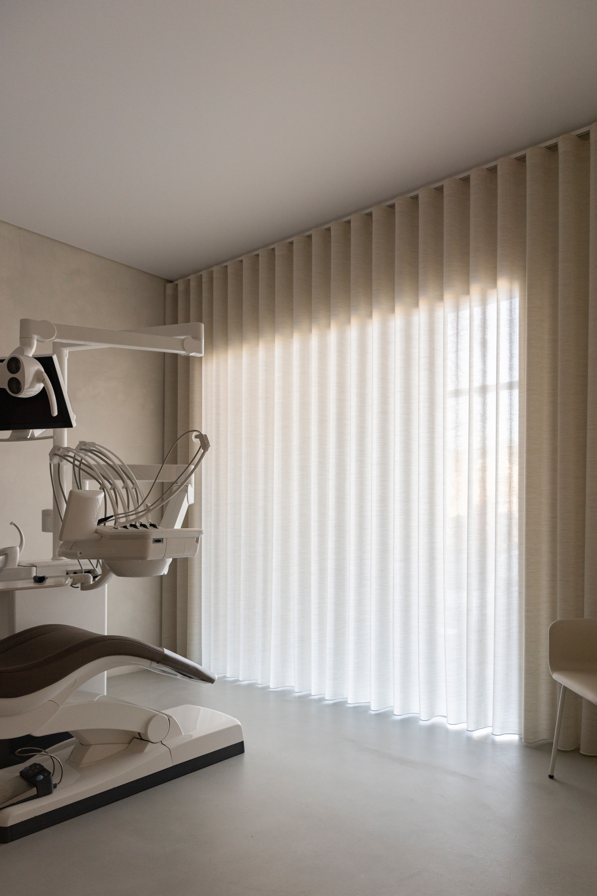
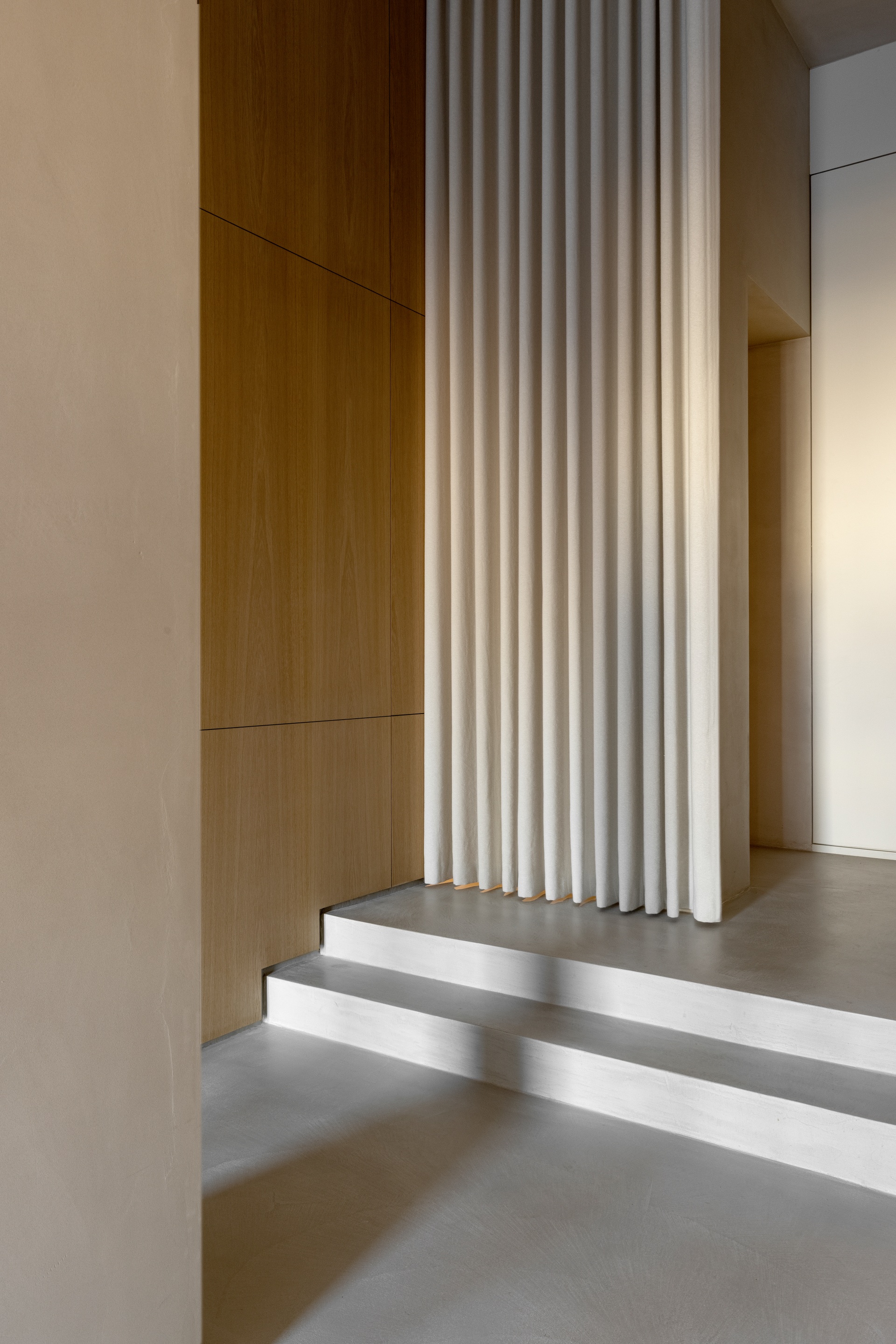
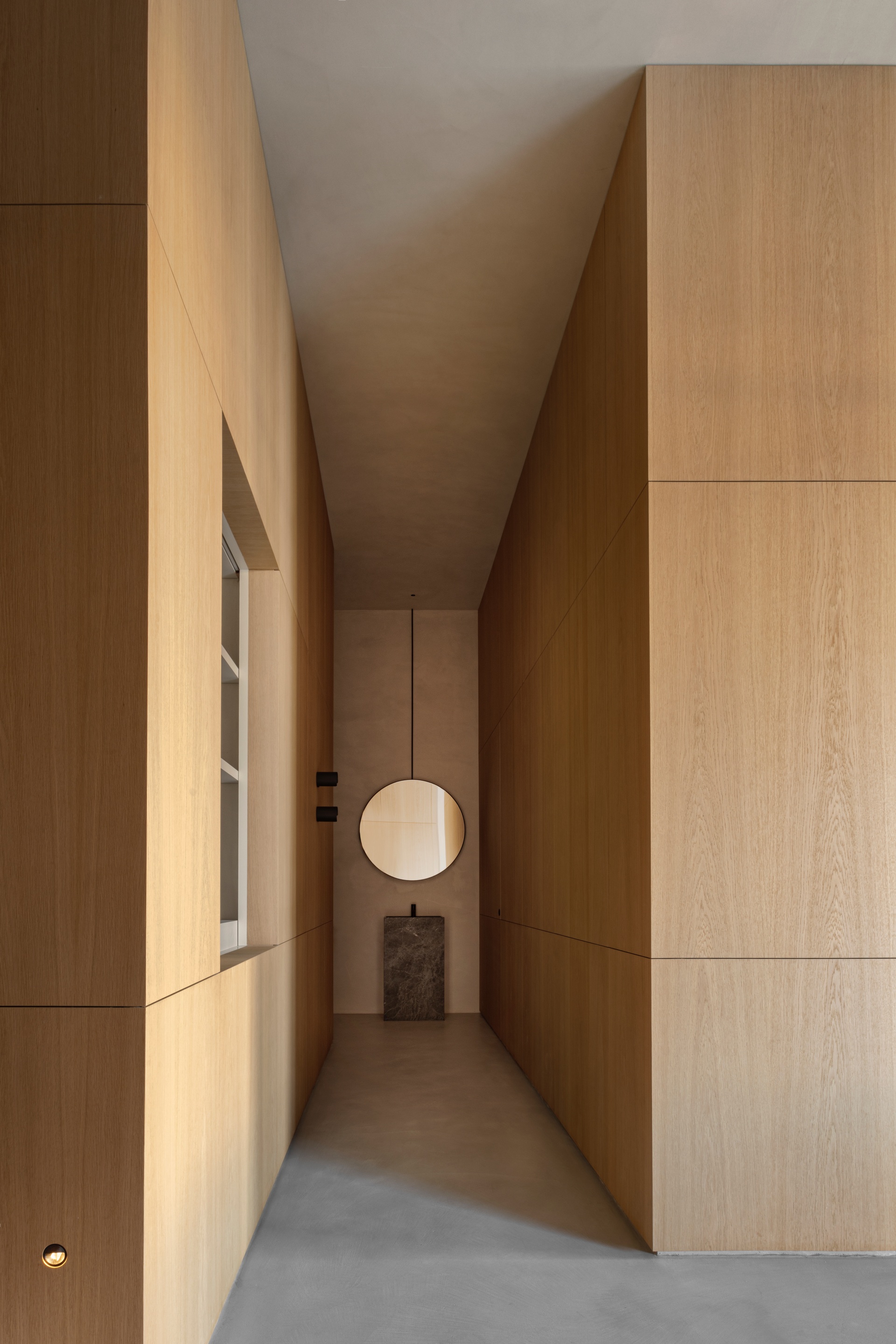
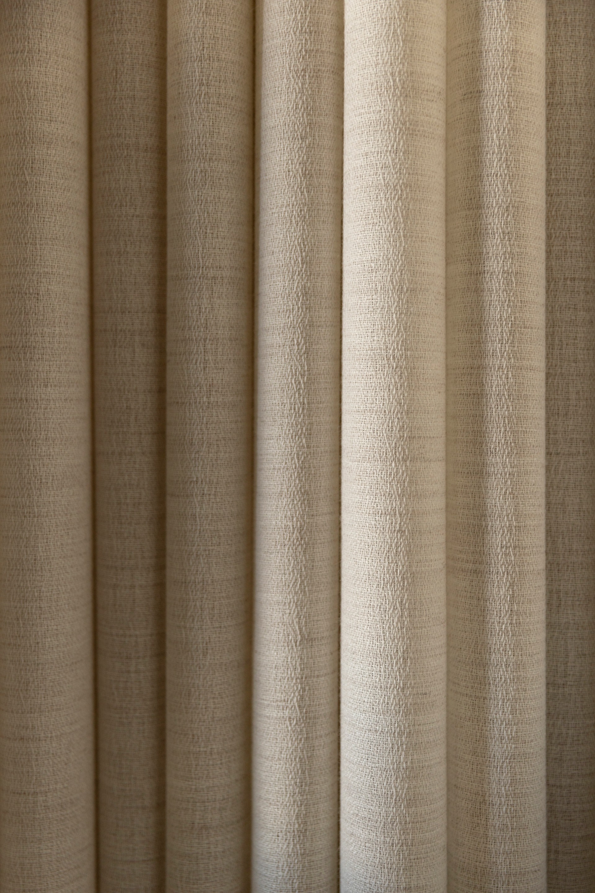
Material translucency and soft, warm light paired with carefully considered, crafted materials work to reshape the patient experience and perception. An environment is in turn created akin to a luxury retreat; evoking feelings of safety, mindfulness, and tranquility. Covering the floors and walls with a tactile concrete surface and letting in natural light through the transparent curtains, the clinic does not feel institutional and uniform. Instead, the architects transformed the usual hospital-like feeling and replaced it with a soothing wellness vibe. This was done by placing carefully selected objects in between the different rooms and sections of the space, to create small unhurried moments. Pauses. This way, the architecture as well as the interior encourages the visitor to slow down and unwind – providing room for self-care on equal footing with a visit to your favorite spa.
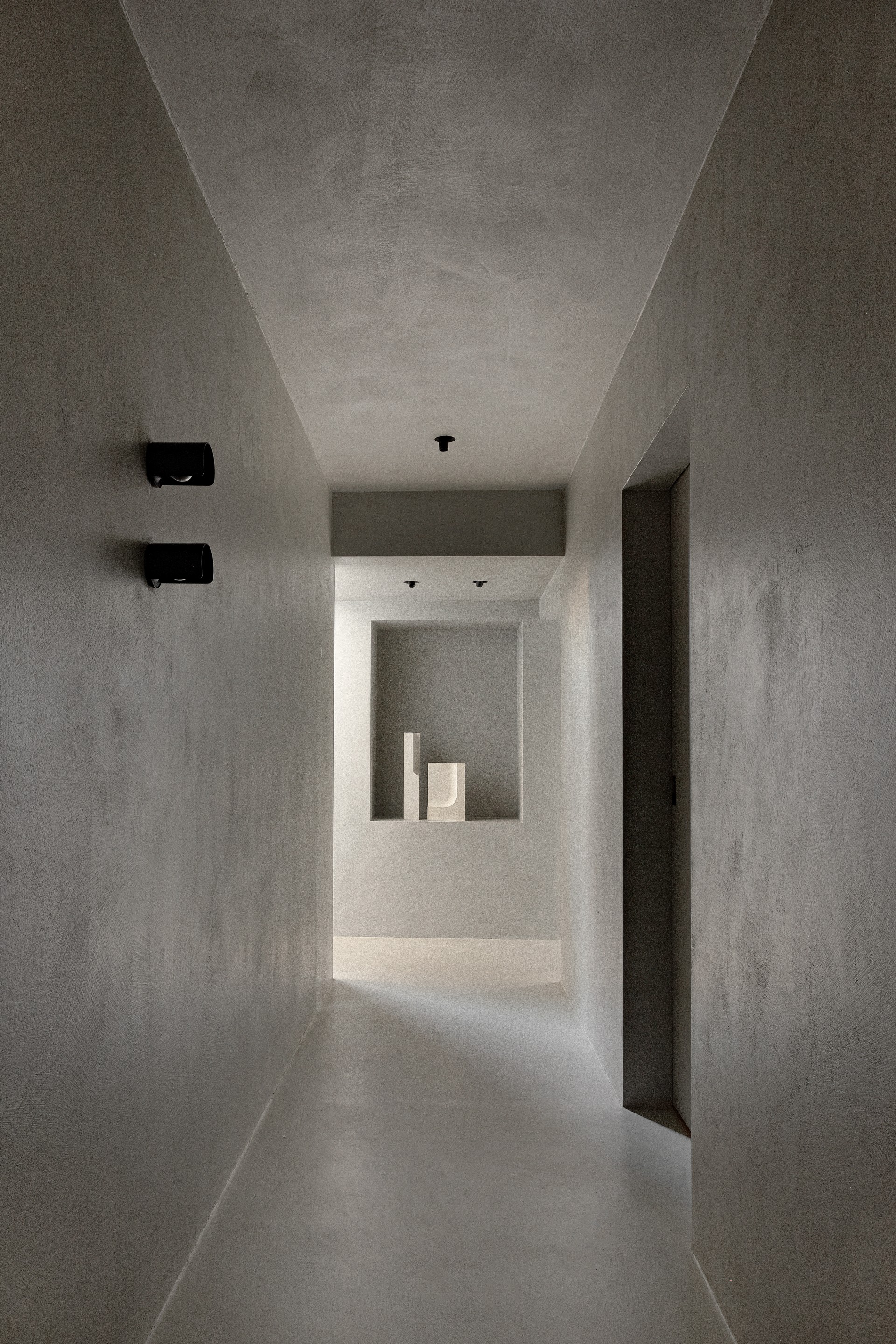
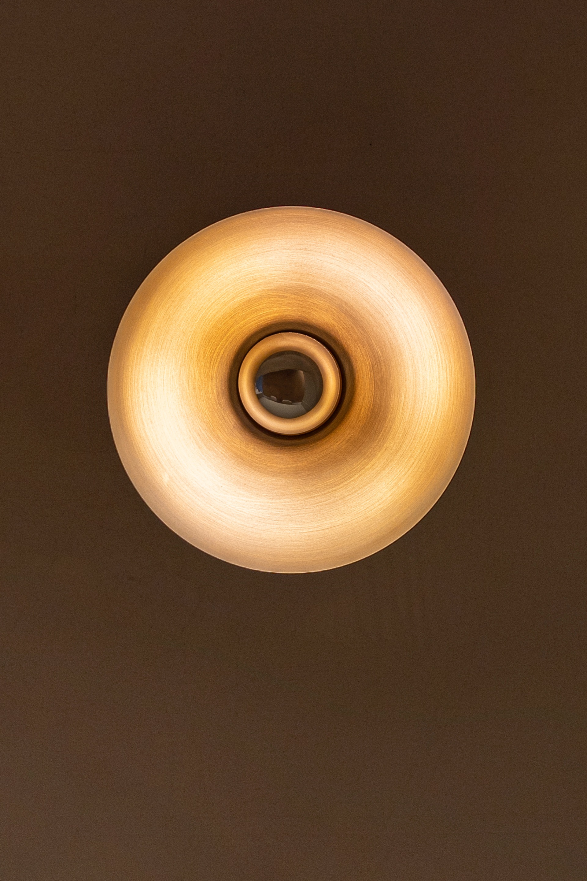
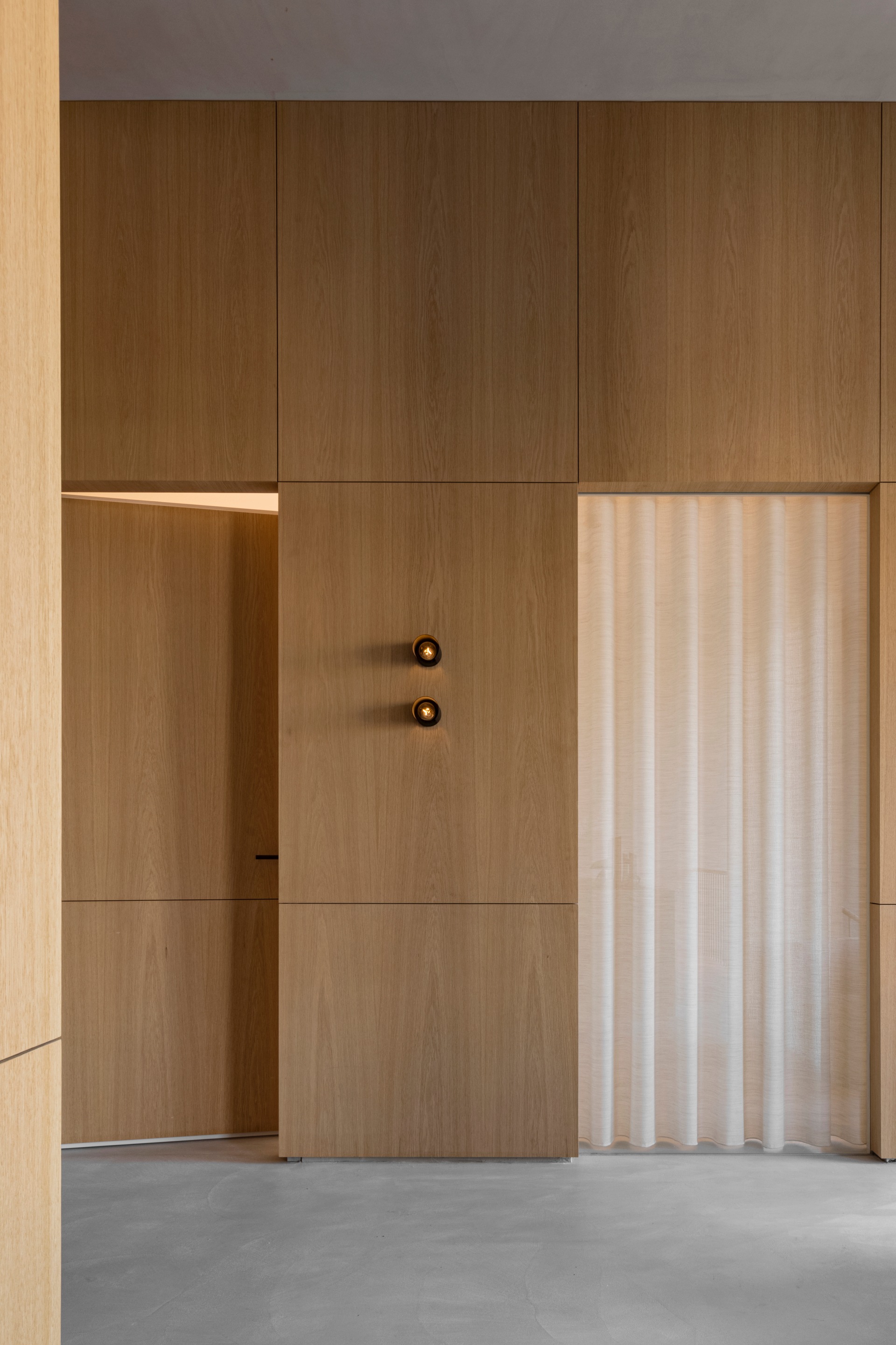
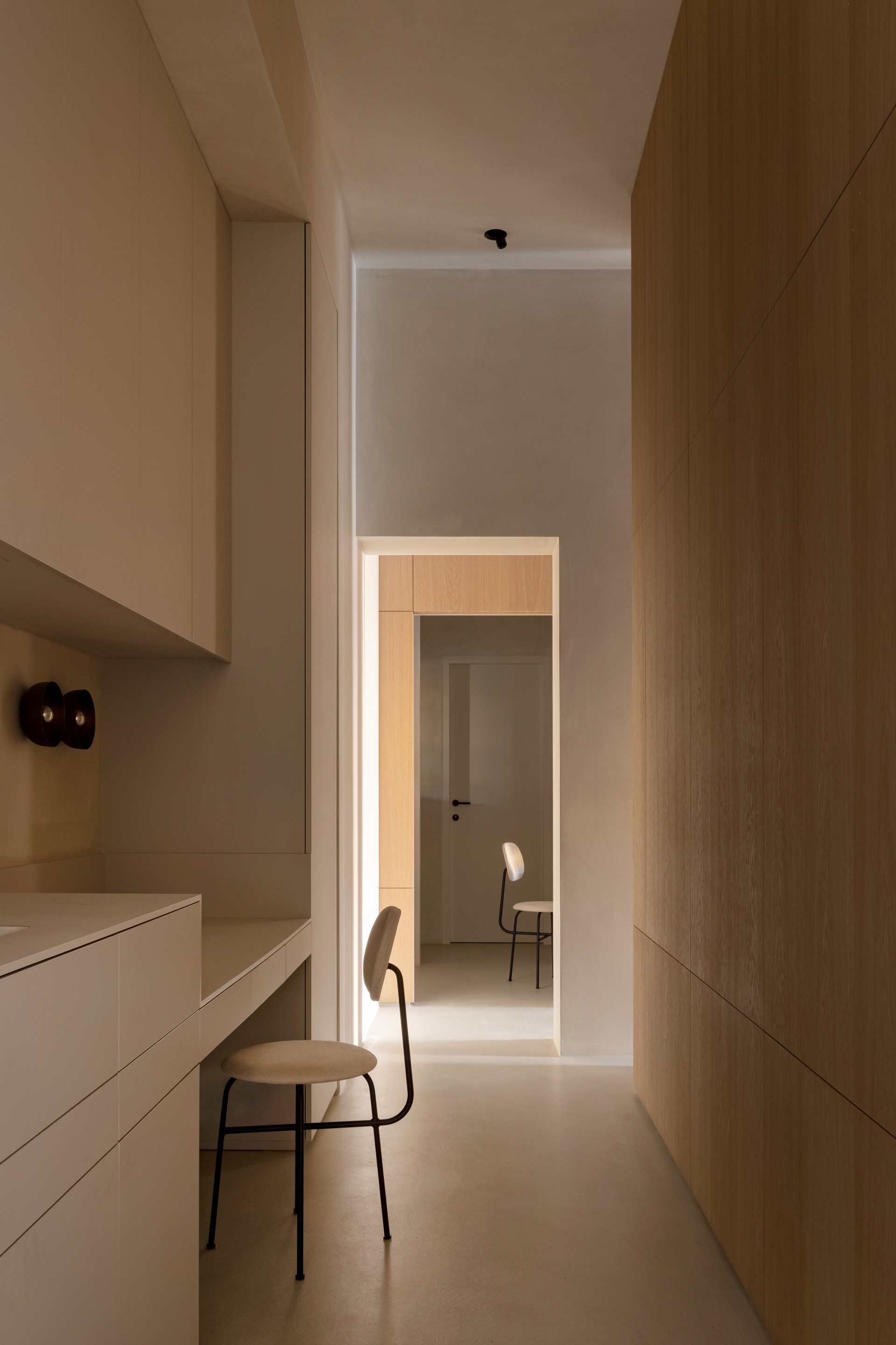
Considering the notion of form and non-form; spaces are living voids defined by additions to the space and deductions from the space – the unseen matter and shapeless absence surrounding defined objects. Therefore when understanding the impact and significance of negative space and balancing combinations of forms, we determine how we interact and feel in the given space. Form simply doesn’t exist without its counterparts as objects correlate and define spaces between them. The interrelationships between materials are interesting as well, as they are, most often, reflections of our own perception of their respective personalities and haptic properties – the hostility of sharp objects and materials, the warmth and softness of wood and the intimate apparel of textile. Respecting the characteristics of materials means carefully considering material composition and the intimate contact they have with one another. Hence, the textures in the space reveal the quality of its material composition, absorbed by our vision as well as our touch.


