The project, known as The Middle Half, dramatically reconfigures the home’s core to create an open, light-flooded interior and direct connection to the landscape. Raw, textured materials like galvanized steel, rough-sawn cedar siding, and cast-in-place concrete define the project and accentuate its unexpected, layered geometries. "Often when thinking about preserving a thing - a structure, an object, a landscape, a city - one talks about preserving its 'heart' or its 'core.' But in this case, it was the opposite - we were trying to preserve the periphery, while completely reimagining the core," says SAW co-principal Dan Spiegel.
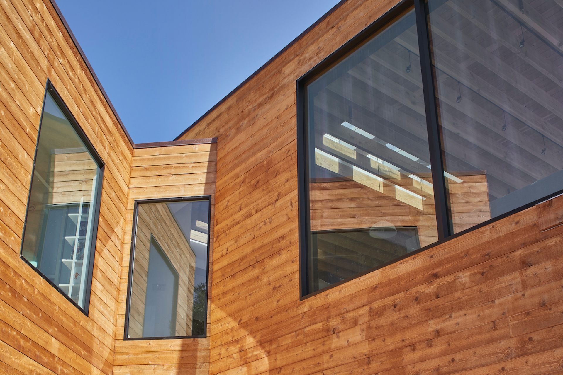
The original 2,746 square feet mid-century home featured a segmented layout of small rooms and a highly congested core. While the homeowners were fond of its modest horizontal facade and straightforward approach to materials, they recognized the effects of aging and organizational flaws, which bifurcated family living patterns and severed the interior from the site’s views. SAW's design enlarges the home to 3,457square feet, unlocks its layout to create an open-plan central living space, and enhances its connection to the dramatic vistas. Throughout the home’s interior, fixtures and finishes were designed collaboratively by SAW and one of the homeowners, Kina Ingersoll of Kina Ingersoll Design Workshop. Ingersoll also selected all of the furniture.
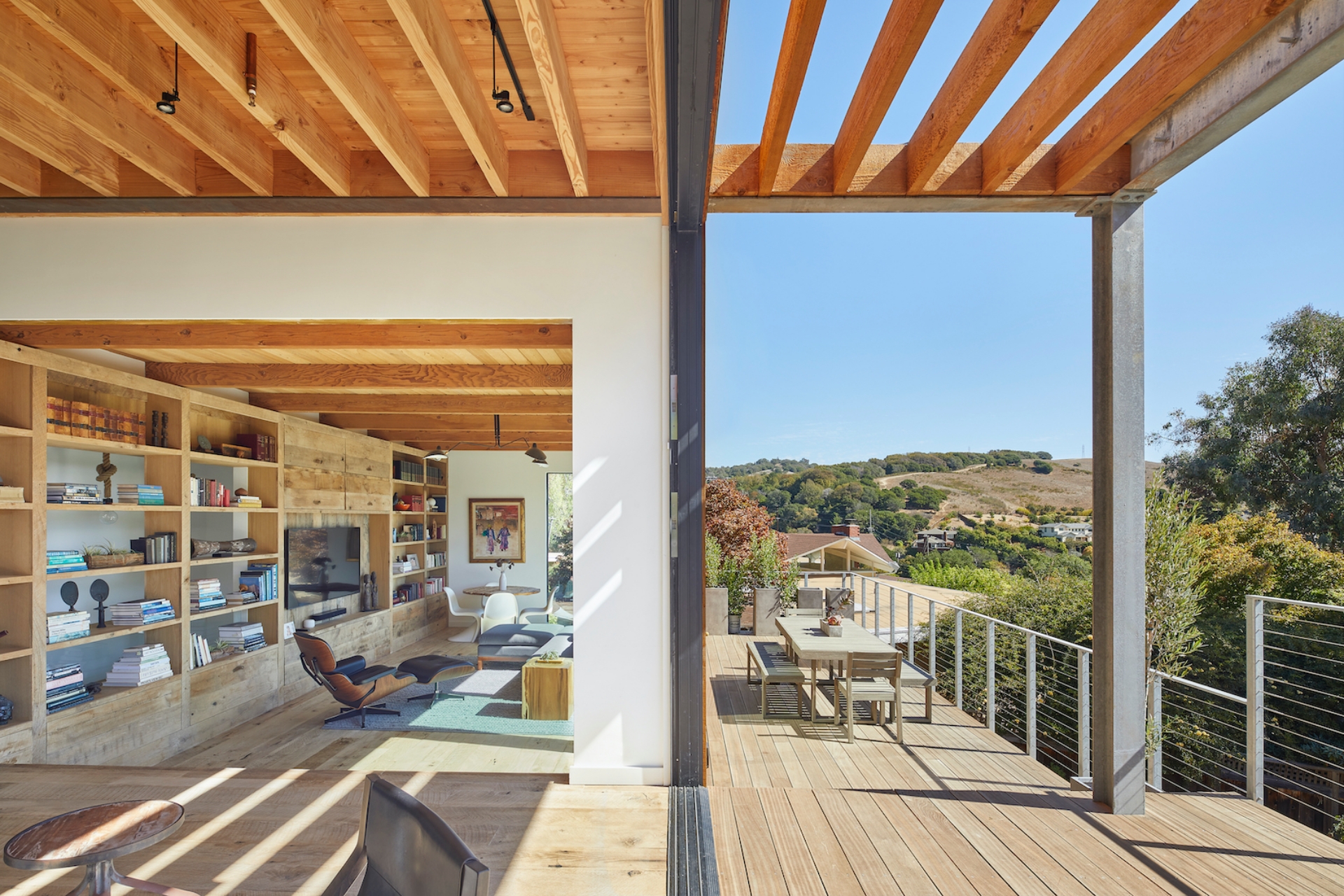
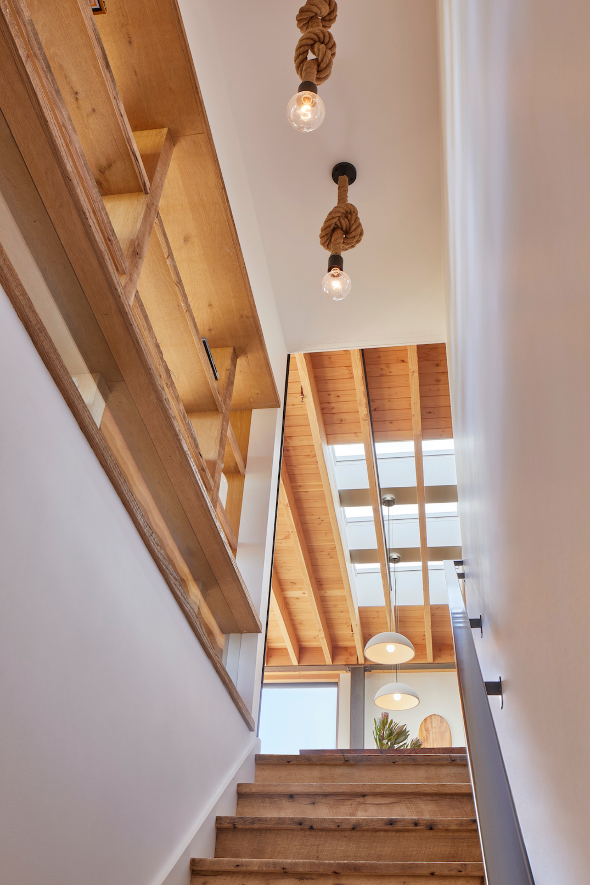
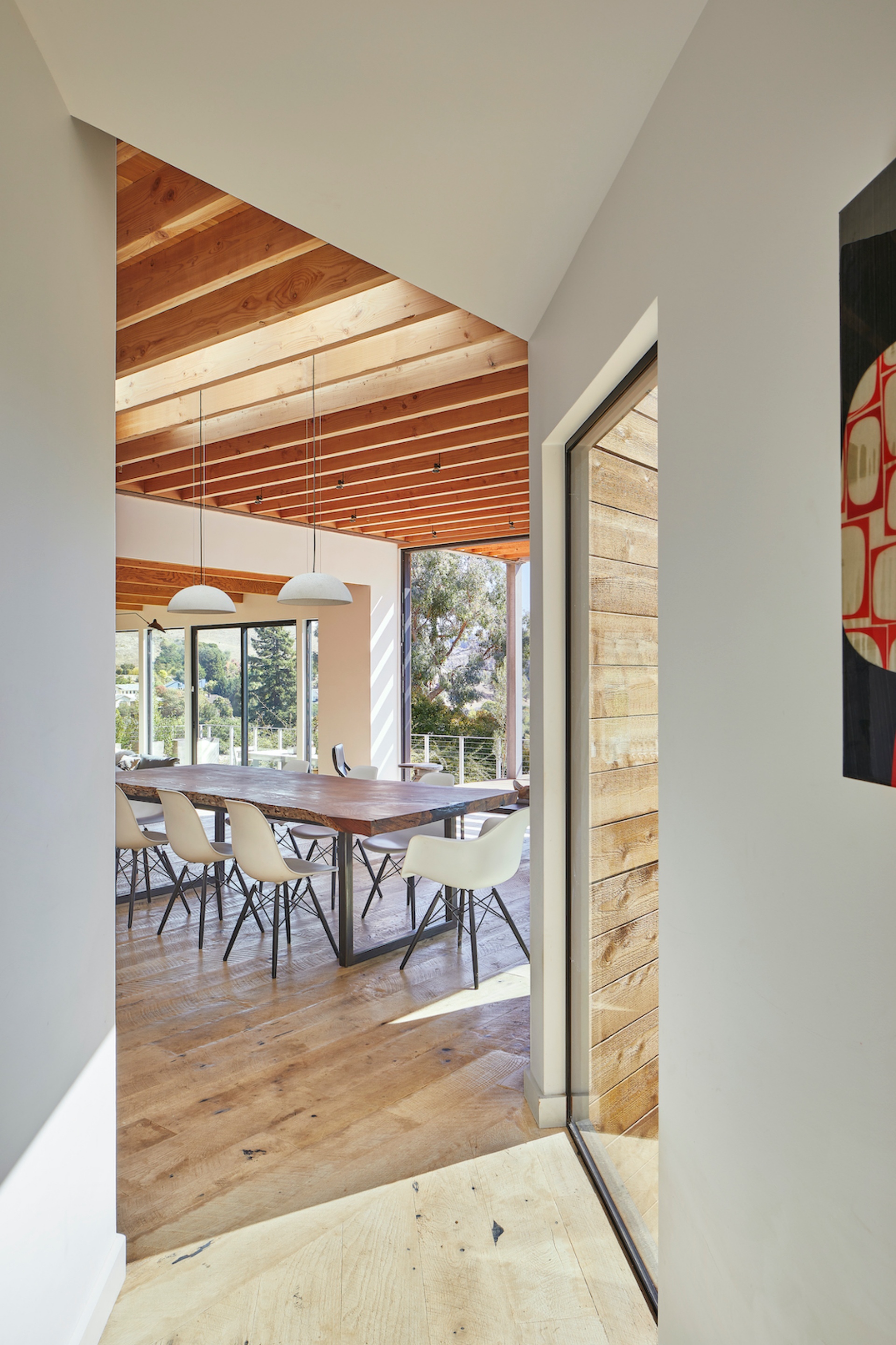
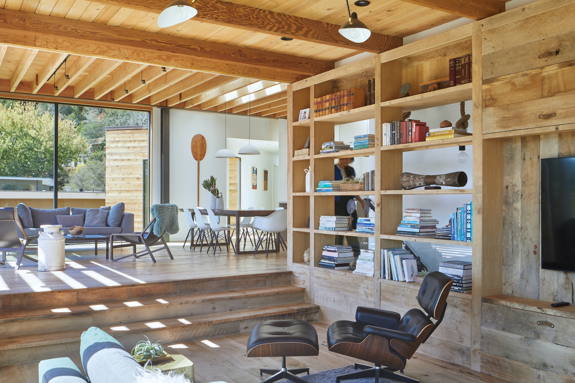
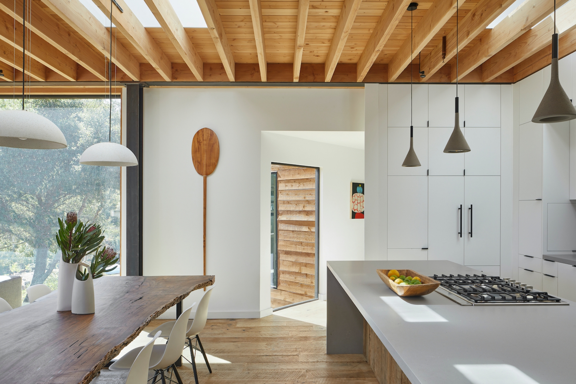
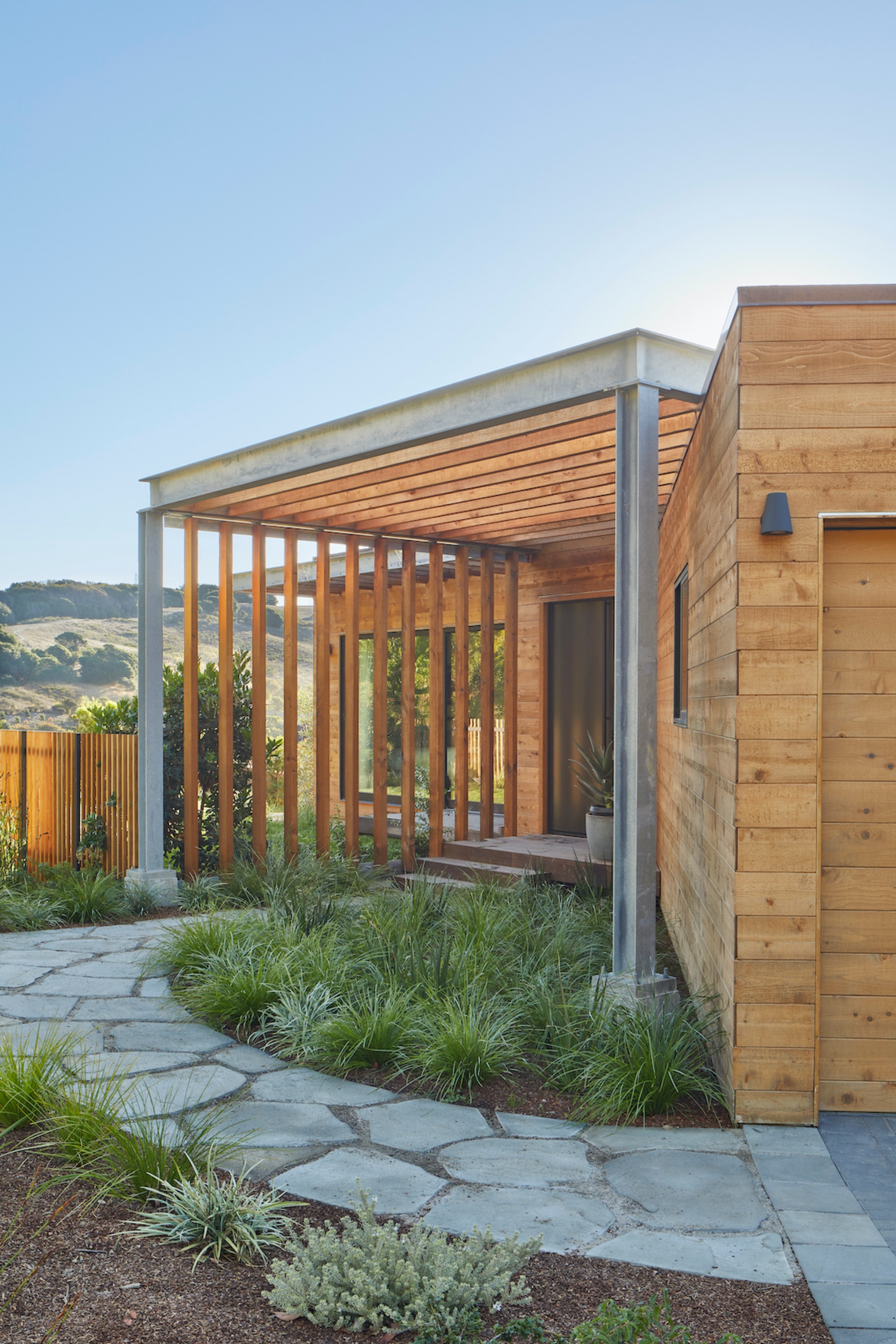
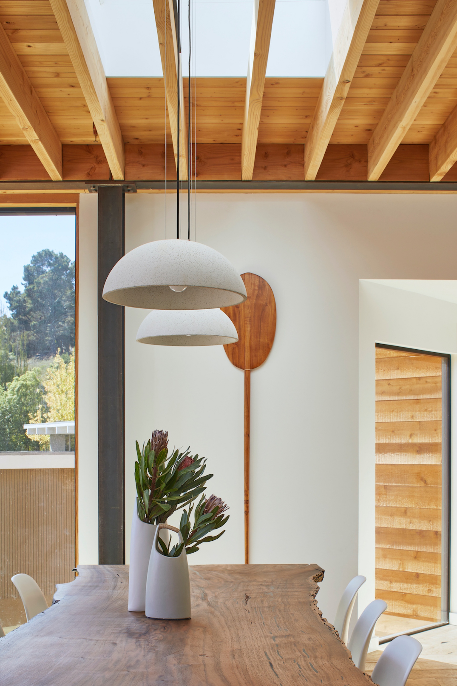
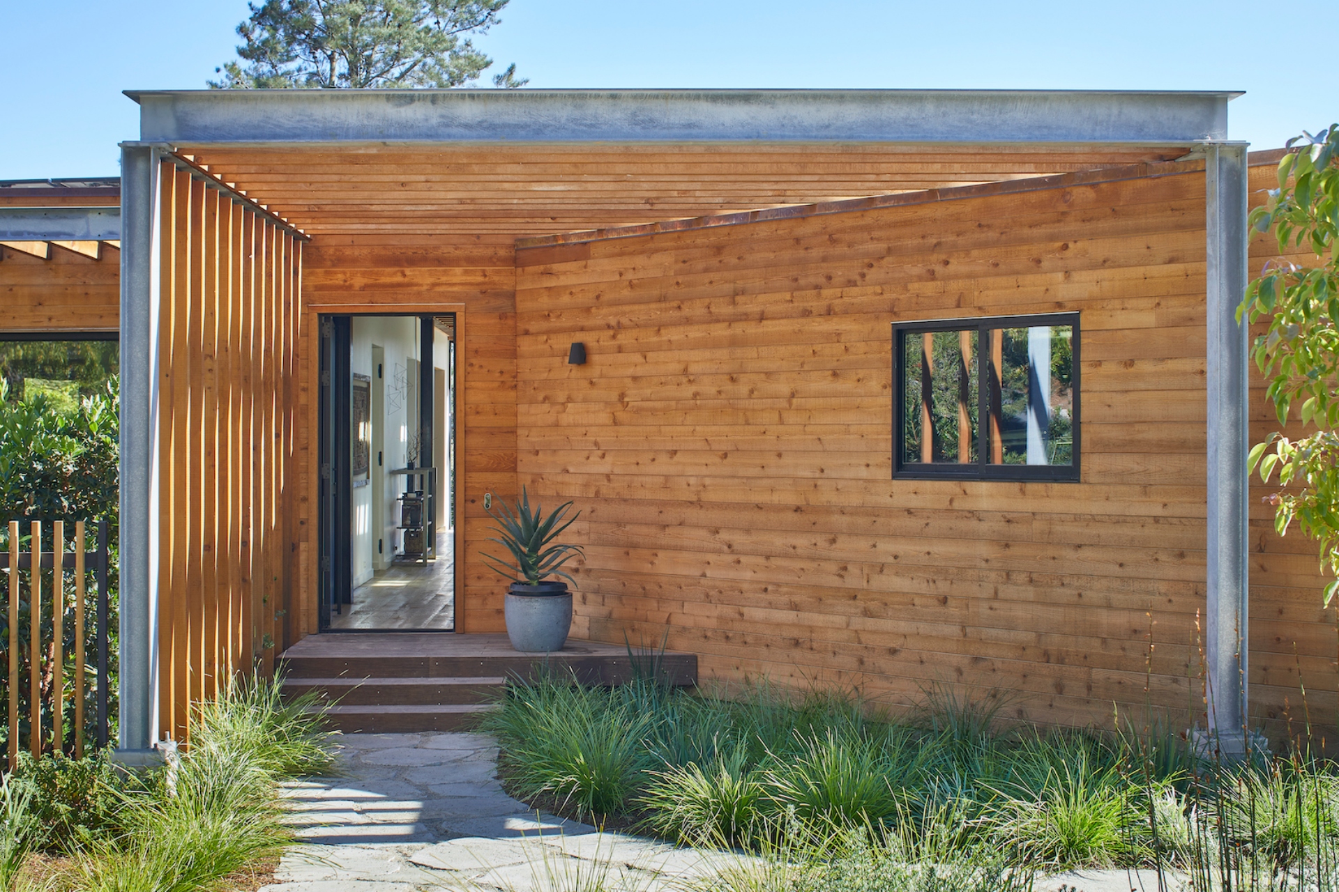
The design is defined by a sense of expansion as one moves from the front of the house, which is one level along the street, to the back of the house, which carves down to two levels and faces a steep, lush valley. "It’s meant to be perceived as a building that is both low and extremely high," says Spiegel. Approaching from the street, the facade is low-slung and grounded in the landscape. Lateral rough-sawn Western Red cedar cladding enhances its horizontality, while slatted trellises slip beyond the roof and frame the front entrances against the guiding angled wall of the garage. A feeling of suspension quickly takes over upon entering the home, where a new circulation path crosses through the diffuse core, drawing a clear slightline from the front door to the suspended rear deck and views beyond. “A basic premise of the design is to use a landscape gesture - a corridor between the front yard and the valley views - to resolve the tension between building elements,” says SAW co-principal Megumi Aihara. This path connects the home’s communal spaces (kitchen, dining area, living room, family room, and outdoor deck) along a central axis, while more private areas (bedrooms, bathrooms, office, and guest suite) peel off to the left and right. Through the front door, a tall, narrow entry corridor opens quickly into a wide, open-format kitchen and dining area beneath exposed-beam ceilings, which are perforated by skylights that punch up and seem to peel back portions of the roof. Crisp white gypsum walls and floor-to-ceiling white millwork enhance a sense of buoyancy and lightness, as subtle long-stemmed pendant lights suspend over a minimal gray kitchen bar volume and a live-edge dining room table, designed by one of the homeowners.
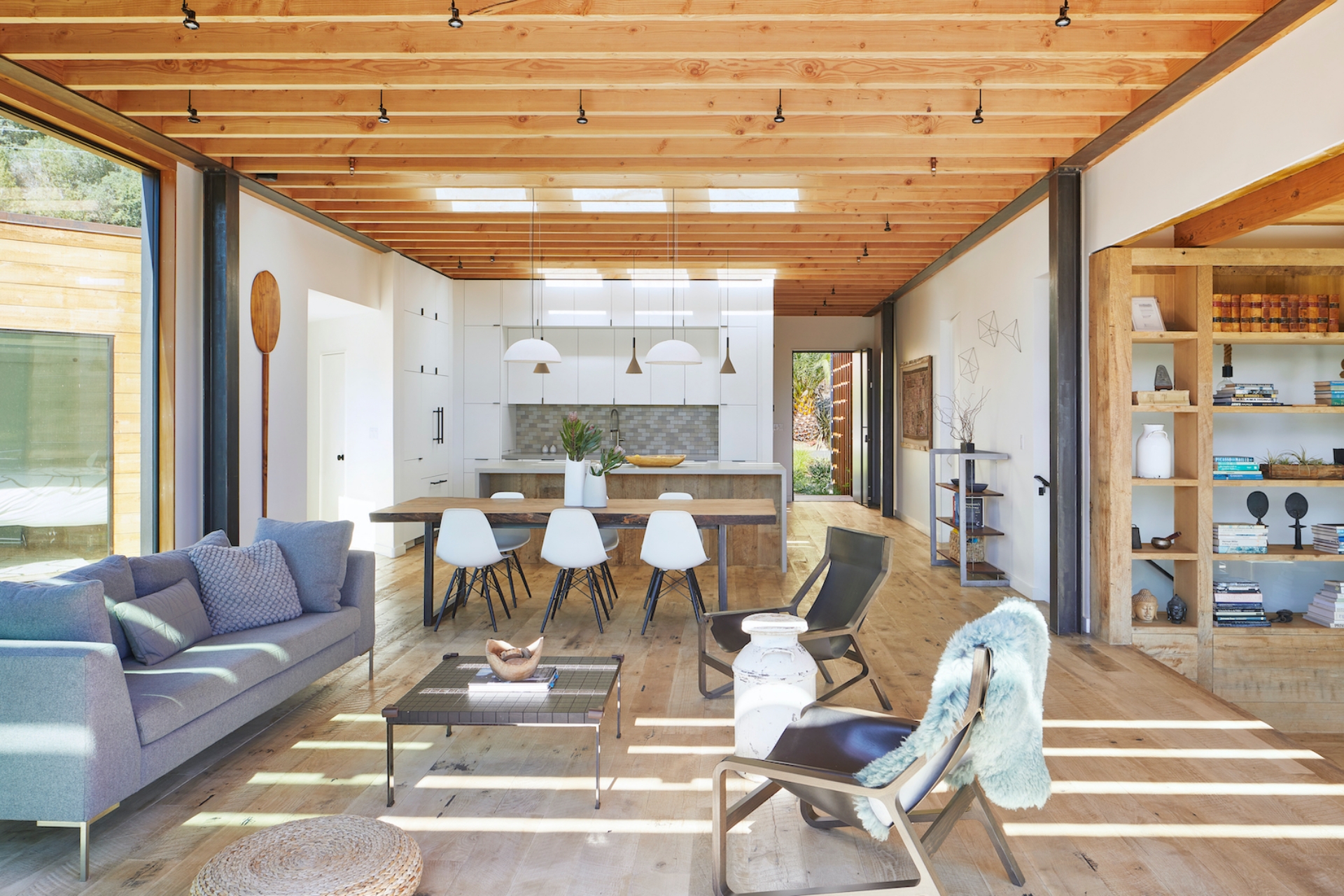
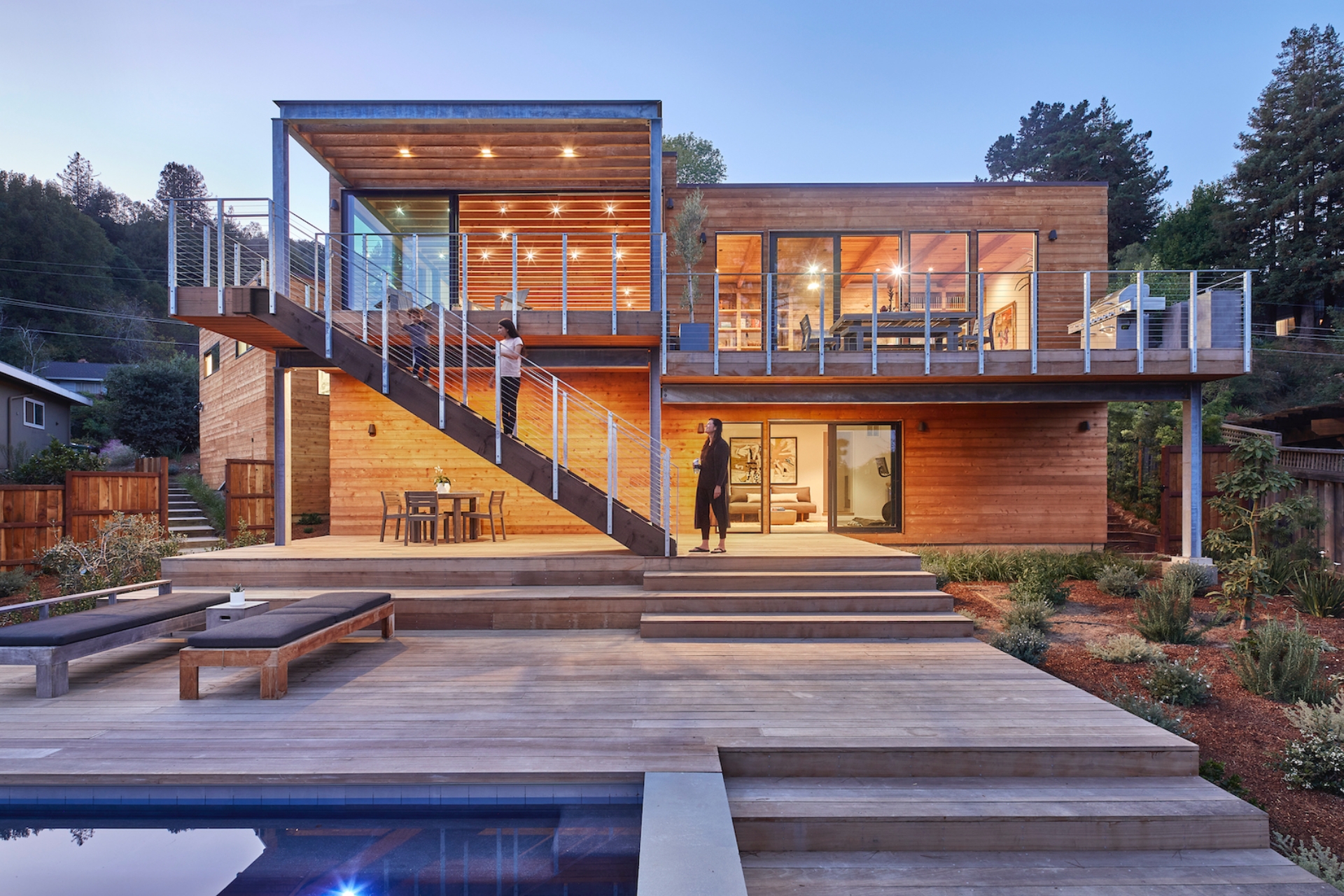
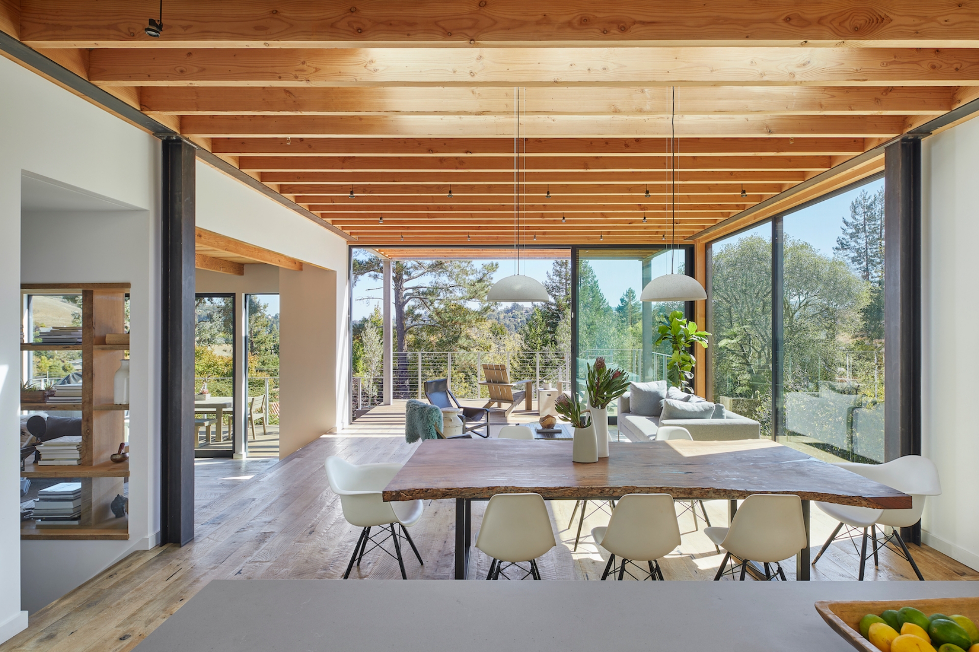
While the entire home is an exercise in blurring distinctions between interior and exterior, this reaches its fullest expression at the rear. The kitchen-dining zone spills without interruption into living and family rooms bordered by floor-to-ceiling windows and glass doors that open to the suspended upper deck, implying layered continuity. The sensation is enhanced by interior ceiling beams that extend into outdoor space, forming a slatted trellis over the back deck. “The steel frame is continuous, defining the space of inhabitation across thresholds,” says Spiegel. “It carves volume out of the air, claiming territory even on the exterior, even without enclosure.” SAW’s design ensures that even the home’s more intimate rooms converge with the landscape. A new, expansive 16-foot-wide sliding door carves into the primary bedroom’s front wall. This opens onto the redesigned front garden, planted with a lush array of azaleas, lilies, and grasses. The connected primary bathroom is likewise organized around a window that reveals the front yard’s camphor tree.
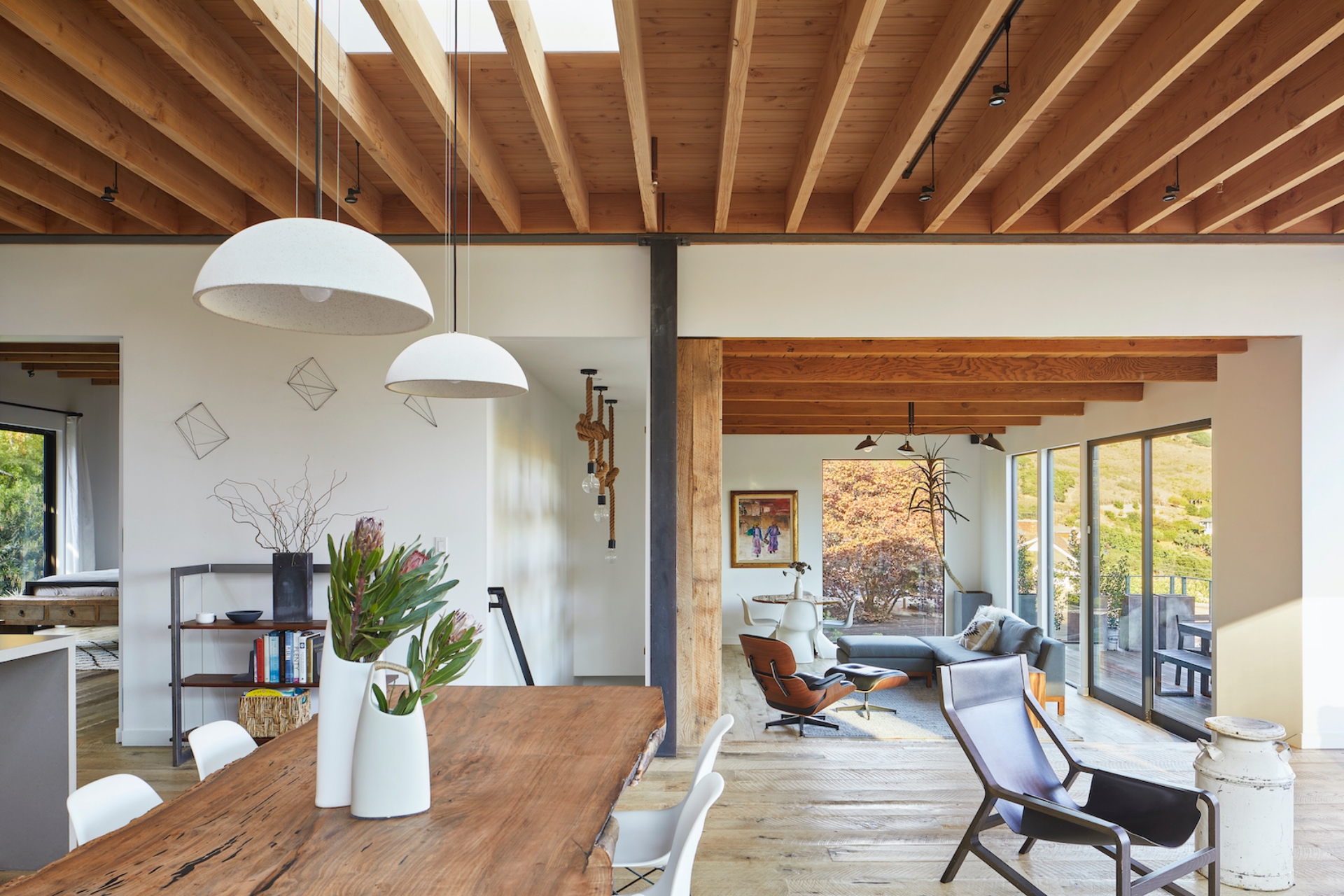
The client’s approach to the interiors also melded indoors and outdoors: “What inspired me was my upbringing in Hawaii and the constant connection to nature you have growing up there... I wanted our house to exhibit all of these inspirations: a connection to nature (with large back doors opening to our yard and the surrounding woodland surroundings), and an interior that exhibited a subtle mix of cultures, from old world to new world, Eastern to Western, and modern to traditional. One example of this thinking was our dining room table. We sourced the slab of black walnut from an east coast lumber company on Etsy and then we hired a local woodworker to finish it and a local metalworker to build the raw steel legs that I designed.”
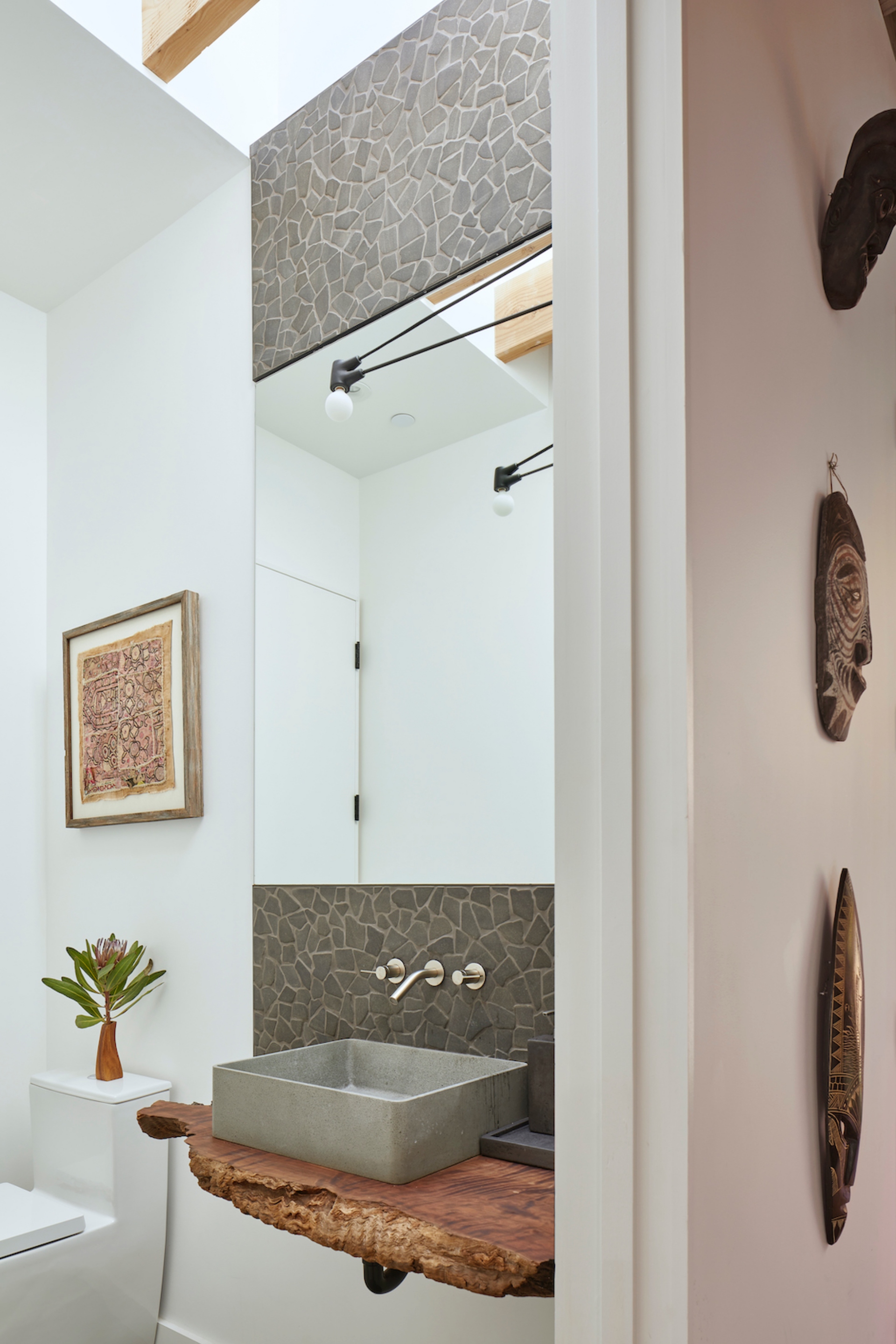
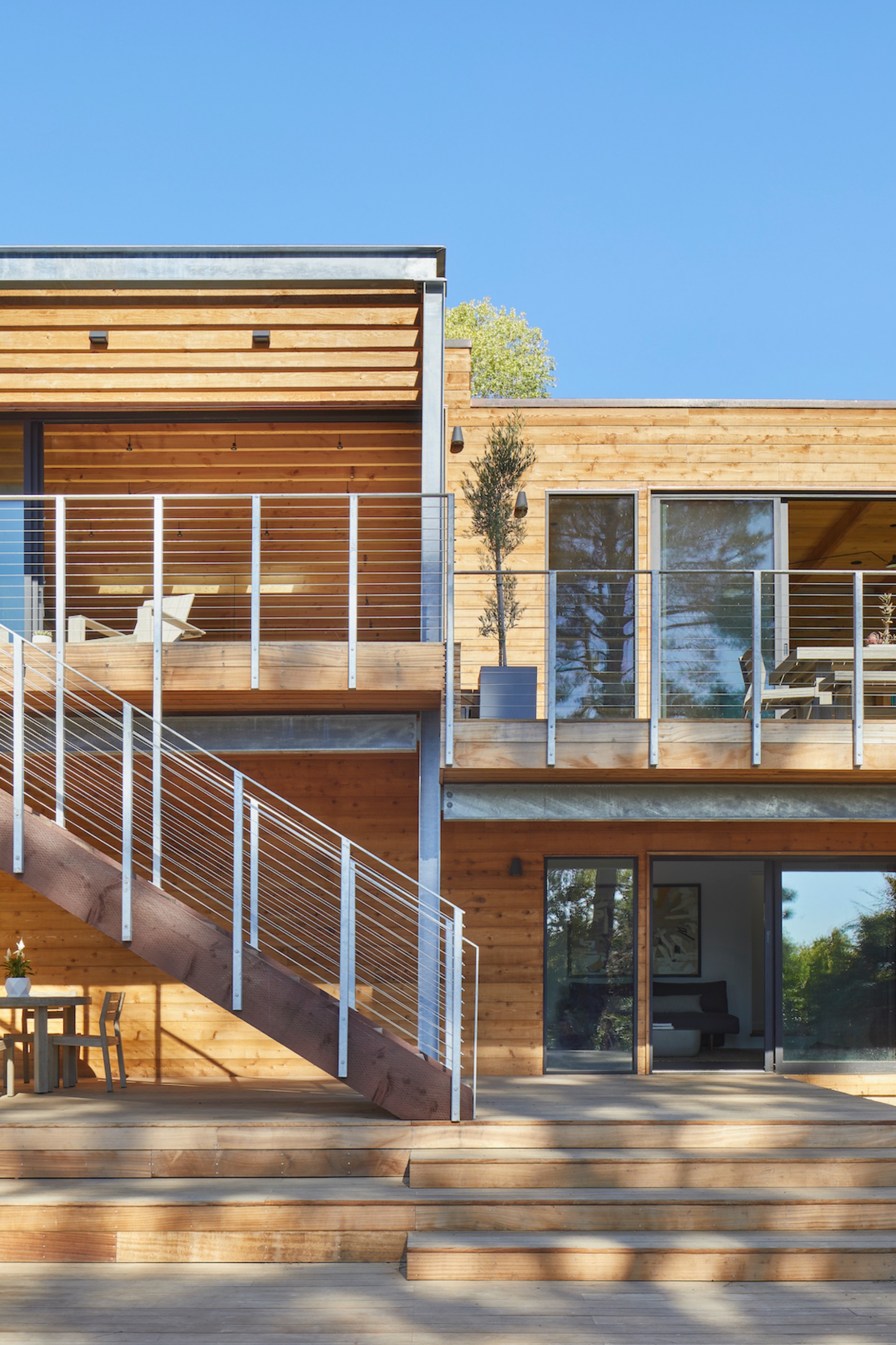
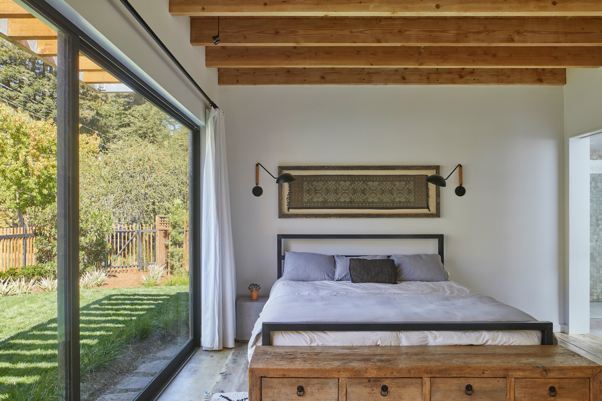
Extending from the right of the kitchen-dining area, a short hallway stitches the main volume of the home to the kids’ wing, which angles to the west. Windows lining this threshold, create a visual connection through the volumes, revealing the home’s layered, slipping geometries. On the other side of the kitchen, a stairwell slides subtly behind the family room’s open bookshelf down into a lower level bar/lounge, guest room, and office; previously, there had been no interior connection between the upstairs and downstairs. The lounge also features glass floor-to-ceiling sliding doors that open onto the lower deck. SAW designed the rear landscape to be volumetric, defined by geometries shared with the architectural design. The wide upper deck connects to the stepped lower decks with a sharply defined, hefty cedar staircase and railing made from galvanized steel posts and stainless steel cable. The pool, located on the lowest deck, is seamless at one side - a void in the landscape - and yet a solid rectilinear block in the hillside from another. Below, terraces stagger as “landscape rooms” across the slope. “The most critical building elements - the steel and wood beams and columns - break free of the constraints of the interior walls to carve out and define volumes of exterior space, framing views as pictorial scenes,” concludes Aihara of the connection between architectural and landscape design across the project.


