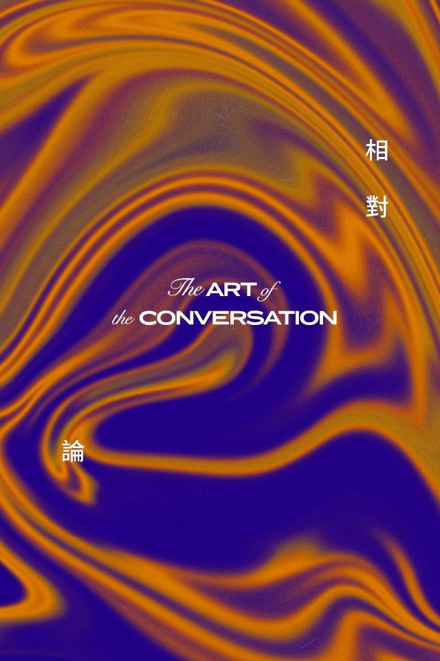
PODCAST
WHAT MAKES A GOOD CONVERSATION? LOOK NO FURTHER THAN OUR ART OF THE CONVERSATION, FEATURING UNCONVENTIONAL STORIES AND PEOPLE WHO MOVE AND INSPIRE
LISTEN NOW


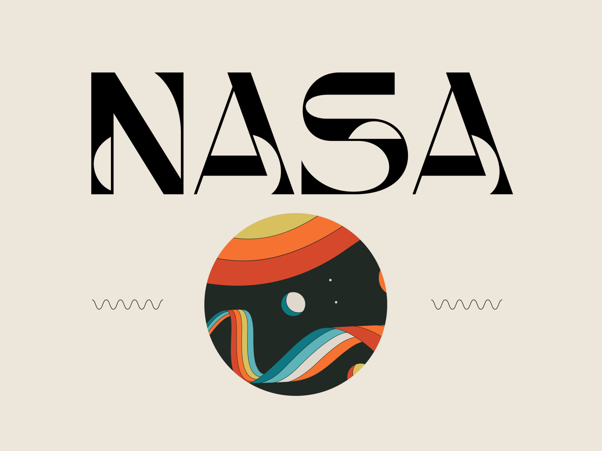
The power of the written word is not solely dependent on the author’s creative words but it’s also a marriage of the selected font design and layout that come together to inspire readers, dancing along with the rhythm of turning the pages of a book. Hailing from London Ontario in Canada, Barrett Reid-Maroney fell in love with typography while he was an undergraduate student in the English and Cultural Studies program at Huron University College. During this time, many of his courses involved examining beautifully-printed rare books. By closely studying these books, he quickly became fascinated by the history of typography and the visual power of letterforms. Hand-made books from the 16th century have had a deep impact on him, and immortal typography and text design have moved him to conceive his historically-inspired typefaces. Here, Reid-Maroney unveils his meaningful process.
Typefaces are more than just a fancy decoration for letterforms. In your opinion, what qualities do you think typefaces carry to help achieve a successful brand identity?
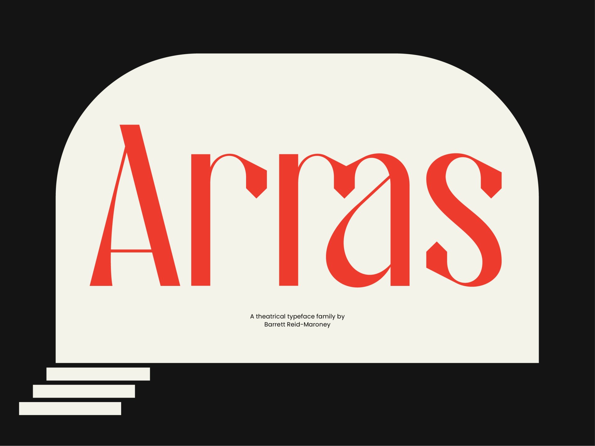
I believe that a well-designed typeface has the power to communicate a story. Some would argue that type should be “transparent”, or that it should not distract the eye. While this might be true in the context of a book (where optimal legibility is essential), the process of creating a display typeface allows type designers to embed artistic meanings within letterforms themselves. For example, my most recent typeface, Arras, was designed to evoke elements of theatricality - movement, tone, and gesture, while also alluding to the history of Shakespearean craft print. With each typeface that I design, I make it a priority to tell interesting stories that viewers can uncover.
How would you describe your design style?
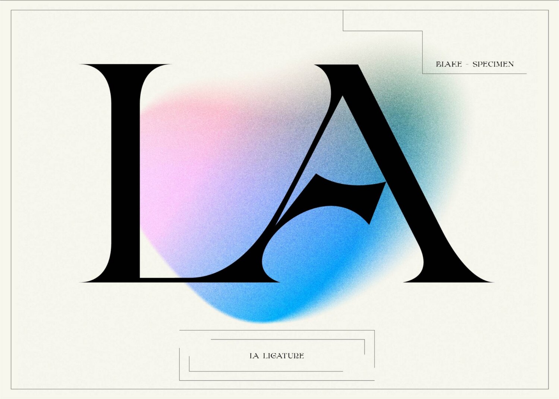
I aspire to design typefaces that are artistic yet timeless. My style is very much informed by the beautiful typography found in handmade books from the 16th century and onwards. My typeface Ephemera is a testament to this, as it incorporates elements drawn from centuries of typographic tradition - from medieval blackletter, to Renaissance humanist serifs to contemporary display fonts. My greatest inspiration is William Morris, who designed his own humanist typeface, Golden Type, and founded his own private press in the 19th century as a counter to the mechanization of print culture during the Industrial Revolution. I am not interested, however, in creating revivals of pre-existing typefaces from the past. Instead, I focus on creating letterforms that are historically-inspired yet unique and original.
You mentioned in your article, Designing a Theatrical Typeface: The Making of Arras Display that your inspiration for Arras Display is mainly from Edward Gordon Craig’s use of typography, as well as the gestures and movements performed on stage. All these details that are easily neglected by amateurs certainly have a big impact on you. The world you’re living in must be fascinating - how do you process and digest all the inspiration and information you come across, and turn it into a feasible idea for future?
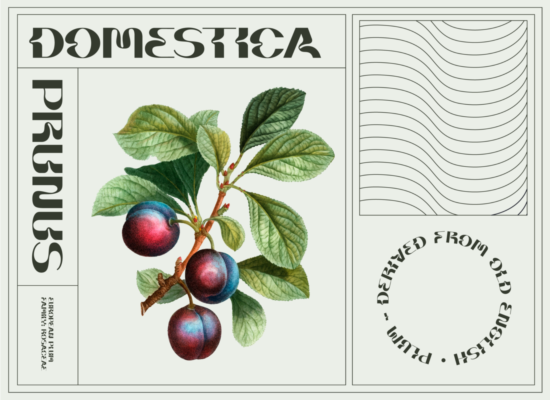
When I am out in the world, I am always gathering inspiration and archiving ideas for future projects. I thoroughly enjoy sketching in small “Field Notes” pocket notebooks, which I take with me most places I go. The naturalistic, expressive curves of my typeface Briar, for example, were inspired by various species of plants, while Personify was inspired by Classical Greek architecture. This research process ensures that I always have new ideas for typeface projects.
When you are approached for a project, what are the first things you look at and what is your usual creating process? What affects your take on the typefaces designed for a brand/project?
I first consider if the potential client actually requires a custom typeface - the development of a typeface from start to finish is very complex, so it is important to determine whether or not a unique typeface is an appropriate fit. If so, I take the time to learn about the brand’s voice and vision, and then I translate that voice into letterforms.
What has been your most challenging task so far?
Designing my first typeface was very challenging. From learning how to draw balanced, visually-pleasing letterforms, to vectorizing each character, to turning the typeface into a usable digital font, the entire process was very lengthy and involved.
Could you recommend a few publications that have inspired you and would be useful for anyone who is interested in pursuing a career as a type designer?
My favourite publication that features typography is AIGA Eye on Design. It is a fabulous resource to learn about the work of other contemporary type designers. For anyone interested in the history of typography, I would highly recommend the blog of Dr. Scott Schofield, one of my professors from university. The blog is named “Impressions”.
Do you have a favourite typeface, whether your own or from others?
I don’t think I can name a single typeface as my favourite (there are far too many excellent contemporary and historical typefaces from which to choose). In terms of my own typefaces, I am most proud of Briar Display - I consider it to be the typeface that helped to launch my career as a type designer.