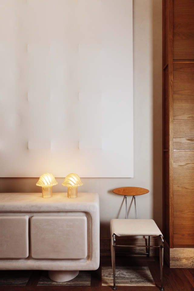
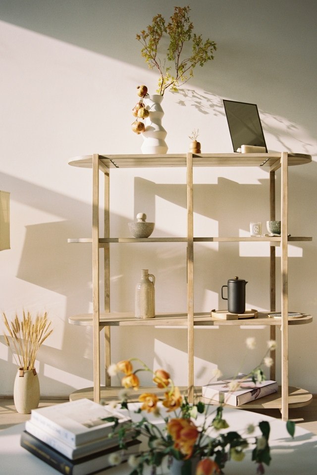
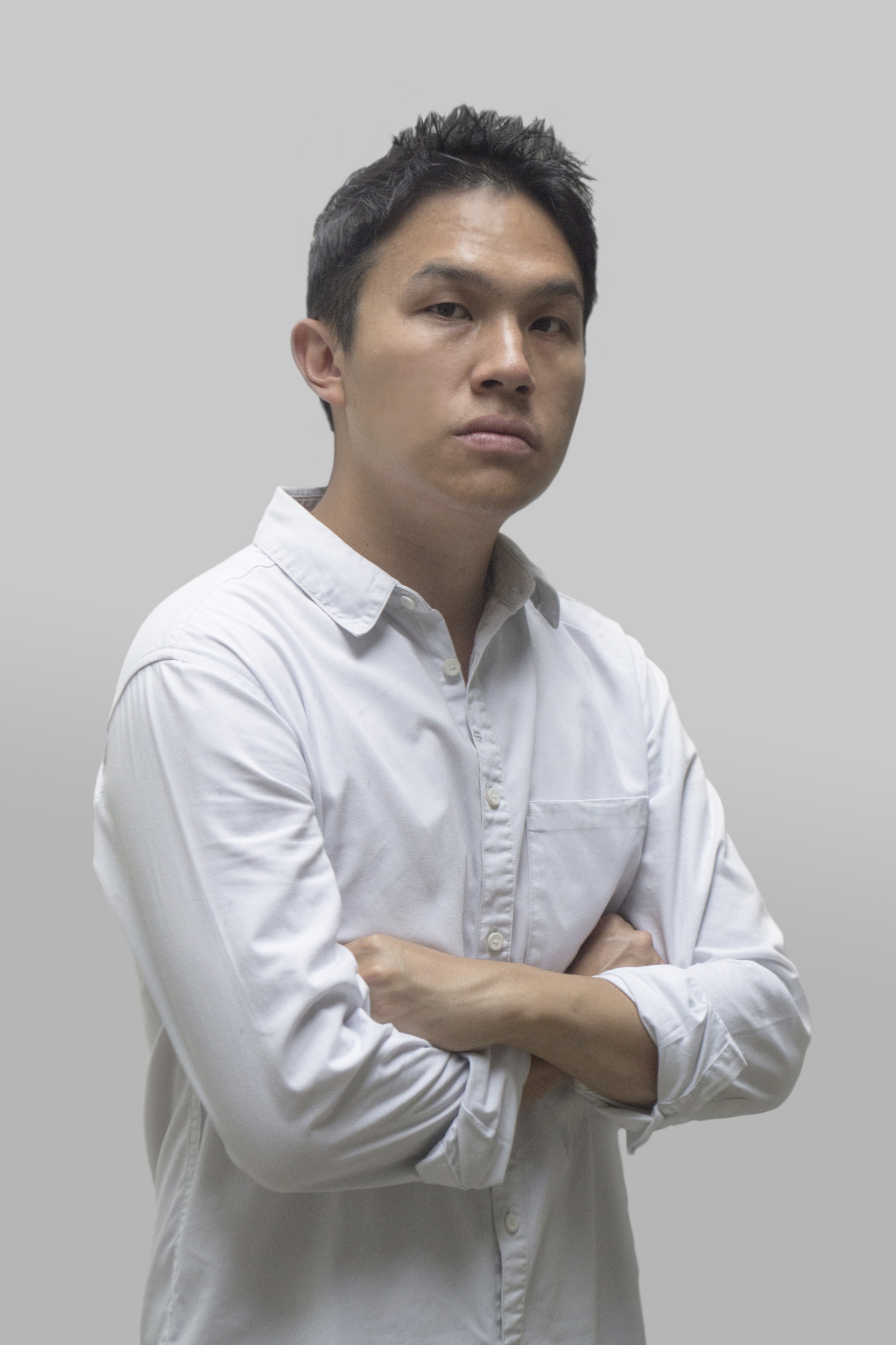
Antimatter is a spatial design agency founded by furniture designer and creative director Gabriel Tan in 2016. Why Antimatter? In modern physics, antimatter is a subatomic particle that is considered the opposite of normal matter, and one that takes a tremendous amount of energy to produce. The same can be said of holistic, memorable interior spaces and the quest for the extraordinary. Antimatter combines the disciplines of interior design, furniture and lighting design, art curation and styling, materiality, tactility, warmth and clarity as some of the key qualities they strive for in their projects. The agency combines furniture, light, objects and spaces to be inherently connected and simultaneously considered during the design process, resulting in spatial experiences that are sensorial and emotional.
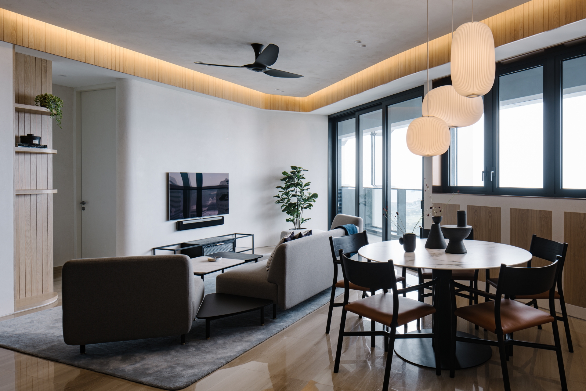
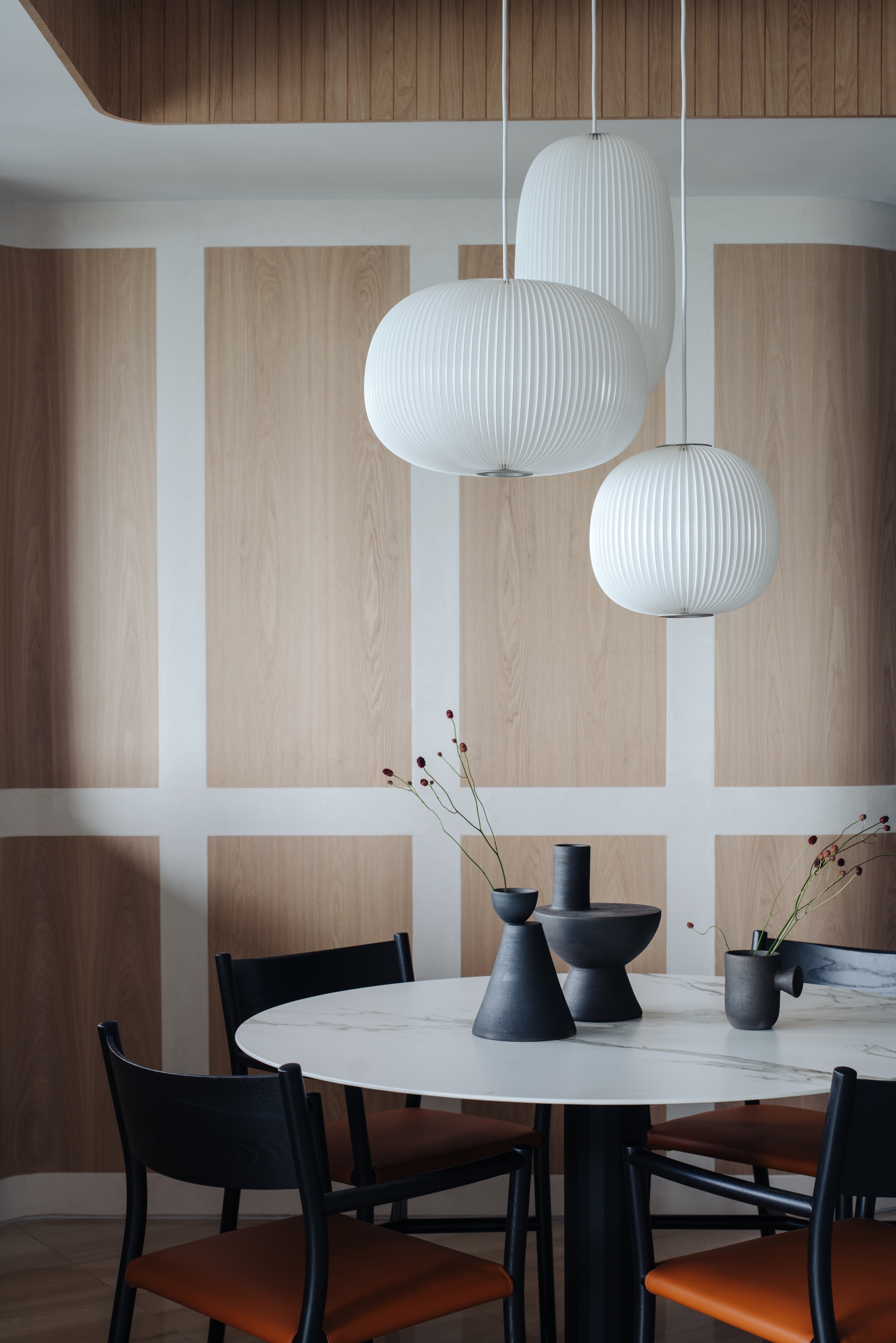
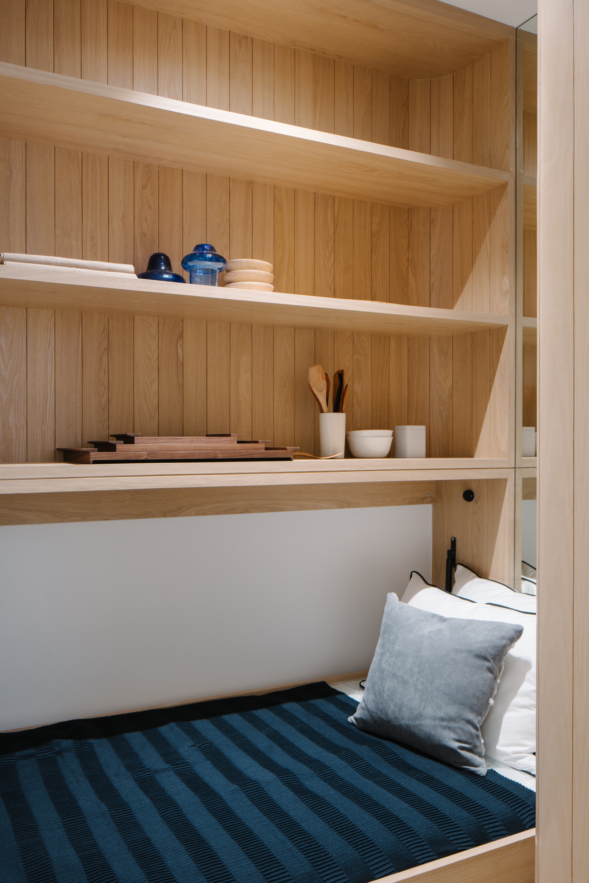
Such is the case of this 2,400 sqft penthouse at Duo Residences in Singapore, featuring an outdoor roof deck and three bedrooms. The interior’s angular plan reflects the geometric architecture of Duo by German architect Ole Scheeren. Antimatter’s strategy was to smoothen each sharp wall edge with a curve, infusing the interior with fluidity. A graphical wall pattern wraps the dining room, created by infilling a framework of textured, ivory coloured mamorino plaster with Ash timber veneer. The idea was to create a wall inspired by Japanese and Scandinavian elements, so as to achieve a sense of regularity and harmony with the repetition, while incorporating a twist as the walls curve to turn corners. Overhead, the curvilinear ceiling is accentuated with slatted ash timber veneer. Tan designed the dining table, dining chairs and vases in this space, as well as the sofa, coffee table and TV console in the living room.
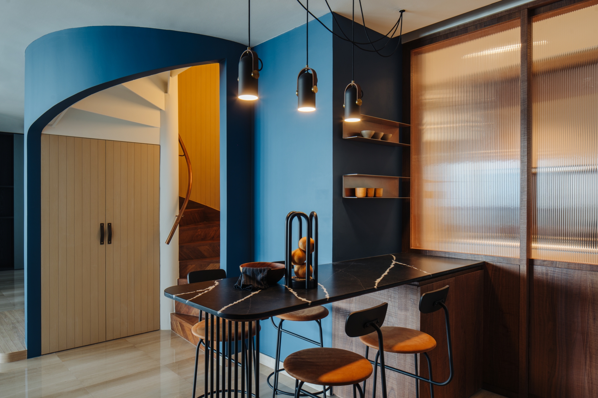
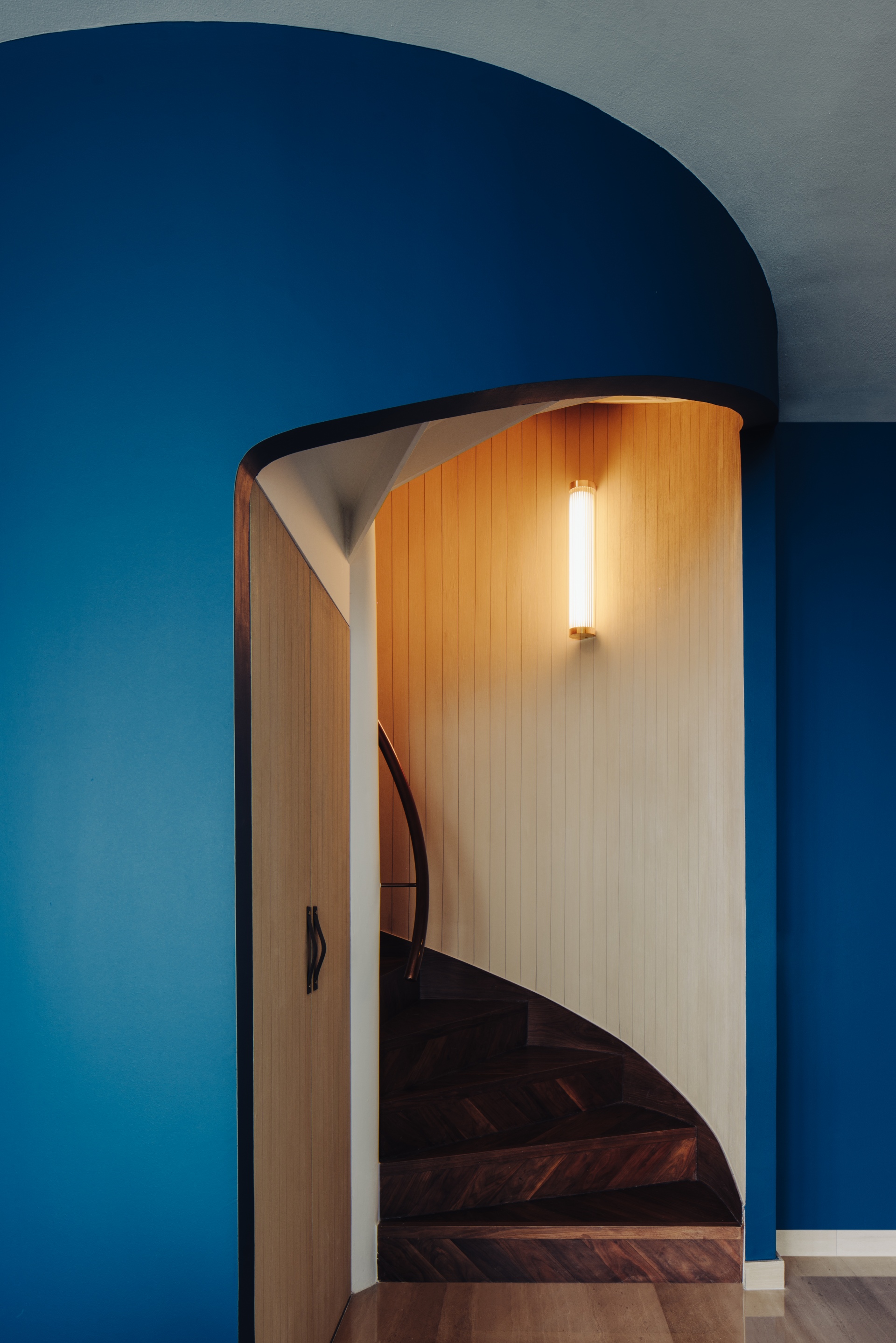
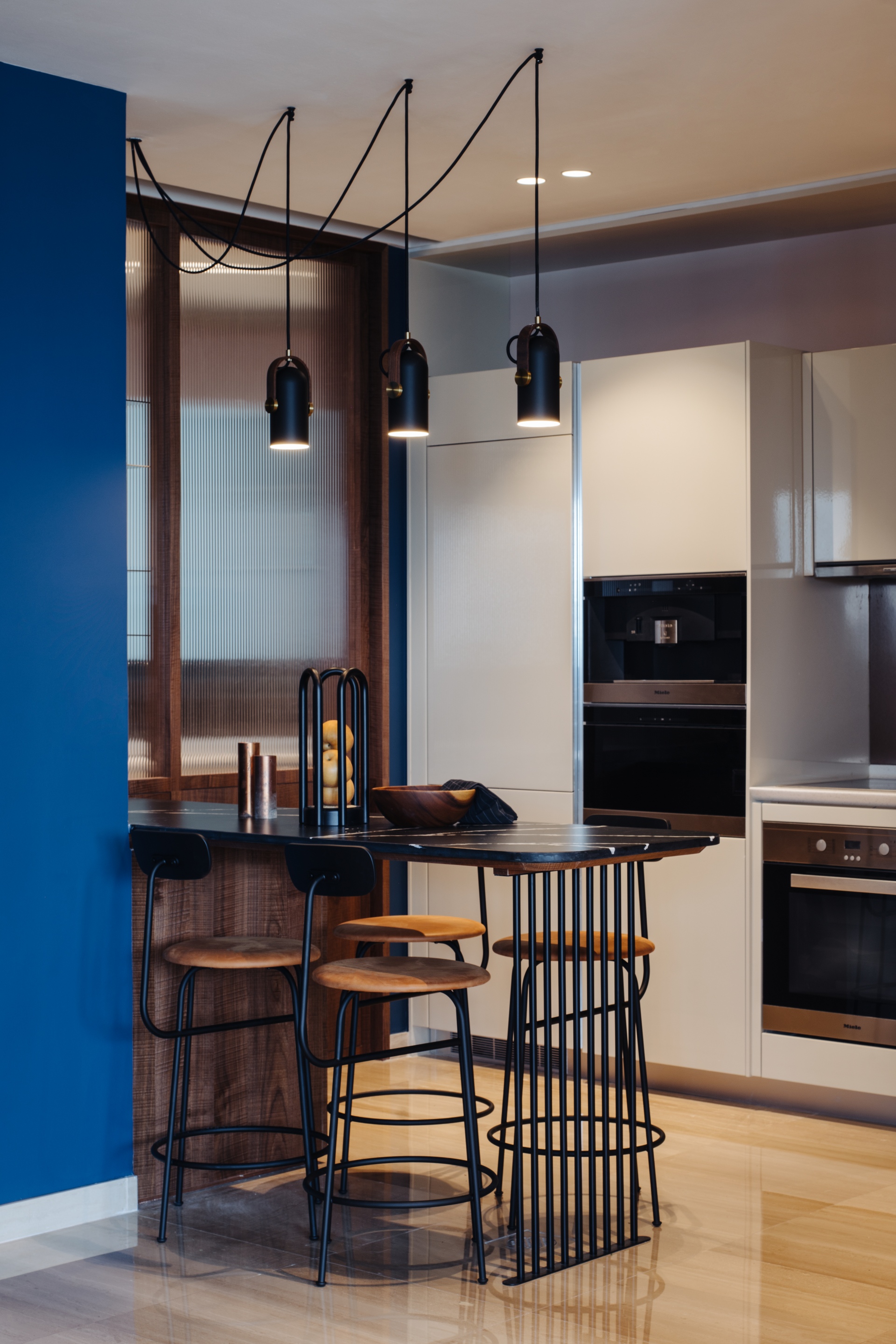
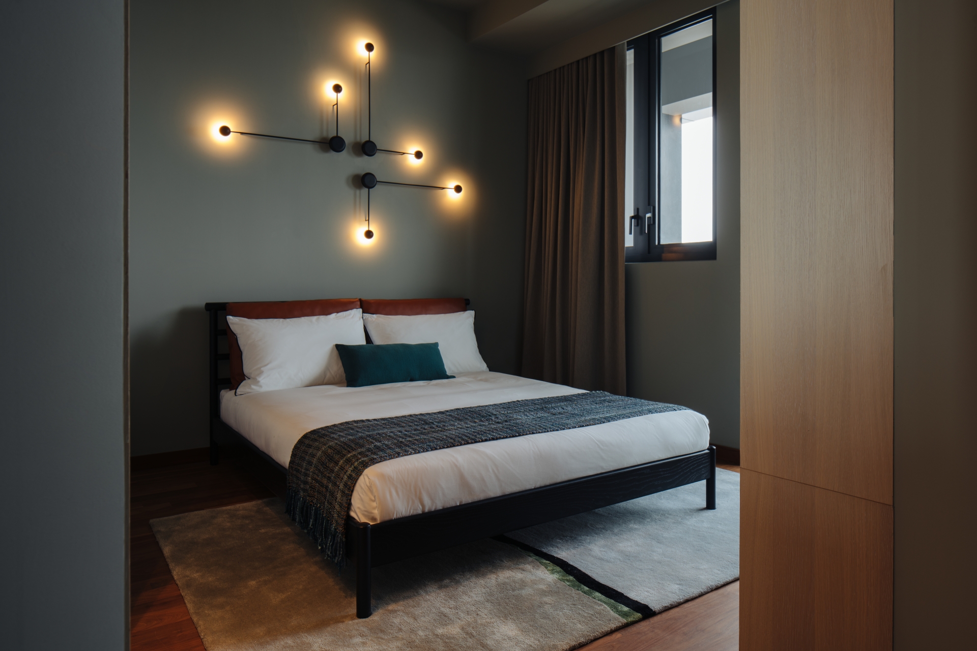
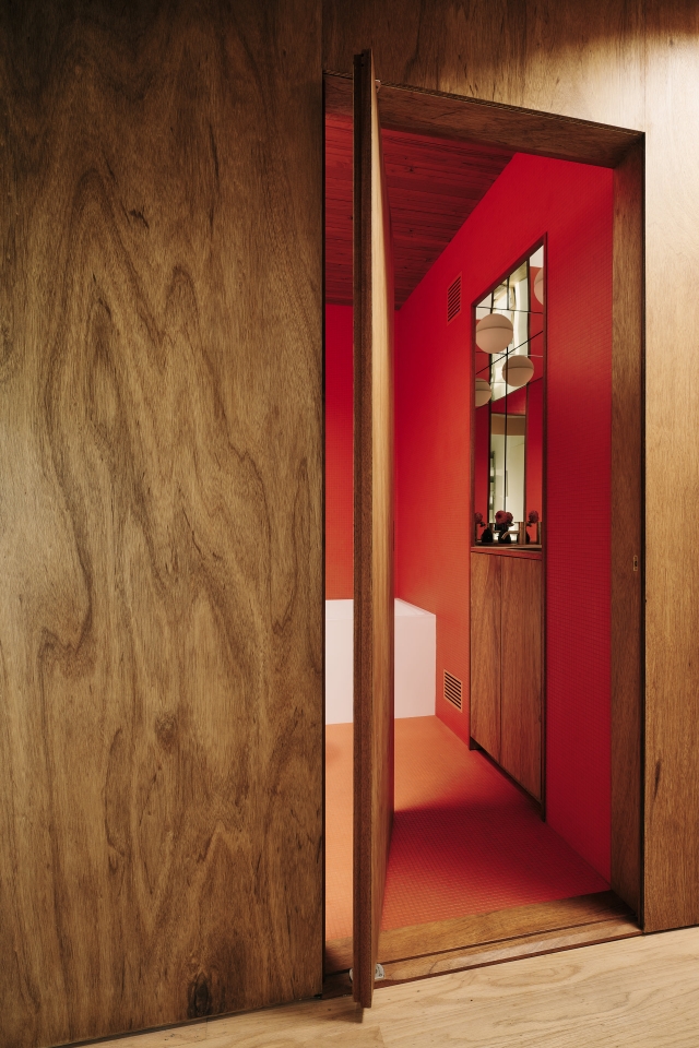
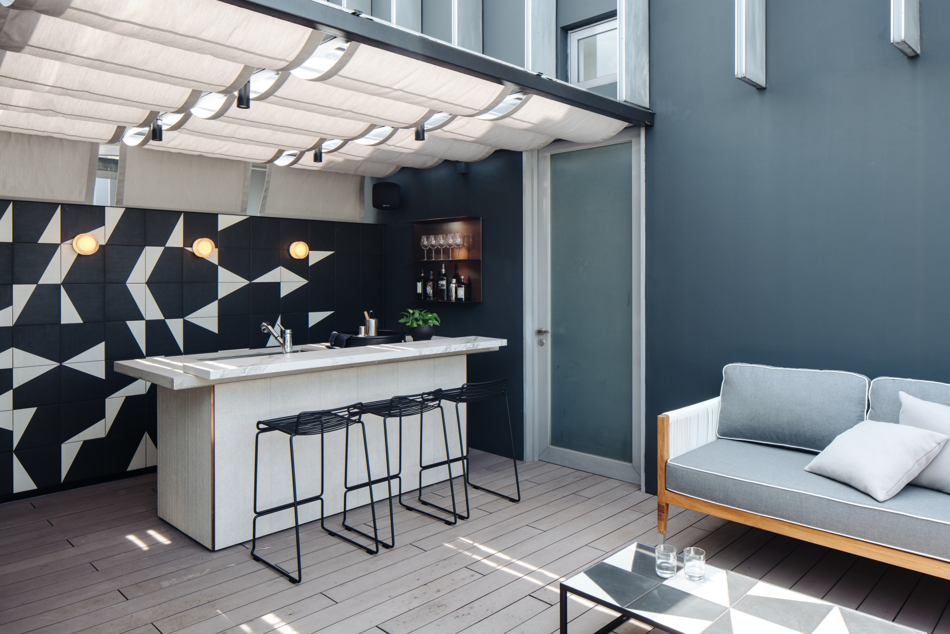
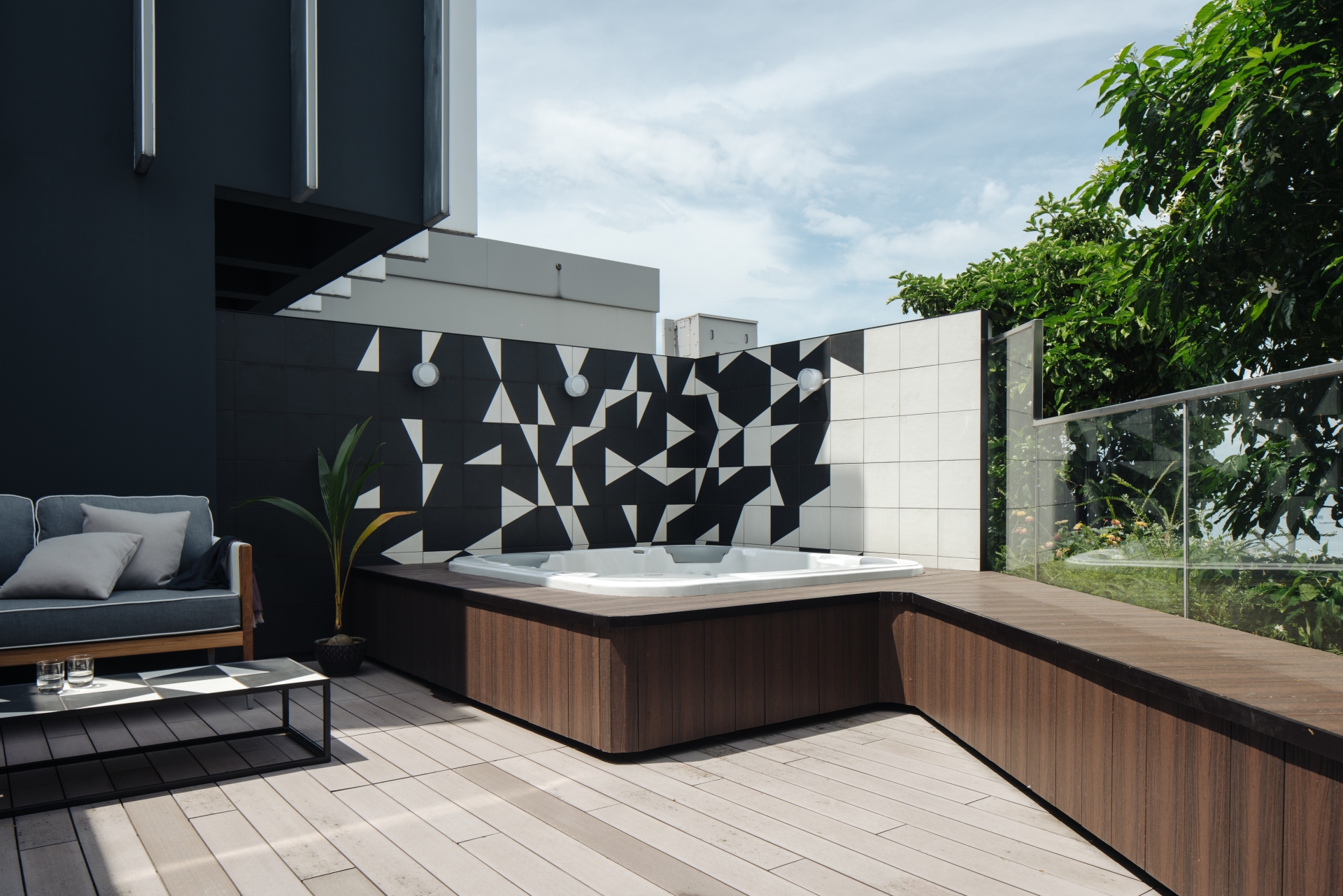
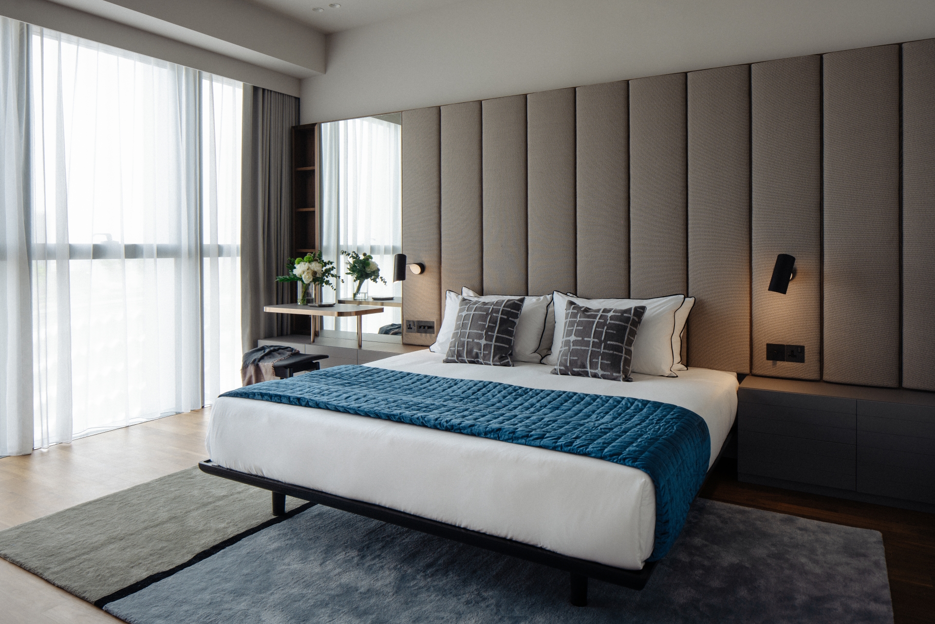
Inspired by the interior treatments of an apartment Tan had experienced at Mies van der Rohe's Lafayette Park in Detroit, the studio wanted to work with colours in a strong and decisive manner - this intention was especially evident in the Egyptian blue staircase volume. The same approach was adopted for the bedrooms, where grey and green tones flow from ceiling to walls. On the rooftop, graphical black and white wall tiles from Mutina, timber cladded bench seating and custom sunshades draped in elegant loops complete the design. We chat with the thoughtful studio principal to find out more.
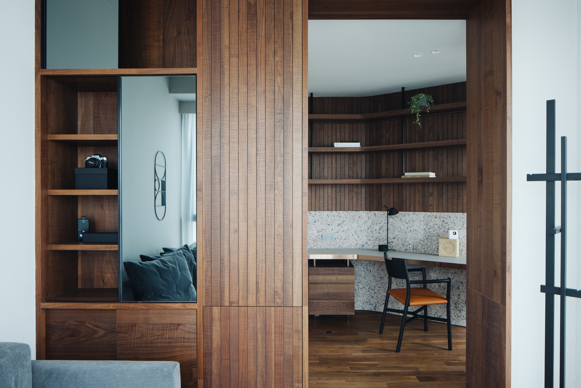
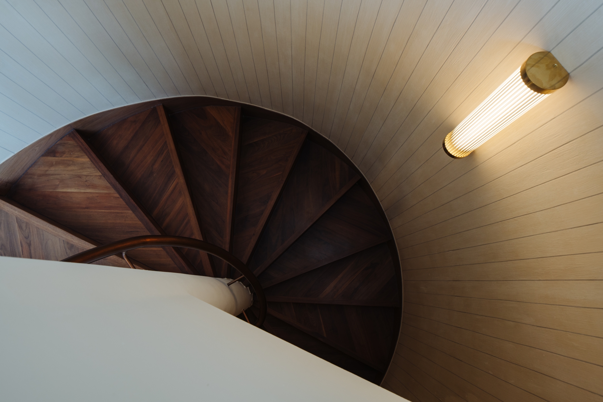
What was the brief from the clients on the Duo Residences project? To what extent do you think the occupants’ cultural background and professions have informed their preferences on a living space?
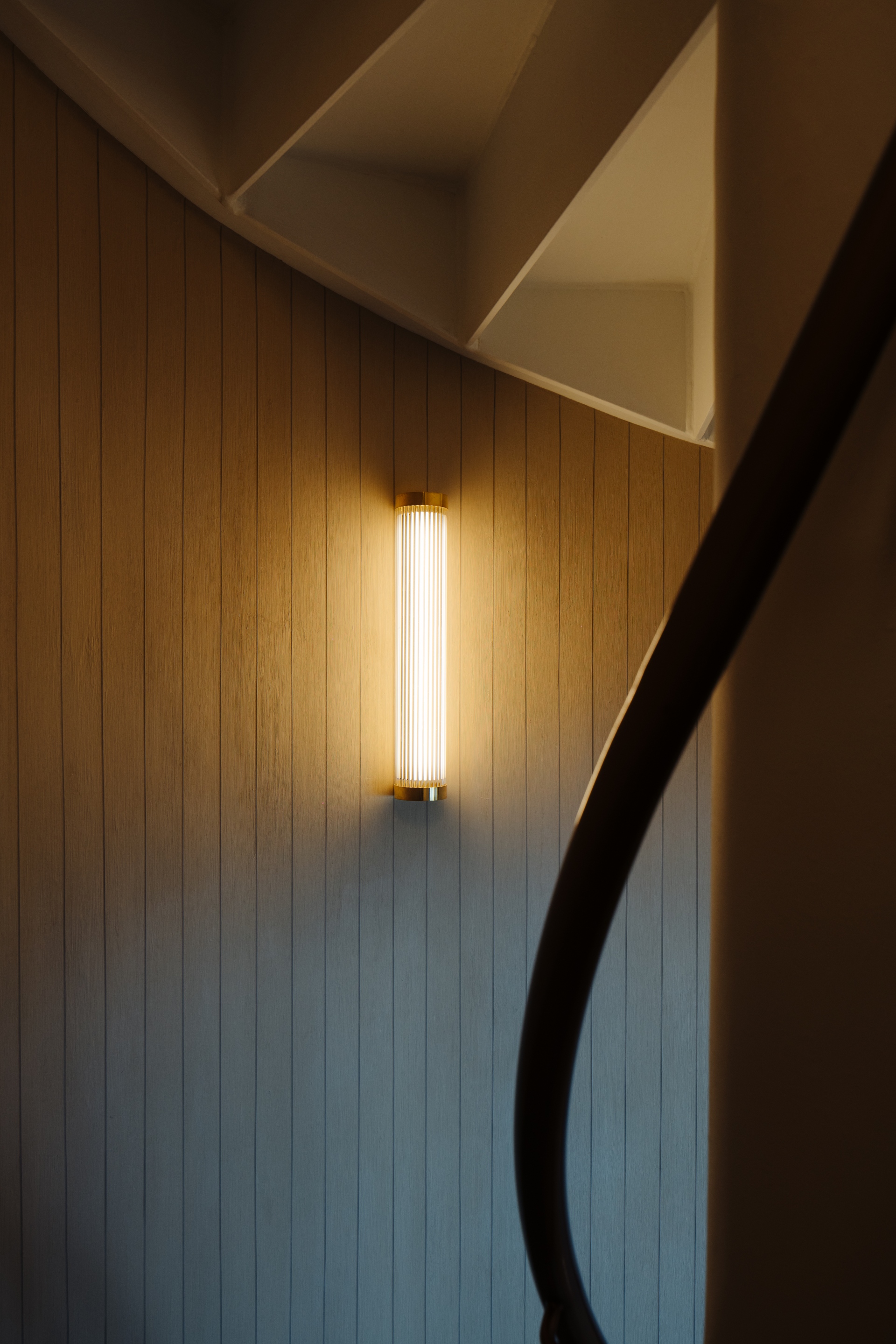
The owner is in the real estate business, has an outgoing personality and would occasionally host social gatherings. She wanted a space that was warm and welcoming while reflecting her cosmopolitan outlook on life. The goal was to create a timeless and enduring space that would exude sophistication and character. While the interior design is very much rooted in the Singapore context, we drew inspiration from a rich influence of ideas from all over the world, including the use of spatial colouring inspired by a mid-century apartment at 1300 Lafayette East, designed by Gunnar Birkerts in Detroit, Michigan, to specific lighting choices from Le Klint, one of the oldest lighting companies from Denmark, to a collaboration with Shanghai-based furniture manufacturer Stellar Works for the living room furniture.
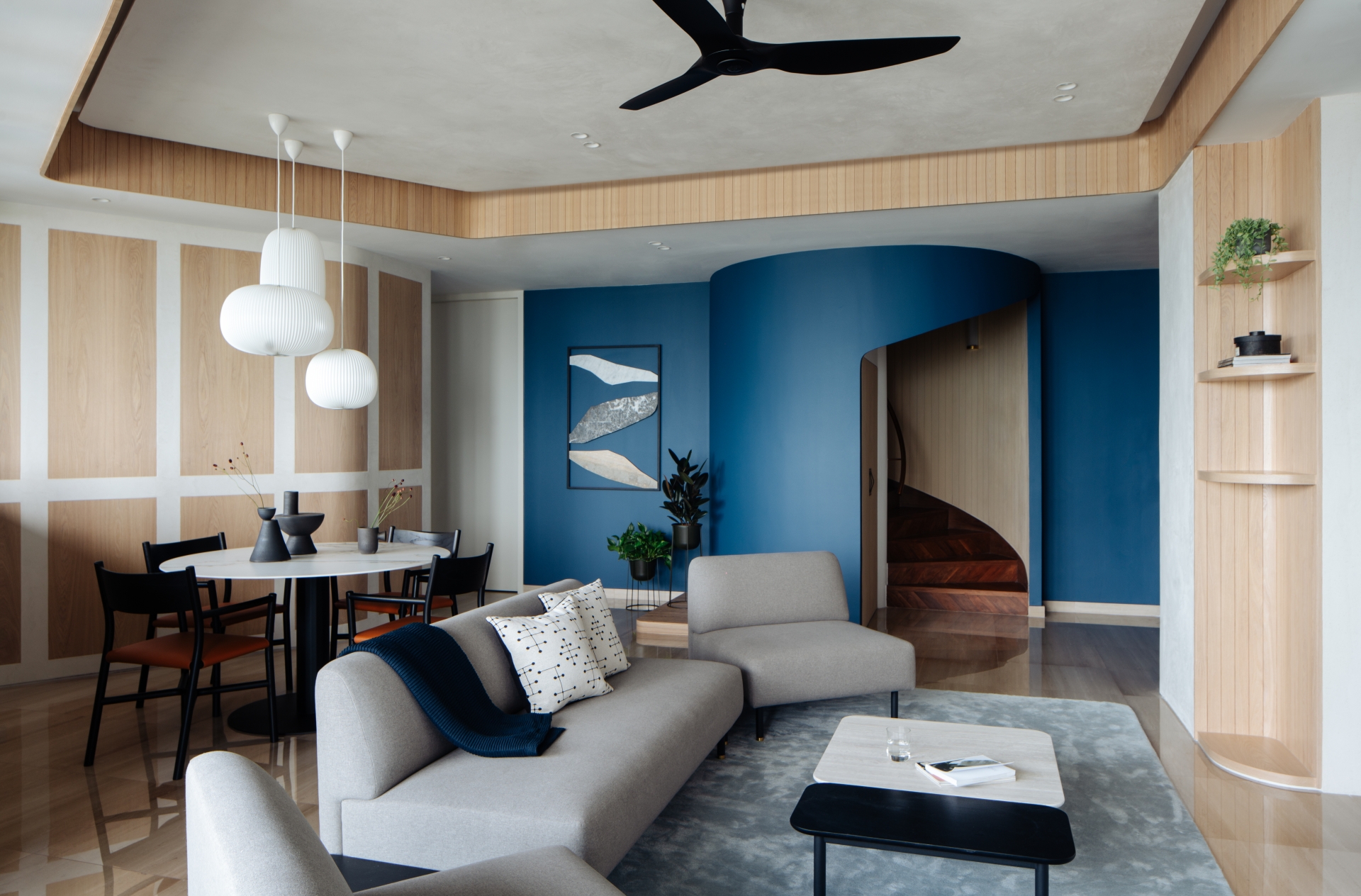
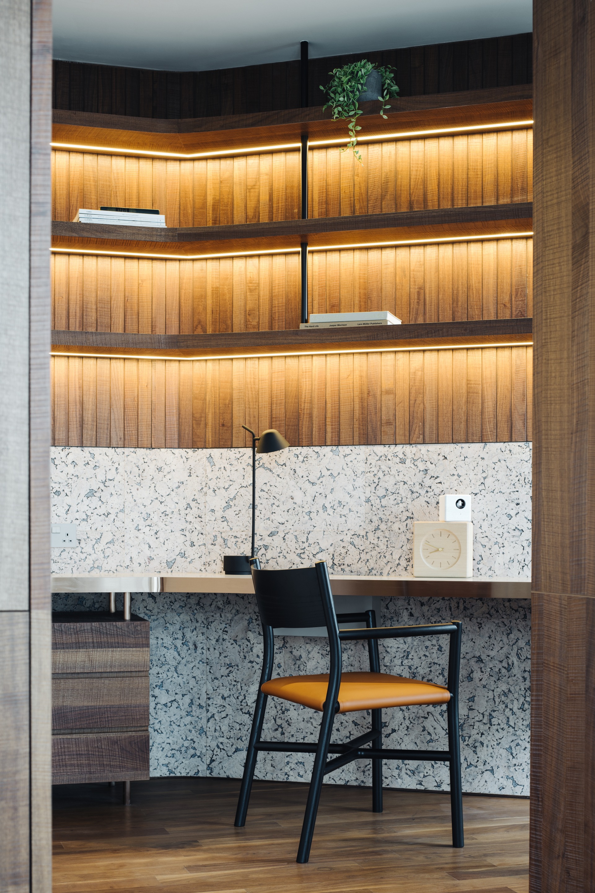
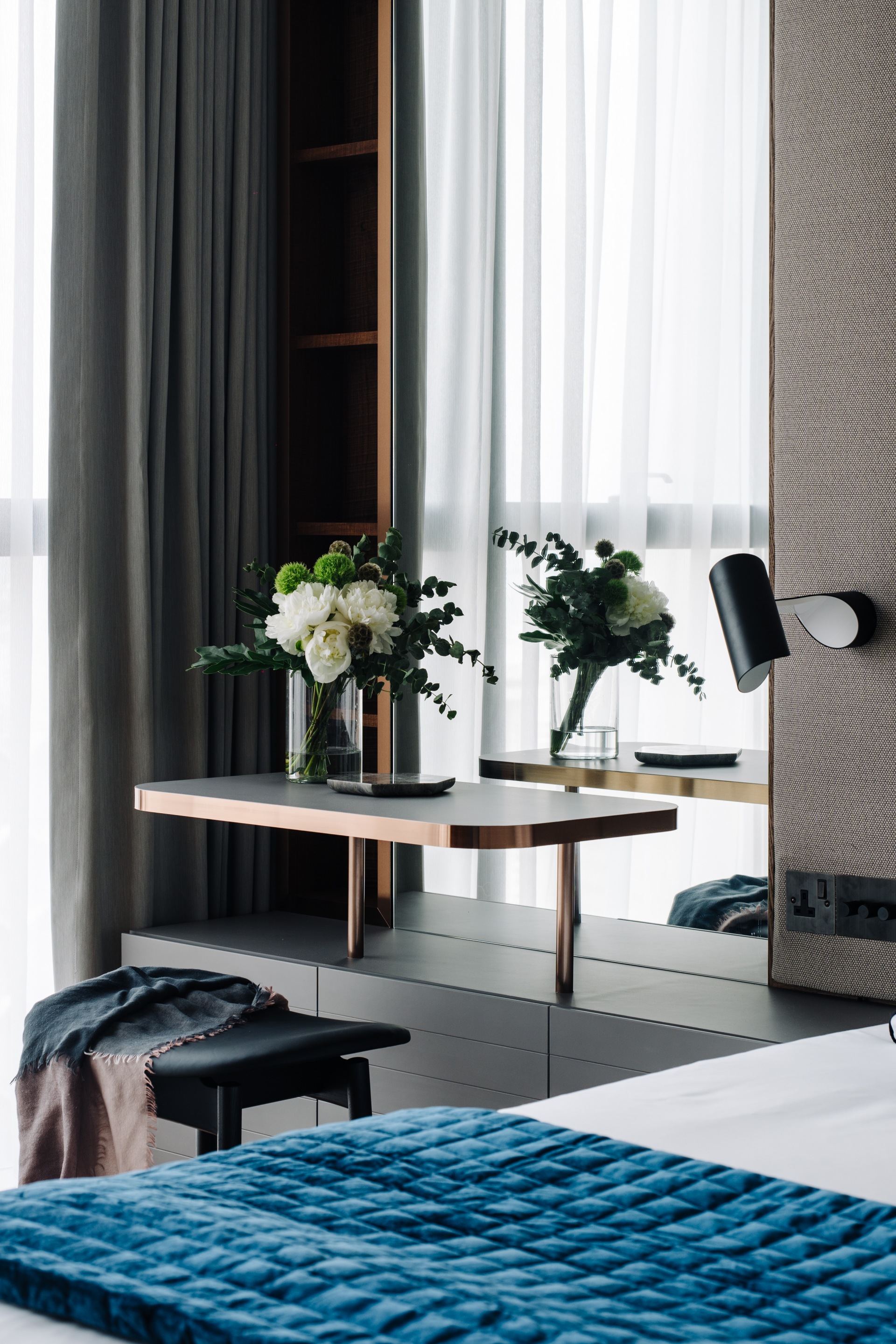
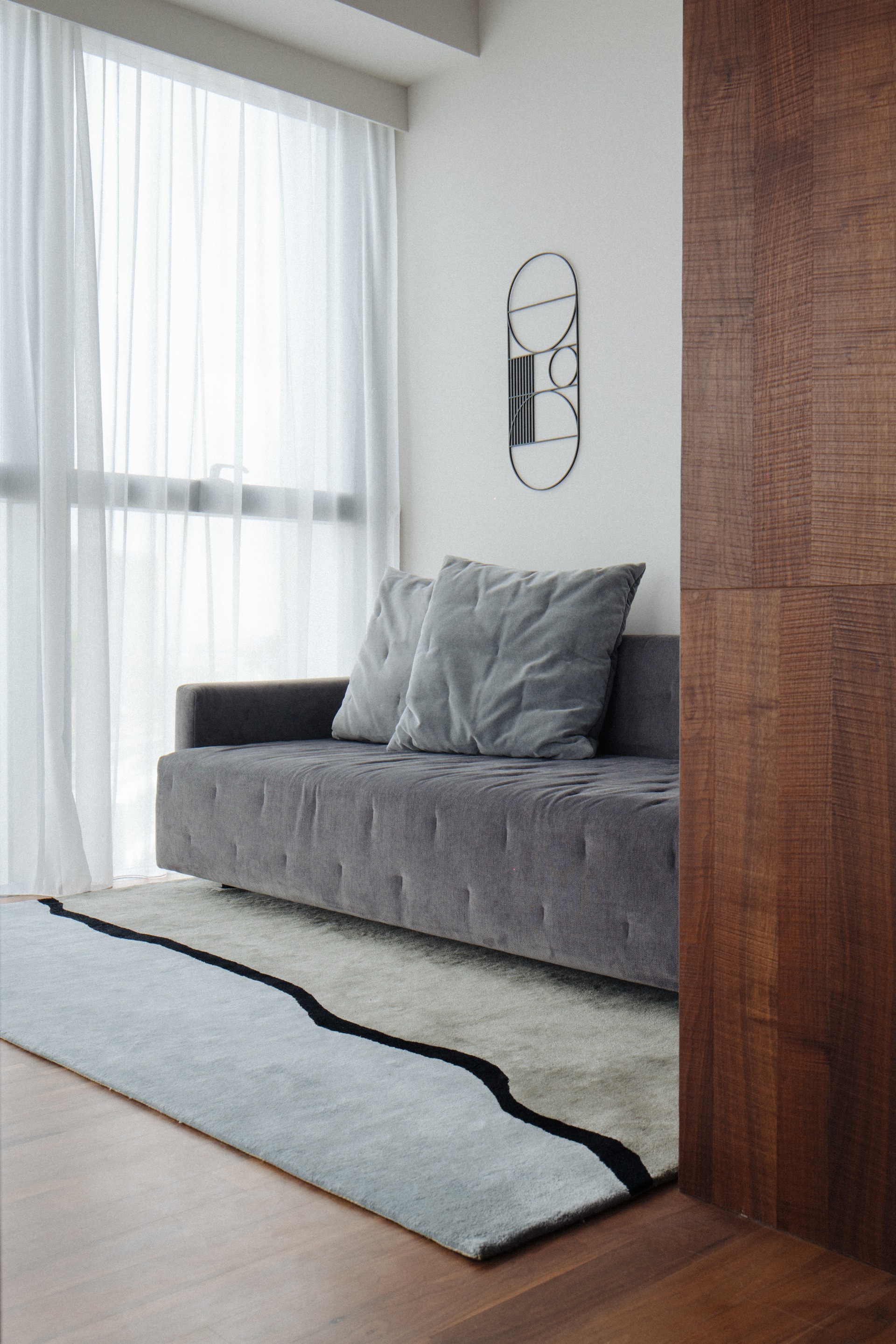
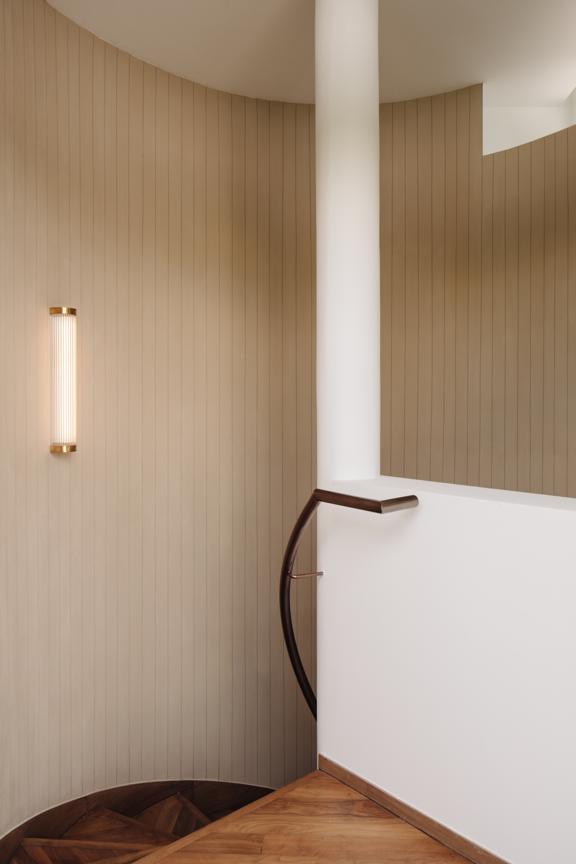
What were the challenges for this project? How were they overcome?
The unit had an irregular layout and was rather angular which reflected the geometric architecture of Duo Residences by German architect Ole Scheeren. Our strategy was to smoothen each sharp wall edge with a curve, infusing the interior with a fluidity that is at once visually calming and also naturally allows each space to harmoniously flow to the next.
As the principal of Antimatter’s, you are also the creative director of Japanese furniture brand Ariake; how does the studio’s signature take on design narratives and Japanese aesthetic values come together and shine in each spatial project?
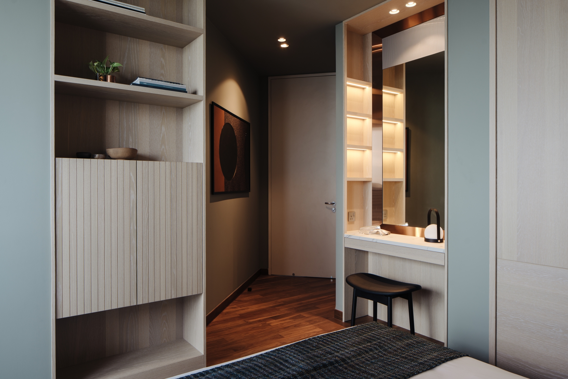
The Japanese aesthetic is a minimalist pared back one. Whenever we take on a new project, we always ask if there is a function for the form. We do not seek to add without editing. A curated response to the space and an understanding of how the space might be used informs our approach to interiors. Often negative space increases the appreciation of the objects that are chosen to be in the space. Overly filled spaces can come across as overwhelming and less enjoyable.
What do you see in the future of design globally?
As more time is spent online, objects in the home need to bring one back to the physicality of the real world. So there is a need to introduce natural, tactile materials in the space. Items that are handmade, with its resultant imperfections, will anchor us as human beings existing in the real world. As much as people question their food choices, farming methods and the source of origin, that will happen to our objects, furniture and interiors. There is still not enough transparency in the industry with regards to this and I see that this will inevitably change in the future.
