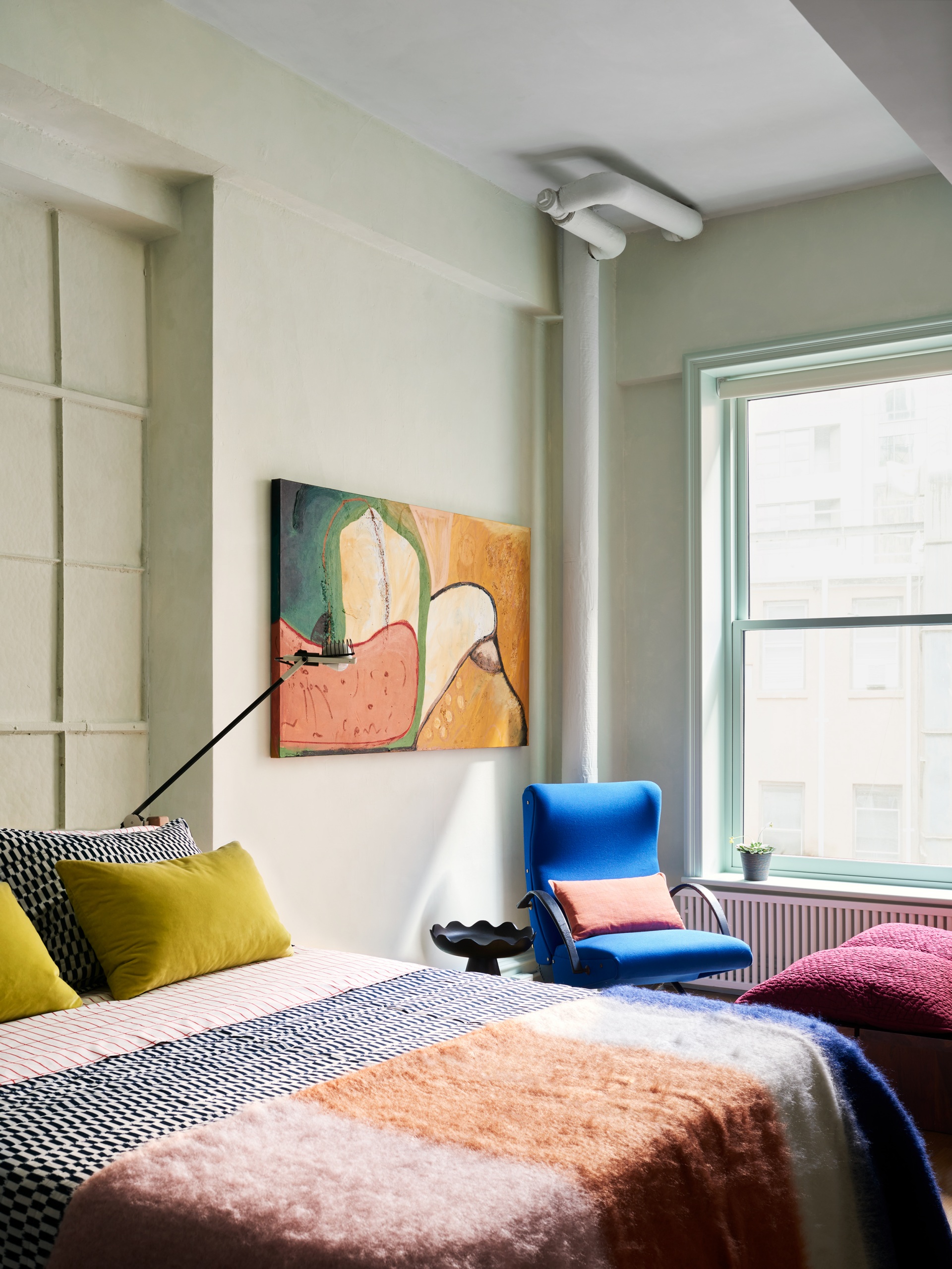
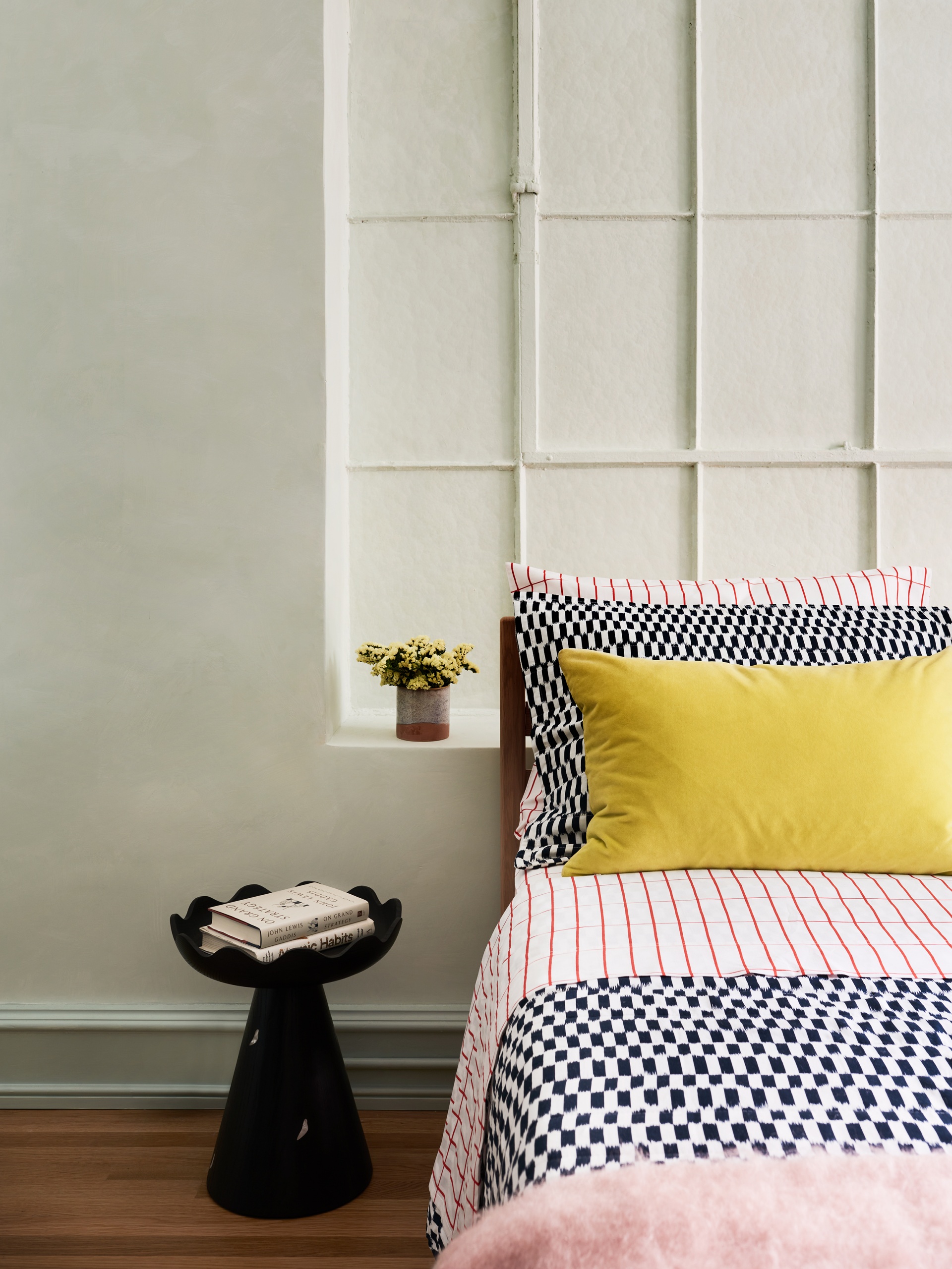
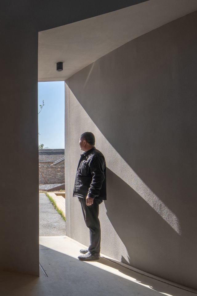
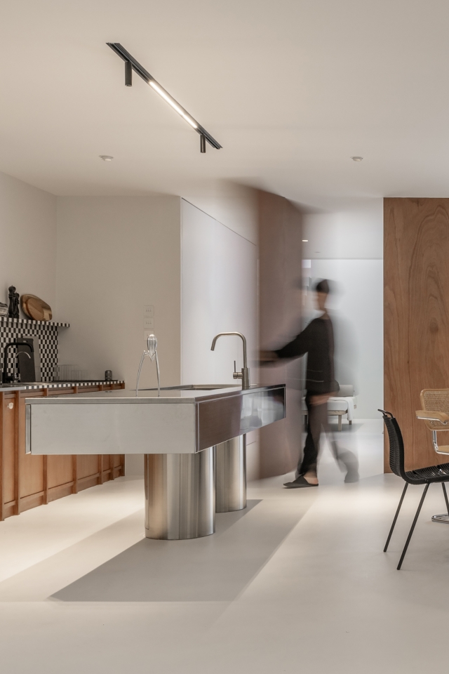
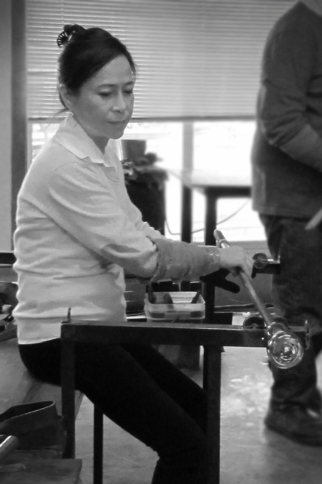
The resulting apartment, which stretches across the 34-foot wide footprint of the building, has floor-through views and 10-foot exposed concrete beam ceilings, and was originally configured as an open loft with one bedroom and one bathroom. Says Michael K. Chen, founder and principal of MKCA, “It’s rare in Manhattan to work with a residential space like this. While graced with generous 10-feet ceilings, the loft is so wide that the space has a letterbox proportion. It’s more like a landscape than a room.”
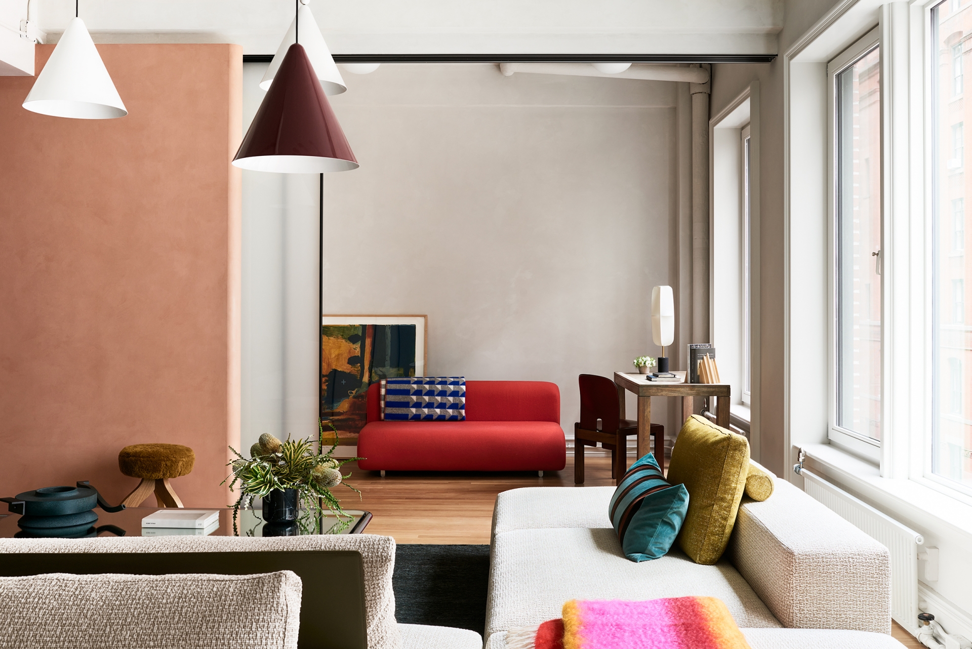
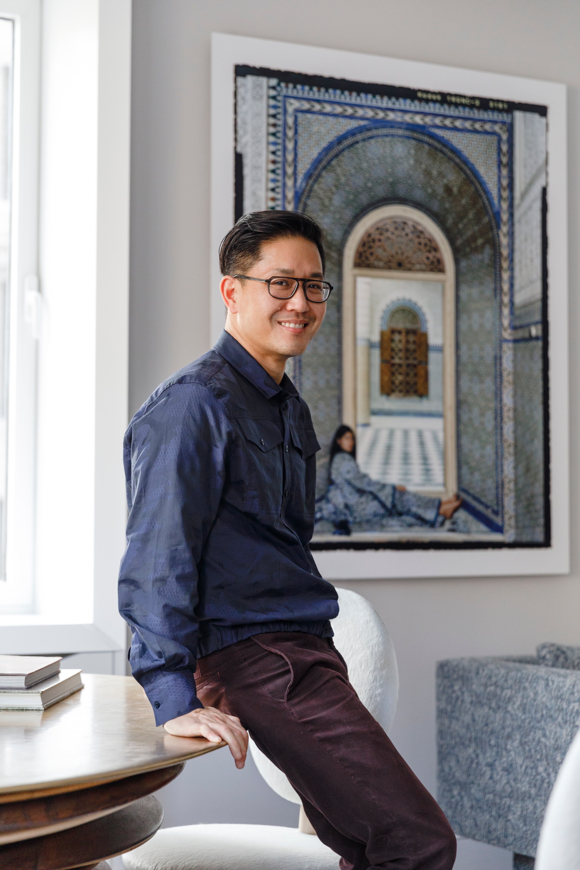
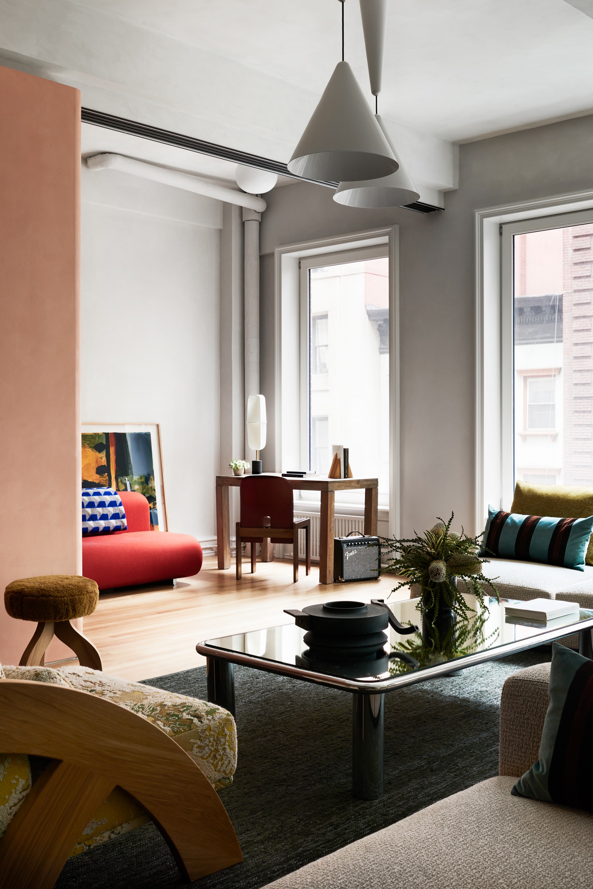
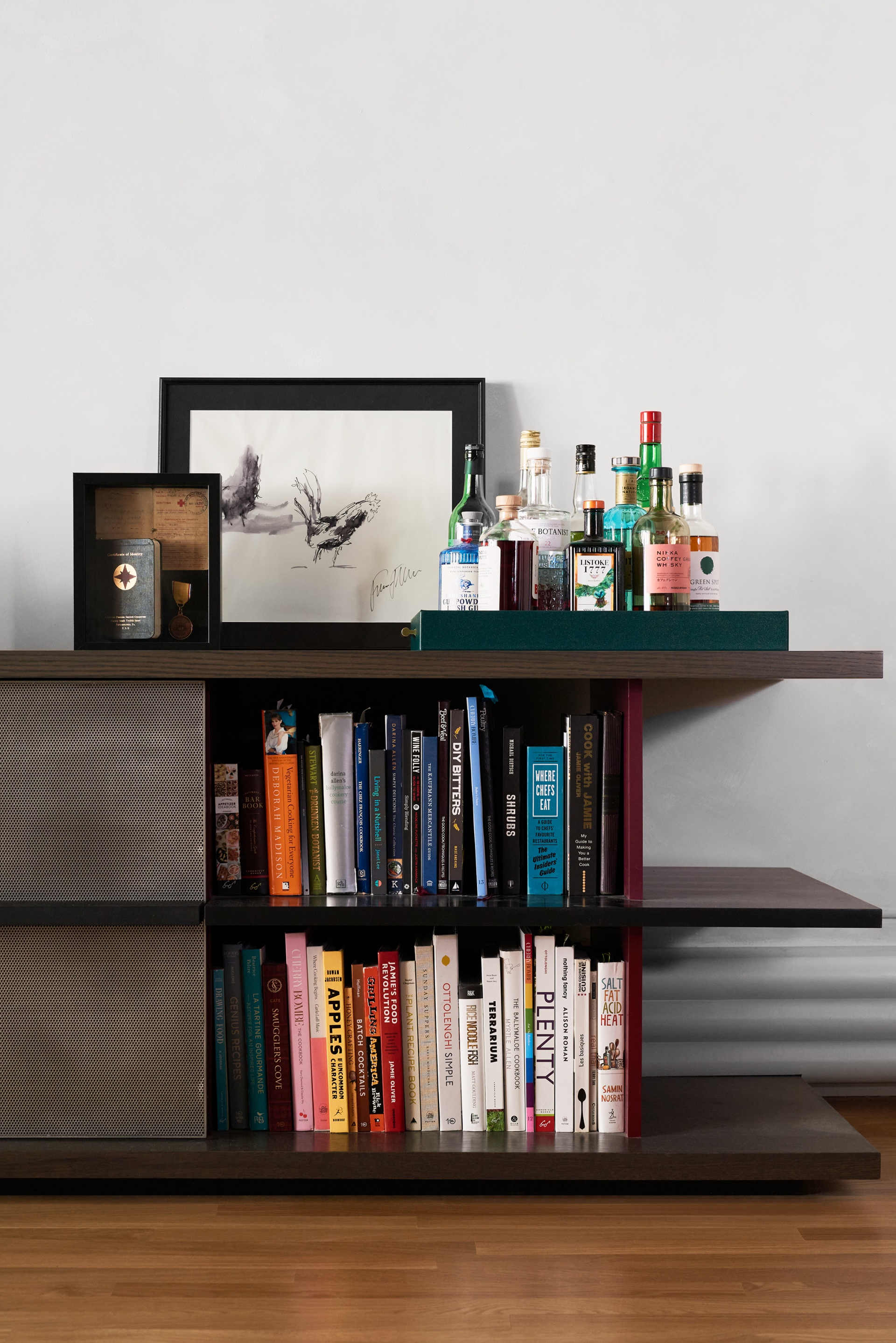
The MKCA design team, led by Chen, associate in charge Natasha Harper, and project designer Rachel LeFevre, therefore sought to preserve that feeling of vastness and horizontality, while redefining what was once a single manifold space into a series of clearly delineated spaces for living, working, cooking and entertaining, with two distinct bedrooms. To achieve this, uninterrupted common space was kept along the existing sweeping windows overlooking 30th street on the building-wide side of the building. A 36-feet-long built-in spine of wood and perforated metal acts as a sideboard, media console, radiator and air conditioning enclosure, and storage element, spanning the depth of the apartment from the living room to the kitchen and lounge. This element helps keep the space open, by keeping storage and bulky functions to the periphery.
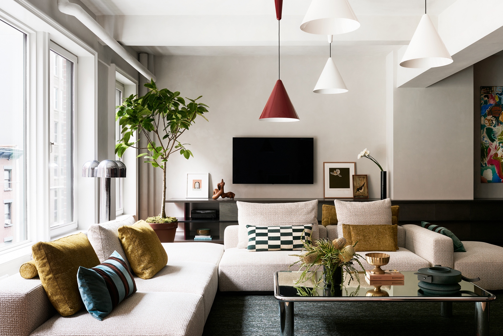
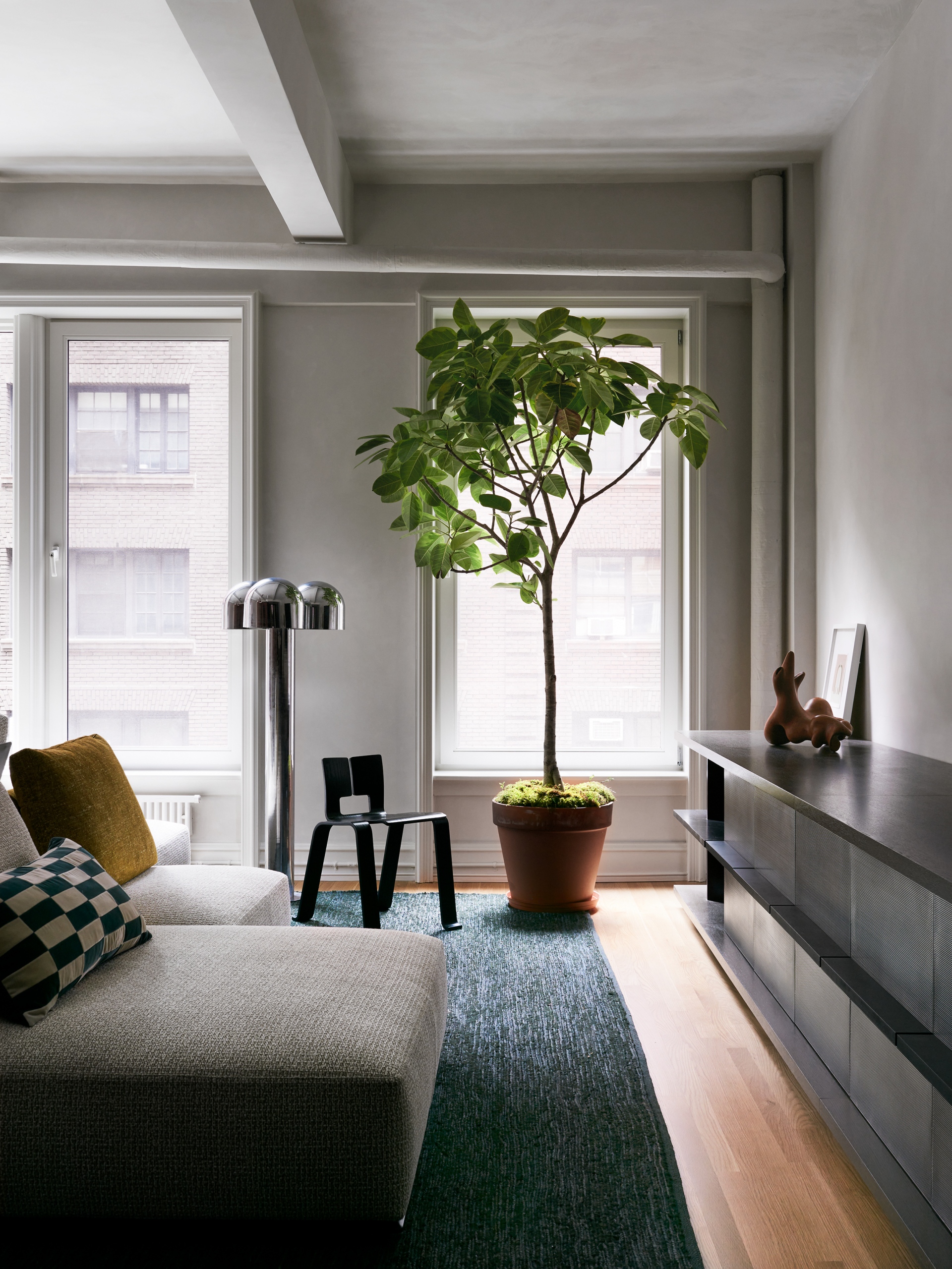
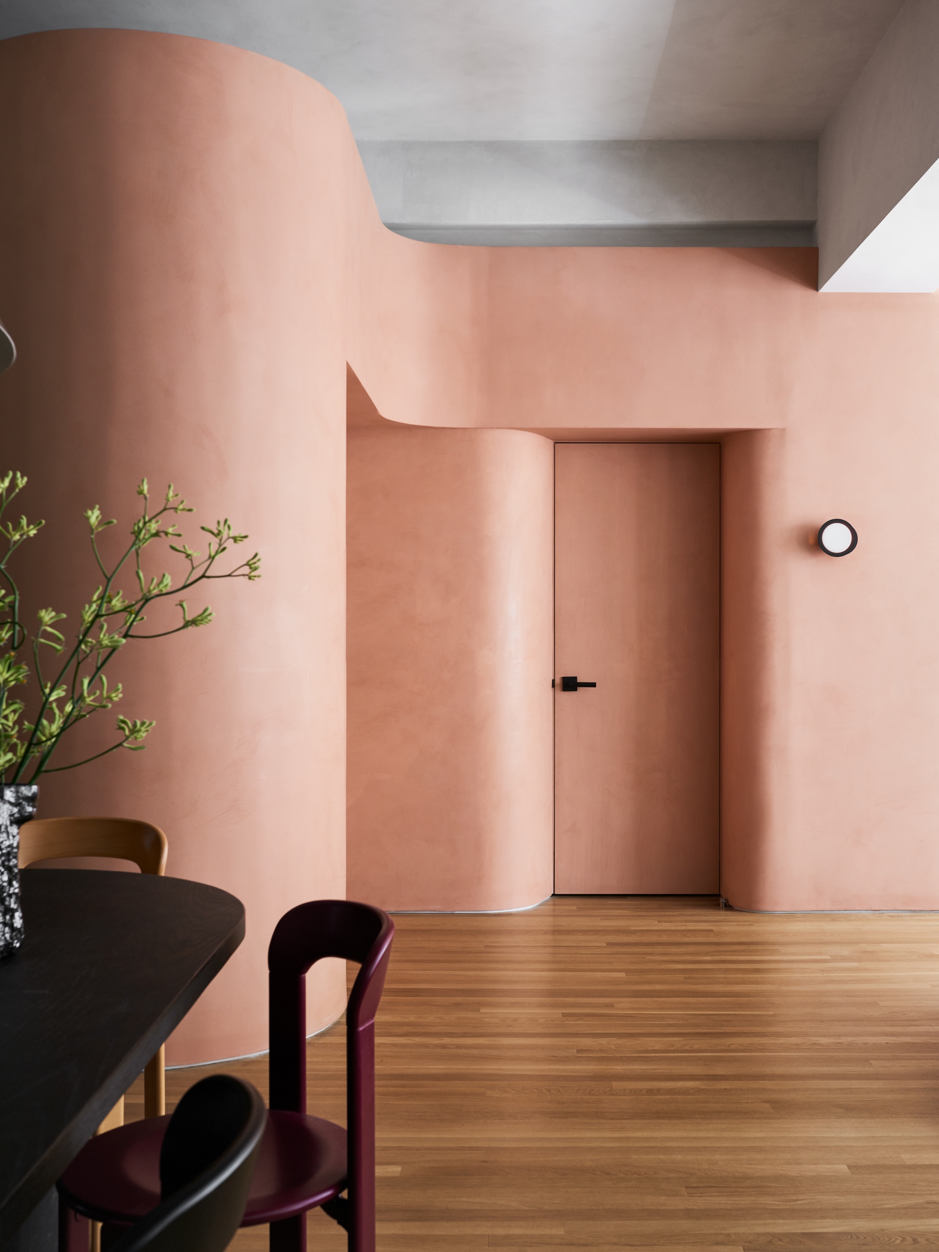
Within the open area, solid elements, such as partitions and islands, are highly articulated and richly colored, and placed with a great deal of thought around how objects within an otherwise open field of space create eddies and accelerations around them, much like the composition of a landscape. The apartment’s rigorous grid of beams and pilasters, part of the building structure, presented a challenge to fluidity, and MKCA sought to work around that, by utilizing these furniture-like objects to carve out clear spaces for certain functions, while creating looseness within the apartment. As Chen says, “It’s an exercise in using the gravity and tension between things to create those spaces that are deliberately defined but open.”
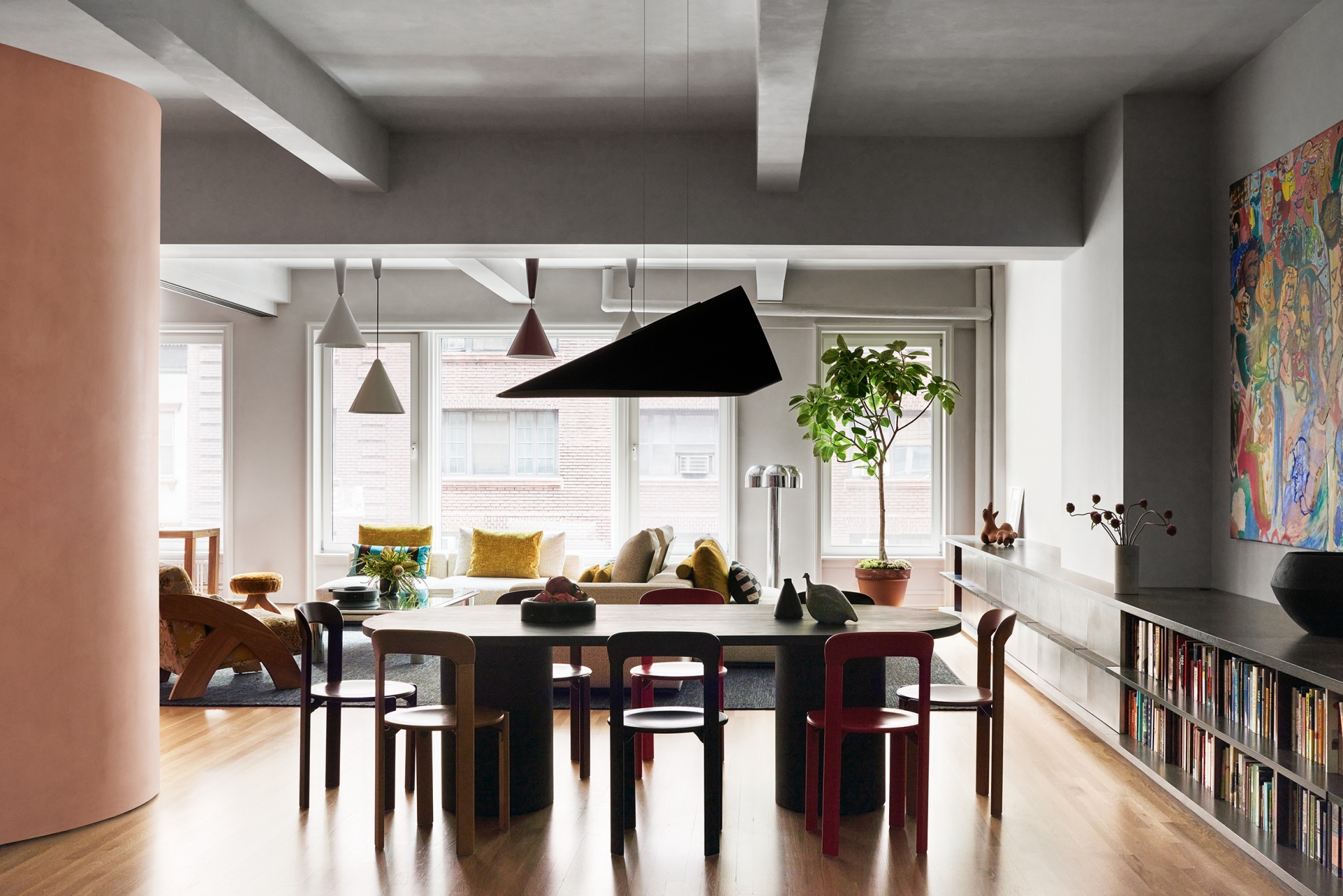
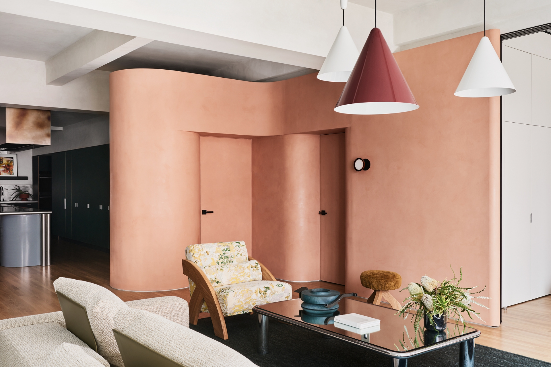
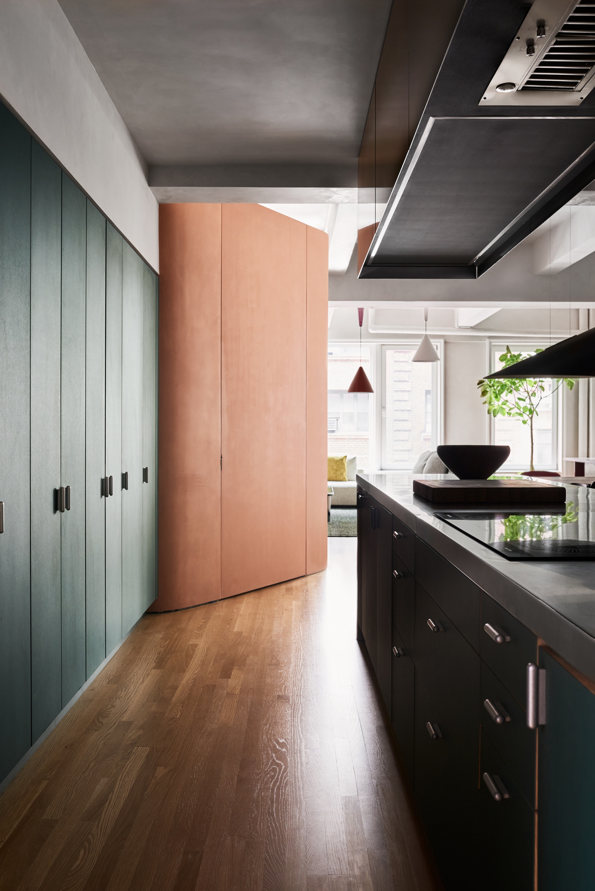
At the entry, a volumetric and superscaled, “squiggly” partition, covered in a grapefruit-colored matte limewash paint, winds its way into the open space around the elevator core, creating a vestibule that encloses the service elevator and coat closet, and and a deep curved recess at the entry elevator, which opens directly into the loft. This enclosure creates a moment of arrival, opening into the living area, and the form also defines the dining space, by giving the dining table, oriented perpendicular to it, something to align to. The partition also does double duty as disguise, screening away the service elevator and a utility closet. The partition bends again to conceal a series of sliding glass doors that bifurcate the living room and create an office or small guest room when needed.
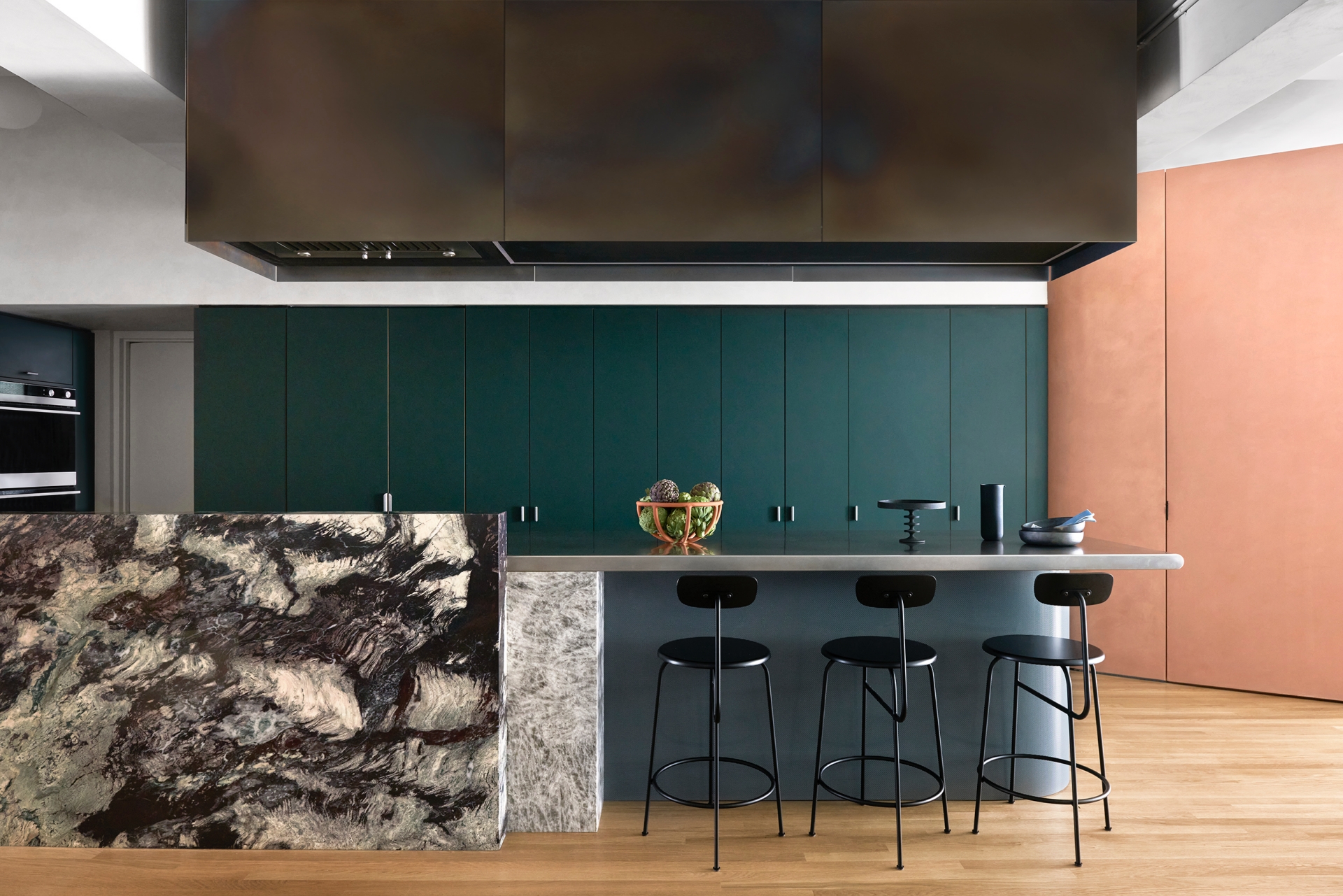
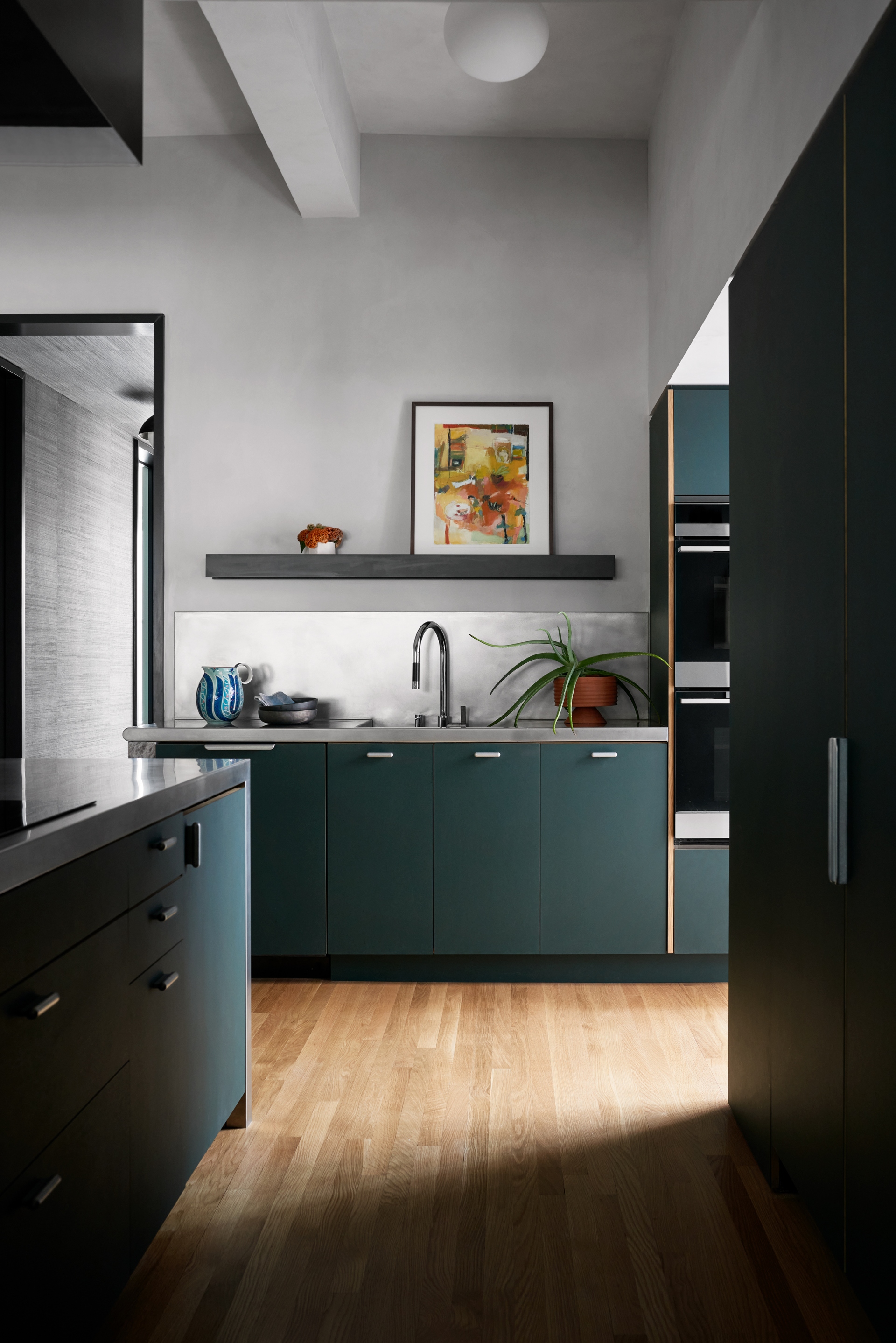
The focal point of an otherwise open space, the kitchen is organized around a muscular, blocky 15-feet-long island containing distinct working and social zones. One side is utilitarian, facing a wall of full height hunter green linoleum Reform cabinets and containing the induction cooktop. A massive, 10-feet long volume of heat-tempered steel, fabricated by Kin and Company, incorporates new kitchen ventilation and task lighting and is suspended overhead. The volume’s colours are multi-varied and slightly mutable - while primarily a rust brown, hints of yellow and bits of cyan and blue appear where it's heated to higher temperatures. The cooktop is concealed on the other side of the island by a large, vertically-oriented block of marbled Phoenix Onyx stone, next to which a stainless steel tabletop appears to extend from it horizontally, providing an additional surface for cooking preparation, or, aided by a collection of barstools, defining a space casual dining and socialising.
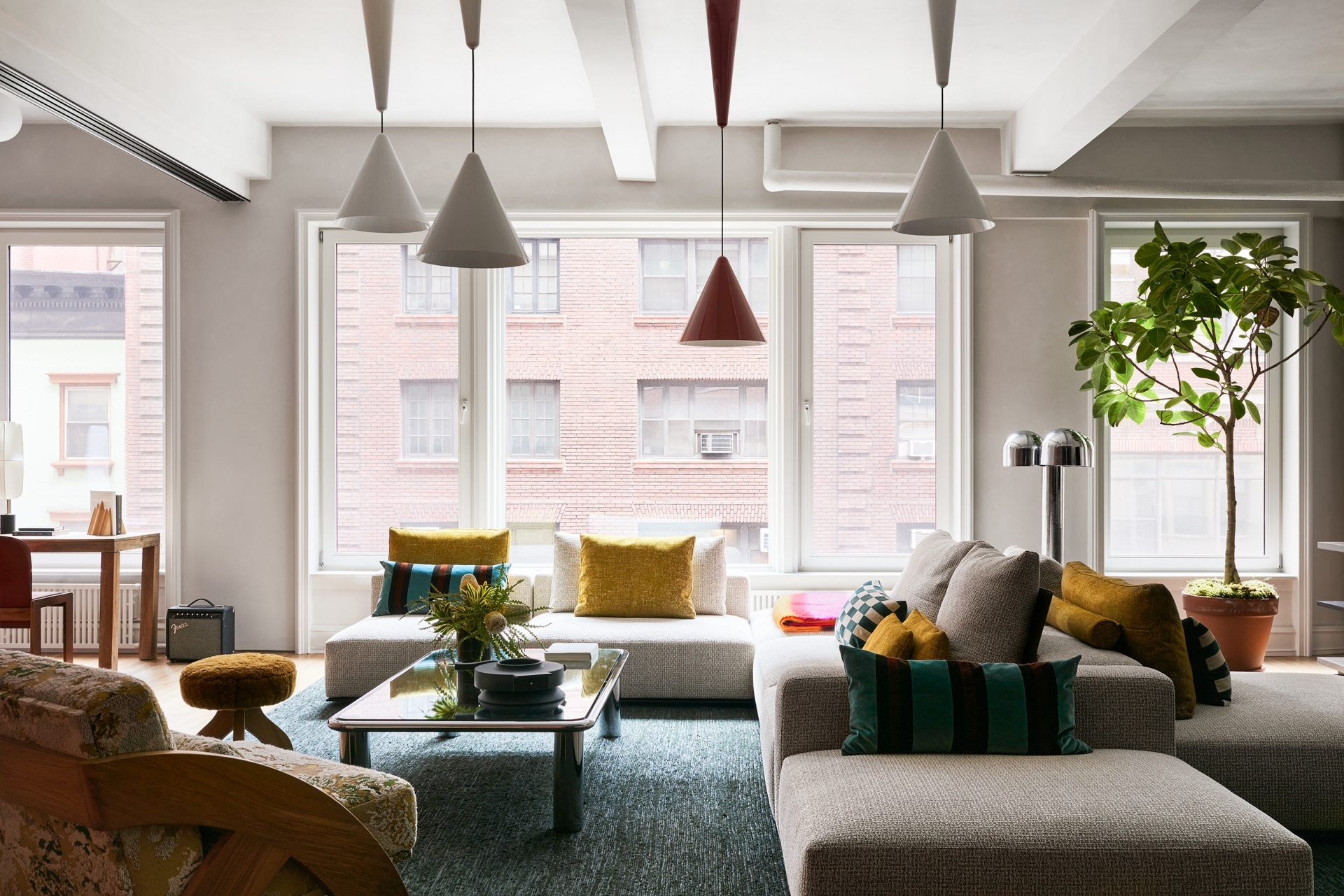
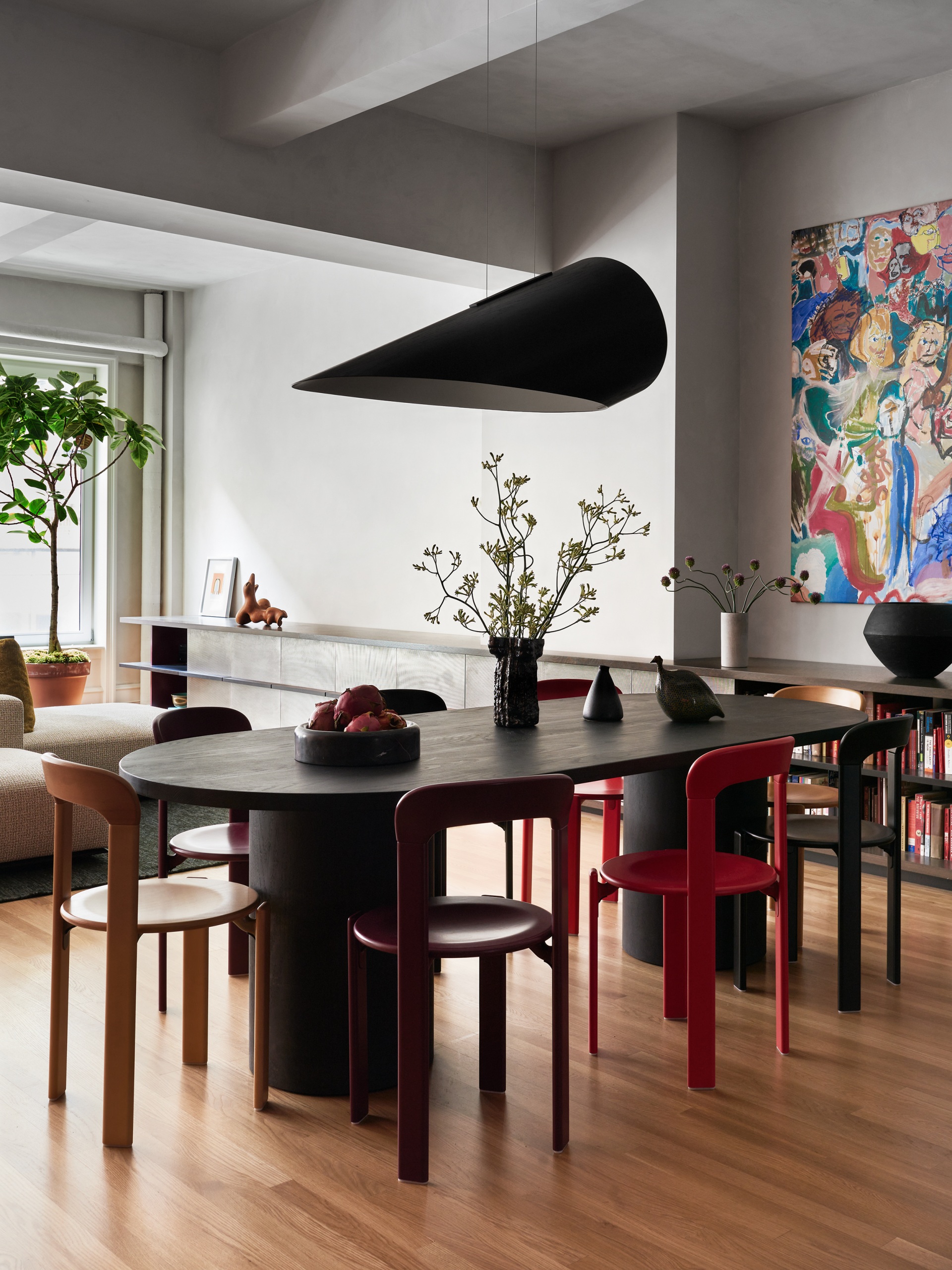
Across from the island is a lounge, a space that is both intimate and suitable for parties and entertaining. The large dining room table, aligned with the apex of the “squiggly” entry, separates the kitchen and lounge from the living room, creating zones of occupation while maintaining the openness of the floor plan. In the living room, a jumble of upholstered volumes from Poliform serves as a sofa, a kind of landform that lives in the middle of the room and faces in multiple directions, orienting occupants to the exterior of the space, and allowing for different zones for different activities, and easy, reconfigurable space for conversation and socialising.
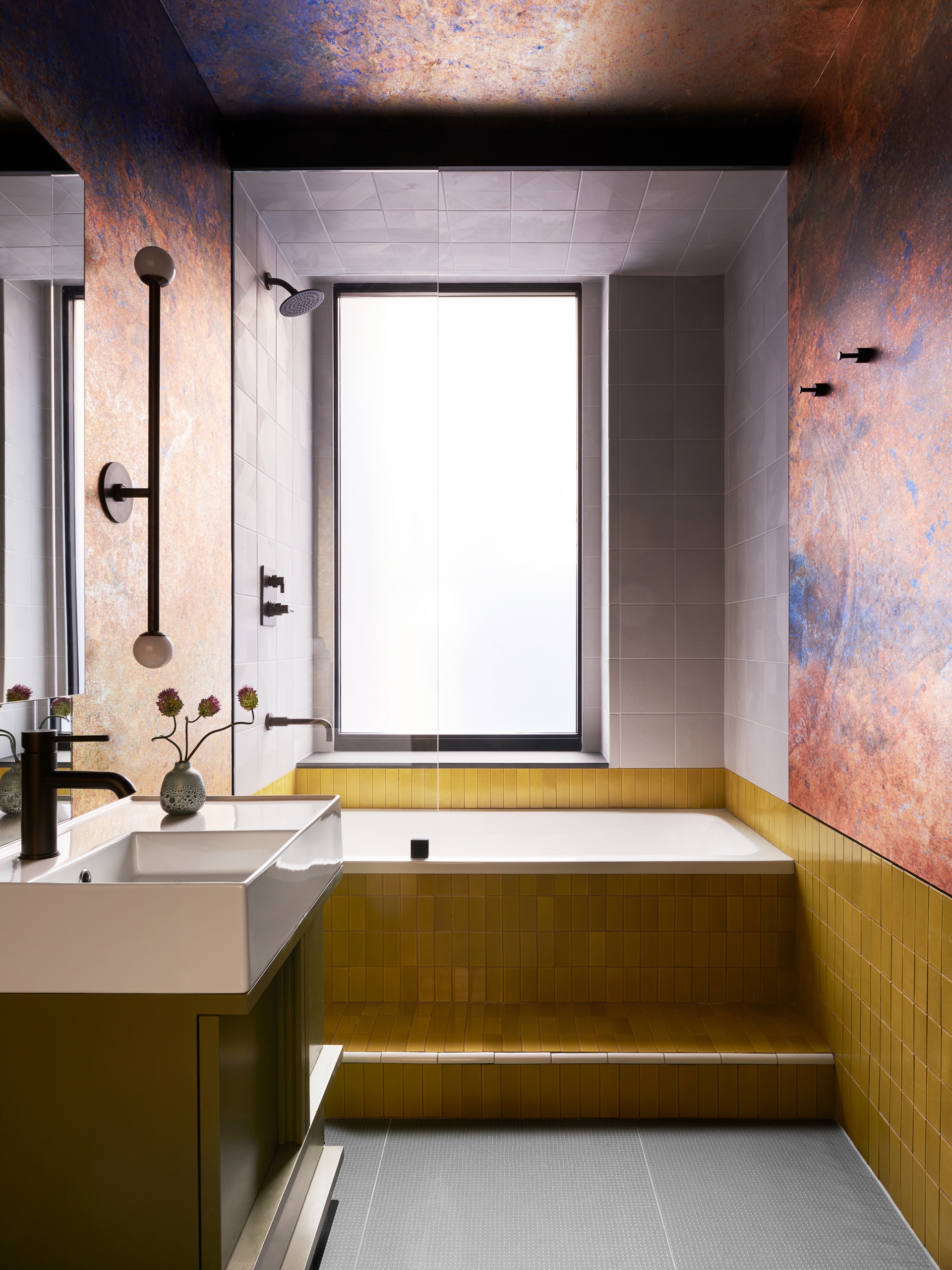
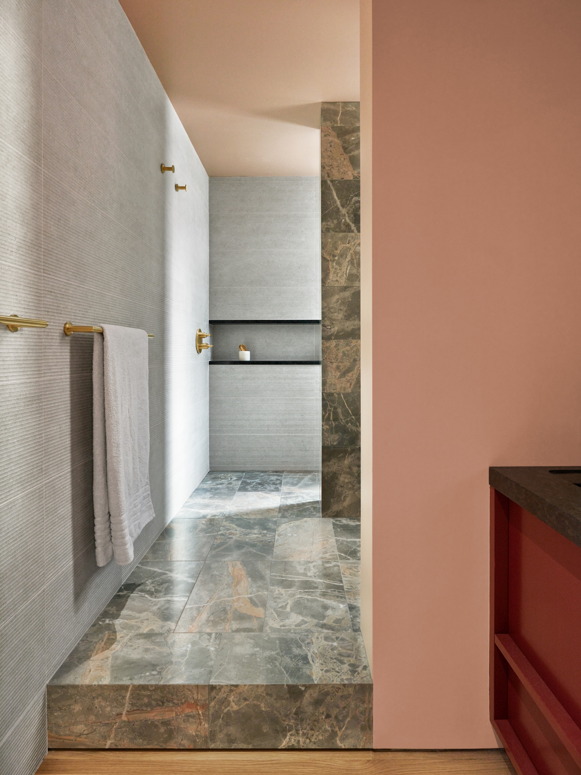
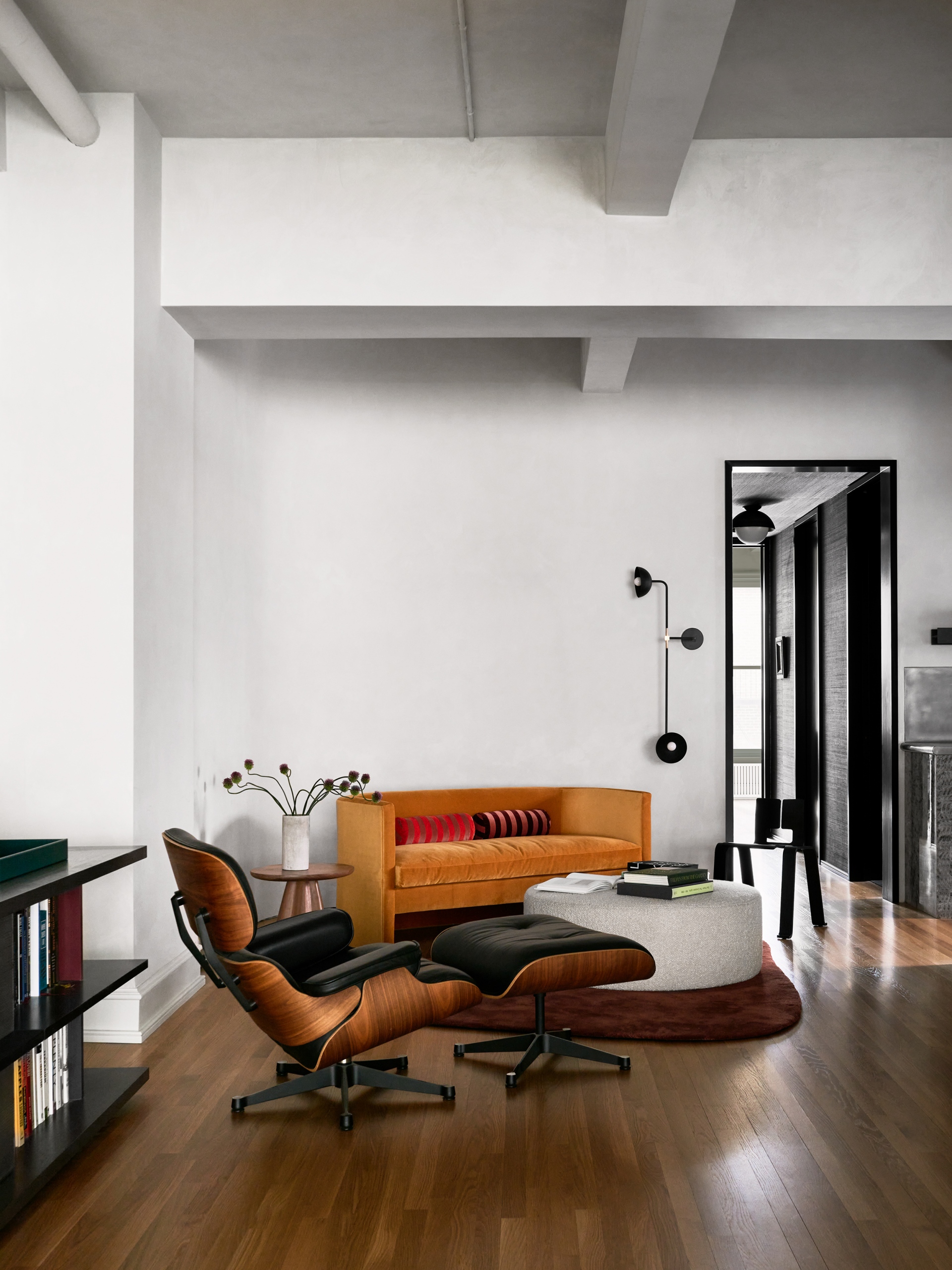
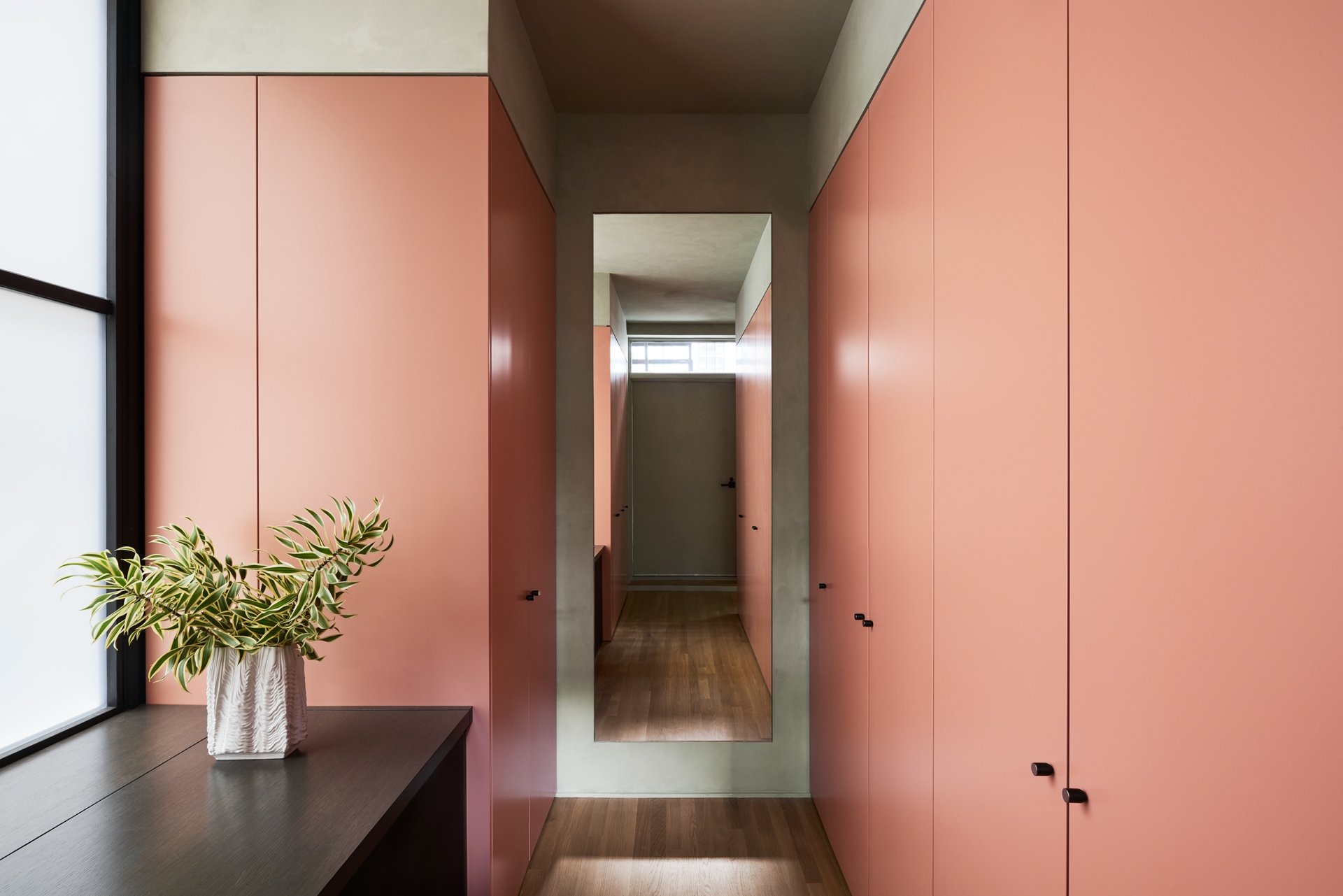
Says Chen, “Our clients entertain on another level. Every single thing is thoughtful, lovely, and seemingly assembled without any effort. Cocktail parties with overflowing platters, spritz bars, minimal glassware; but also arts and craft activities and impromptu performances, or participatory action paintings. There is this freewheeling and generous way that they host and live, so we wanted to maintain this spirit of being a home of intentional accidents.” In order to allow two-thirds of the floor plate to remain open in this way, the two bedrooms, two bathrooms, and a large storage space form a private zone towards the back of the apartment, which also helped MKCA to avoid repositioning plumbing running through apartments above and below. Like many converted loft spaces, there was a single plumbing riser in the rear of the loft where wet spaces clustered together, which would have made moving kitchen and bathroom spaces difficult. The positioning also allows for a feeling of moving through from a very porous and public space into a private “indoors” where the materials and surfaces accordingly become more refined. The hallway that leads to that is rendered in metallic grasscloth, clearly delineating a new spatial experience.
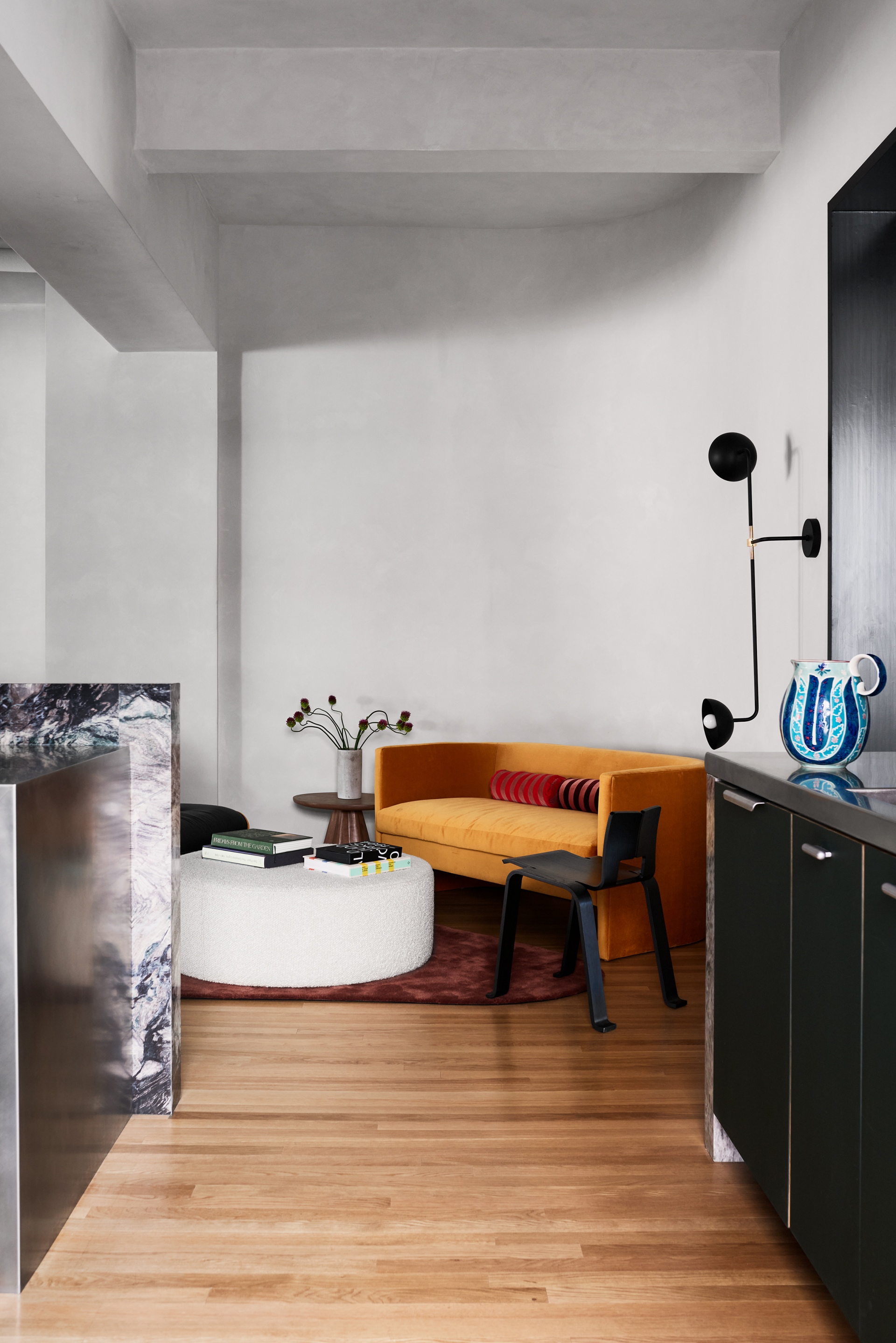
To keep the character of the original space, the ceiling is touched up and painted with a lime wash, but not re-built or levelled. Carefully planned but exposed conduits run the new electrical, while track lighting mounted to the beams allows for flexibility and even lighting throughout the space. Says Chen, “There is a delicate tension between crisp, new elements and a strong sense of place that we try to bring out in all of our projects. The manufacturing history of a space like this is like a material that requires care and enhancement. The clients bought a loft and wanted to retain that history. The mottled lime wash and strip flooring are ways to blur the lines between new additions and existing elements - to enhance that environmental sense of place while allowing other elements to come to the fore.”
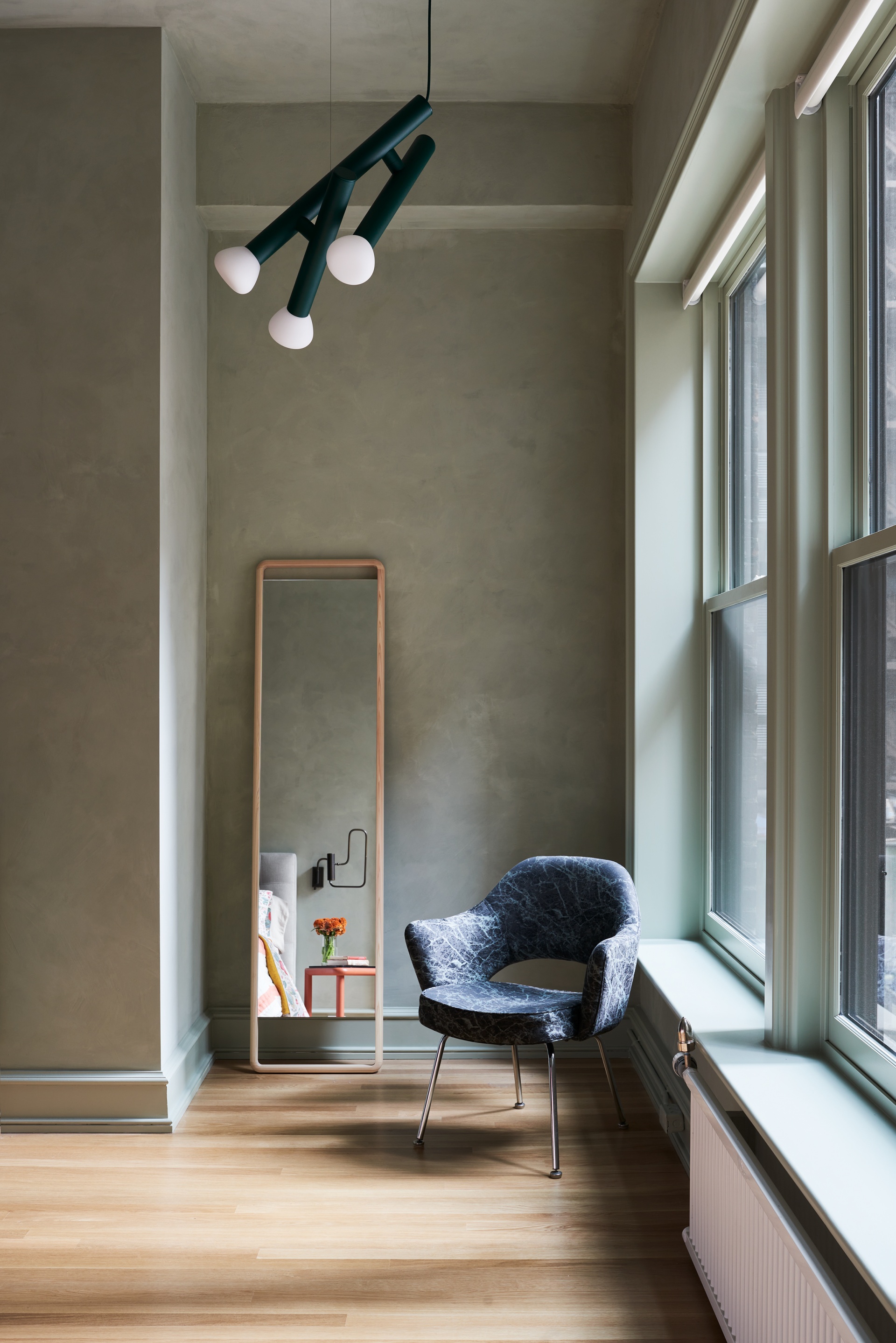
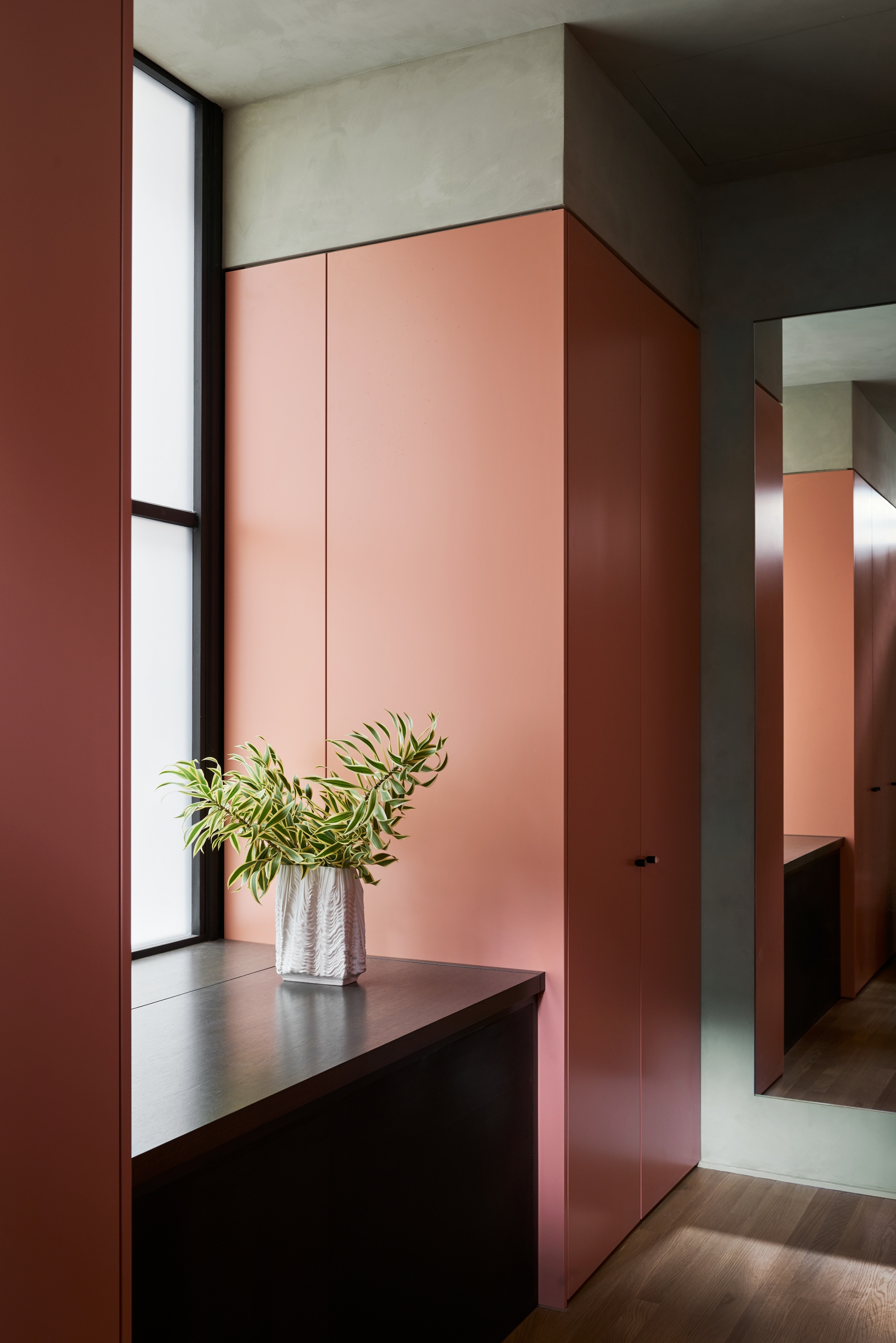
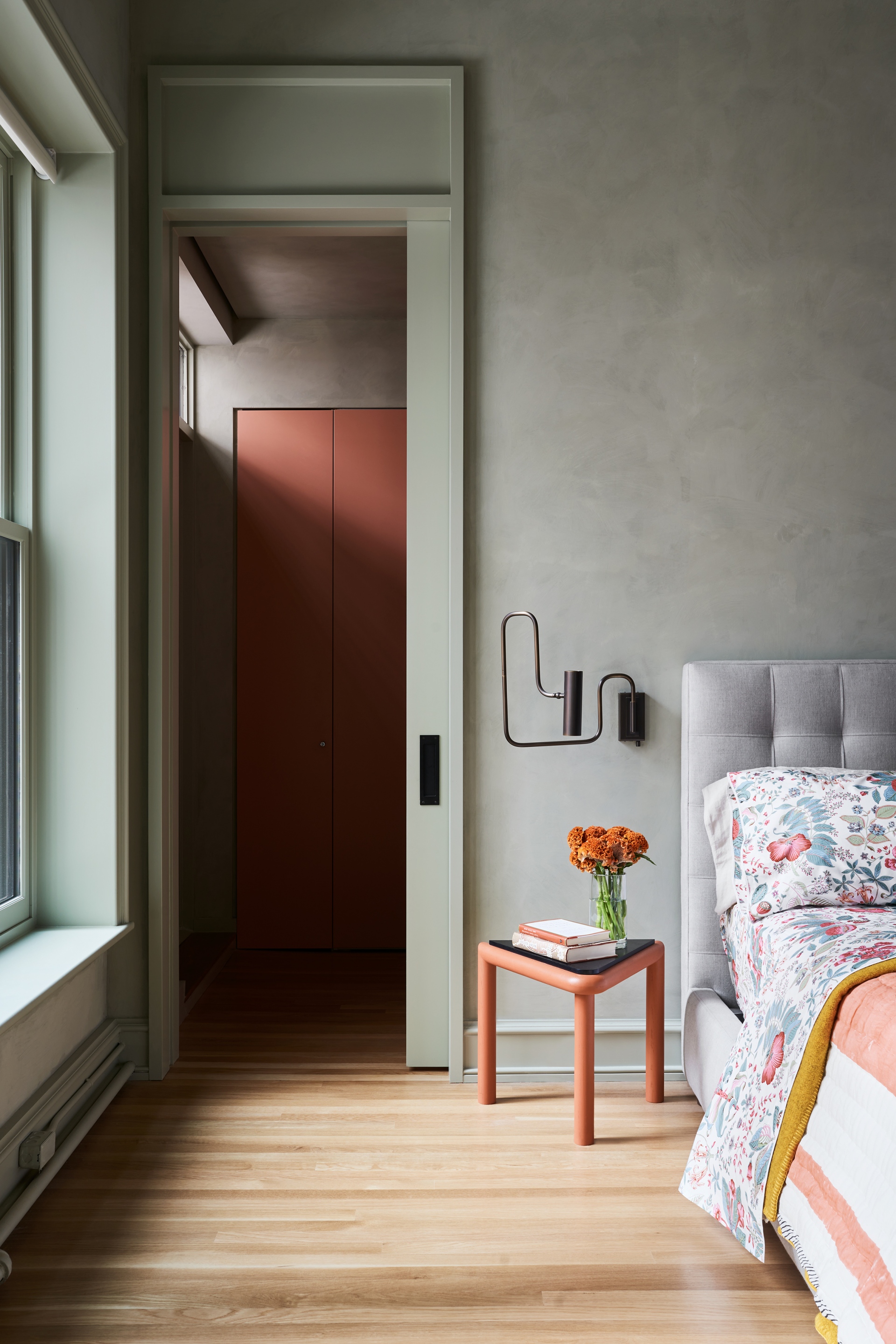
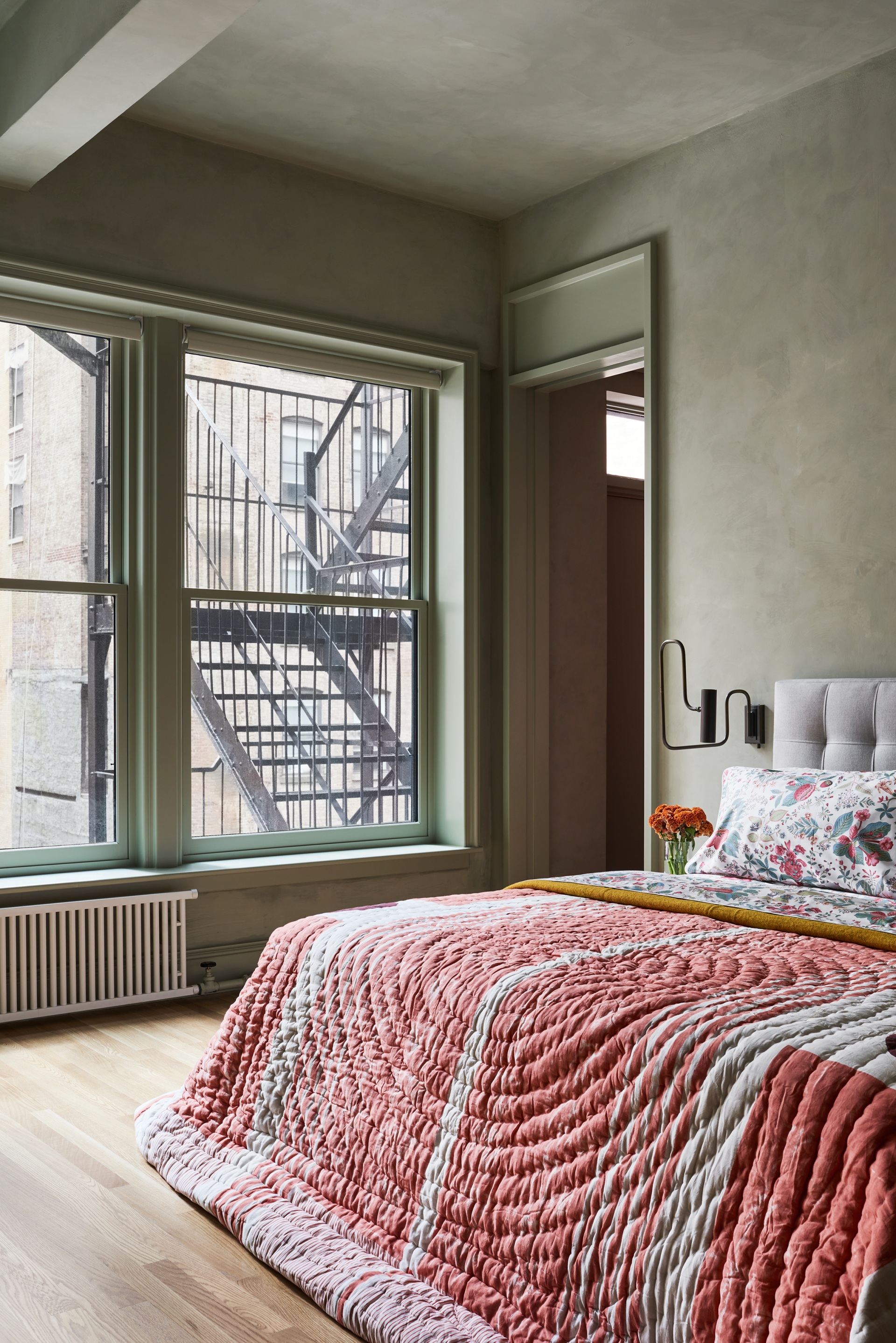
To enhance the track lighting, four counterweighted "Diablo" pendants by Achille Castiglioni are sprinkled across the ceiling above the living room, configured to allow for intimate experiences. A 4-feet-long "Arbor" pendant by Karl Zahn for Roll and Hill is suspended above the dining table. Says Chen of the lighting objects: “We opted for straightforward forms with some sculptural scale - the cluster of adjustable pendants in the living room and the large shade of the Arbor stand up to the volume of space without getting lost, and are simple enough to keep the space feeling open and fluid”.
