The design narrative draws inspiration from adventures amid mountains and forests and pays homage to Vancouver's cultural context. Through a continuous dialogue with nature, the store guides consumers through diversified themed spaces, offering an unprecedented experience for both outdoor enthusiasts and the brand's veteran fans.
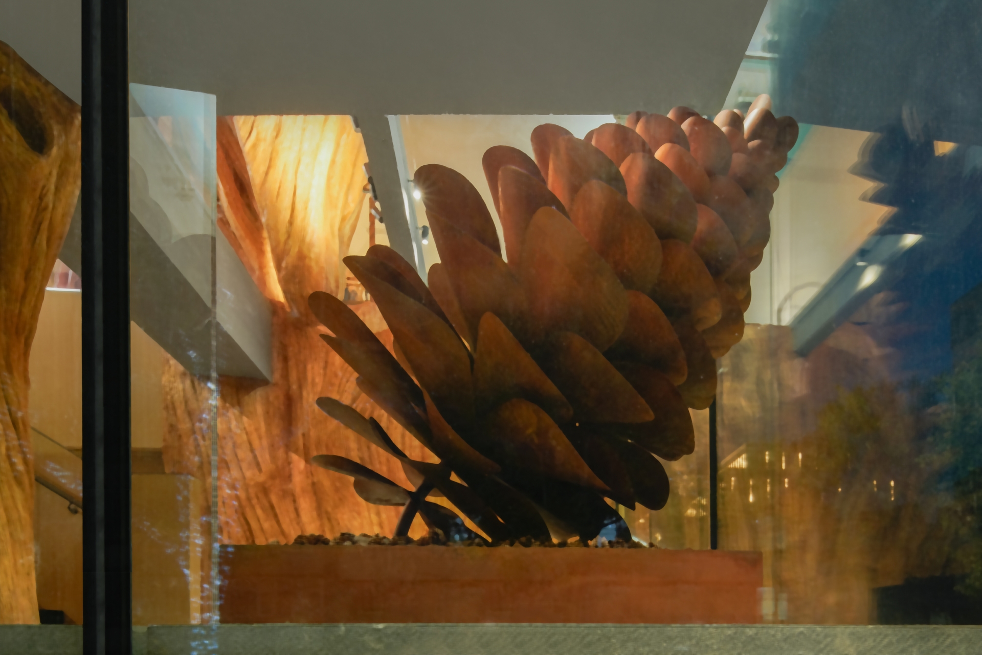
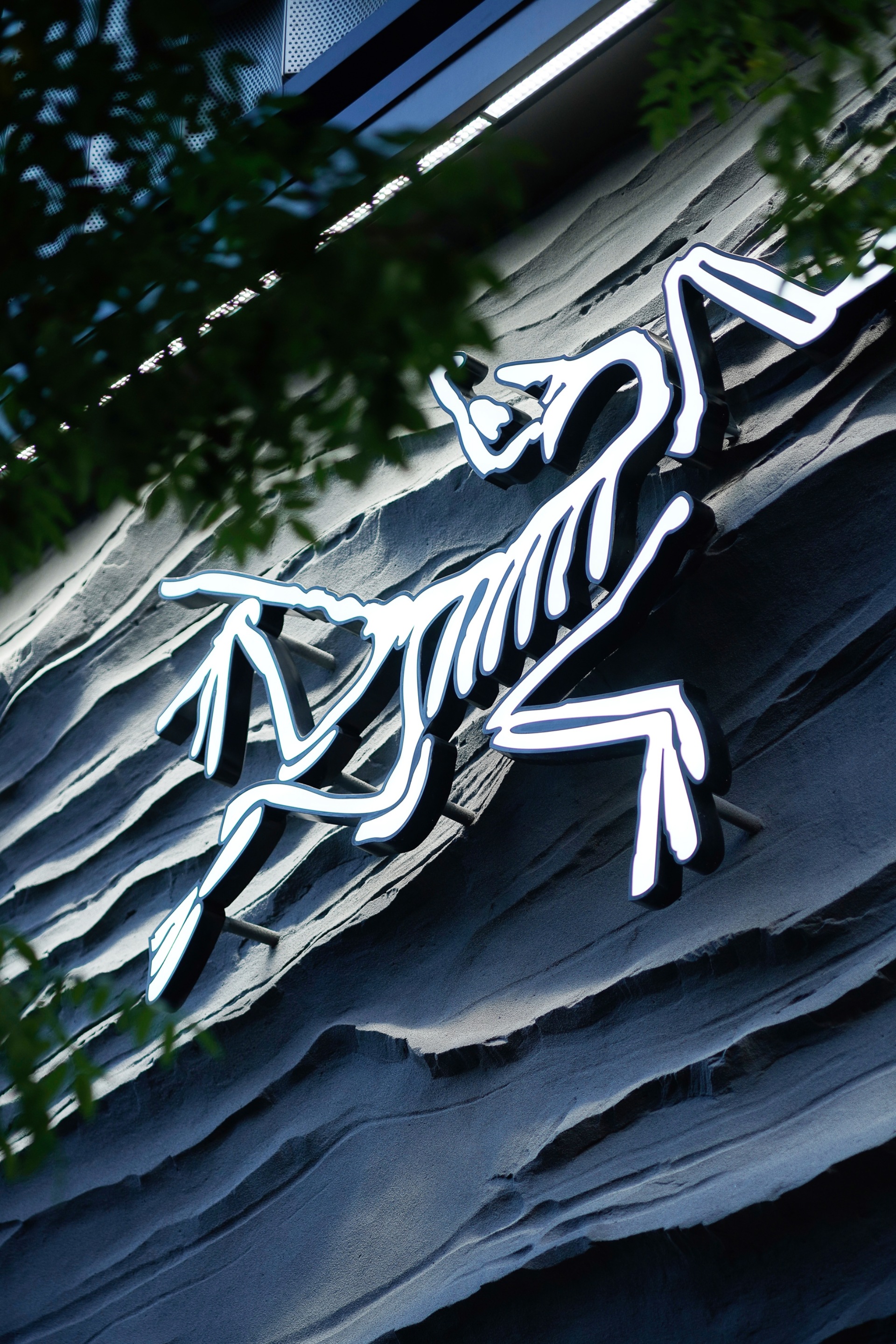
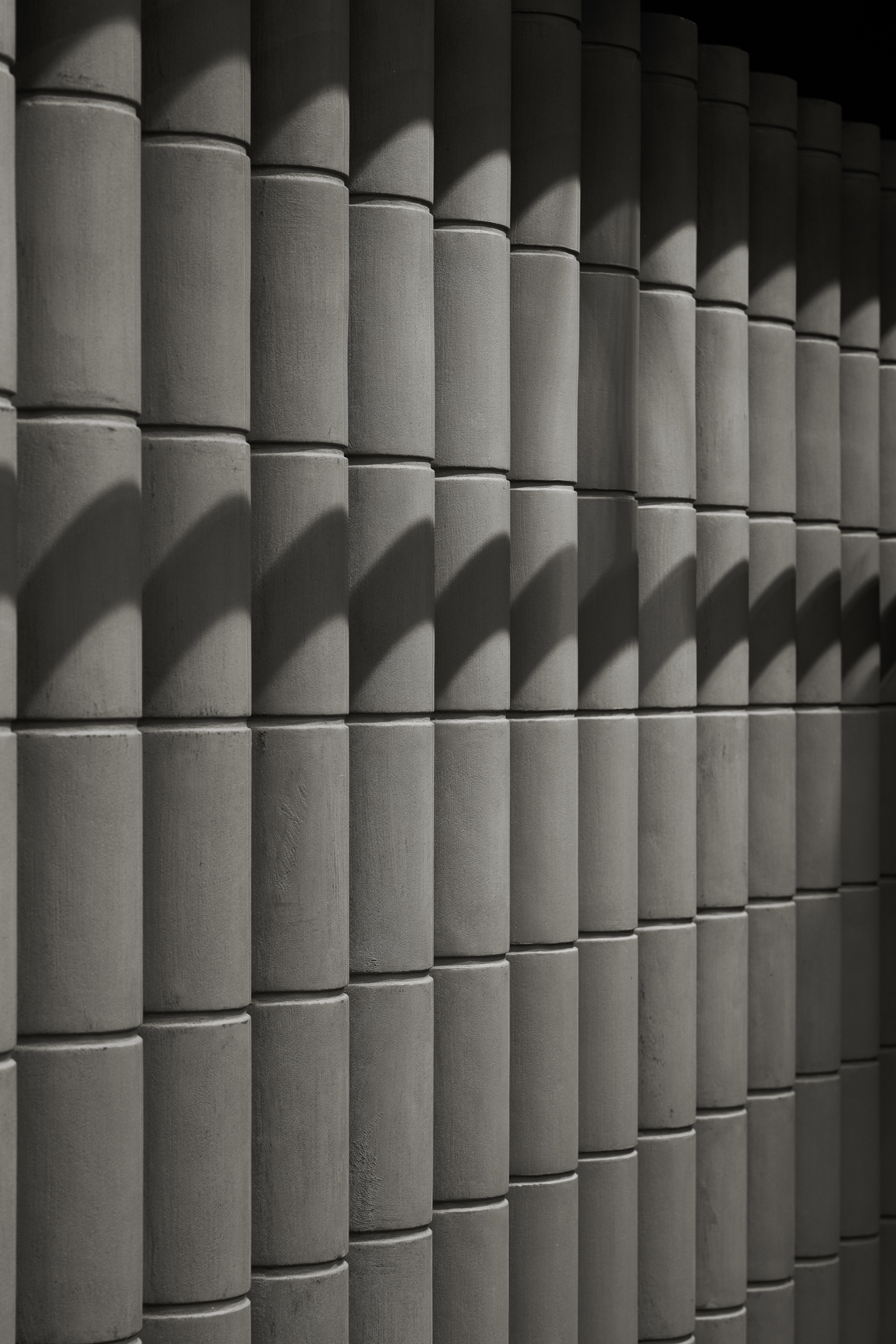
In the initial stage of schematic design, the design team delved deep into Vancouver, finding inspiration from local artists' reimagining of "trees". This re-creation became the primary muse for the design, which seamlessly weaves the urban outdoor cultural artwork into the store.
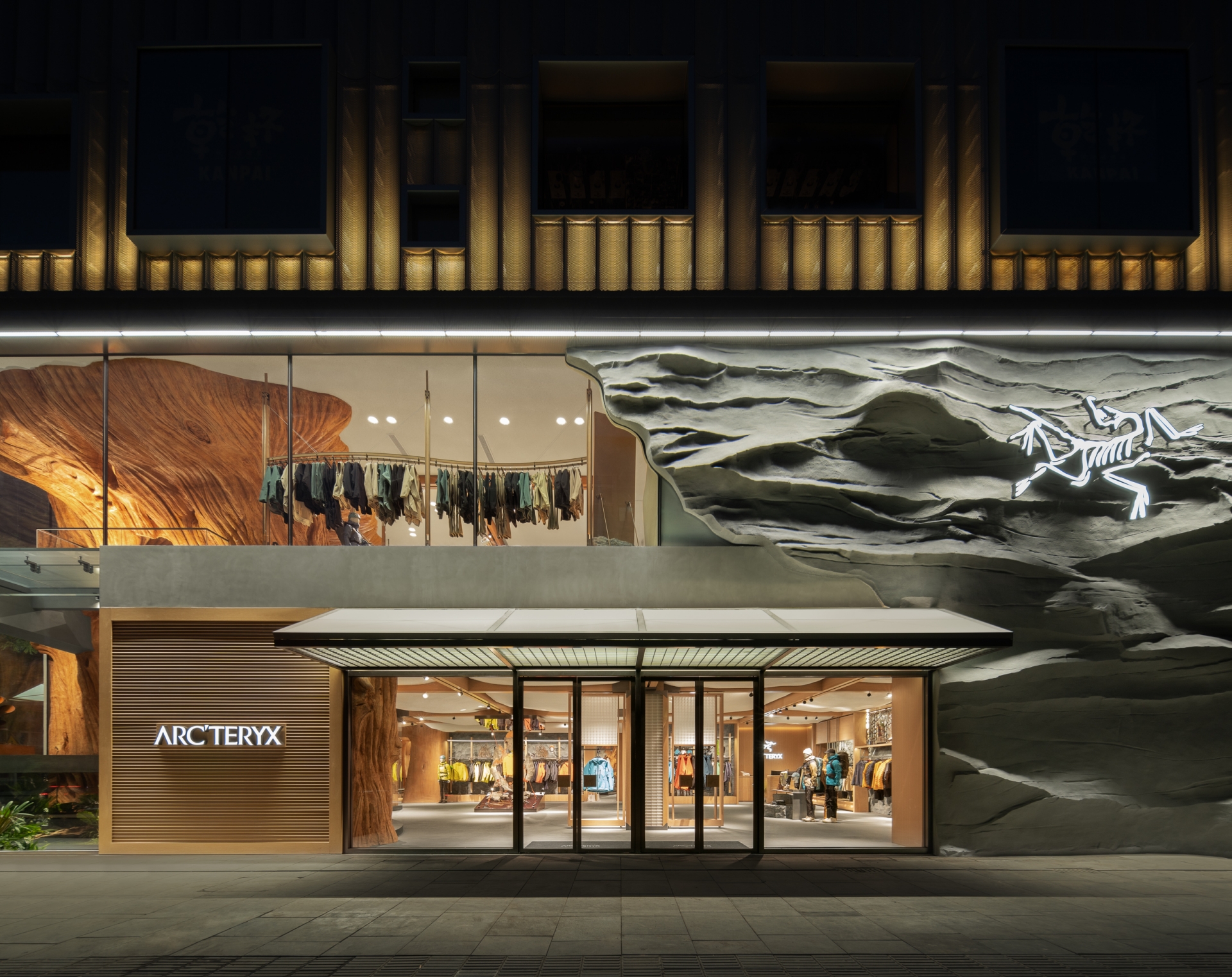
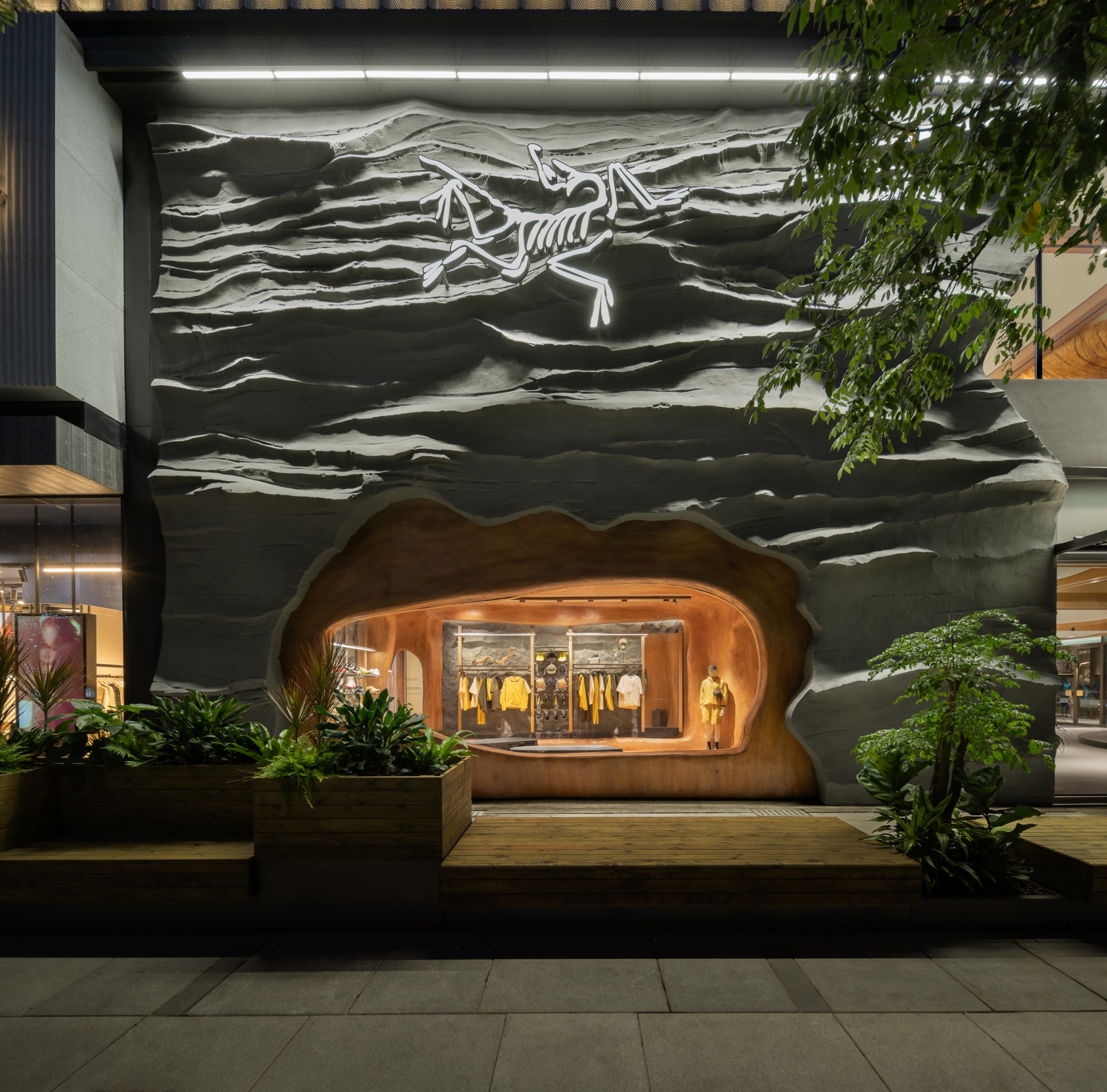
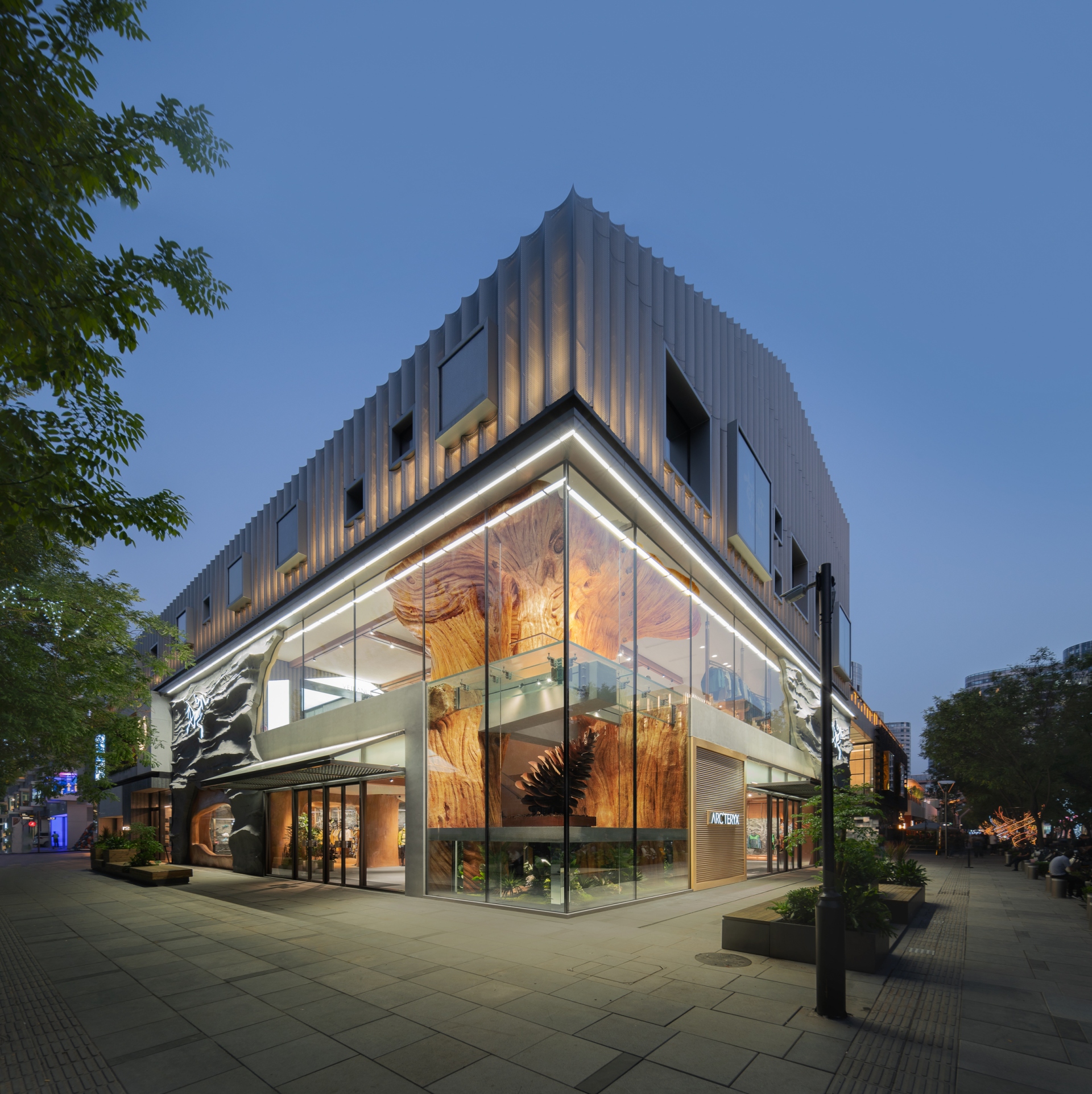
Situated on an L-shaped site, the store features a facade crafted from gray rocks embedded with glass. Employing bold design techniques, this composition not only creates a striking visual effect but also demonstrates the brand's distinctive and memorable identity. The design captures the essence of a natural mountain. A luminous installation in the shape of the brand's skeleton logo is placed on the rugged surface, forming a unique brand atmosphere in the external environment to invite customers into a setting that encapsulates the spirit of Vancouver's mountains and forests. At the entrance, a grilled lightweight acrylic canopy is set up with an extended lounge area reaching out towards the street to engage with consumers.
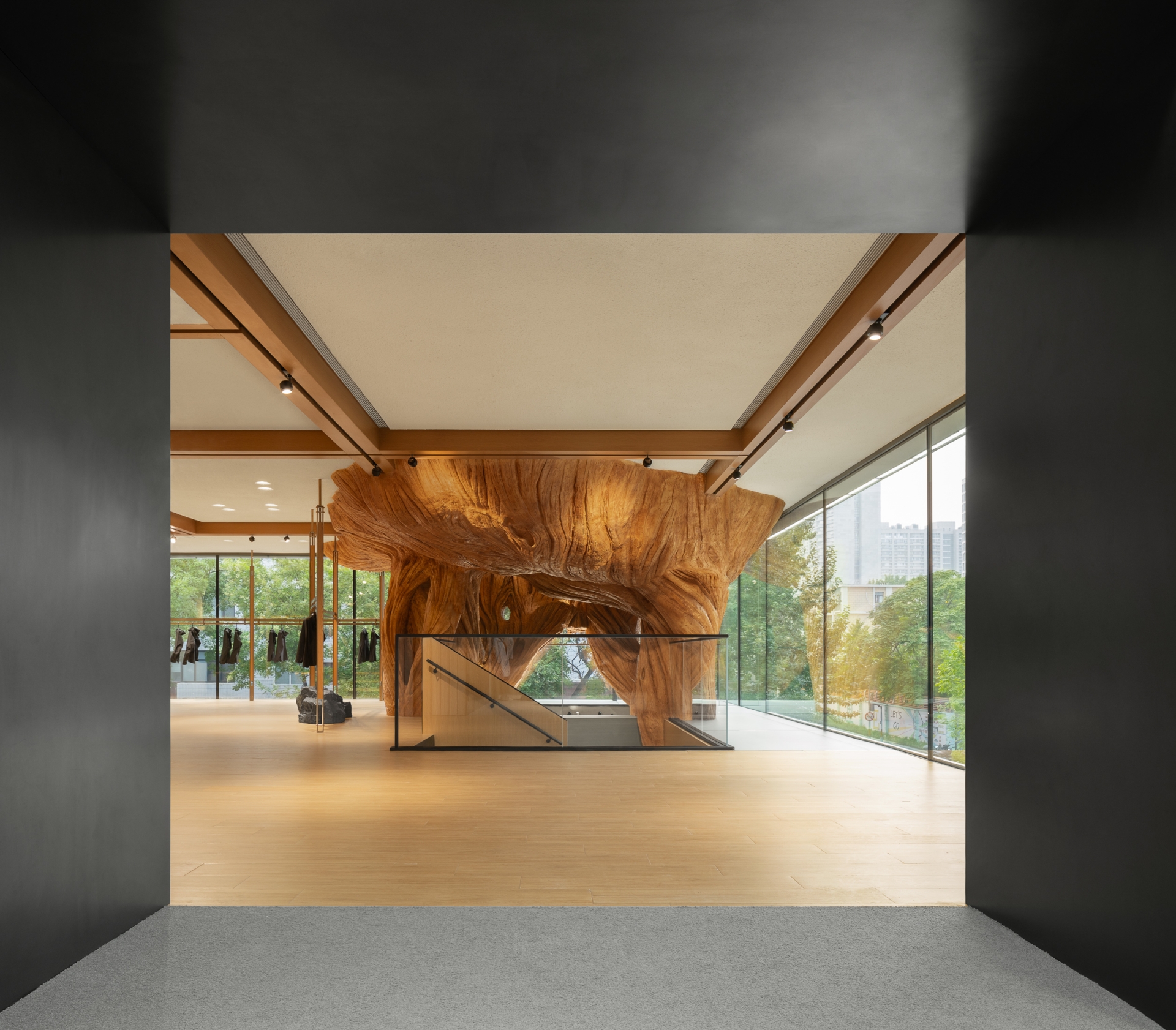
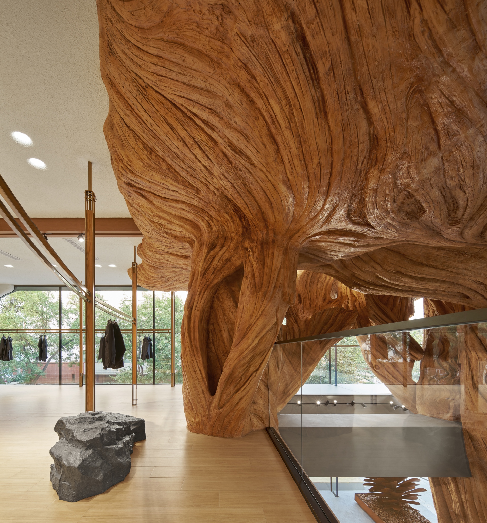
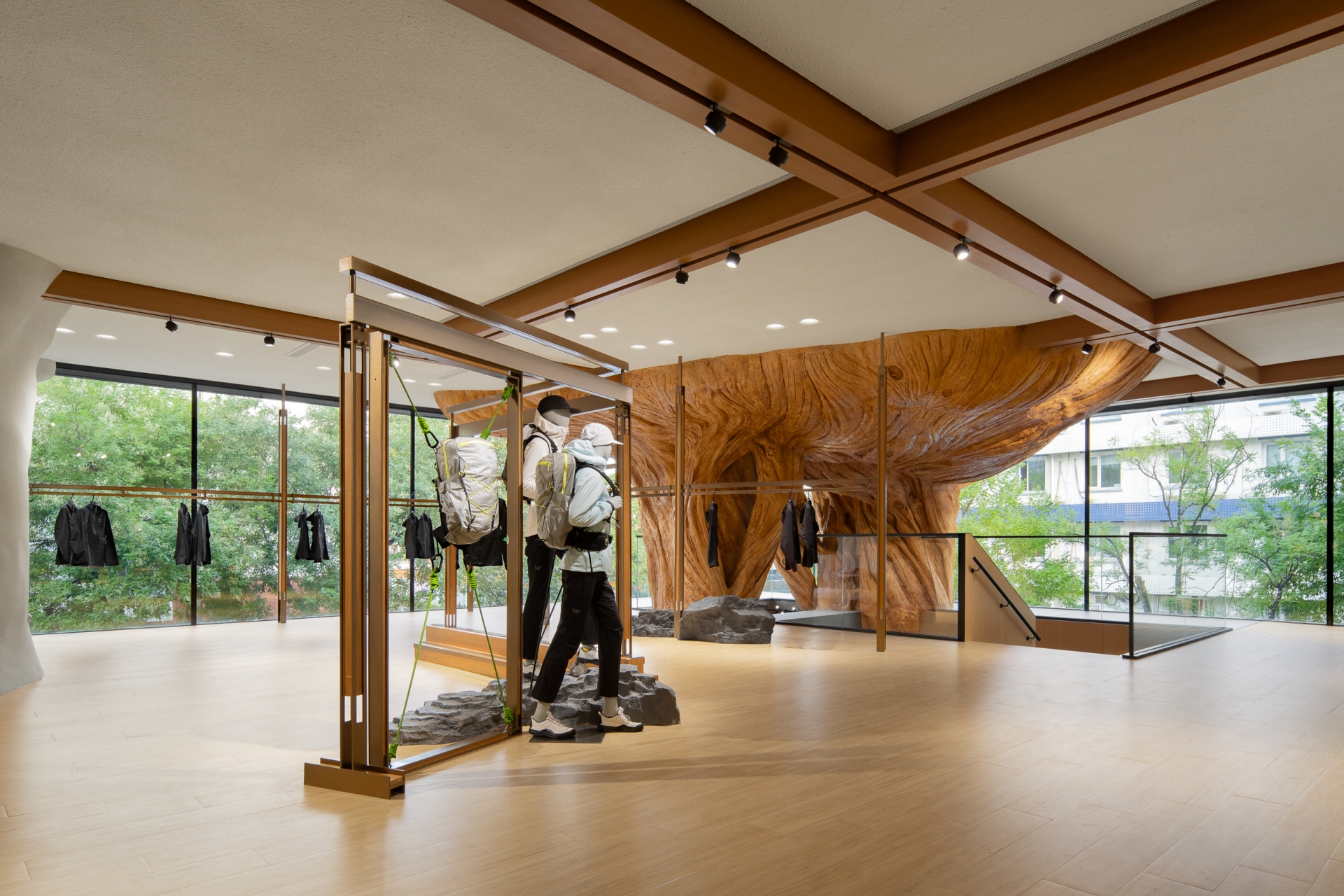
The space strives to foster a harmonious connection between humanity and nature and interpret the spirit of the outdoors through innovative artistic expression. Positioned in an elevated corner of the store, a colossal dead tree's root extends vertically along a transparent glass facade, seamlessly blending into the store's setting. The project emphasises the sustainability of materials. On a suspended staircase platform, the design team introduced a two-metre-high pinecone art installation crafted from rust boards recycled from factory waste. This installation harmonises with the upward-reaching large tree root, cultivating a profound artistic ambiance.
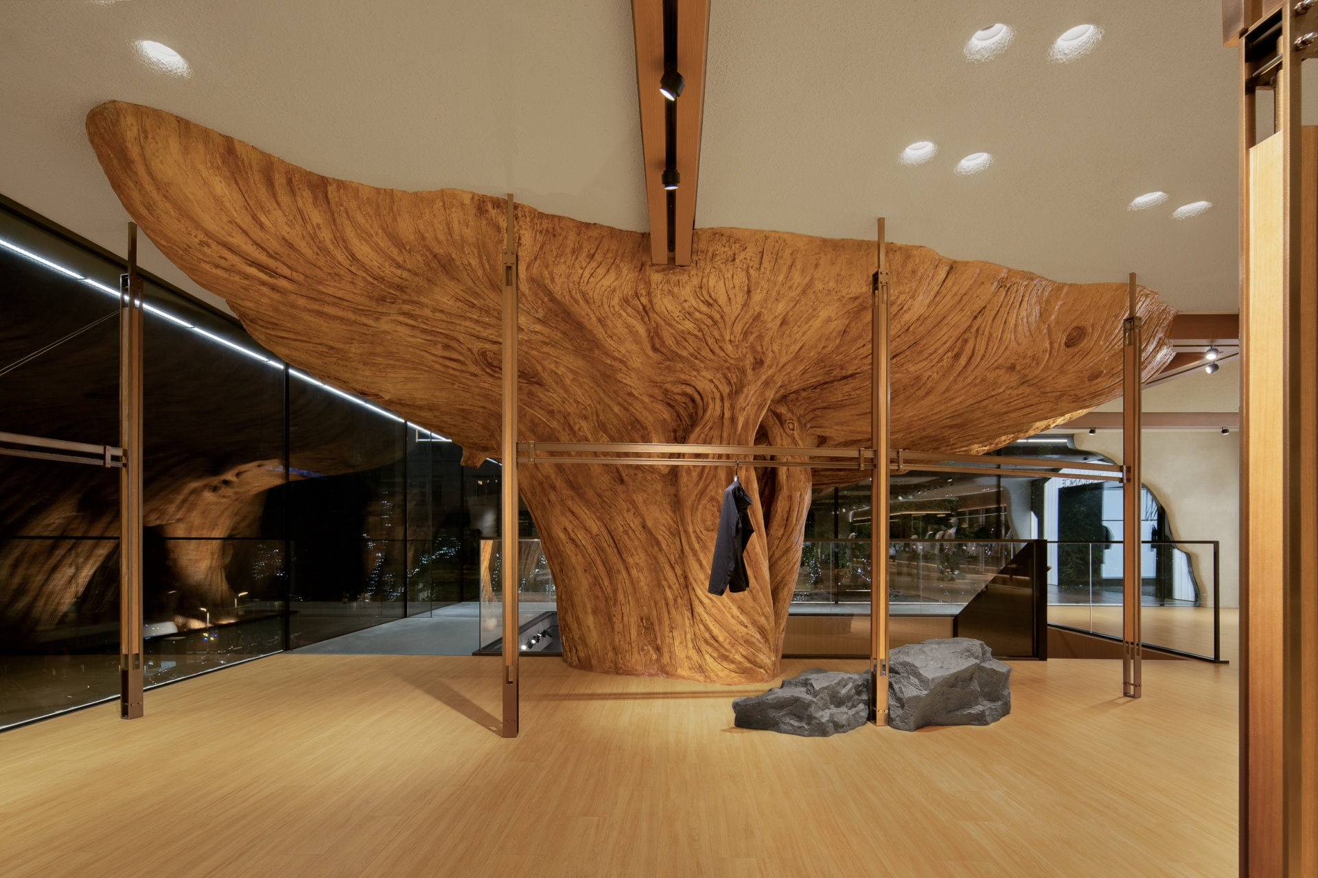
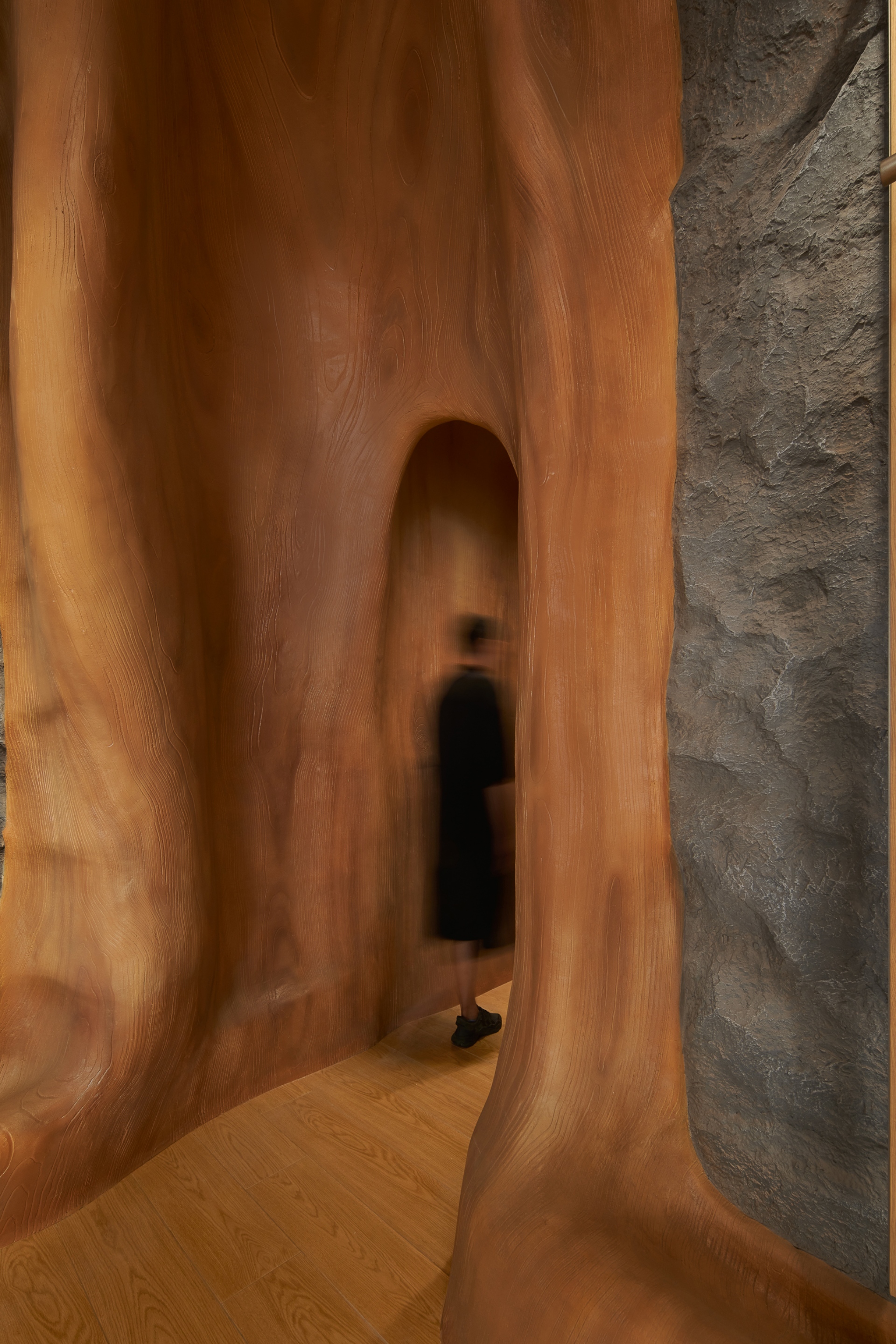
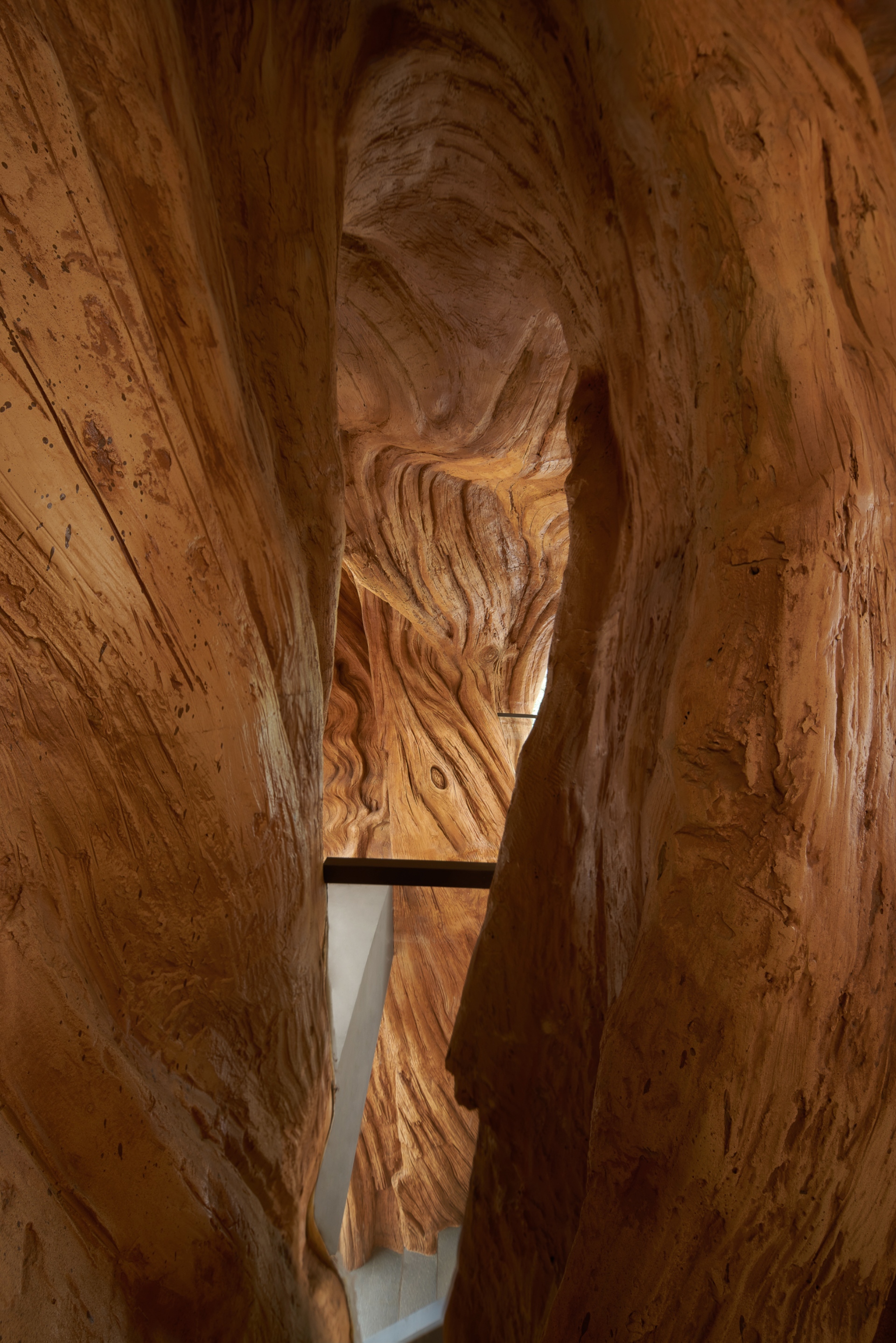
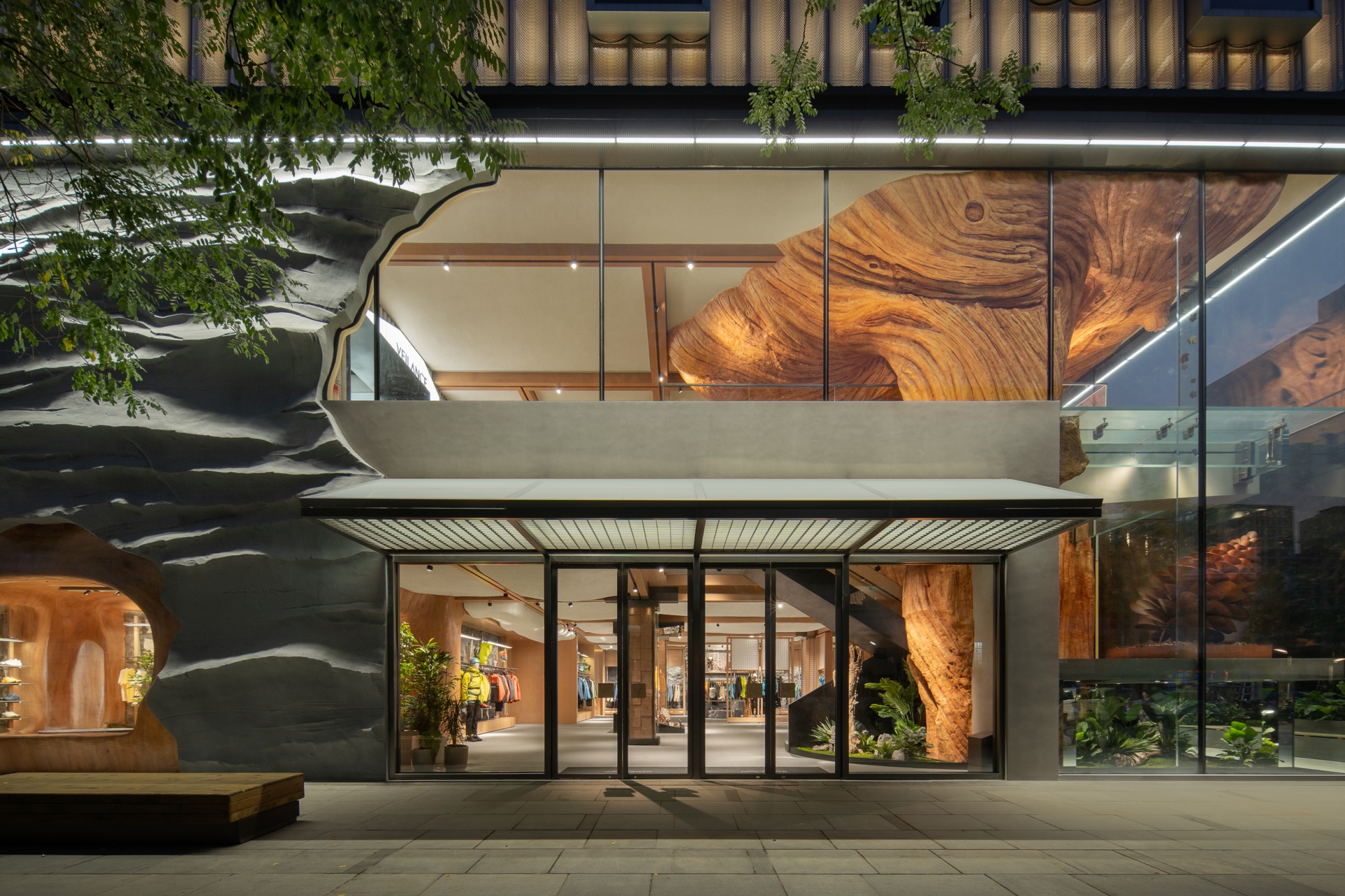
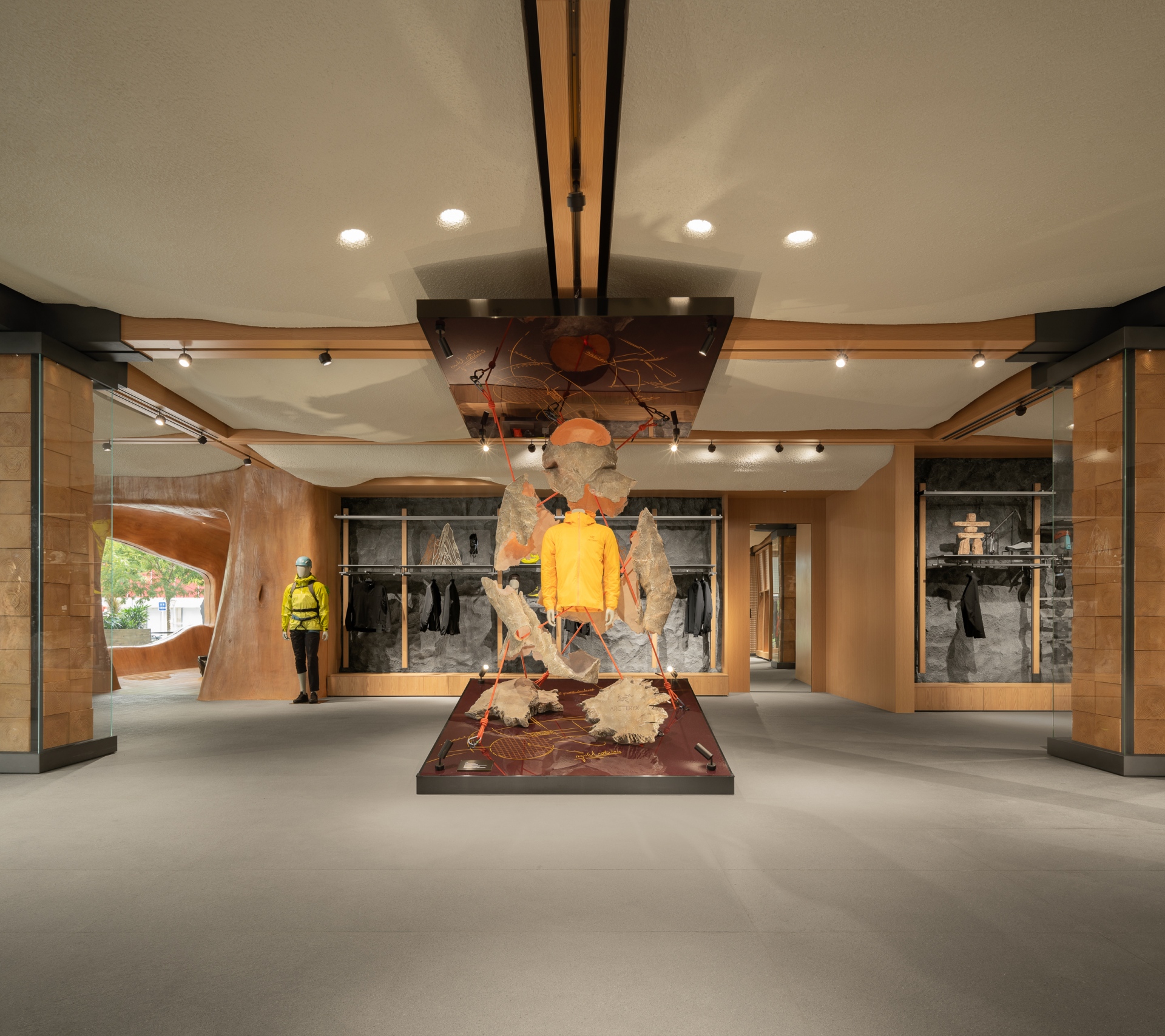
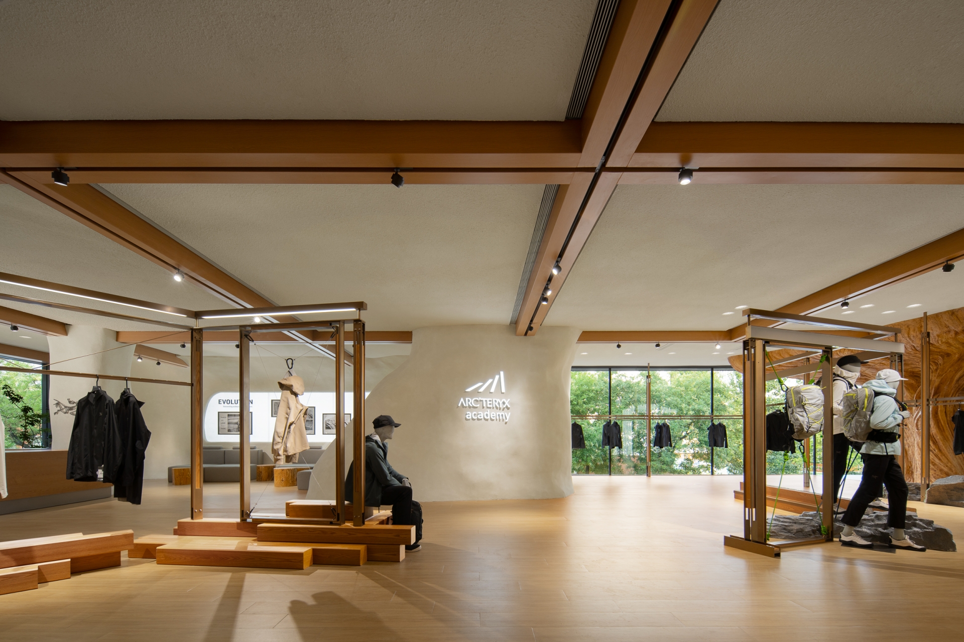
In this two-storey store, the first floor is designed as a dedicated space for the professional rock climbing and hiking series – an area suited for mountain and forest-themed scenarios. Meanwhile, the second floor is curated as an urban life product area for the 24 Collection, the VEILANCE Series, and in-store sharing sessions on mountain skills. Throughout the entire space, elements of rocks, trees and wood grain are incorporated into the mountainous backdrop to express the brand DNA of ARC'TERYX. A combination of ambient lighting and localised lighting for products contributes to the creation of distinct atmospheres in different areas through the interplay of warm and cold tones.
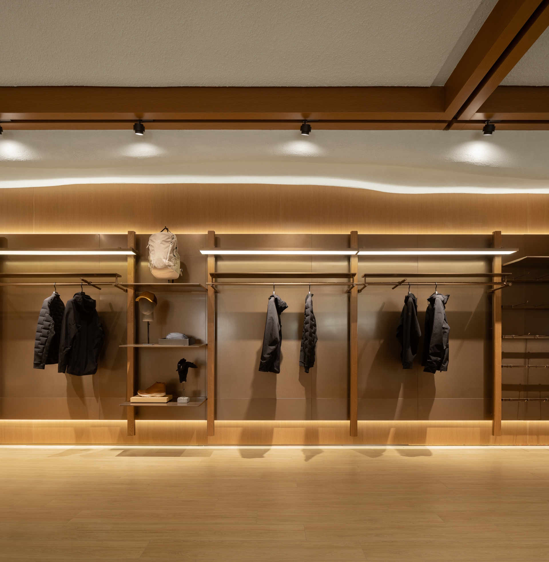
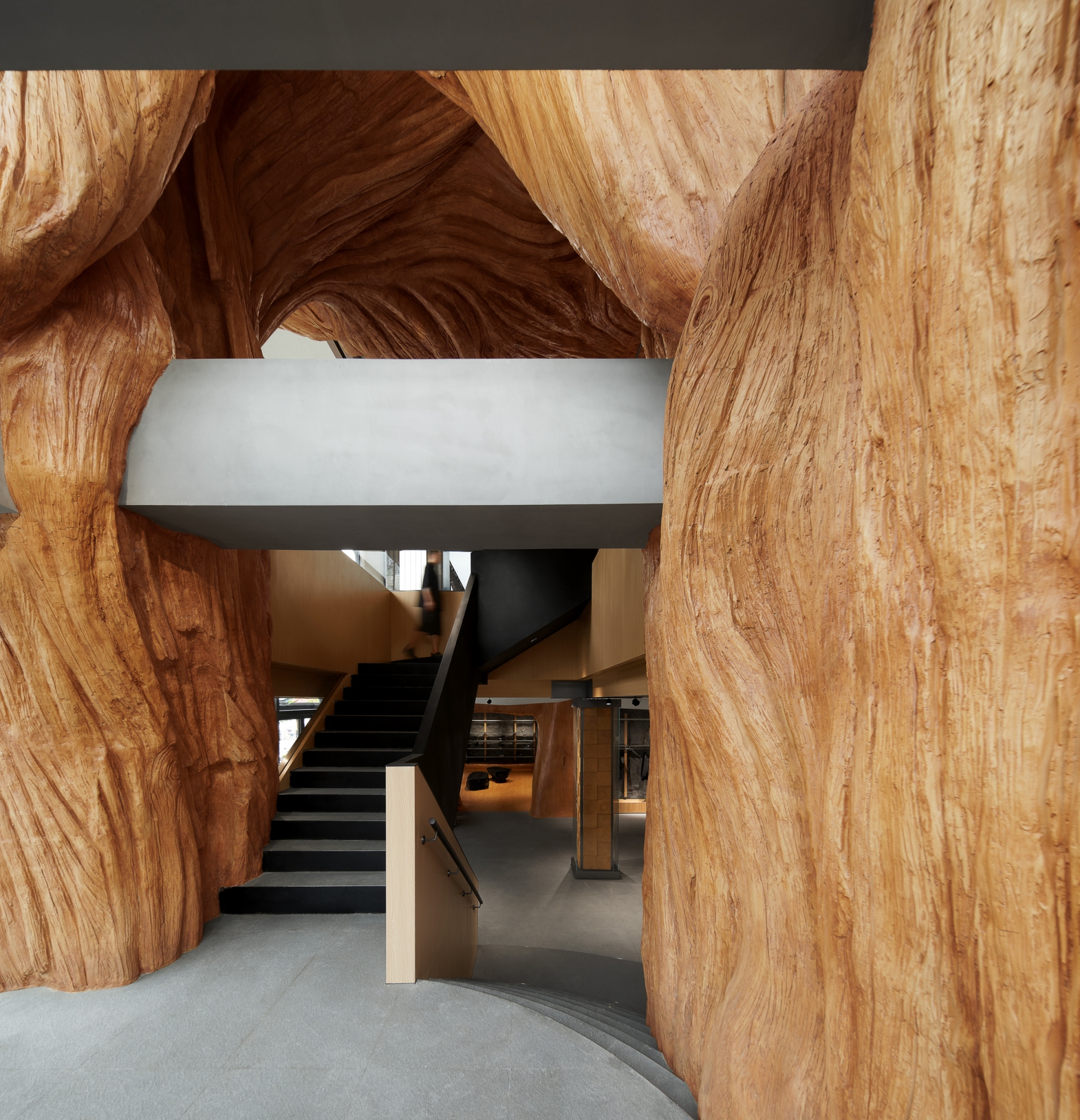
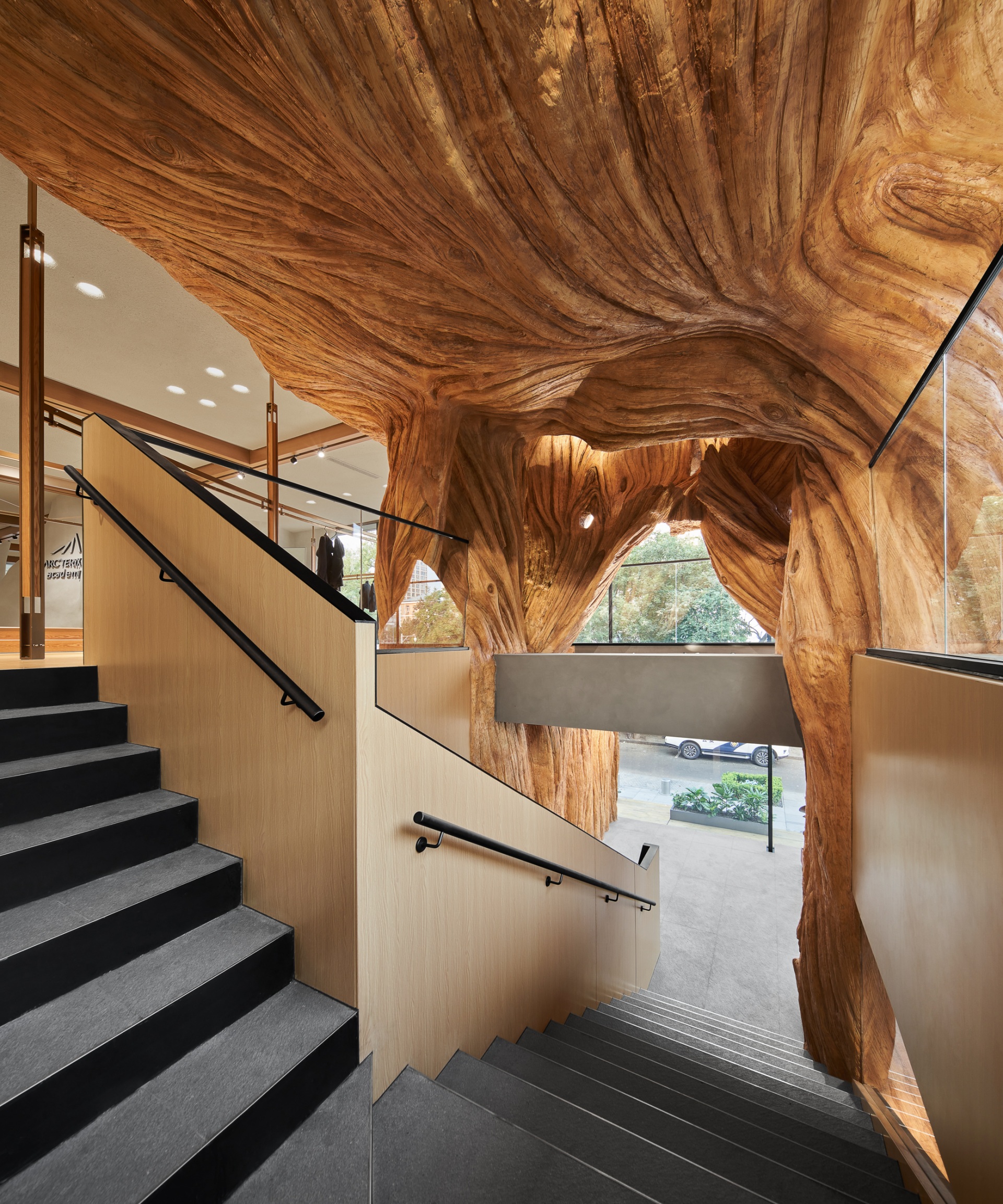
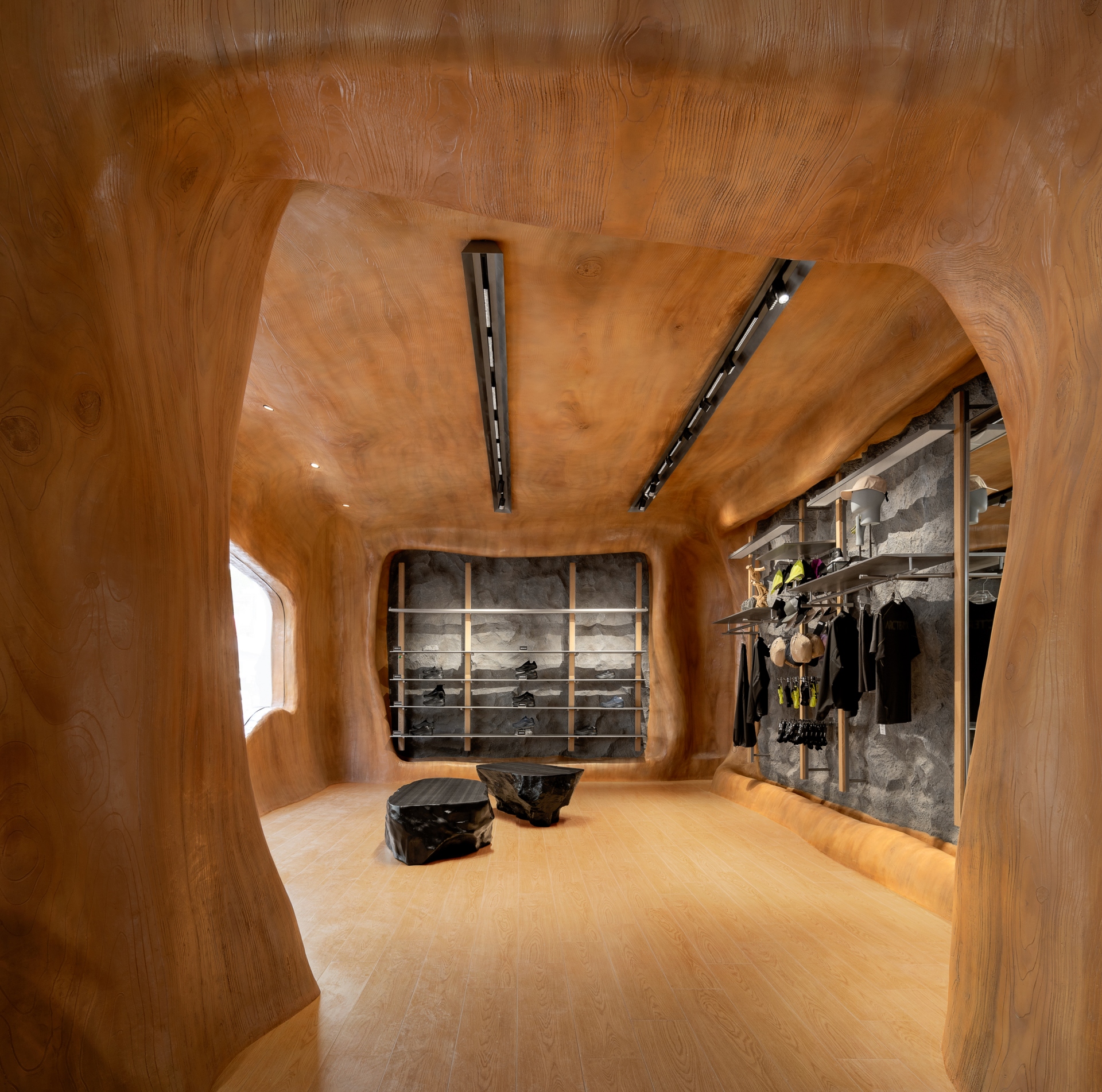
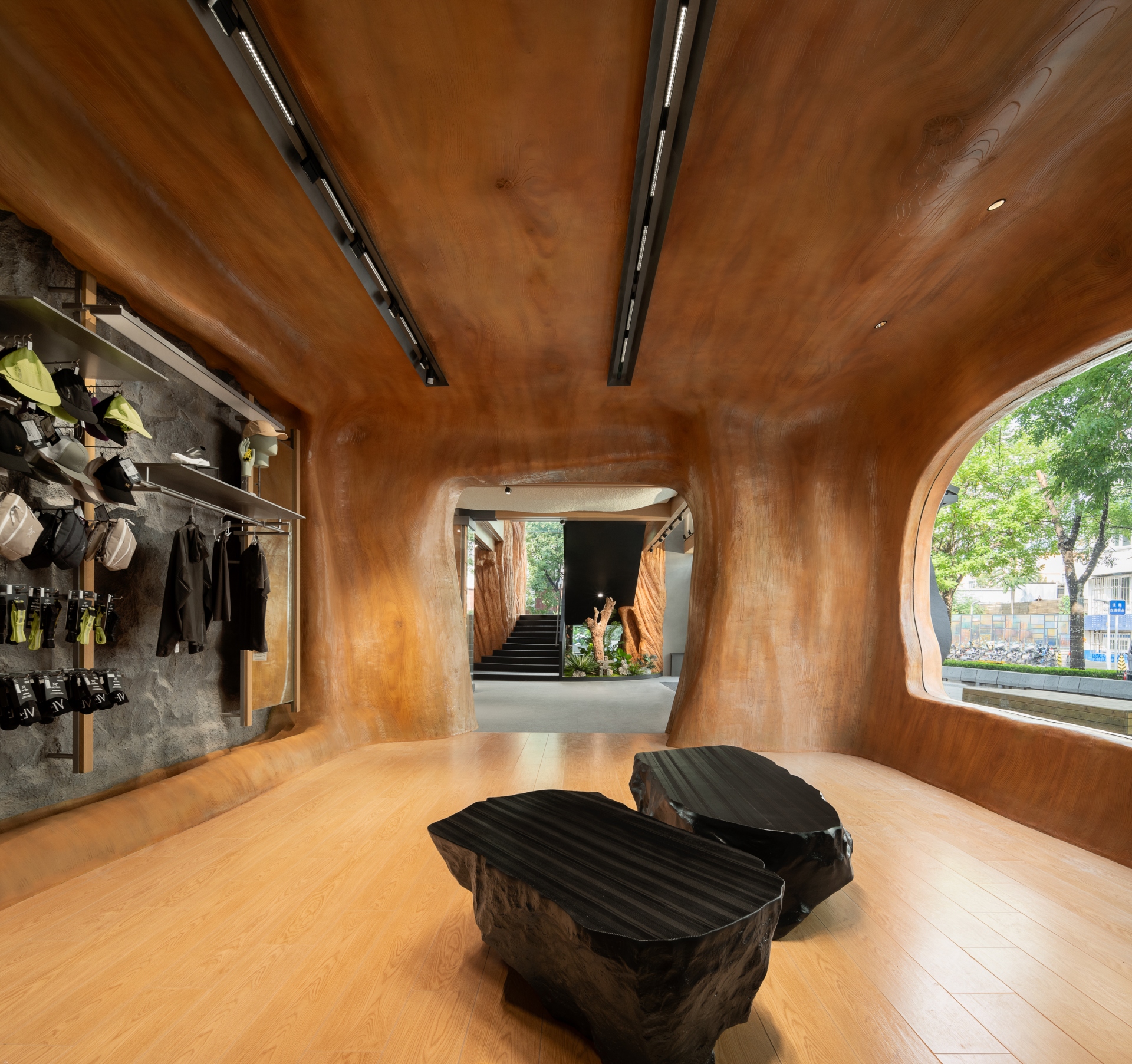
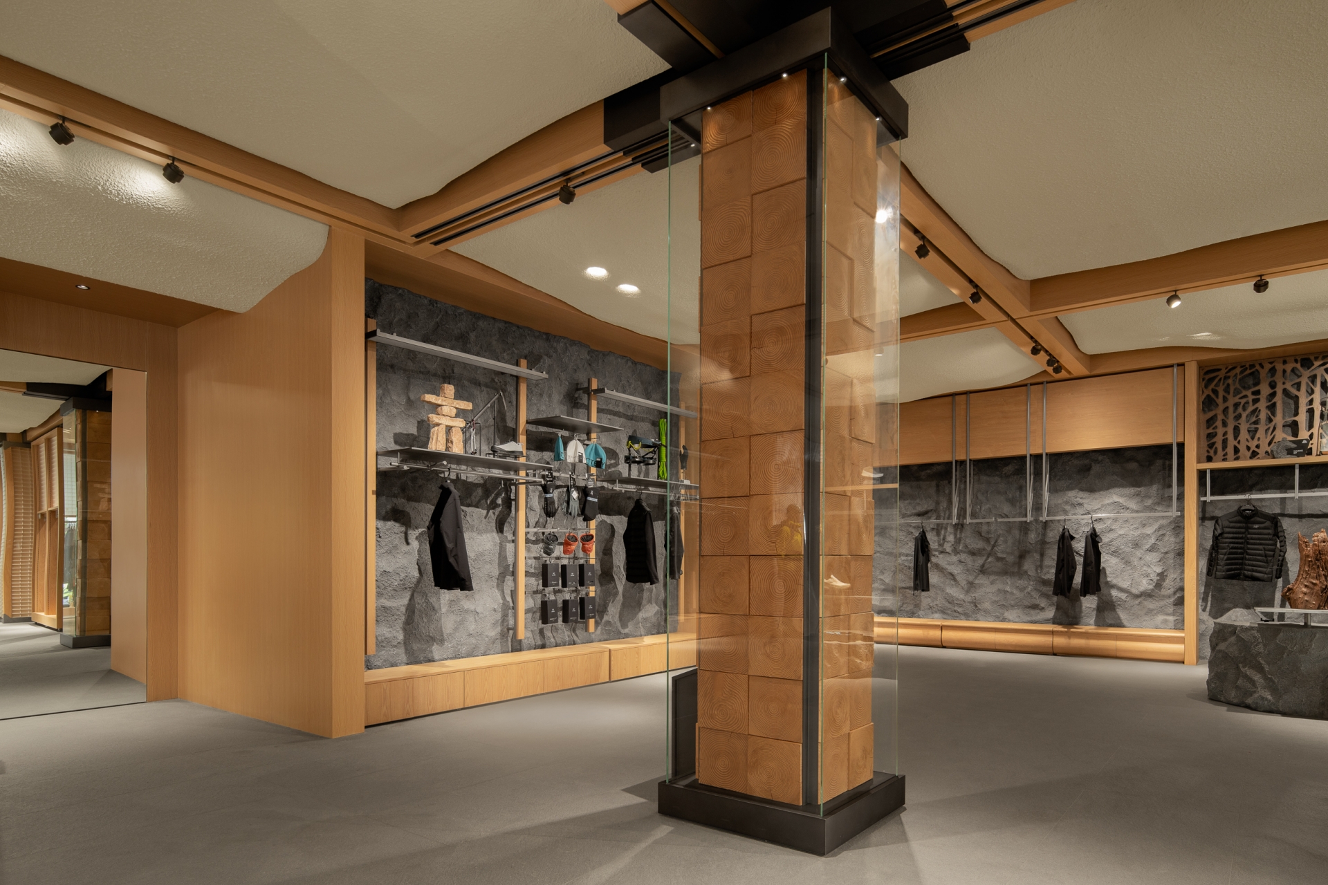
The design team hunted for fallen dead trees in the forest and transformed them into decorative columns by slicing and encasing them in glass. The tree rings on these columns serve as a visual testament to the trials and tribulations endured by the trees during their growth in nature – a perseverance that resonates with the spirit of ARC'TERYX, which aims to break through limits and keep reaching upwards.
In the display area, a customised irregularly shaped rock platform is erected, complemented by a rust-coloured metal wall featuring tree branch silhouettes, echoing the overarching theme of "trees" in the store. The concept of tree holes is also applied to the first floor, where each scene draws inspiration from nature, catering to the desires of outdoor enthusiasts. This space is primarily dedicated to the outdoor product line for young people, which is also available for the release of special merchandise in the future.
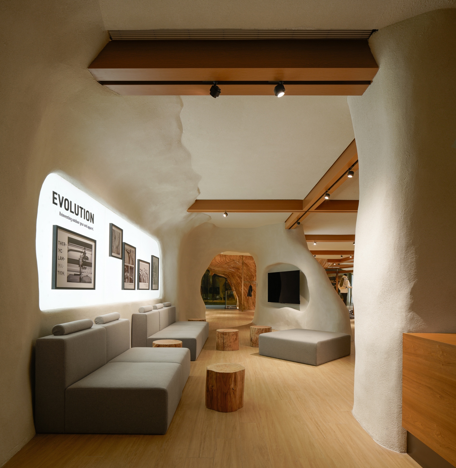
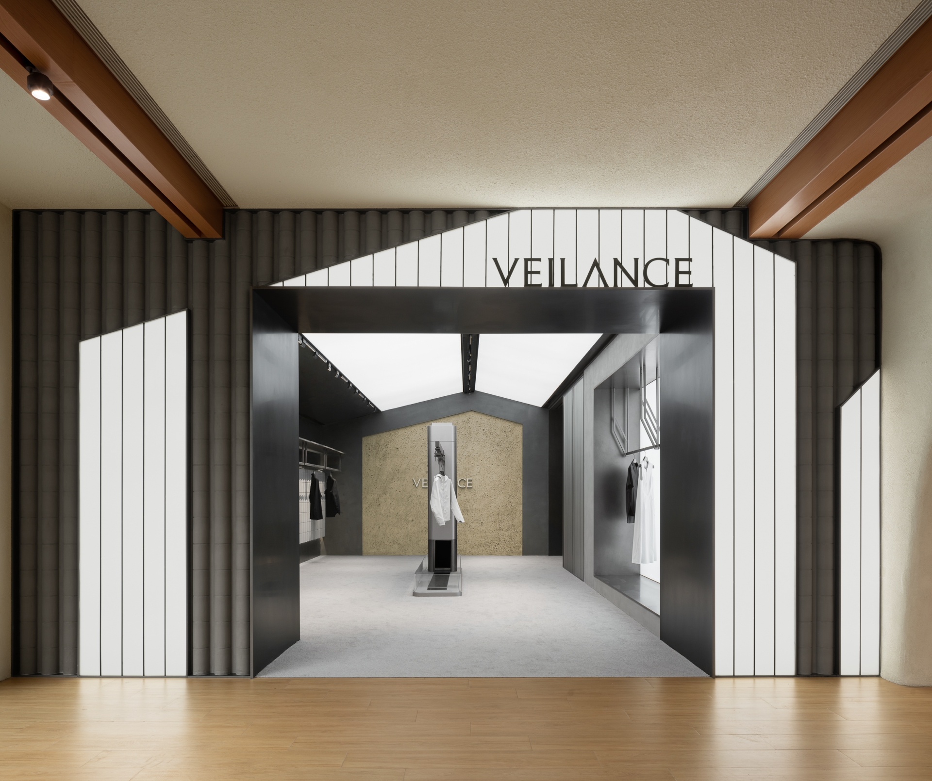
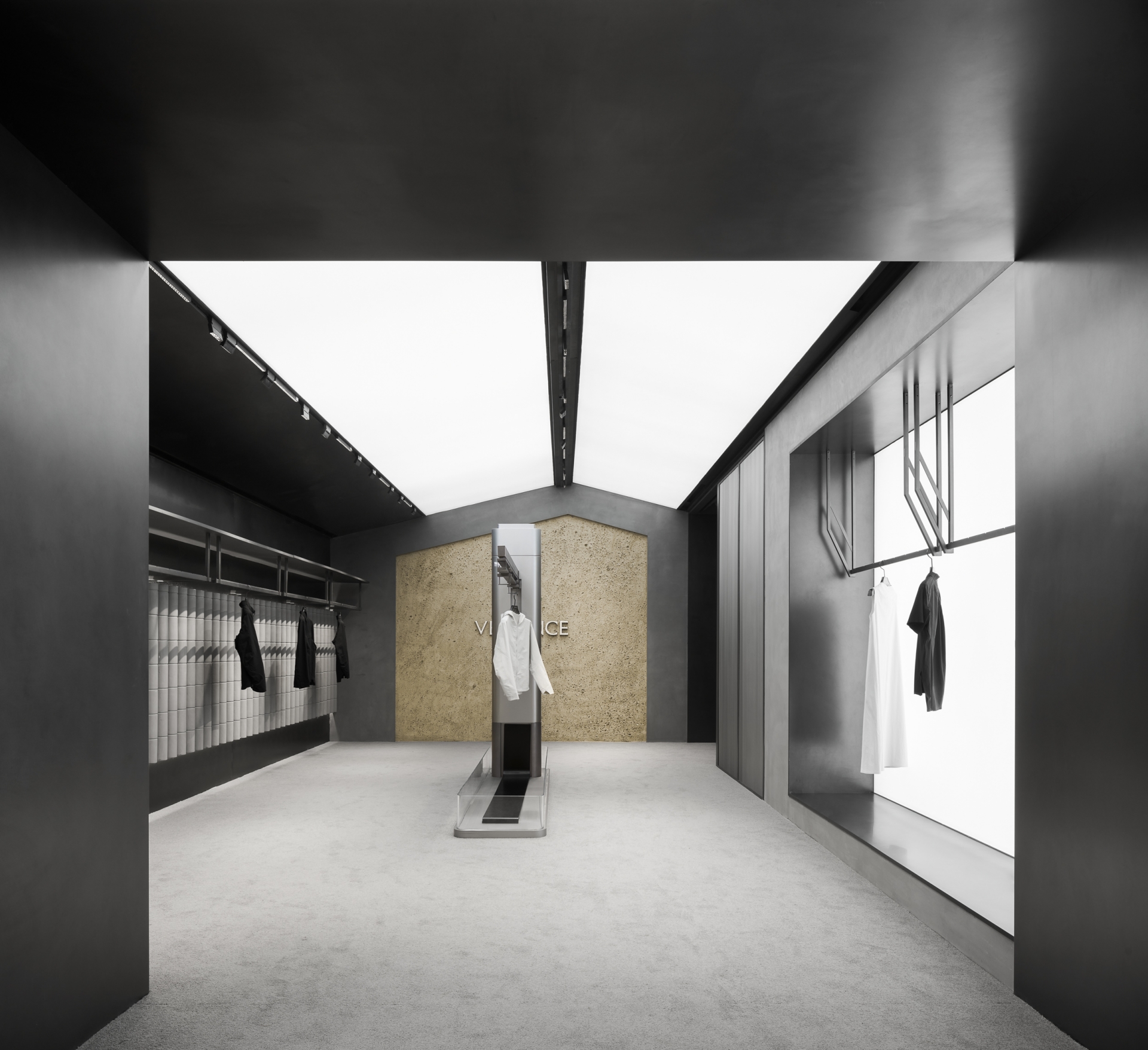
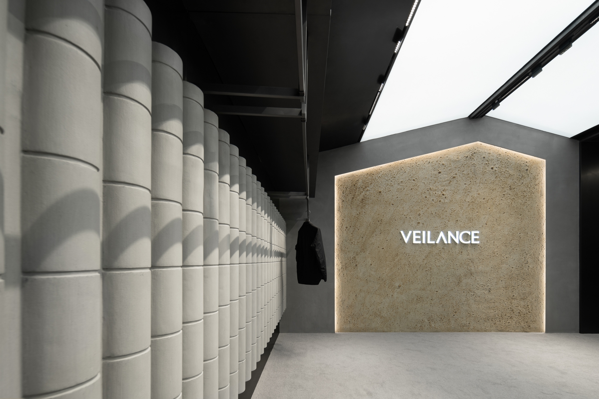
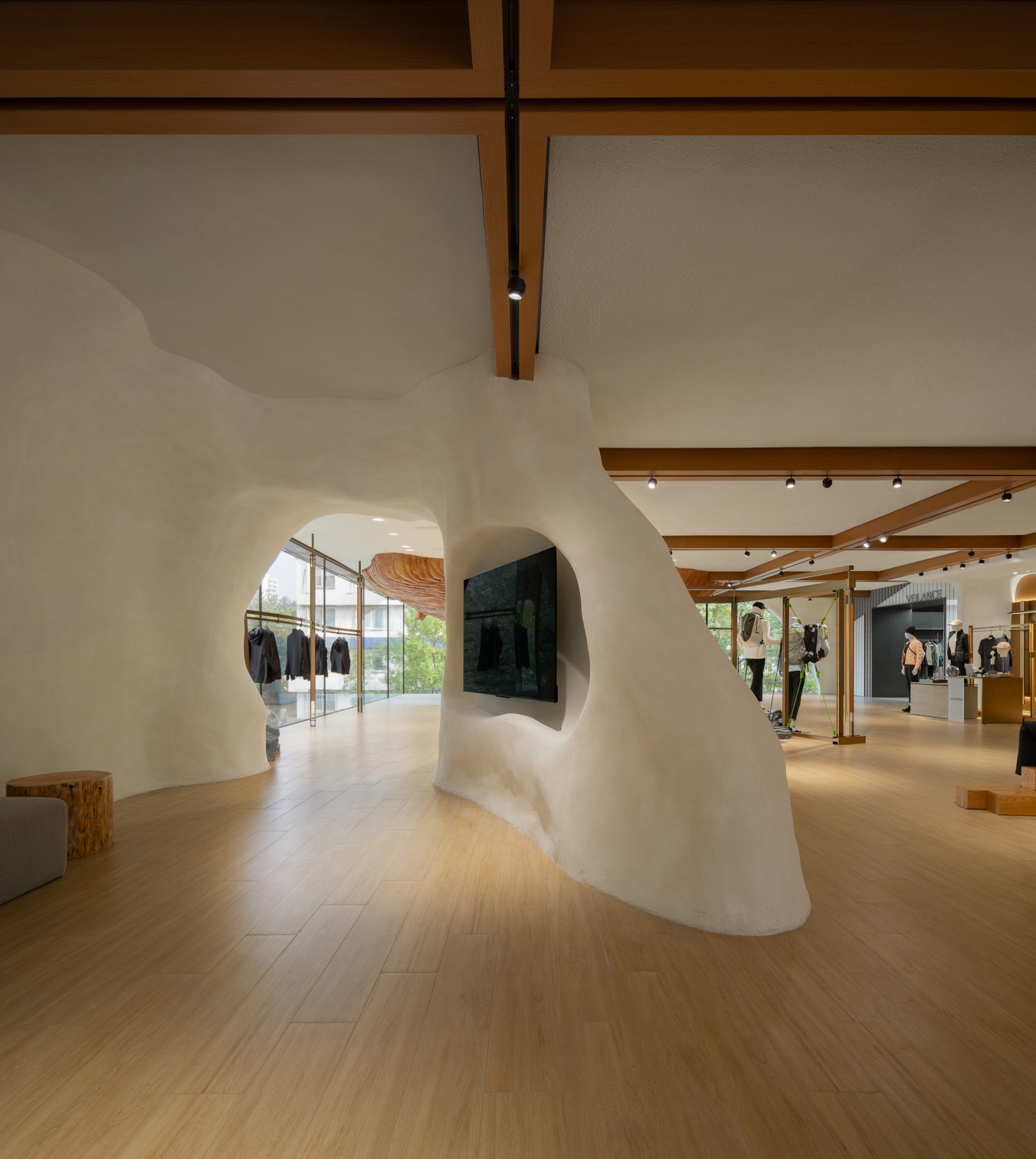
Beijing boasts a skyline where ancient buildings majestically merge with the sky. Drawing inspiration from this cityscape, the project incorporates the element of eaves tiles into the facade of the VEILANCE Series area. This design aims to evoke the aesthetics of ancient Chinese architecture and showcase the brand’s cultural richness and inclusivity. The use of grey metal and cement contributes to a spatial ambiance infused with a solid feel, complementing the temperament of outdoor products within an urban environment. The overall space emphasises the harmonious blend of an outdoor feeling and a sense of technology. Display installations are crafted with acrylic and metal materials and mirror the forms of production line equipment. This choice seeks to spotlight the brand’s dedication to research and development and its modification techniques, while paying homage to its outdoor spirits. Within the 24 Collection product display area, wooden frame structures are adopted. Meanwhile, an irregular mountain-shaped display platform creates an outdoor vibe through details on its base. A cavern-shaped installation takes centre stage in the area for sharing sessions on the second floor. Low tables made of timber piles, fabric sofas, and decorative floor stoves collectively craft a cosy setting infused with a woodland feel. This environment allows consumers to enjoy coffee while listening to stories shared by rock climbing experts, thereby bringing consumers closer to the brand through brand promotions.
That intense connection with nature - driving back to mountains and the greater wilderness, being prepared for exploration, and experiencing the world through our bodies marks the initiation of our connection with the vast expanse. ARC'TERYX stands as a premier brand championed by numerous outdoor enthusiasts and extreme sports experts. The opening of its landmark flagship store in Beijing represents an innovative fusion of nature, outdoor sports and art, and a fresh interpretation of a sustainable outdoor lifestyle.


