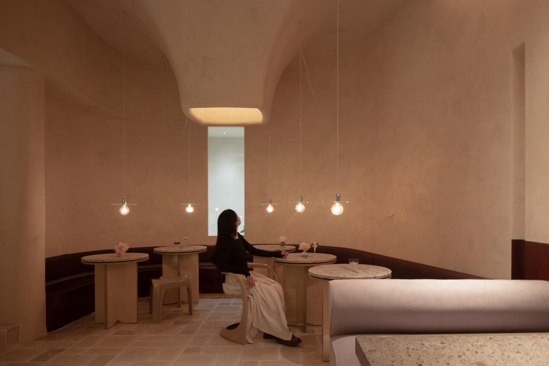
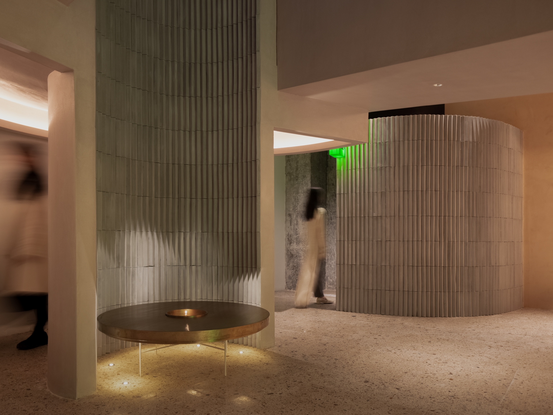
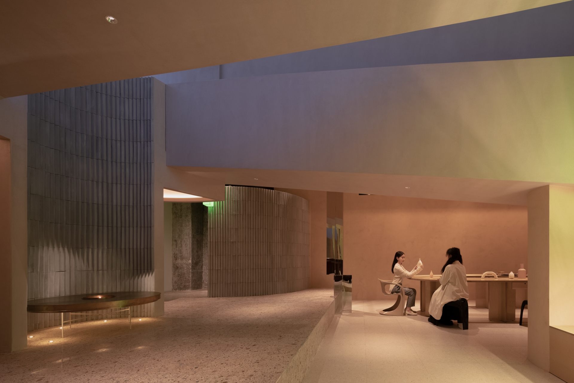
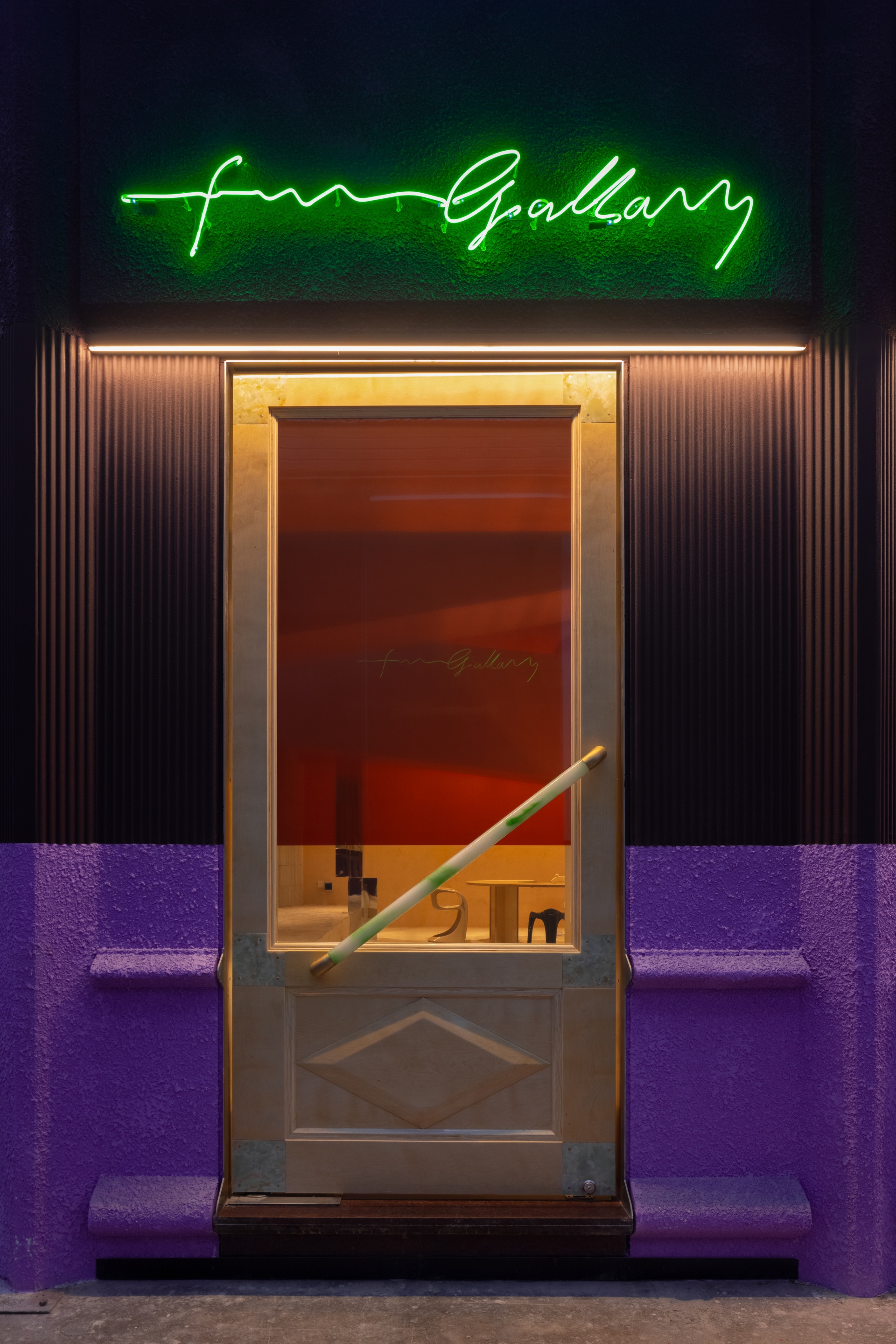
FUNFUN Gallery is situated in Silian 166 Creative Park, which was repurposed from the former Hangzhou Silk Printing and Dyeing Factory launched in 1956. As one of the first cultural & creative parks in Hangzhou, Silian 166 retains strong characteristics of industrial heritages in the 1950s, featuring a single-pitched roof, cement trusses and high daylighting windows. The project's site was a former industrial building, 16.5 metres in length and 11 metres in width, with a concave on the exterior. The existing pitched roof creates the highest point of the interior, which is 8.65 metres high; while the lowest net height of the space is merely four metres due to the restriction of the trusses. The design team at lialawlab applied bold colours and textures to the external facade. Black coffee and lavender purple colours help enrich the emotions of the space, and create a contrasting visual compact along with the tactile smooth and rough coating textures.
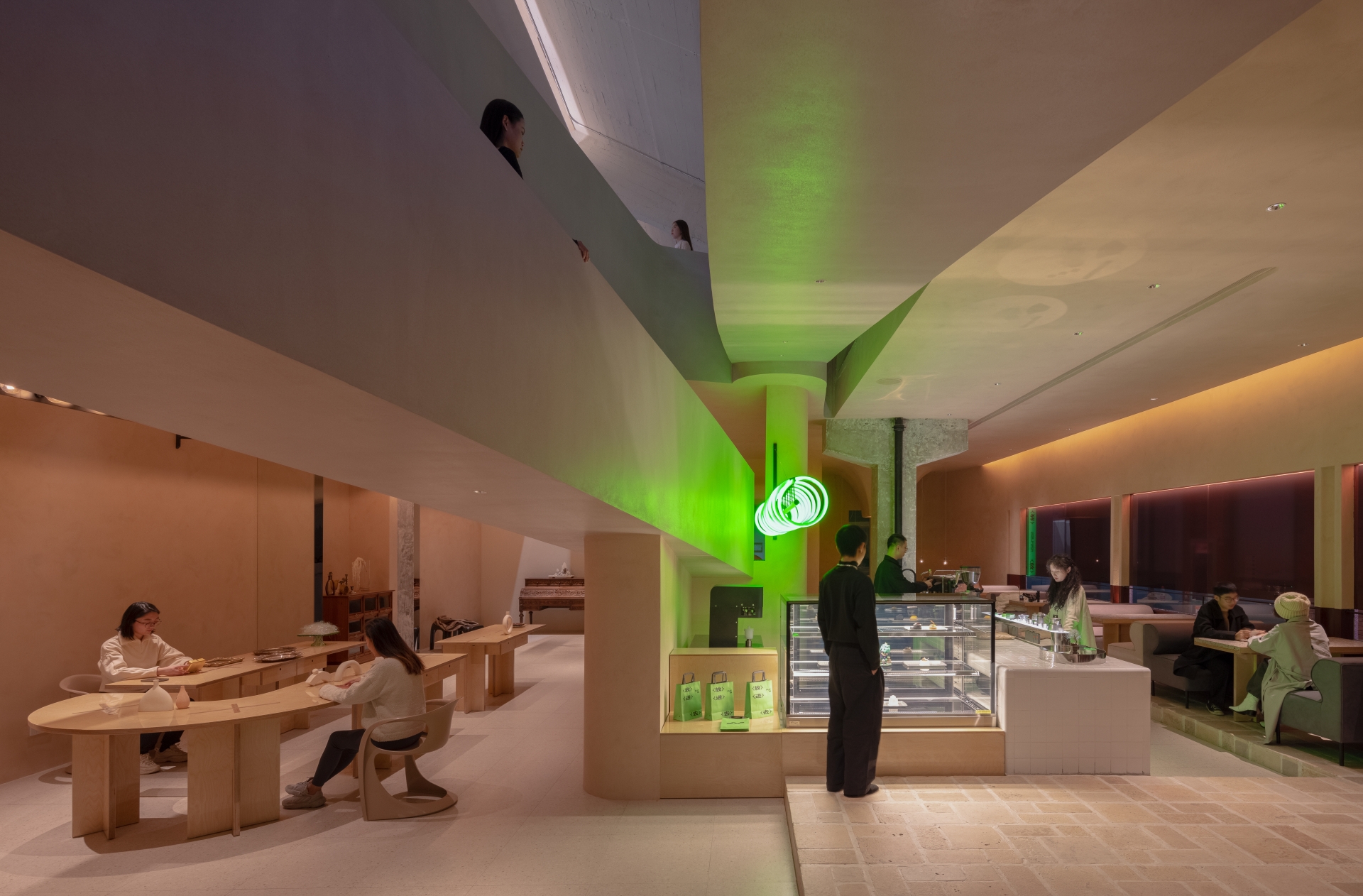
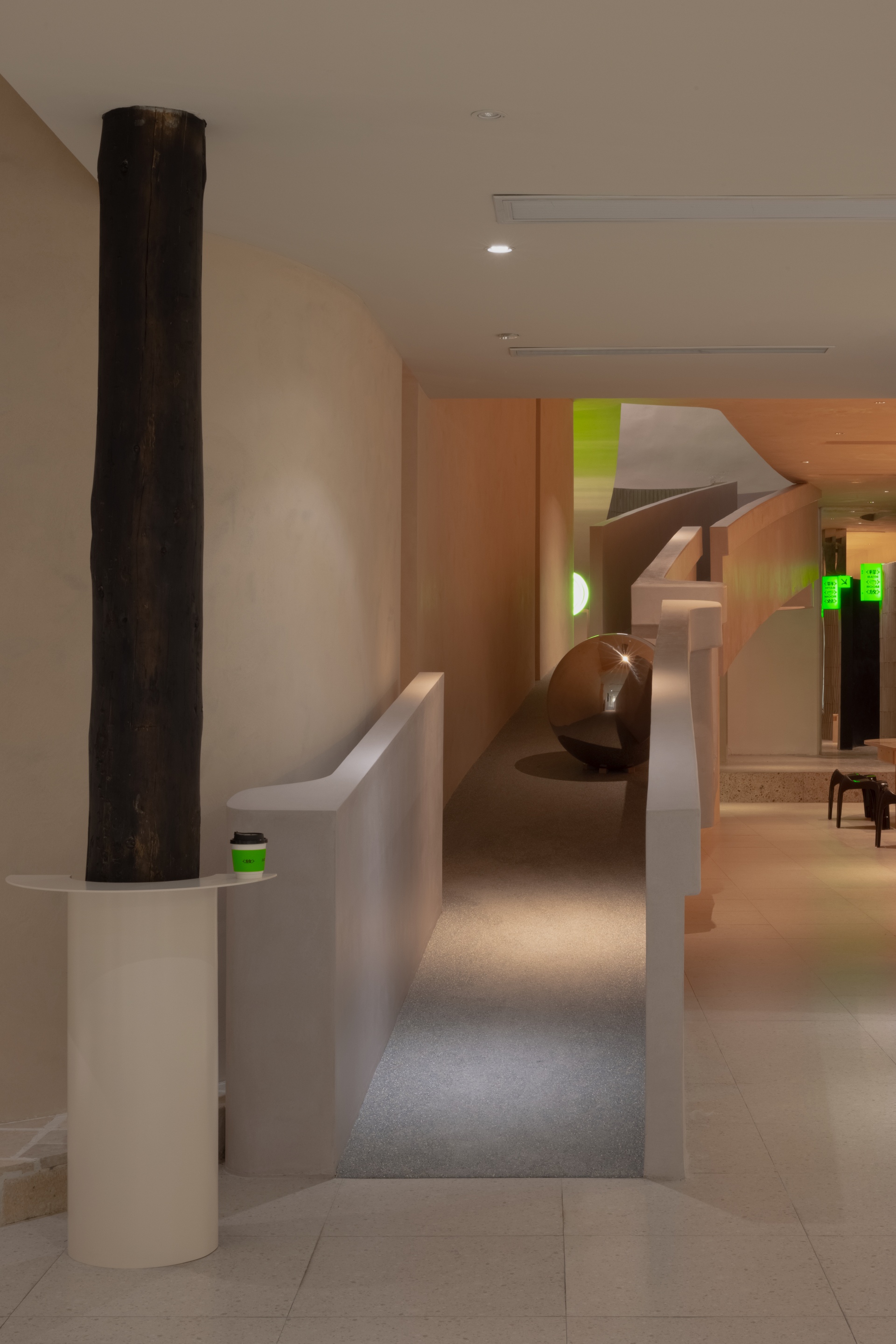
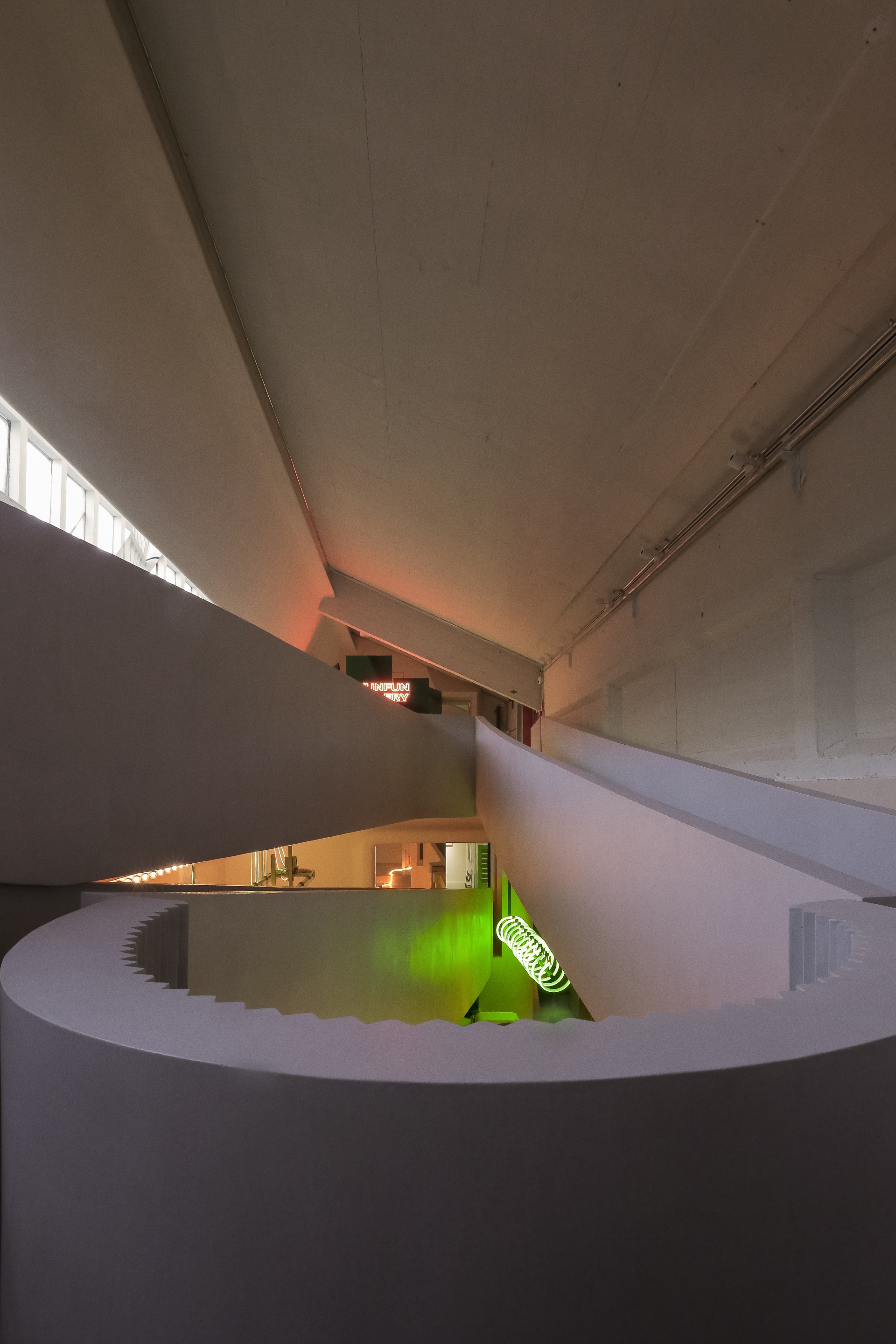
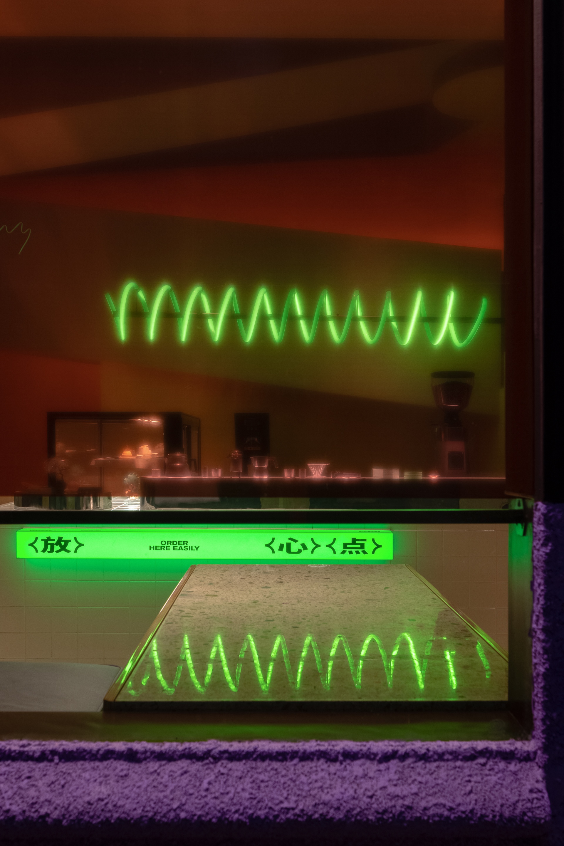
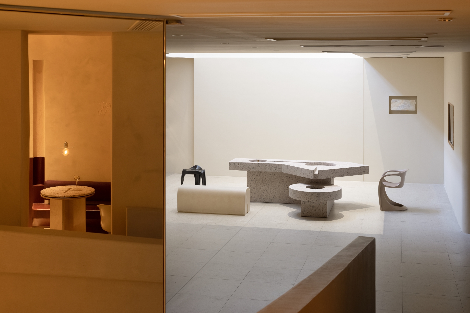
As the client requested more possibilities of spatial use, the project is positioned as an integrated exhibition space, available for various art and cultural exhibitions as well as creative markets by providing multimedia exhibition facilities and services, and also a unique cafe, which offers a gathering and socialising venue. As well, the client hoped to create more possibilities for the space's future operation and extension. Based on these diverse design requirements and the existing conditions of the industrial building with expansive trusses, the designers decided to take "folding" as the spatial design strategy. While retaining the magnificent structures of the original building, the design team defined new boundaries suitable to social relations in the current context.
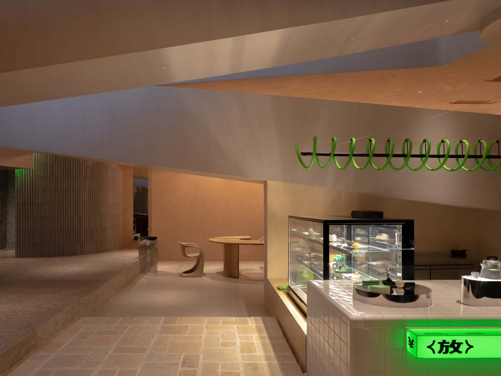
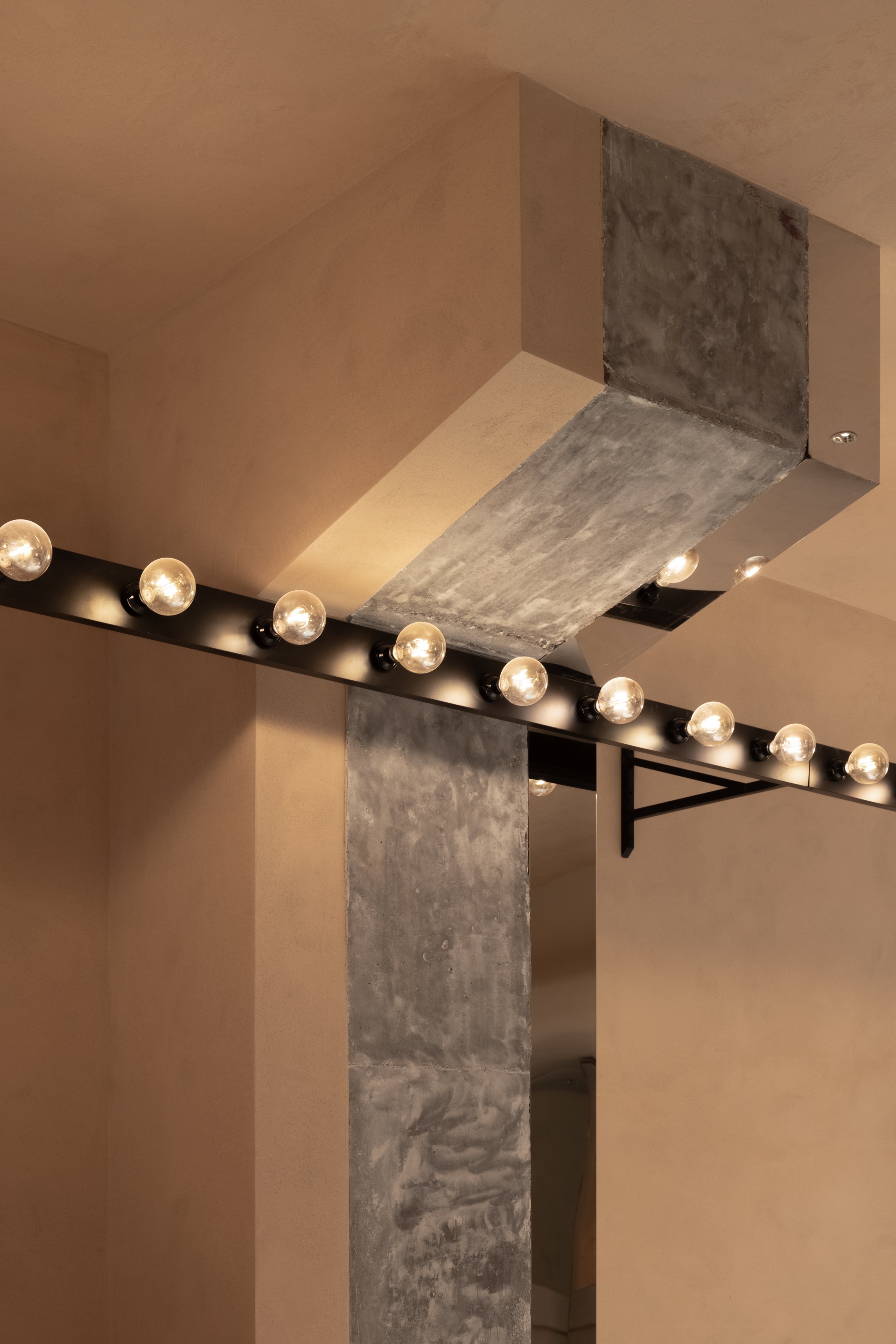
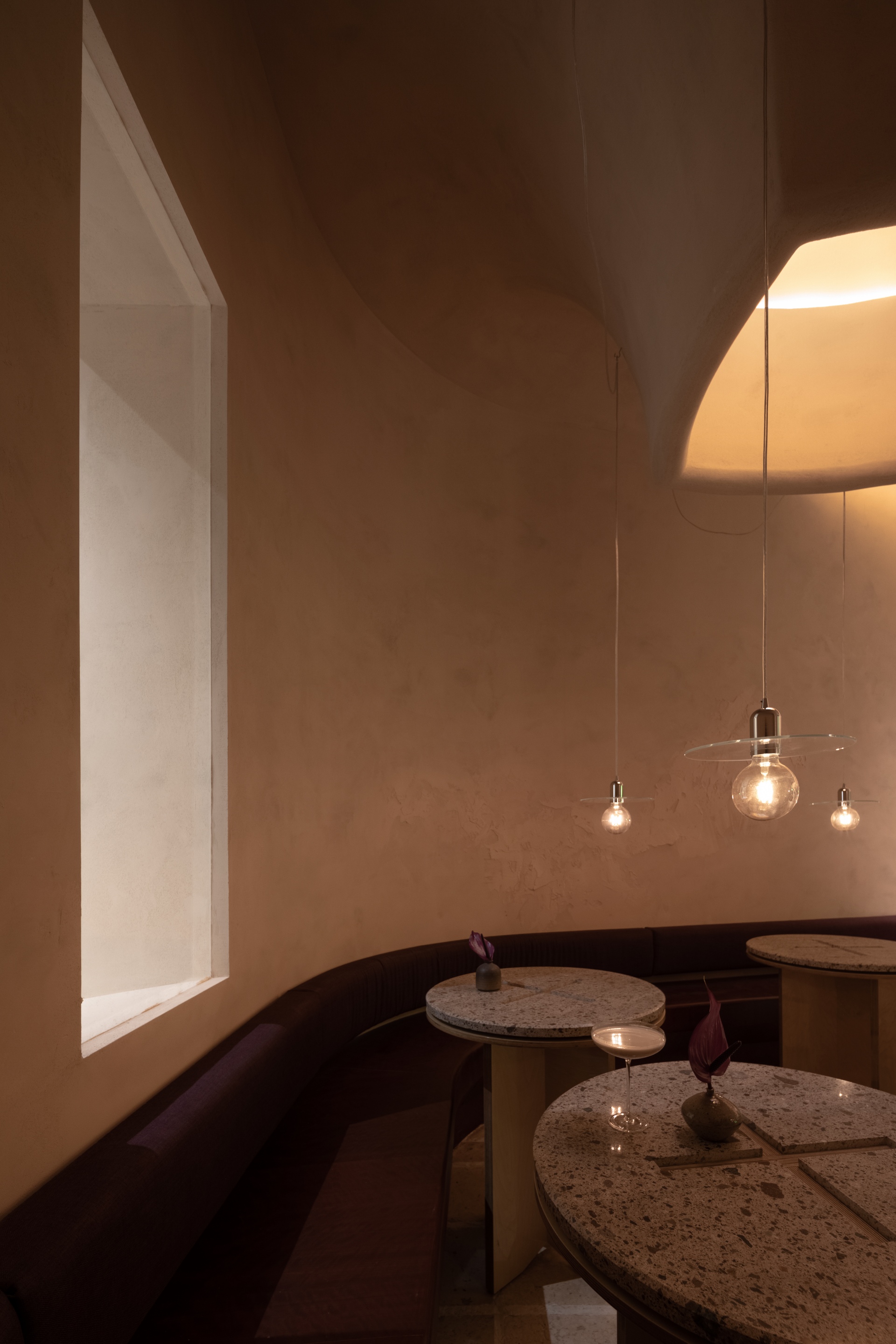
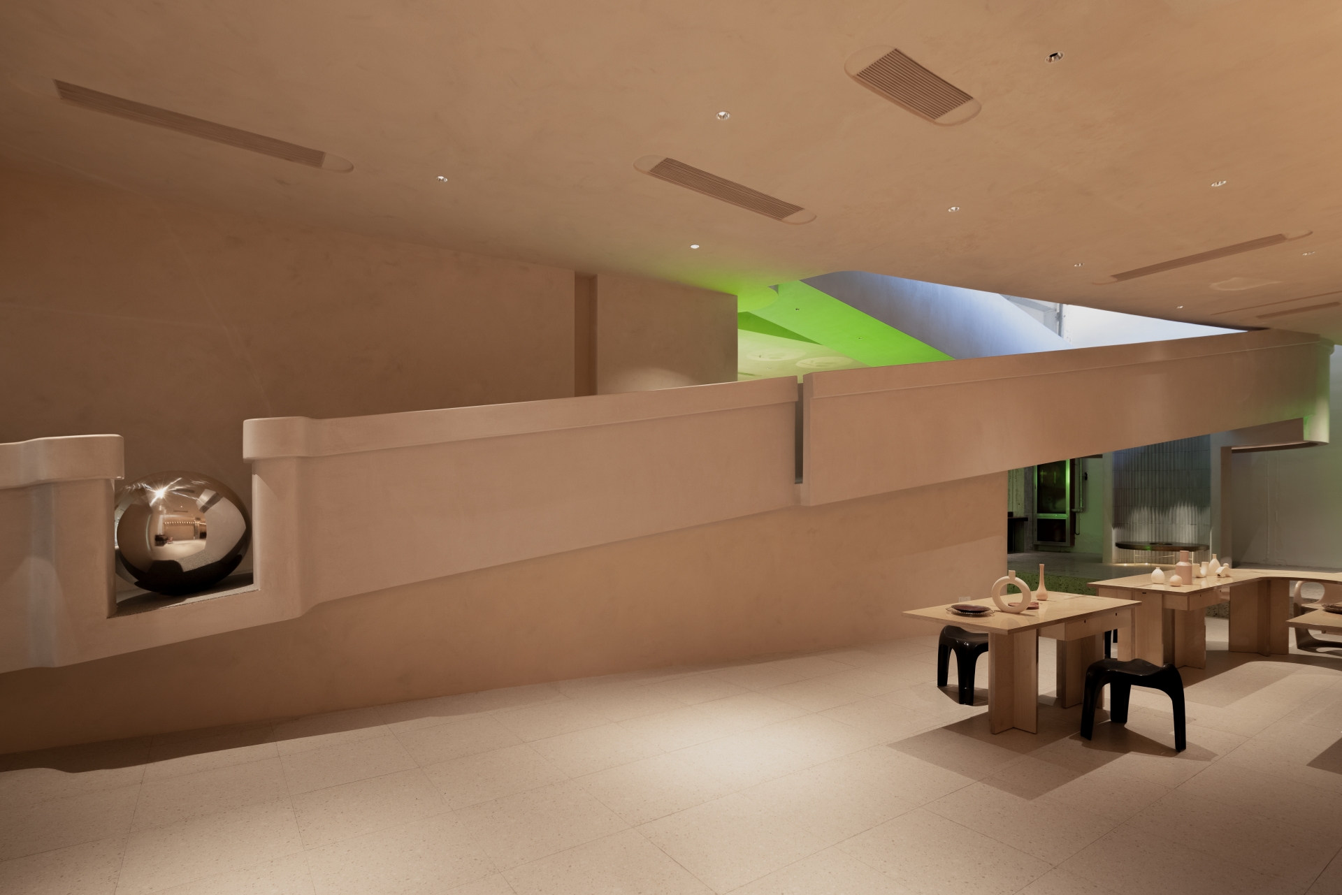
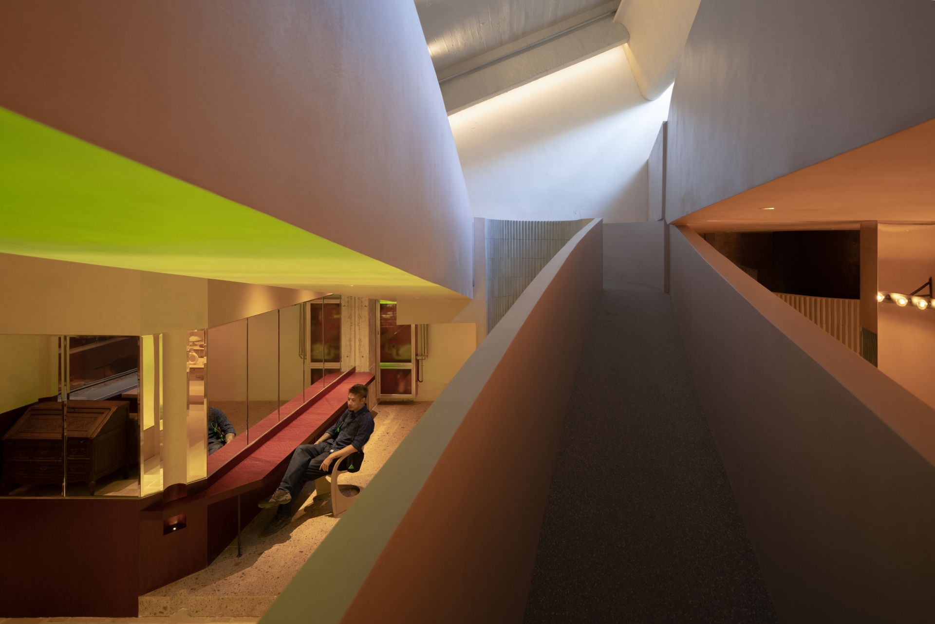
They have ensured that every folding treatment embodies meticulous detailing. The design team created varied folding patterns on the facade, and also incorporated folding forms to the metal door frame, the retro-style door and the green resin door handle. The threshold stone folds along the external wall, and the W-like pattern of the jade stone flooring also highlights the concept of "folding". Meanwhile, the proportion between the height and width of the original space made it lack a sense of depth. “Therefore, we inserted a curved folding ramp to dissolve the rigid framework of the original architecture and create varied experiences as people move towards the second floor,” say the designers. In almost every space, daylight peeks in and out, through the gaps of the structure, glowing through skylights, and serves as a warm interlude between top-and-bottom ramps. Overall, throughout the project, directional lines, powerful materials, contrasting hues and implicit elements have been all perfectly fused. Freely extending surfaces are supported by solid foundations. As such, various conflicting elements achieve harmony. These turning boundaries become a rational way to express emotions in the space and demonstrate the design team’s vision to perfection.
