

PODCAST
CHI WING LO: THE ARTIST WHO TEACHES US HOW TO LIVE AND ALLOWS US TO SELF REFLECT
LISTEN NOW


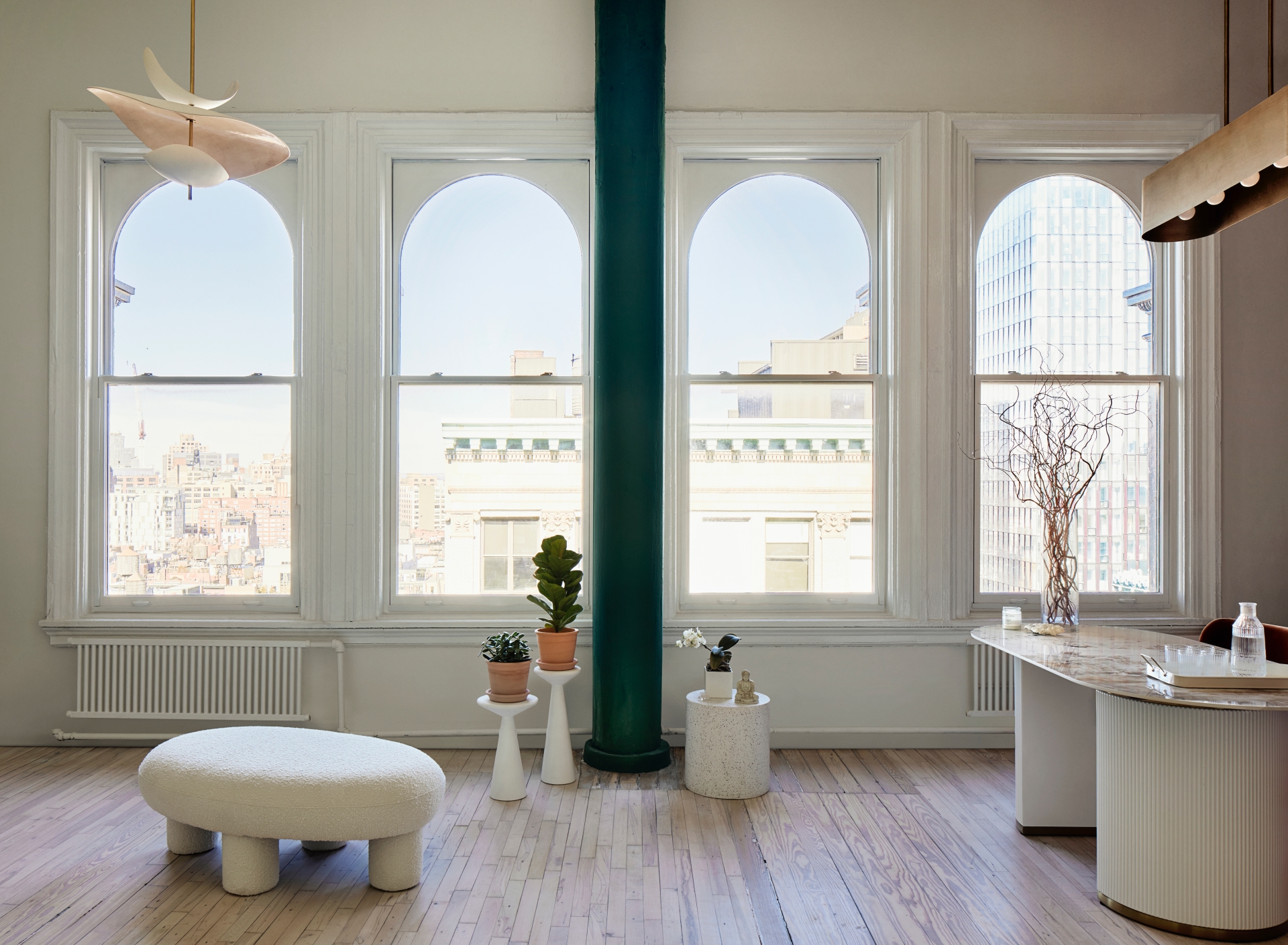
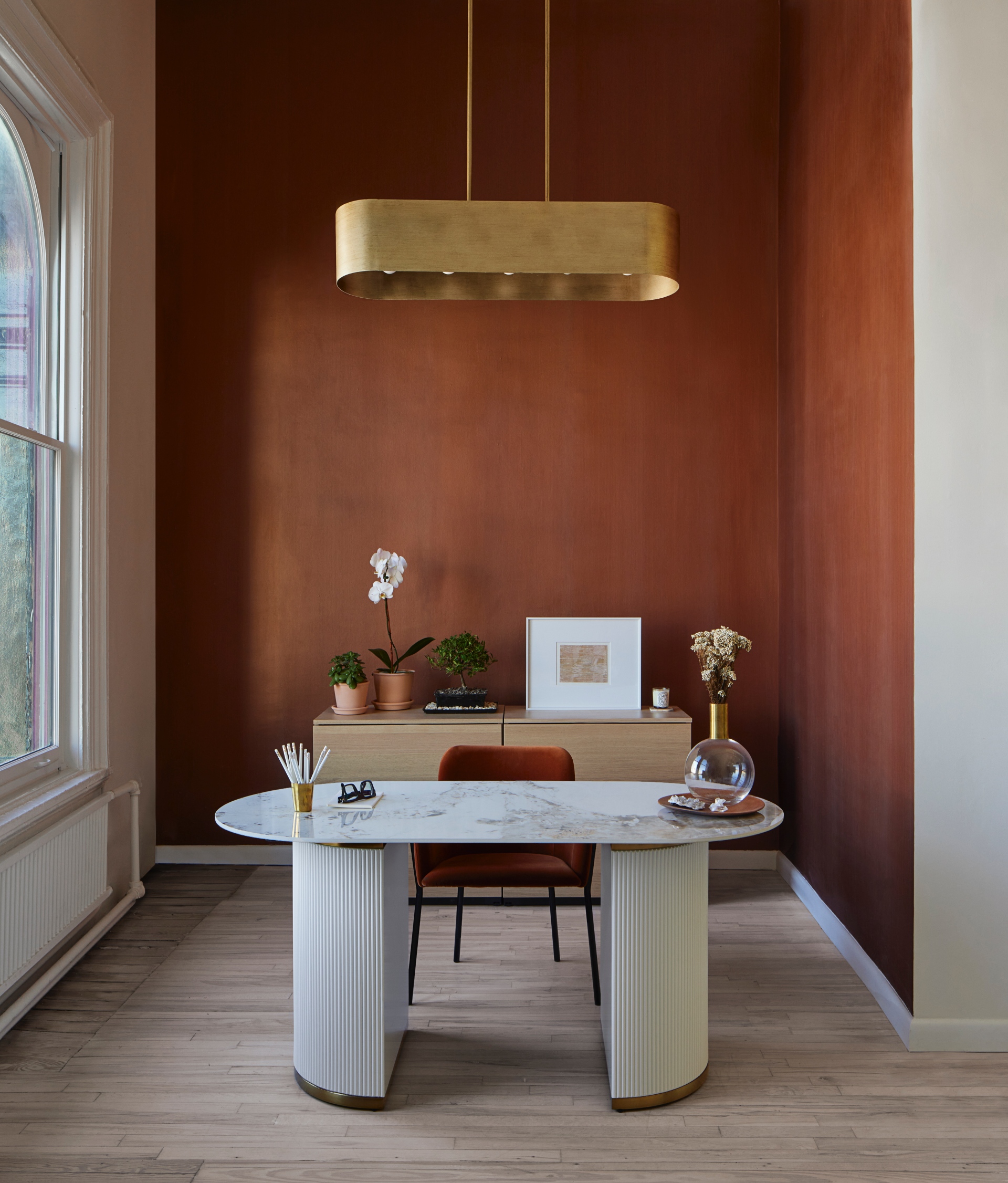
A striking oval skylight informs a new, softly curving atrium at the studio’s centre, from which treatment rooms radiate. Throughout, organic materials like light woods, stones, and ceramics complement a colour scheme of cypress green, copper, terra cotta, and peach, all chosen for their calming effects. Acupuncturist and integrative health clinician Lisa Sumption, founder of MOXI, approached FTA to update and reorganise the previously open-format space to accommodate a reception area, six treatment rooms, offices, bathrooms, a herb dispensary, and pantry. In response, the new plan uses existing apertures to arrange programs within the rectangular layout. At the street-facing front, an entry door opens into a large, flexible reception area lined with four arched windows that fill the room with light and reveal sweeping views up Broadway.
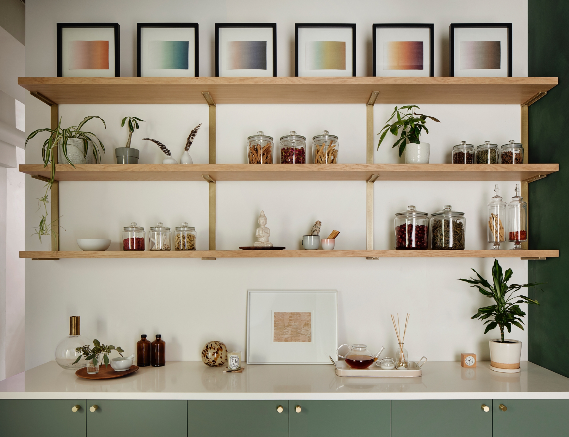
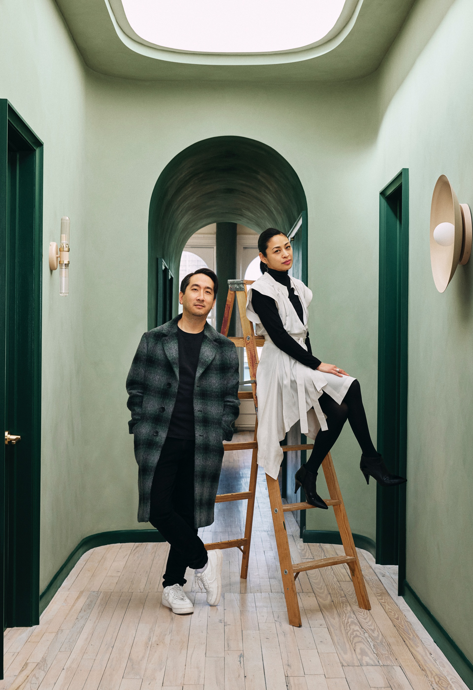
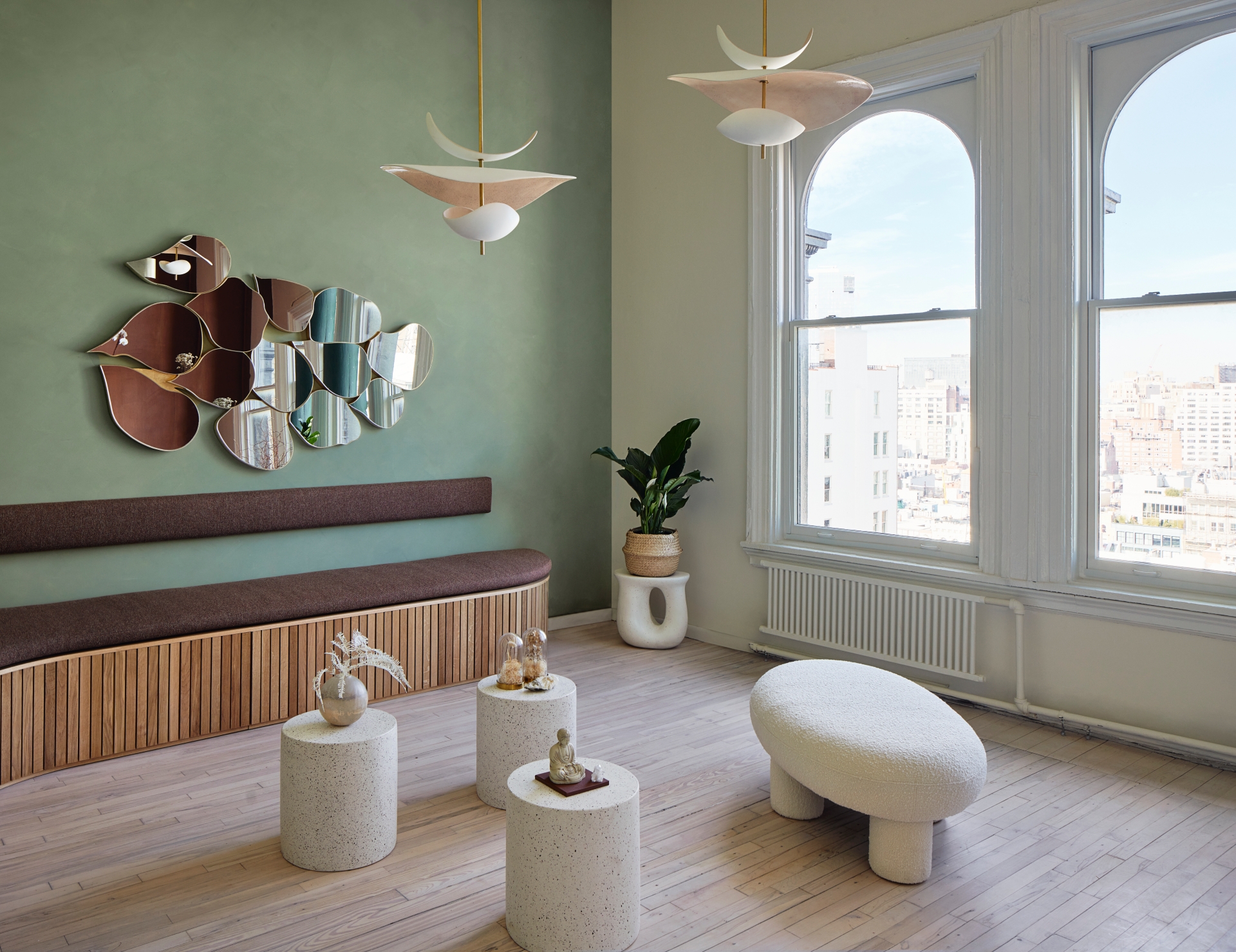
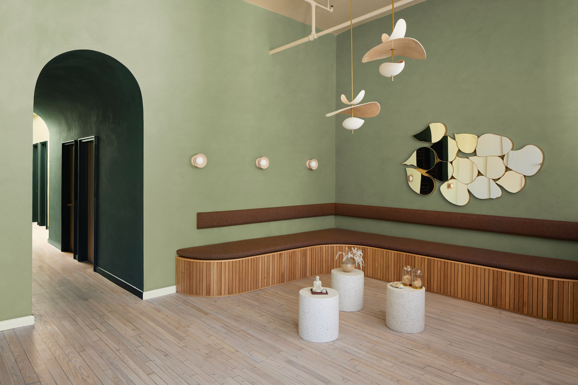
To maximise space and take full advantage of the natural light, this area doubles as a site for gatherings and classes. “Beyond the pragmatics and technical requirements of wellness treatment rooms, Lisa also wanted to provide a place of community, where people could gather, share knowledge, take classes, and build relationships,” says FTA’s founder and principal Frederick Tang. Here, a low-slung custom bench crafted from white oak slats and copper detailing curves along two walls. Floating above, handmade ceramic pendants by Elsa Foulon, sourced from France, and orb sconces, sourced from Greece, add warm layers of light. Other elements, like terrazzo side tables and plush seating in boucle and velvet, can be easily moved to make way for large classes and gatherings. Walls are lime-washed in a soft cypress green, with wainscotting painted in a darker shade of the same hue. Throughout, saturated passages of colour were inspired by the atmospheric work and colour theory of artists like Wassily Kandinsky, Mark Rothko, and James Turrell.
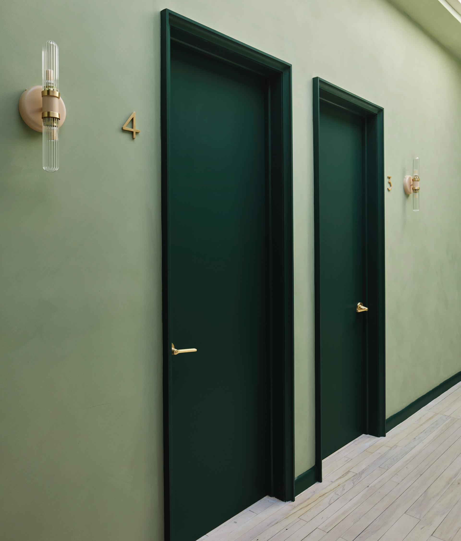
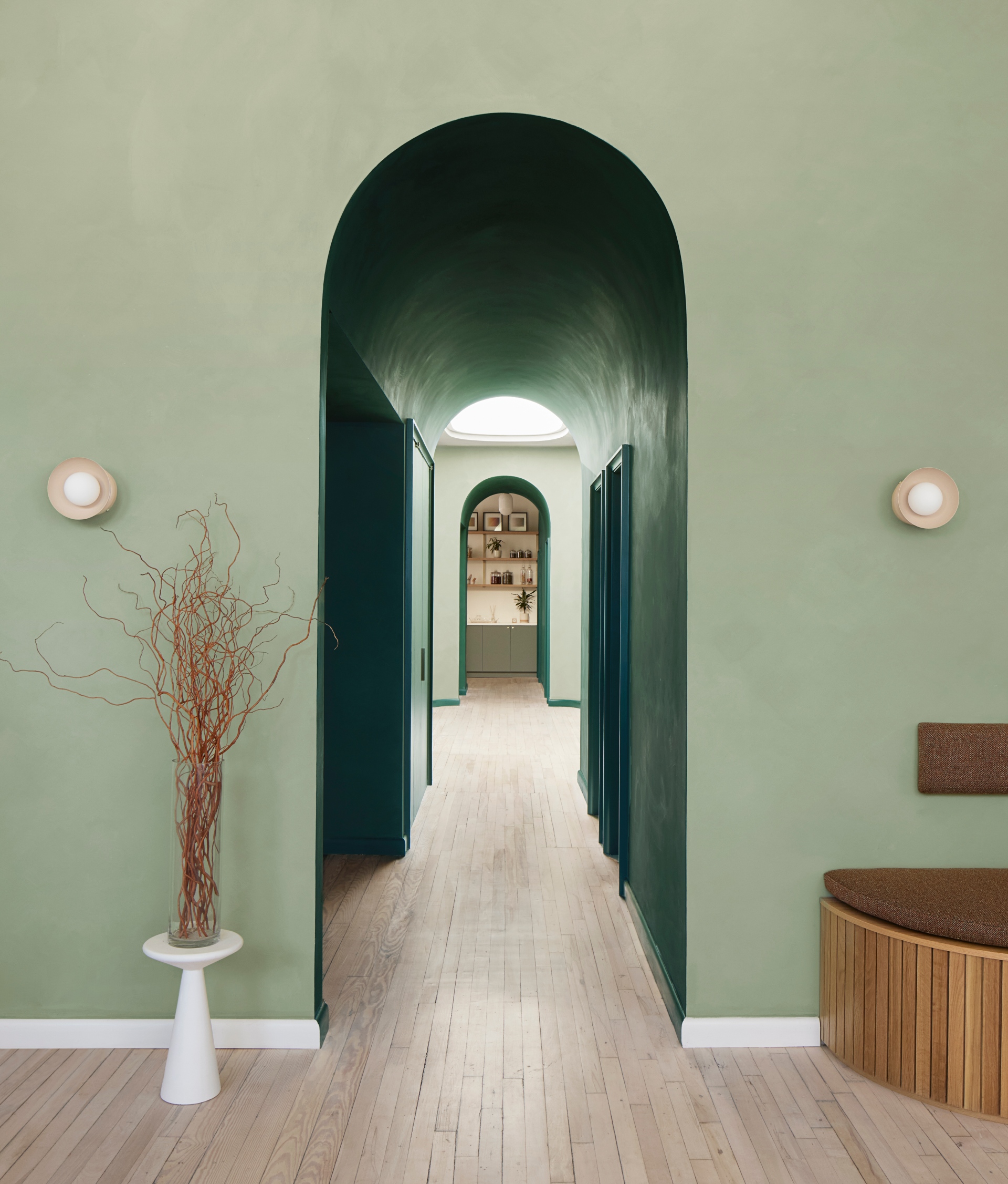
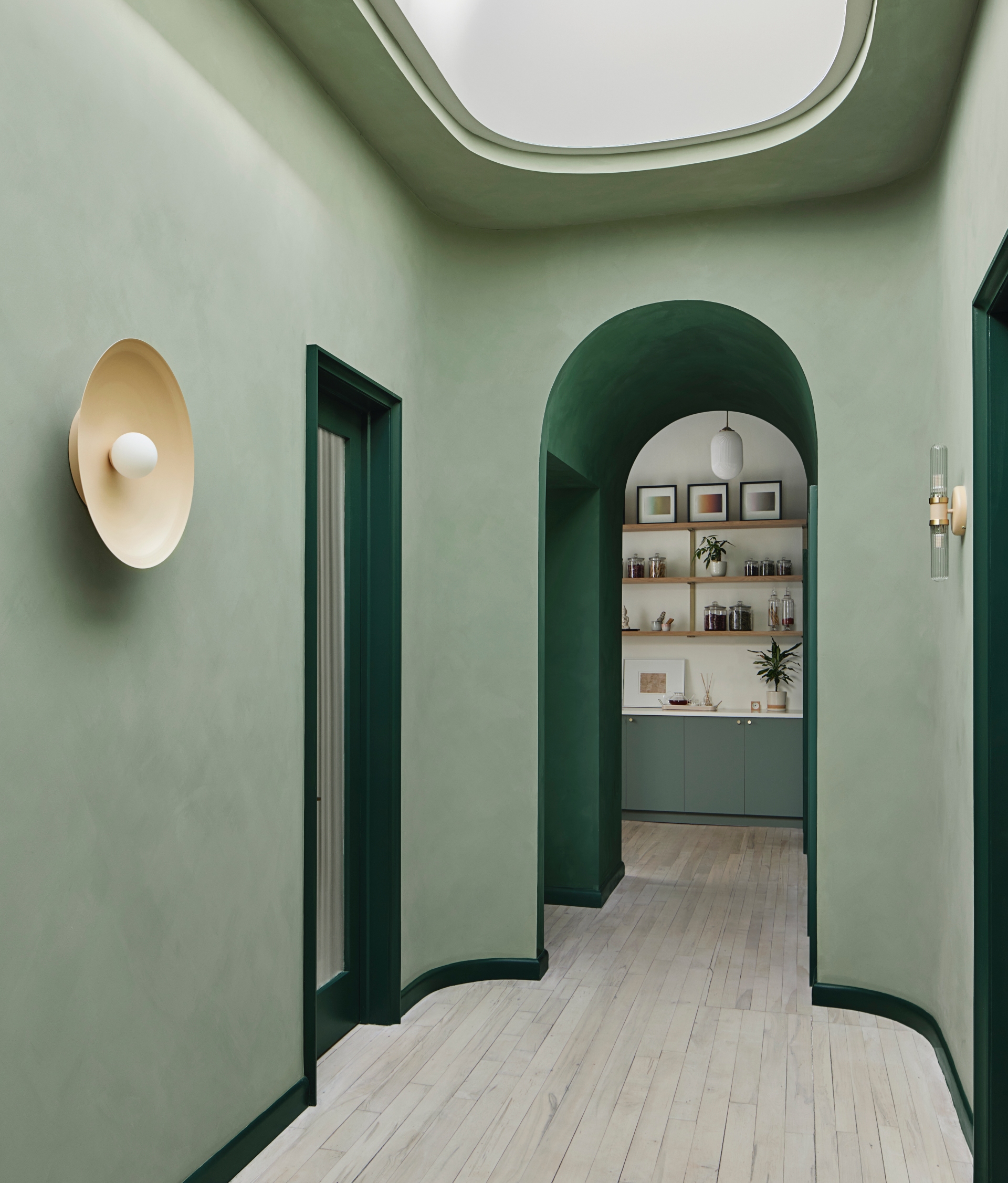
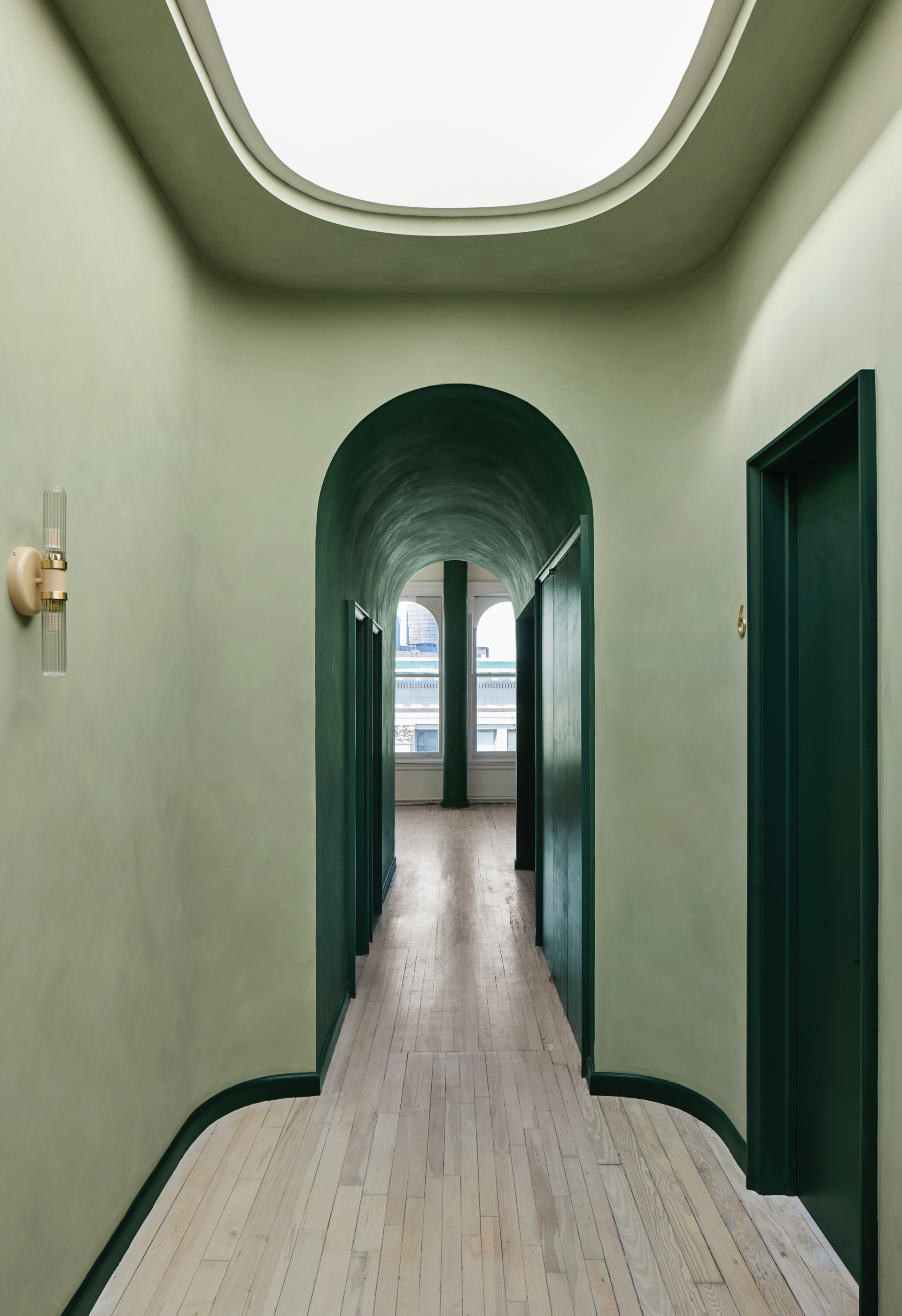
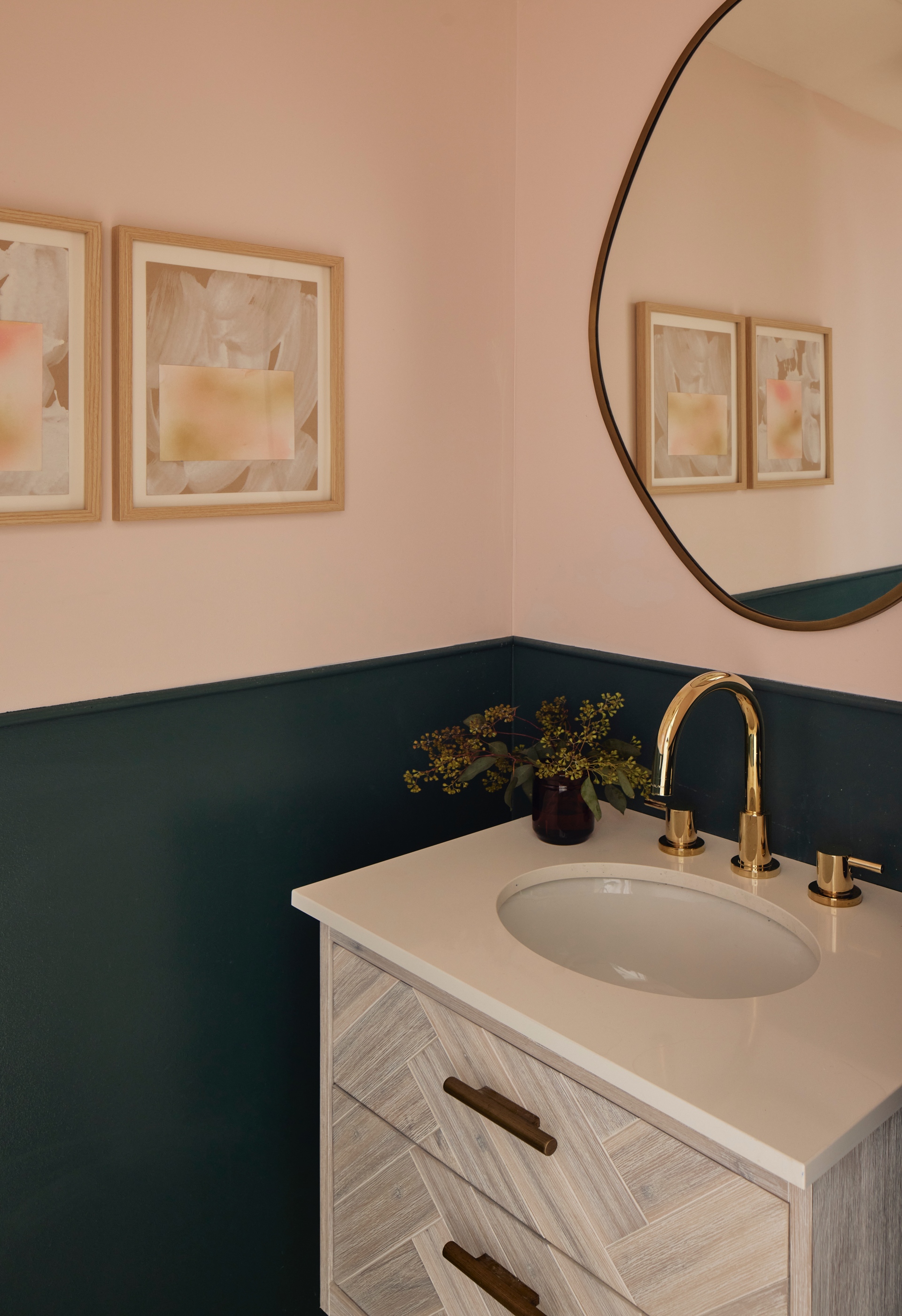
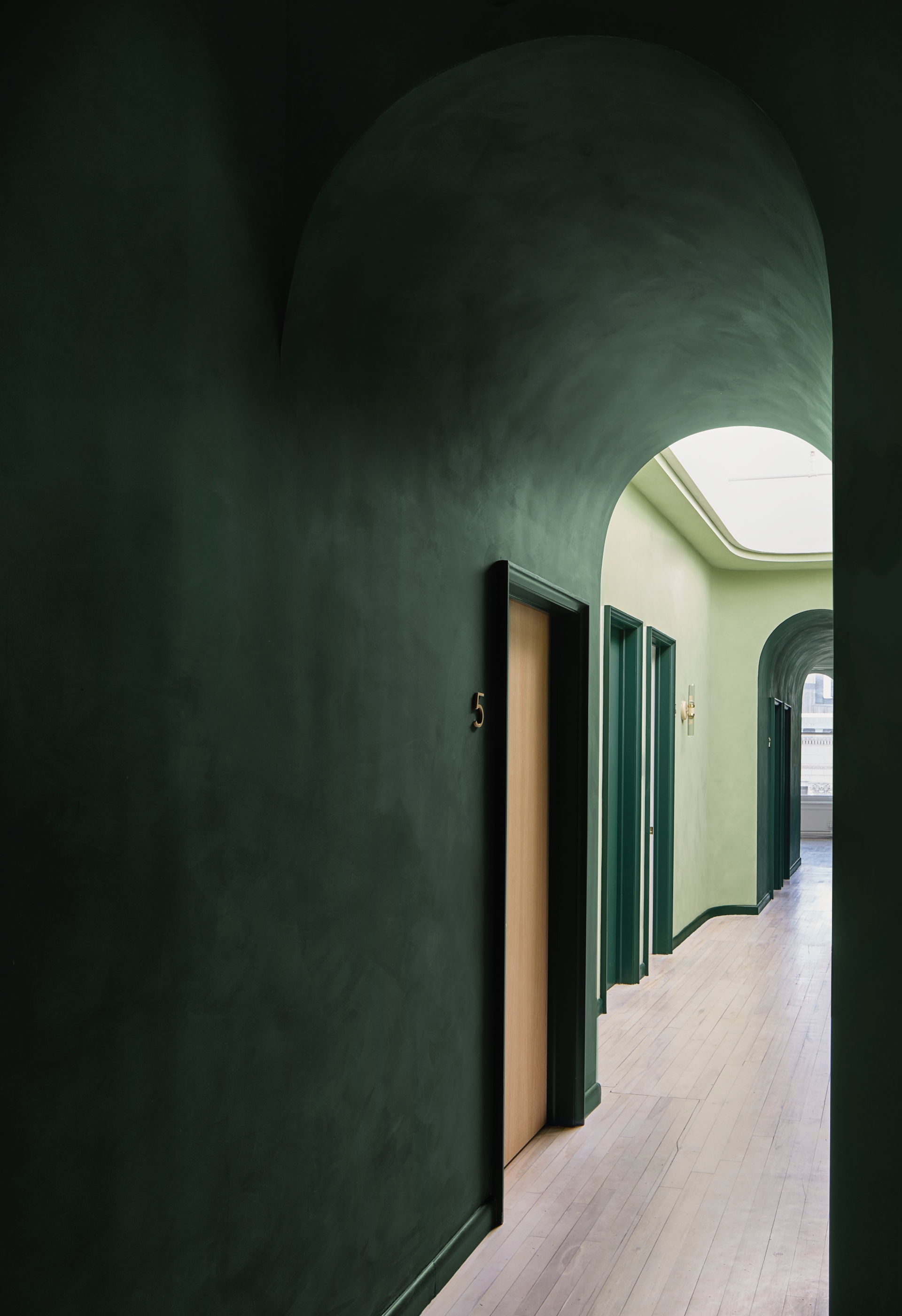
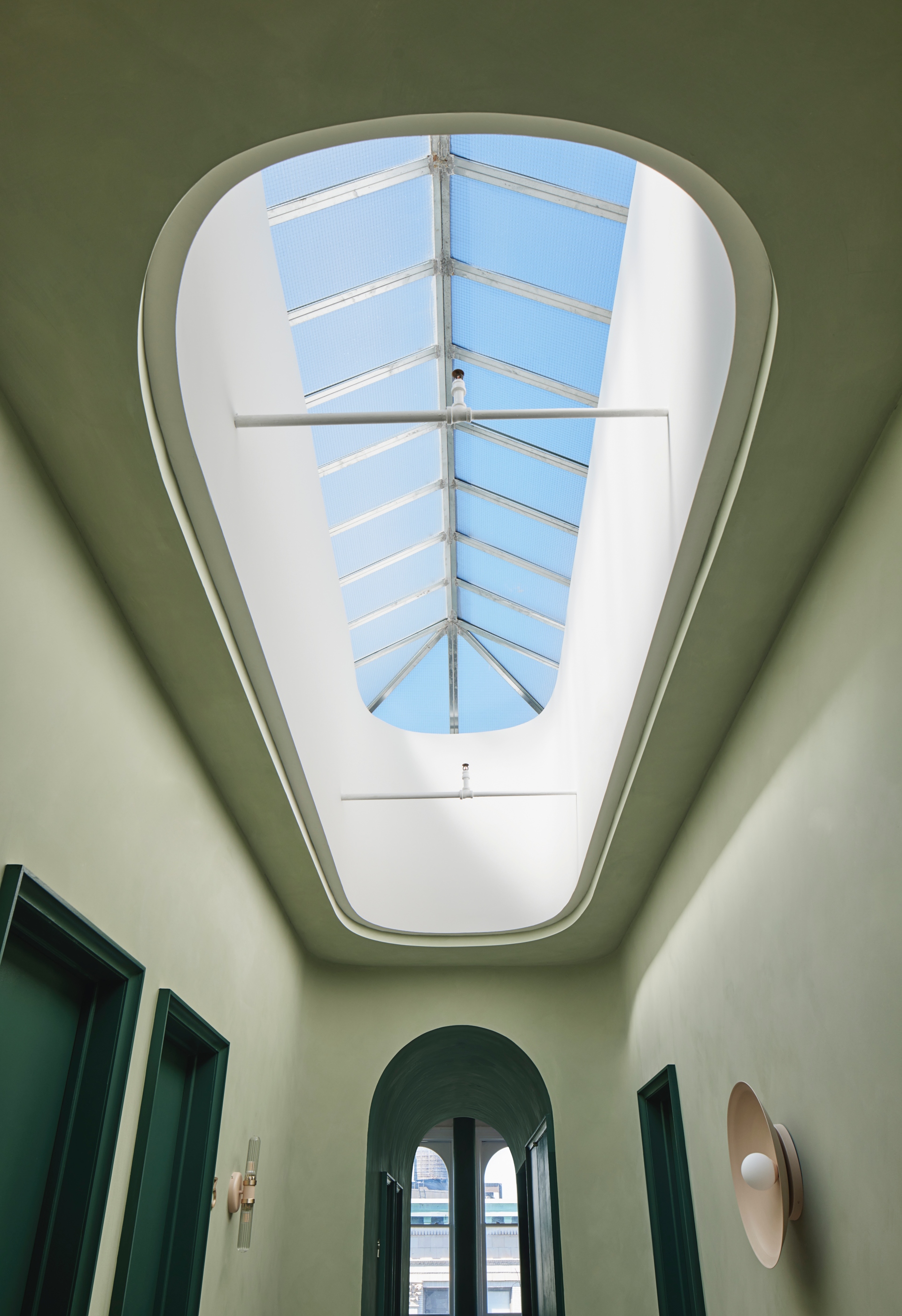
“Colour is powerful and we wanted to be strategic with its use,” says Barbara Reyes, FTA’s director of interiors. “The colour green became the palette foundation, chosen for its ability to heal and create balance for your mind and body. A darker version of the green lime wash in the barrel vaulted halls was utilised to create intimacy for the patron - a transition before heading into treatment.” A long, wide corridor extends from the reception via an archway that mirrors the front windows. Painted deep green, the colour shift - from light to more saturated - indicates a movement toward more intimate spaces: individual treatment rooms extend from either side of the hall. Uniquely, the corridor remains washed in natural light thanks to the original skylight above that rises through its middle; this serves as the nucleus of the space, from which all rooms radiate. “We turned the area below the skylight into a widened hallway, which we see as an atrium or courtyard around which the other programs are organised,” says Tang. Taking a cue from the skylight’s rounded form, FTA also softened the hallway’s corners and, in turn, the space’s overall geometry.
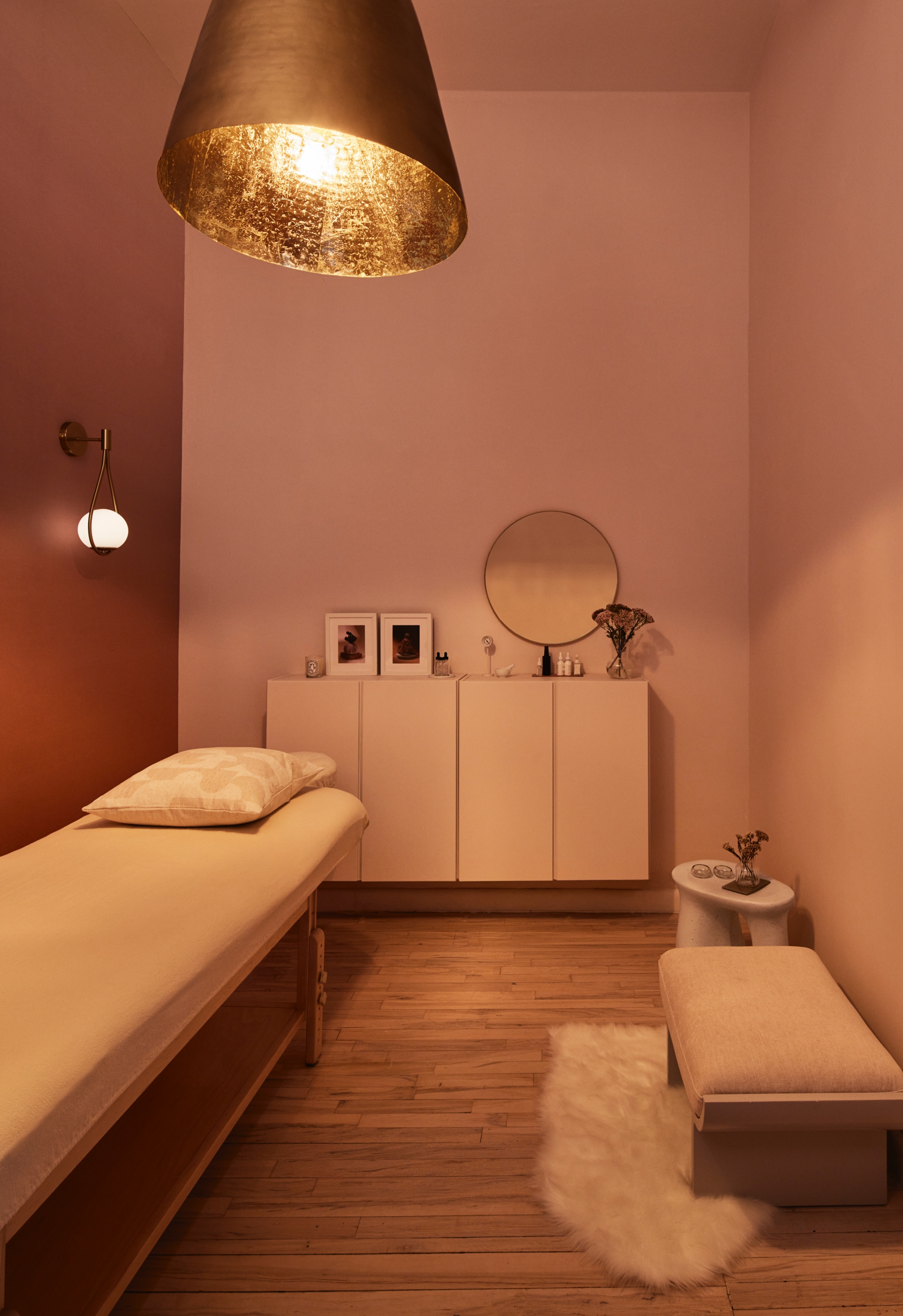
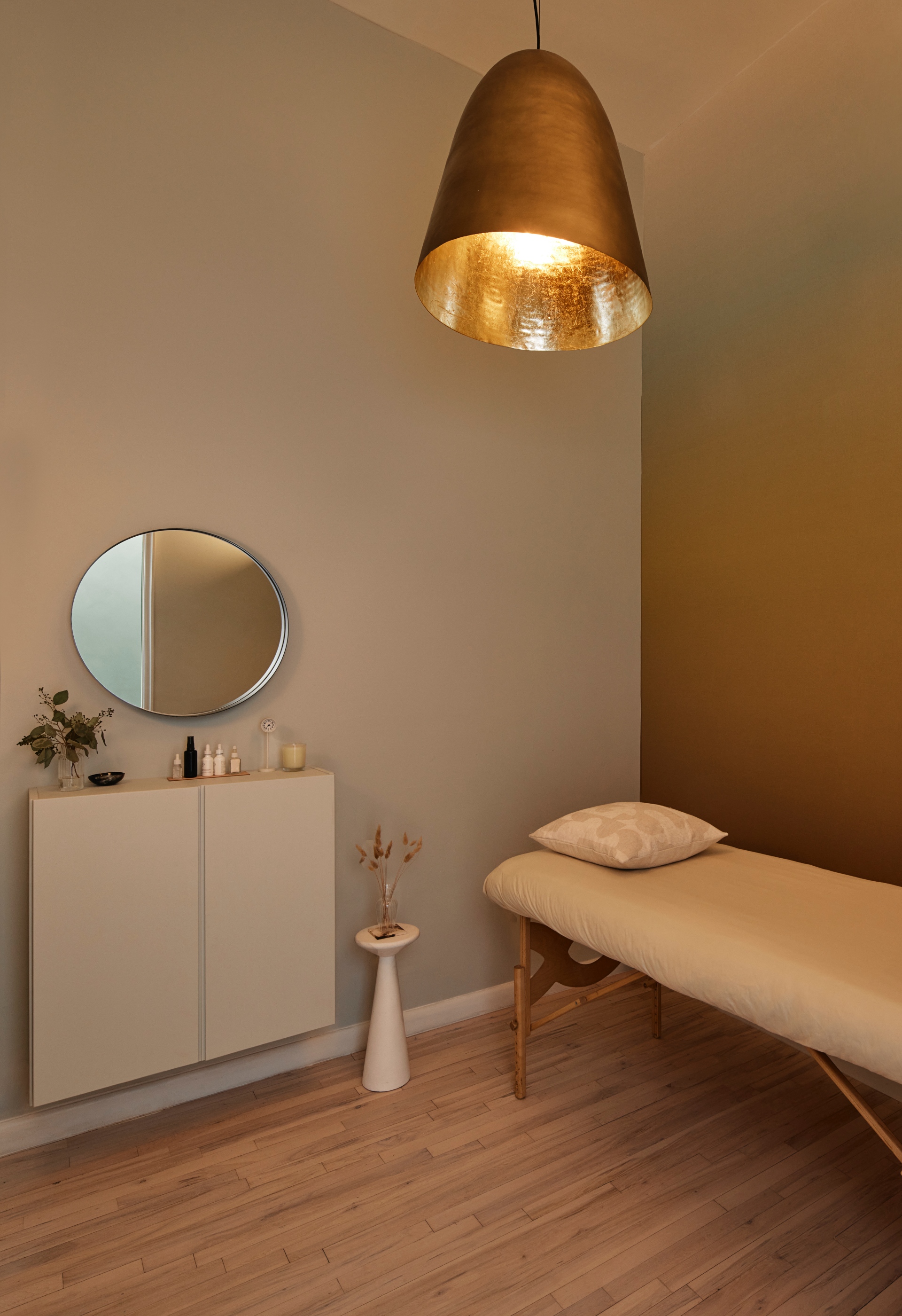
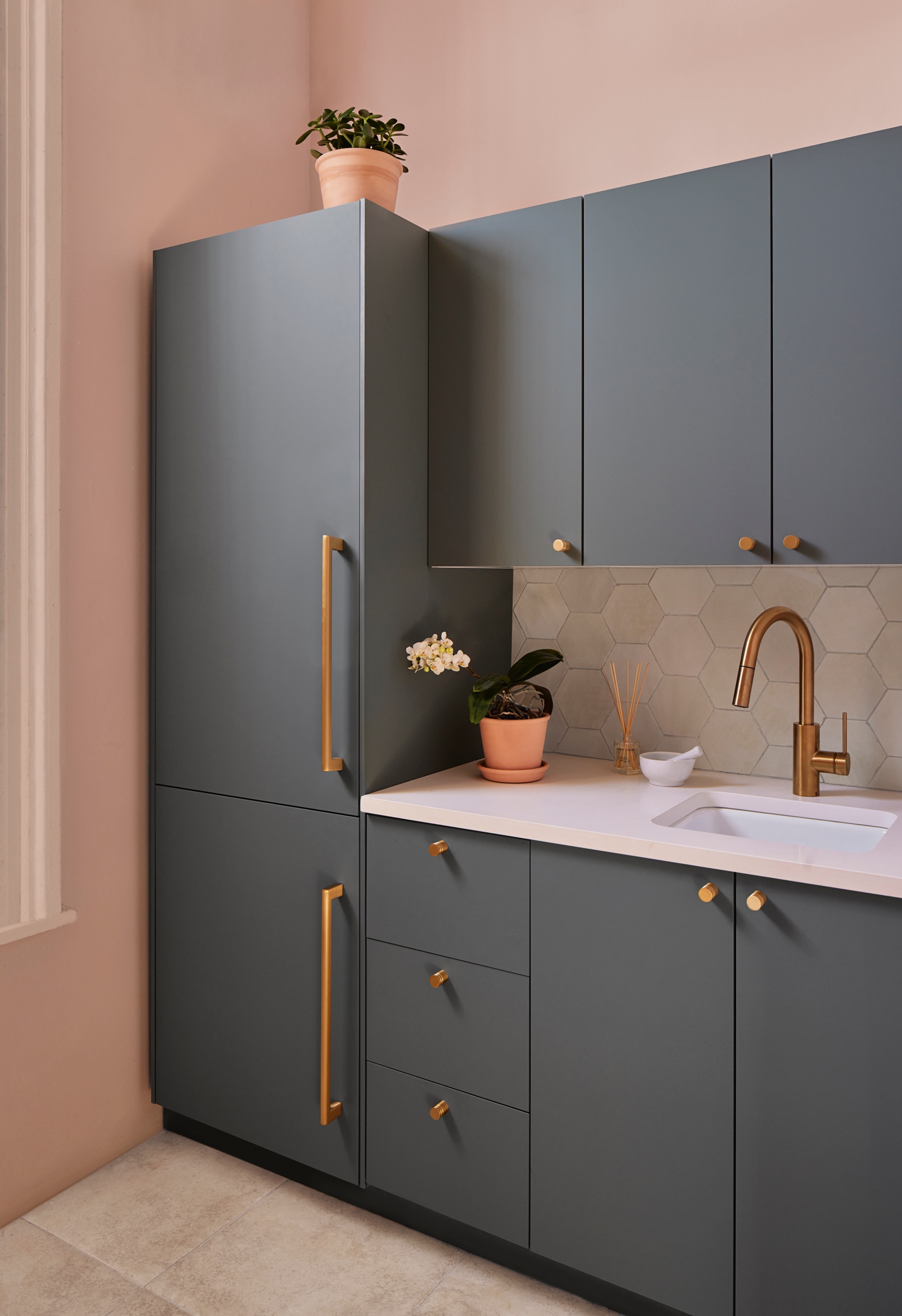
Similarly, treatment rooms use soft, immersive washes of colour to indicate the program. Each receives a different gradient wallpaper that aids wayfinding (“make your way to the peach room”), personalises experiences, and points to personal transformation (from dark at the bottom to light at the top). “The gradient wallpaper is perfect for the treatment rooms because it signifies transformation,” says Reyes. “The wallpaper’s darkest point was placed at the floor base and the lightest point towards the ceiling, creating a colour ascension from terracotta to pale peach or deep purple to pale pink, for instance. Plus, its slight iridescent quality offers a shimmer of light.” At the corridor’s rear, a second archway opens into a back-of-house zone, where FTA has inserted a new office, herb dispensary, staff pantry, and bath. The existing kitchen was given a facelift with cabinets in a soft, desaturated green and a shimmering, hexagon tile backsplash whose colour evokes sea mist. Elsewhere, pale pink accents signify good health, according to colour psychology, while pale peach offers warmth and a sense of calm.