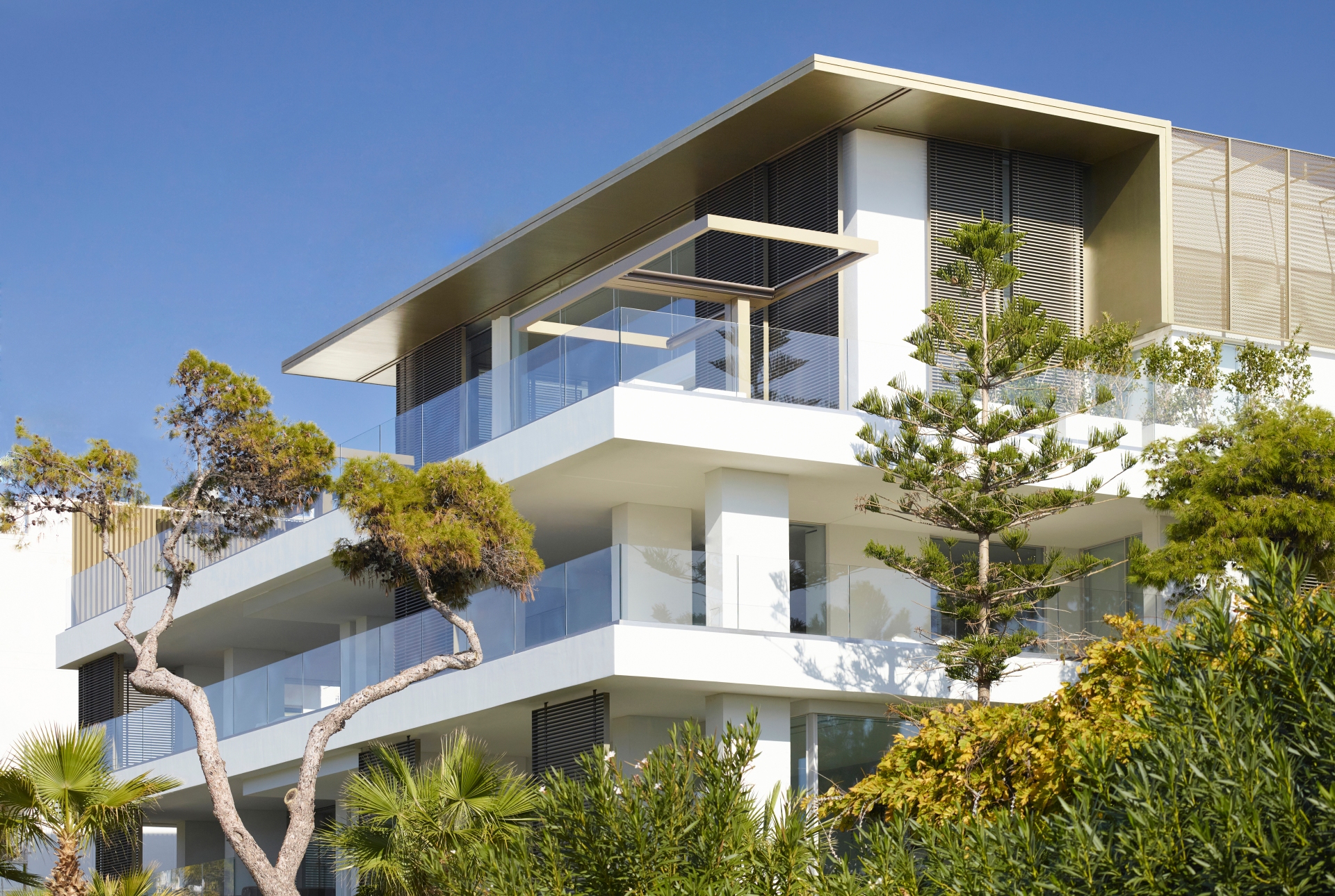
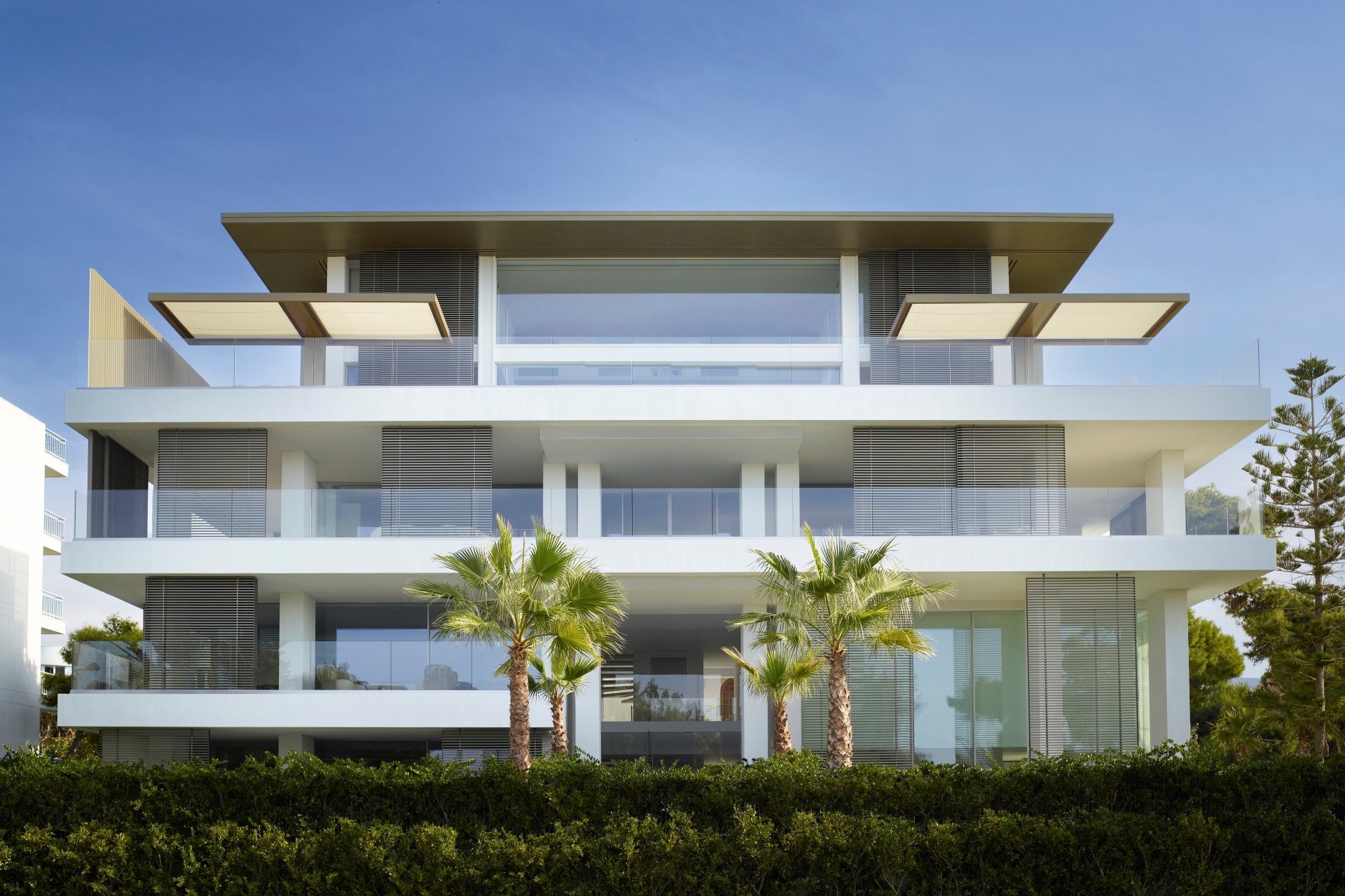
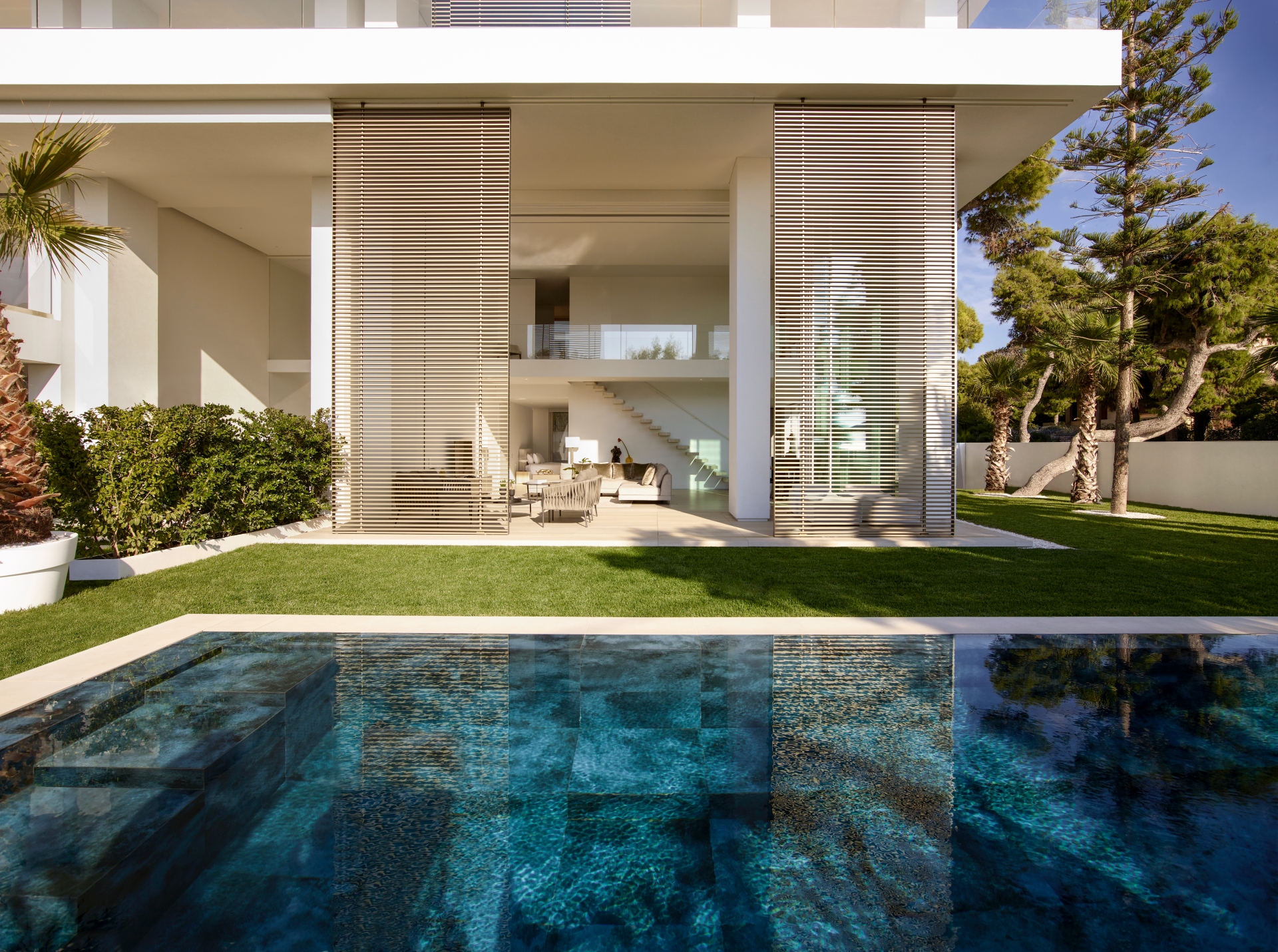
The building occupies a corner site on the frontline of the promenade overlooking one of the local beaches. Comprising four apartments located on either side of a triple-volume arrival hall, this provides access to landscaped gardens with twin swimming pools to the front. A double-level penthouse spans the width of the podium on the upper level, set back from the building’s edge. The front of the building presents a layered approach with expansive glazing, recessed columns and moveable screens that moderate the bright maritime light and provide privacy while allowing the interiors to open to the views. Meanwhile, the rear of the building presents a contrastingly solid facade with puncture openings to shelter itself from its neighbours to the side and behind. The front facade design emphasises the play of horizontal and vertical planes. Crisp white finishes and almost classically symmetrical proportions of the building reflect a contemporary architectural approach rooted in the climatically appropriate local Mediterranean tradition but expressed in a language of timeless minimalism. In the penthouse, the architects have used a minimalistic approach and the language of simplified plains and voids into the interior.
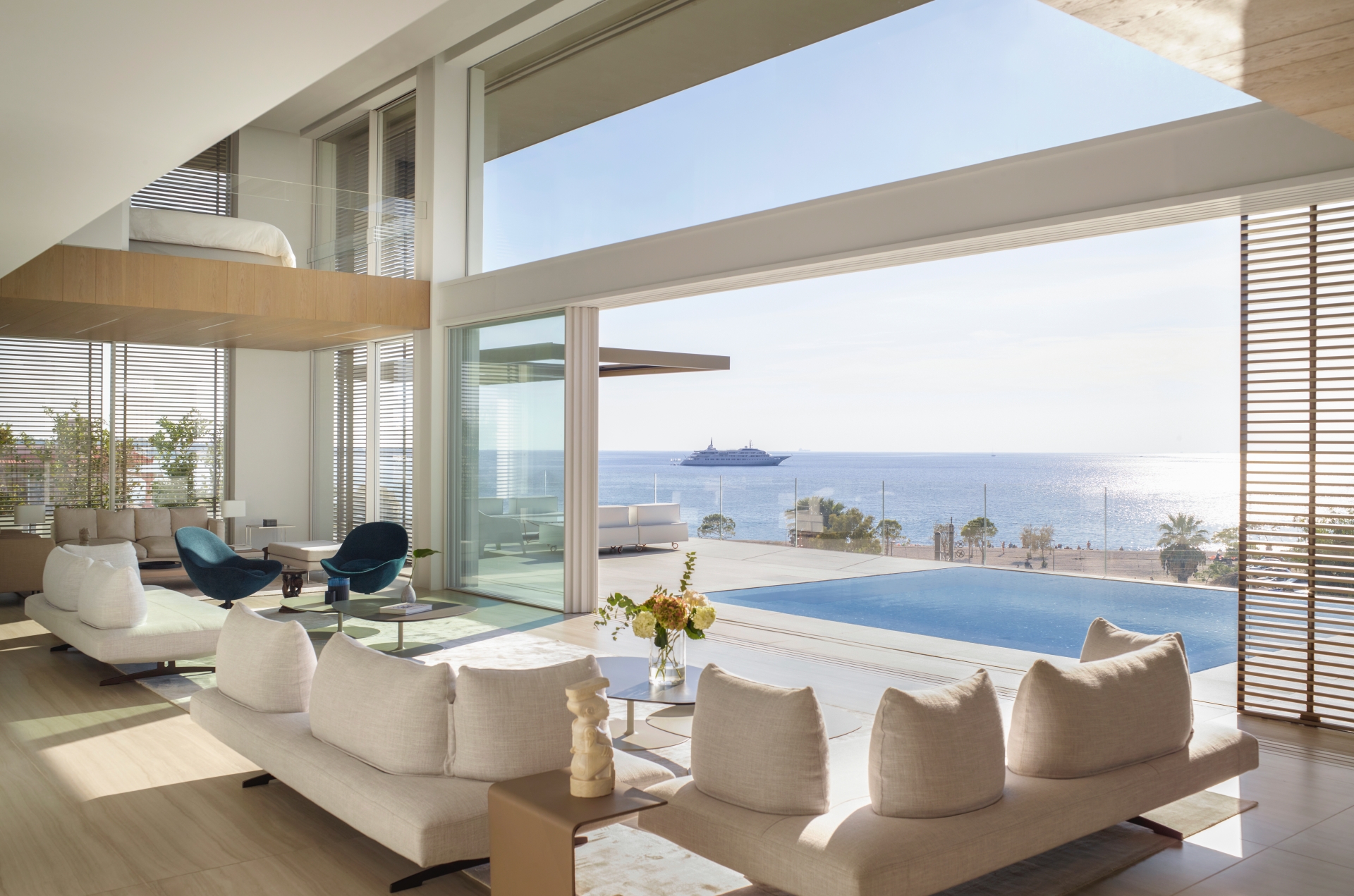
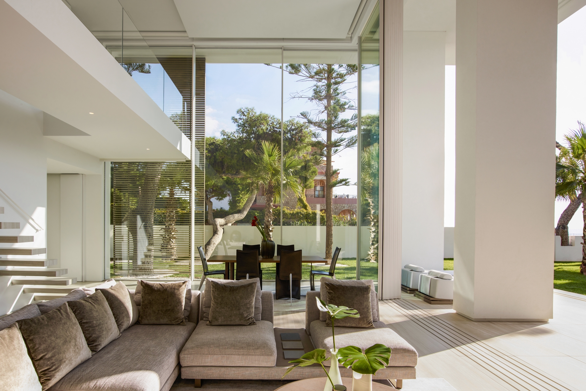
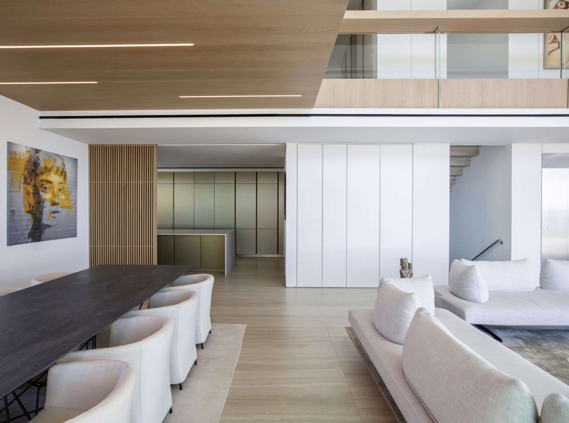
SAOTA and ARRCC’s client sought a versatile apartment that could easily accommodate large social events and also provide a sense of intimacy when there are no guests. As well, he also required a gallery-like space that could accommodate and display artworks. In response, the penthouse centres on a large, central volume which acts as the principal living space and gallery. Its volume responds to the scale of the views, while double-volume motorised glass sliding doors and moveable screens pocket away into the walls, blurring the distinction between inside and out. Simple, considered volumes and proportions are arranged around this central volume, while the large horizontal spans maintain a sense of lightness in the architecture. The living areas represent a sophisticated interplay of solid and void elements, with interconnected planes that ‘slide’ through one another and intersect, borrowing space from each other while creating unity and coherence. Functions are intuitively defined and enhance the ability of the various spaces to provide distinct experiences.
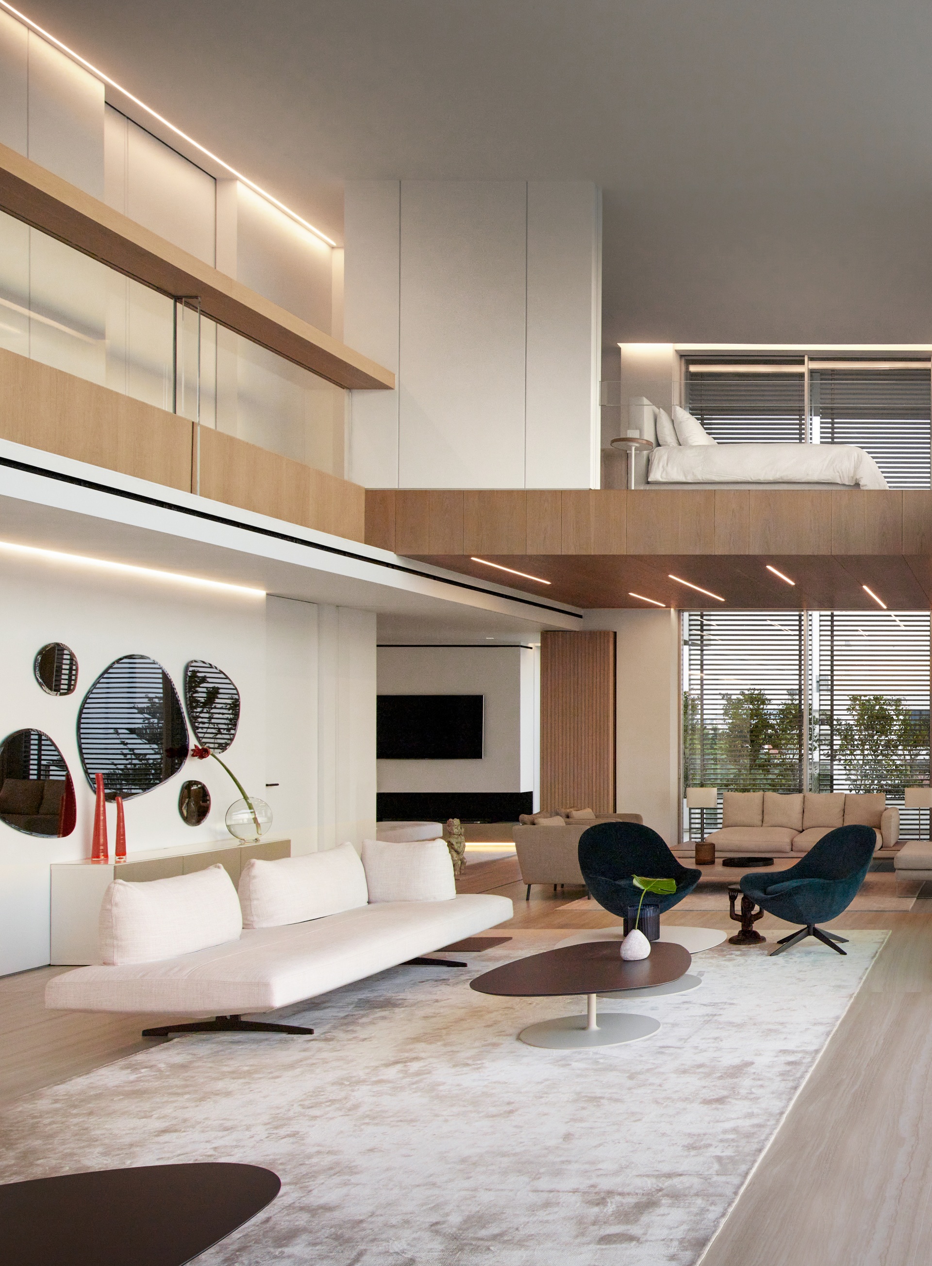
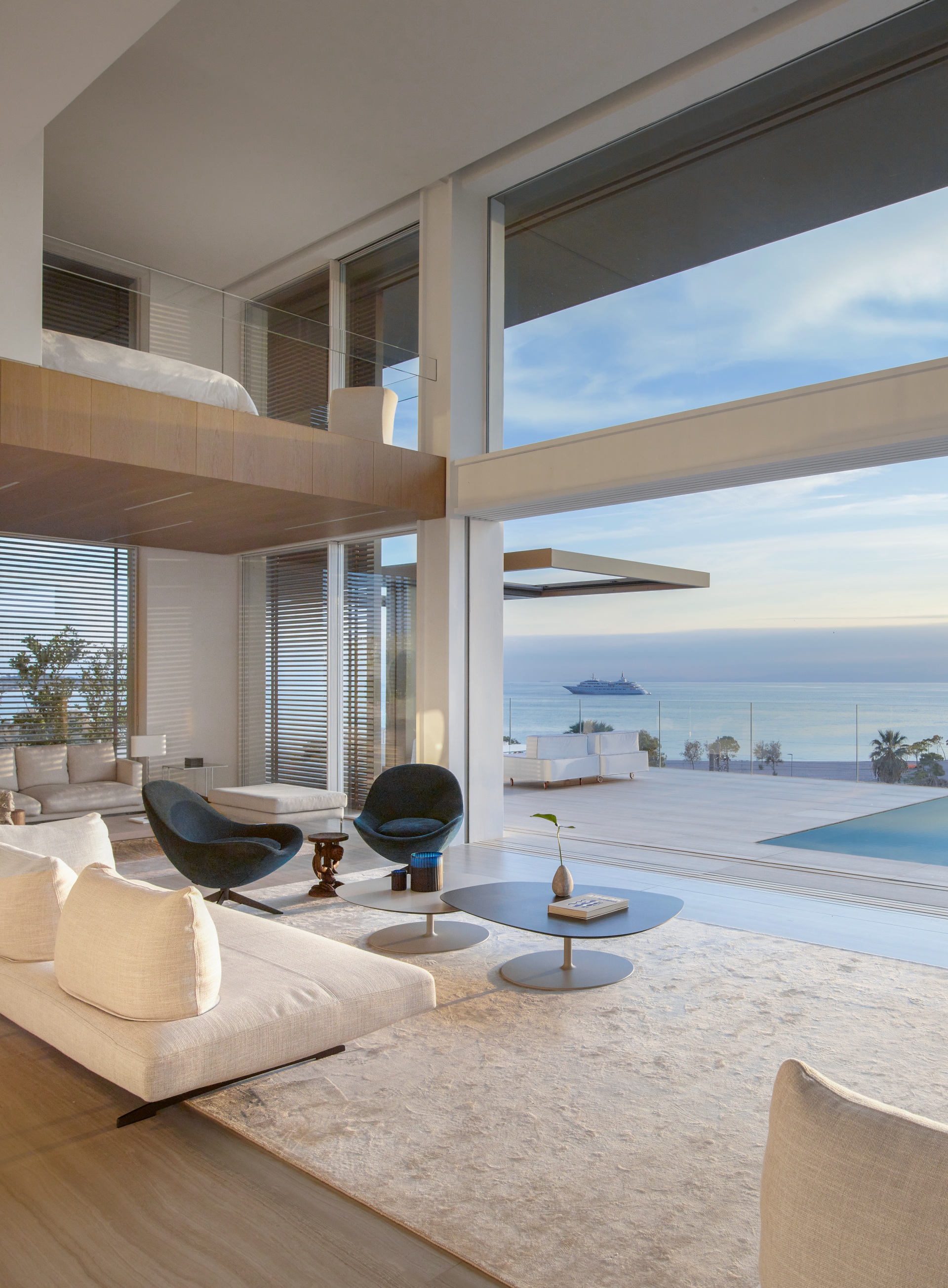
The lounge and dining areas are tucked away on either side of it to create more intimate social spaces. A kitchen is located behind the dining area, with the option of being screened off and an extra family room/spare bedroom is accommodated behind the lounge on the other side. The bedrooms are on either side of the double volume on the upper level. Sliding door panels set into cavity walls make it possible to open the upper level so that the overall space can work as one without internal divisions between the upper and lower areas but can be enclosed for privacy.
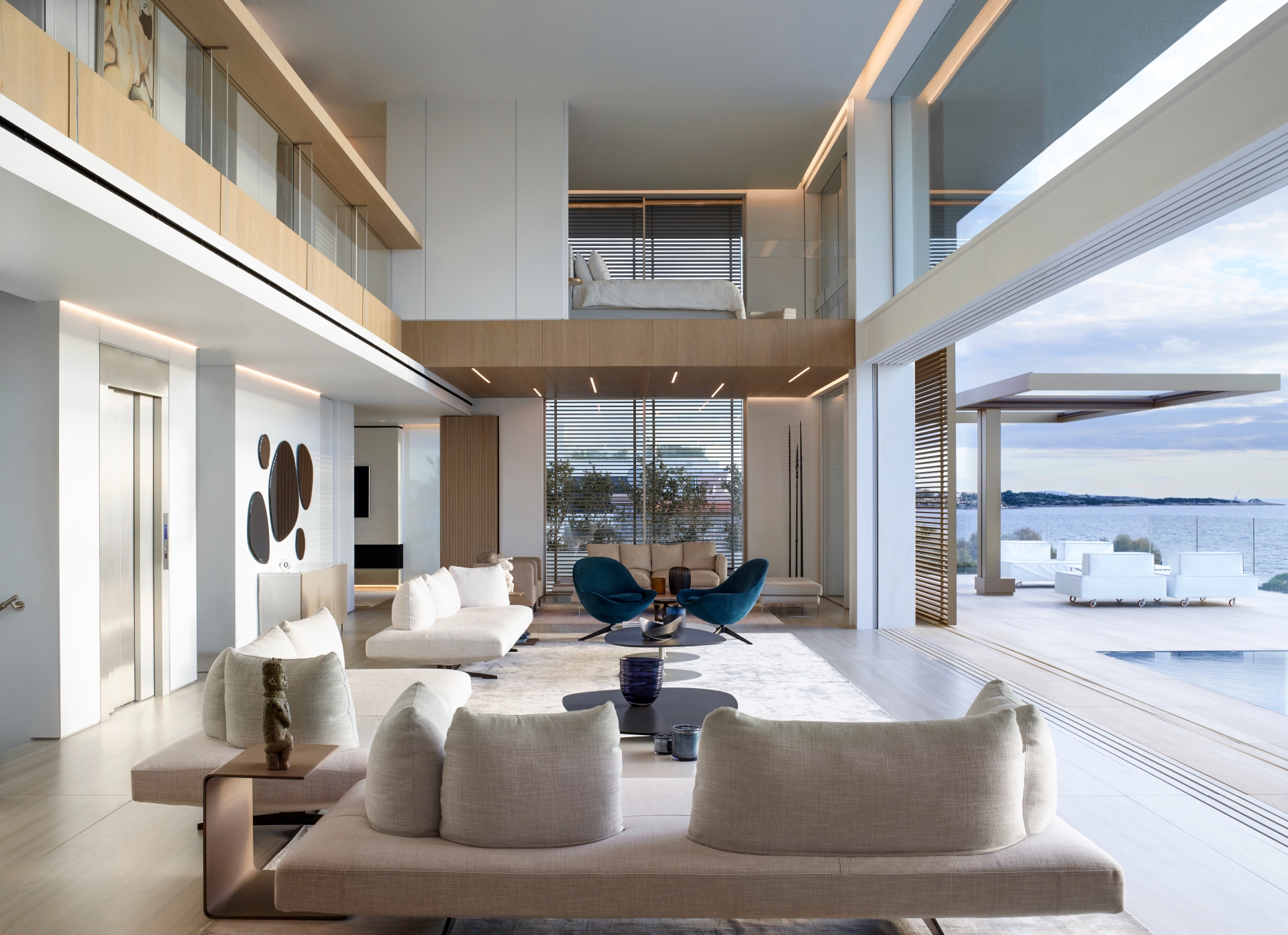
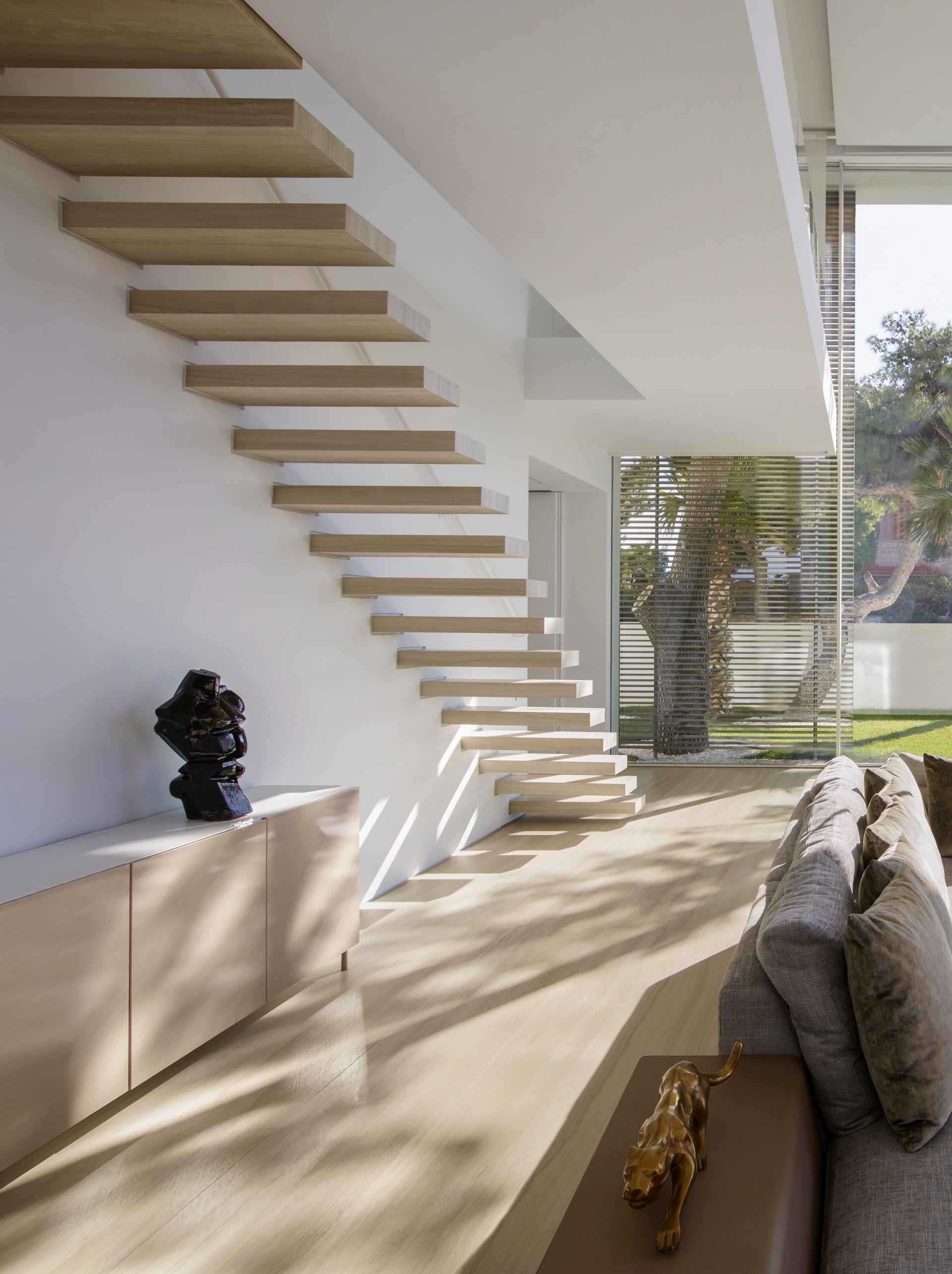
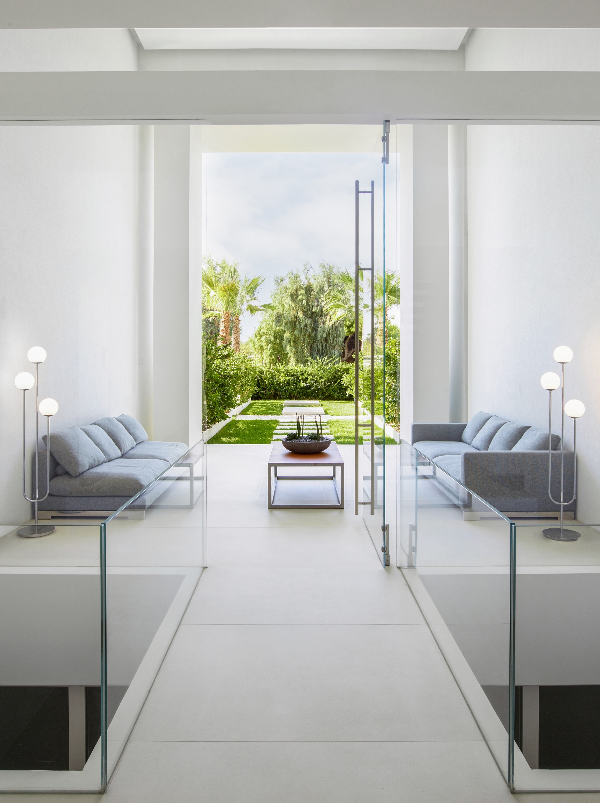
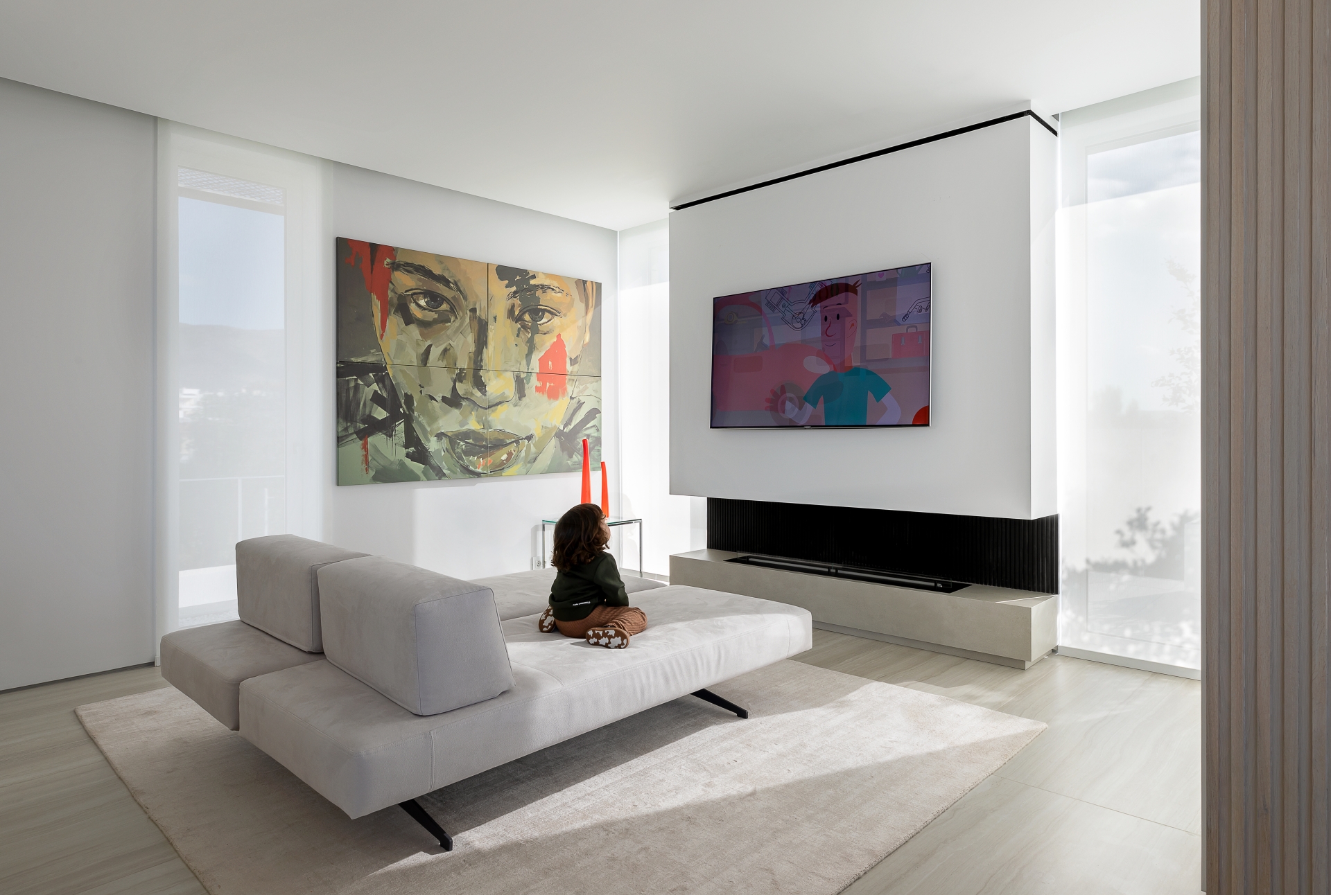
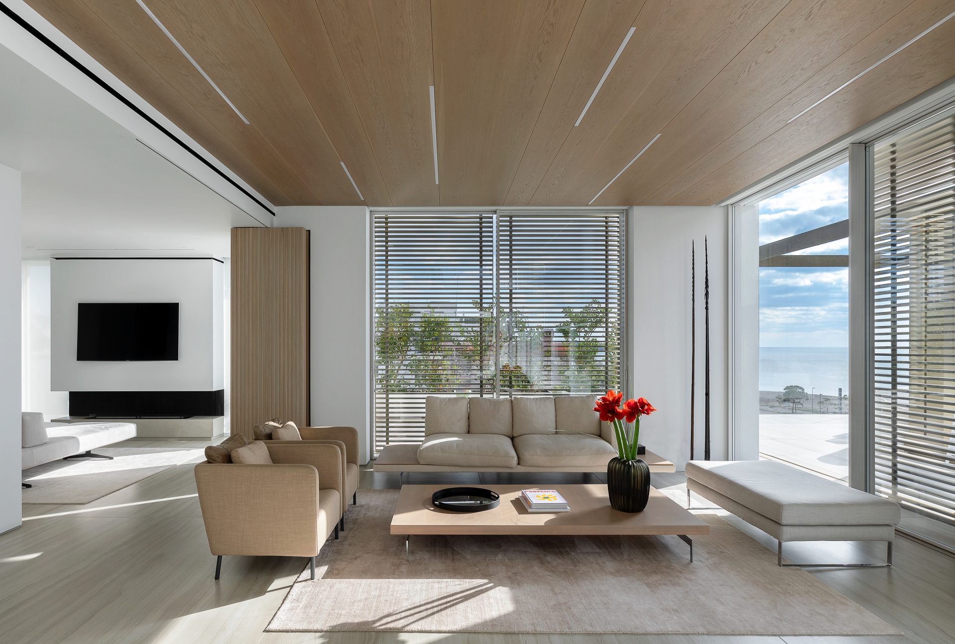
A pared-back, refined approach characterises the interior of the penthouse and its terrace and a conscious effort has been made to avoid fussy details and reduce visual noise. The natural material palette of timber and stone is articulated throughout the interior, with white and accented with bronze-coloured elements, such as the fibre-cement ‘eyebrow’ framing the top double-storey volume. The language of horizontal and vertical planes that characterises the architecture continues to the interior, where walls, screens, and cupboards also read as simplified planes. This detailing has been reduced to clean surfaces, seamlessly integrated cabinetry, uninterrupted ceilings and large sandstone floor tiles.
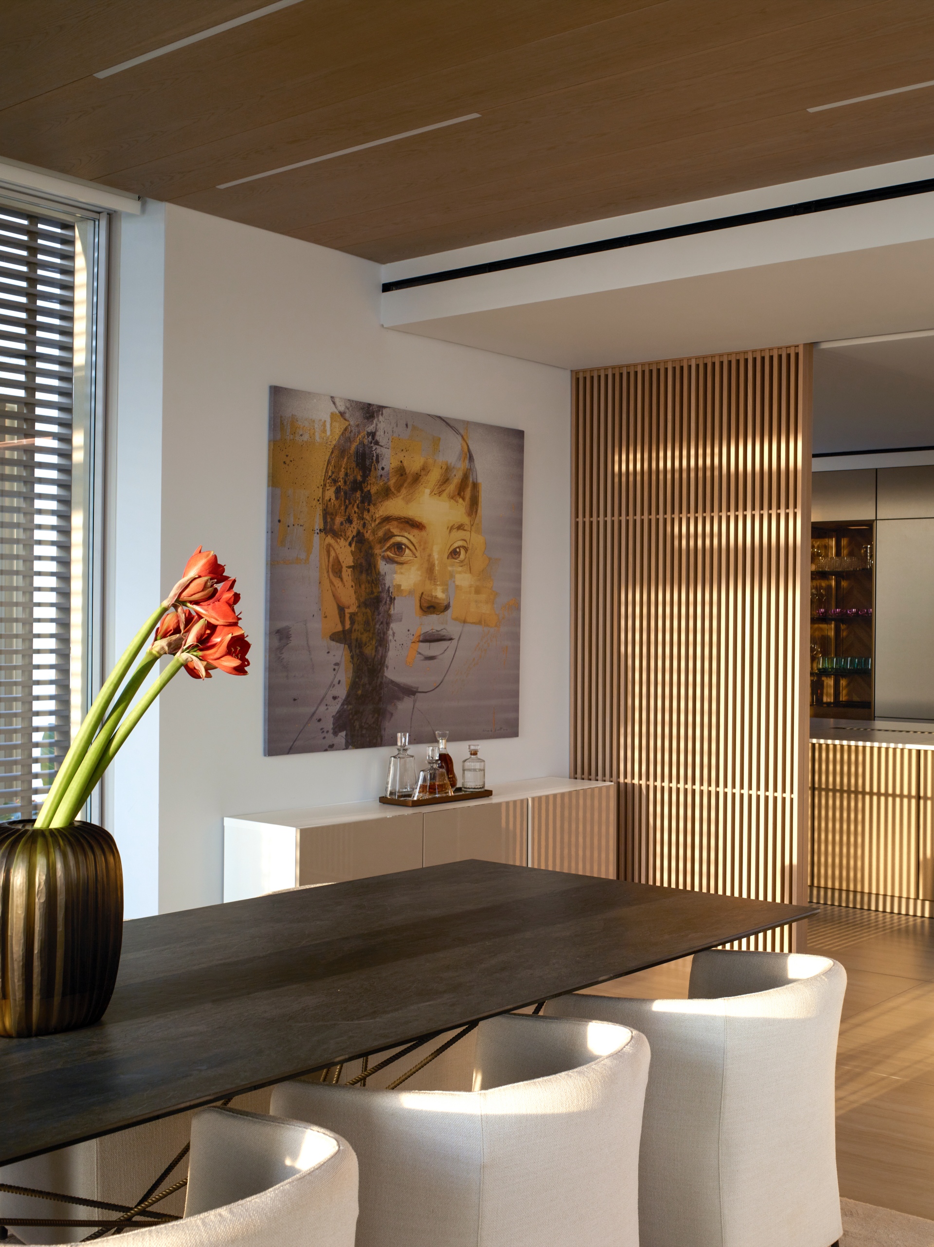
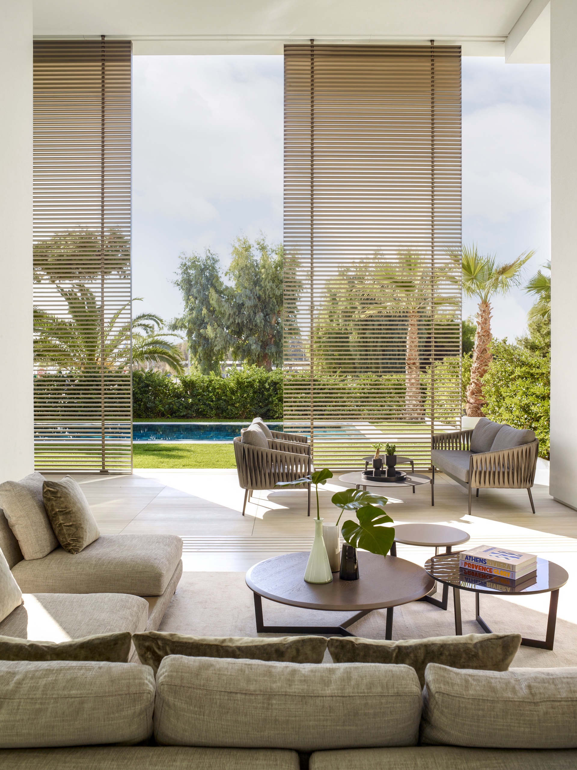
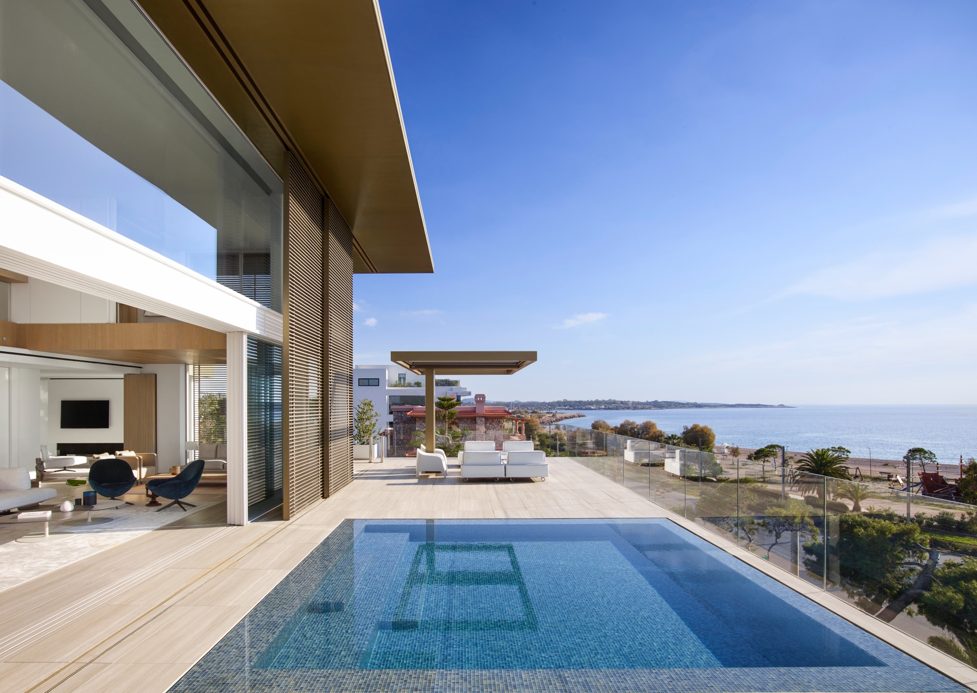
The interior opens onto a wraparound terrace, sheltered by a slim floating roof - the terrace includes a swimming pool flush with a sandstone floor. Here, single-column, cantilevered pergolas positioned symmetrically provide shelter for alfresco dining, seating and poolside entertainment. Semi-permeable screens wrapped around the sides of the terrace carefully manage the balance between privacy, climate and the views, with their louvres angled to let in the views where possible. Glass balustrades ensure the ocean views to the front are uninterrupted. This rigorous and disciplined approach to architecture and interior design enhances the clarity of the volumes and creates a sense of sophistication throughout. The restrained palette and subtle shades make for an understated minimalist environment and the resulting unencumbered sense of freedom seems a fitting architectural response to the natural Mediterranean beauty of the Glyfada’s setting.
