On the basis of the changeable triangular texture unit seized from the concept car, NEXT100, ARCHIHOPE combined the geographical feature to create moving lines and connections in the Chengdu BMW 4S Showroom, completing a unified and high-quality design from building renovation to landscape and interior space. Located beside the Gaodian Road, Pidu District, Chengdu, the original building with a total floor space of more than 10,000 square metres had been abandoned for years, with aged exterior wall bricks partially peeled off. The owner wanted to transform the building into a dynamic and remarkable volume, which meant it would be easily identified from the high-speed rail and highway across from the building, and to incorporate BMW's concept of being environmentally-friendly and sustainable.
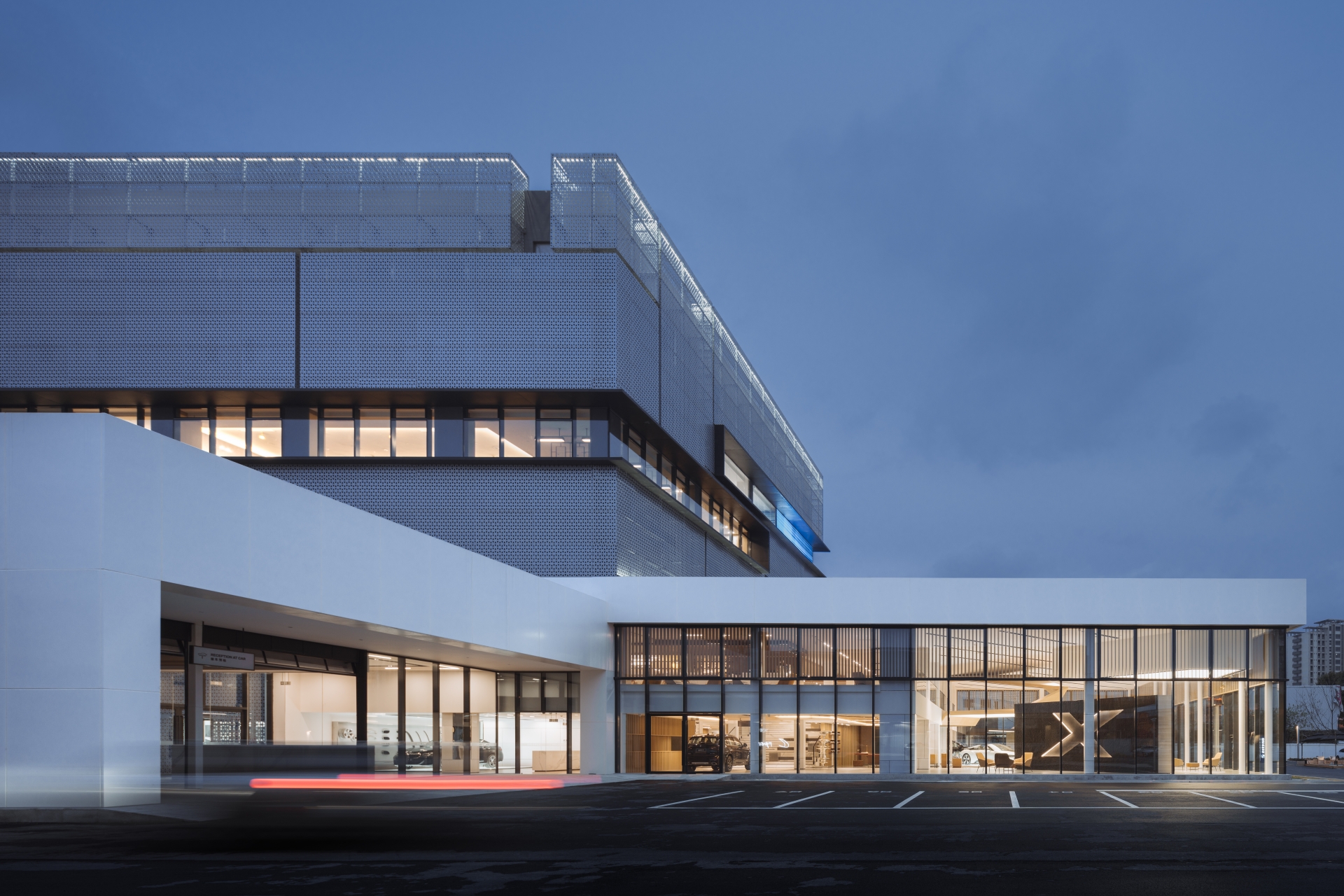
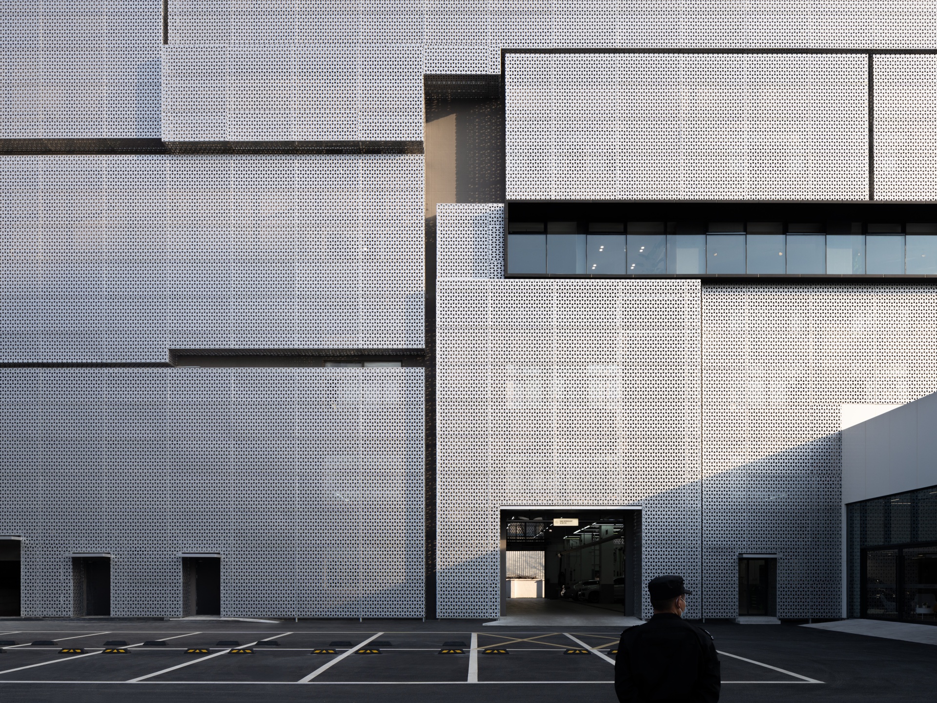
The architects set up a second layer of skin - anodized perforated facade outside the main body of the building, with the texture inspired by triangles in the skin of the conception car VISION NEXT, and strengthened the readability of layered blocks of the vertical and horizontal matrix. On the premise of lighting, the perforated facade covers the internal workshop of the building, making the overall facade of the building rich in layers. The curtain wall unit in the perforated facade is a large area of natural ventilation windows that can be opened independently, which reduces the heat island effect caused by the absorbed radiant heat from the large amount of direct sunlight in summer and reduces the cooling energy consumption ratio, so as to achieve the sustainable concept of energy conservation and emission reduction. It brings shade in summer and creates heat insulation in winter. Like a layer of ecological skin, it makes the building more environmentally friendly.
For this project, time was of the essence - the owner required a short construction period and a controllable cost, so the architects put forward a scheme of prefabricated steel structure after accepting the exterior design scheme of the building: that is to complete a lot of work in the processing workshop, and then to assemble these prefabricated components on site. This scheme ensured the quality and accuracy of the project variables.
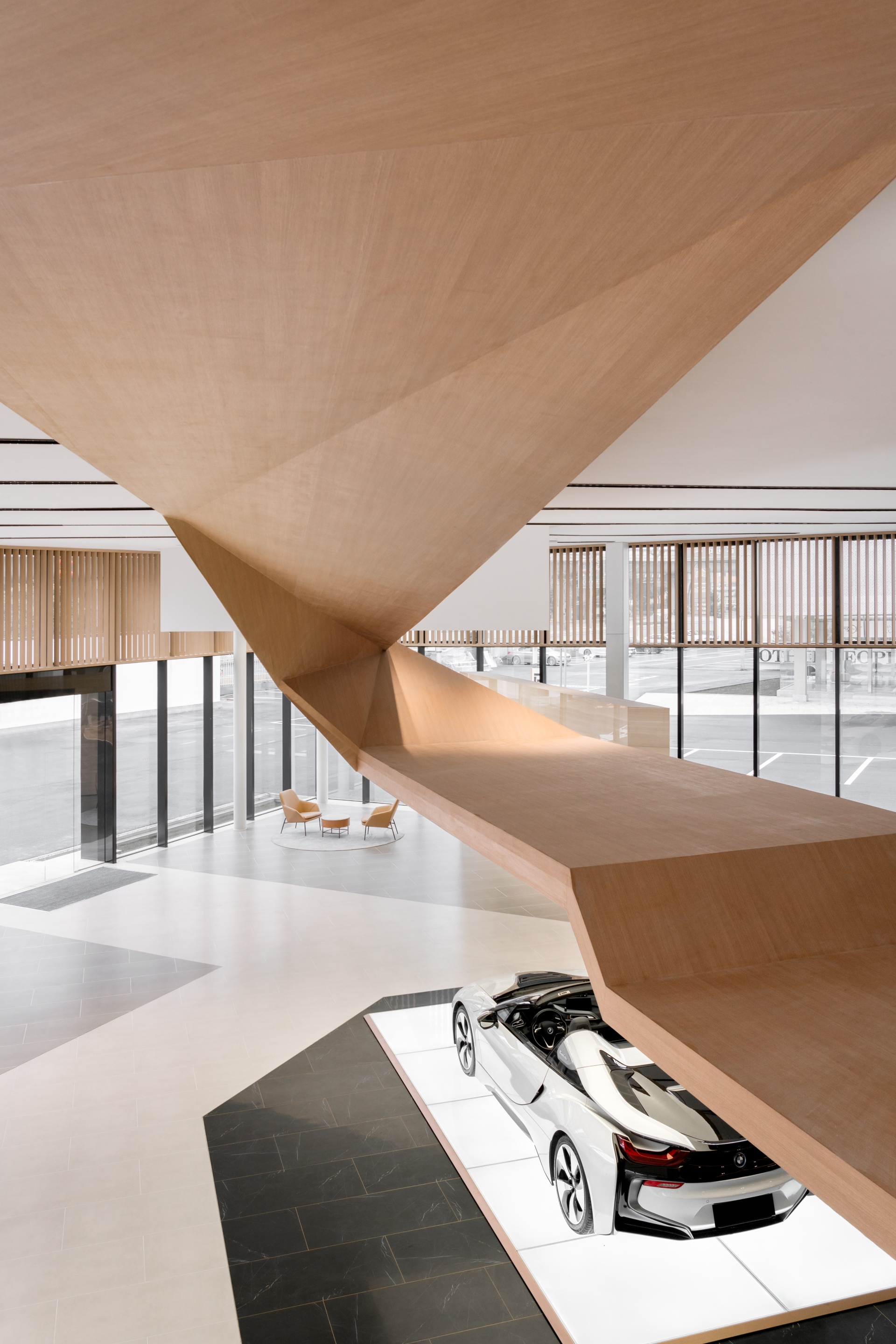
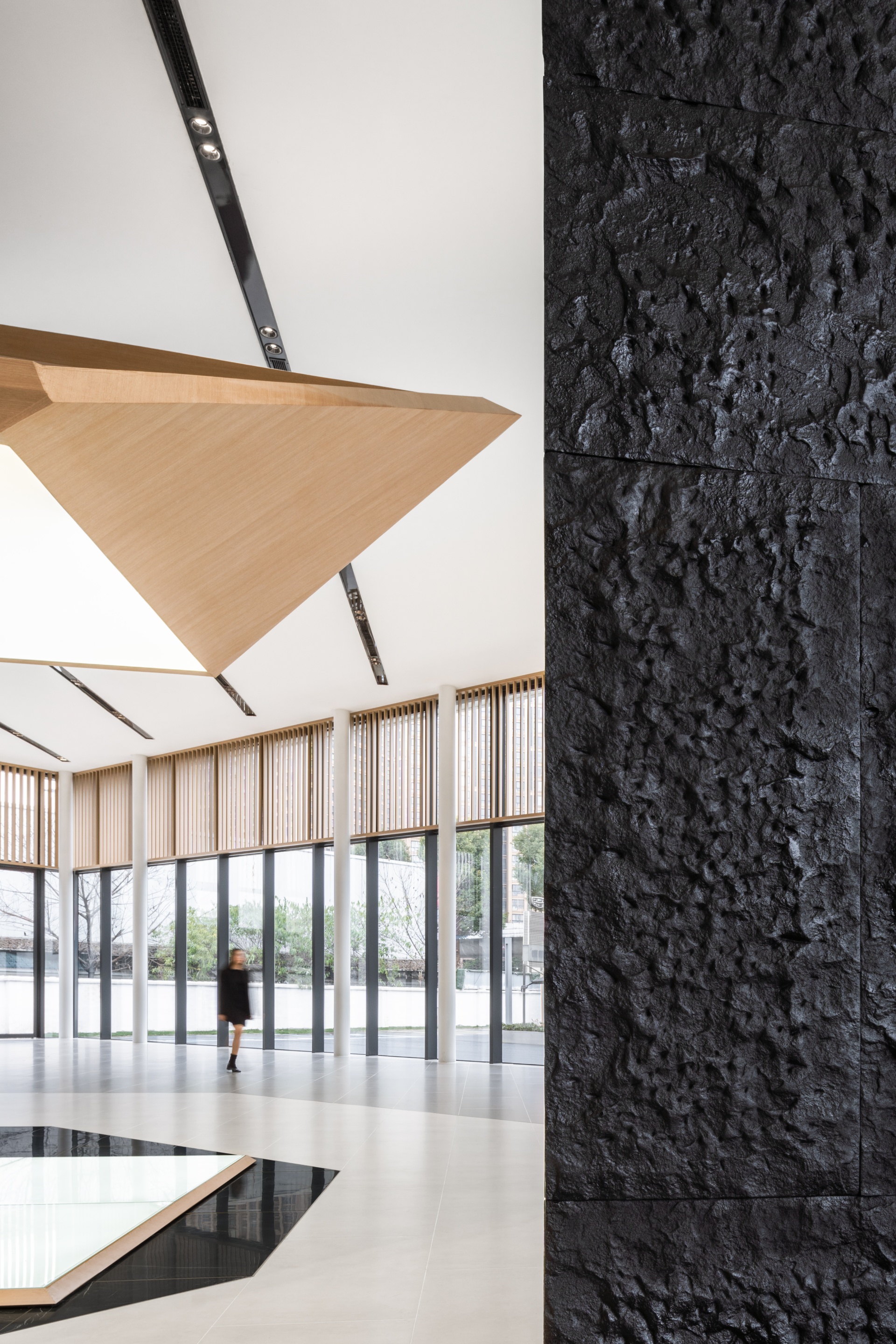
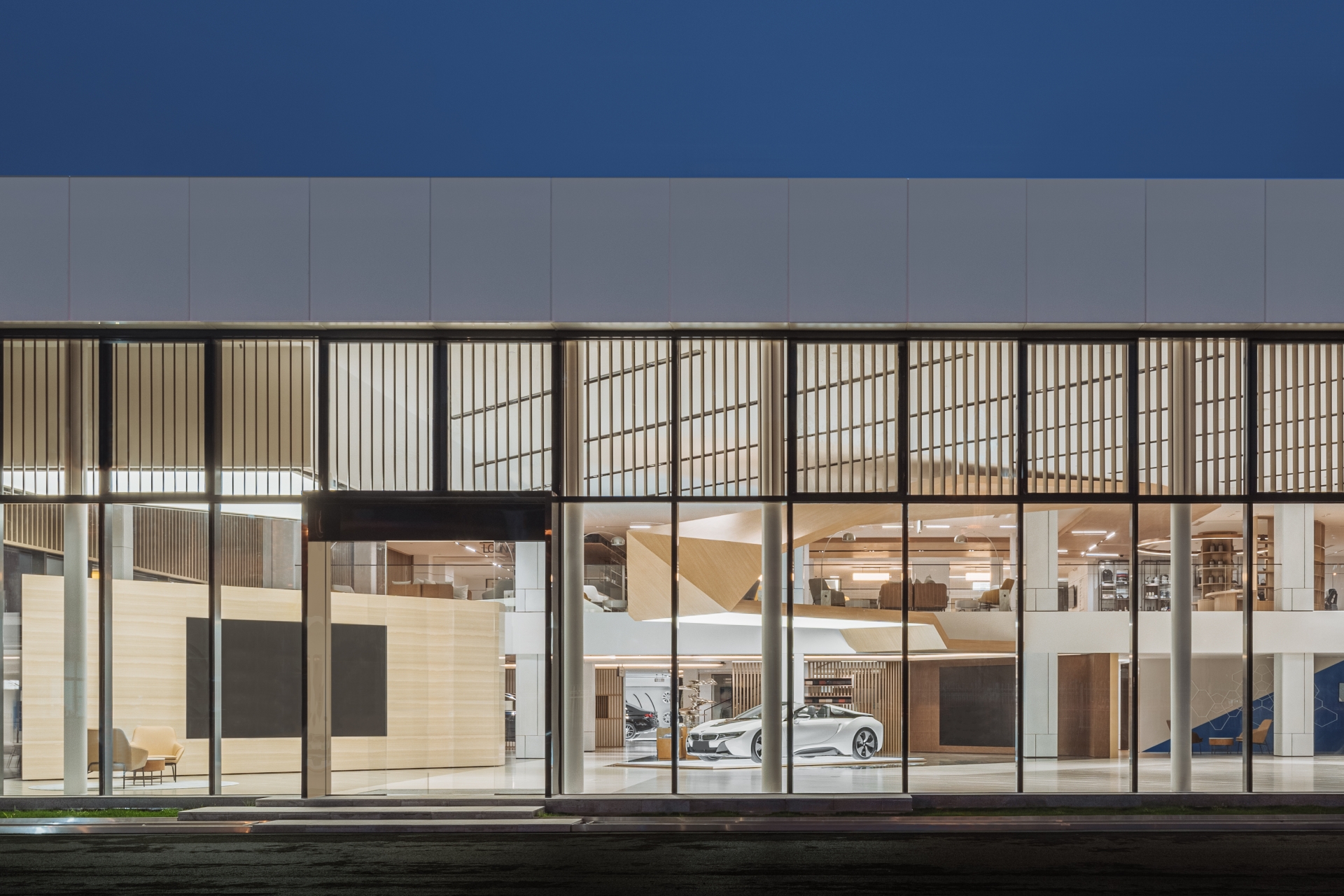
Throughout the project, the unified design of architecture, landscape and interior space allows the design concept to run through. On the first floor of the south space inside the building is a specialised BMW exhibition hall and roadshow area, while the latter part is a car pre-inspection service workshop whose fully open space provides customers with visual pre-inspection service. On the mezzanine is an open rest area, a merchandise retail area and other shared social zones.
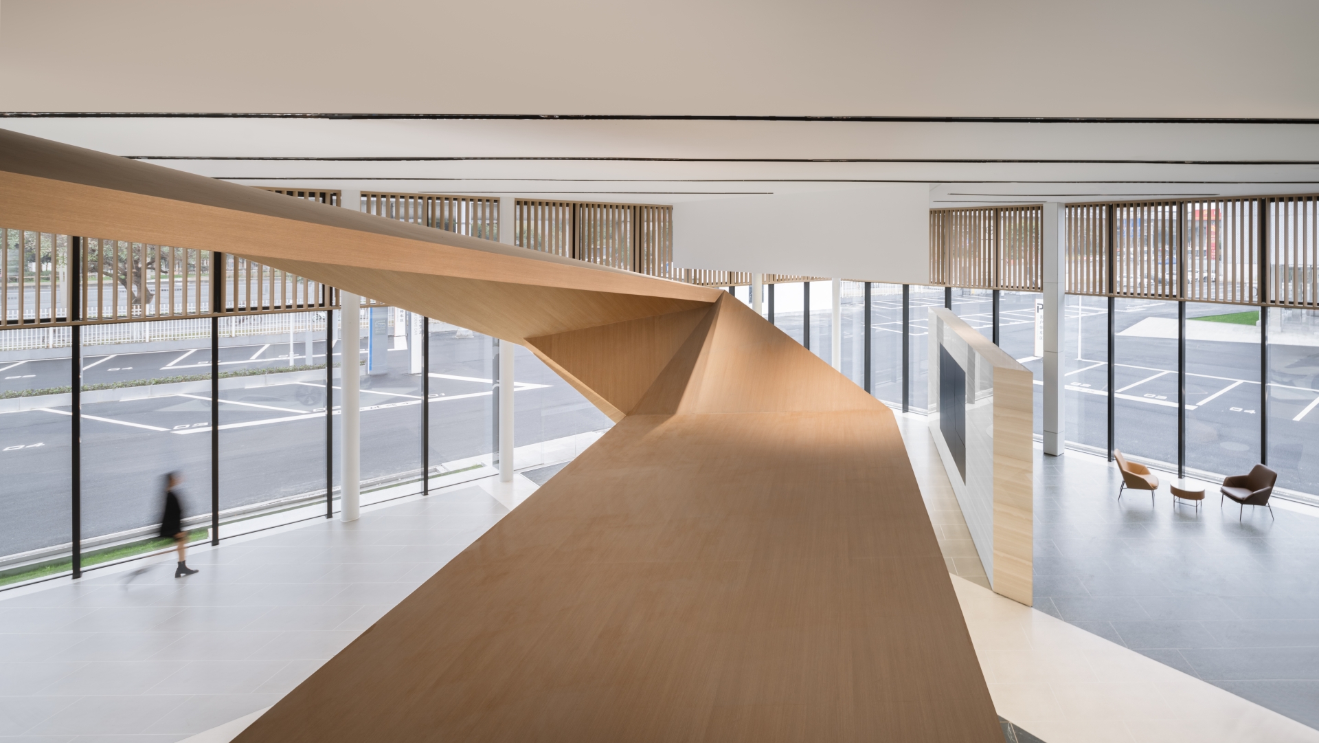
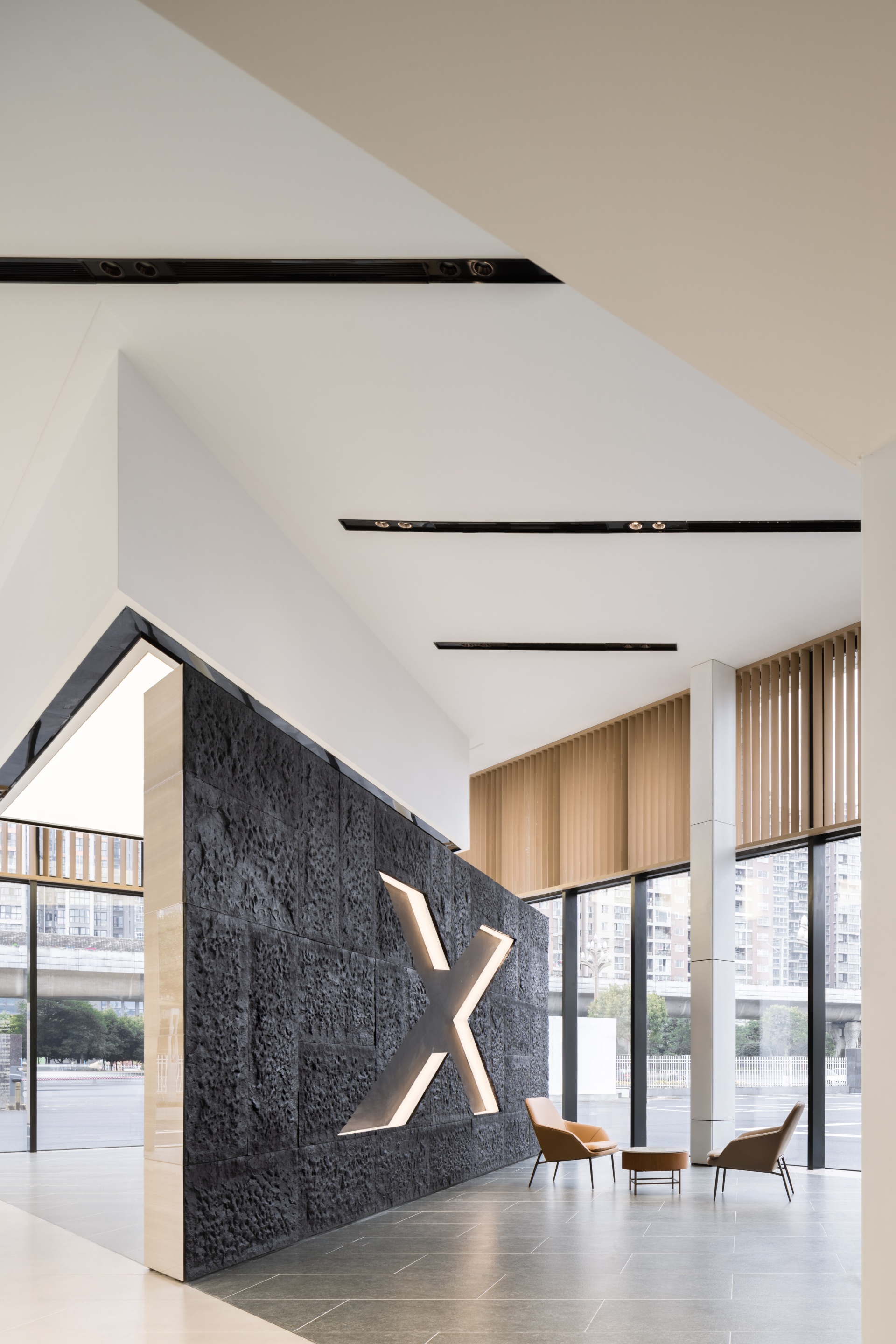
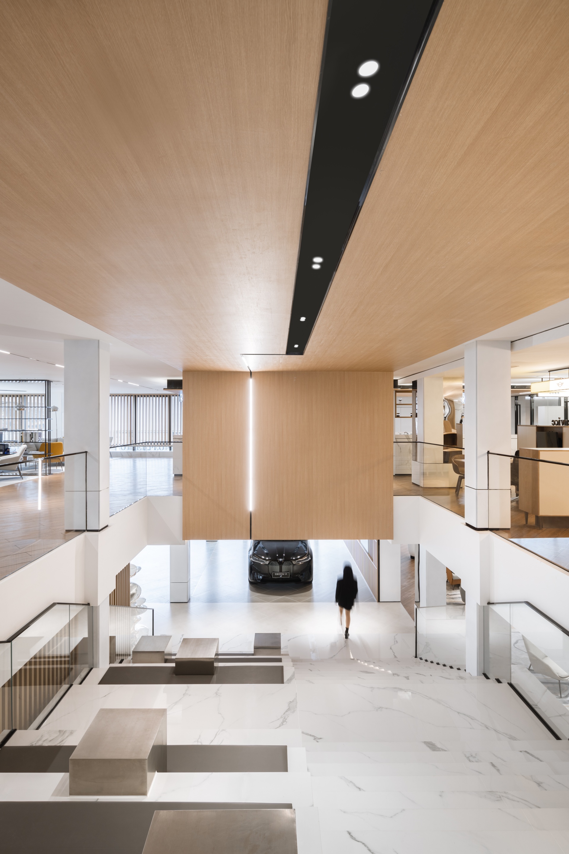
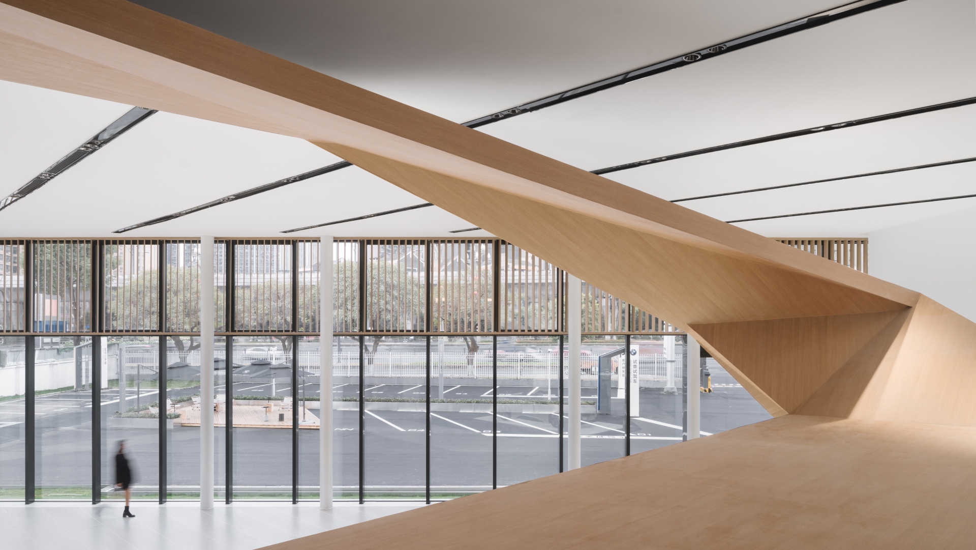
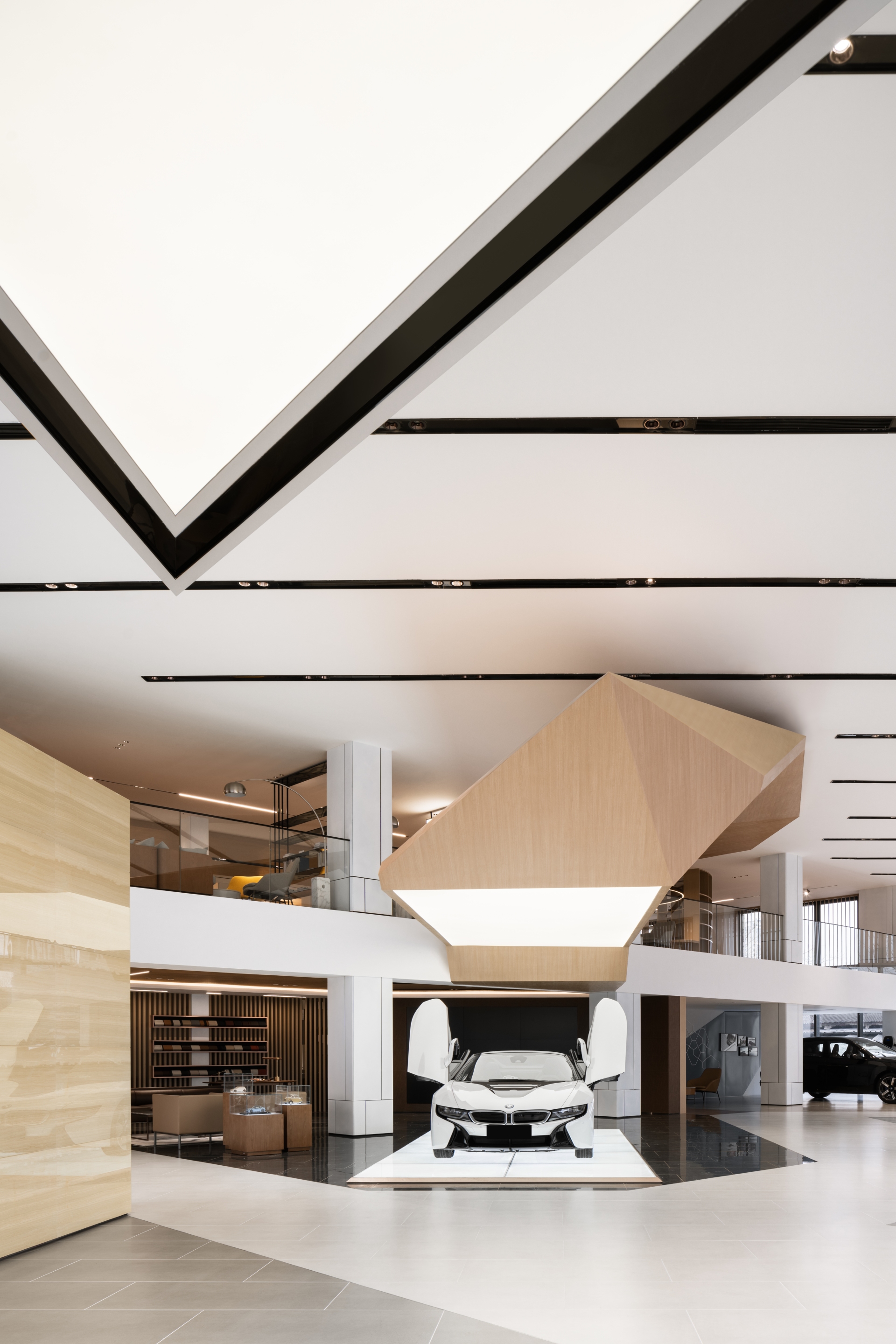
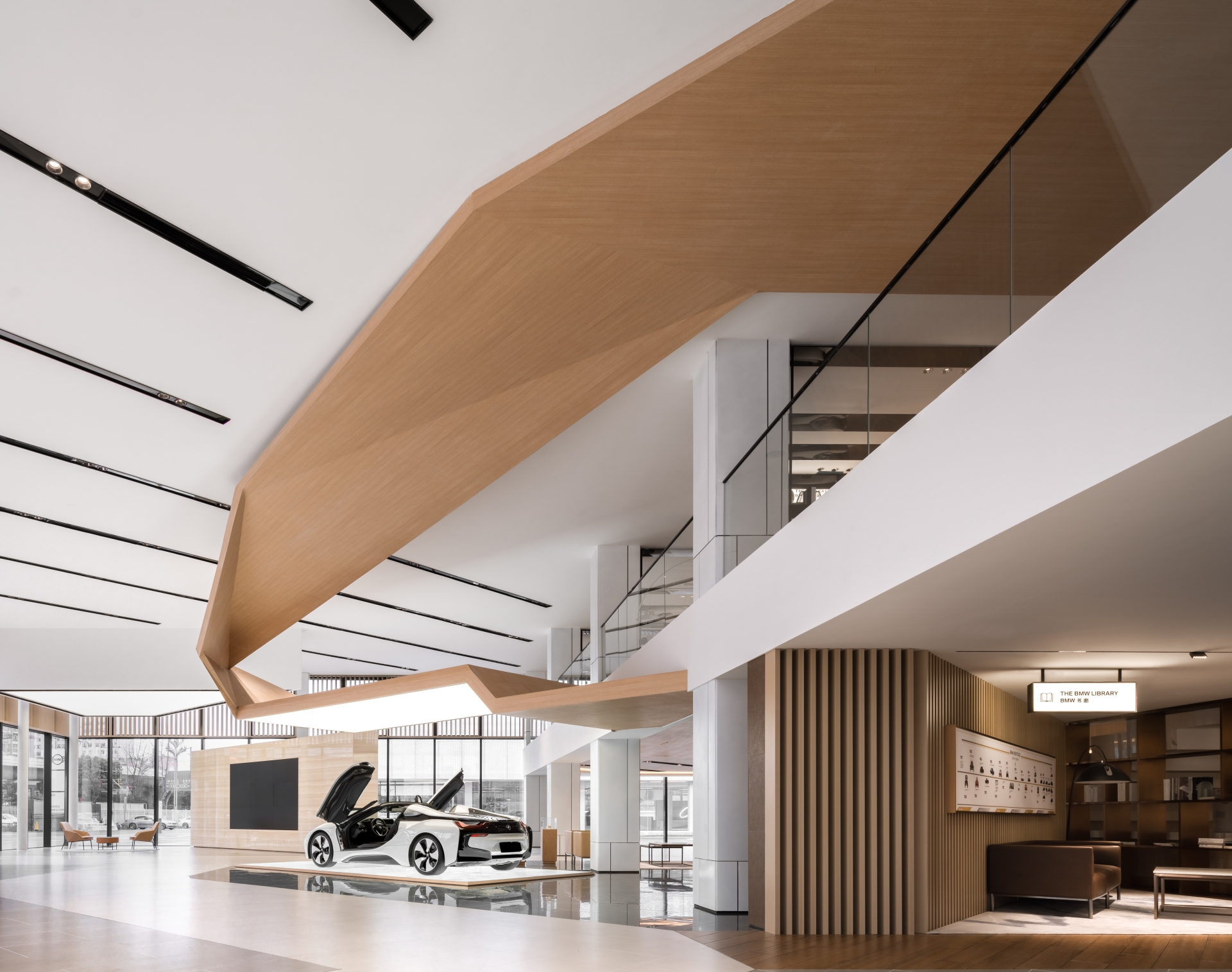
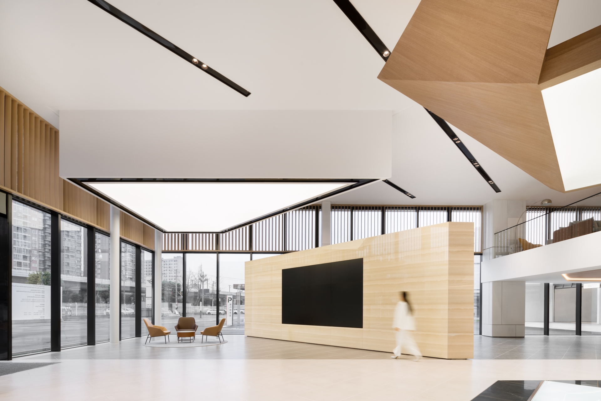
The original intention of the design was to be social and transparent, so the double-layer space on the whole floor was to be integrated. As we know, the water level in the Pidu District (where the building site is located) is a river system composed of distributaries from the Precious Bottle Neck Neijiang River of Dujiangyan. It was also this geographical feature that inspired the design for the architects, so while they did not do too much work on space partitioning, they focused on the moving line design of the hall. Responding to the concept of Dujiangyan river system field with the moving line design, the field, architecture, people, cars, lifestyle and BMW brand concept have all been connected seamlessly. The triangle symbol of BMW VISION NEXT is a large geometric form of suspended ceiling installations that extend through the two spaces of the mezzanine to form a symbiotic relationship. The installation overhanging the mezzanine is mainly composed of four triangles to form an arrow symbol pointing to the future.
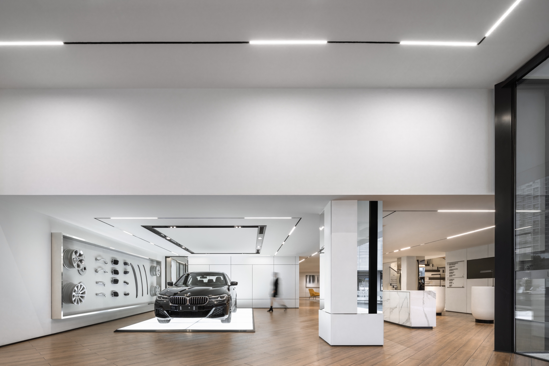
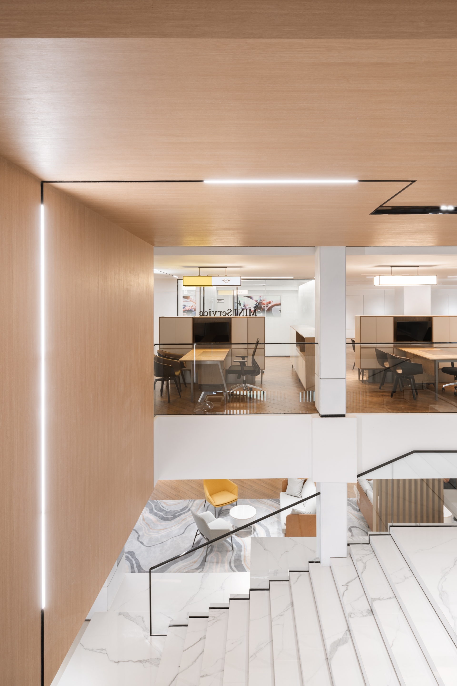
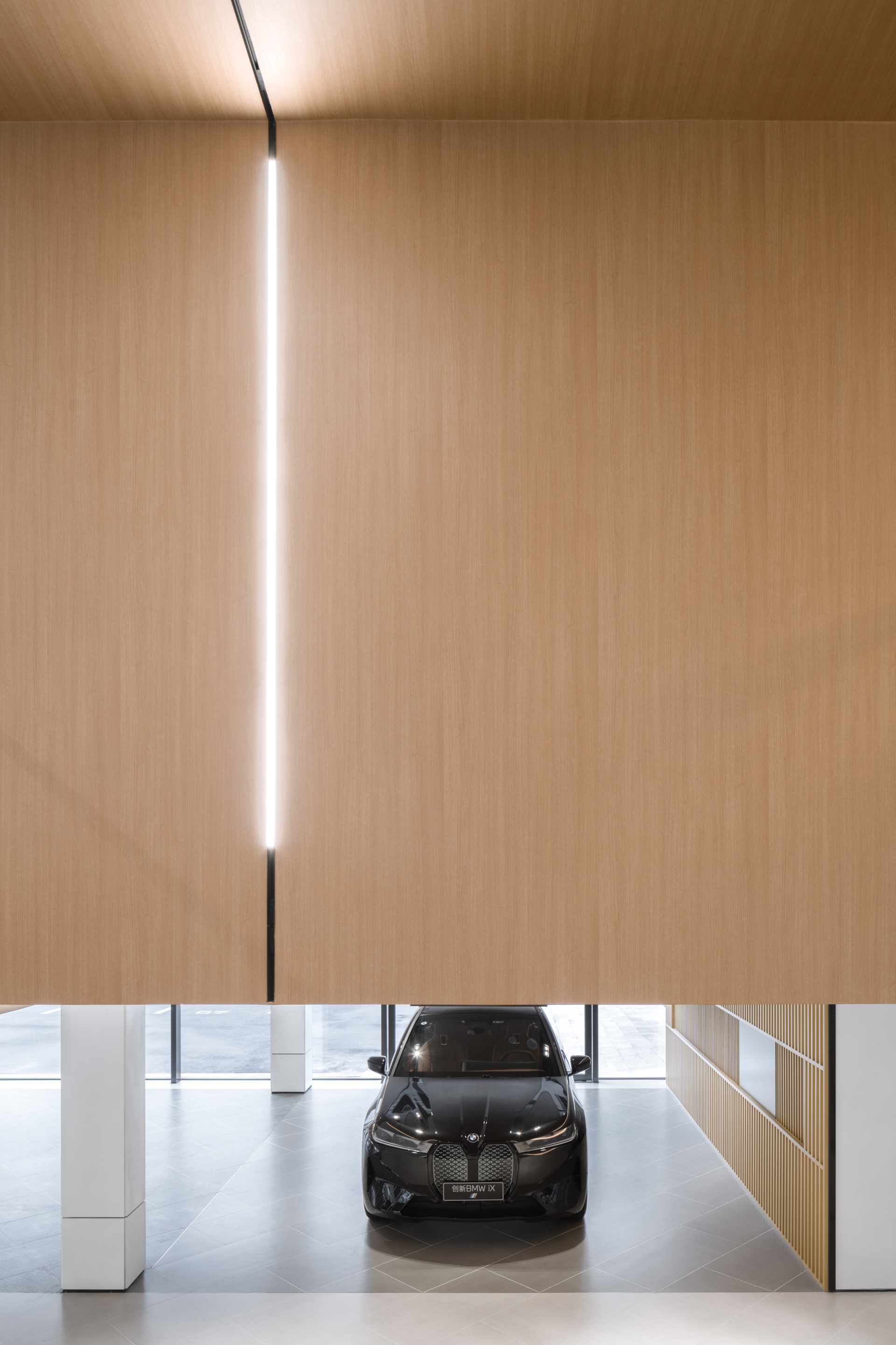
The extension part of the installation is to provide a guide for the moving line of customers. From the different car model areas in the exhibition hall to the two-layer complex multi-functional spaces including lifestyle arenas, merchandise retail area, leisure area, tea room and café, they are derived from and connected together by the triangular unit, which also integrates display, sales, customer experience and after-sales service simultaneously. The owner reveals, "We don't have any mysterious places. All services are open to customers, and everyone who comes here can freely enjoy the complimentary services we bring to them, whether it's coffee, tea ceremonies or various entertainment and social activities.” Design wise, there was therefore no physical partition in the overall space layout, with the hope of providing a space for customers to move around freely. On the second floor is a relatively independent customer restaurant and internal office area, while on the third, fourth and fifth floors are specialised maintenance workshops.
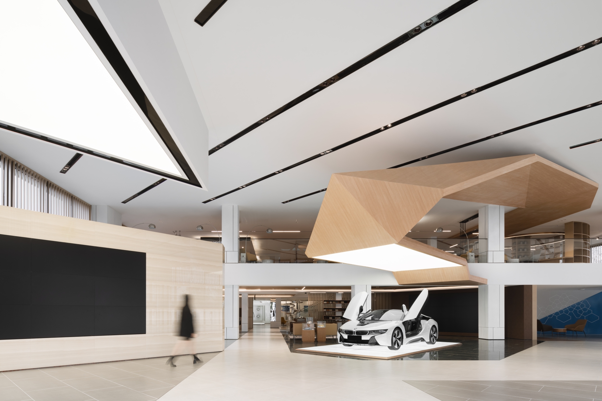
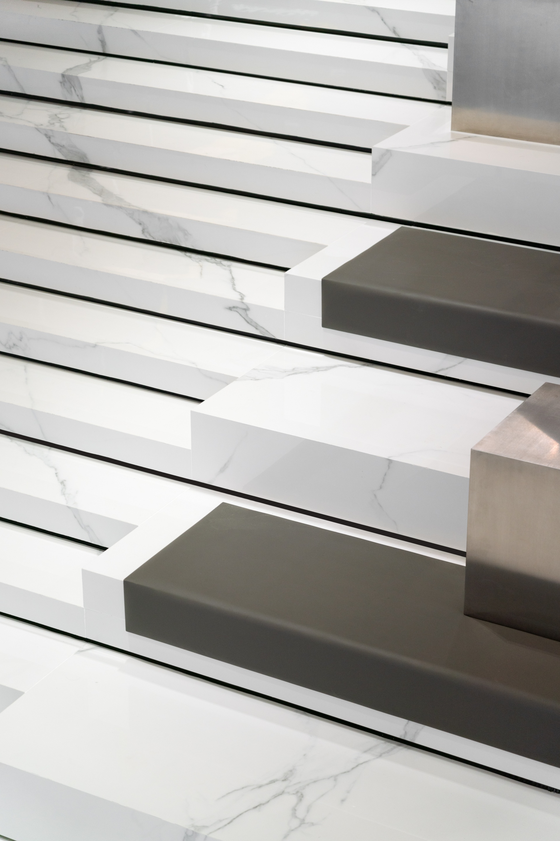
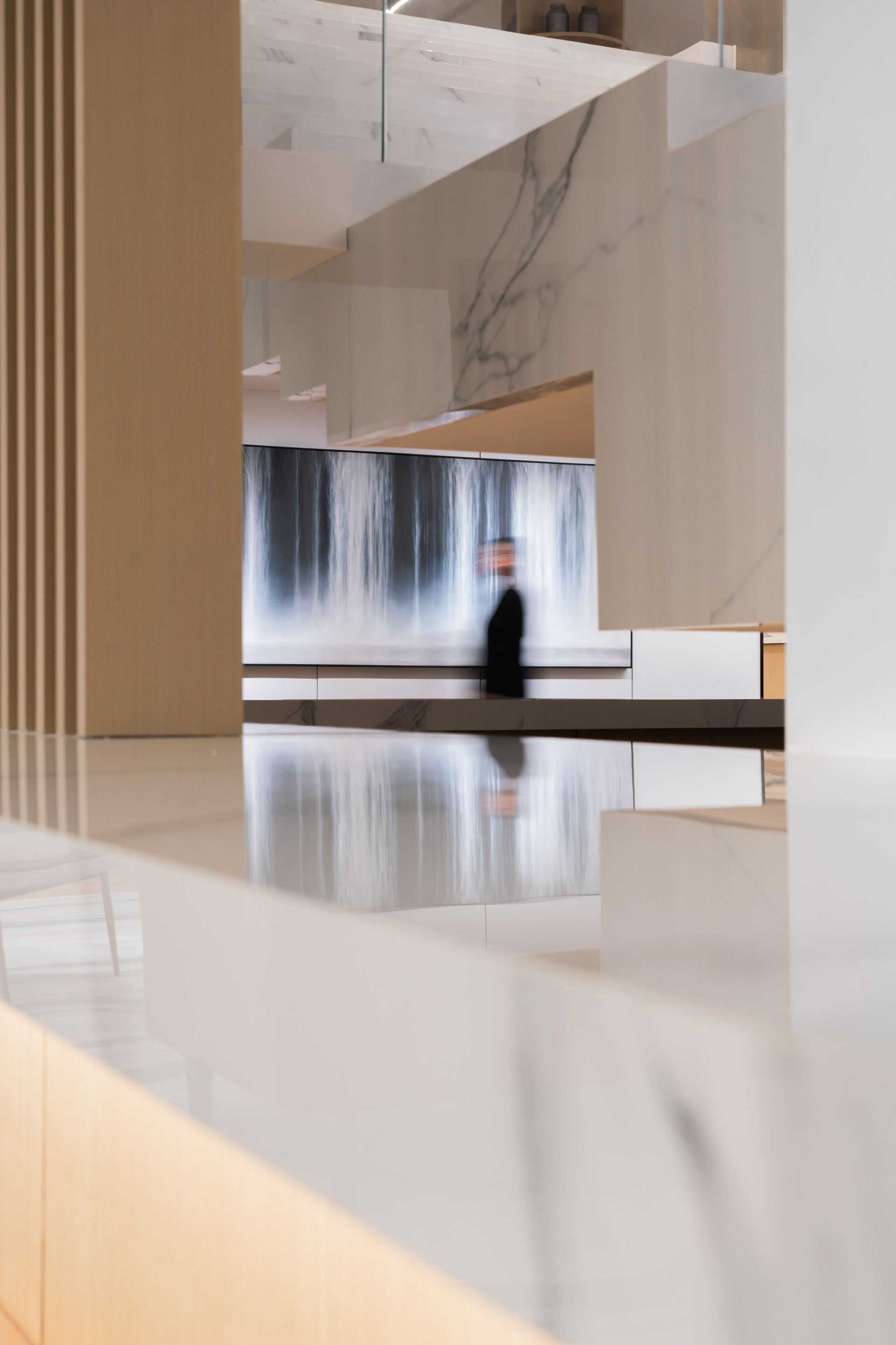
The designers conclude that good design is not a pile of materials, and less is more, so simple wood grain hues and white are the main tones used throughout the whole space. As an environmentally friendly material, the wood grain aluminium profile will not release harmful elements such as radon and formaldehyde, etc, and has a strong plasticity. More importantly, it lasts longer than solid wood, and protects the ecological environment by reducing the waste of material resources. The exterior facade meanwhile made of white stainless steel is reusable, safe and secure. This will also not change colour or rust, overall enhancing the simplicity of the space while achieving the sustainable concept of reuse.
