PODCAST
CHI WING LO: THE ARTIST WHO TEACHES US HOW TO LIVE AND ALLOWS US TO SELF REFLECT
LISTEN NOW


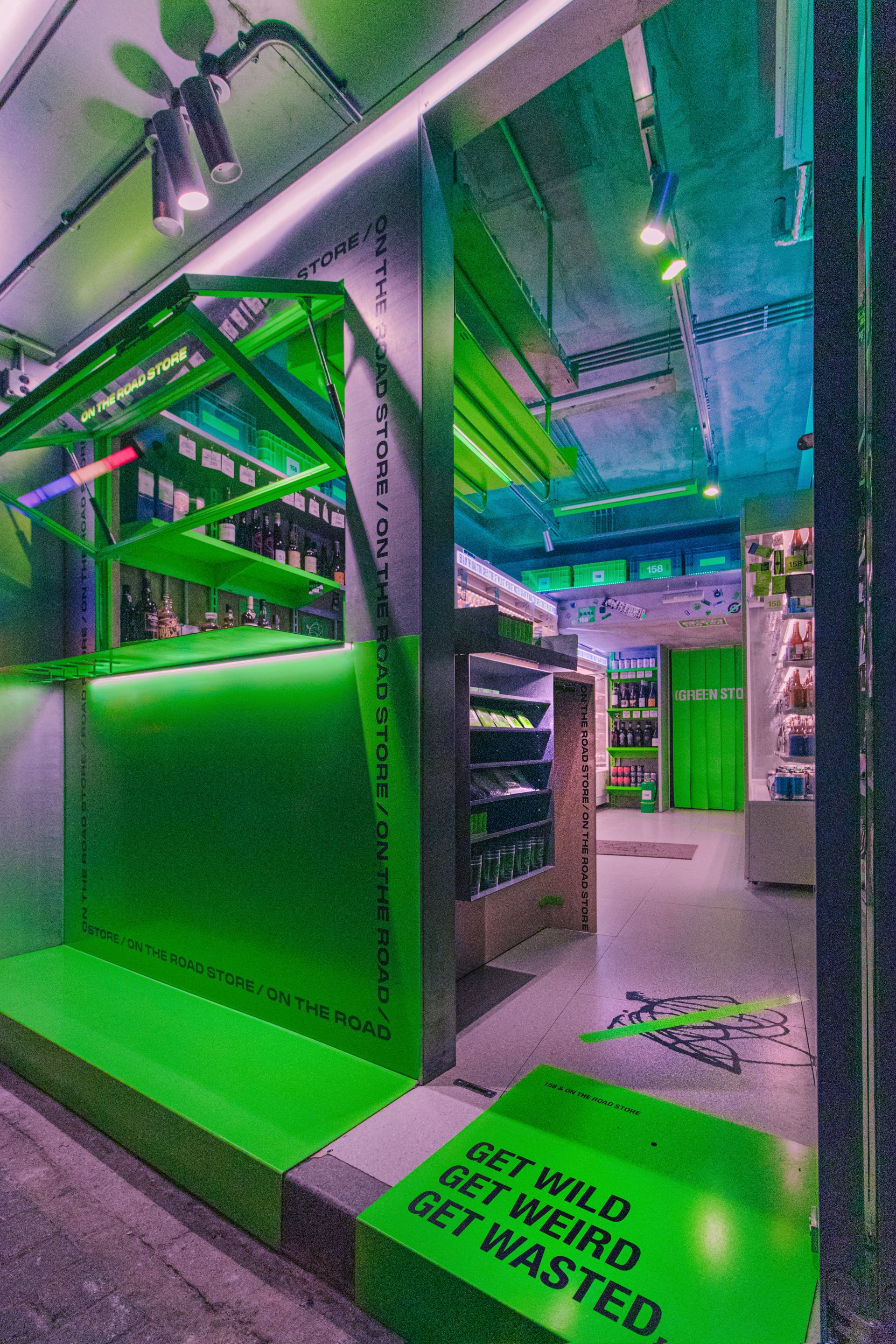
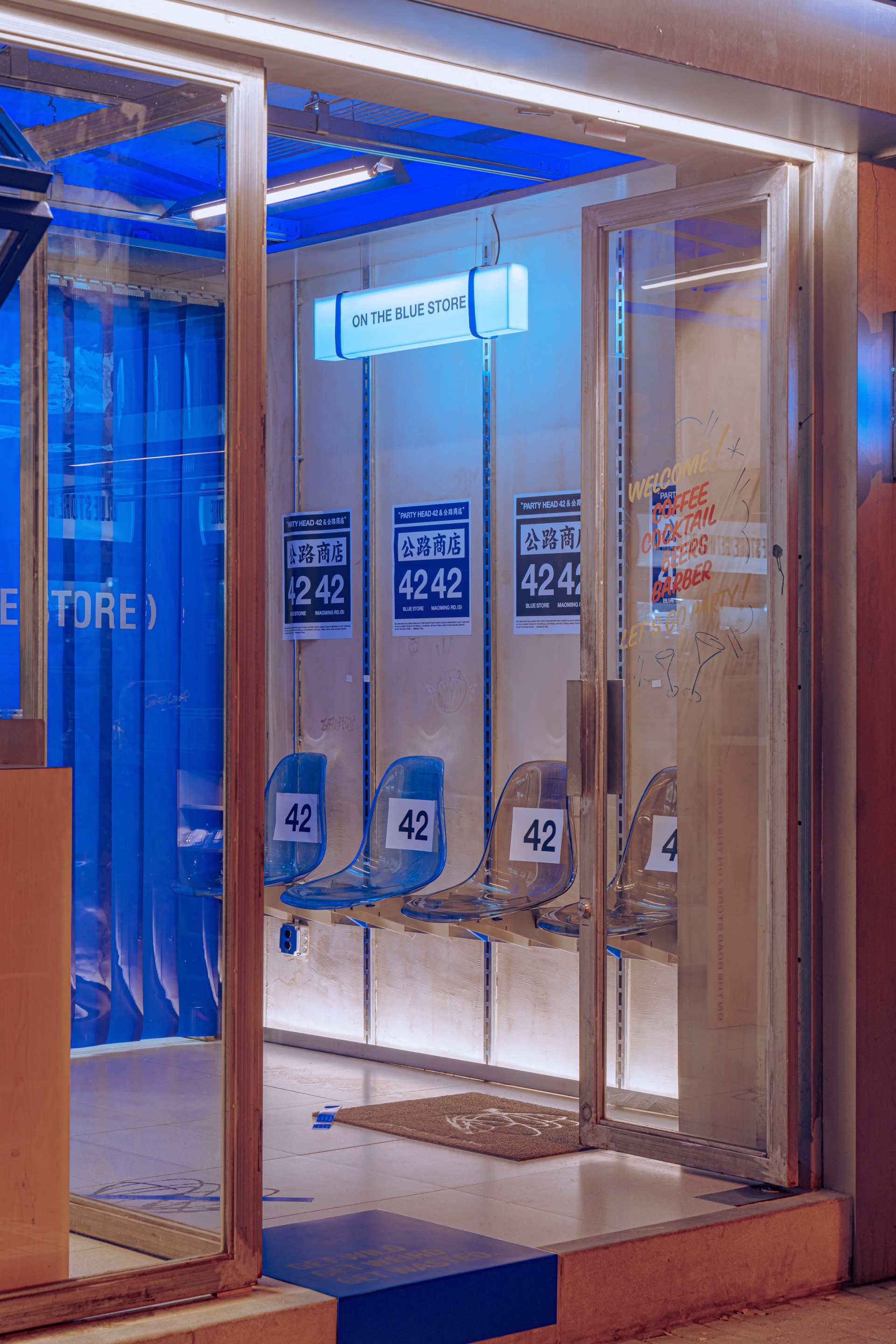
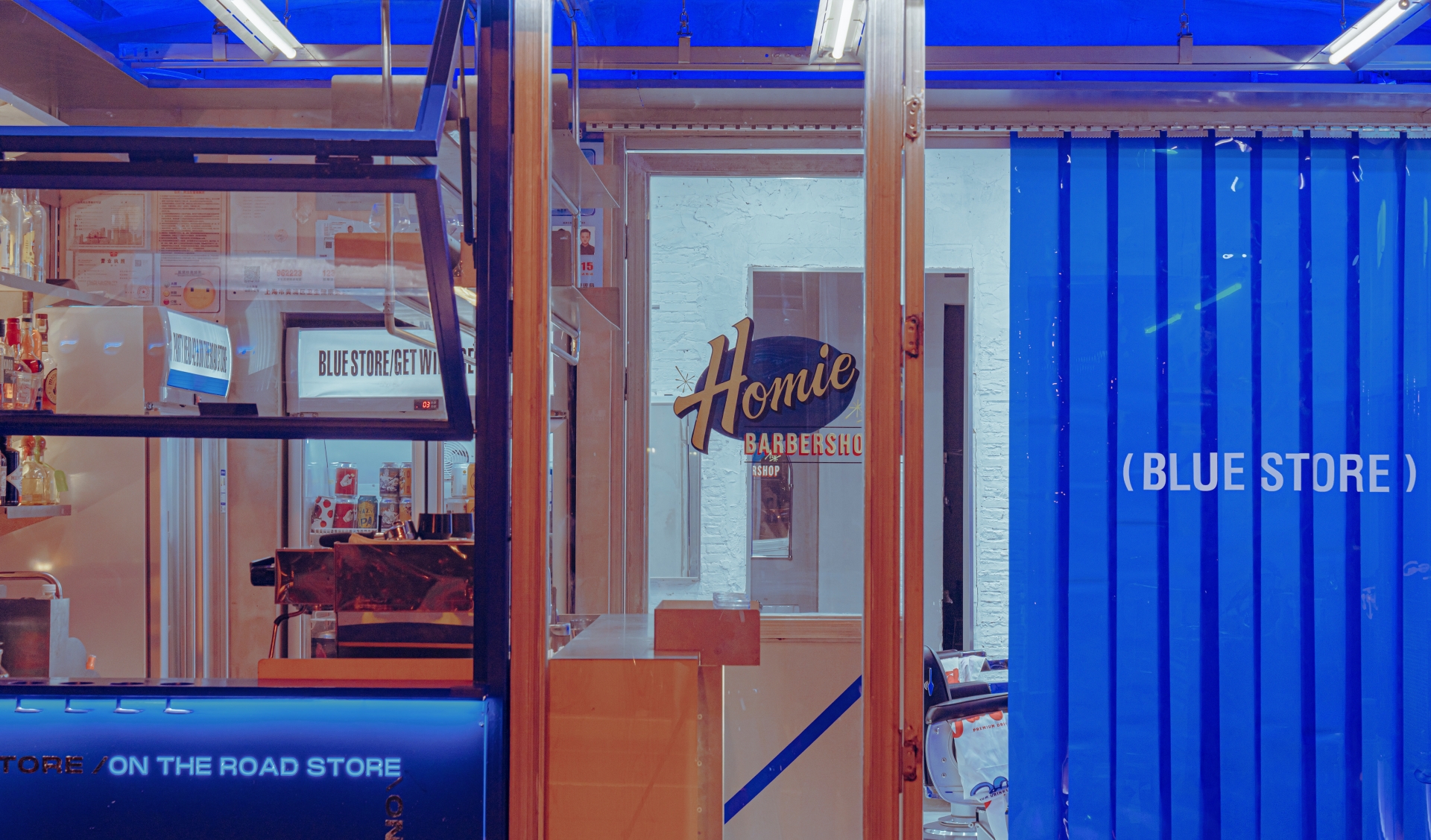
ON THE ROAD STORE (OTRS), is on one hand, a content creator, or specifically, a maker of street culture. On the other hand, OTRS uses its official account on WeChat as a means to spread youth culture, which is described as a 'subculture' by many. Above all these, OTRS also connects the streets of the city through small pubs, creating a niche street culture that exclusively belongs to the young generation. For design firm, RIGI, they felt it was their duty to preserve the public memory of OTRS and the common behaviour of the community by creating more logical and extensional designs, which may bring an opportunity to keep the niche and sub-cultural condition of this society.
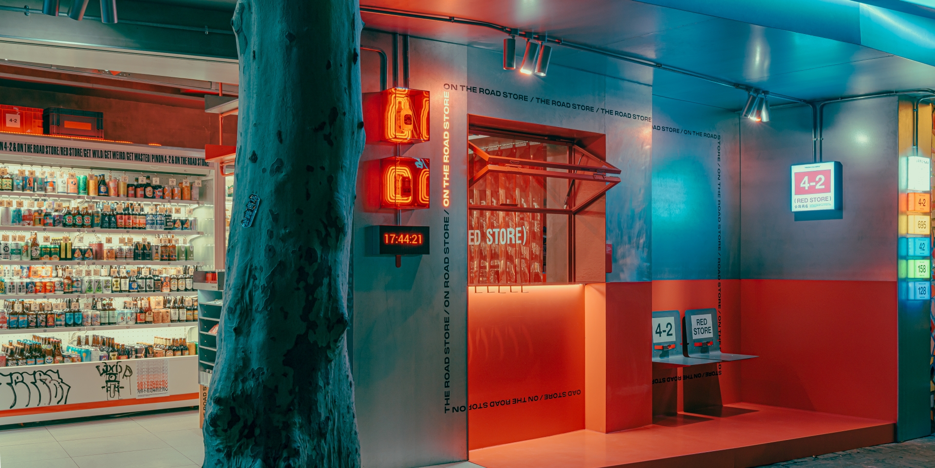
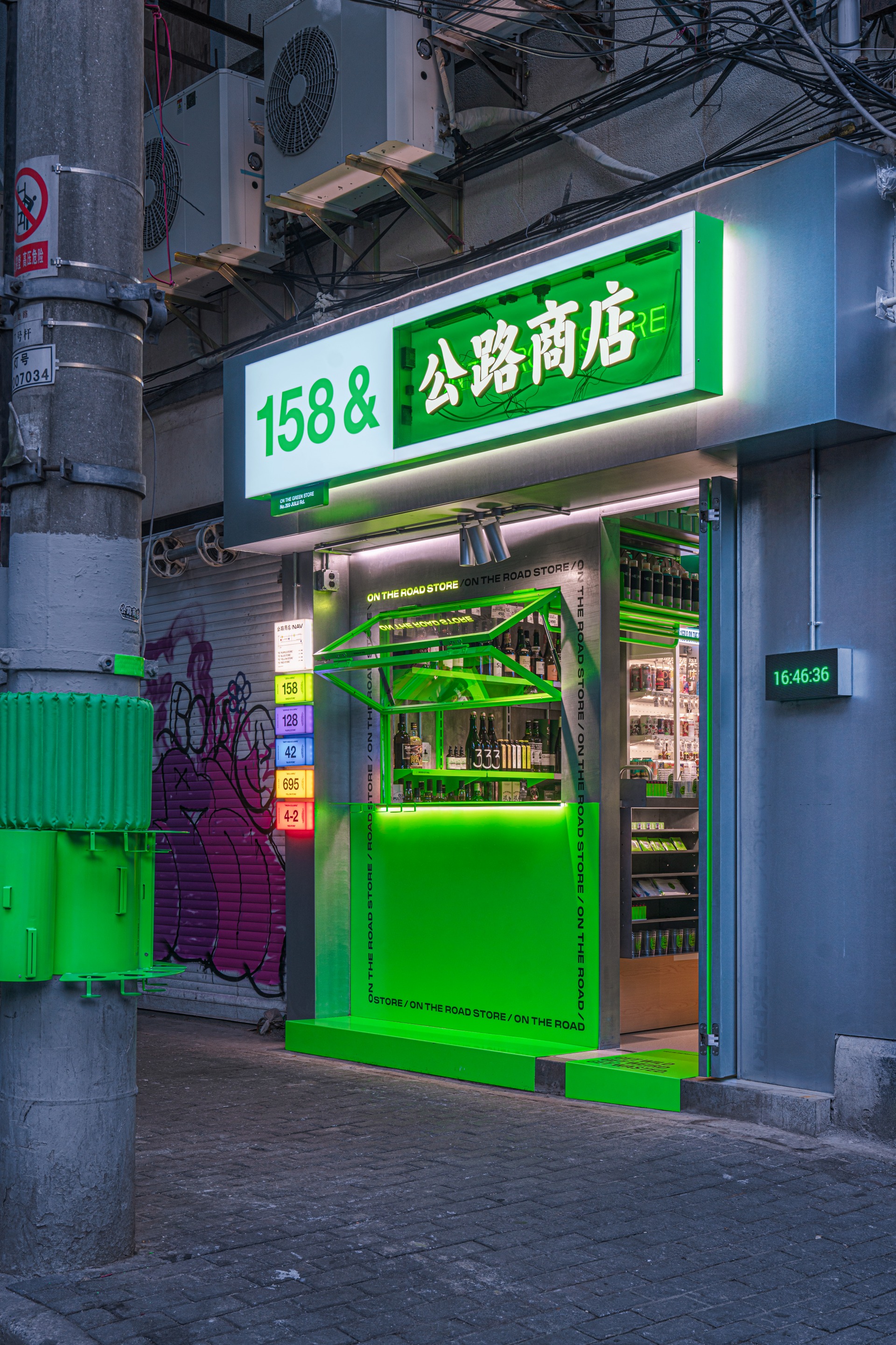
State the designers, “We value the diversity and freedom in this city, and what we want is to give more possibilities to these characteristics. In every store that is barely twenty square metres, every night after nine o'clock, there could be more unexpected joy and relief in the glasses. The world may have embraced a higher level of efficiency, and may also be creating more anxiety. The city may have seen waves of economic boom, and may also become less interesting. What we are going to do is try to heal the era or city a little bit by making it a band-aid. Five locations, five stores, five streets, here is where we begin the design…”
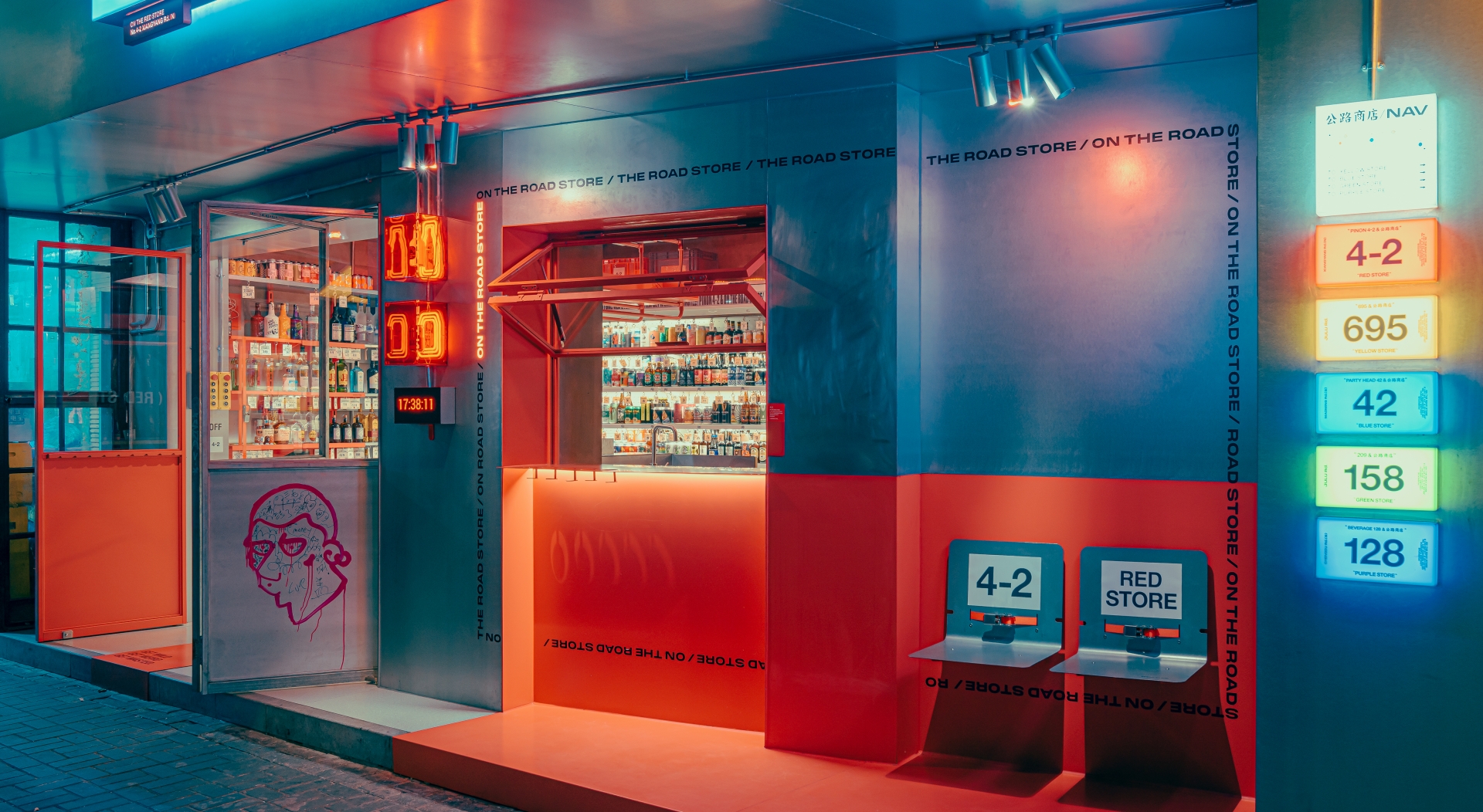
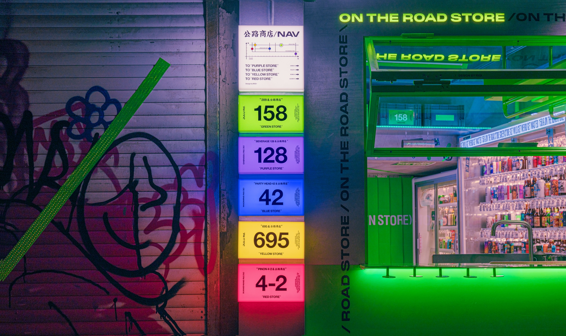
For this project, OTRC first chose four new locations, which are barely related: Julu Road, North Xiangyang Road, South Maoming Road, South Chengdu Road. Fundamentally, all the stores will be planted in the interface of the city, much like patches in the streets. “Of course, we could make appealing excuses to make it sound worth it, but the fact is the designs are doing the same thing, one thing: interruption. Seems like a less valuable job this way, doesn't it? Thus what we need is - a constructive interruption. We would have to stick a band-aid to make up for the interruption. And of course, as we said there would be five new stores, however, as time went on, the district changed, people moved, and ideas changed. It eventually turned into three stores in the end.”
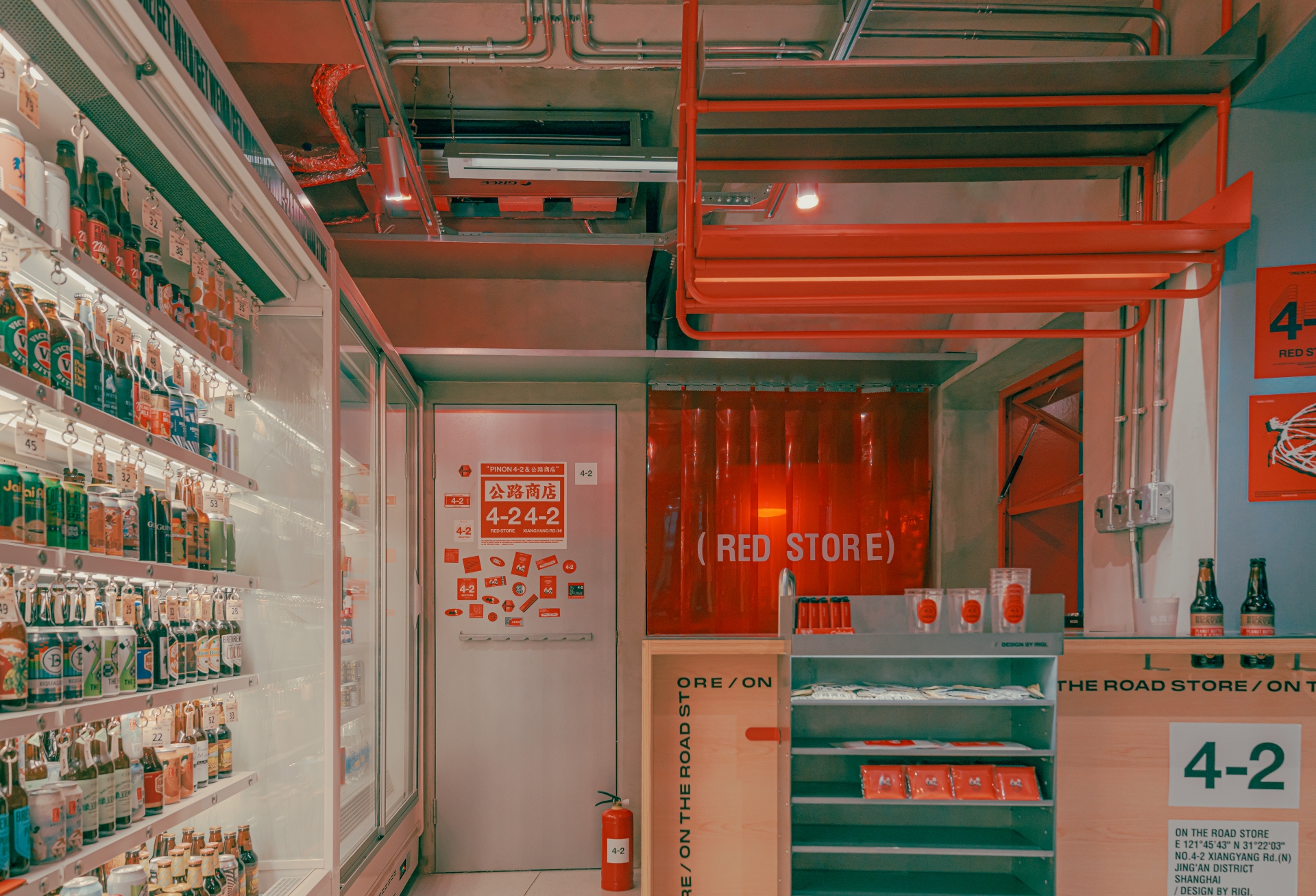
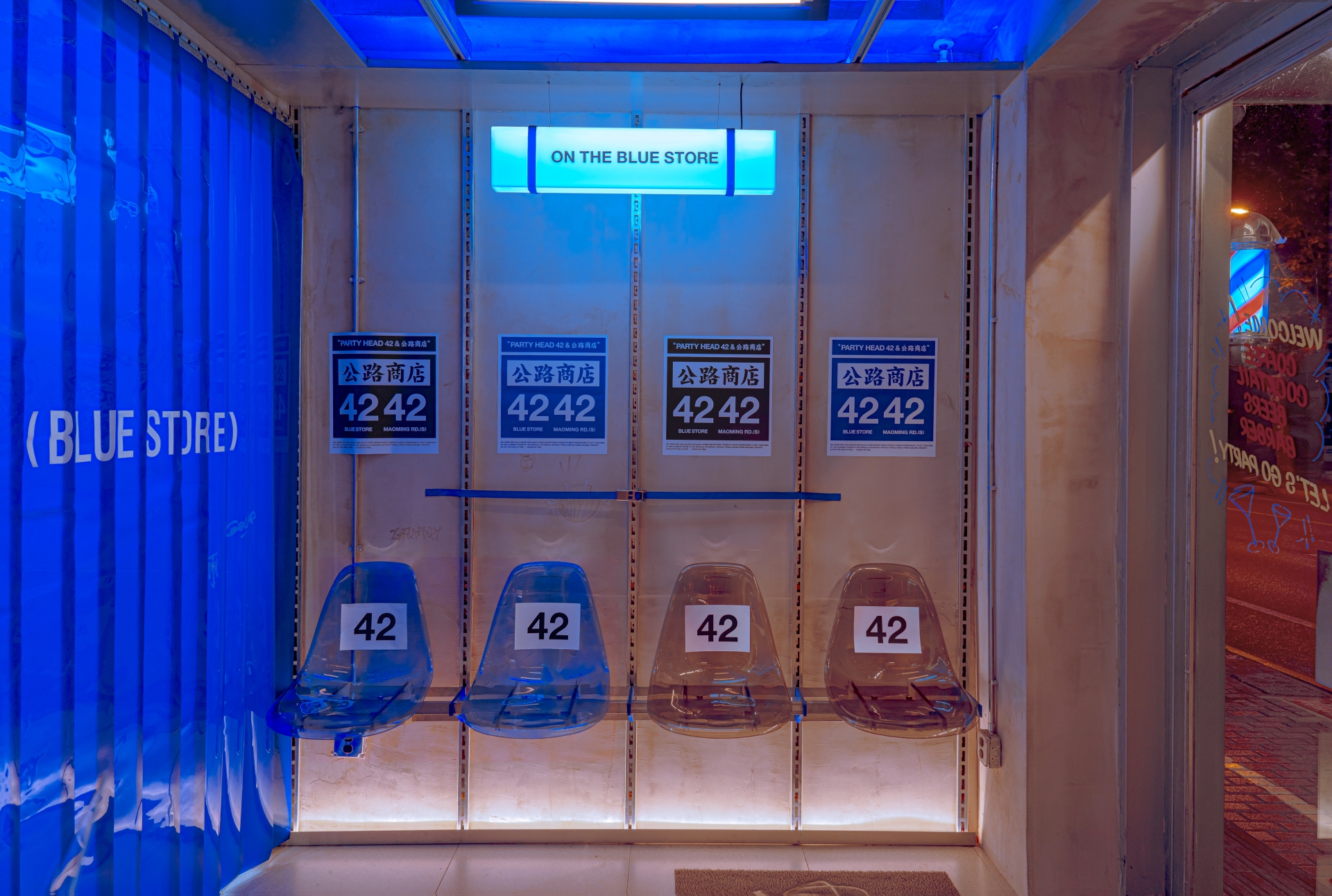
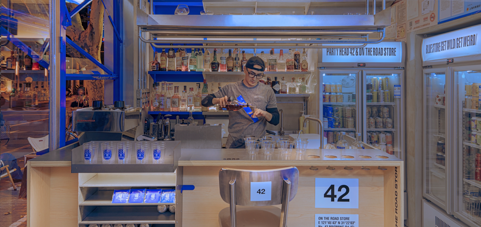
When RIGI got their hands on the design, they intended to form a logic of expression exclusively used by OTRS and conceived that the logic could connect more spaces throughout the city, no matter if it is a barbershop, a toilet, or a pub as it is this time. “We are not, from top to bottom, designing a decoration or a design to only be talked about. When we use 'band aid' to describe OTRS, we are trying to create an interface that links more people,” the designers continue. “We decided on two things, colours and numbers. There are ways people remember things, for example, through shapes, materials, or even feelings. But colour is the most direct one since the first element that goes into eyesight is always colour.
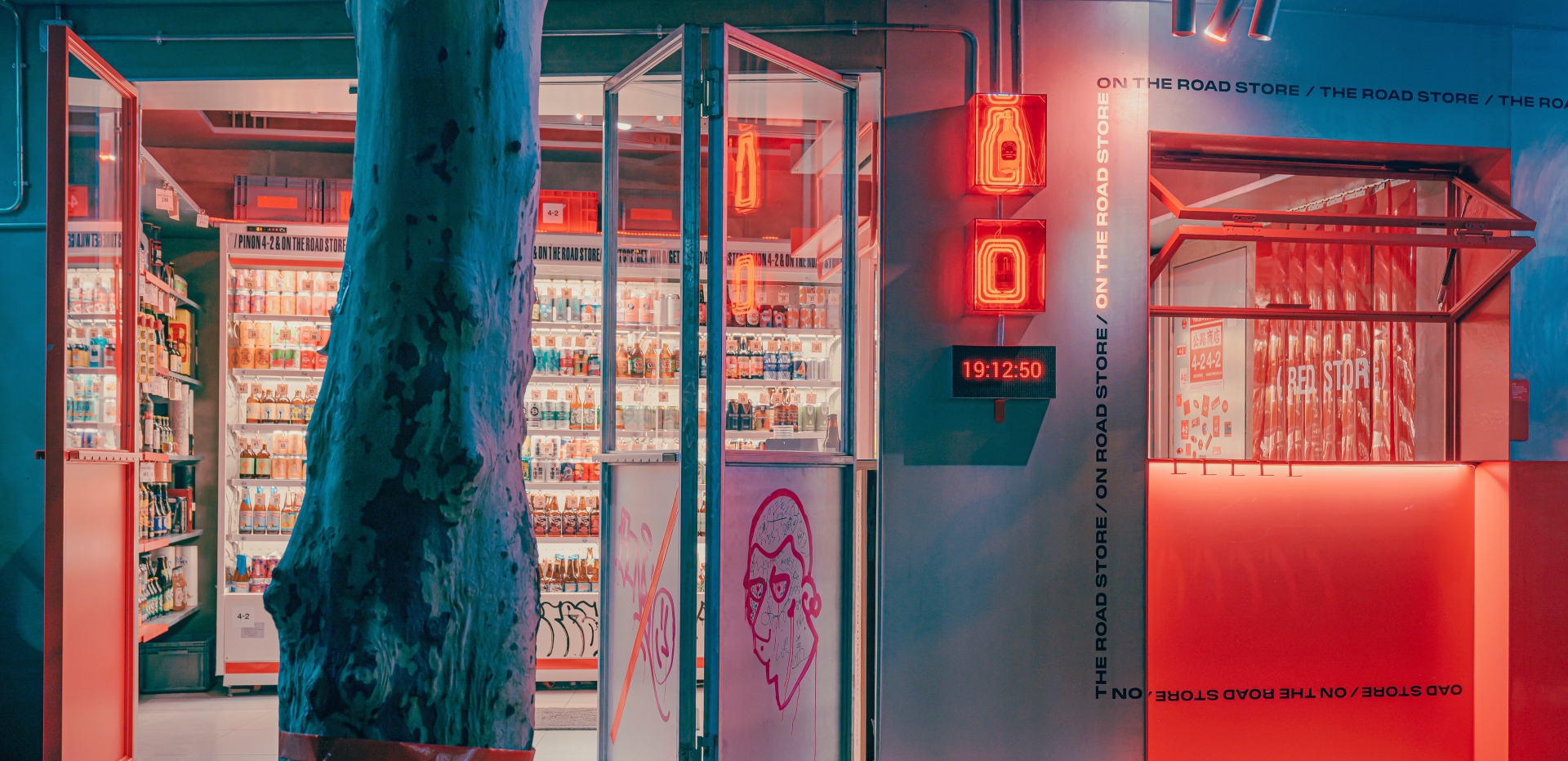
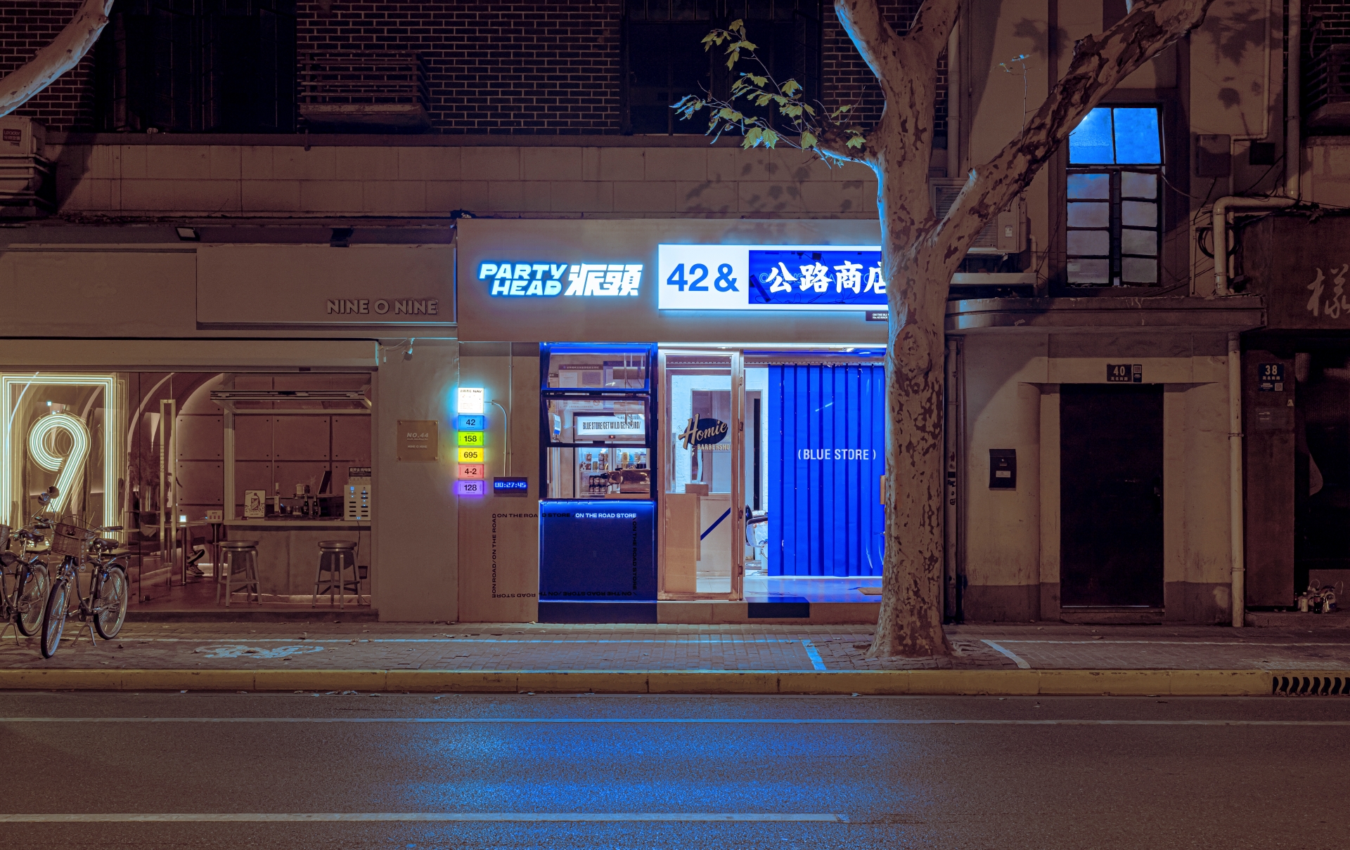
In popular theories, colour could be used to represent emotions. Red conveys passion, blue means calmness, and the green represents peace. Not necessarily true. Now that we have done an interruptive action, it would be best for us to use the most straightforward and basic way to define every store. Like animals use smells to define each zone, we wish people could recognize different stores by this strong medium. Patch on the streets, divide the zones. Red, green and blue contain immeasurable possibilities. When night comes, the RGB lights spark the three streets and naturally wake up dopamine inside young bodies.”
Passionately, the designers continue their sentiments, “There are actions of things, actions by people to things, and actions to people from things. RIGI takes a lot of actions here, we are trying to spark action with these gears. Maybe you would like to lean on something, sit somewhere, open a bottle, or toss a cap. Stories happen randomly, and that is On The Road Store. So many things might happen through the night, not maybe nothing at all, both of which are reasons people come here. For example, the poles are always the sexiest installations in the streets, no matter what is on them, illegal flyers or graffiti. It is a billboard for young people, so as we respect the authority of the poles, we also put a functional gear on it, where you could hold a beer on it or just give it a punch. Wish it a more confident pole with this piece of equipment. Ultimately, a colourful patch simply covers a corner in the city. It is not important to tell if it is a harmonious design because at least we are being honest with the nature of the colour. What distinguishes us from the vulgarness and affectations found in many other projects. The crowd in the street. Two seats. Who can sit? How to sit? When to leave? What to do? That's how it begins. Existence is the meaning. Repeating is power. We want to leave the evidence in the city.”
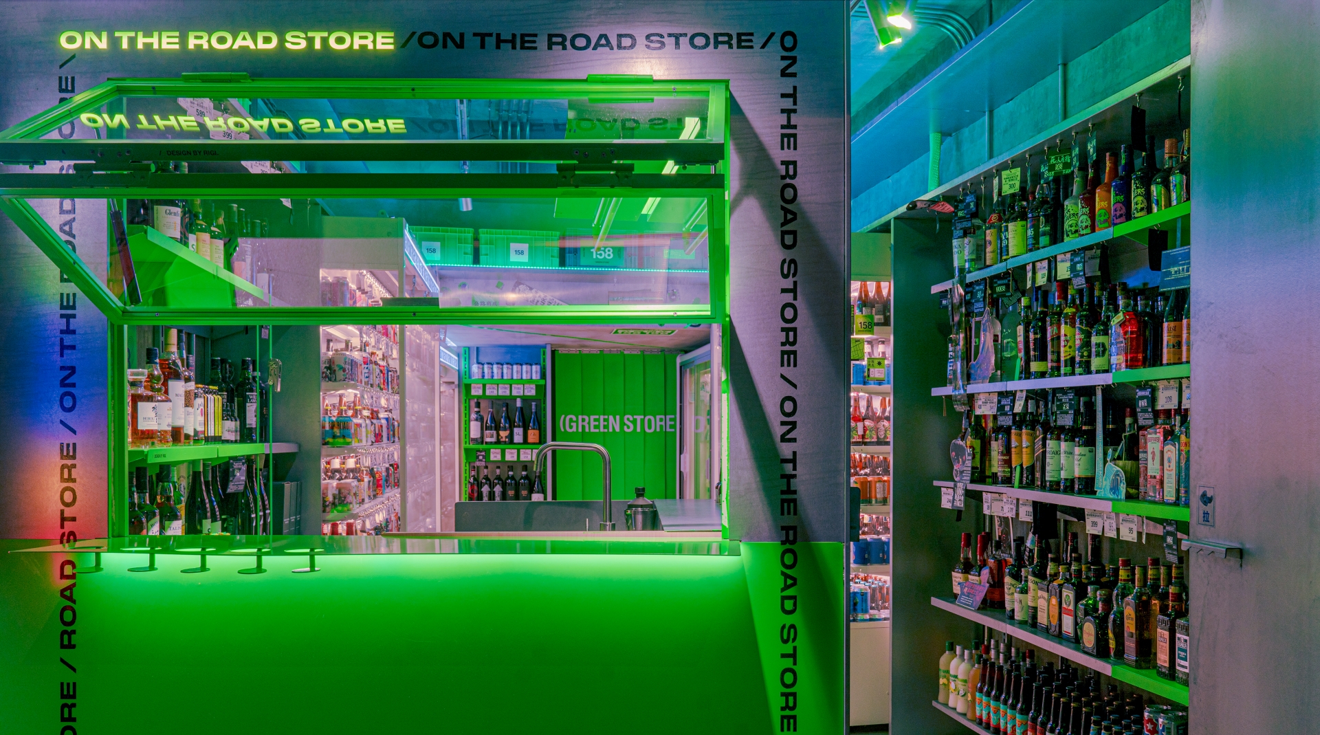
In these stores of approximately 200 square feet, where everything is related to liquor, every bottle of wine is a story or an attitude. This is a convenient shop about alcohol, and that’s the only thing it sells, but you get far more than that. As RIGI makes clear, every destination should not be the final point, because the meaning of the road is always found in the next stop. Only by continuing to strive forward could ensure one's joy found today doesn’t become just a memory. They conclude, “Stories always happen randomly, change occasionally - we think this is what On The Road Store means to the young generation, and also why we design. At every fussy but energetic night, we hope it can provide people with more unexpected joy.”