
PODCAST
WHAT MAKES A GOOD CONVERSATION? LOOK NO FURTHER THAN OUR ART OF THE CONVERSATION, FEATURING UNCONVENTIONAL STORIES AND PEOPLE WHO MOVE AND INSPIRE
LISTEN NOW


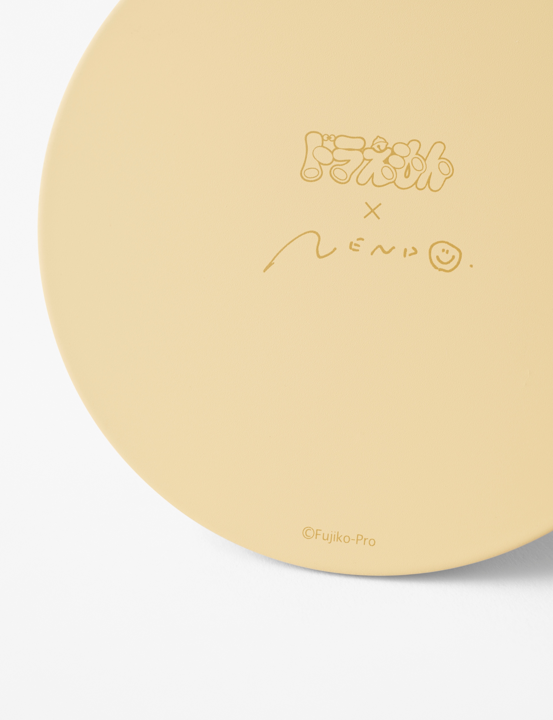
Whether you know him as ‘Ding Dong’ or ‘Doraemon’, this robotic cat from the 22nd century bearing different affectionate names and known for his special gadgets has made a lasting impression in our hearts. To commemorate the 50th anniversary since the first publication of the manga series of Doraemon by Fujiko F. Fujio, a series of products – a minimalist stationary collection was designed with Nendo’s signature aesthetic. Although there has been a multitude of merchandise in which protagonists of a story are depicted directly the way they are, or simply placed on the item, the idea for this project was to expand to new target groups and scenes by using a different approach.

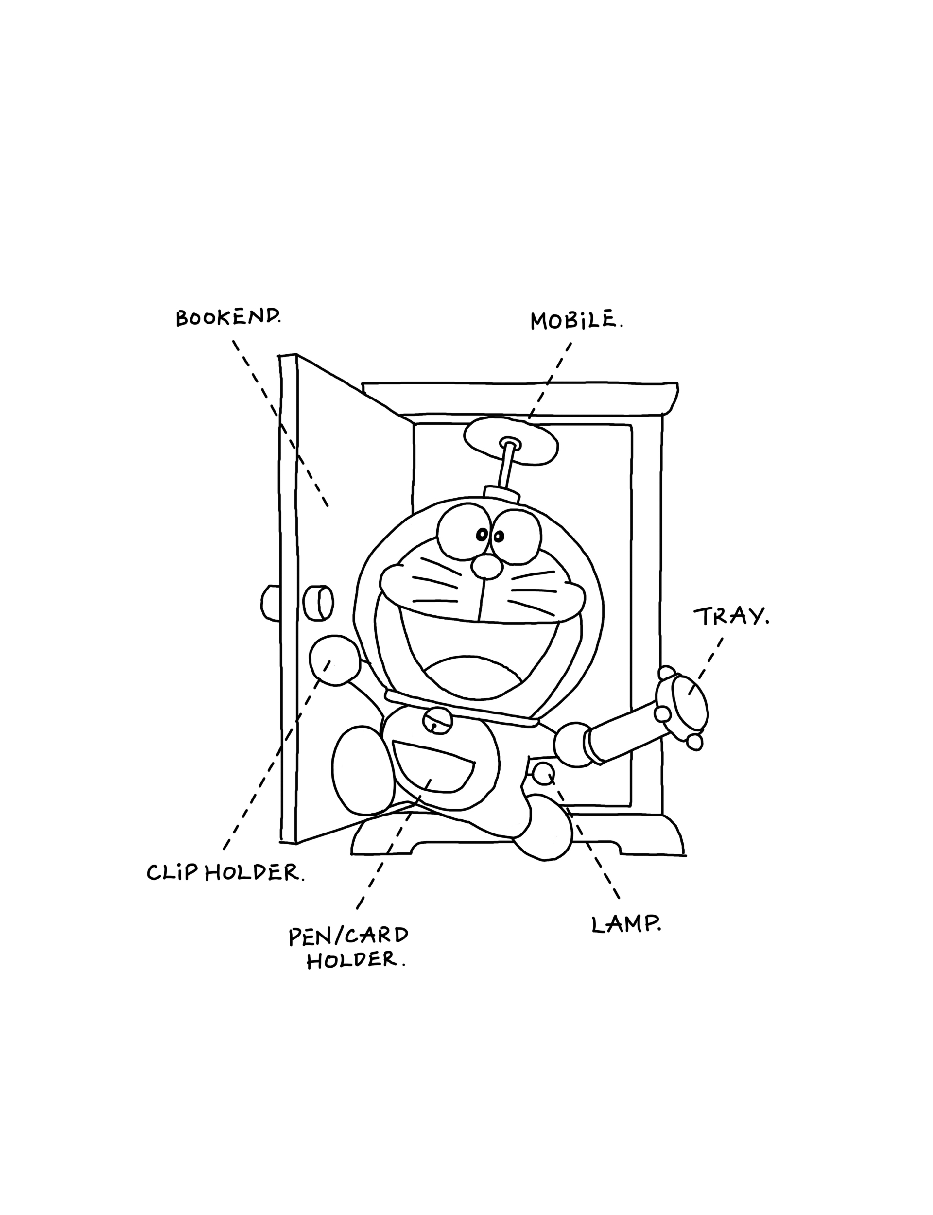
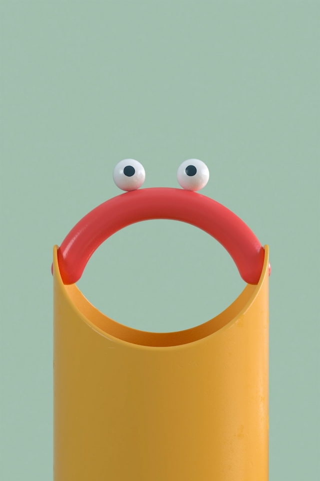
First and foremost, focus was placed on how one of the main characters, Doraemon, and many of the secret gadgets in the story are composed of simple shapes and colours. The collection of minimalist desktop accessories was created upon the assumption that the characteristics of Doraemon will not be compromised even if elements and details are stripped down to the absolute minimum.
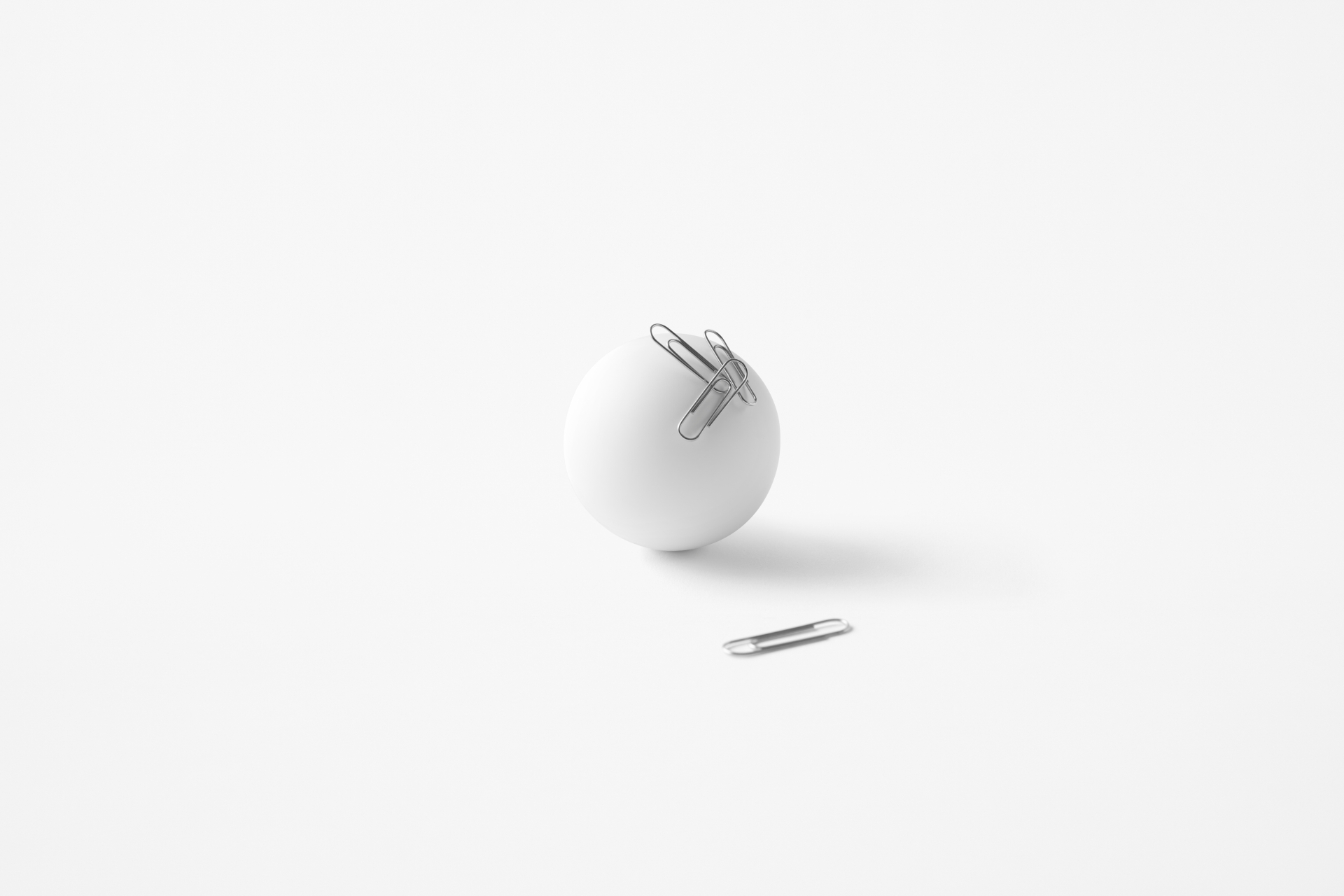
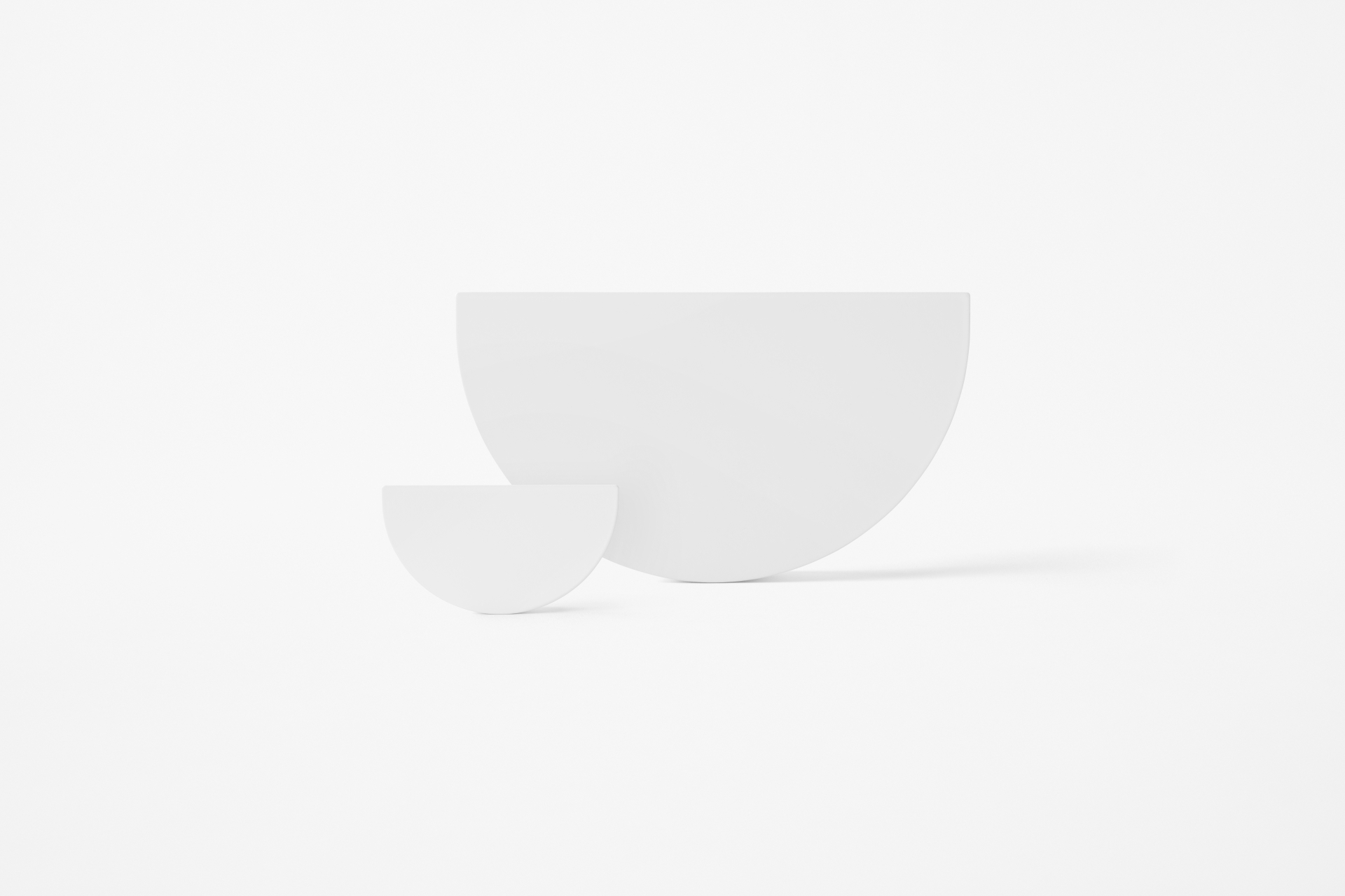
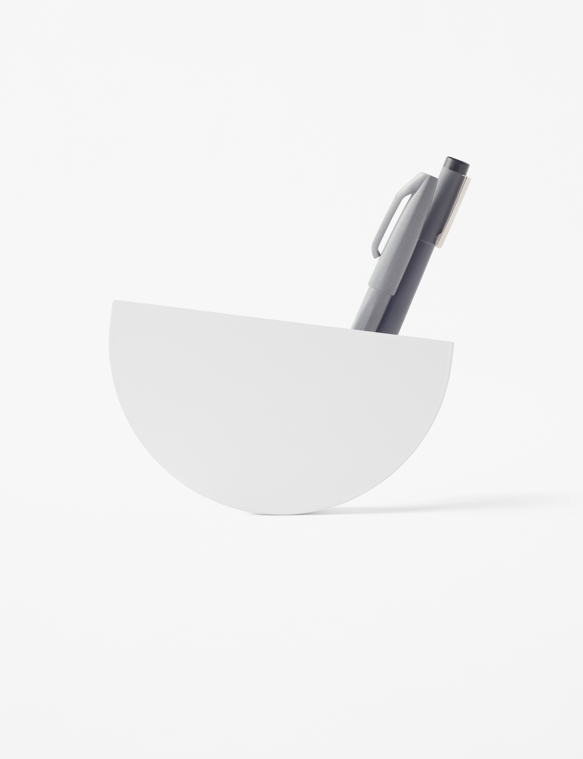
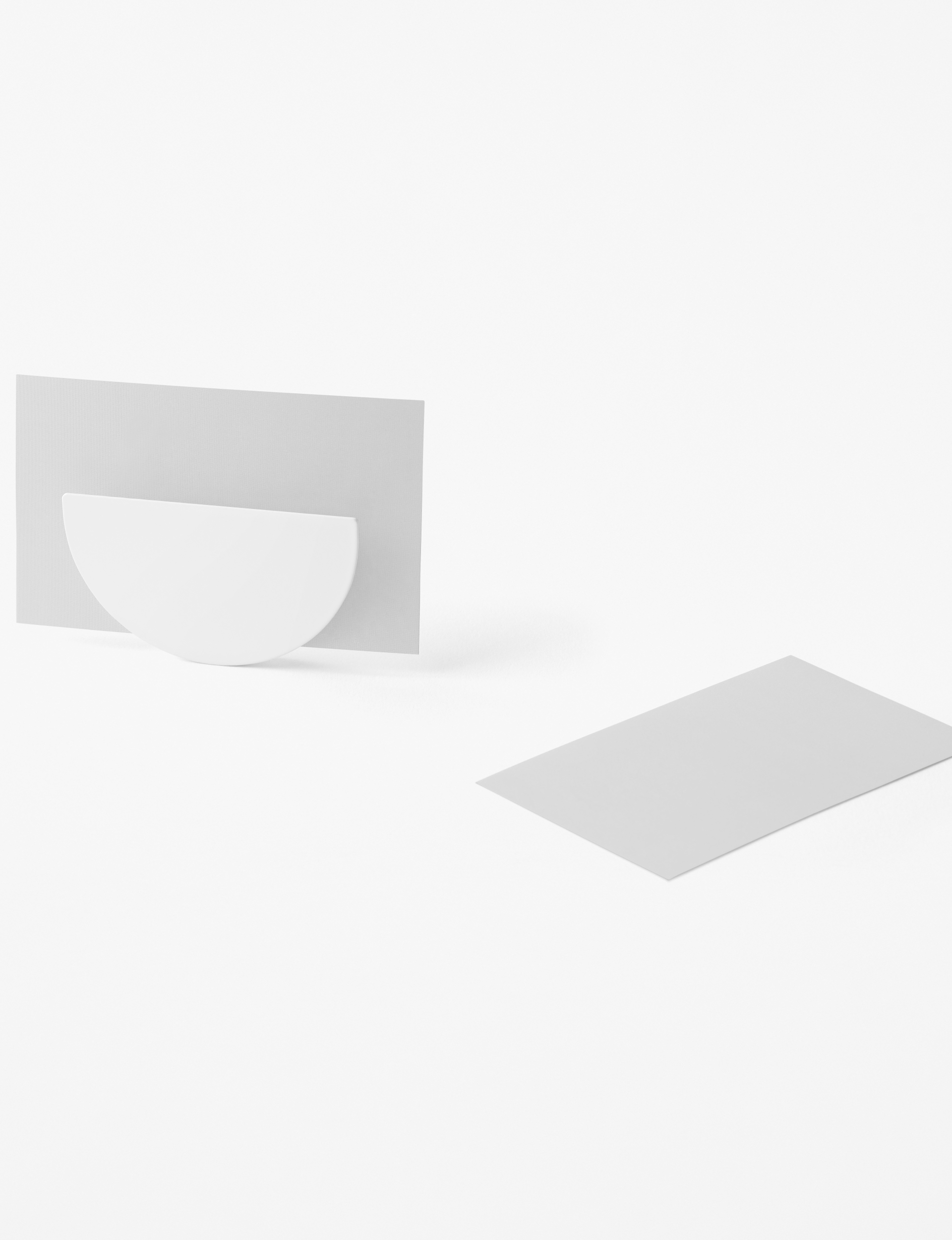
Doraemon’s hand takes the form of a simple sphere. With a neodymium magnet inside, the sphere can hold clips and pins that tend to be scattered all over the desk, and it can also be used to hold memos. The card holder and pen holder, both designed in the shape of Doraemon’s ‘4D pocket’, are balanced by the weight inside, as is the clip holder.
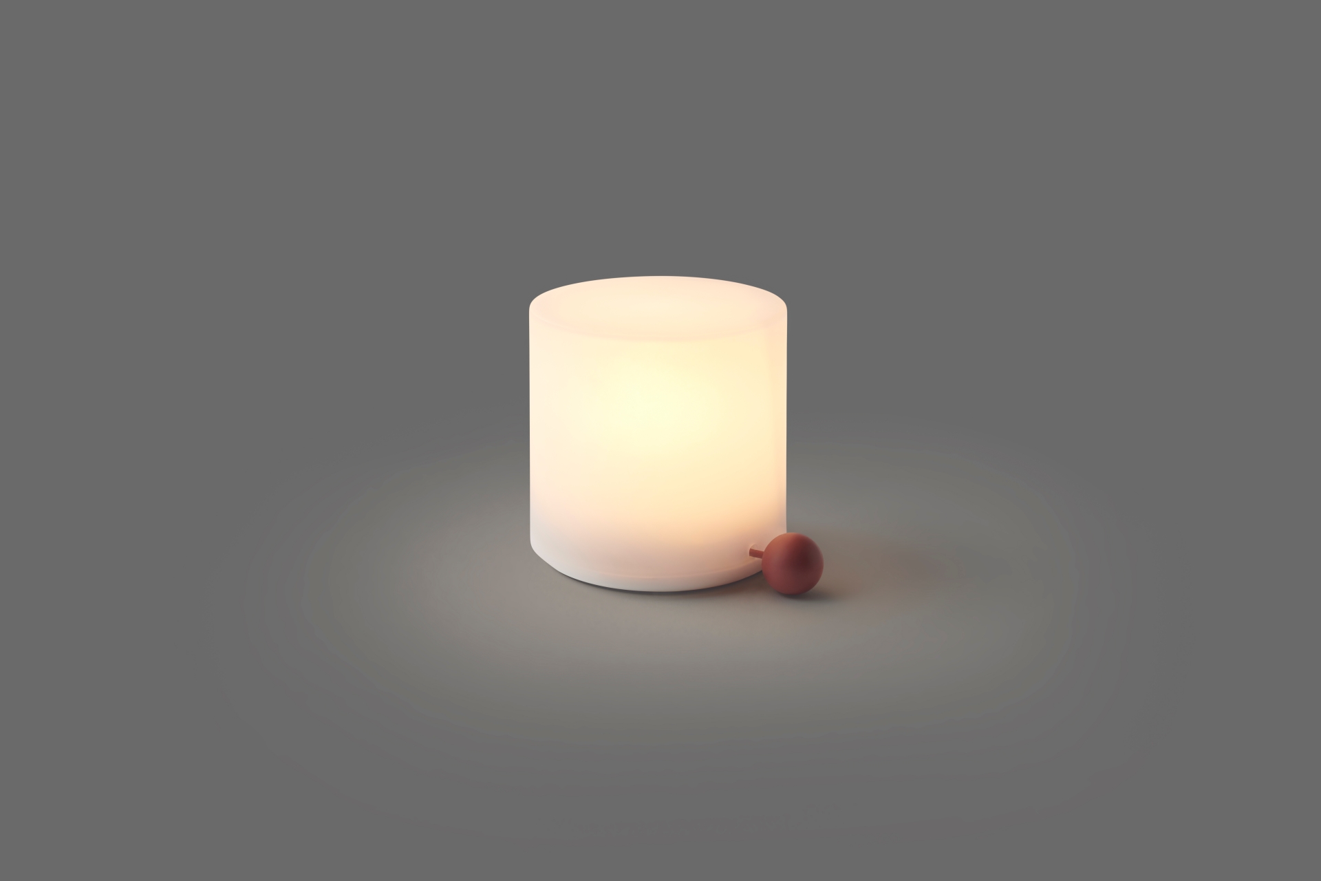
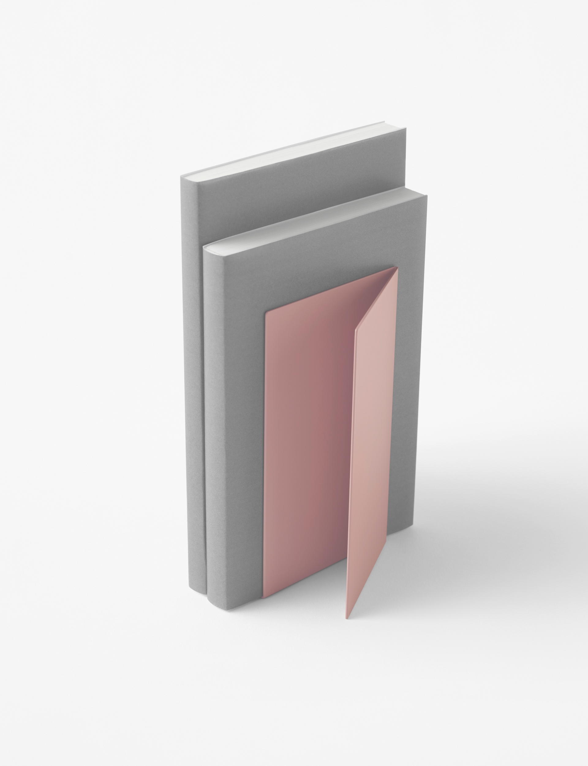
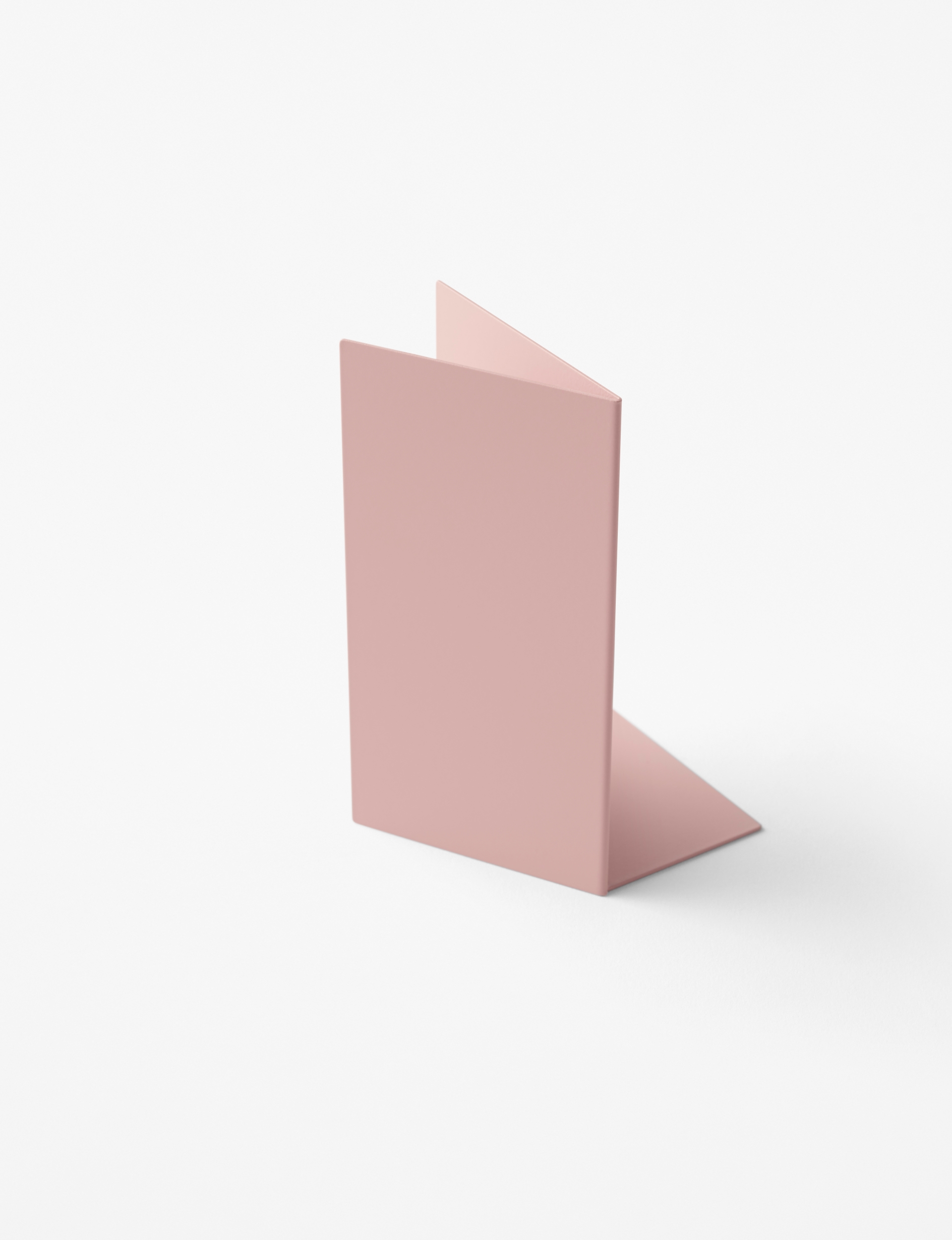
The lamp comes with Doraemon’s tail attached, which is a power switch that can be turned on and off by pulling on it, just like Doraemon in the story. The bookends featuring the ‘anywhere door’ motif were inspired by the fascination of books, which allows anyone to move instantly between various worlds.
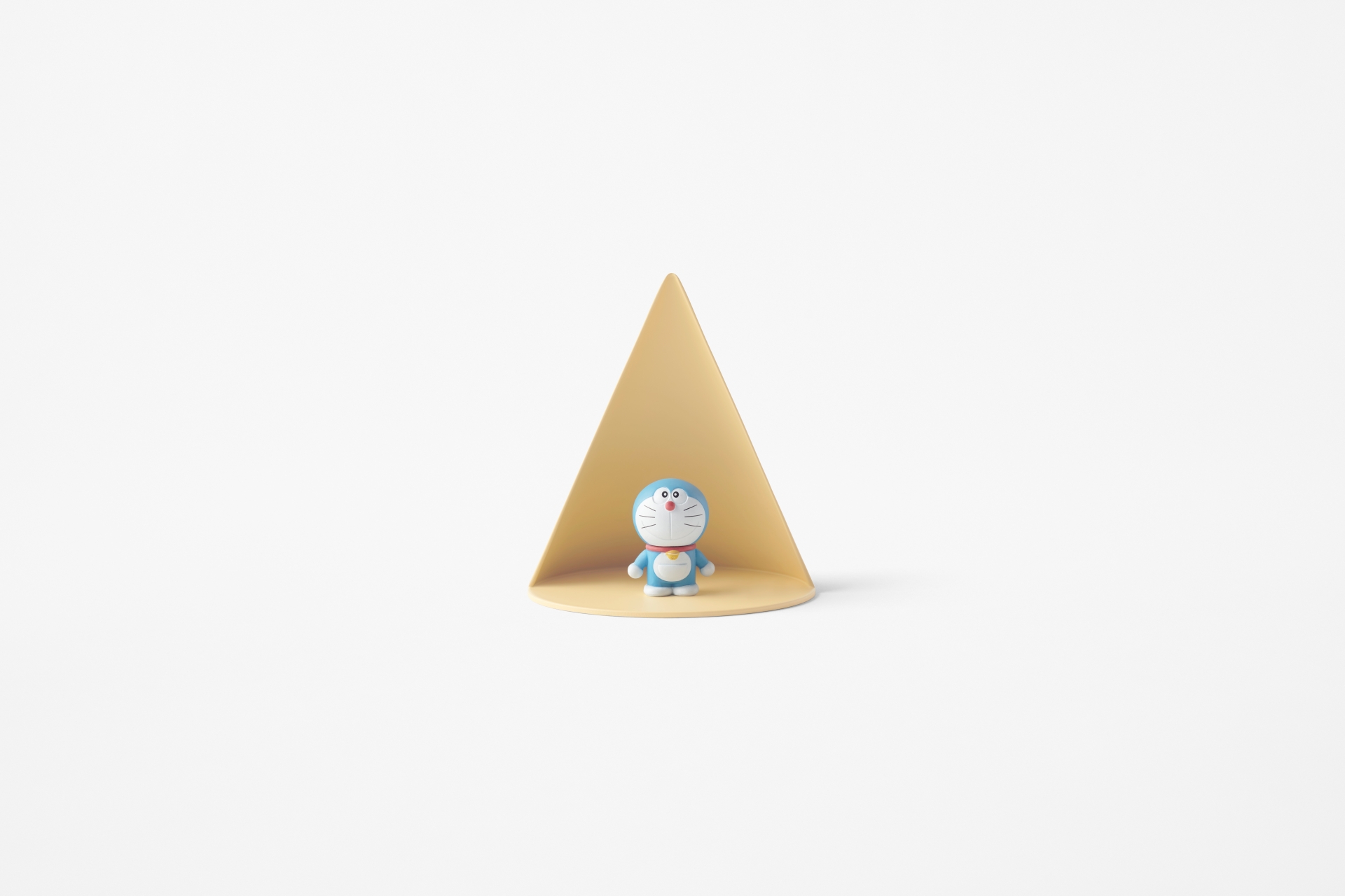
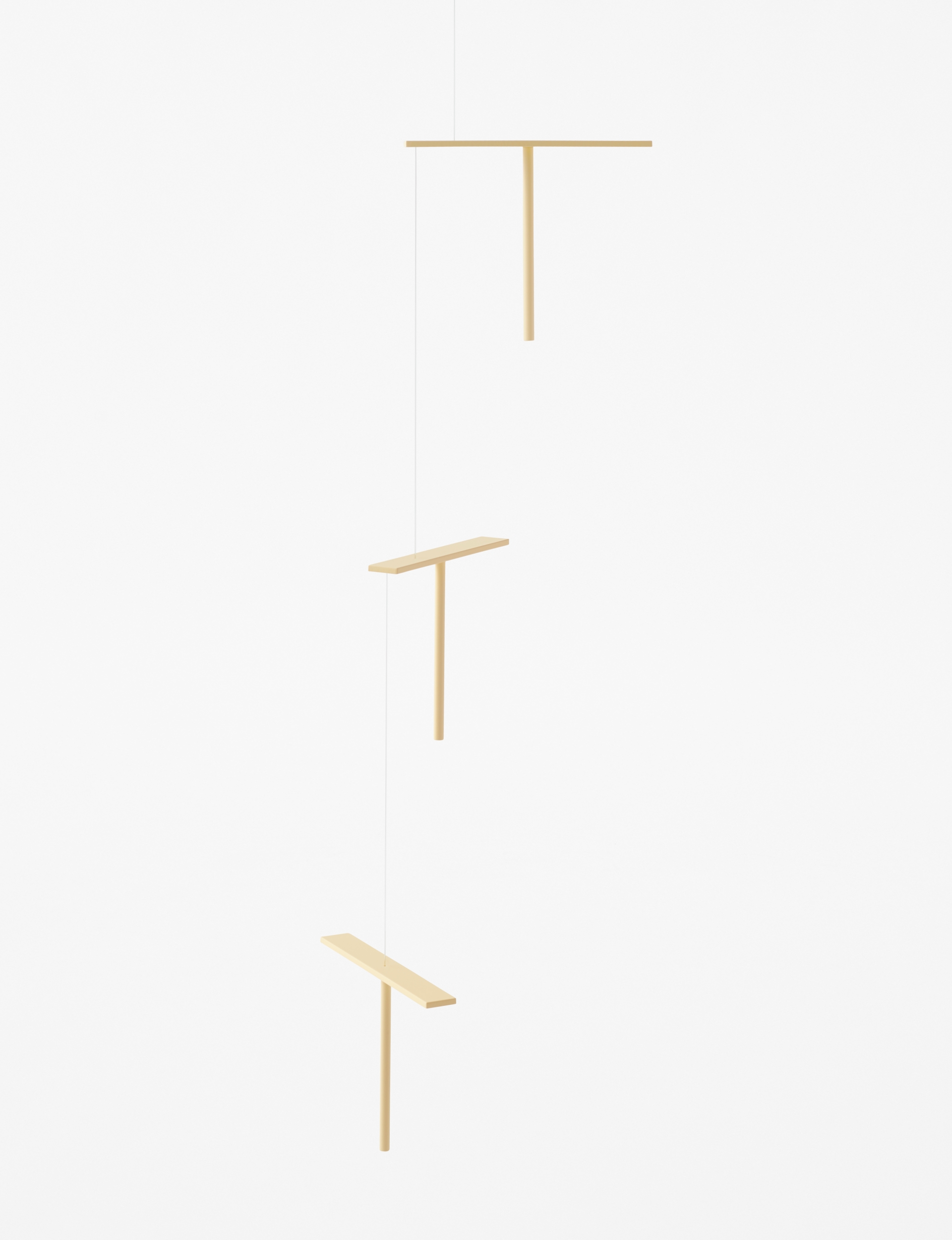
Meanwhile, the tray for small articles is in the shape of a beam emitted by a ‘small light’ straight from above. When a figurine is placed on it, it looks as if it has been shrunk in the light. The mobiles, enlivening the interior with their floaty movement in response to the flow of air, are in the shape of ‘hopters’. Rather than simply abstracting the shapes themselves, the collection is designed to be cognizant of, and linking to, the functions and roles of each item in the story. While our childhood has long passed, we can thank the tireless creative wizards out there whose work unfailingly reminds us that the wonder and innocence of childhood never really disappears.