Red Dot Design Museum in Xiamen is the third Red Dot Design Museum globally and the second in Asia. Unlike traditional museums, Red Dot Design Museum mainly exhibits industrial design products that are close to people’s daily life, which naturally inspires us with the relation of consumer culture.
Andy Warhol once commented: “All shopping malls will become museums, and all museums will become shopping malls.” Inspired by this comment, STEPS Architecture decided that rather than designing another traditional white-box type of museum, the team should break the boundaries between the two spatial systems of museum and shopping malls. This fortunately coincided with the main idea of building a new type of design museum.
From arcades emerging in 19th century Paris to shopping malls nowadays, the concept of “idler” that Benjamin created has now become a common value that architects firmly guard: Creating as many free public spaces as possible in urban consumer environments for people to enjoy and for leisure. Learning from shopping malls, the team tried to create a museum that feels like wandering in a shopping mall by balancing commercial and free public spaces.
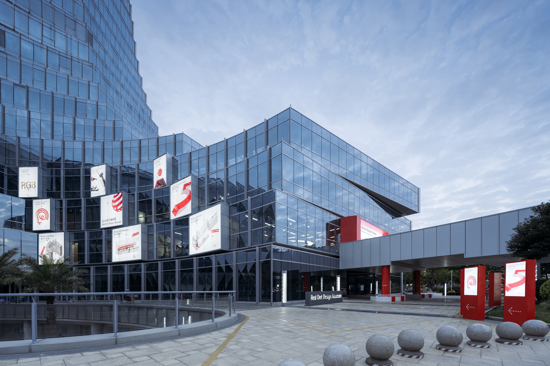
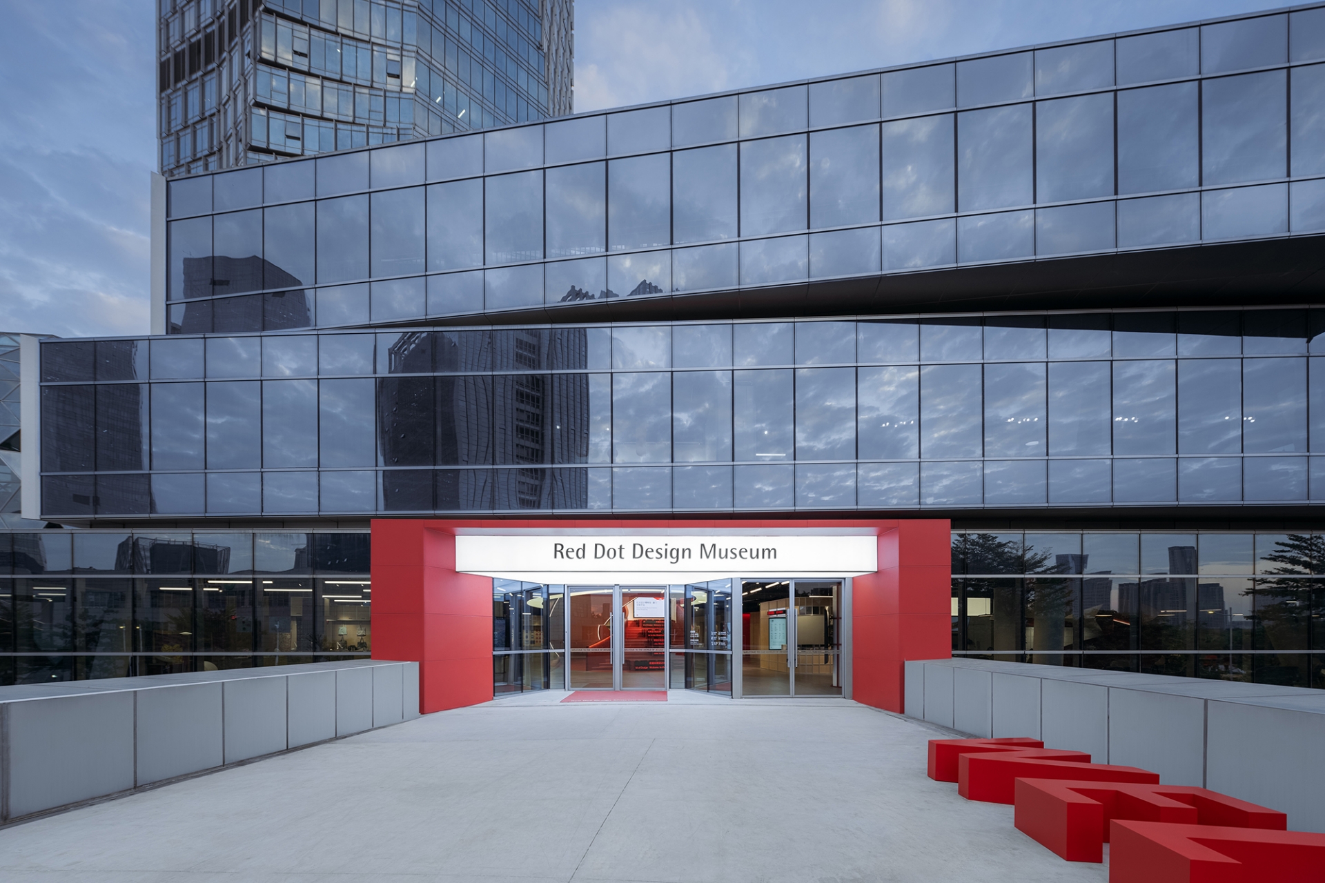
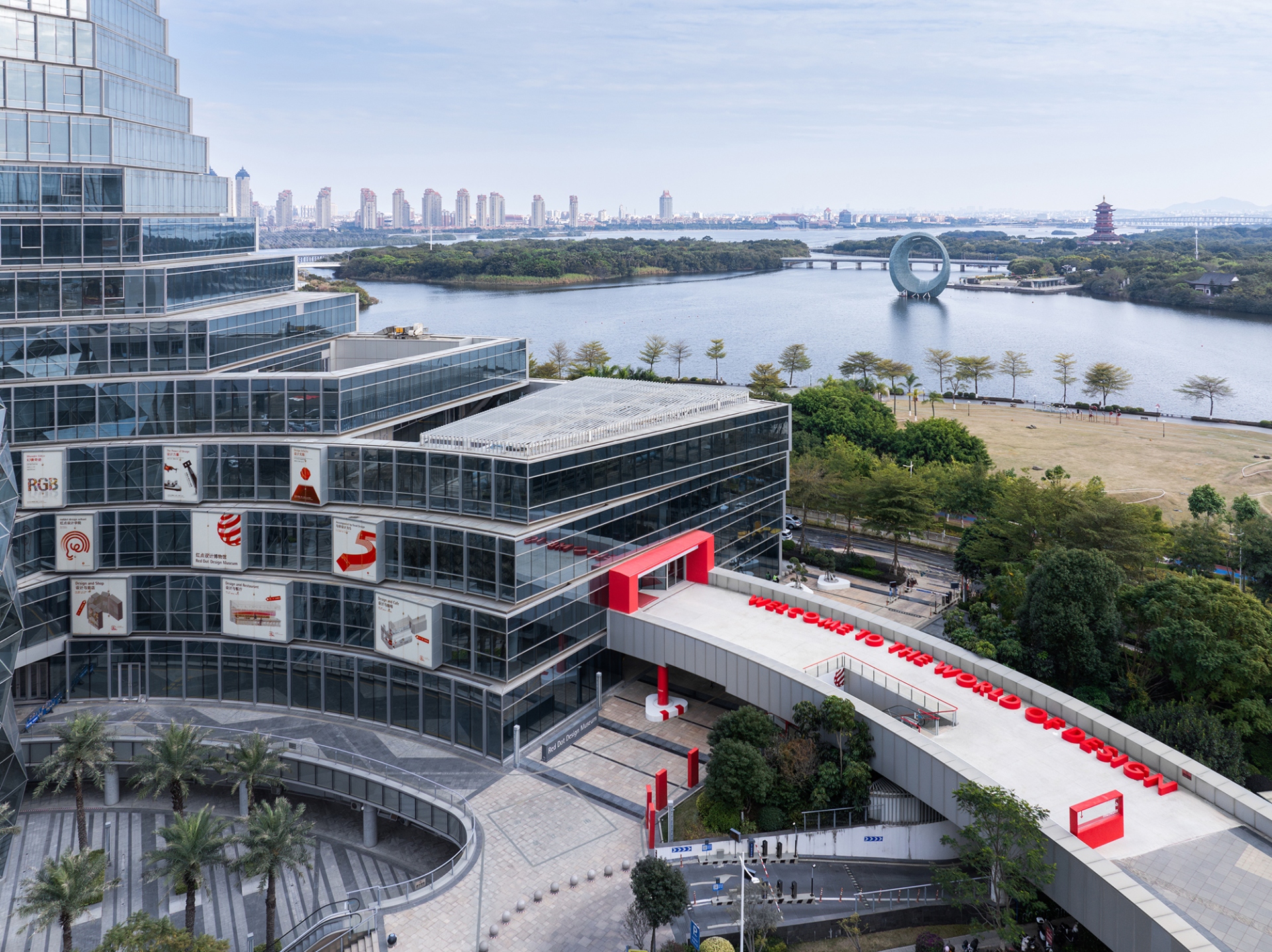
The new museum is located in the commercial podium of the highest office building in Xinglin Bay, Jimei District, Xiamen. The team at STEPS Architecture tried to adapt the original spatial properties of a shopping mall into new museum spaces, thus activating this long-vacant podium. First, they reused the commercial façade to showcase museum posters. On the exterior plaza and bridge, by implanting a series of red elements as poster installation, column and railing paint, alphabetical seatings and canopy, they created a distinct pathway that leads people to the entrance of the museum, which also serves as the exterior public spaces of the museum, bringing a distinct shred of red to the city.
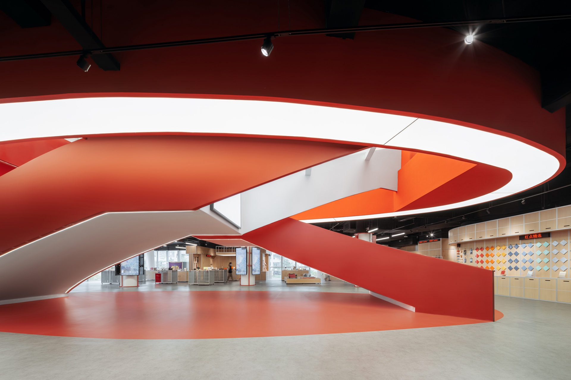
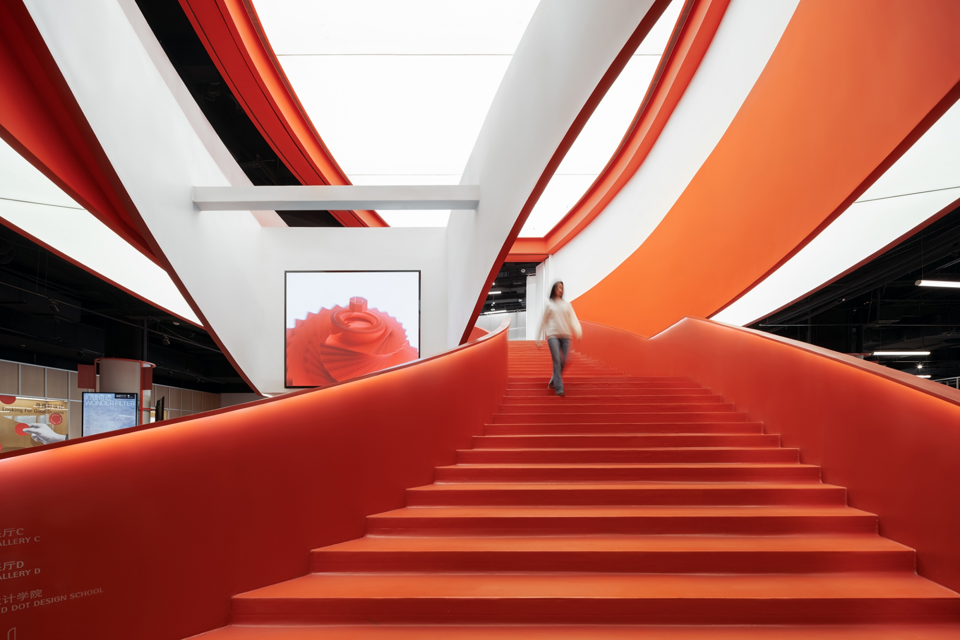
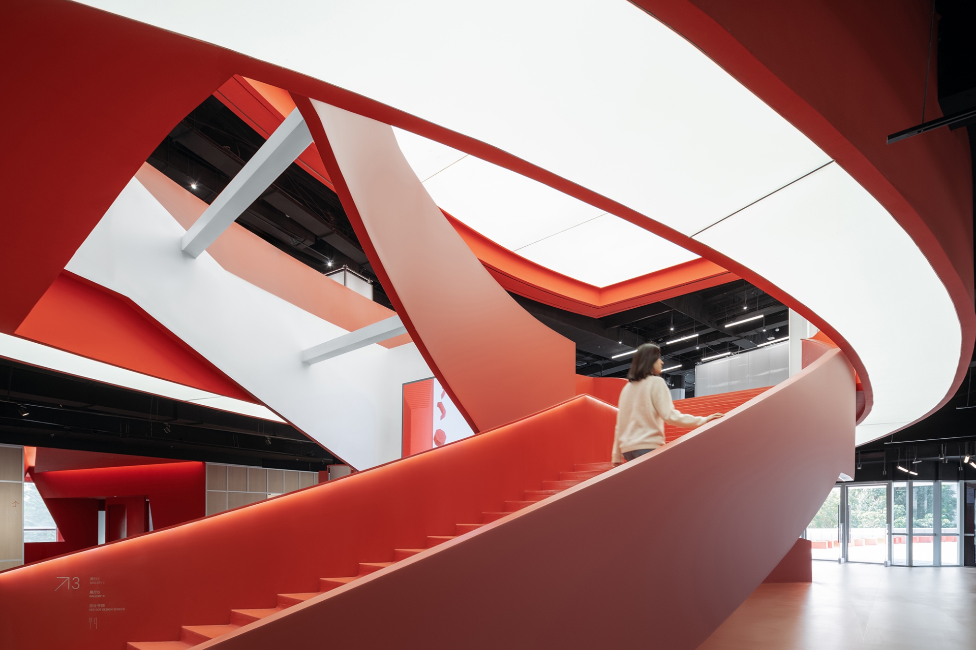
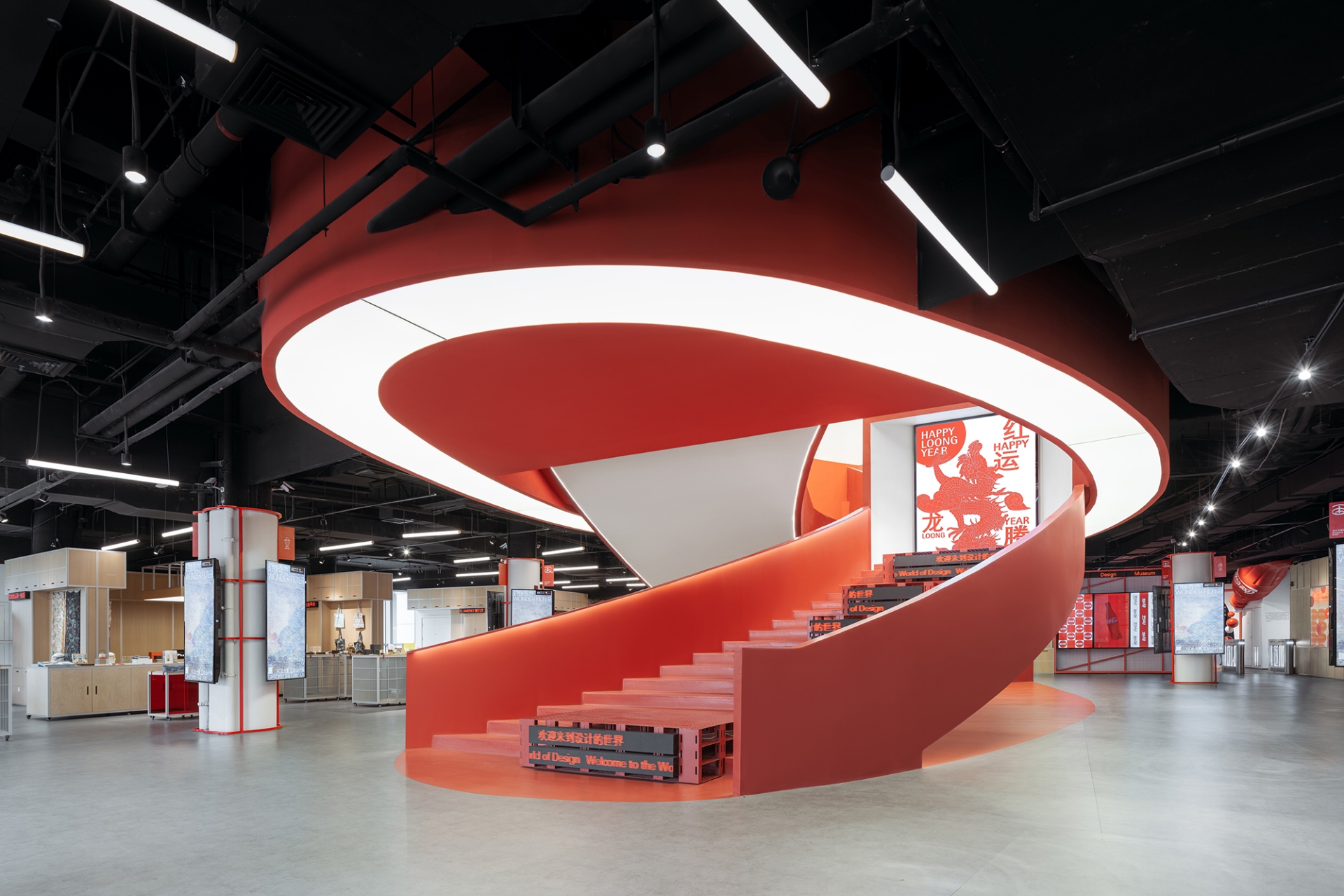
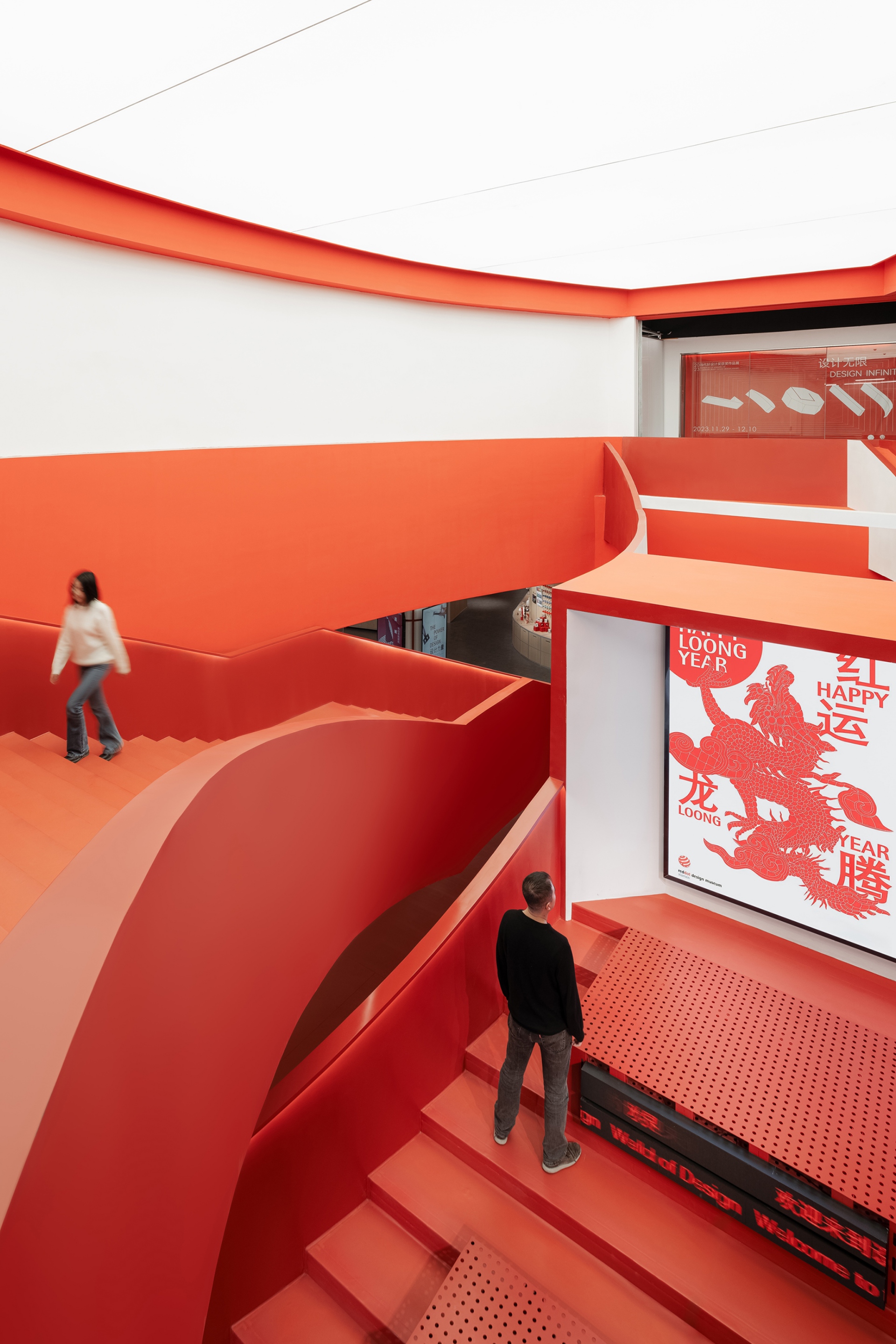
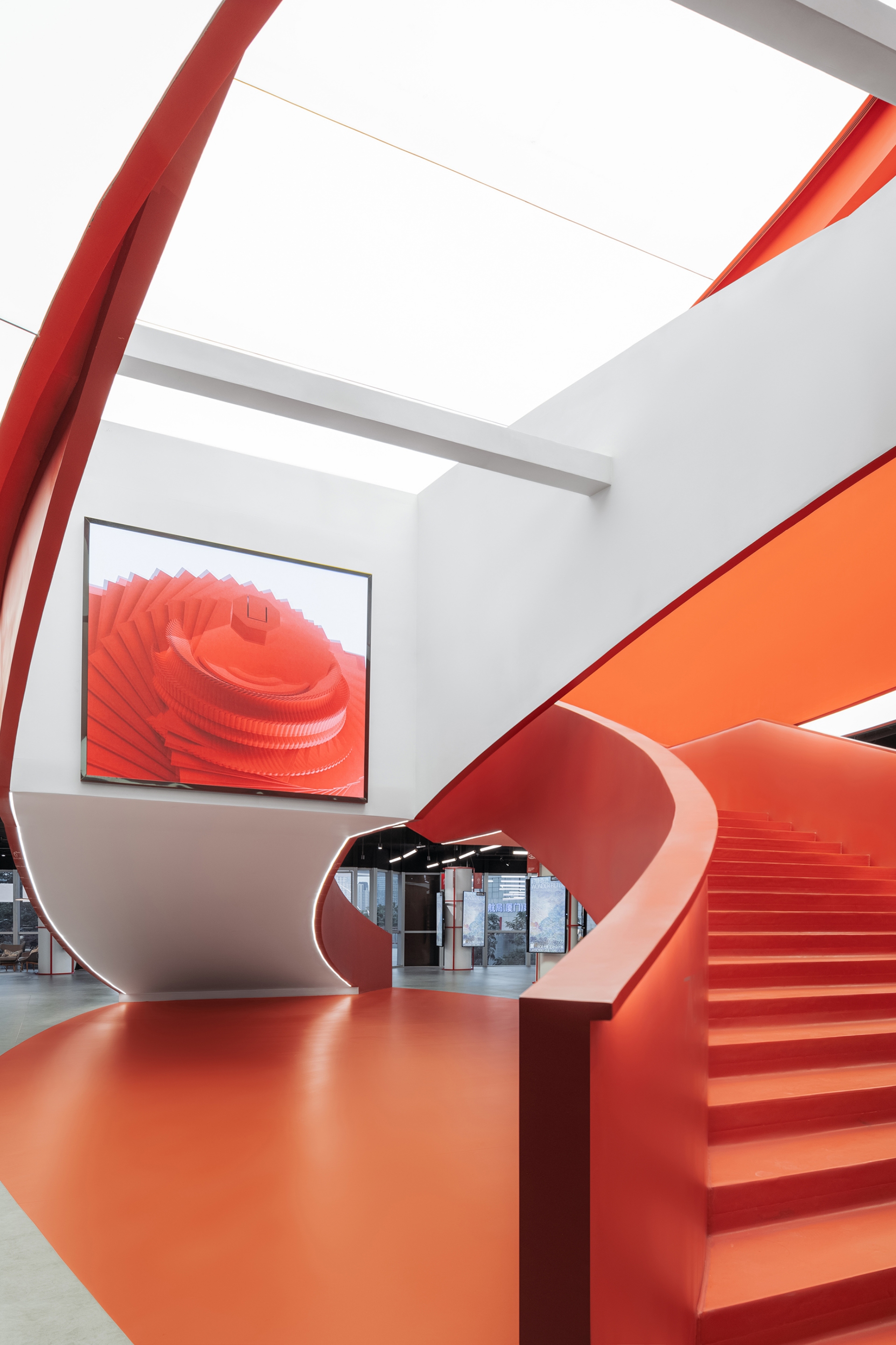
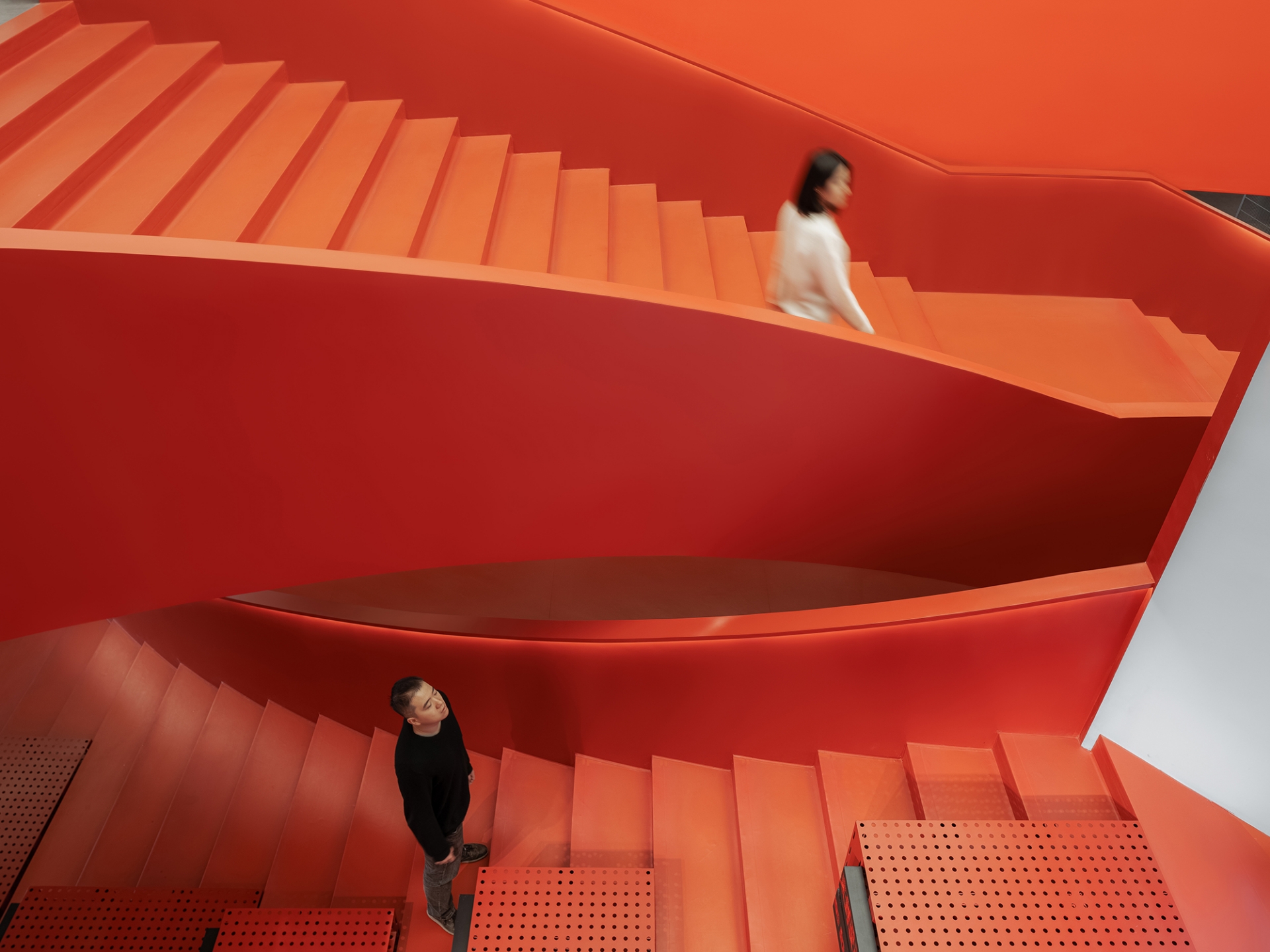
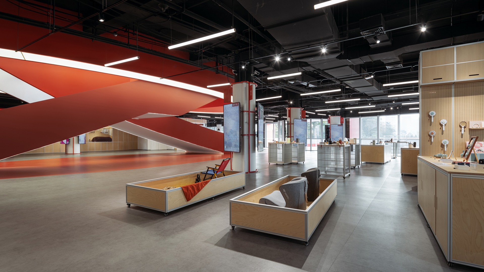
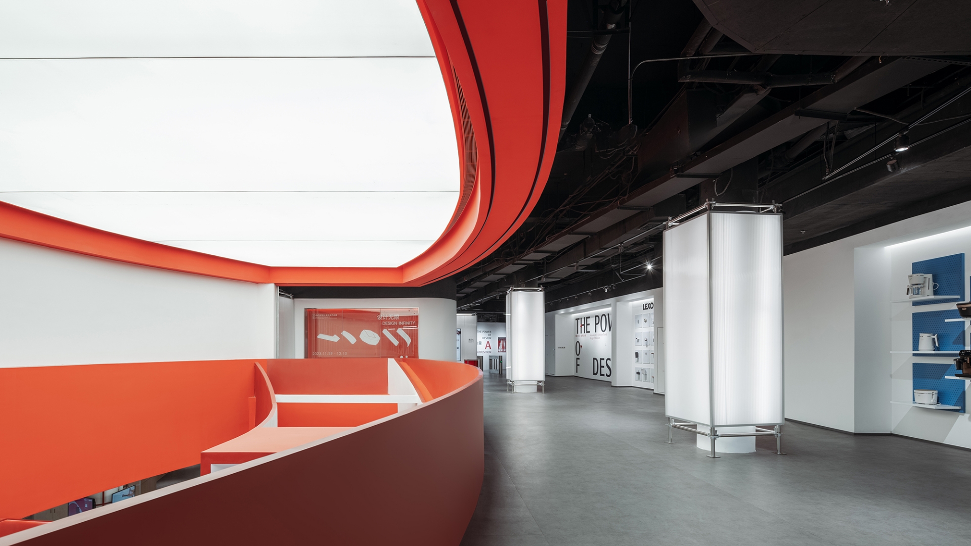
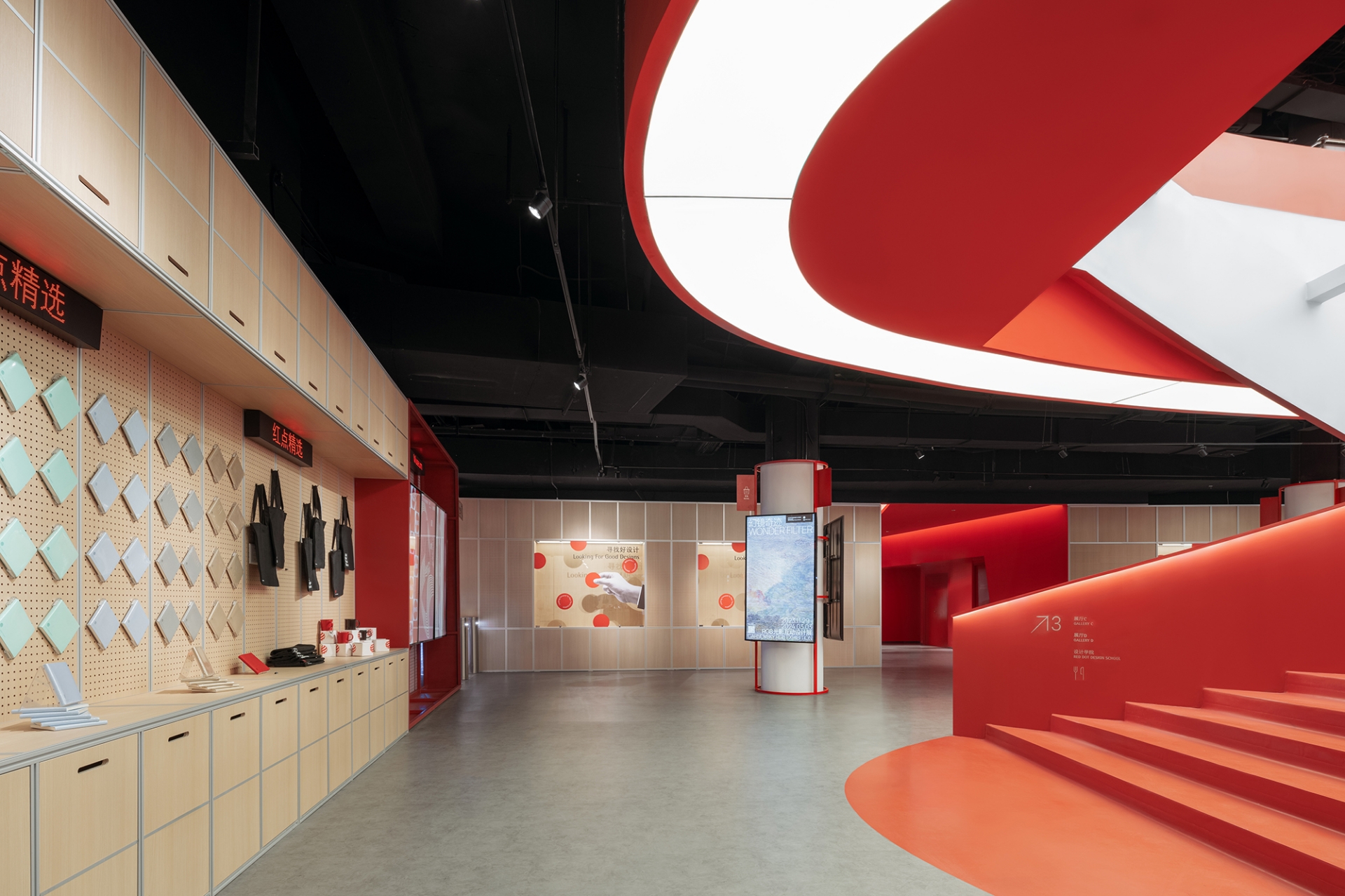
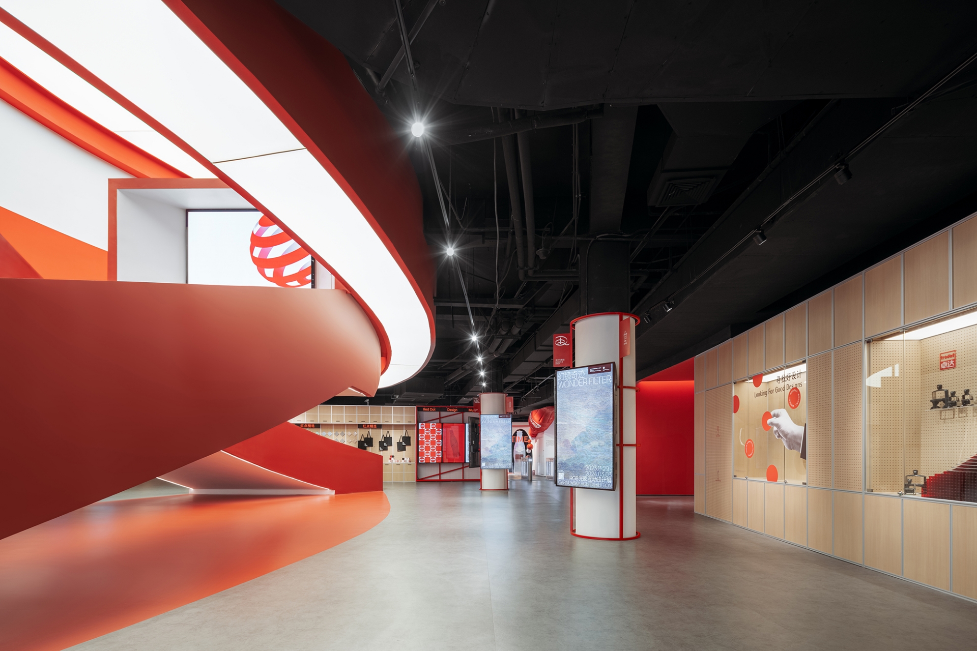
Collaborating with Network Party, the designers took full advantage of the interior spatial properties of the commercial podium to form essential public spaces of the museum, which are the spaces of retail, coffee and restaurant. The atrium facing the entrance is the most distinct feature – the team removed the escalators and turned it into the most iconic double-spiral red stair that serves as the visual core of the museum. One half of the double-spiral stair facing the entrance serves as the “display stair” which seats the LED screens showing posters and videos that are updated periodically, and the other half leads people to the upper floor. The double-spiral stair intertwines dramatically, bringing much attraction both off and on-line.
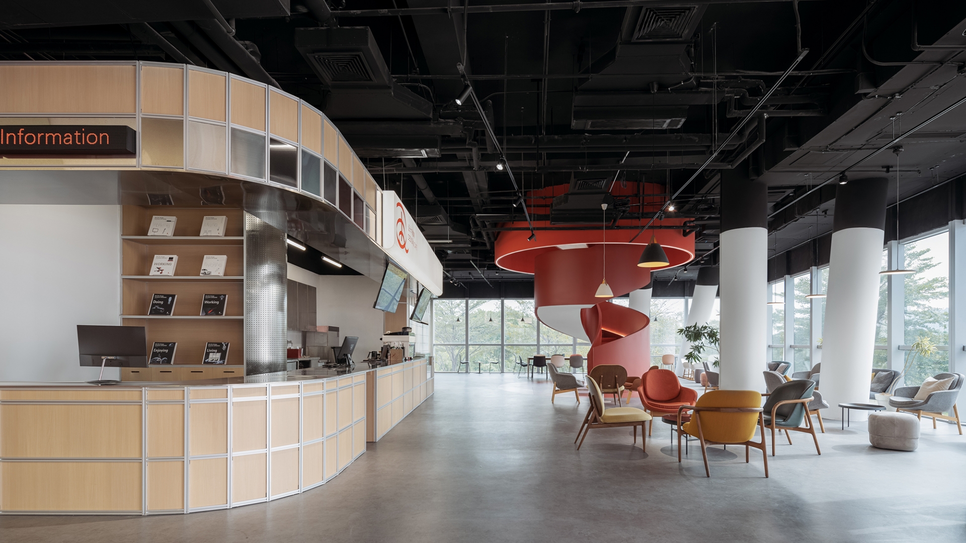
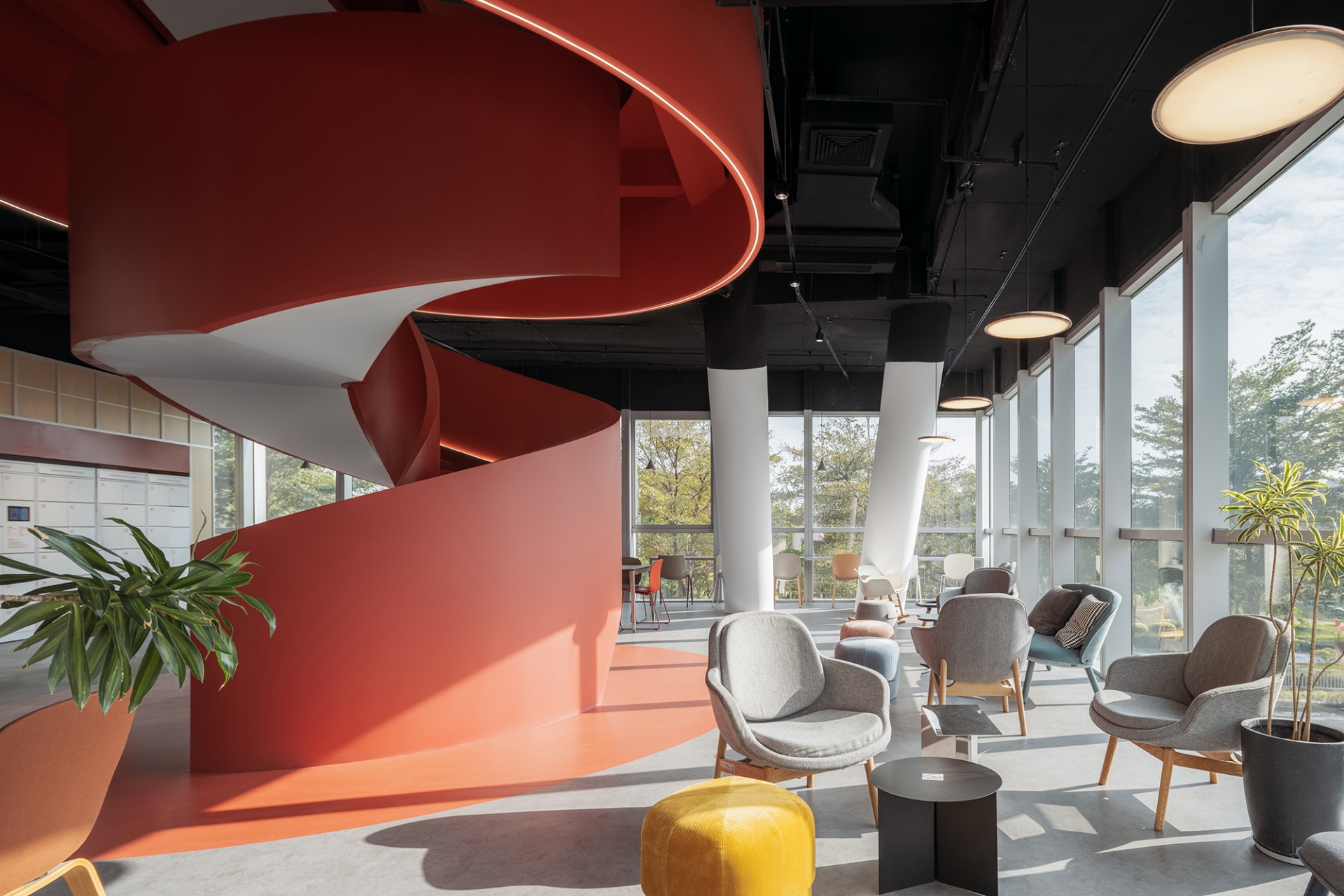
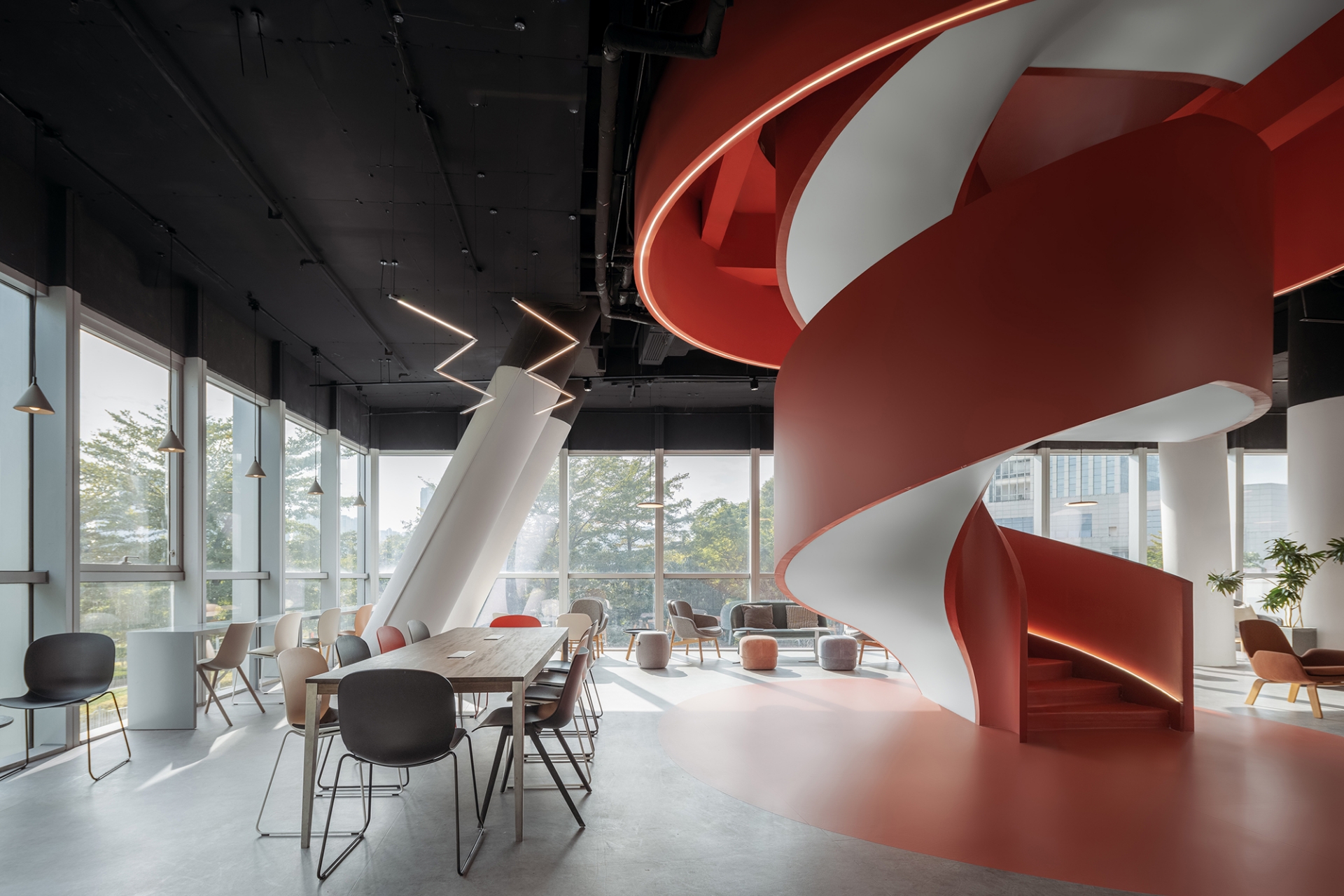
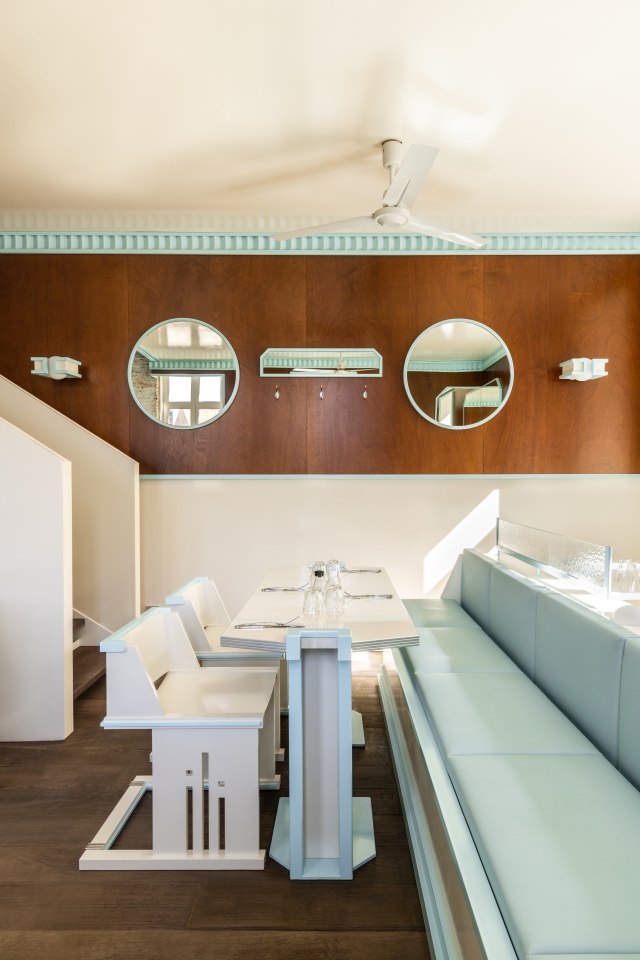
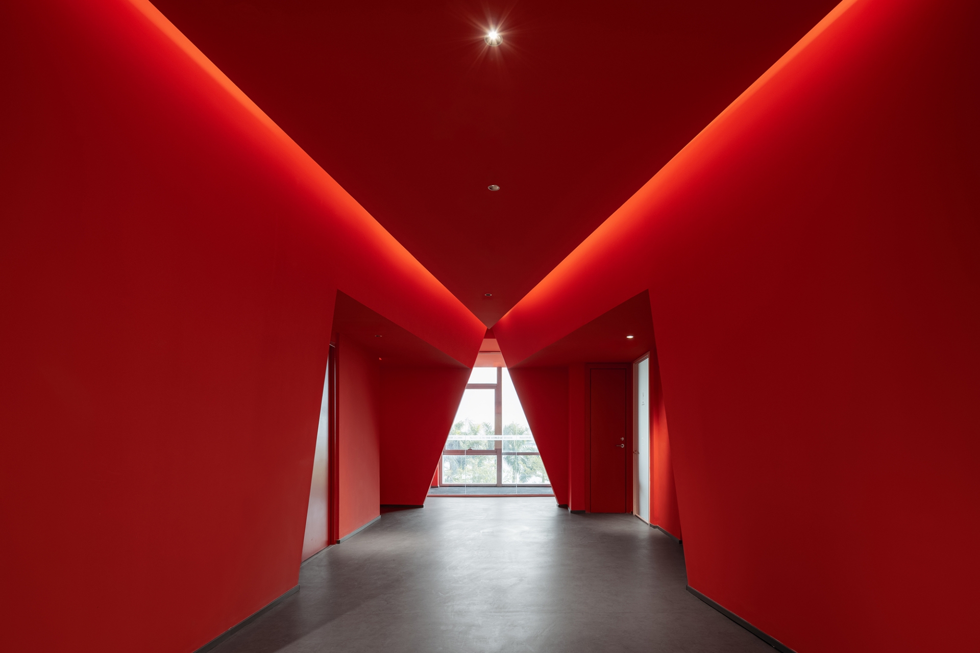
Meanwhile, the edge spaces on the 2nd and 3rd floor facing Xiamen Horticulture Expo Garden are sufficient with daylight and sceneries, so the team only added counters and reutilized award-winning furniture, creating comfortable coffee spaces and restaurants, and to connect these two spaces the team implanted another iconic red spiral stairway. They also took advantage of the space leading to restrooms that are common in shopping malls, transforming it into a dramatic red tunnel, which naturally forms a triangle glass showcase in the end, serving not only as a viewing window but also as exhibition space.

To achieve the continuous wandering experience that the STEPS Architecture team learns from shopping malls, they tried to blur the boundaries between exhibition halls and other spaces, creating the sense of a big integral space without partitions. Exhibition-oriented and prefabricated boundaries are two strategies that they implied to achieve the goal of a museum without walls.
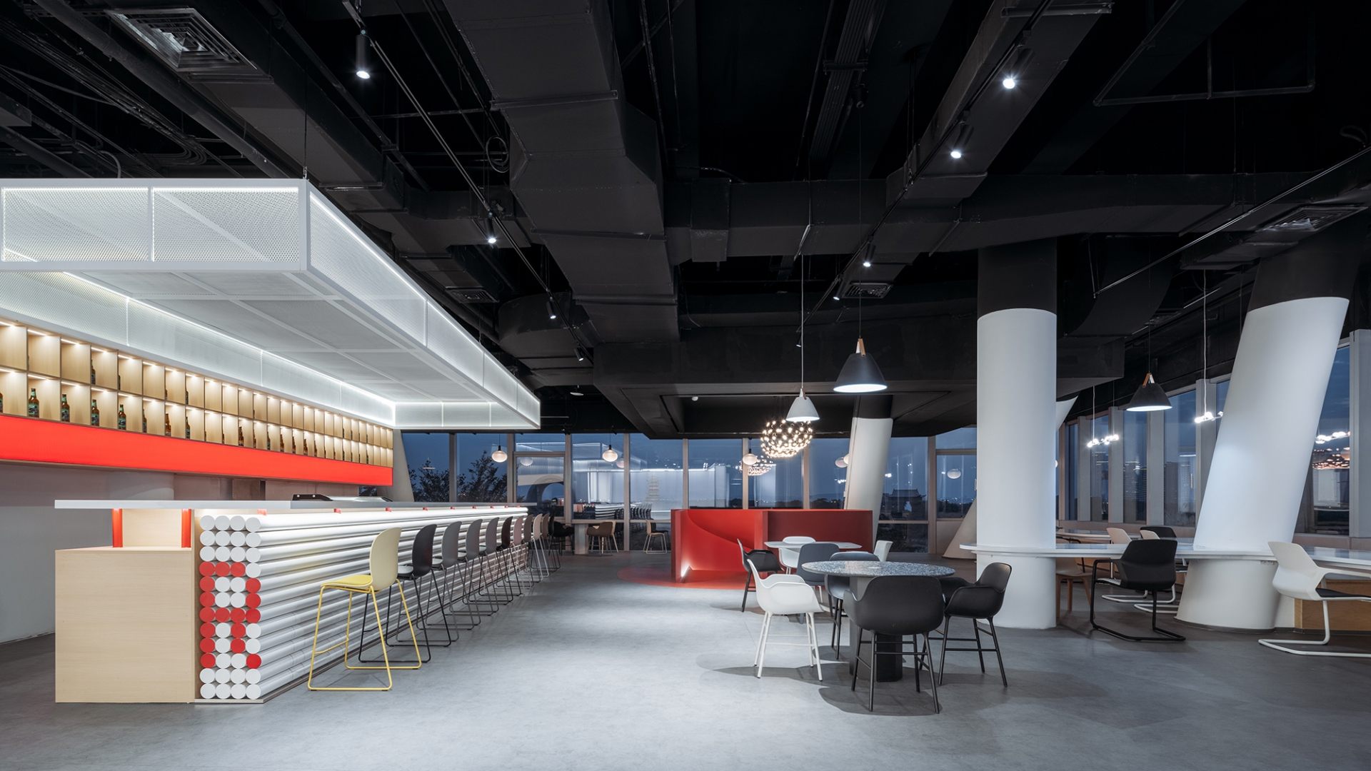
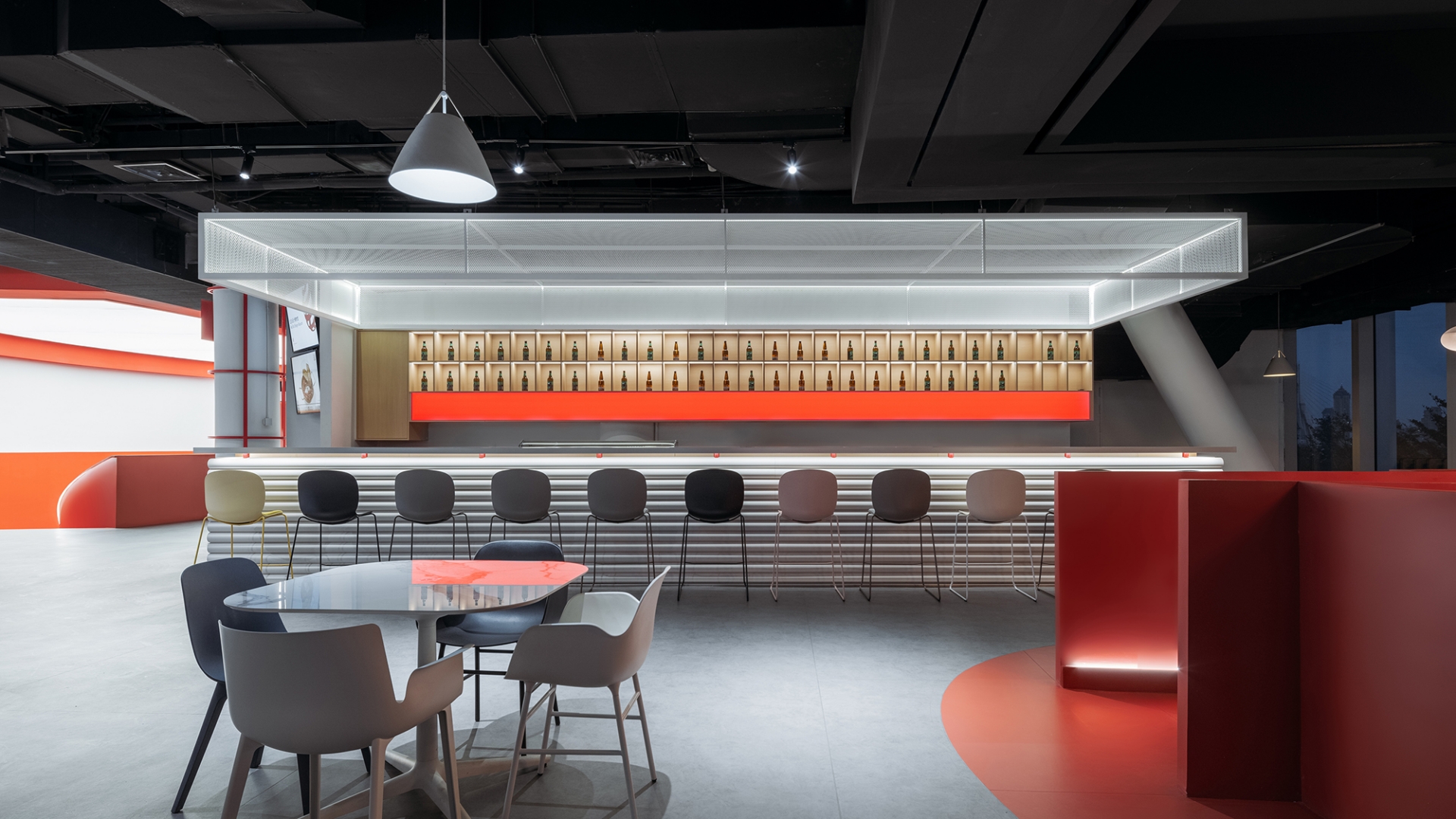
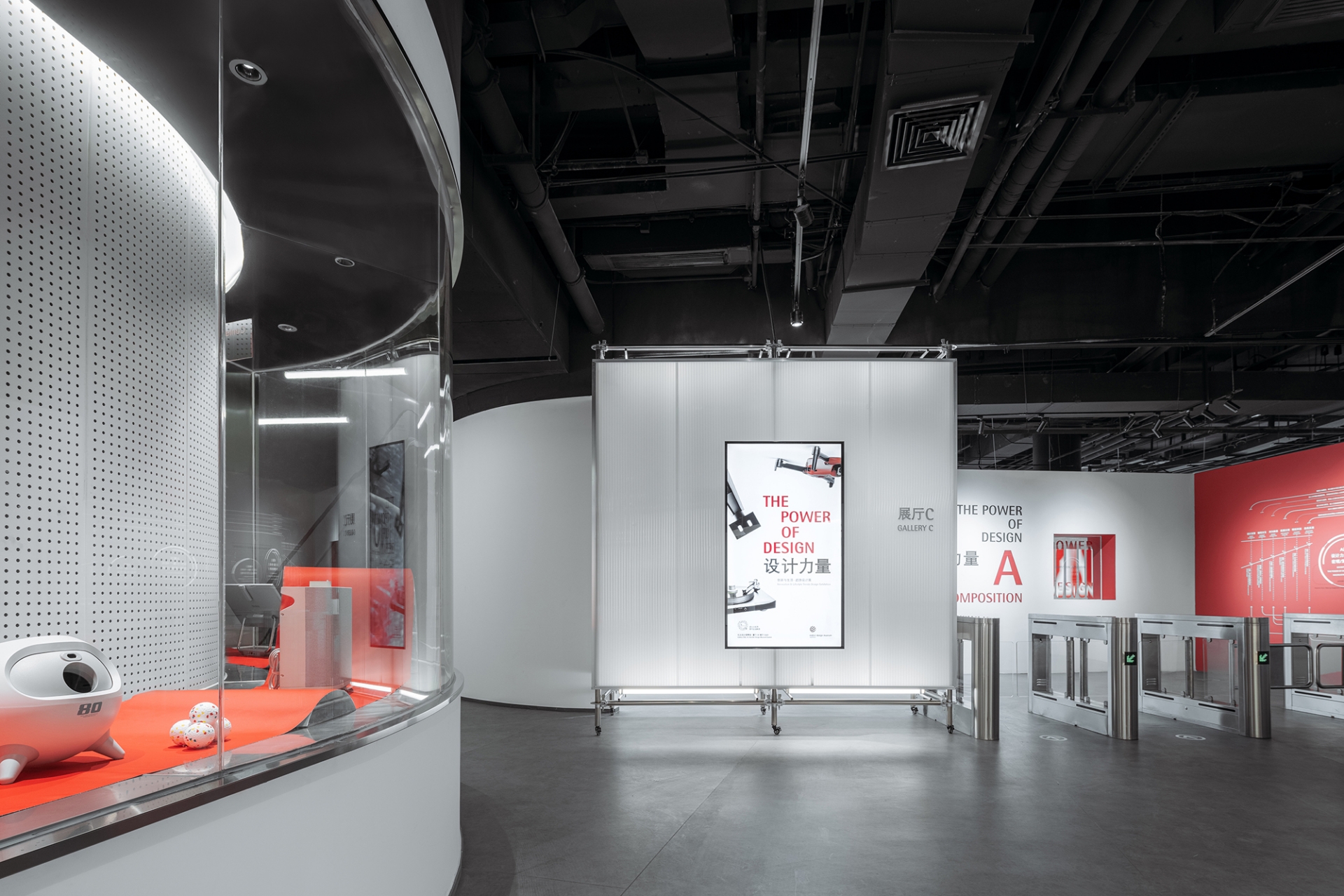
Exhibition-oriented boundaries: The design team placed many showcases, openings and perforated panels in different forms on walls of corridors, giving these spaces the property of exhibition, making them free exhibition halls for viewers, and also bringing extra revenue to the museum by leasing these showcases to companies.
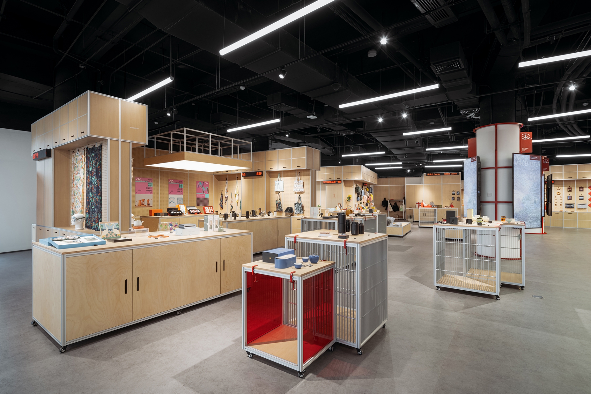
Prefabricated boundaries: They implied the thinking mode of industrial design, using prefabricated elements such as scaffolding to replace walls of the exhibition hall, thus breaking the sense of a closed box of exhibition space. On one hand this meets the need of flexible exhibition spaces and cargo shipping, on the other hand this saves tremendous time and cost due to the simultaneous work on site and in the factory. Moreover, the overall quality of space is elevated due to high controllability of prefabrication, which also coincide with the spirit of Red Dot Design Award that recognizes the value in top-notch industrial design.
Apart from planning, design and construction, STEPS Architecture also participated in planning the future operation of the museum, and provided exhibition design. As the leader in the field of design, Red Dot Design Museum serves as the platform where the next generation of designers grow. Education plays an essential role in a museum's operation.
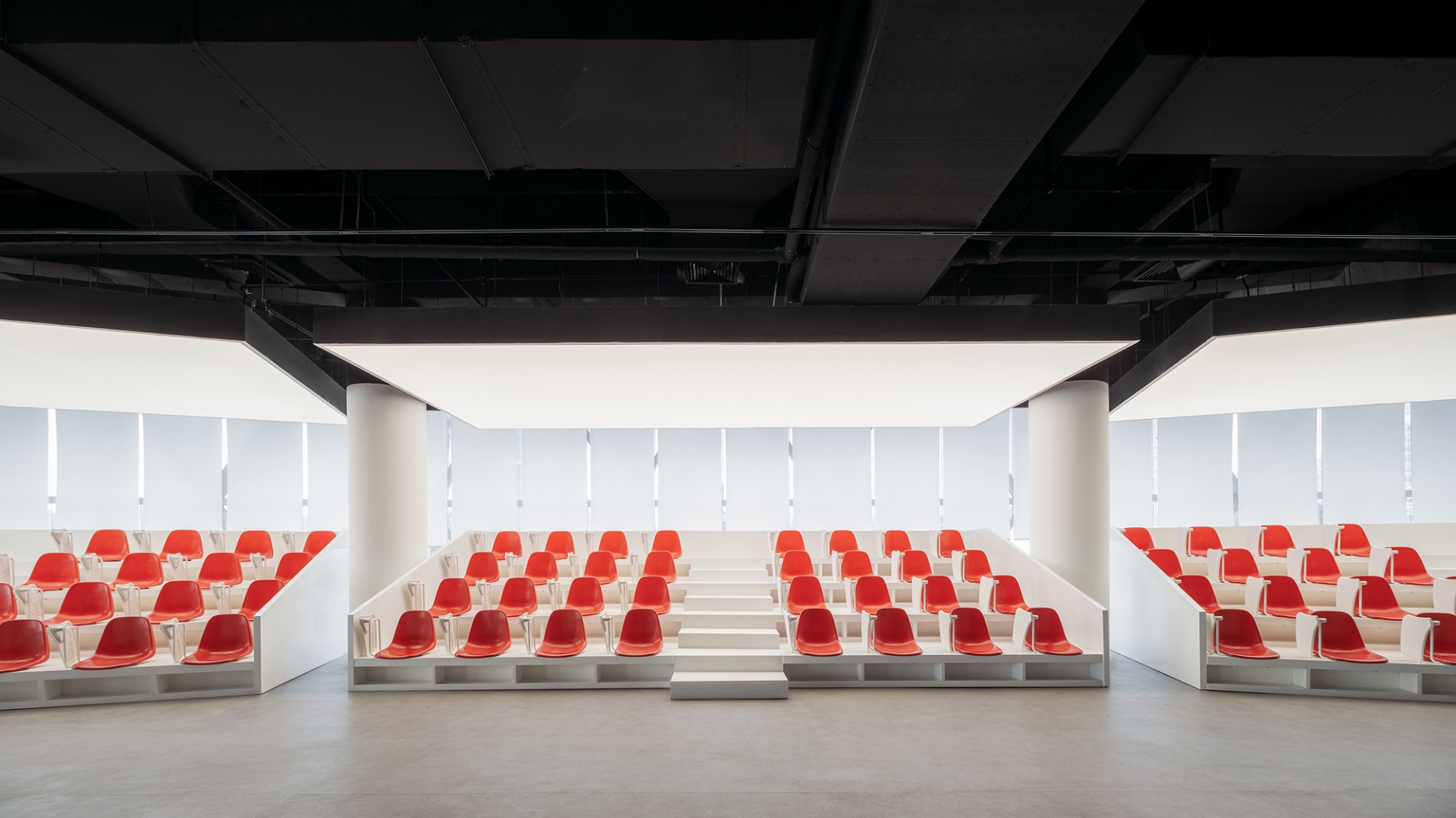
Red Dot Design School provides space for sessions, forums and conferences for designers to learn, communicate and socialize. To accommodate such various activities, STEPS Architecture designed flexible theater-like seatings on which the rotating table plate and seats could be disassembled and reassembled.
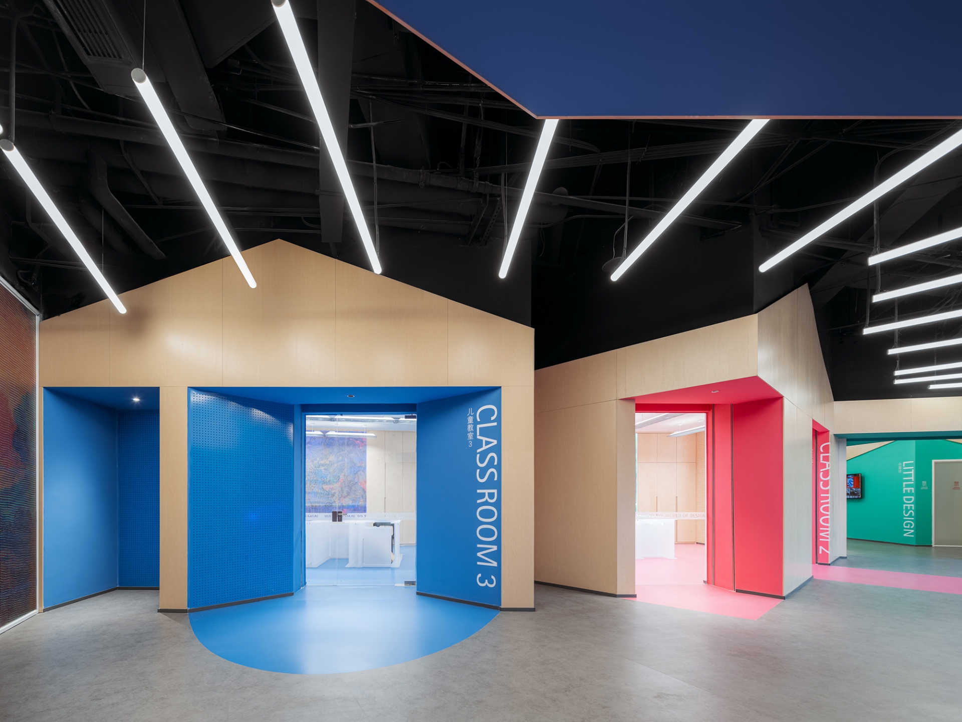
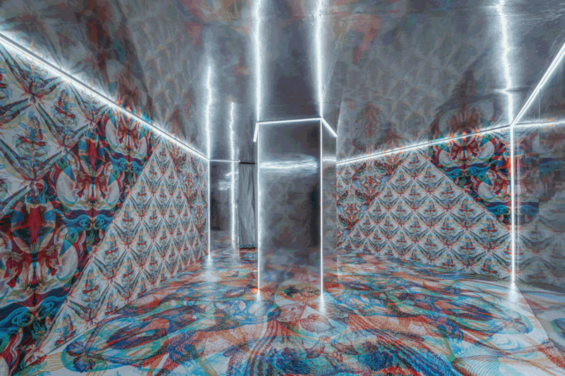
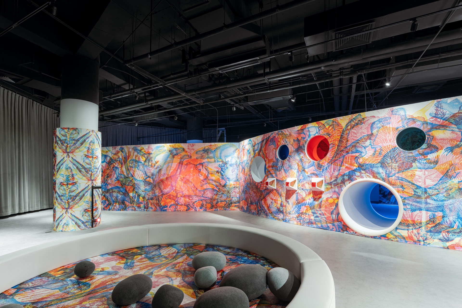
The section aimed for children is relatively independent, including children’s classrooms and exhibition halls. STEPS Architecture designed three distinct “wood cabins” that vary in color for the three classrooms, the mass of the cabins is cut to create openings that serve as showcases for children’s artwork. The transparent classrooms also serve as free exhibition spaces when needed. STEPS Architecture designed the exhibition for the children's exhibition hall during the museum opening - Wonder Filter, RGB Interactive & Design Exhibition. Based on RGB principles, Artists in Europe overlap patterns in three colors, creating psychedelic effects when the color of light changes. The team designed multiple ways of viewing wall patterns: through ever-changing LED lighting that shifts in RGB, and through wall openings that vary in color, creating dynamic spatial experiences. STEPS Architecture also design a series of mezzanines, openings, steps and sliding for children to explore, thus combining education with fun. Moreover, a unique set of exhibition furniture, frosting acrylic panels are easily assembled and disassembled with colorful connectors, creating various forms.
