Mas Creations is an initiative from award-winning interior and product design studio Masquespacio, founded by Ana Hernández and Christophe Penasse. Through Mas Creations after designing for more than ten years all type of commercial projects with Masquespacio, Hernández and Penasse wanted to show their personal and independent view on design and art without being tied to a briefing, with the aim to experiment more than they did before and thus seek for new challenges, creating new objects and projects that make you live new experiences and question the regular through a collection of products and projects that narrate a story represented by their universe of forms, textures, colours and materials.


They share, “Three years ago, we decided to buy a house and although our first idea was to buy an apartment in the city centre of Valencia. We were deeply in love with the typical old Valencia houses that can be found mostly in small towns in the countryside in the surrounding of Valencia. For this reason, we changed our mind and started to search for one of these historic houses close to Valencia with the idea of travelling easily to the city. It nevertheless was a very hard search with a lot of obstacles, and we ended up signing the documents to buy a house on four occasions, but due to different circumstances we ended up not buying any of them. It was then when we found the unique one, in the middle of nature. It made us dream... It was surrounded by some beautiful trees and incredible views... and after managing all the documentation needed for six months, we were not able to buy the house. At that moment our dream fell apart and took us a bit to desperation... Although we started our search again and two weeks later, we found a new house. We entered to see it inside and fell in love immediately... so we told the owner directly we wanted to buy it. The house had everything - a beautiful surrounding, a good size to live upstairs and work downstairs, a lot of light and the typical characteristics from an old Valencia house from 1925. Thus, when reaching our house, looking at the façade you can in a minute recognize the details of a house from the beginning of the 20th century of this style with its ornaments made of lattices and the original wooden door.”

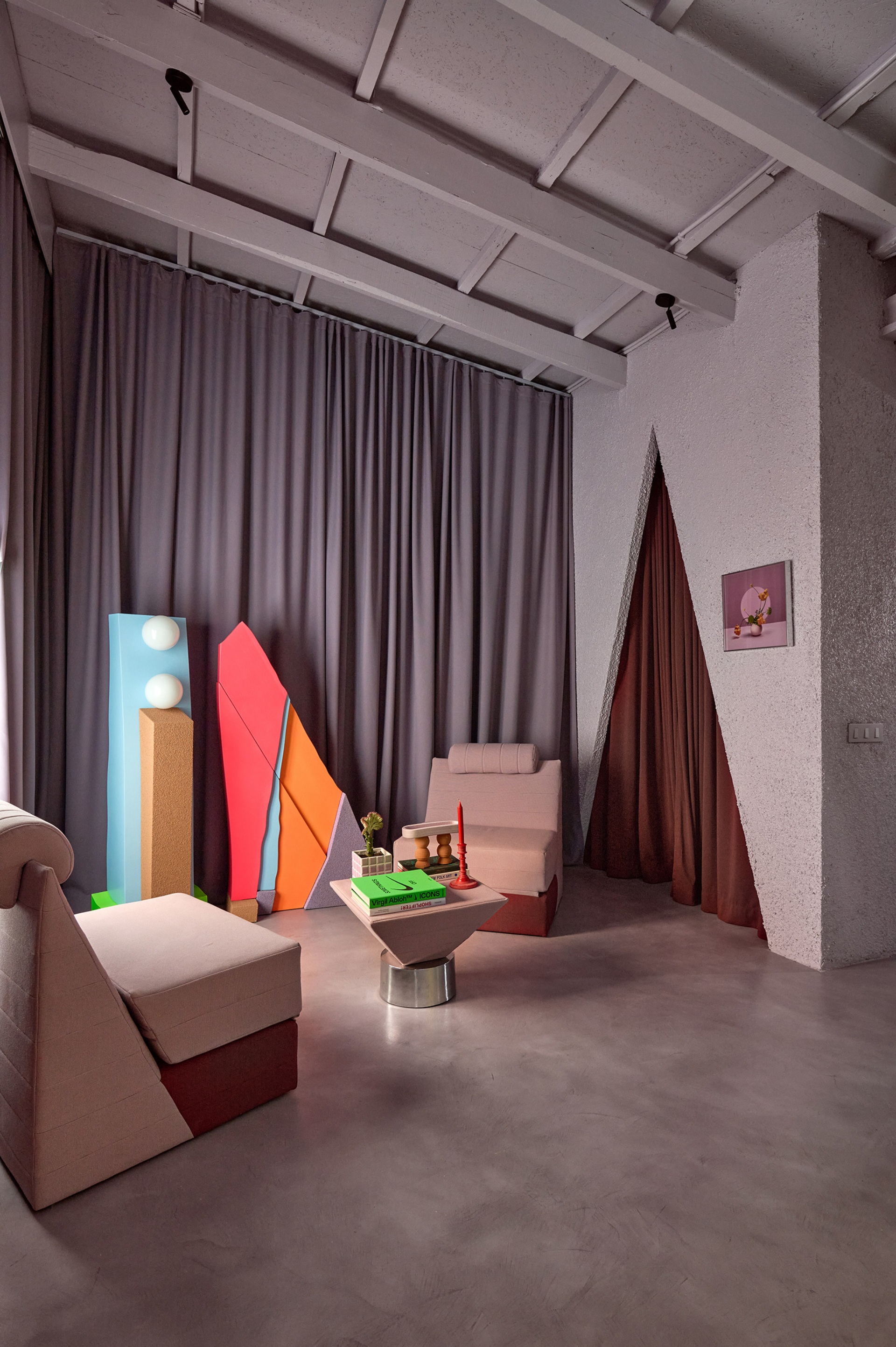
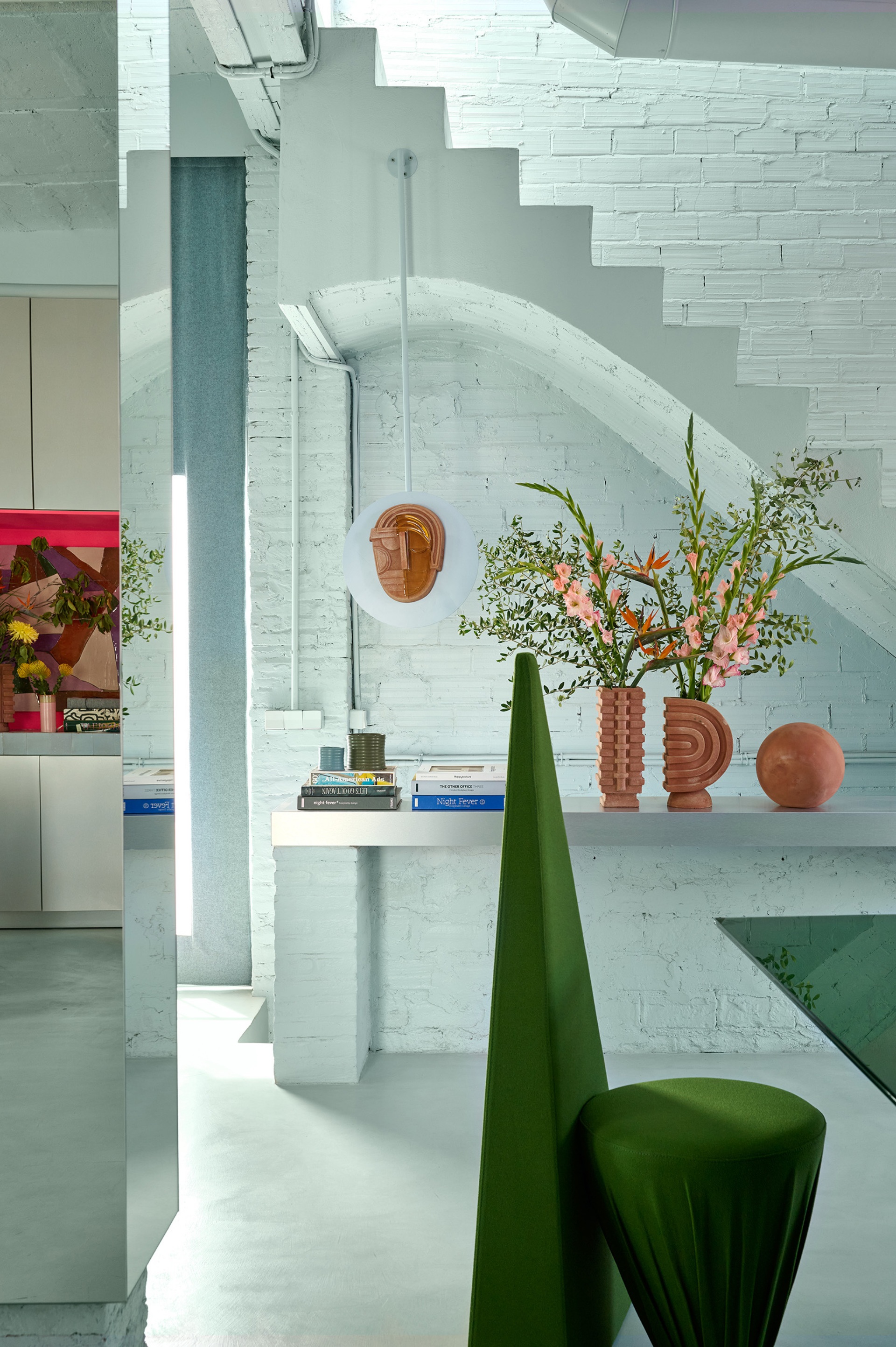
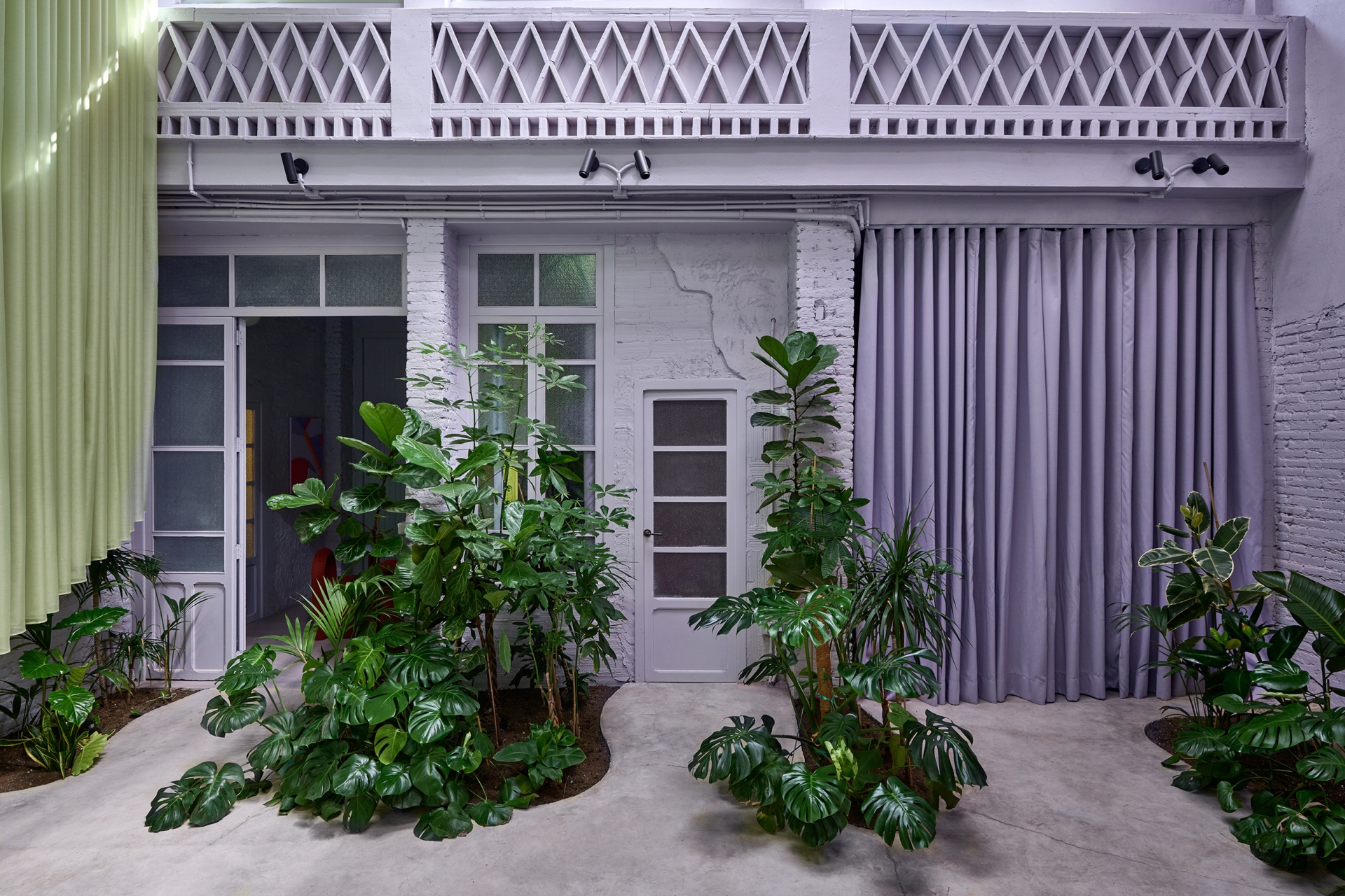
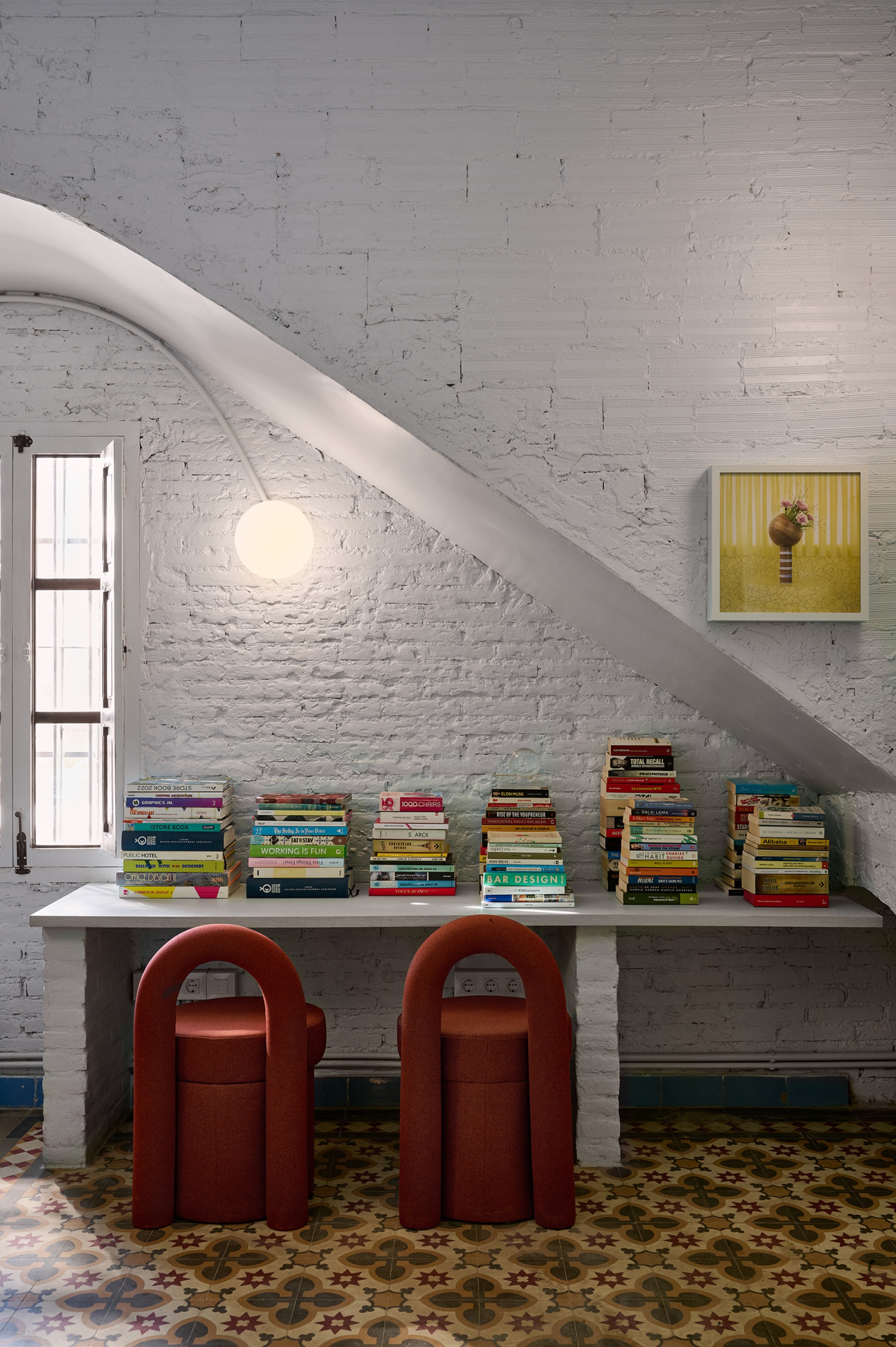
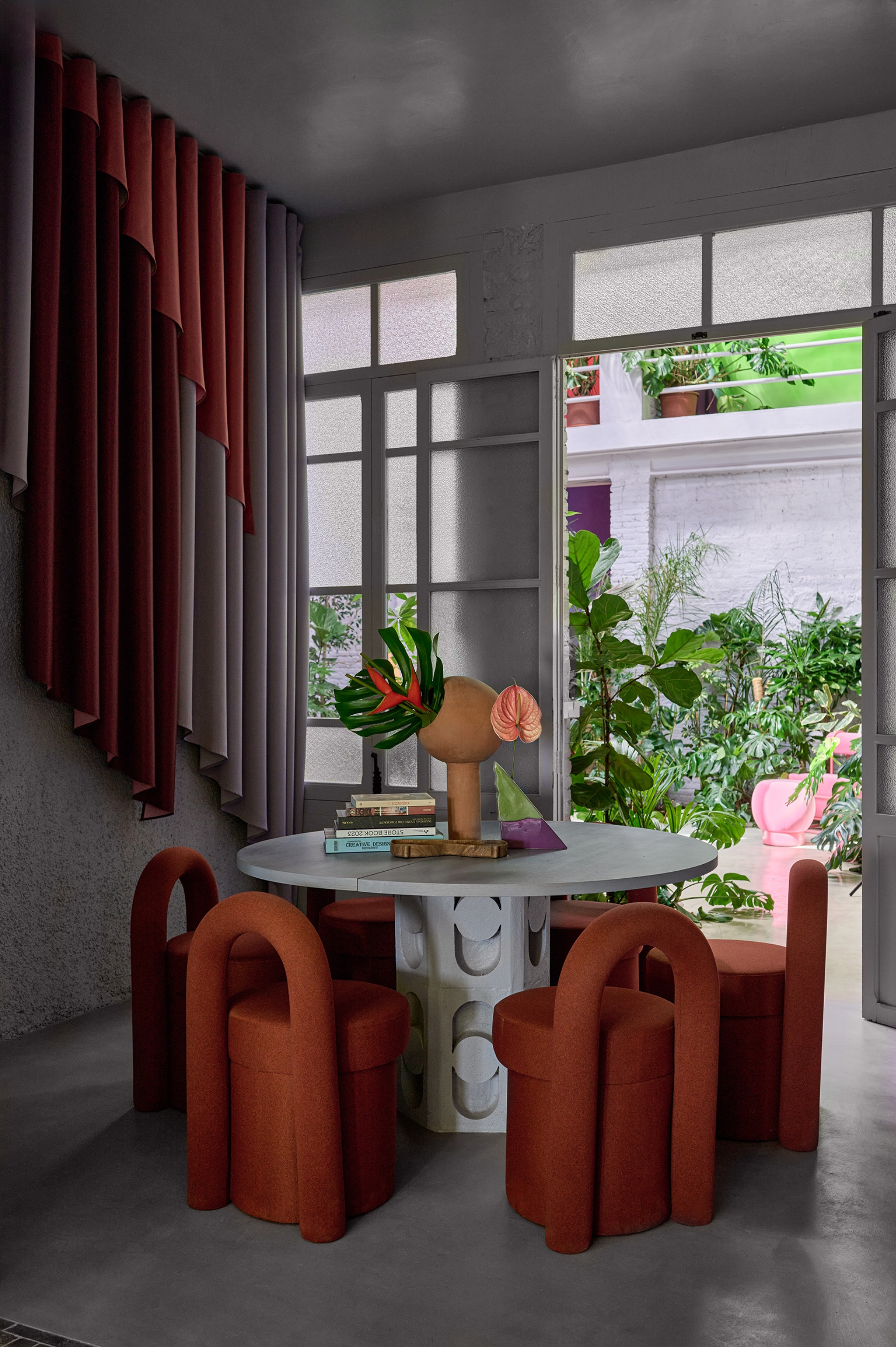
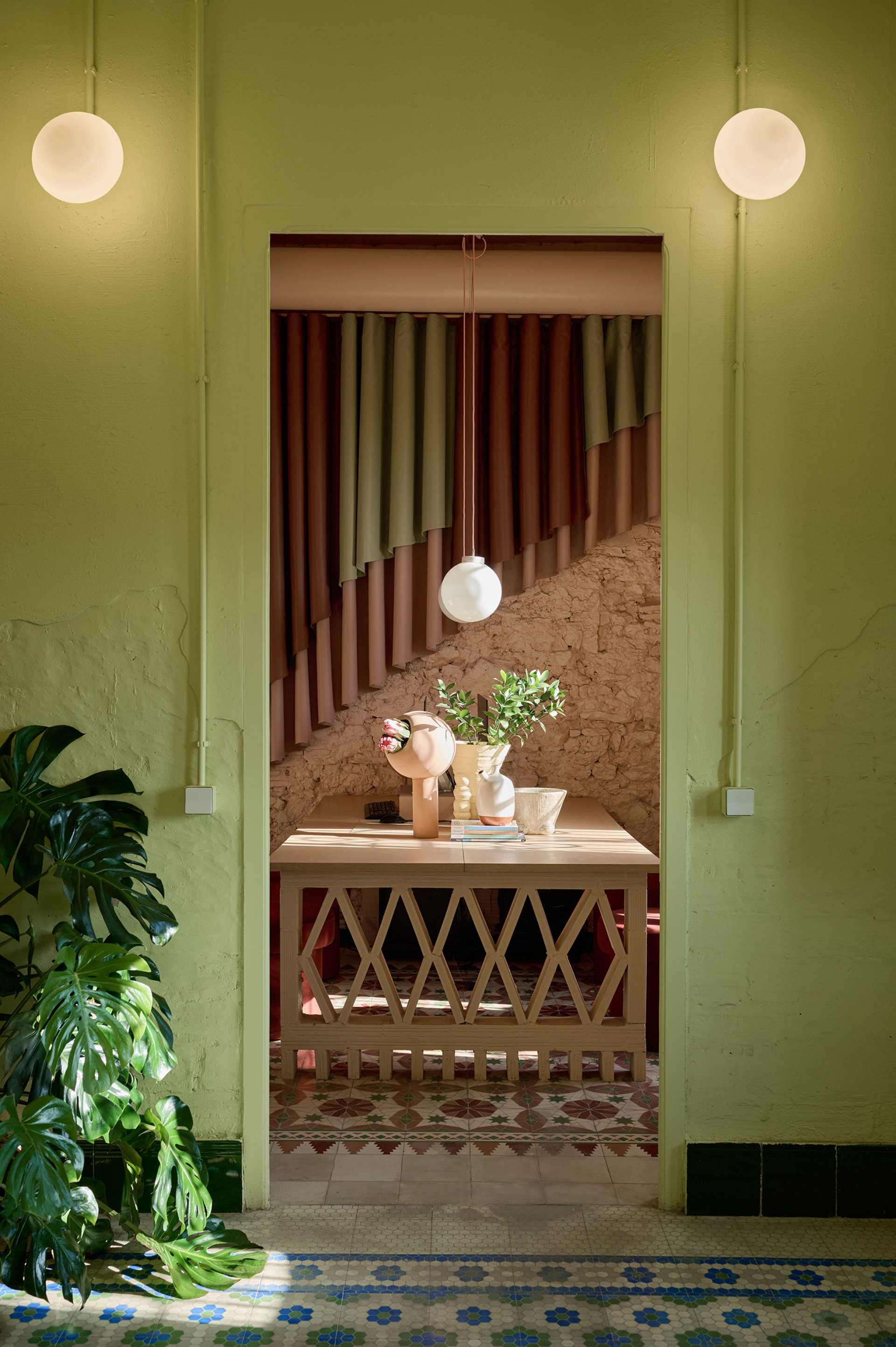
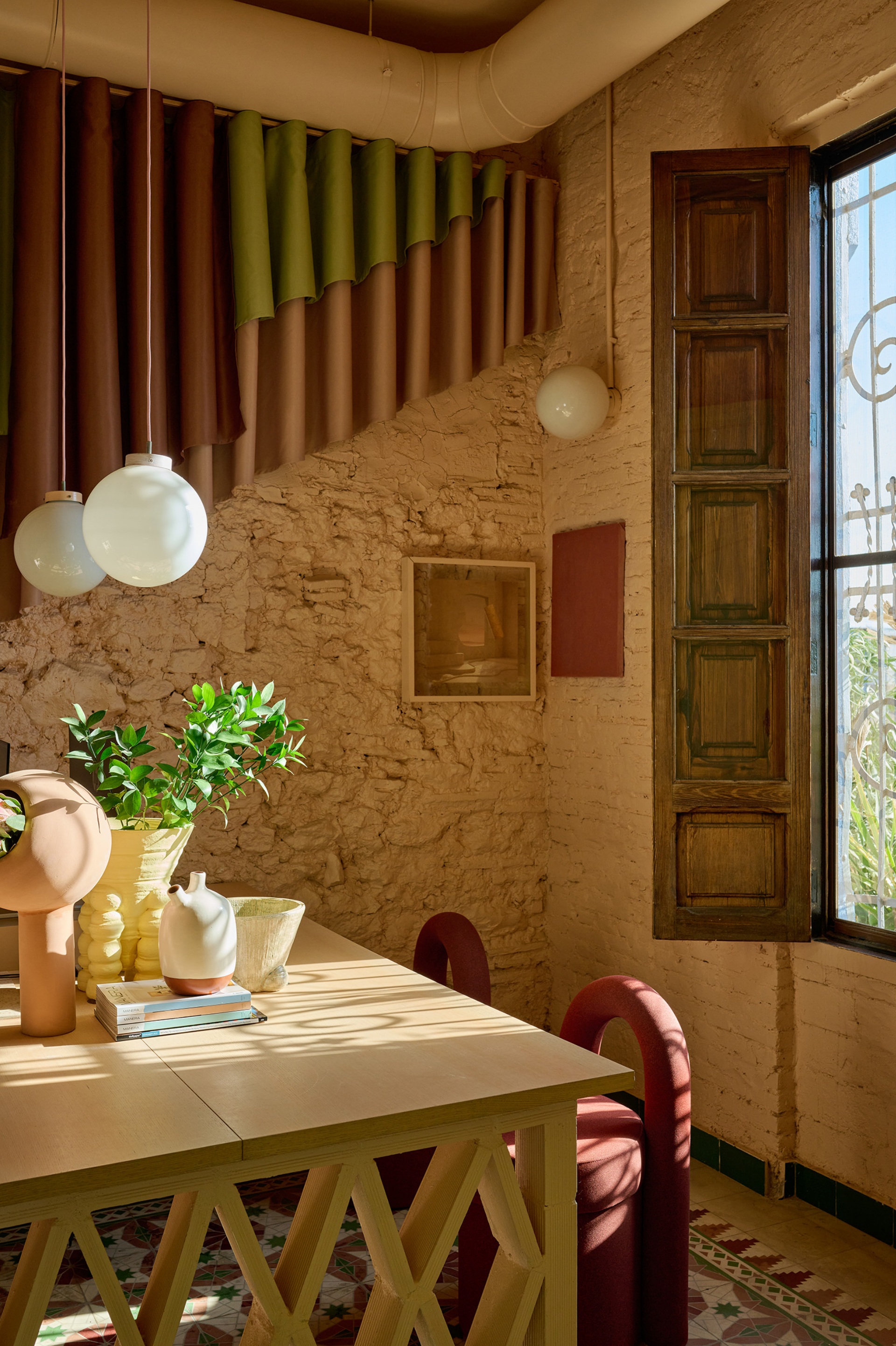
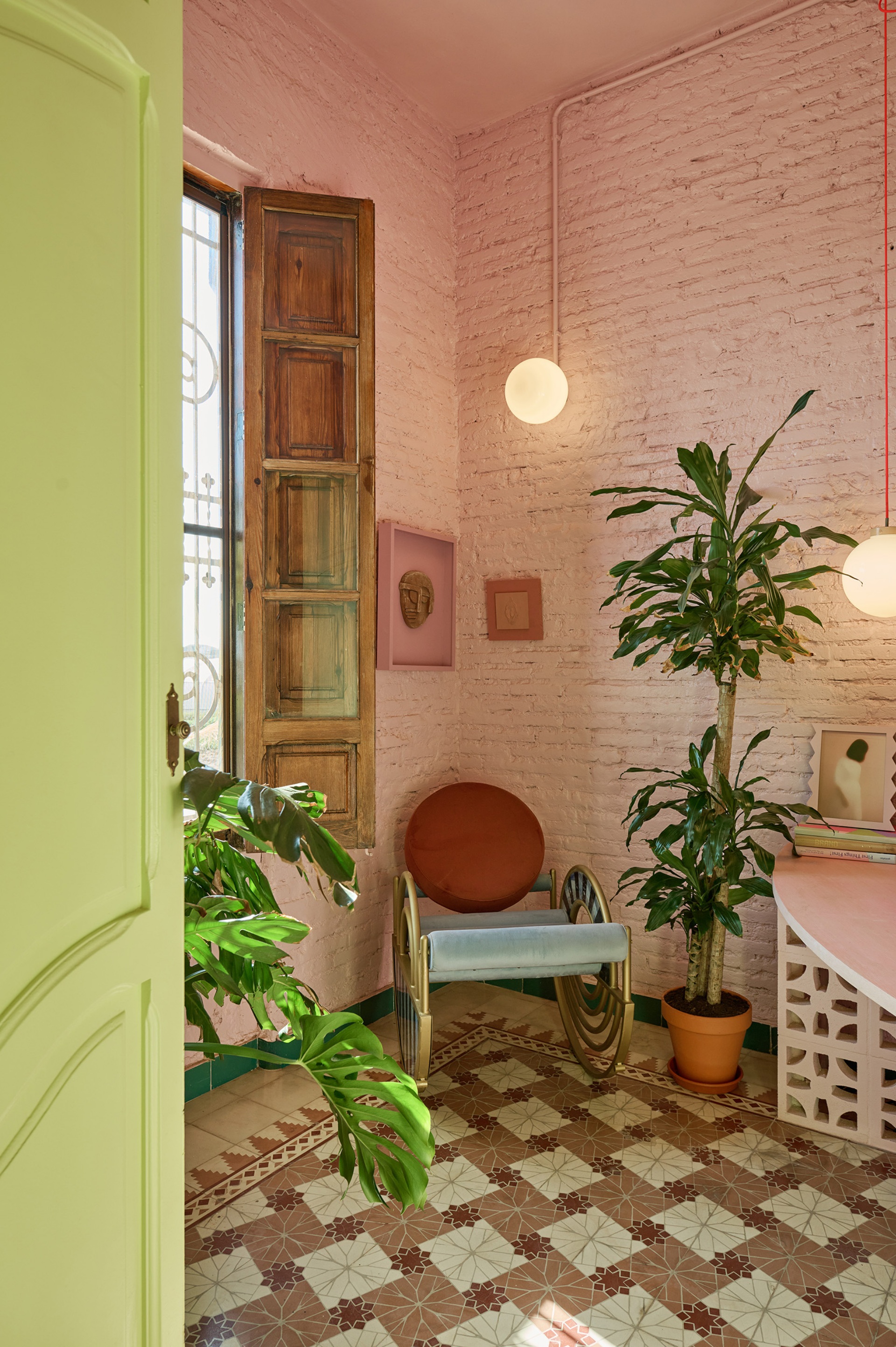
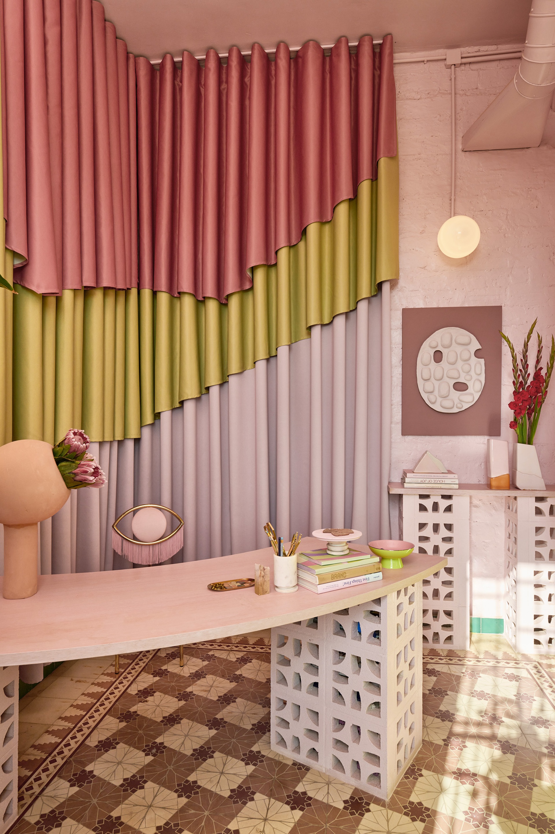
Hernández and Penasse continue, “Our intention always was to maintain the essence of the house’s historical character, respecting the beauty of its past. When entering the house, you can see that we maintained the original hydraulic tile floors made in Valencia, as well as the skirts and ceiling, together with its brick walls. Being our office here, to the character of origin we added a contrast of colours, while we created tables using a similar lattice than the one from the façade and combined with coloured wood. With the use of curtains in different coloured layers, our intention was to add a touch of warmth to the space. Going a step further in the house we can see the meeting room where we recognize again the layered curtain and the table with lattice legs and wood top that makes a connection with the materials in our office, while in this area we use a coloured microcement floor and a wrinkled texture on some of the walls. Those two last material incorporations create a connection point with the materials we use in our home on the first floor of the house, as from this space you get up to our kitchen and living room.”
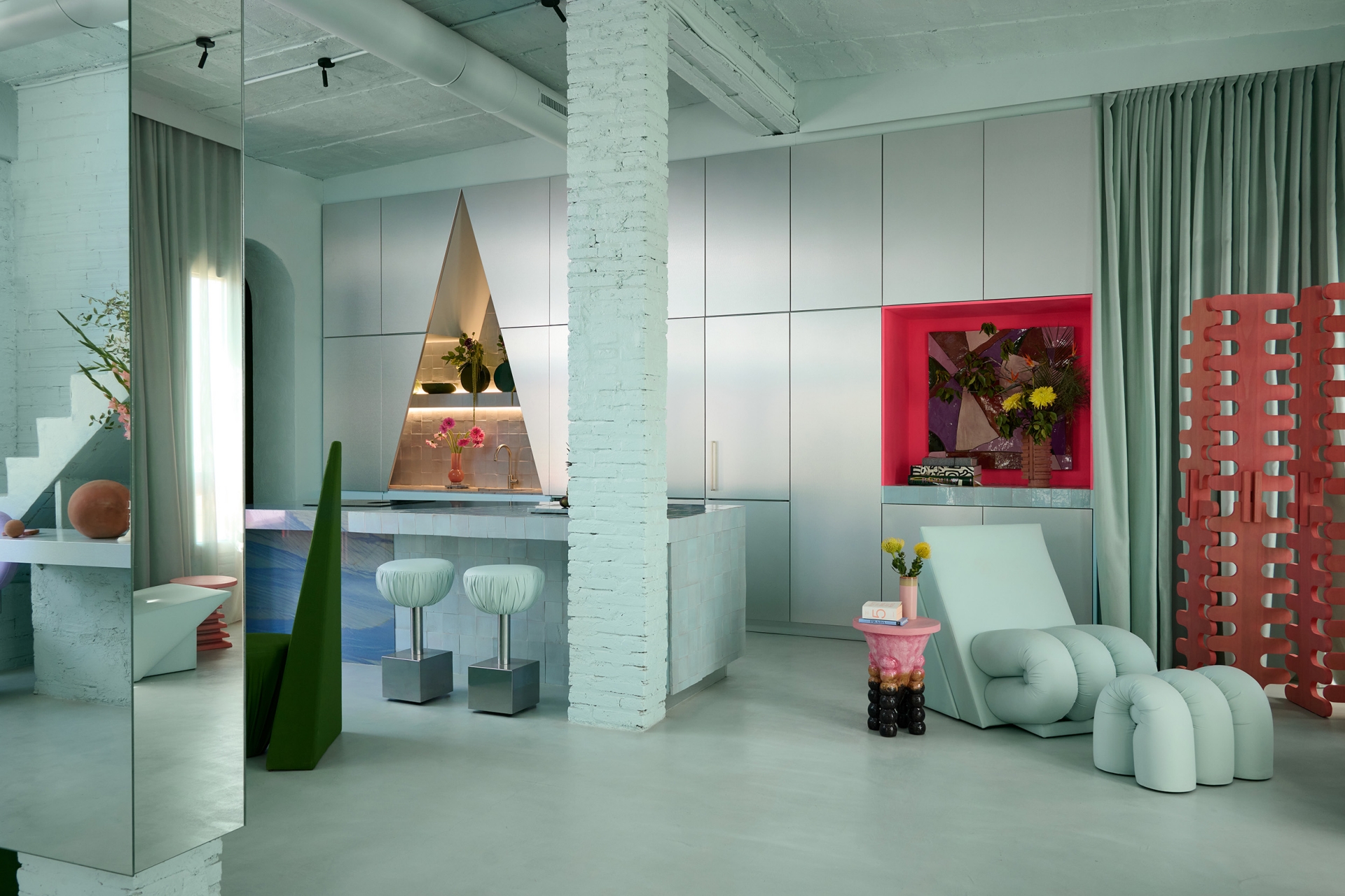

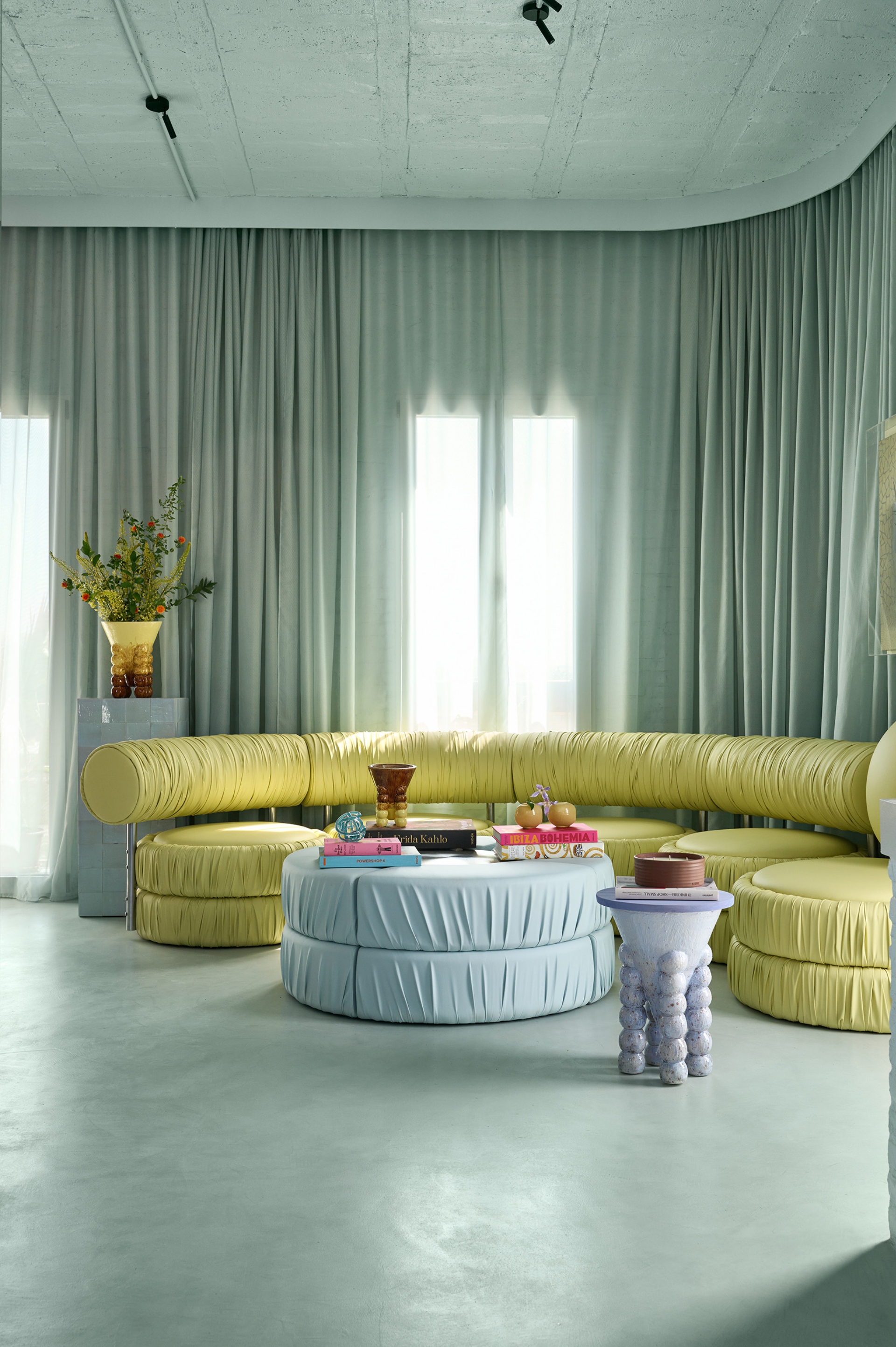
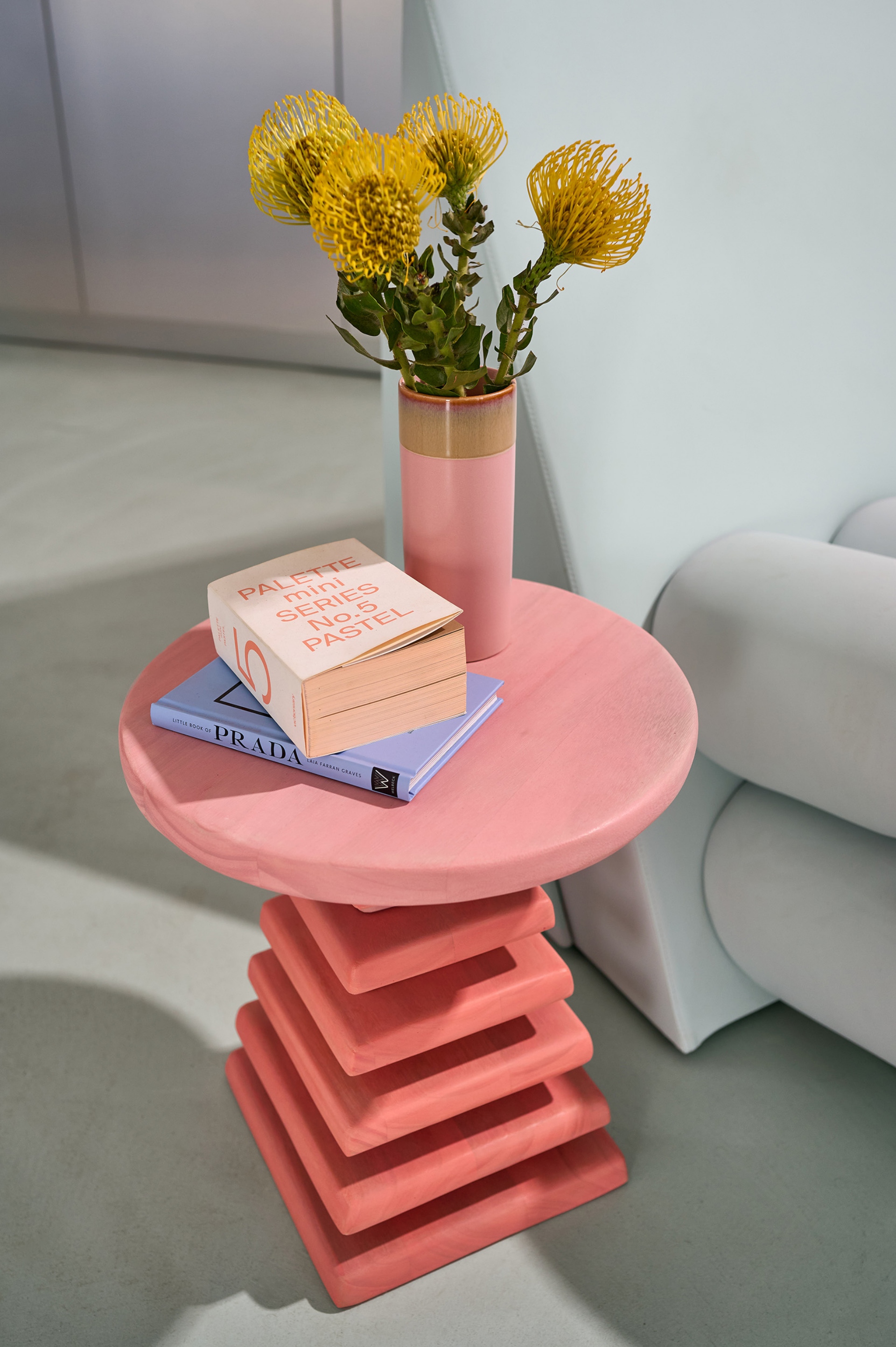

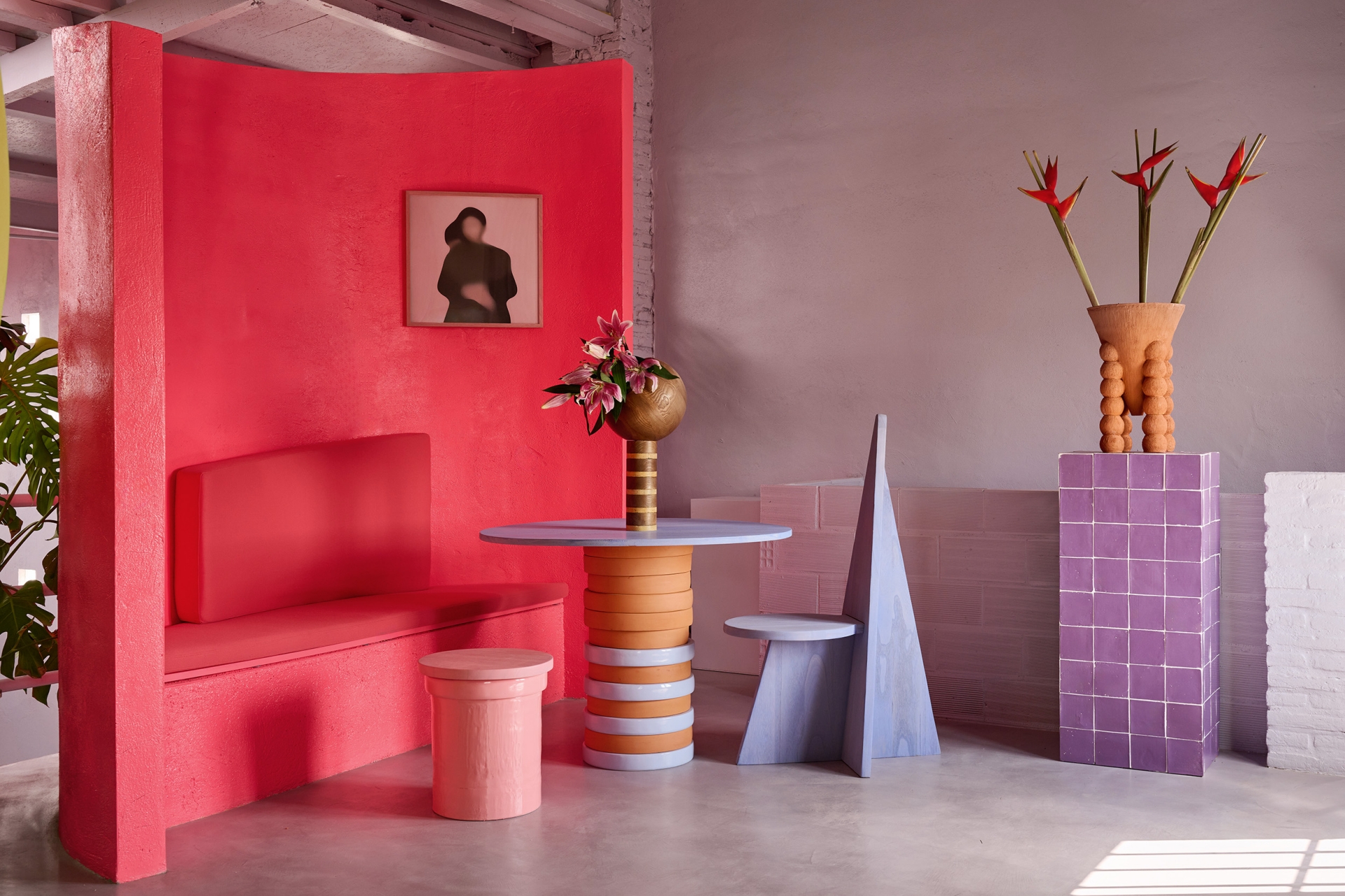
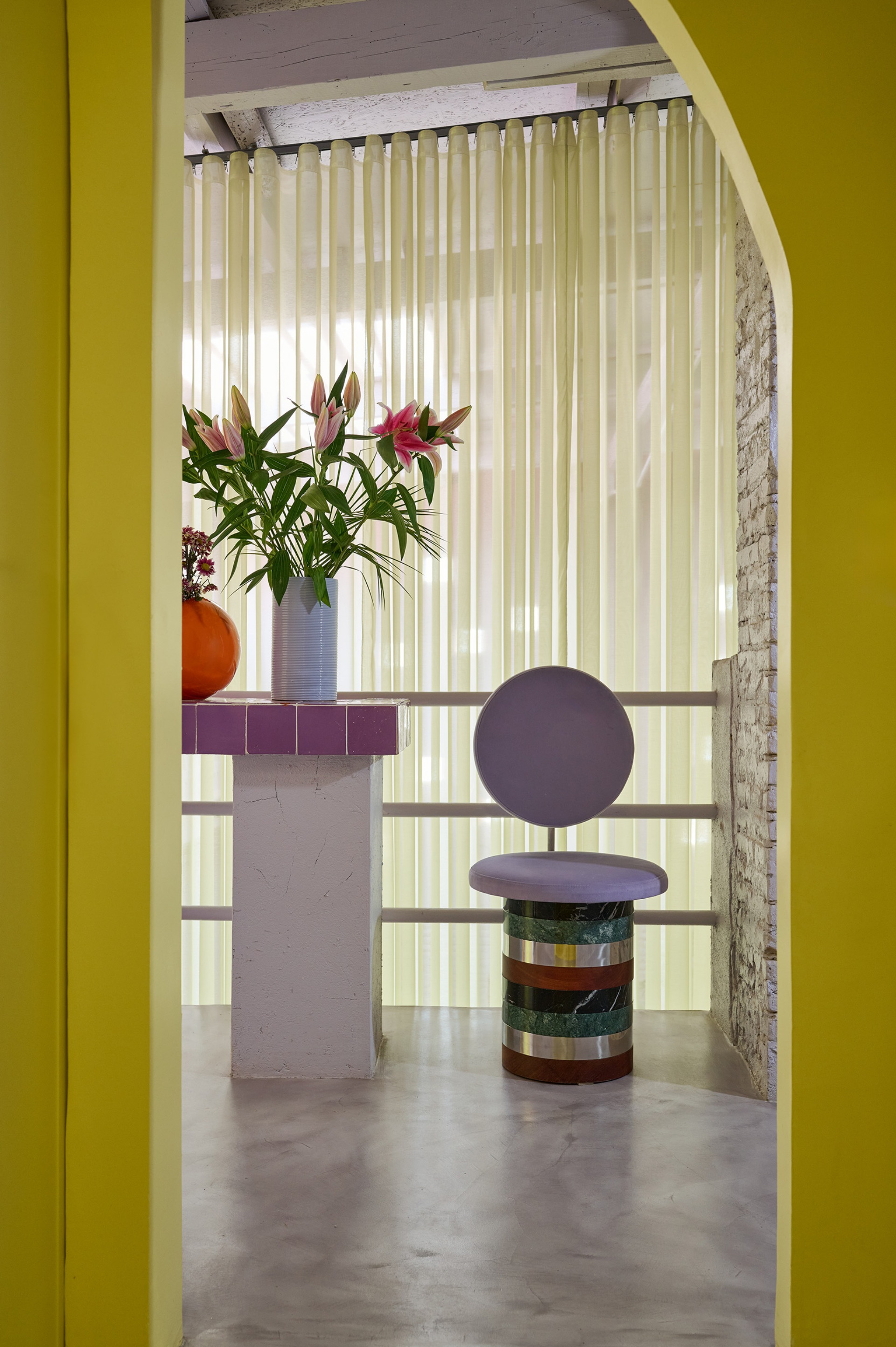
“Before we go upstairs, we take a walk towards the interior courtyard at the end in which we created an interior garden that is making a transition point between spaces, where we can have a family lunch, do some sports or do a photoshoot of our designs amongst others. In the house upstairs the highlight comes from the play of square, triangle, circle and semicircle forms that remind us of our past when we were still doing graphic design, although some visitors also told us that it reminds them of the time we developed New Memphis projects. Here, we also wanted to respect the beauty of the old details of the building, however our hand is more visible in search of combining an aesthetic with a touch of brutalism, but reinvented with our contrast of colours, artisan materials, textures and forms.”
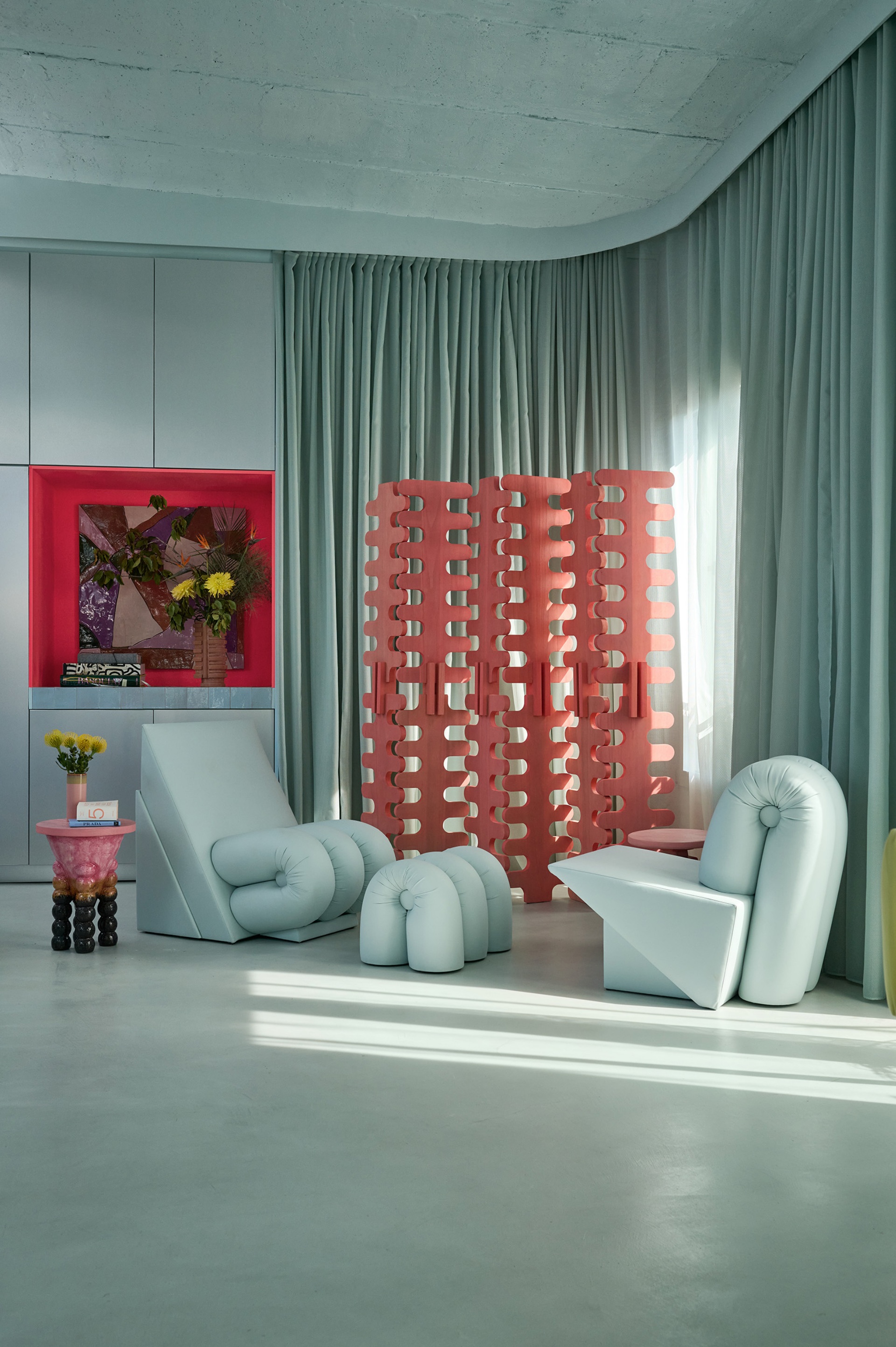
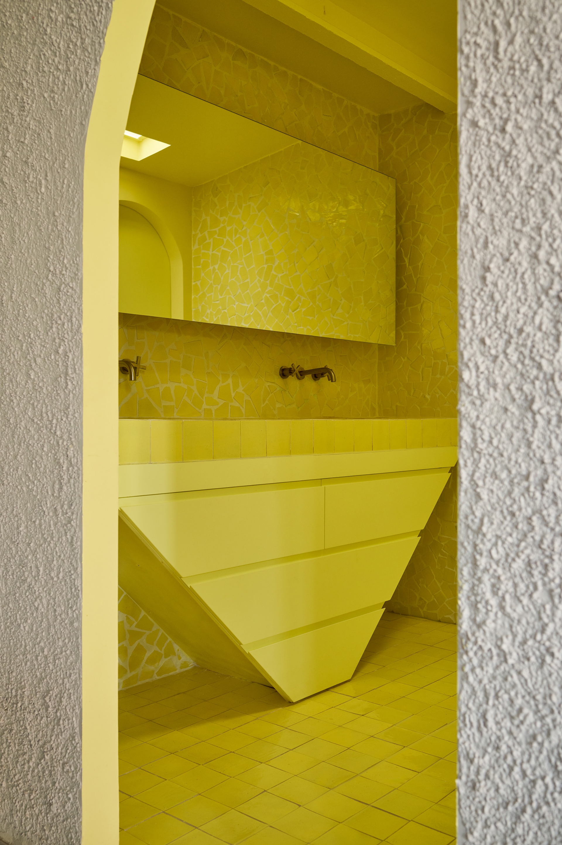
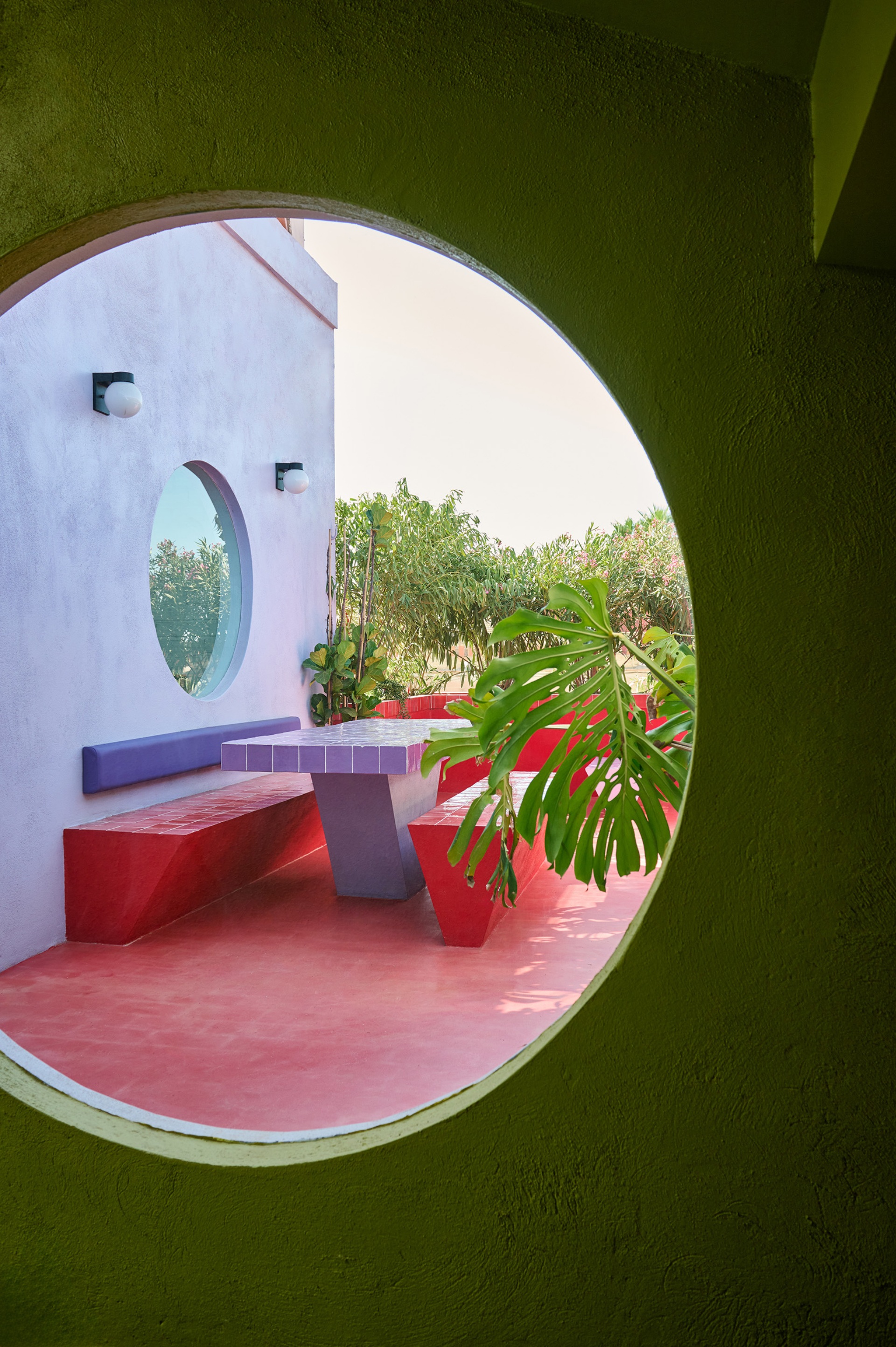
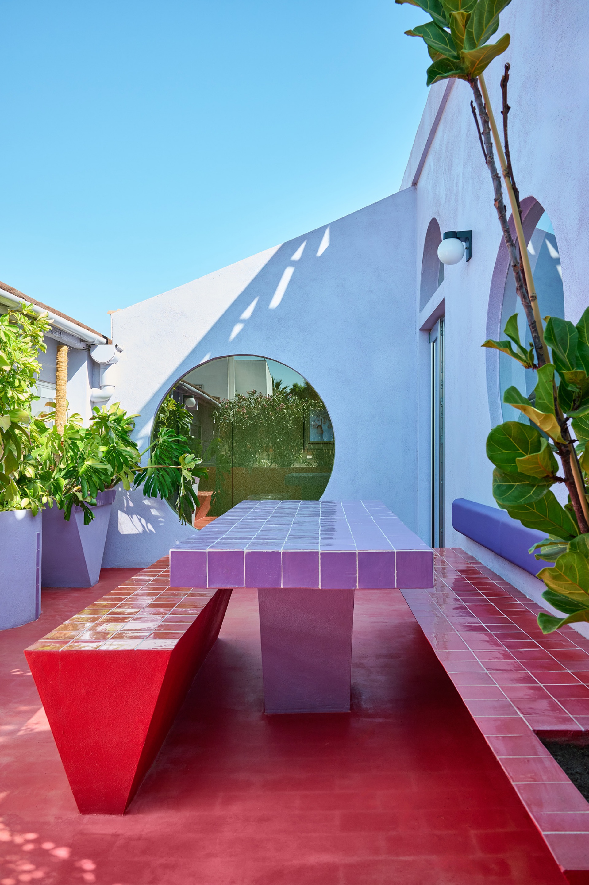
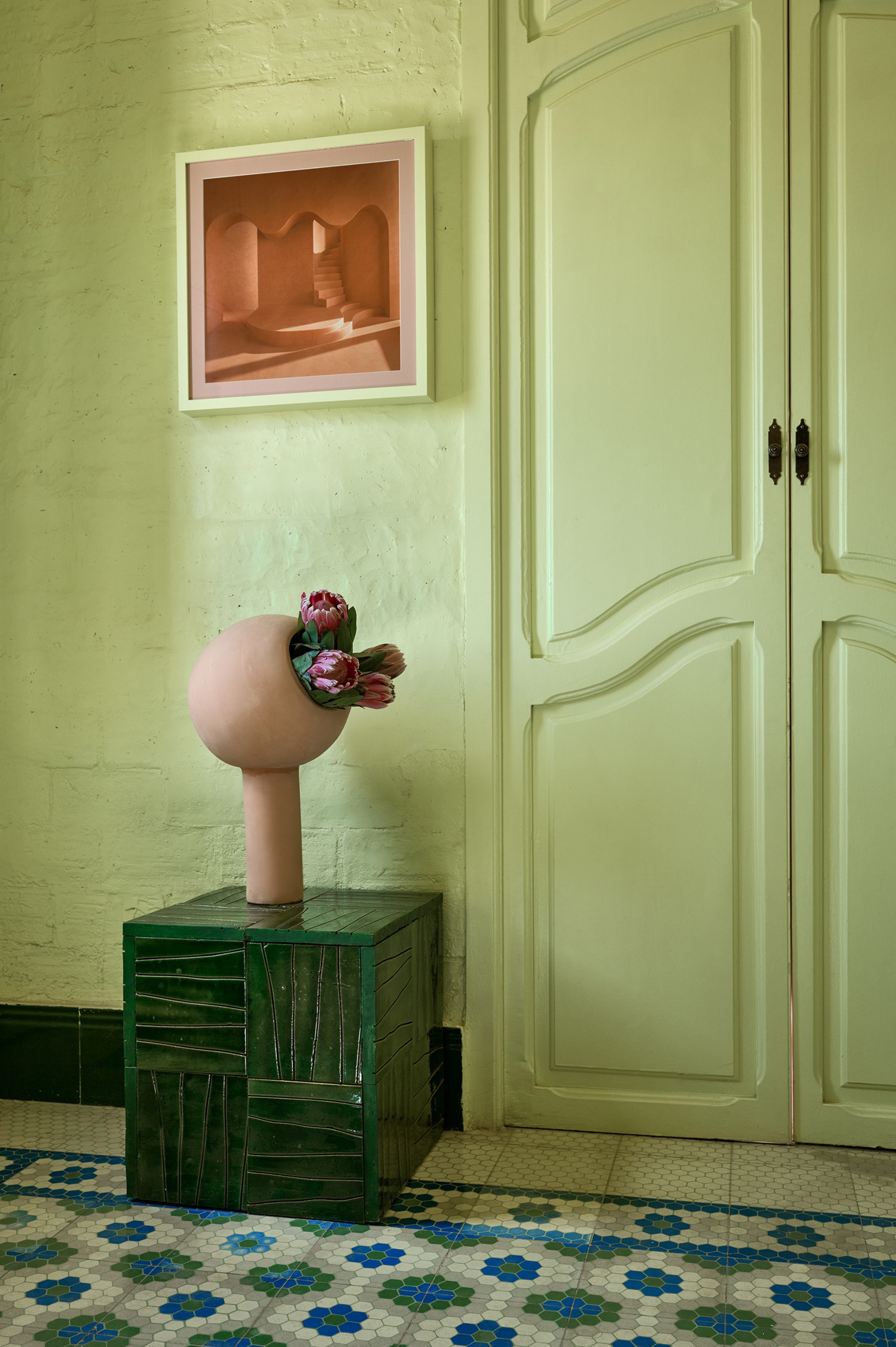
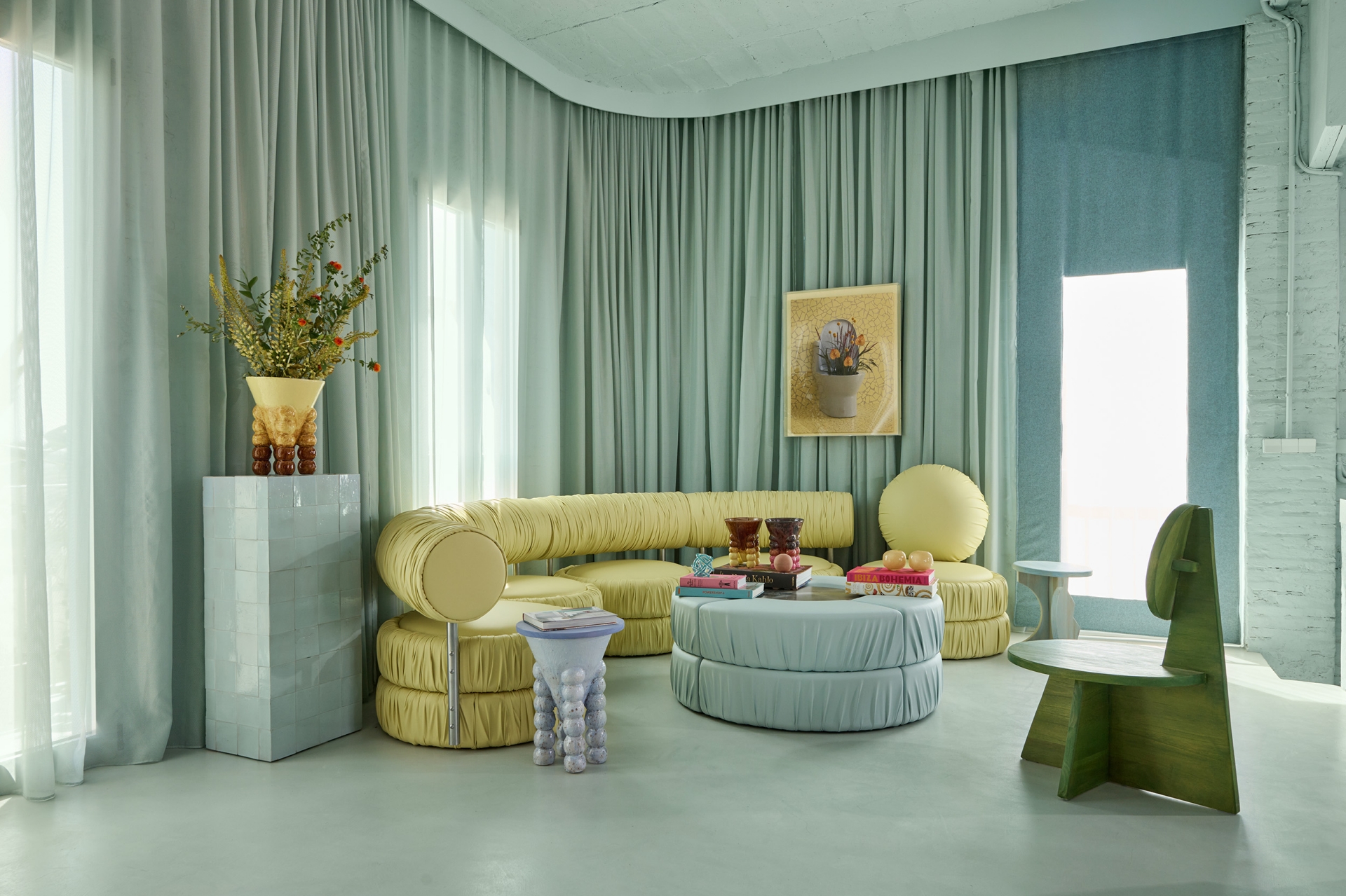
“The first space is the kitchen/ living room together in an open space where we immediately recognize the mentioned play of forms contrasted by the used materials. Here we looked for more sophisticated materials like marble, aluminium, microcement and handmade tiles. The furniture from its side that was all designed by our studio as a part of our Mas Creations collections, aspired to highlight at every time its particular textures, forms, materials and colours. The explosion of colours is stronger in this space, but also offers a sense of freshness to the environment. To be highlighted is the collection of CONO (cones) that were part of the first collection we designed and produced in our studio directly, using 3D clay printing, finished by hand. With the curtains on the other side, we also added some more warmth to the space, while the staircase that takes you to the maintenance roof was kept in its original state. When leaving the kitchen / living room we pass through a corridor that on the left side connects with a small terrace, while a bit further we find the bathroom that catches your attention through its splash of yellow colour created with handmade tiles and the wall made of the traditional Mediterranean trencadis technique. The wall finished with rough cement reminds us of the meeting room on the ground floor and the partly industrial character of the building. Then on the left side we see a custom-made curtain that privatises this area, while we see a few items of our furniture collections on the way further.”
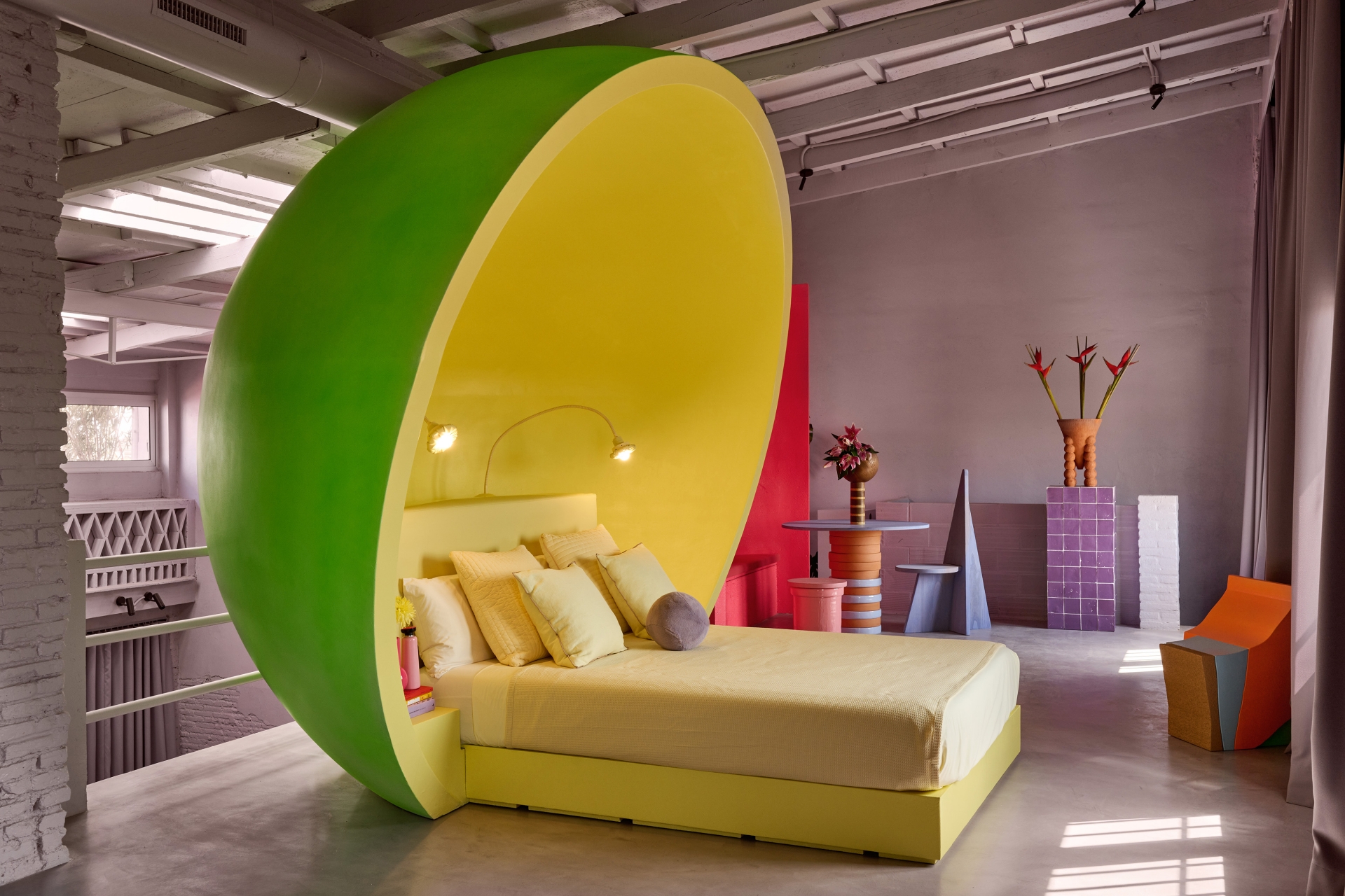
Then, finally, at the end of the space is the crown jewel, which is the residents’ sleeping quarters. “At the end of the space, our sleeping room is where the bed takes on a ball form with a touch of fluor colour catching all the attention. This dome that offers us total disconnection at the end of the day was designed by our studio and manufactured with a 3D robot. On the right side of the bed, we created a small television room with more pieces from our collections, while on the left side we have our meditation room with its pink fluor touch. In summary, the project of our house is representing very well our career and the artistic style we have been developing during all these years, from the graphical beginnings we had, to a touch of New Memphis and sometimes a futuristic air, while in every moment we aimed to maintain and respect the original state of the house.”
