A solid, milk-based creamy candy, each wrapped with a layer of delicate rice paper – many children having it for the first time question whether the wrapper is really edible? This is followed by the curious joy of peeling the rice paper, bit by bit, and experiencing a melt in your mouth sensation, before chewing into the sweet goodness. Scrumptious!
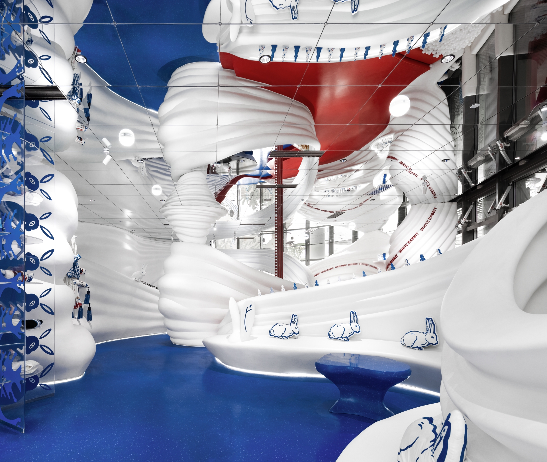
This national brand encompassing 60 years of history has forged numerous cross-border partnerships in recent years to prompt a successful transformation, and X+Living was invited to reimagine the spatial experience and visual design for The White Rabbit Global Flagship Store, located at the JKS Arts and Cultural Centre in Shanghai.
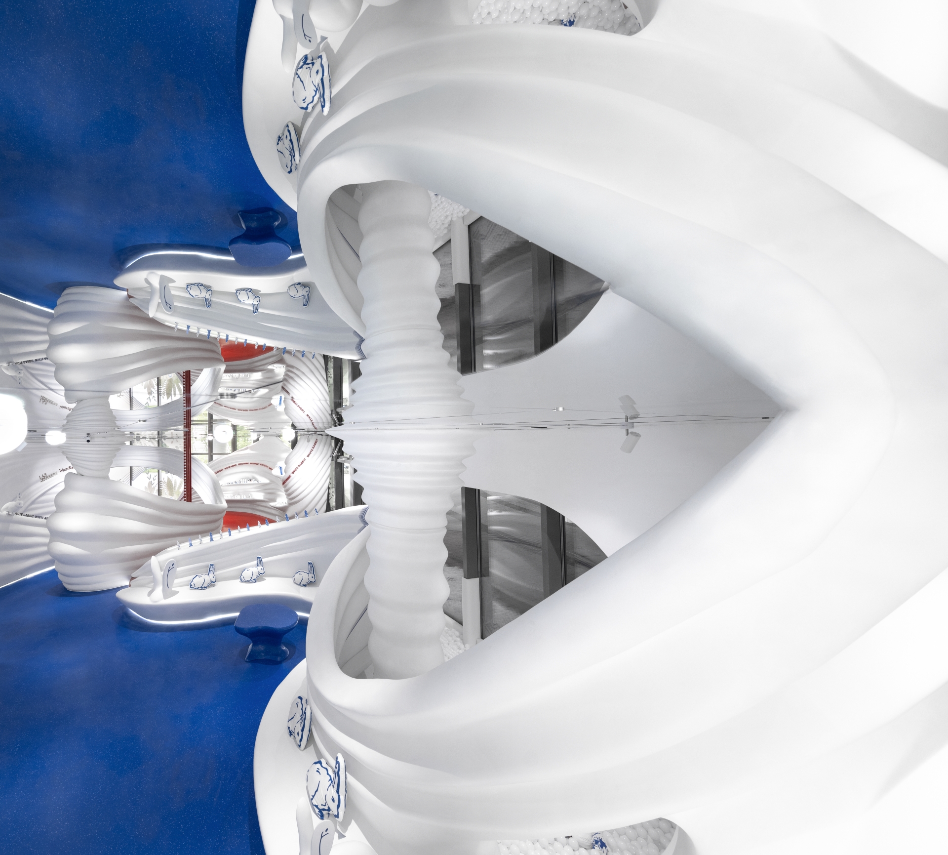
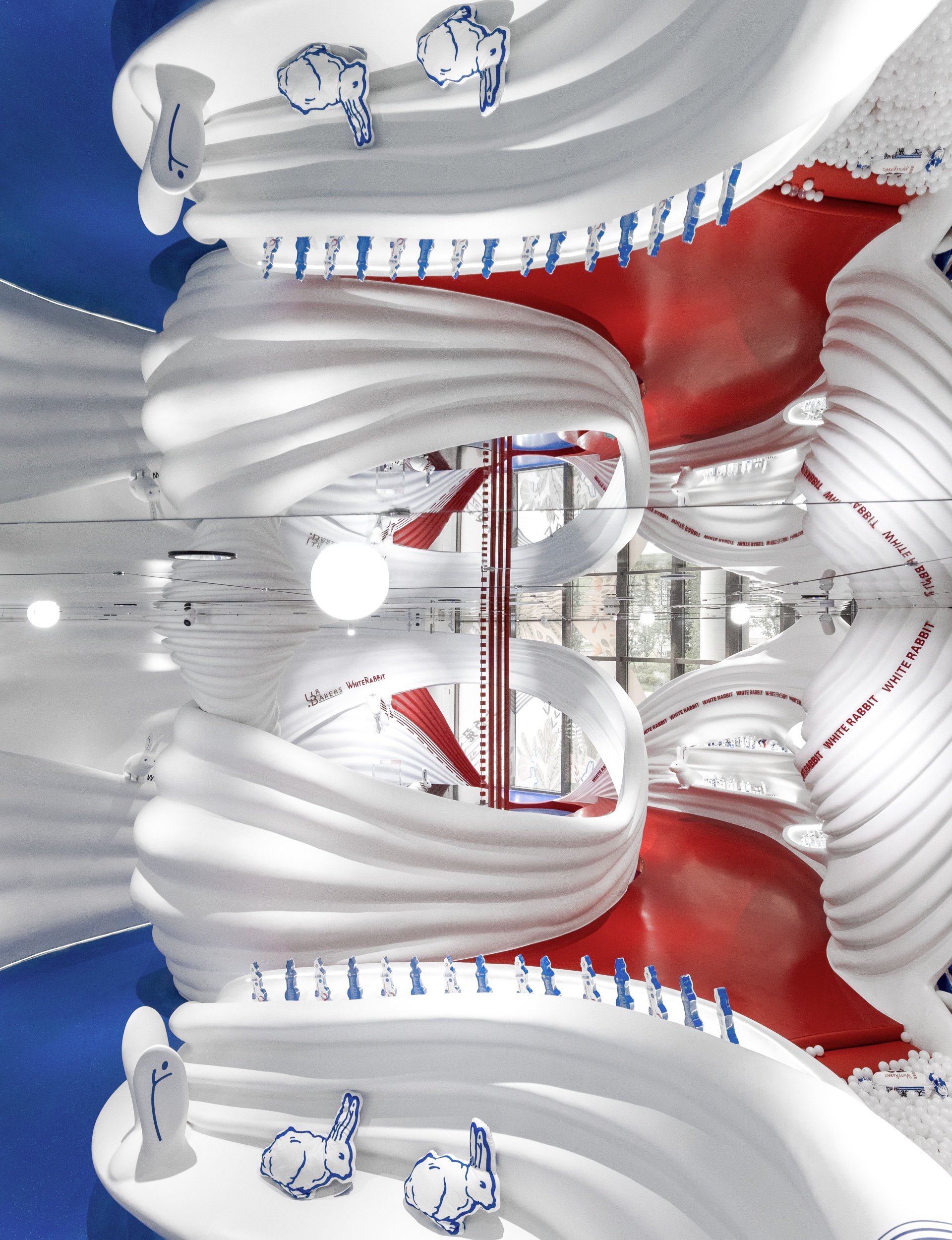
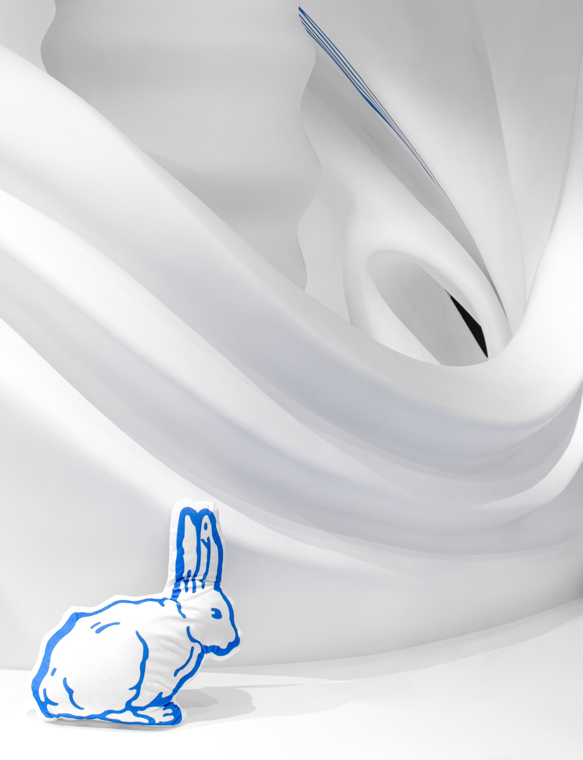
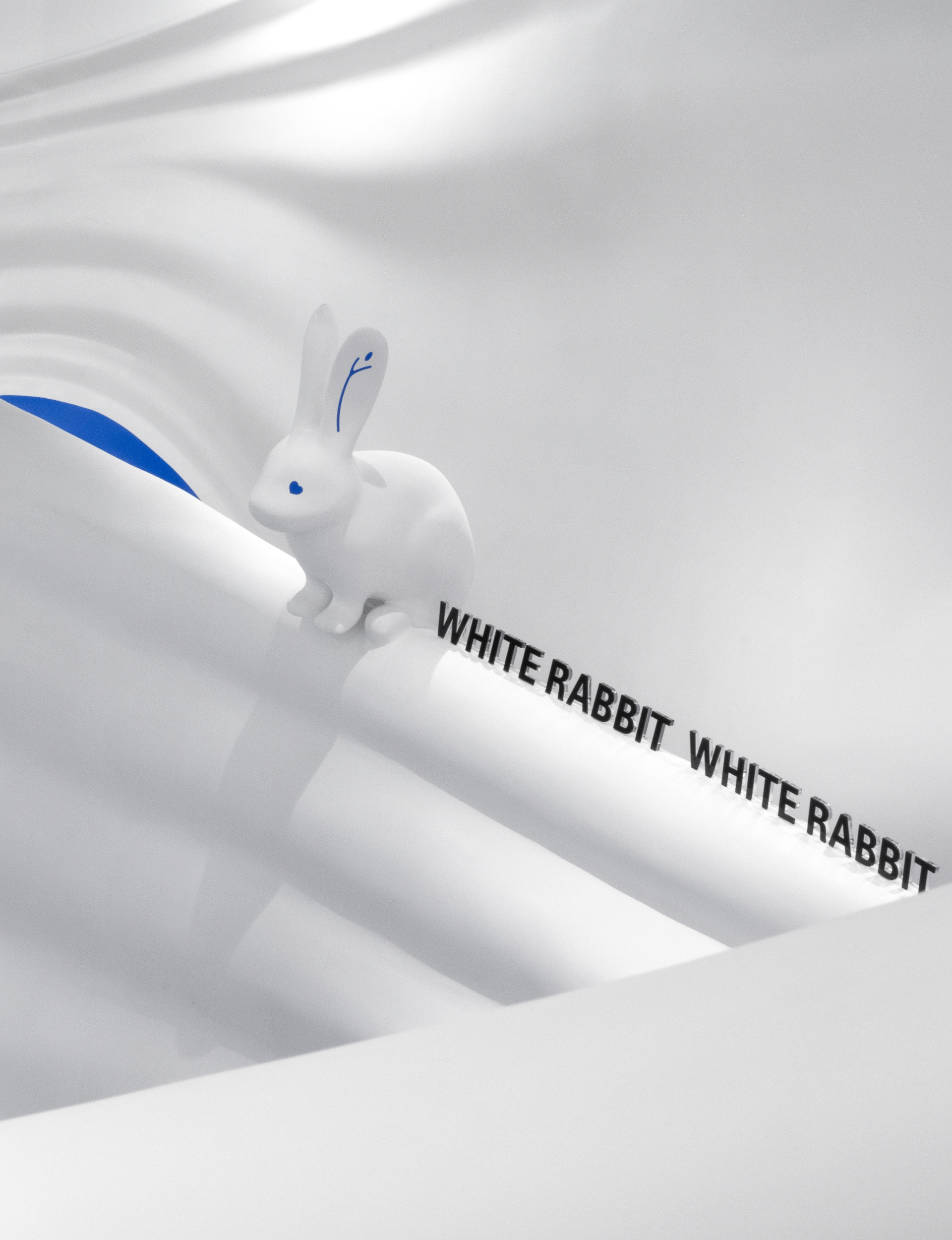
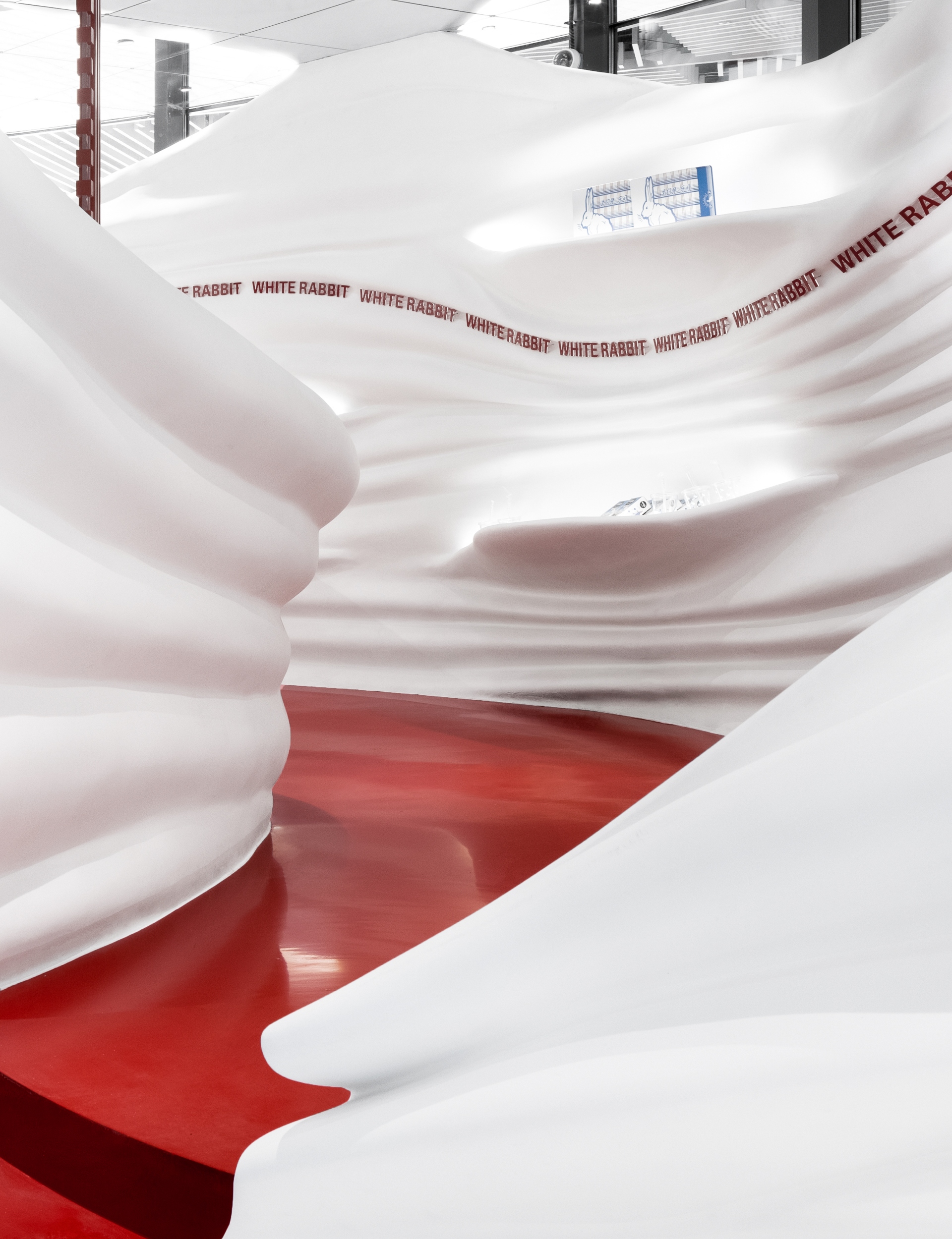
The designers envisioned the project as a surreal artistic scene, focusing on strengthening the visual impression of the brand. This new-born global flagship preserves the essence of the brand, while reflecting its spirit and novel attitude of continuous breakthrough and creative integration. The concept flows like a witty fairy-tale in red, white and blue: within the 2800 square feet space, 3D-printed streamline shapes simulate the flow of milk, which is an artistic abstract expression to humorously narrate the production process - the seemingly enchanted flowing milk in the air eventually turns into creamy candies on the shelf. Floor to ceiling glass walls facing the walkway enable the overall design is clearly visible to pedestrians, while the illustration-style green plants and brand mascot rabbit adds a touch of mysterious storytelling - as if falling down a rabbit hole and entering a sweet and pure white whirlpool by accident. The spherical lights dotted irregularly in the room, haloed with a shimmering light render a surreal filter for the space, to produce more narrative tension and emotion resonance. The designers also used meticulous strategic thinking to maximise the diversity and function of the shelves: the pleated texture “pinched” using streamline shapes have cleverly evolved into different sizes of shelves and adjustable bar shelves to display different types of products.
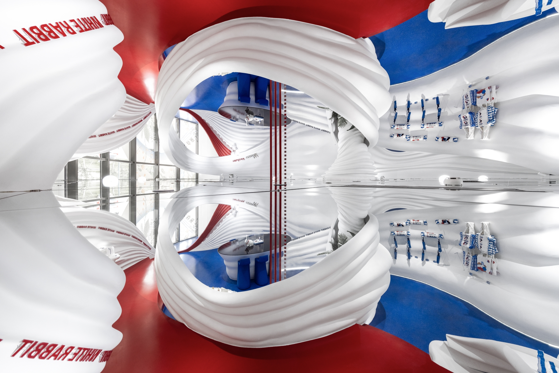
Through the design team’s construction, architectural symbols are strengthened, and the sensory impact when stepping into or viewing the space is amplified. As well, it revolutionizes consumers' ordinary expectation of a commercial space; dissolving the boundaries between art and commerce, providing an immersive spatial experience and using design and artistry to merge tradition and modernity, evoke old memories as well as create new ones.
