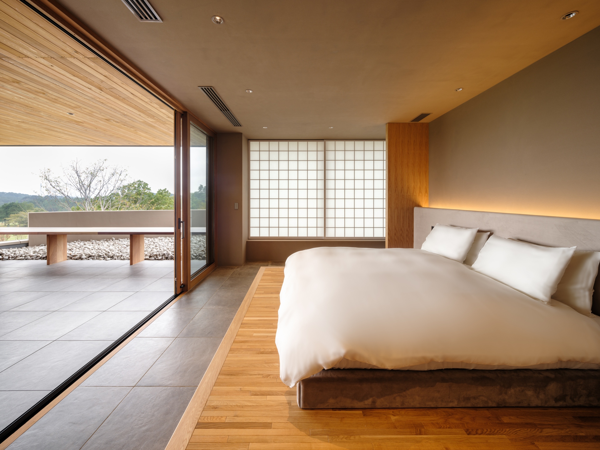
The design concept was drastically changed from the initial golf course (which symbolized the economic bubble era), to a facility that would welcome a wide range of customers for the purpose of retreats, following which design considerations were made. Primitive shaped spaces such as the domed lobby, spherical meditation sauna, and floating rectangular lockers are placed in a dispersed manner, and the wood finish and light design create a sense of the extraordinary. Materials used were limited to gray plaster paint and wood, and the aim of Kubo Tsushima Architects was to create a high-quality space suitable for adult holidays by eliminating decorative design and applying a light design sensibility.
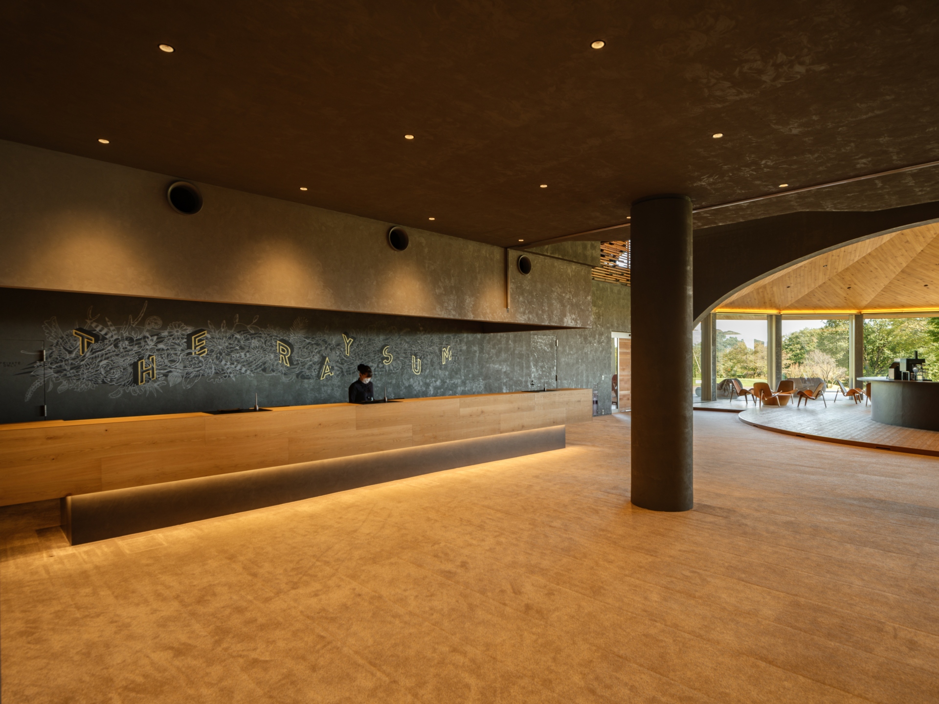
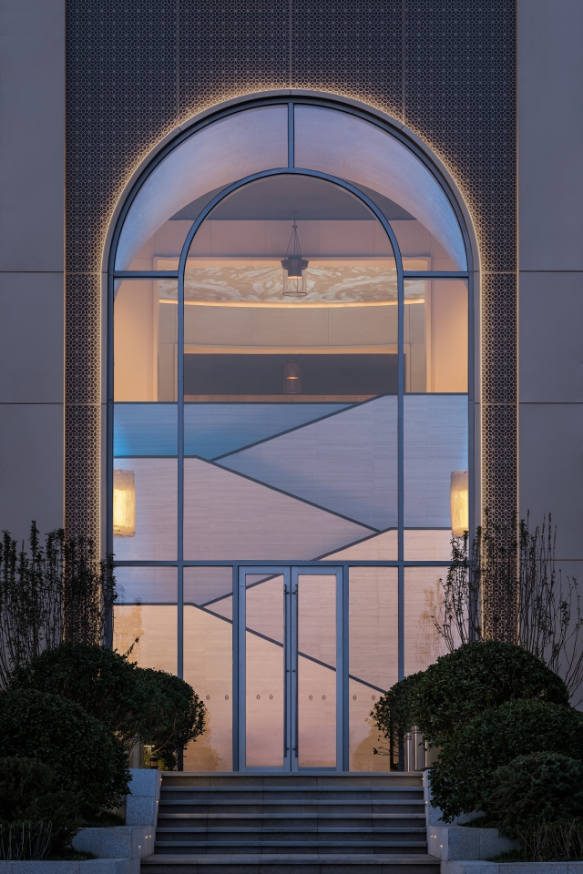
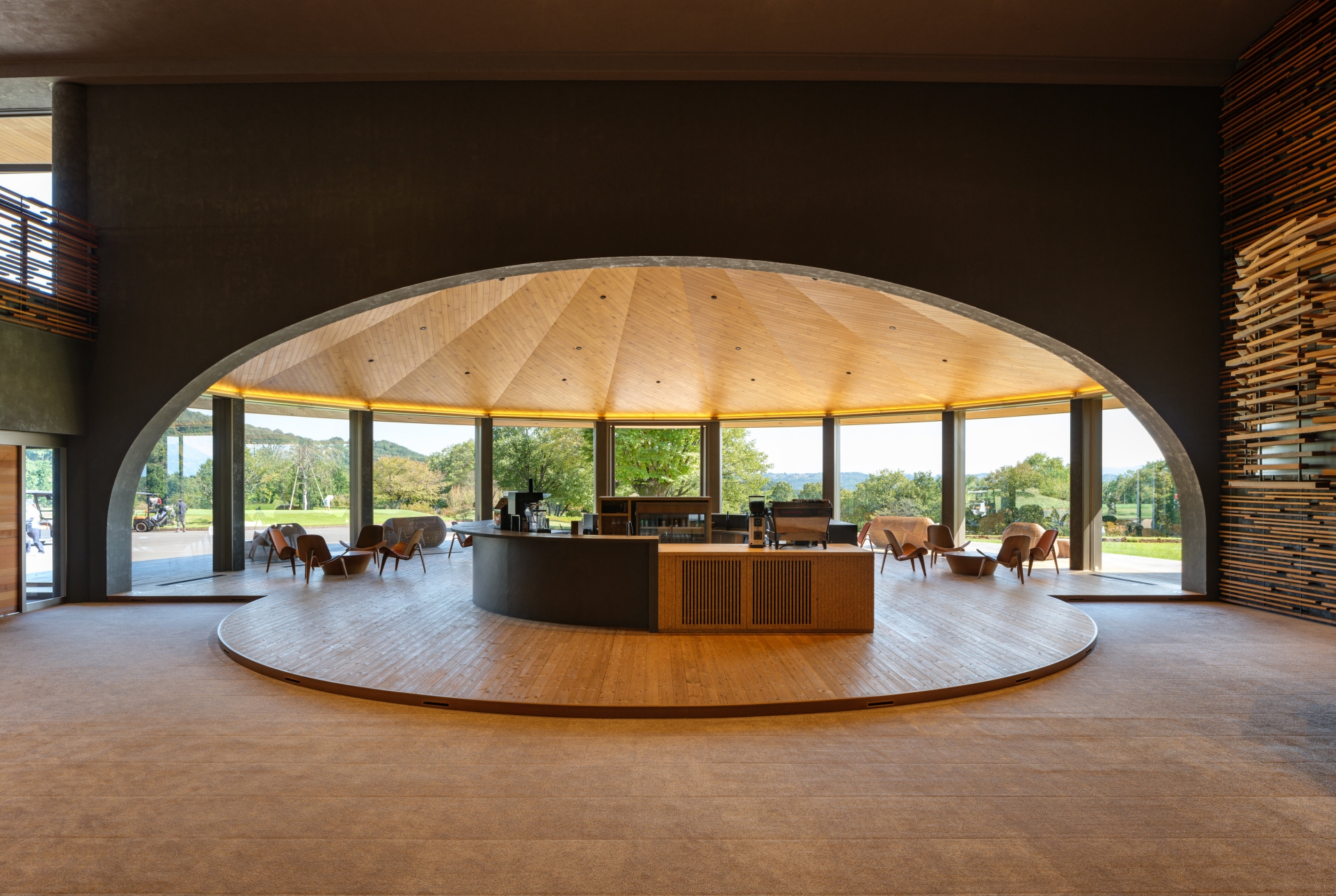
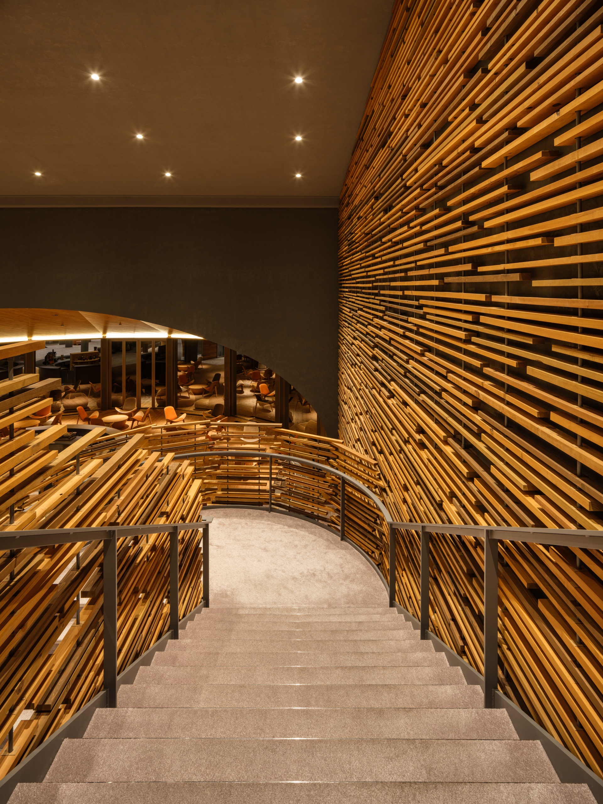
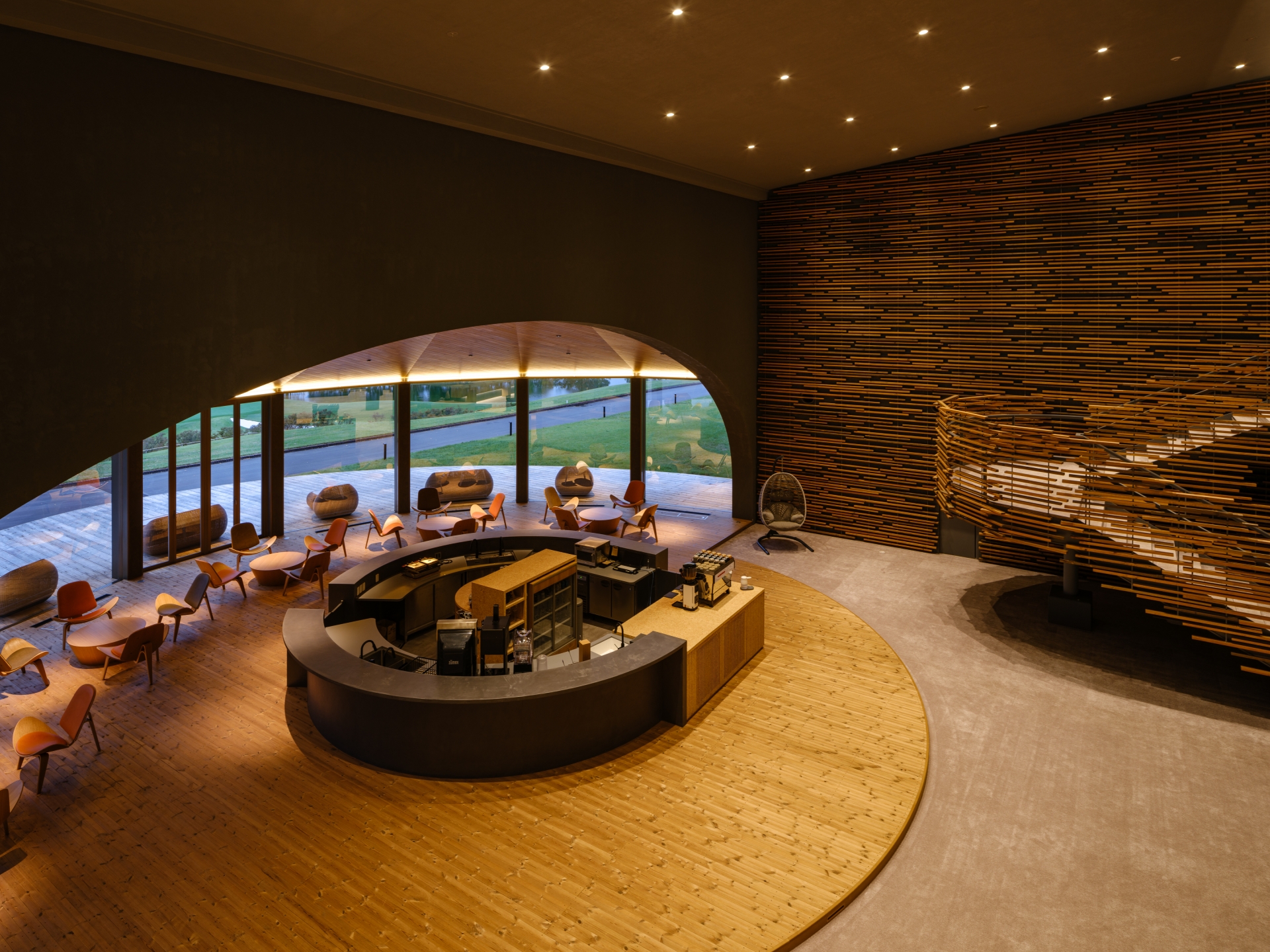
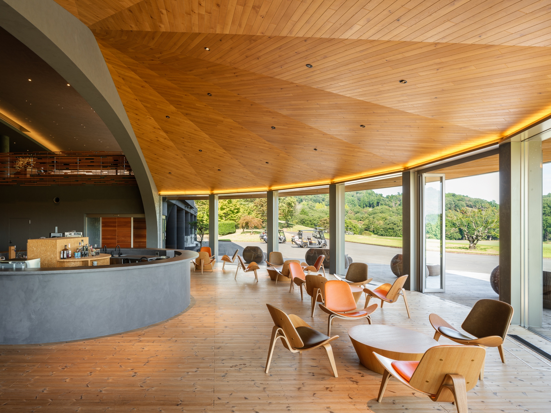
The café space is situated behind the reception counter at the entrance, while utilizing the existing curved ceiling. This was designed as a wood-lined dome-like space, with the area divided by an arch opening, eliminating decoration. This café space, which looks out from the entrance to the golf course, is filled with bright natural light reflected from the floor, and serves not only as a welcoming space for visitors, but also as a visual and experiential link between this clubhouse and the golf course. The top light on the large roof of the second floor - which was a feature of the existing building - was blocked off to prevent heat, but artificial lighting was added to provide stable light, and reflectors were added to illuminate the ceiling surface, a design feature inherited from the original design.
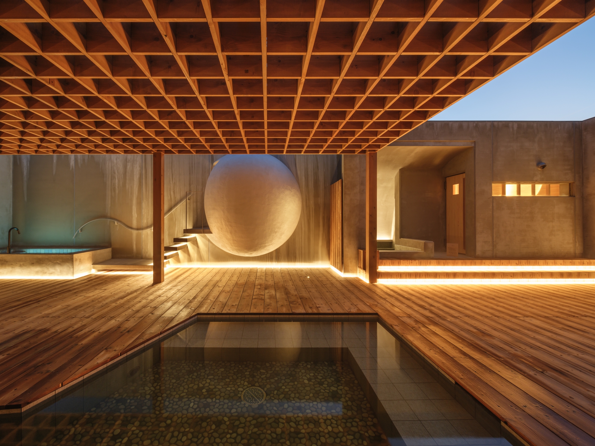
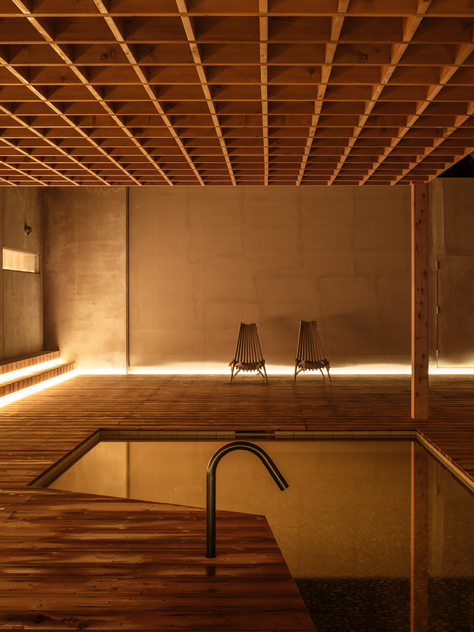
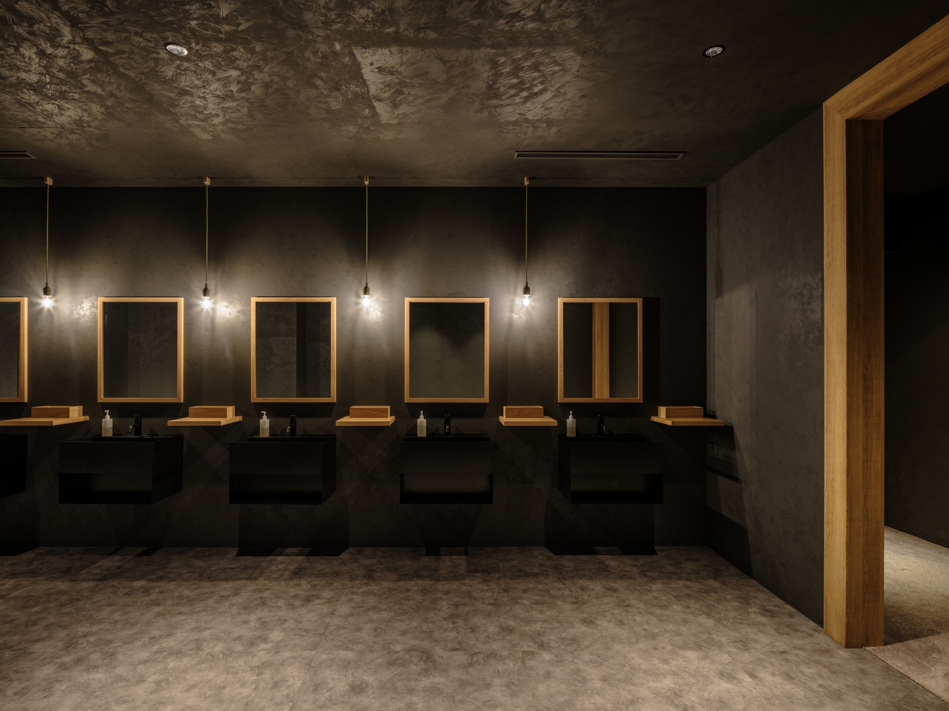
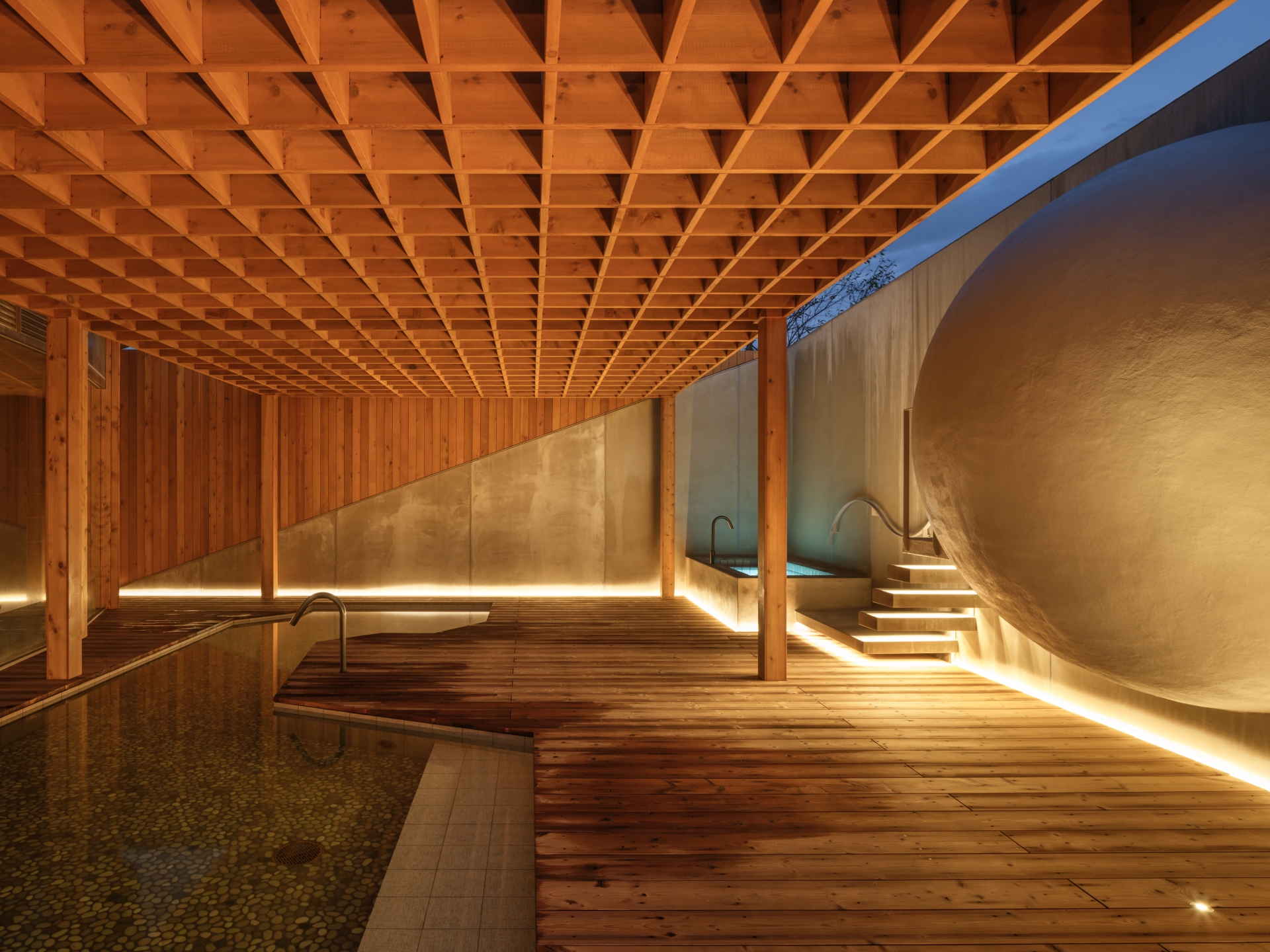
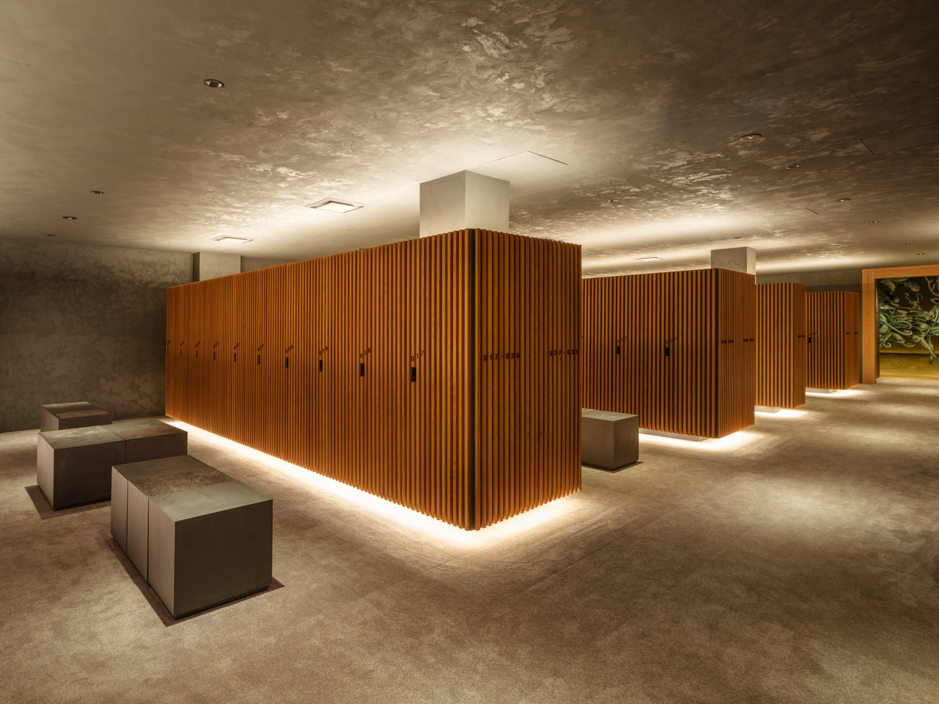
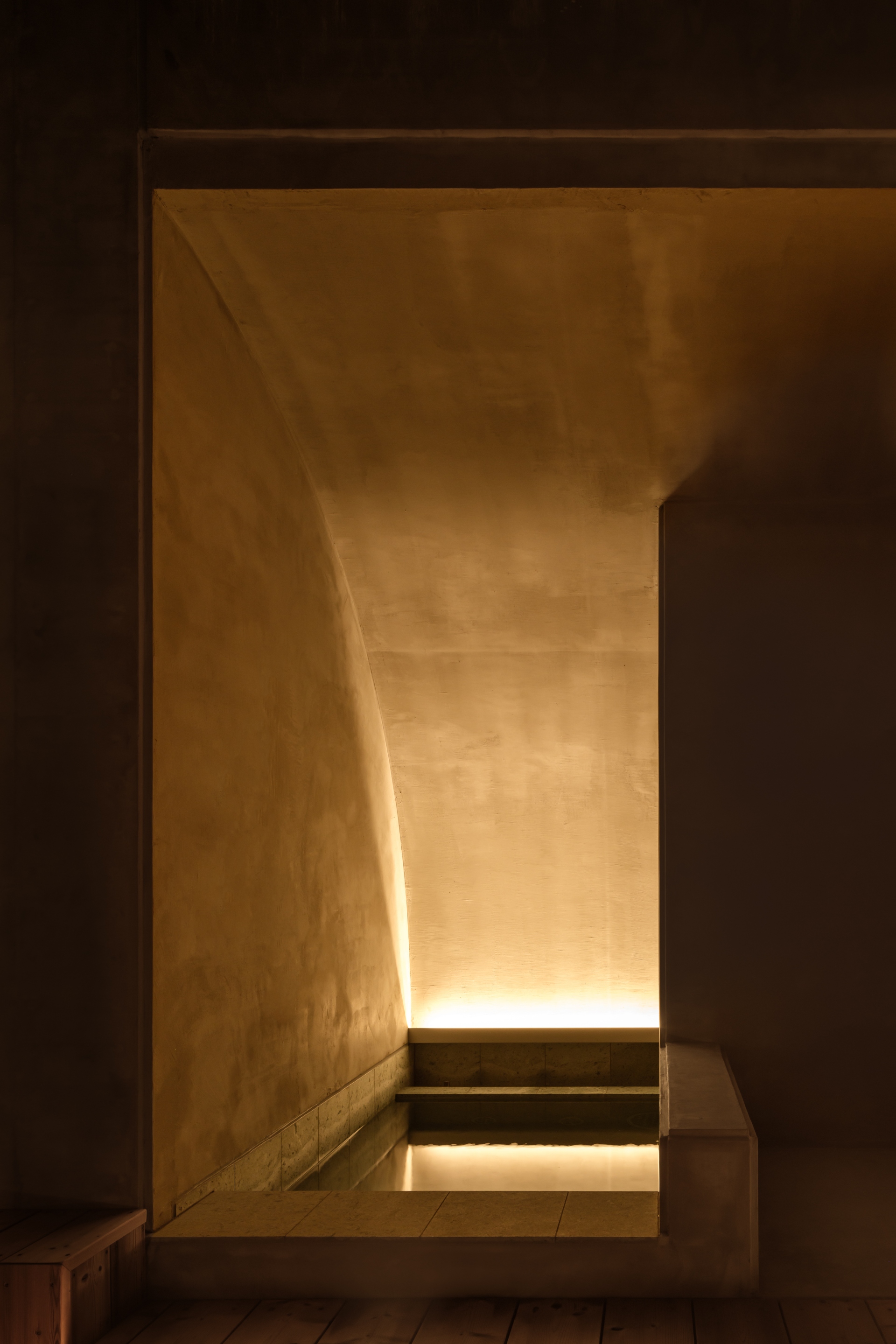
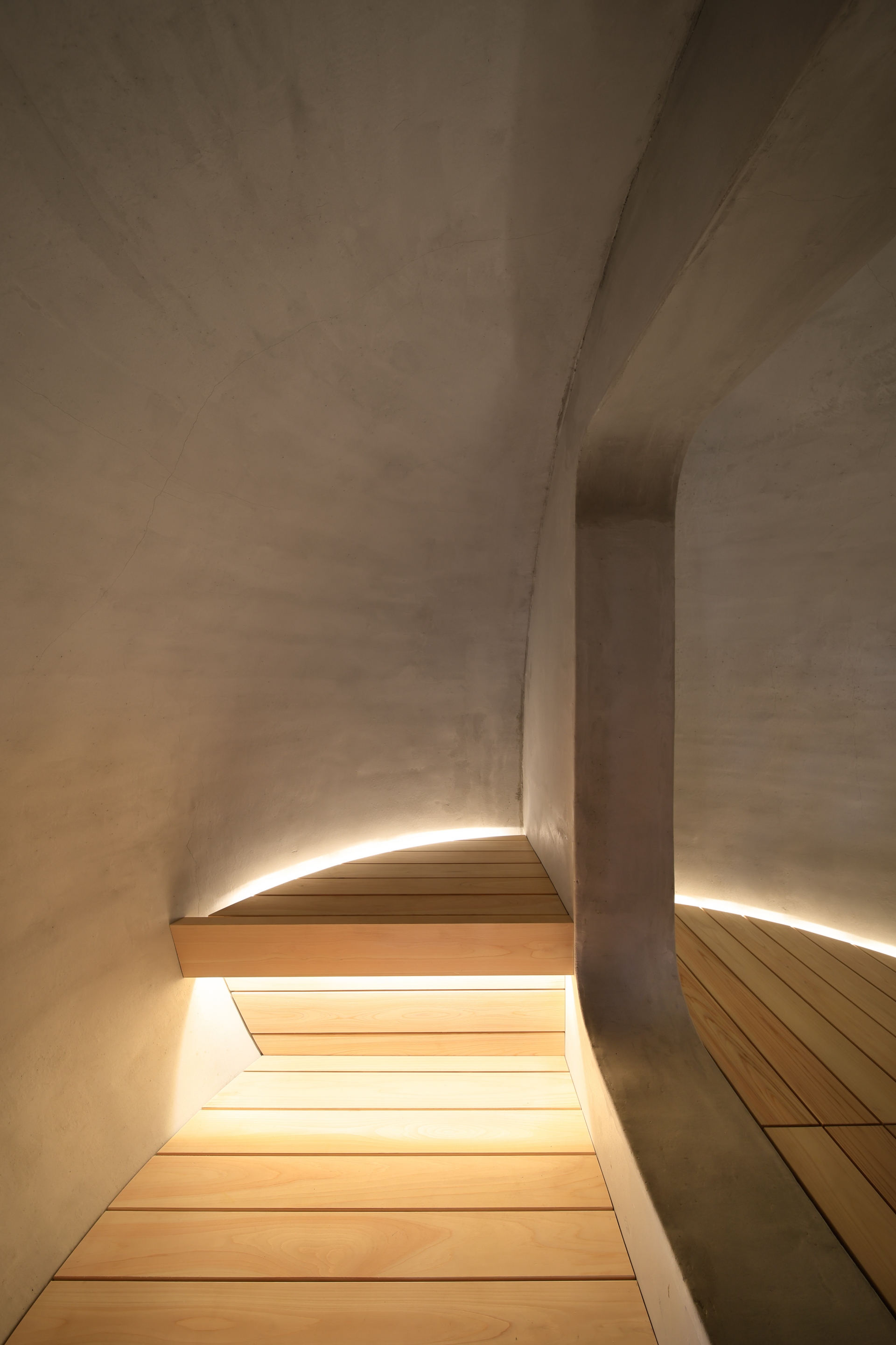
On the first floor of the clubhouse building, the existing large bathroom has been significantly updated by retaining the location of the bathtub in the interior area and a careful selection of furnishings - wooden bath chairs, wooden decking, gray tiles, and wood finishes to match the materials used throughout the facility. The bathroom's washing area has a wall that is dug in to keep shampoos and the water basin out of sight, whereby indirect lighting has been then applied. In the outdoor bath, with a lattice sunshade and deck, a new, spherical sauna was designed. The water bath and spherical sauna, illuminated by indirect lighting, are private saunas in the private room category, where one can meditate alone. By creating such a special place with a sense of detachment, the spa experience in the bathhouse was enhanced. In the locker arena, this space focuses on a place to change, whether into golf wear for a day of the greens or back into bathrooms to enjoy the bathing and relaxation facilities. Here, a unique design was required to avoid making the space look inorganic and tacky with rows of metal lockers; lockers were designed to look like they are floating with indirect lighting and a minimalist shape with only a locker number and key, with thin wood covering the entire surface so that they would not be recognizable at first glance. Meanwhile, art paintings directly on the wall of the front room peek out from the back of the locker room, creating a warm and inviting space, where one feels they are spending time in the midst of trees.
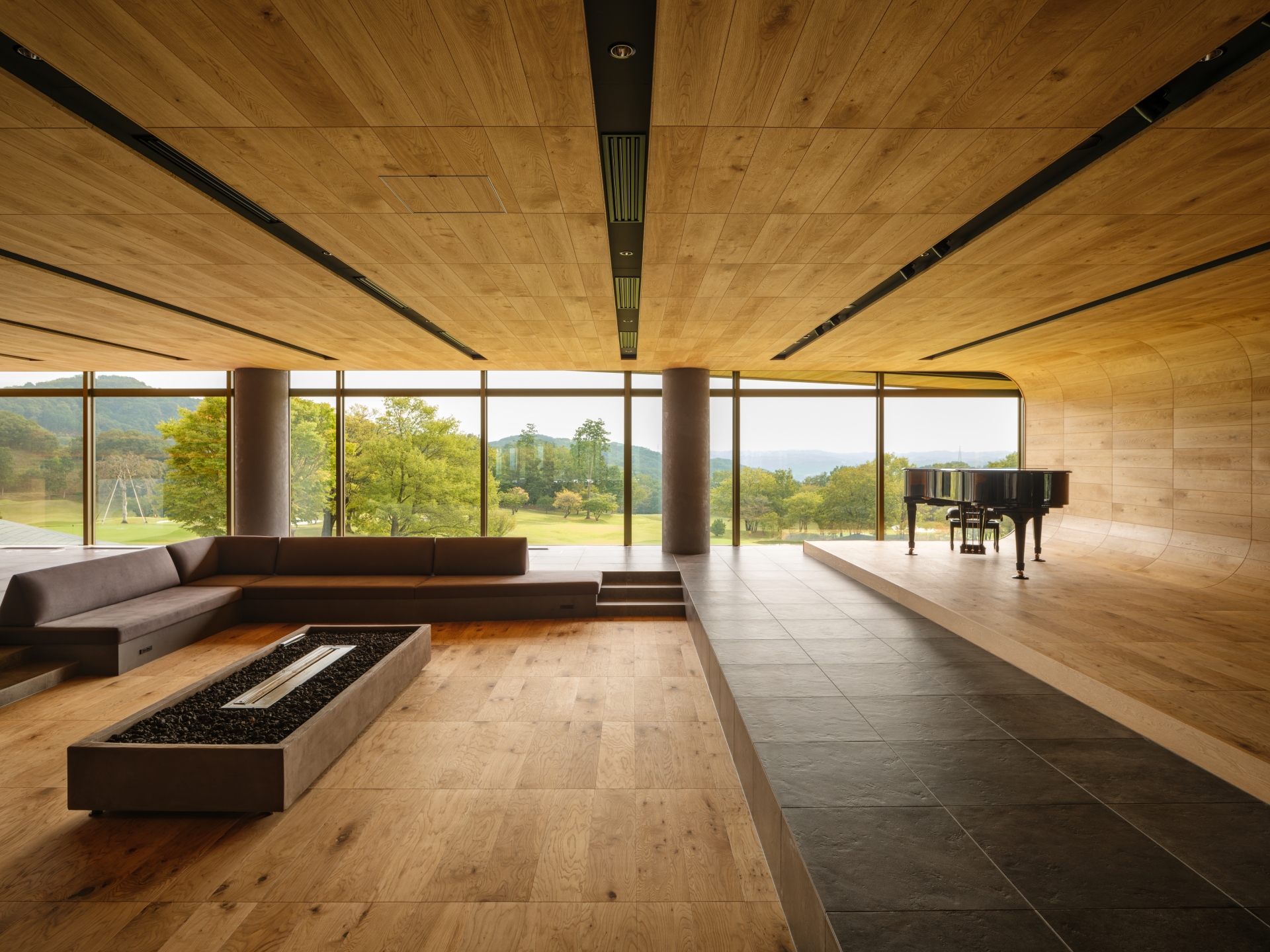
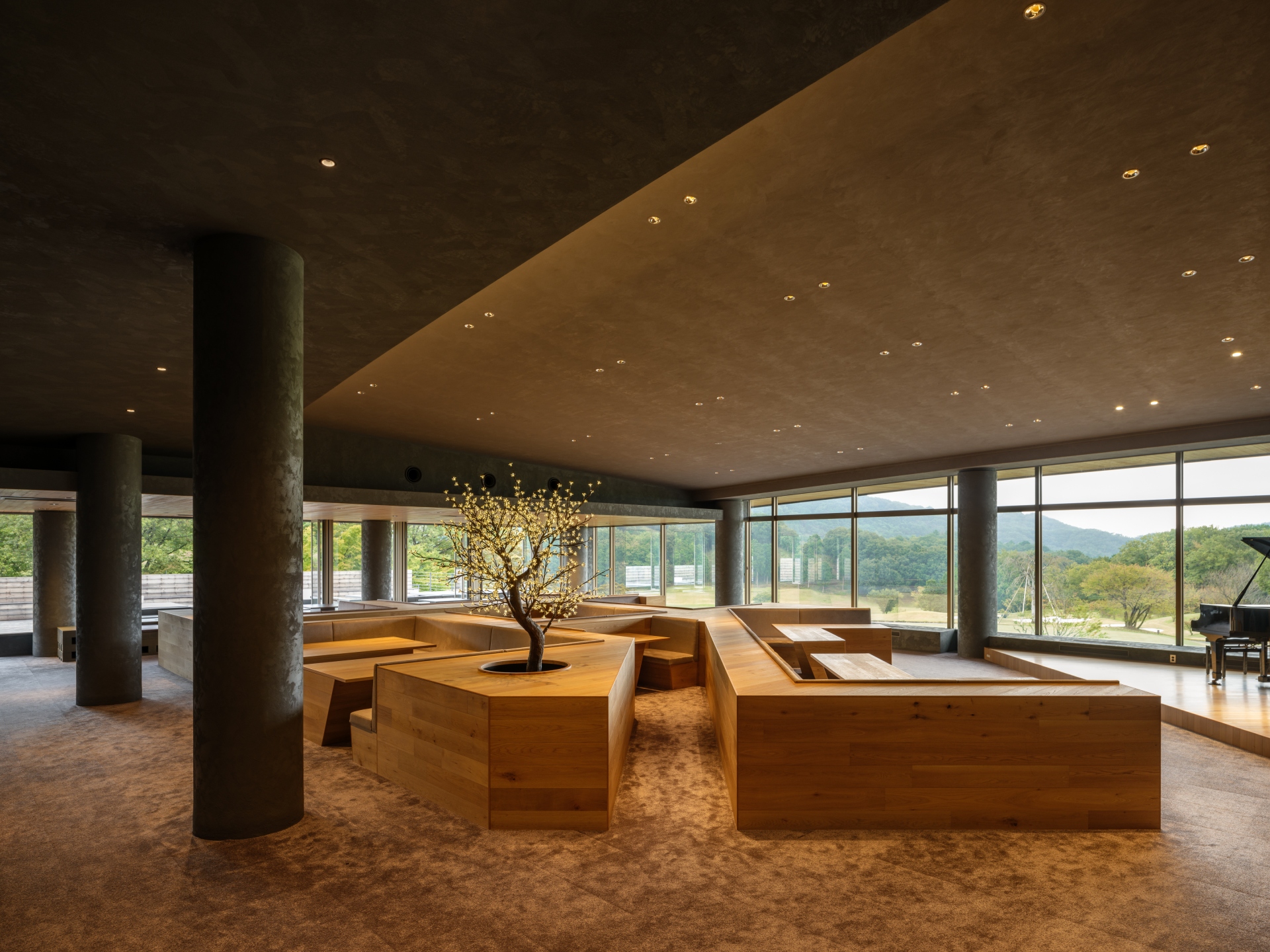
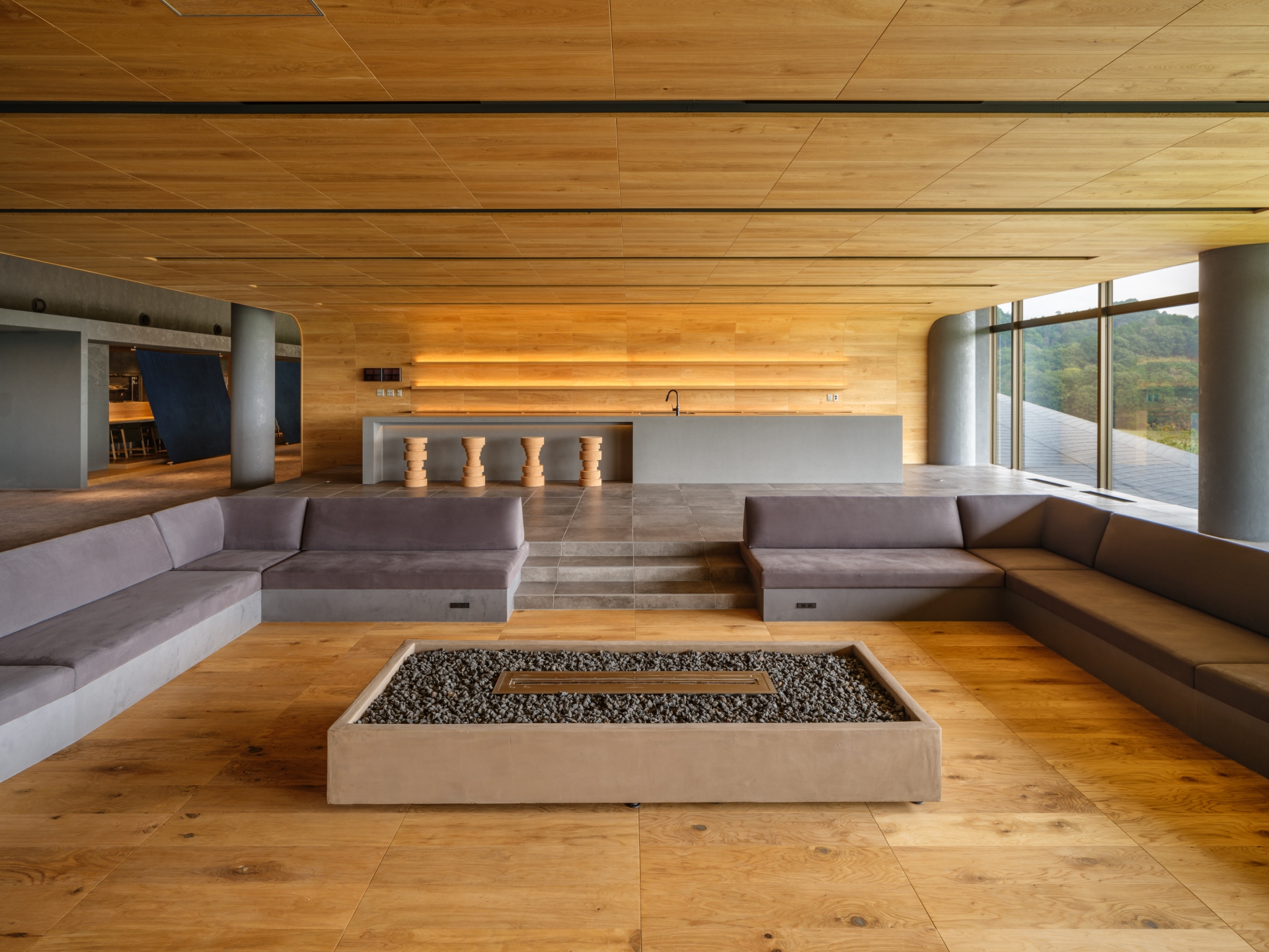
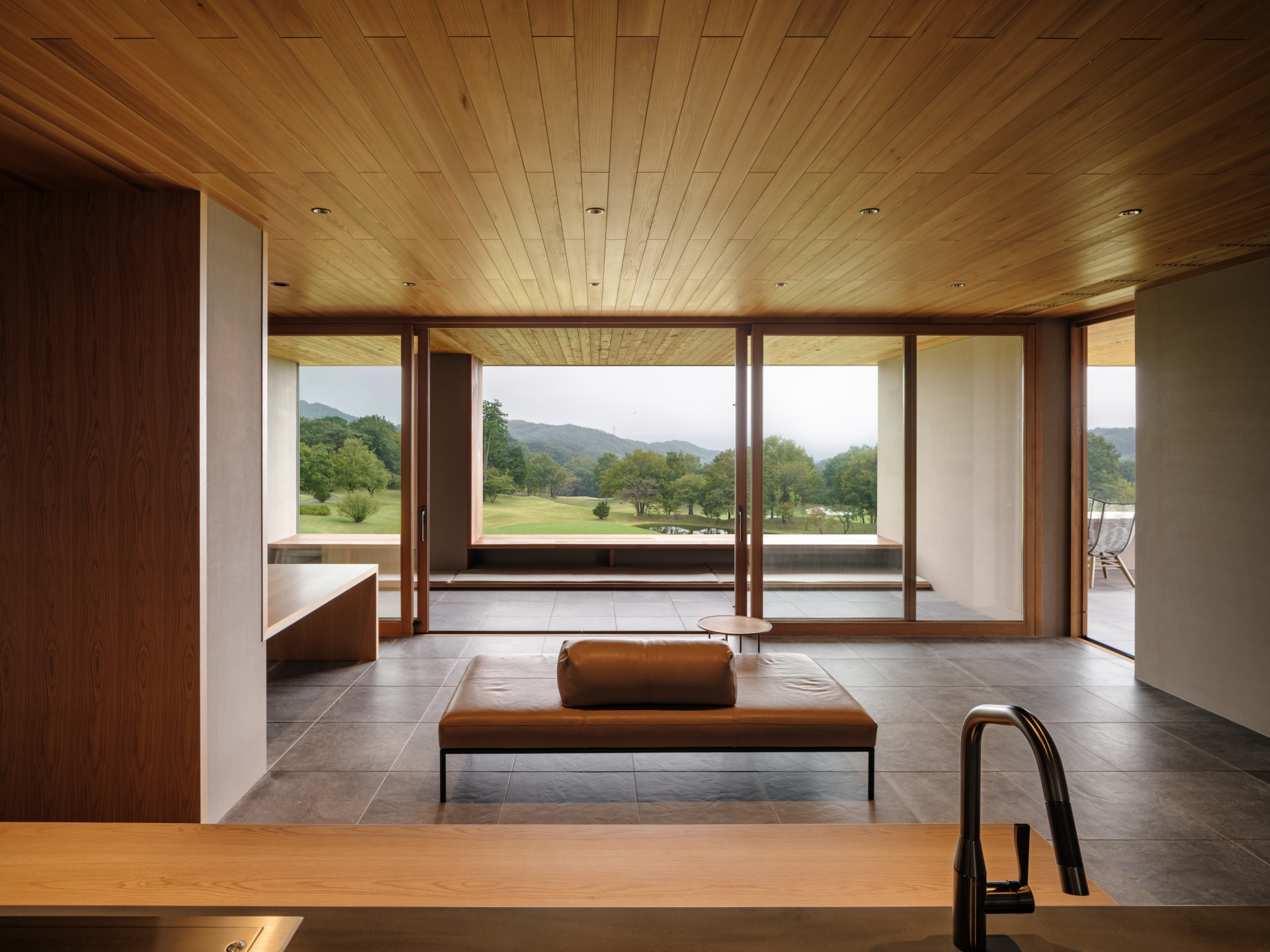
On the second floor of the clubhouse building, a members-only living room was created. This is a spacious zone with a counter kitchen, where light meals and drinks can be enjoyed - a down living room with a bioethanol fireplace, and a stage for live piano performances. The floor, walls, and ceiling are finished with an integrated wood-clad band, creating a safe, enveloping space and reducing visual overload with existing columns and beams. This is intended to be a place where one can go back and forth between the living room and the fitness gym across the street, even dressed down in relaxing clothes or bathrobes, in a relaxed atmosphere as if one were at home.
