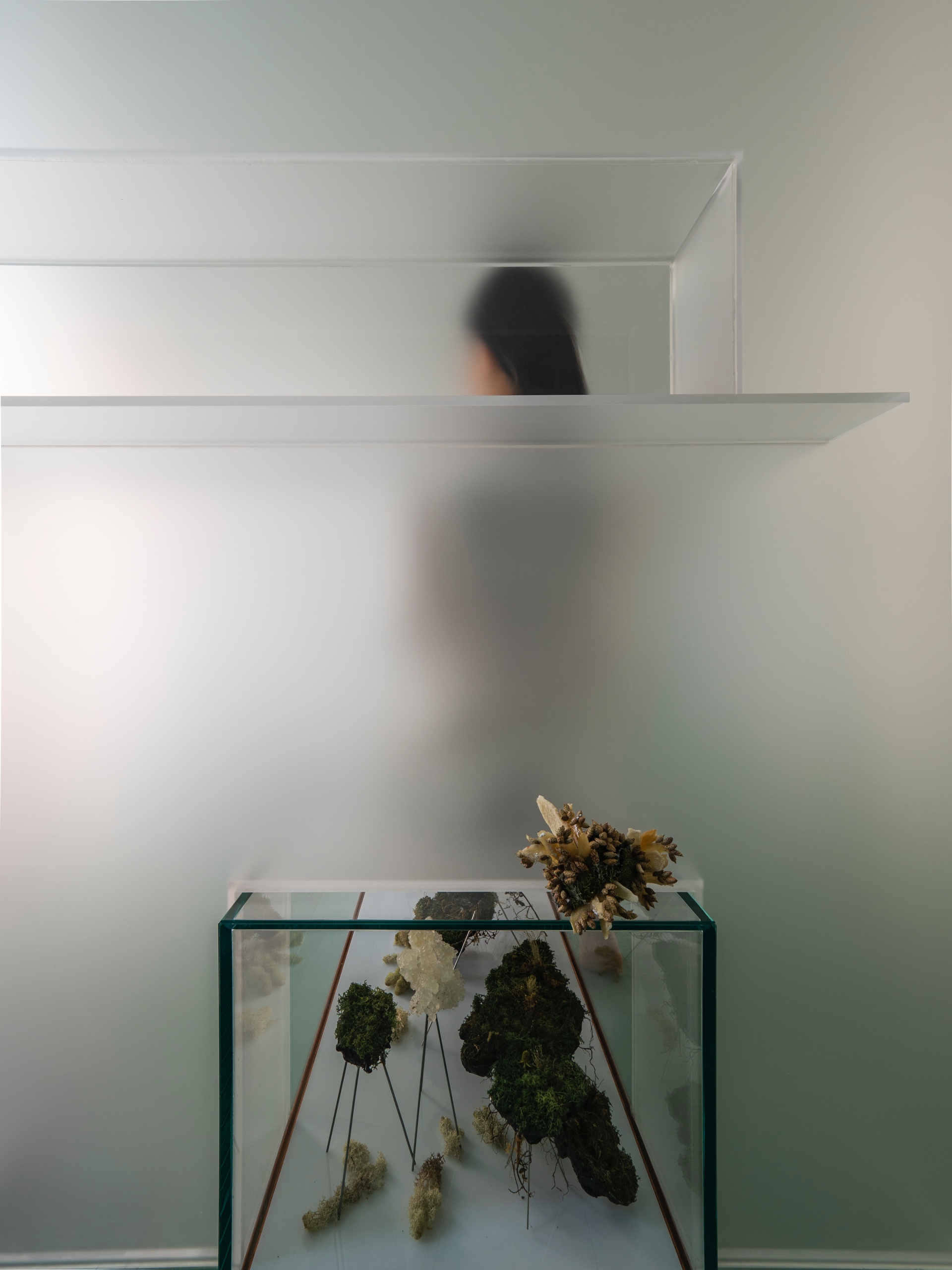
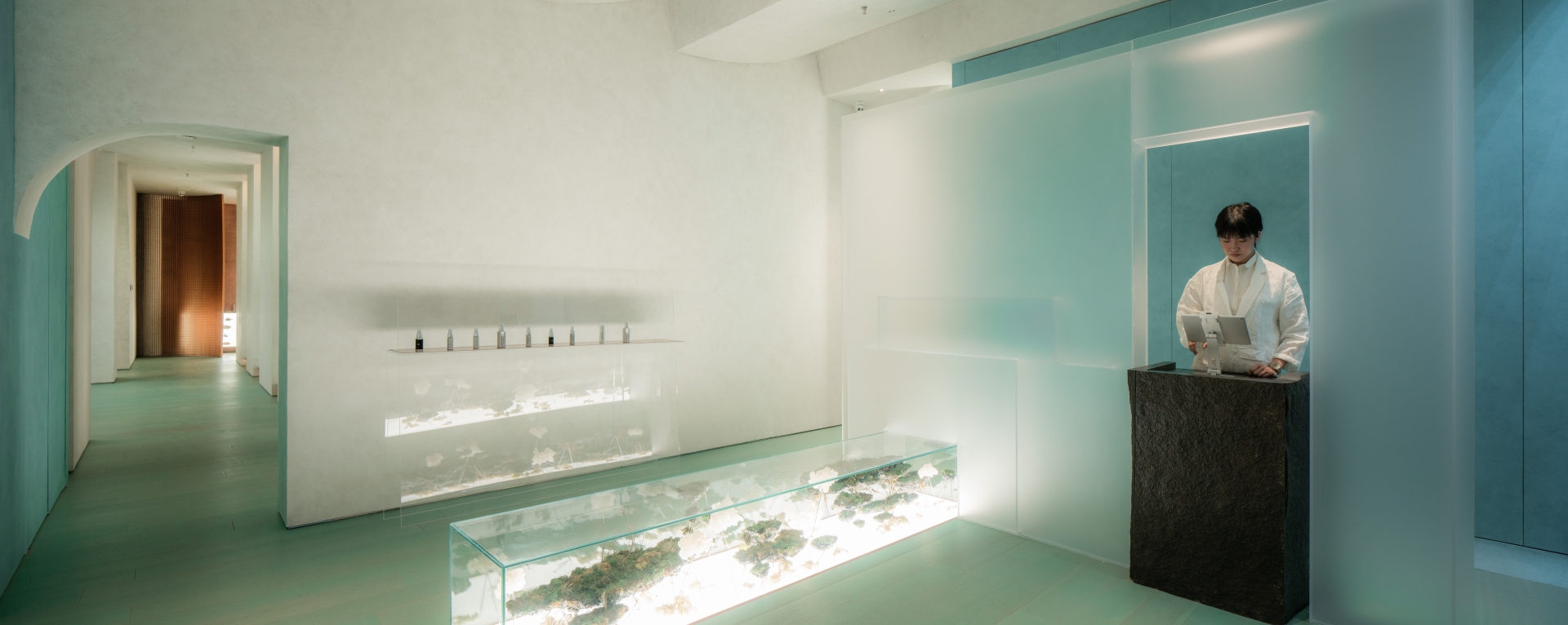
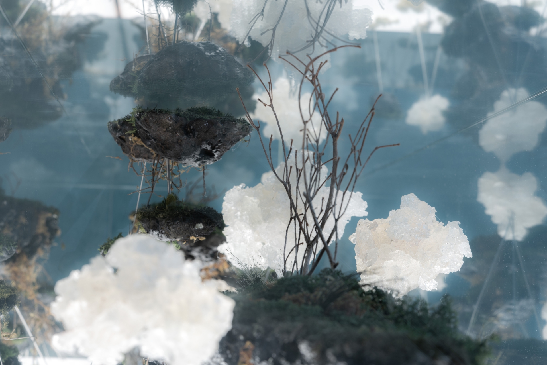
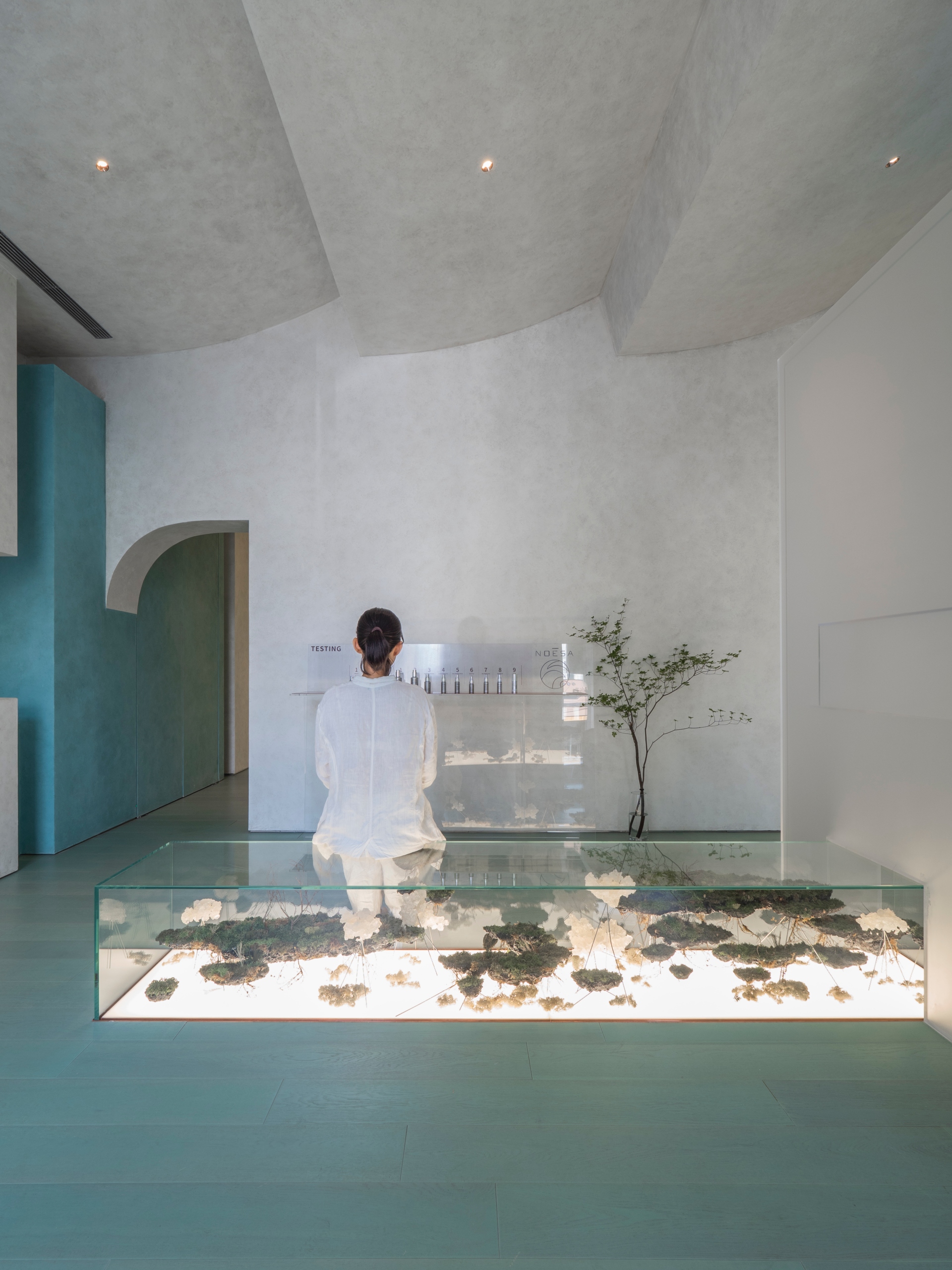
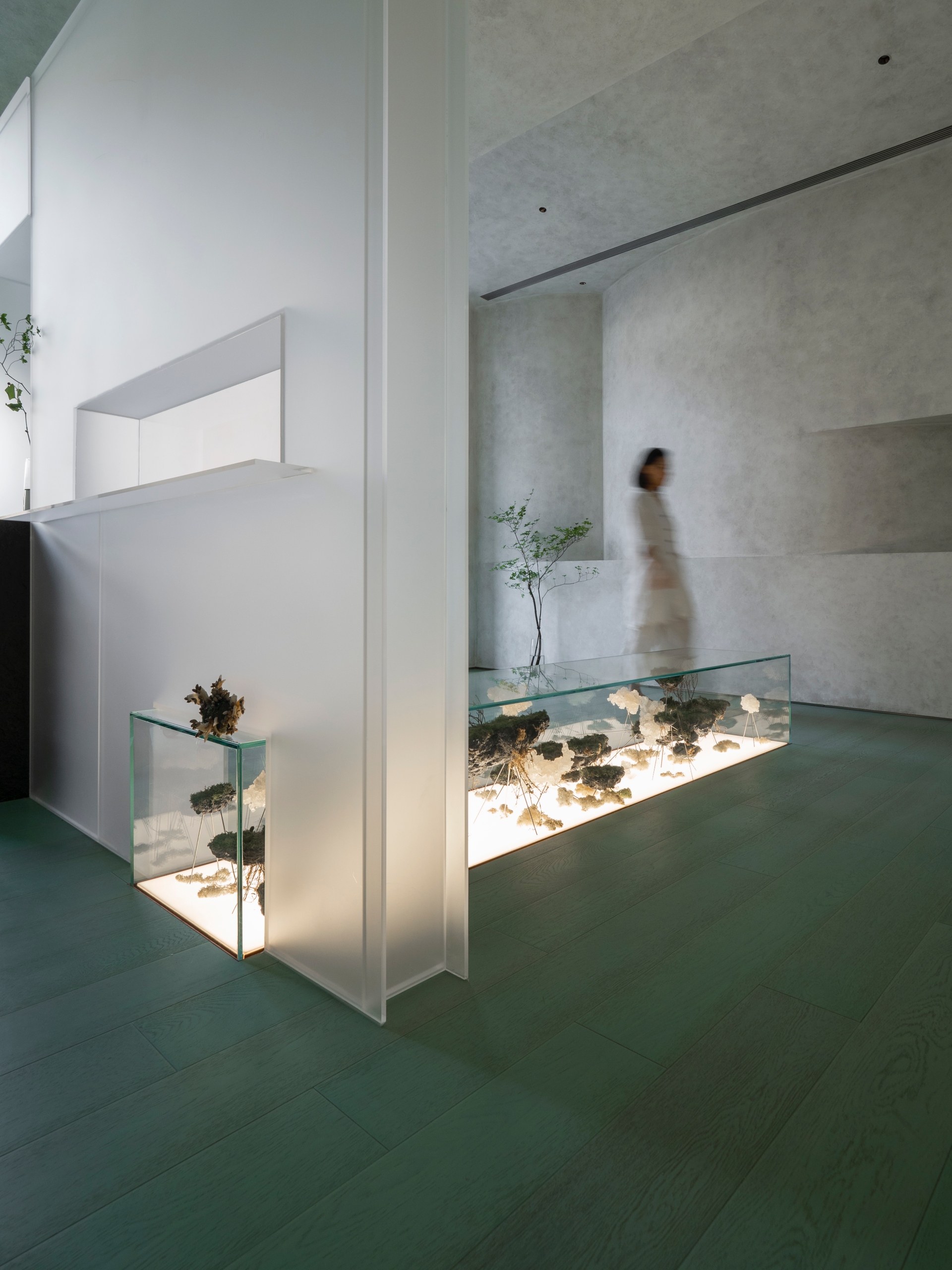
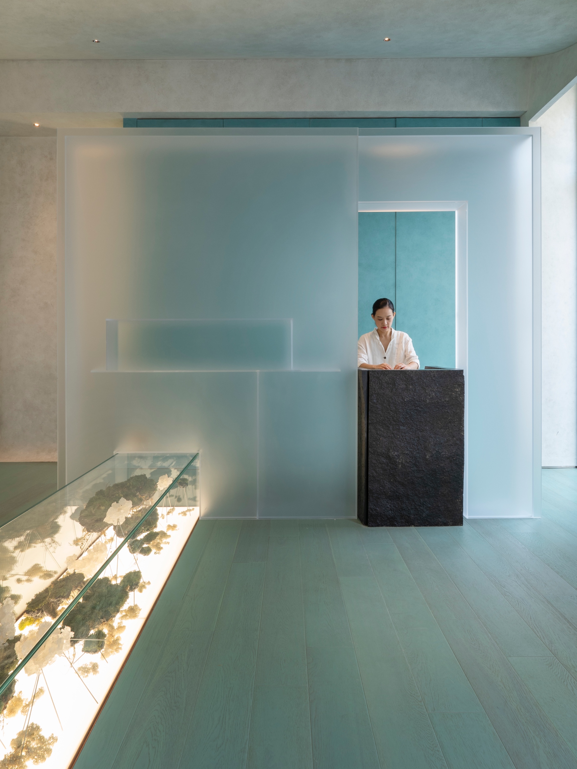
Upon entering the door, in the center of a cool and avant-garde solid wood floor stained with soft-stem bulrush, the long glass case is covered with warm light, and the moss decoration inside as the main material floats like a cloud. This set of planting art decoration was originally a chair stool. The space is surrounded by a beige gray façade and one end is hidden with a matte frosted acrylic screen. A blurred figure appeared from the opening similar to the ticket booth of the art museum. It turns out that this is the starting point for traditional Chinese medicine treatment and SPA care testing.
Artistic Exhibition and Frozen Time
Aqua Health Clinic attempts to use cosmetic SPA and technological atmosphere to twist the old impression of traditional Chinese medicine. It uses medical principles of pulse diagnosis and medication and food therapies as the approach to design specific treatment for visitors to relieve physical and psychological fatigue. This place enables people to jointly shape the contemporary 5-senses culture through space, diet, and SPA, as well as experience the ancient internal and external health cultivation of traditional Chinese medicine.
Coincidentally, Aqua Health Clinic (水相事務所) shares the same name in Chinese with Waterfrom Design (水相設計) located several thousand kilometers away in Taipei, whose name also implies water. Due to such coincidence, Aqua Health Clinic cooperates with Waterfrom Design to jointly create a space subverting people’s collective memory about traditional Chinese medicine. The philosophical background of five elements and medicinal herbs in Compendium of Materia Medica both are presented in new sensory forms through design conversion techniques. Their goal is to enable visitors receiving the diagnosis and treatment of traditional Chinese medicine or SPA care to experience tenderness in an environment rich in technological and medical principles. Such tenderness comes from the sense of slowness of detachment from time and space, refinement, and endless aftertaste from art. Therefore, the use of “Exhibition of Frozen Time” as the design idea was initiated.
Format-free and Dissected Time
The argument about time that is closest to people undoubtedly is life and death. The design team viewed specimens as the tangible carrier of time, which is exactly the same as the idea of the British artist, Damien Hirst, who investigates animal specimens symbolizing the concepts of life and death and suggests that the life perception surrounded by viewers and the static specimens bring back the collective memory of personal feelings and the civilized society.
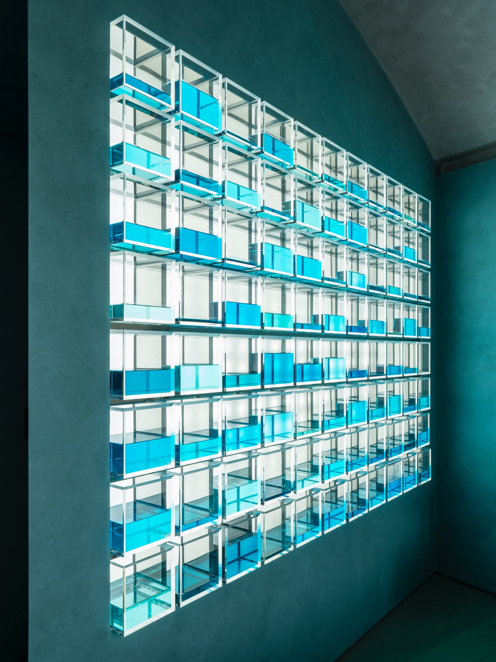
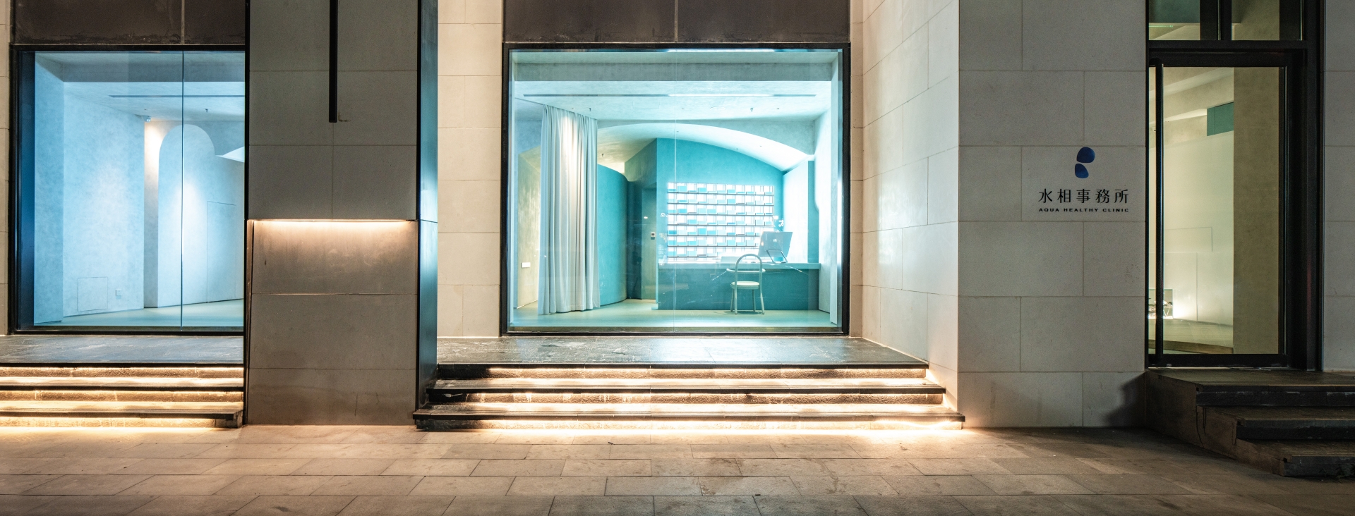
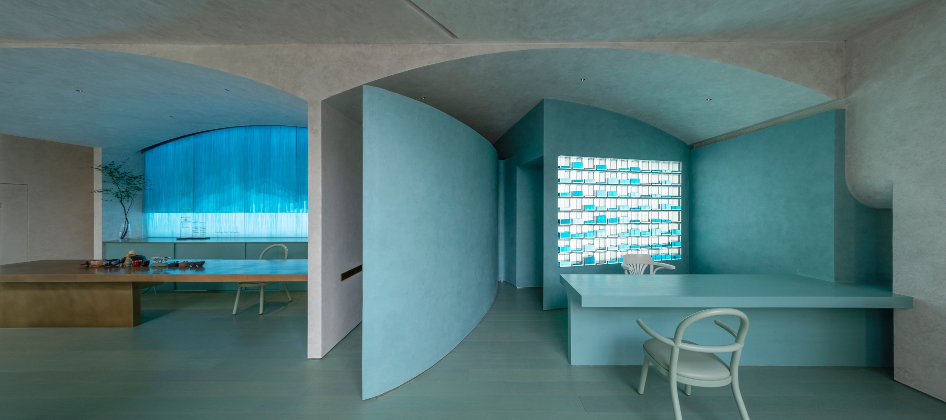
The front wall of the seat in the facial care area demonstrates the artistic tension brought by the specimen installation. There are nearly 100 kinds of traditional Chinese medicine plant and mineral specimens, including common peony and Chinese angelica, with which modern people are still familiar. These specimens are statically placed with a rare herb gesture in neatly arranged and glowing glass grids. The scent and taste that the medicinal materials should have released have been condensed and disappeared, while design was used to spiritually inspire vision and imagination.
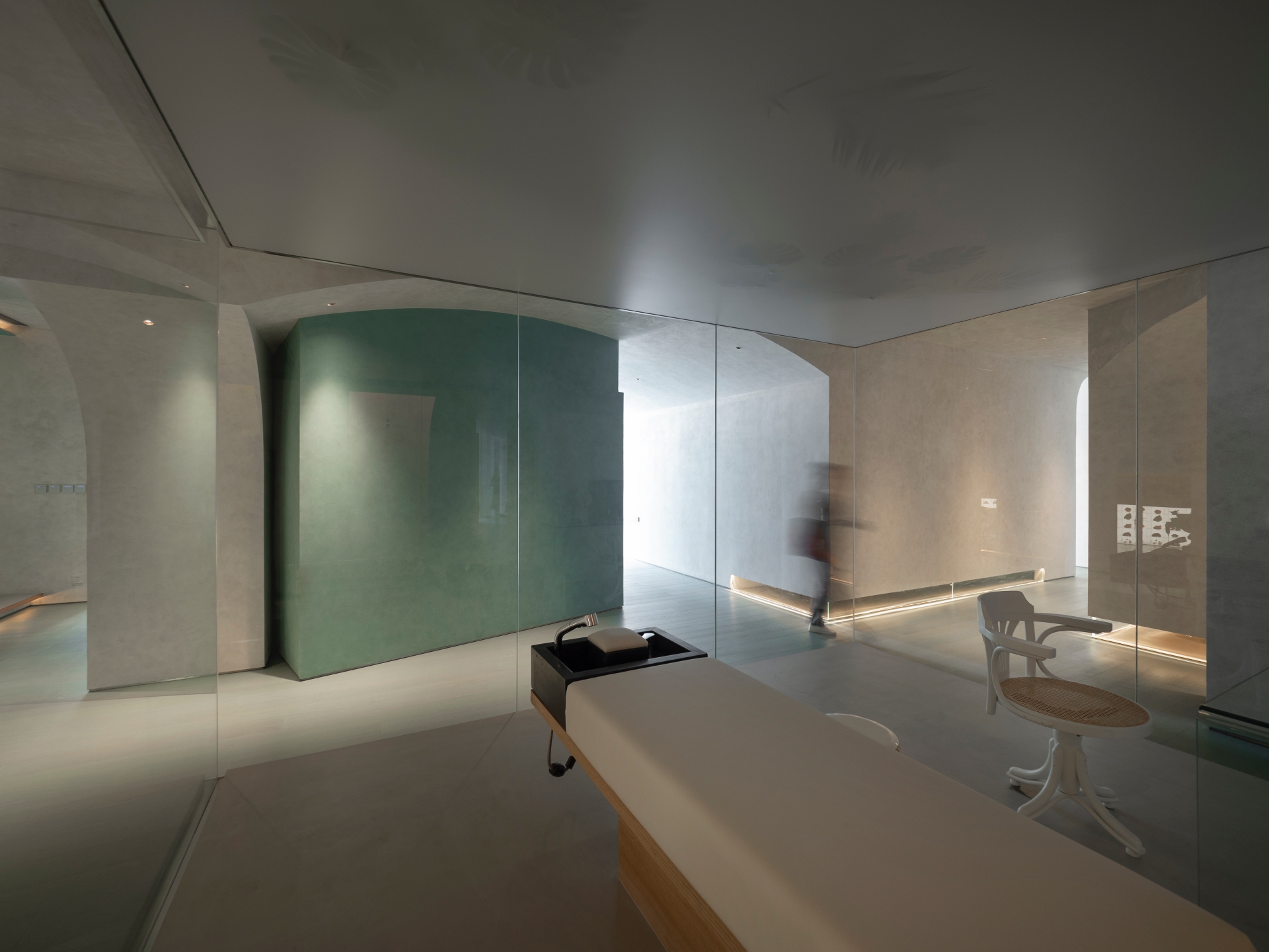
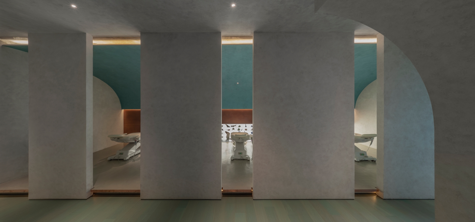
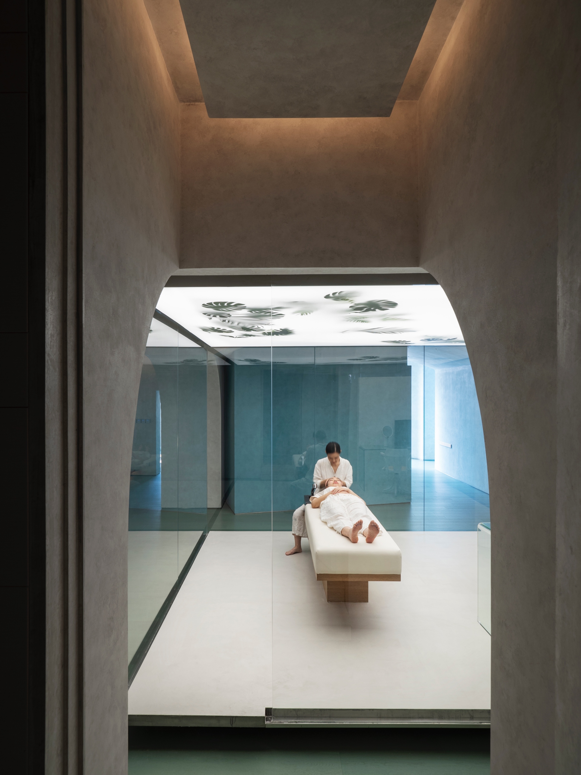
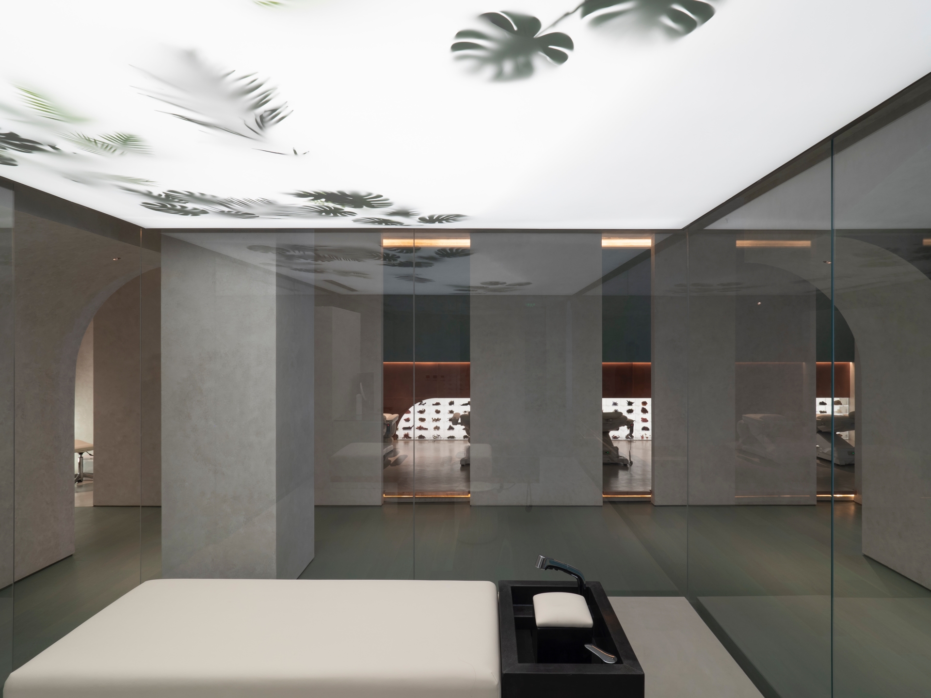
For the haircare area in the center of the base, the designers intentionally raised the ground and circled it with a glass curtain, projecting a light source that is homogeneous above and brighter than the surrounding area. The illuminating film reflects the randomly scattered leaf shadow, forming an exhibition installation full of science fiction. The behaviors carried out on the platform and the flow rhythm of the surrounding people's shadows constitute the performance art without starting and ending points of time where viewers only see a small part of stories.
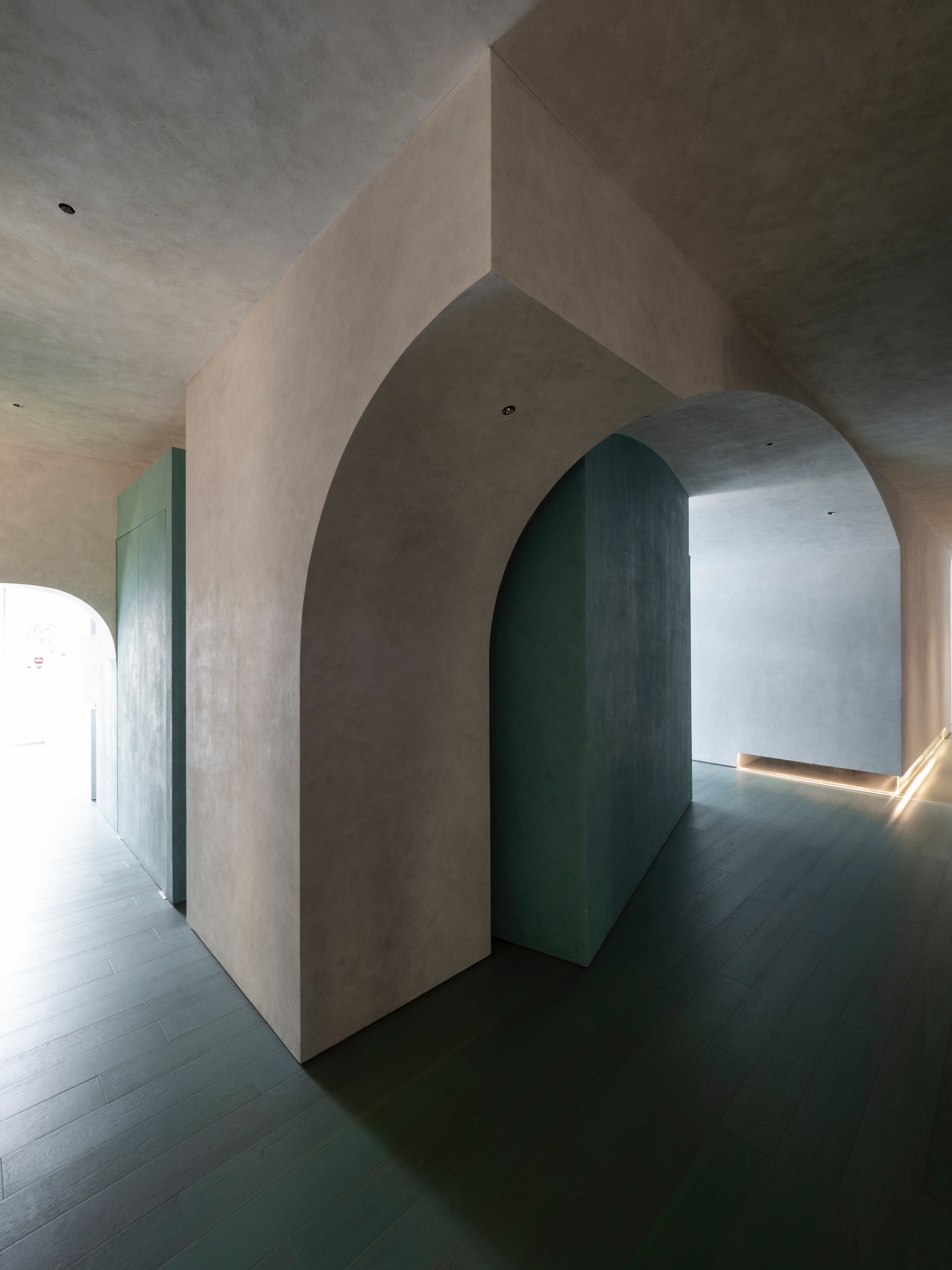
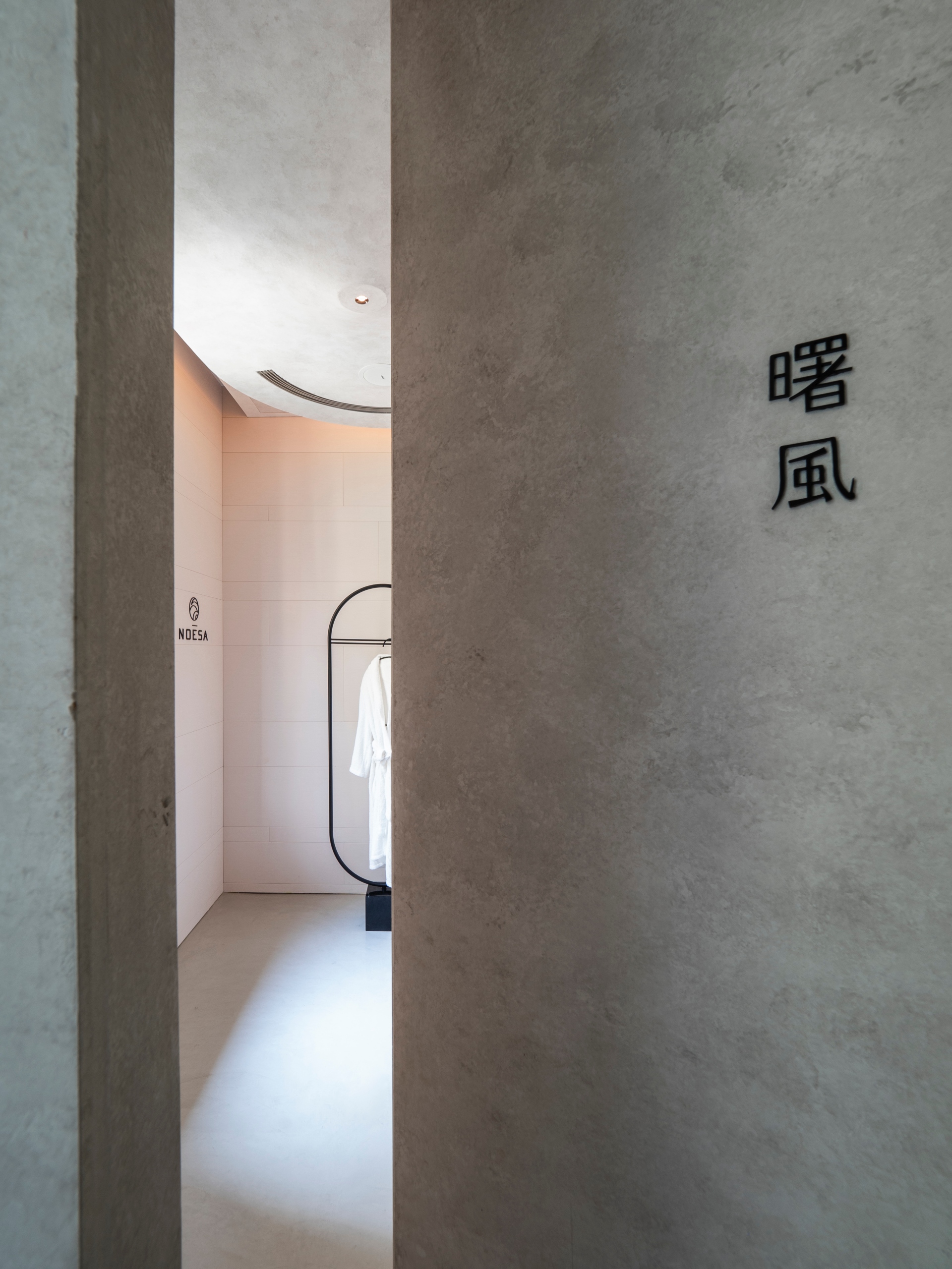
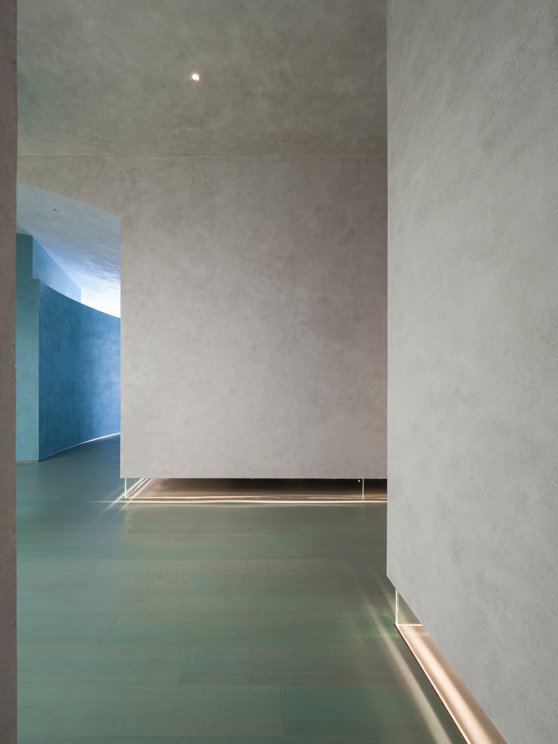
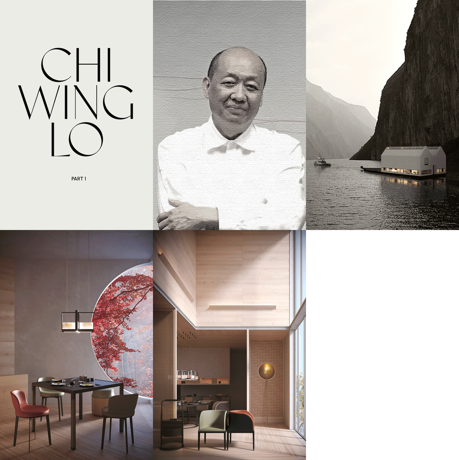
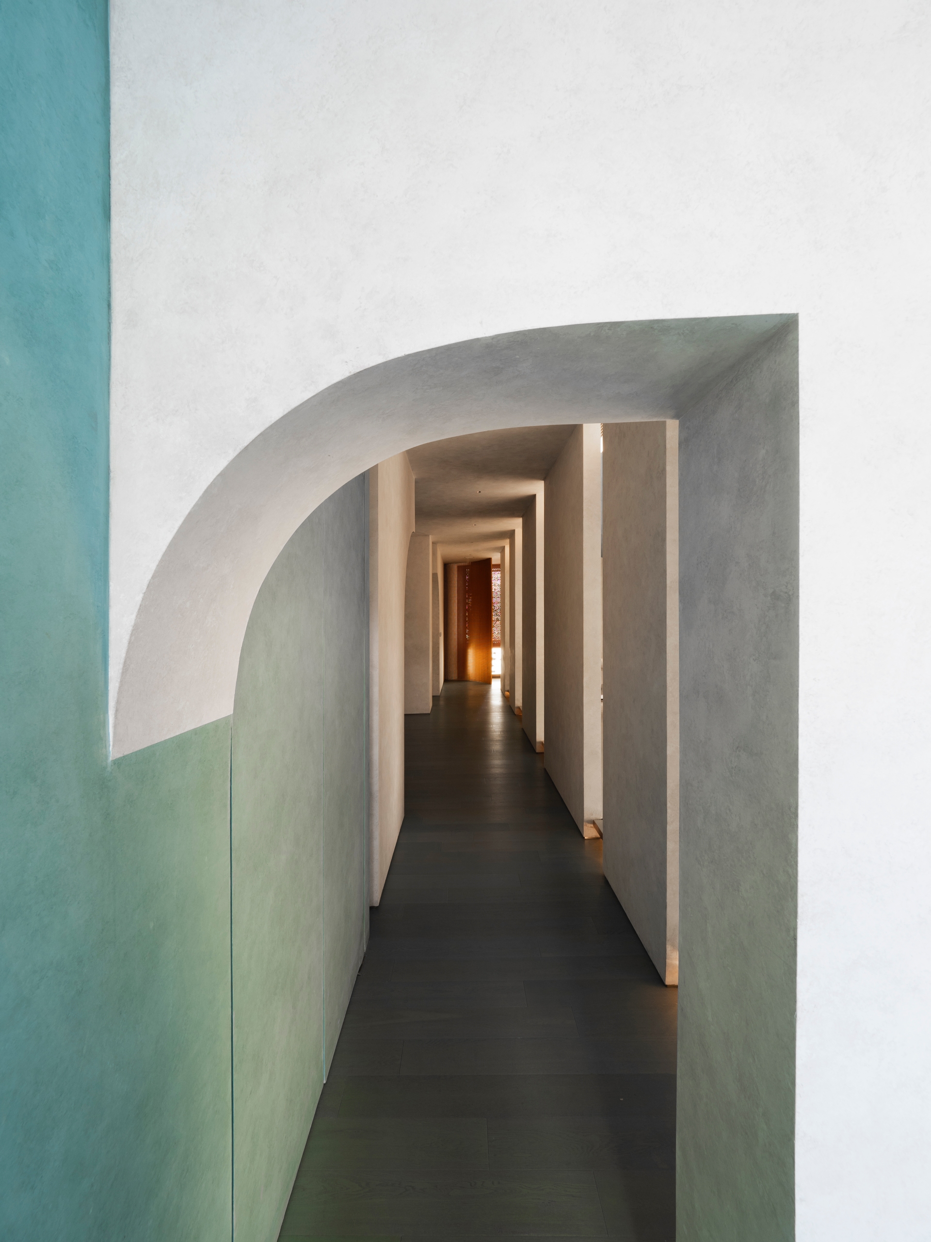
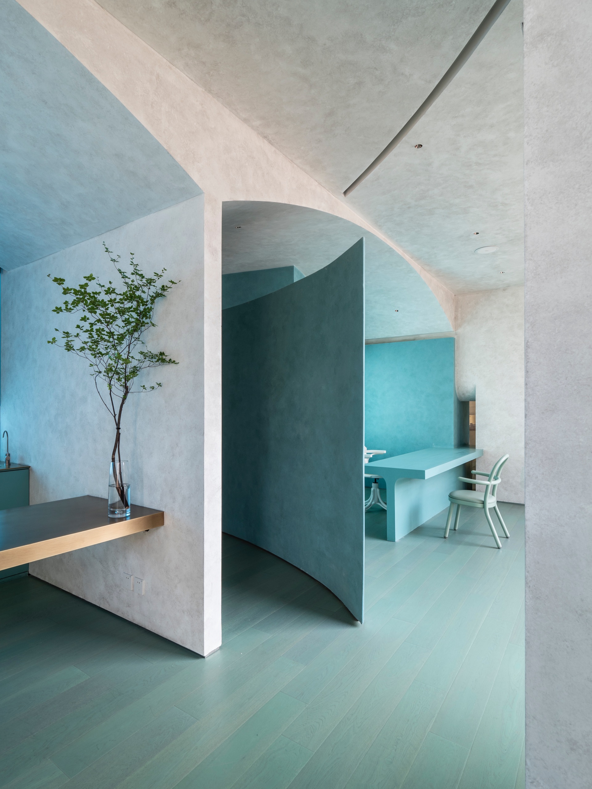
The indoor arch and façade create a discontinuous section shape that extends the slice concept of the art specimens. Compared to the perfectly symmetrical outline, a structure that appears to be interrupted by a half-cut, or a semi-circle that appears at the end of a curved walkway leaves an unfinished atmosphere with sliced structure more similar to truncated time, letting the curatorial performance interface be more diverse and stereo.
Text Transfer and Reorganized Time
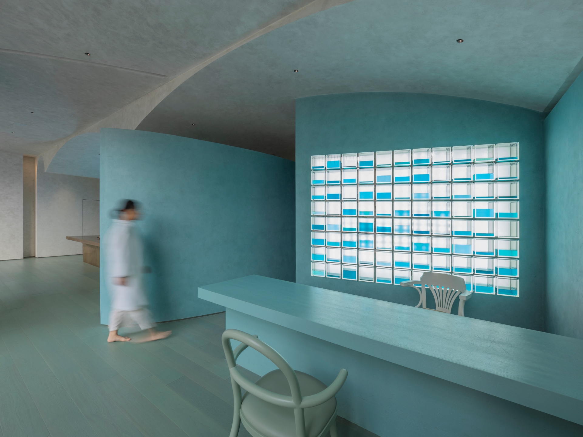
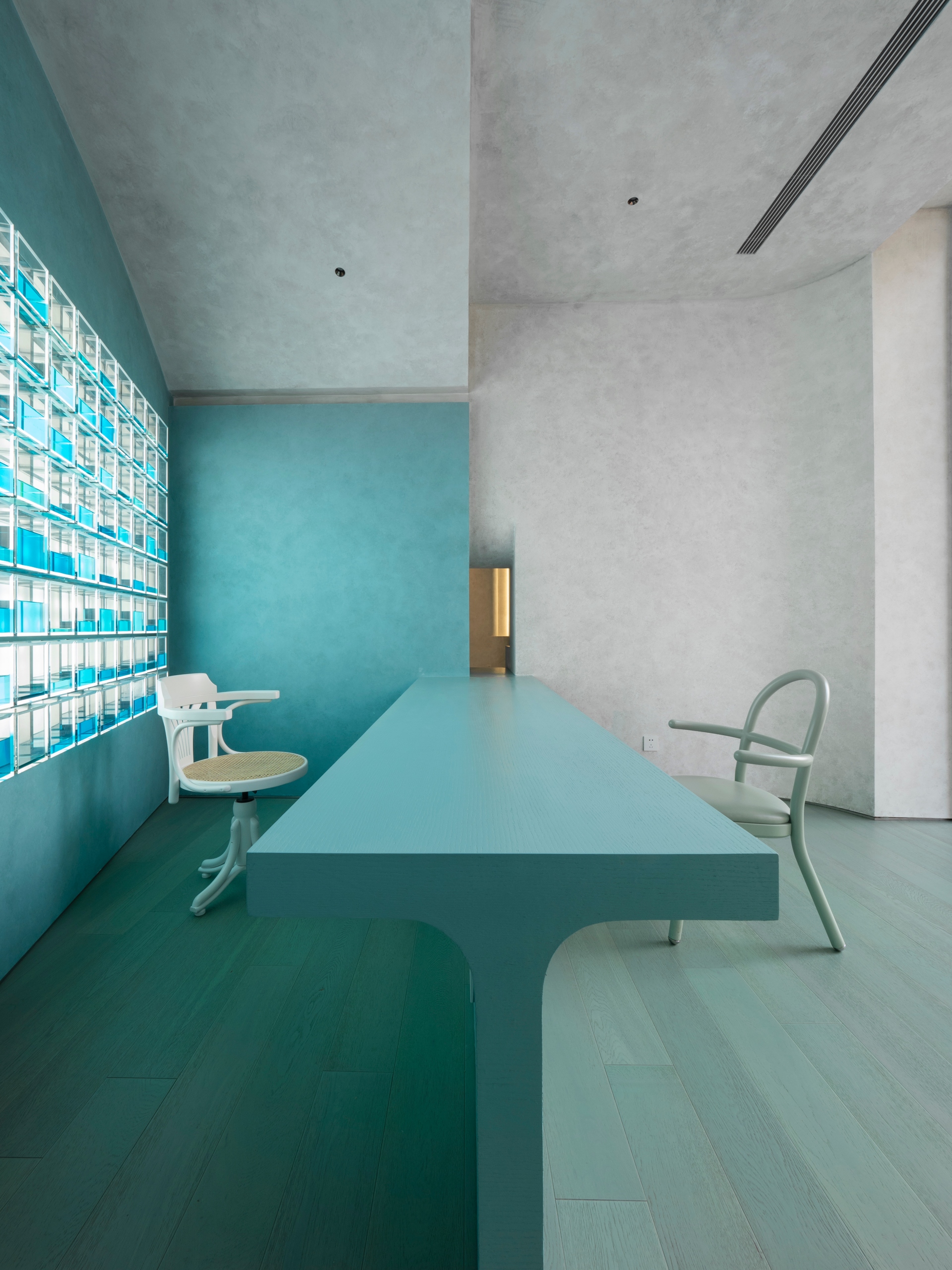
In addition to the medicinal materials, the designers also extracted the collective memory symbols of traditional Chinese medicine culture and transformed it into a decorative element that conforms to the avant-garde technology. The TCM clinic area deconstructs the solid wood medicine cabinets of the existing impression while the medicine cabinets turn into a square glass container with a blue sea of varying volume that is still as solid and floating as a soul. The light block arrays condense the charm of medicinal materials, consultation, medication ritual and thousands of years of wisdom, and the avant-garde field also reflects the ancient diagnosis and treatment behaviors, surpassing the drama tension that any painting and calligraphy copybook can convey.
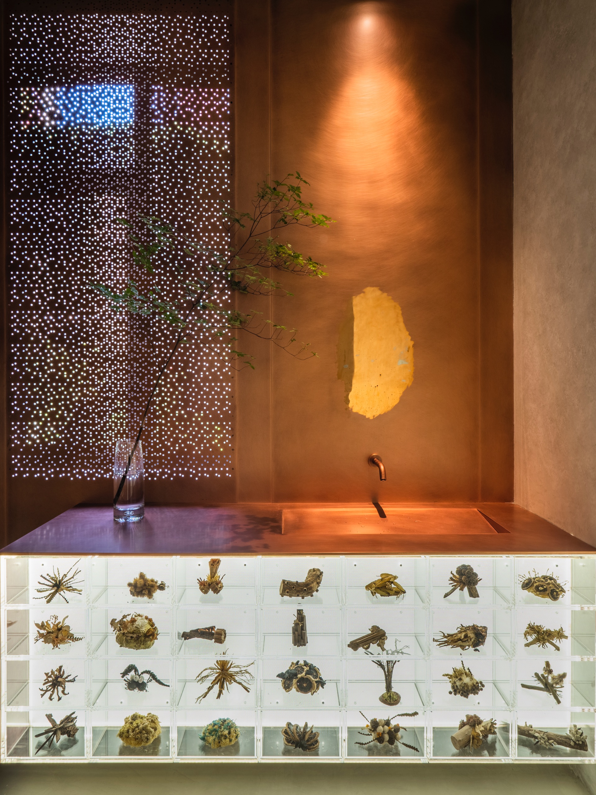
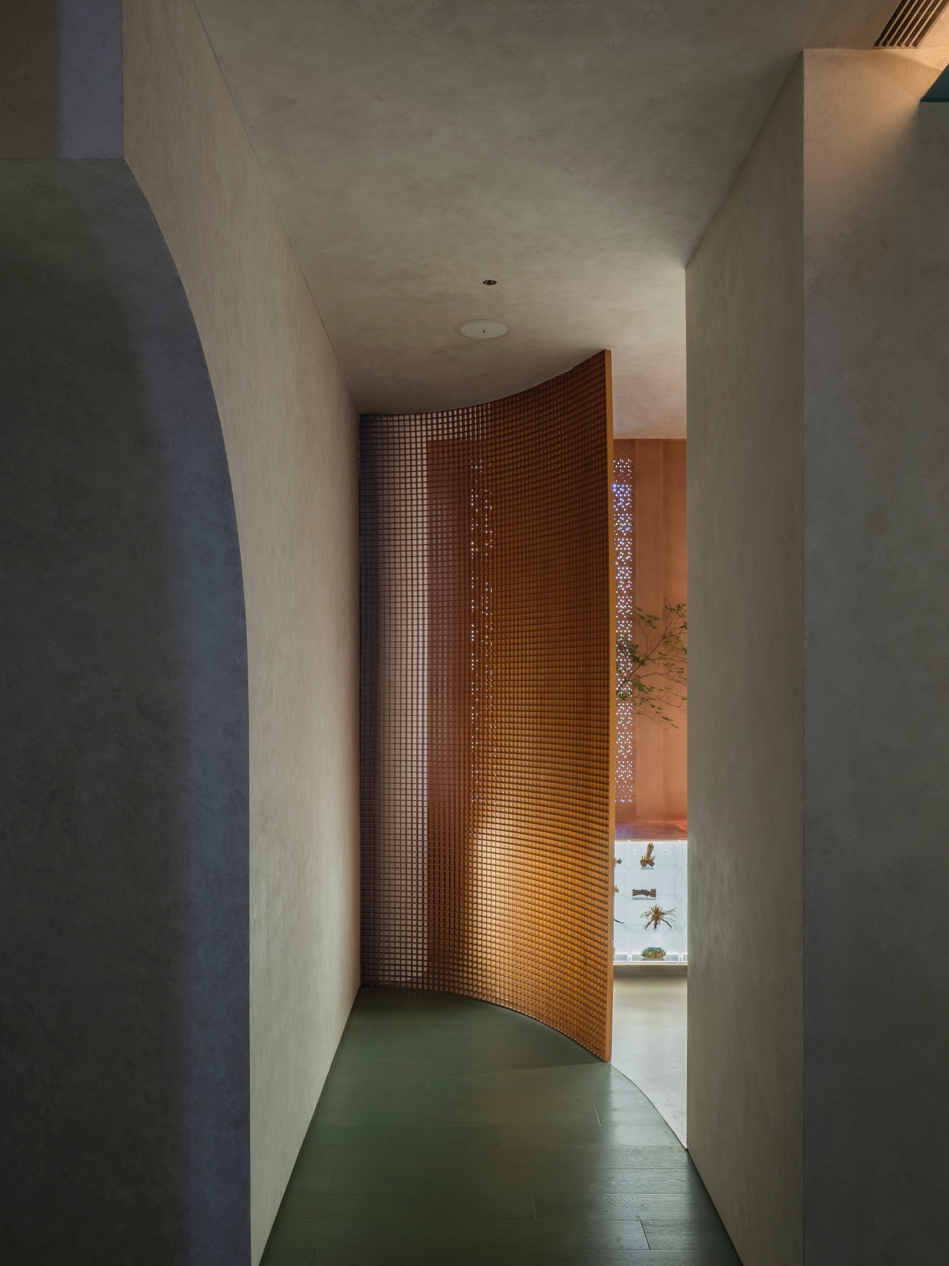
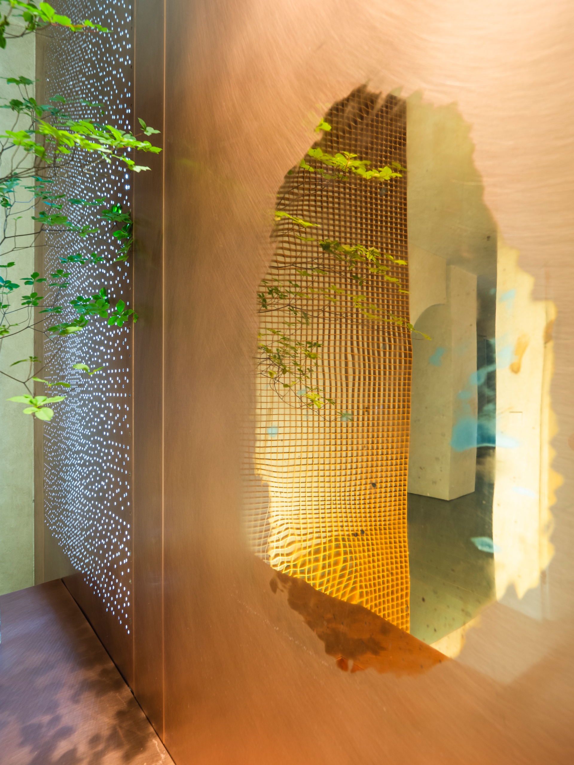
The tea break bar area at the other side uses six layers and tens of thousands of blue acrylic rods of different shades and arranged in collage with lighting to render the rhythm of mountain, fog, and rain. Contemporary materials are used to reflect the splash of ink and water with Chinese meaning and the restrained mood. Large floor-to-ceiling windows and the minimalist architecture and installations are used to block the noise outside and create calmness. The texture of objects is changed to create spatial artistic sense, and there are also surprises in the bathroom. From the countertop to the wall, the thick and lustrous pure copper is only partially polished at the height of face to a smooth mirror surface, changing the interface properties, so that people can see the clear reflection unexpectedly. Simple things can also become attractive installation art.
Sensory Immersion and Floating Time
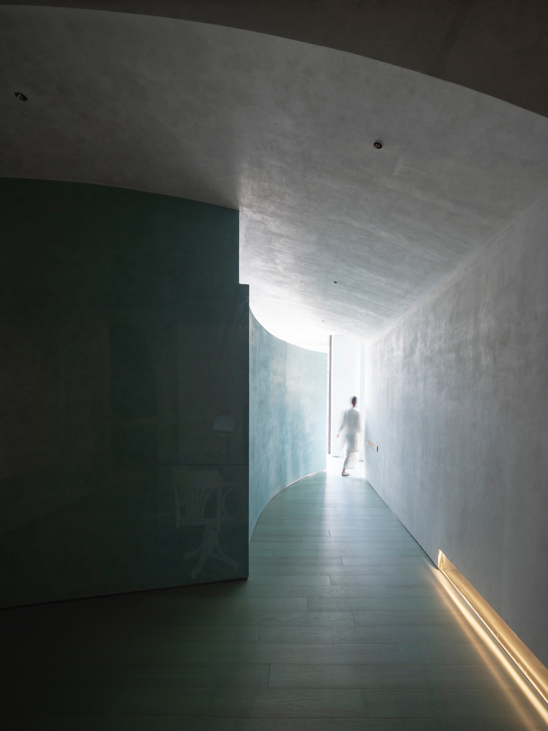
After finishing the consultation of relaxation and enjoyment and SPA treatment, visitors may go to the tea break bar area to allow their senses to continue enjoying the green color of the brand’s main tone. The indoor arches similar to caves, the arc walls, and the visual axes that revolve around the twists and turns form a fuzzy space-time context that is difficult to synchronize with the outside. Visitors may feel that they enter the space or are deeply submerged into the water. The endless floating and absolute isolation and silence constitute the eternal calmness that is beyond comprehension.
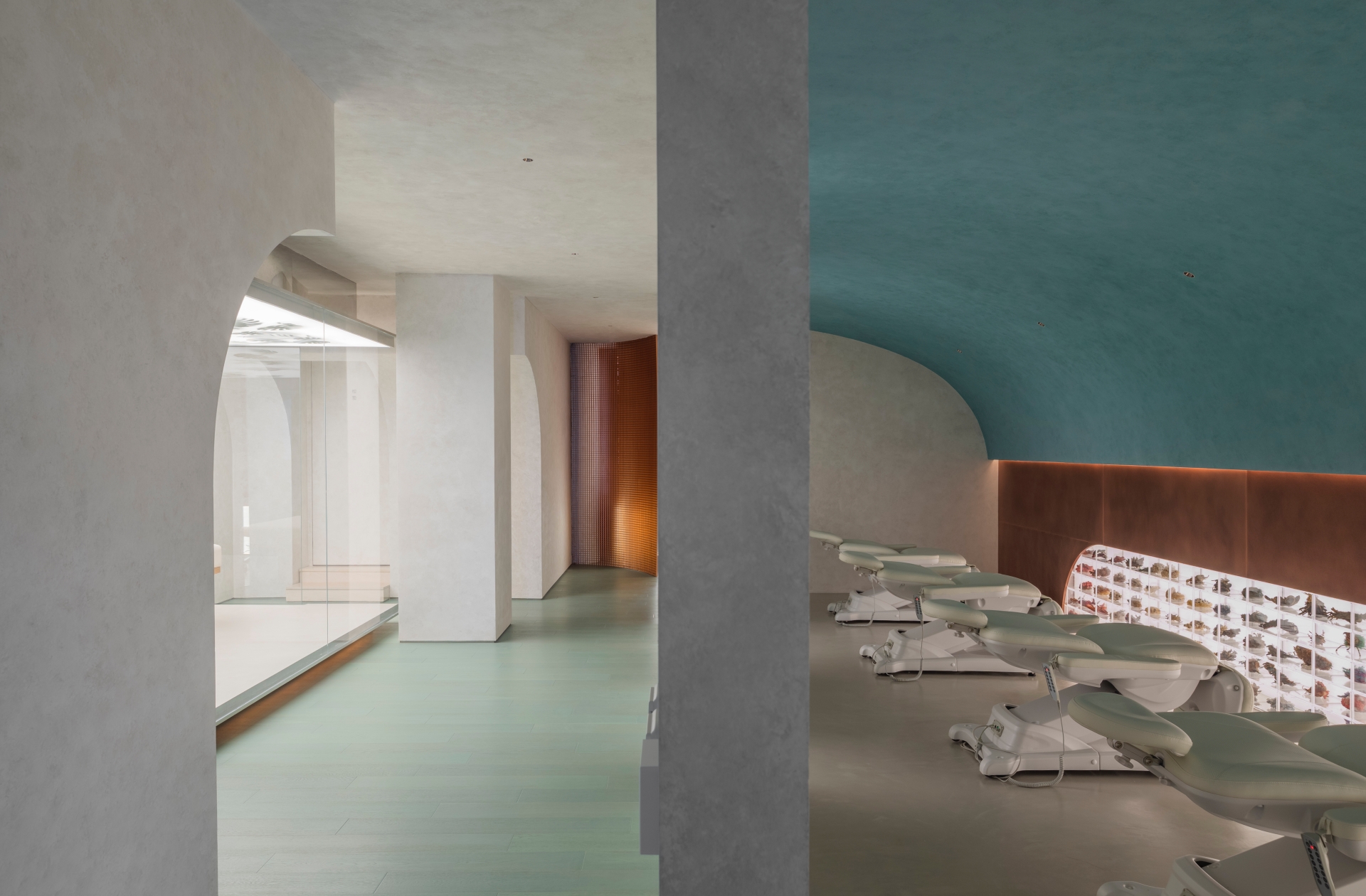
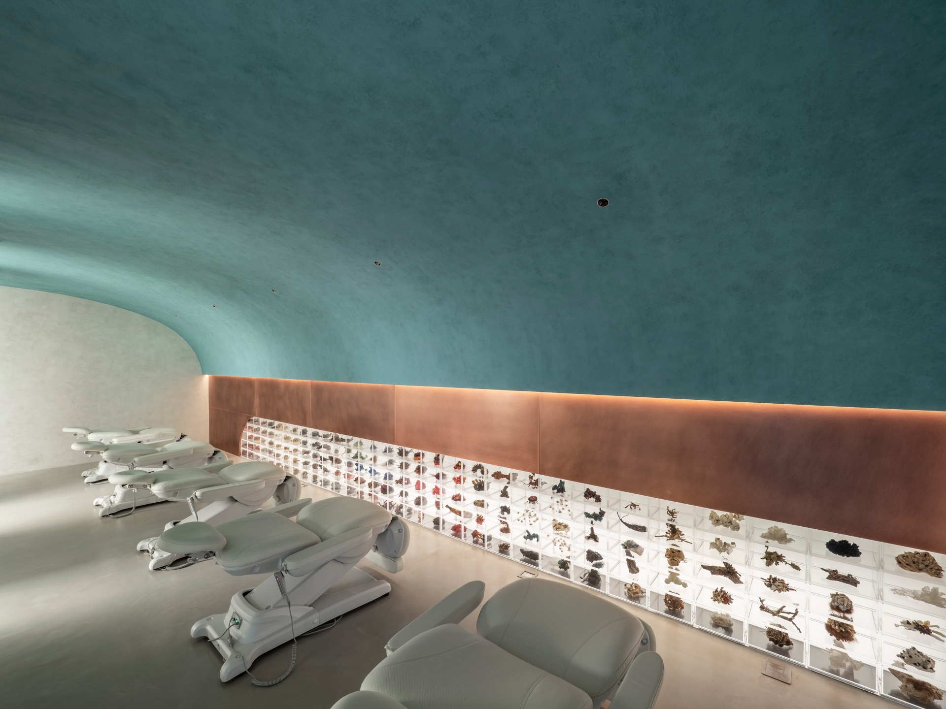
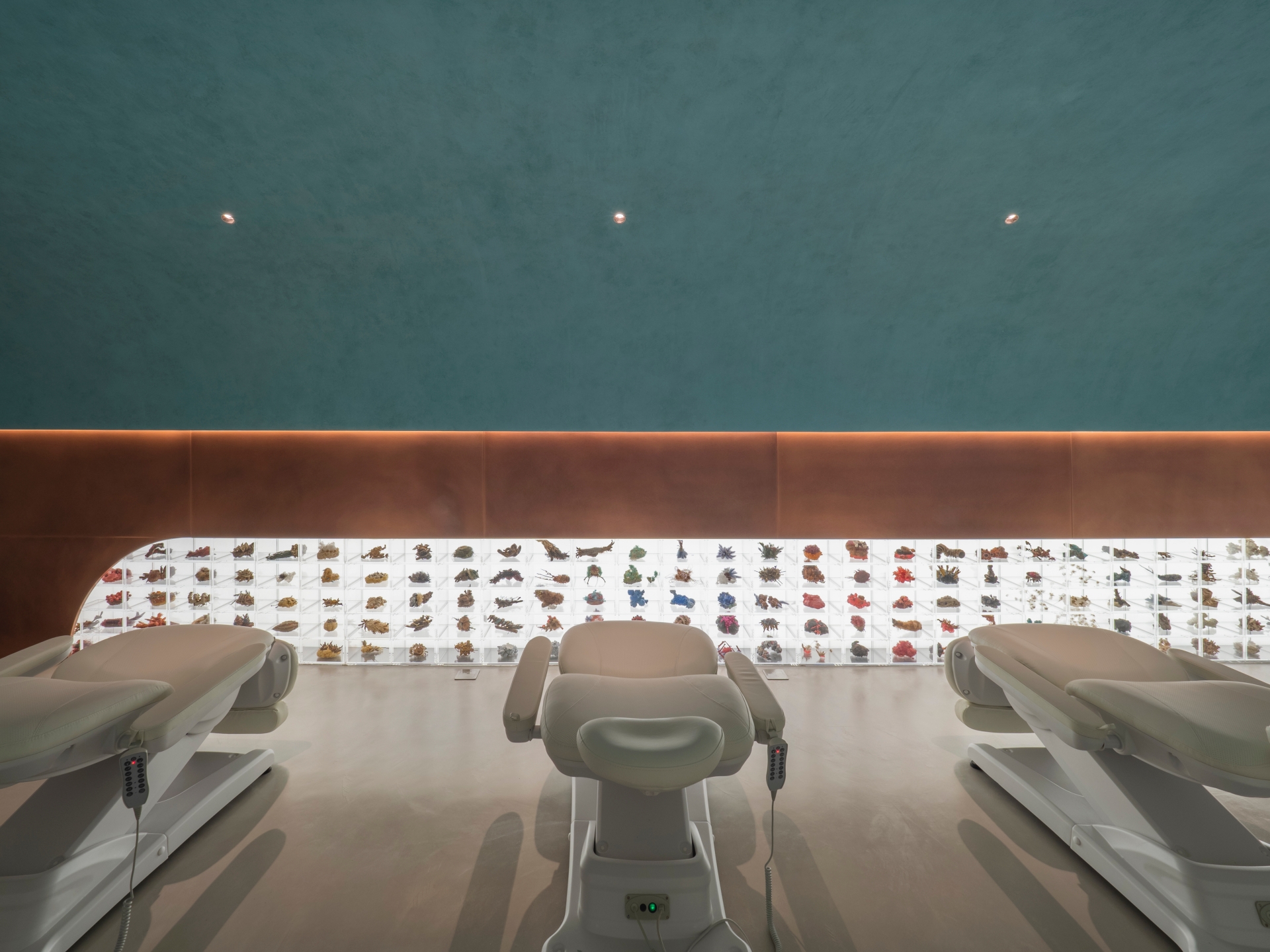
Due to the spatial nature, lighting is not as homogeneous as other residential or commercial spaces, or does not directly emphasize a certain object in a top-down manner. Therefore, many blocks use only minimal light, and even the beginning of light cannot be noticed. The light illuminates against the undulating gaps of the building's volume, allowing the time of daylight to flow through the opening of the narrow and long walkways. In the dark scene, the design team uses decorative objects to match the brightness, allowing art to become the center of light, as well as the core of the exhibition. When the source of light is from the façade below, light does not directly illuminate objects, it becomes the environment, art, and the time of dreams.
