Located on the eighth floor of Deji Plaza Phase II, the ordinary passage connects with the Deji Art Museum with a rich cultural and artistic atmosphere. The owner hoped to transform the passageway into a casual, elegant and unmanned retail space to perfectly embed into the closed loop of this artistic journey. Consulting the expertise of X+Living, the designers considered all inextricable factors including art, business, visit and leisure in the space and successfully transformed it into a miniature art museum. The spiritual realm comes in between the breaths. The designers have intended to create moments of highlight for ordinary things, and pays homage to the Impressionist approach, thus creating an atmosphere of timelessness, while conveying the beauty of epiphanic moments in a new form. Breaking away from tradition, art and commerce has intermingled to form a creative commercial space that pulls in emotions and imagination.
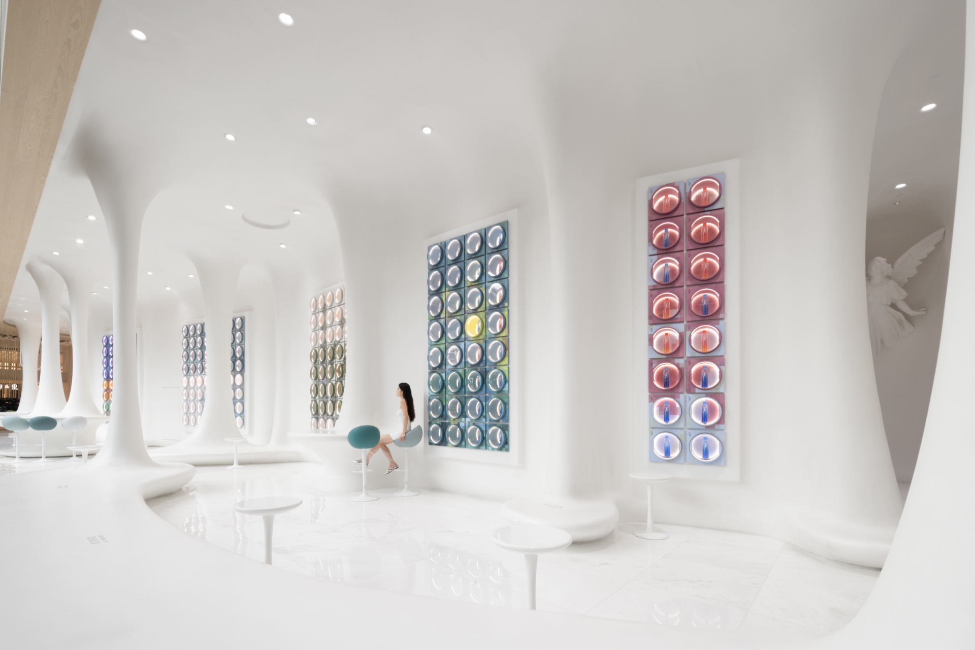
Imagine the landscape in paints becoming reality, an art gallery in the forest emerges. The passageway has been reconfigured into a semi-open gallery layout, which is then divided into functional areas such as retail, lounge and warehouse spaces. For the sake of consistency, the adjacent washrooms are also included in the theme design. In the hands of the designer, the ordinary passageway is transformed into a magnificent prelude and conclusion to an artistic journey.
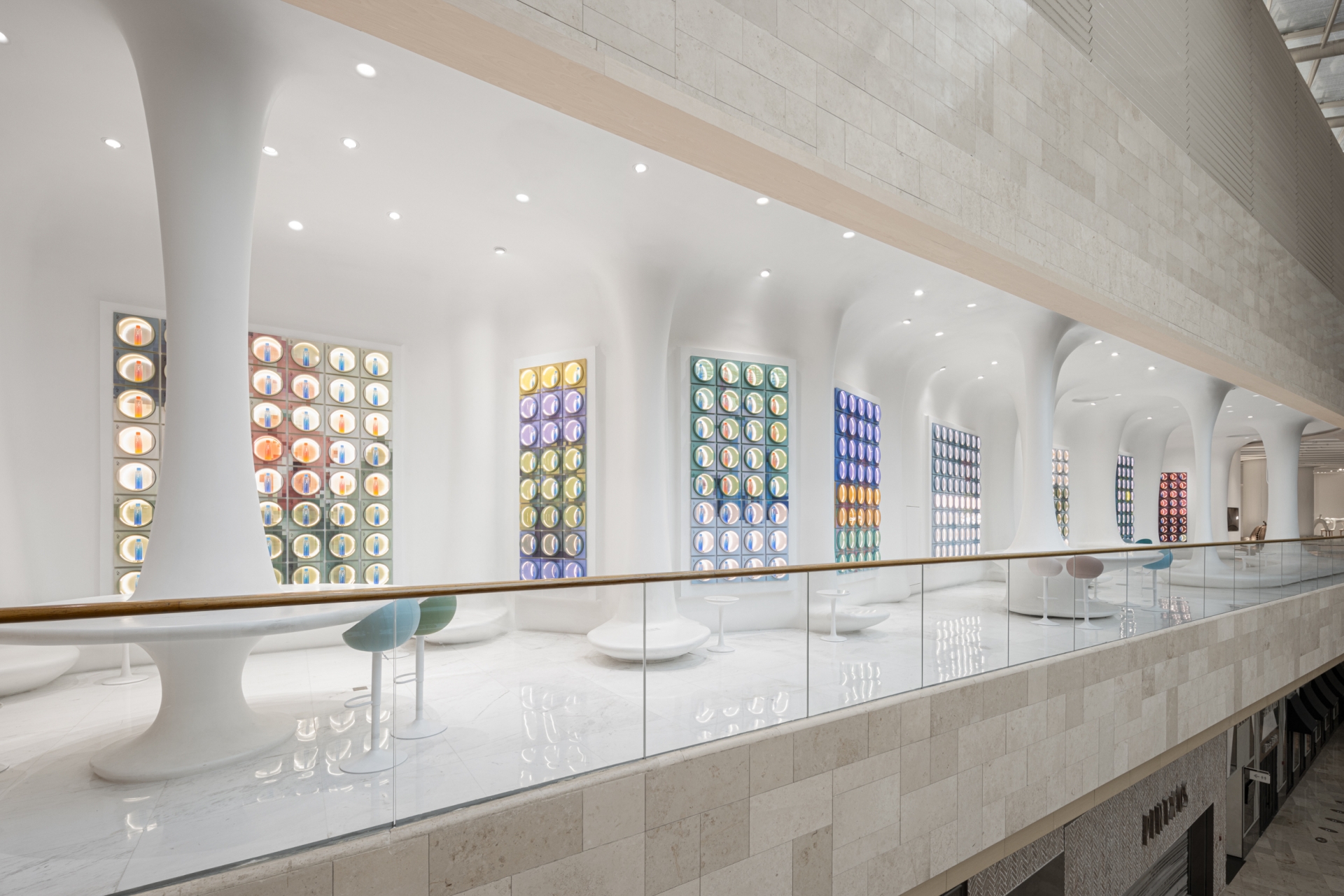
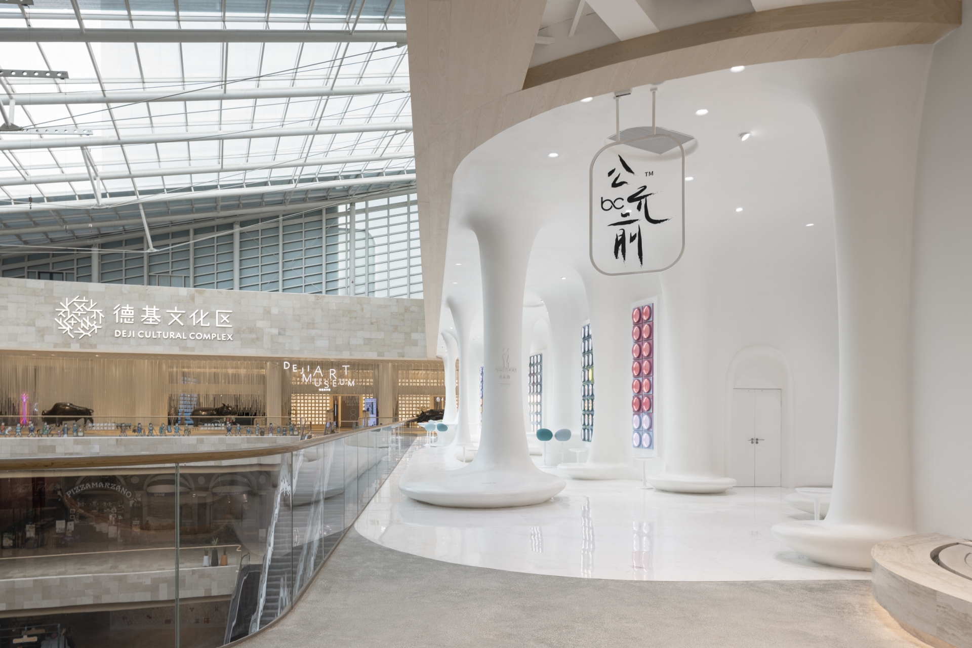
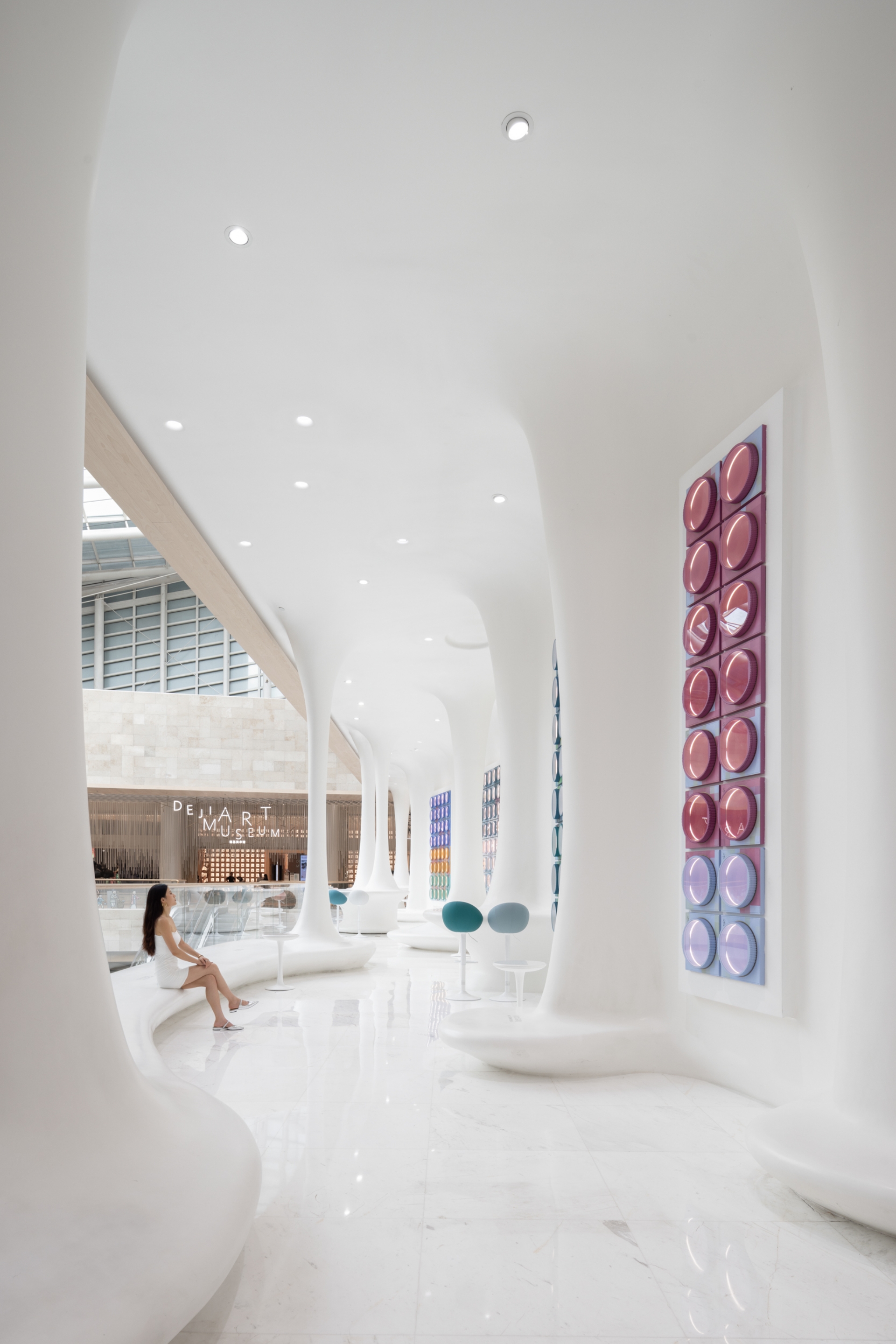
"In my sleep, I heard the autumn breeze outside, but when I woke up, I couldn't find anything but buttonwood leaves falling all over the steps, bathed in the bright moonlight." To depict a space as a Chinese poem describes, the designer has used pure white columns to simulate the growing branches of the buttonwood trees, which are ubiquitous in Nanjing. The upper end of the buttonwood branch blends into the white ceiling in a gentle curve, like a splash of water on a lake. The lower end of the branches spreads out into a cloud-like one-piece bar counter and long seating area, a soft visual sensation that nourishes the consumer's sense of tranquility and relaxation.
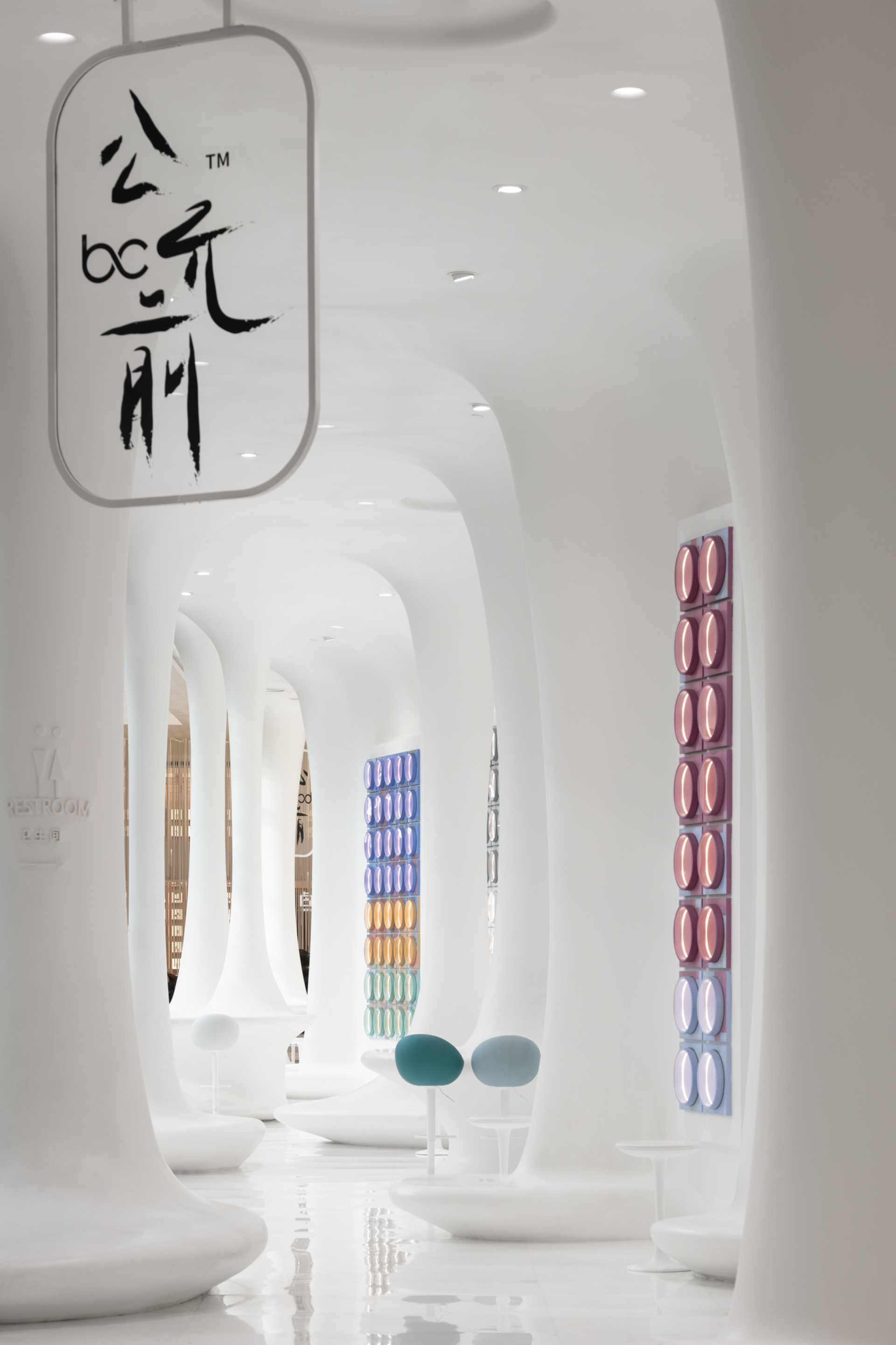
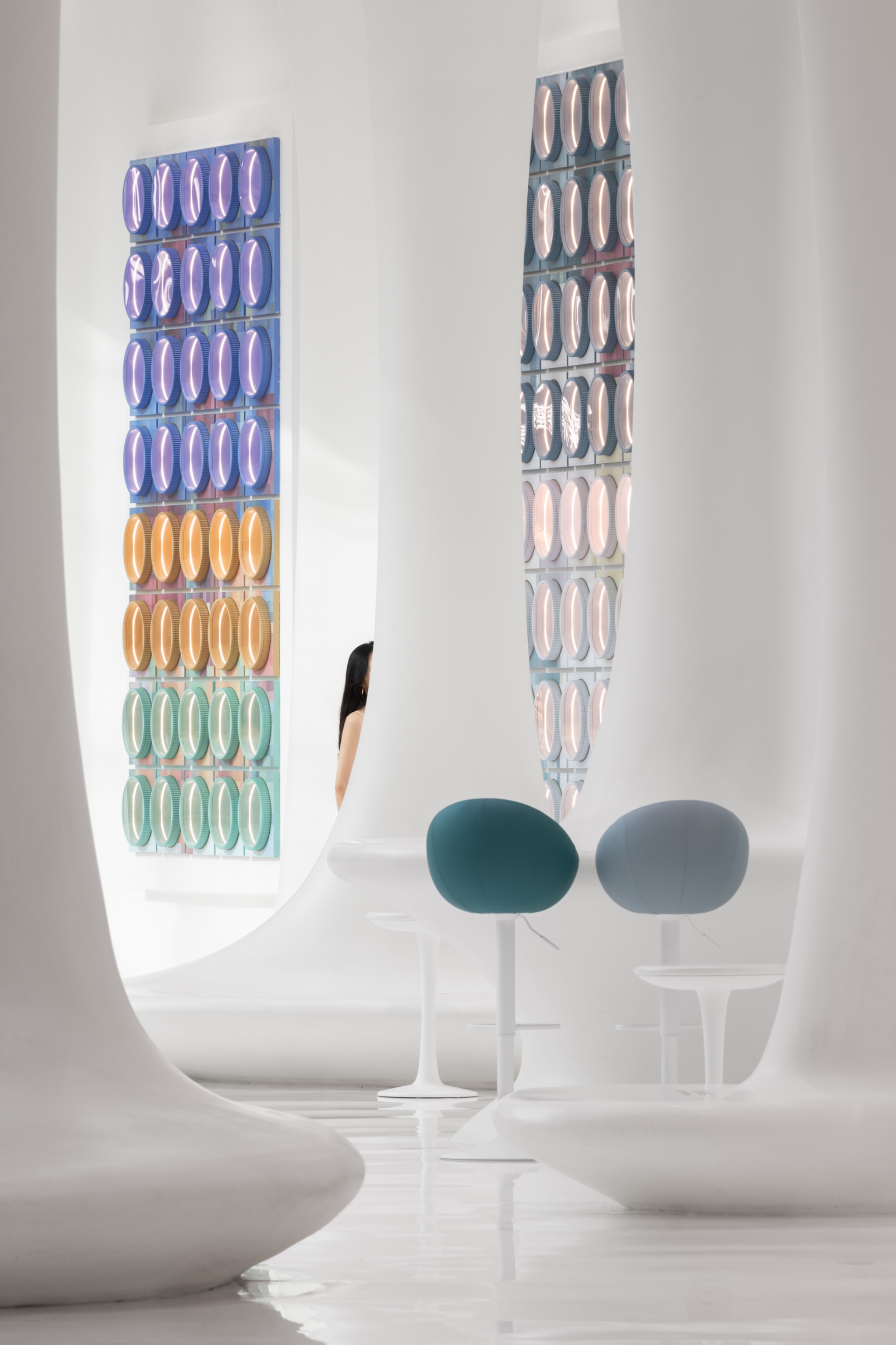
The bar counter and seating area are rich in functionality, with a built-in bin and charging port in the bar counter to maintain a clean and uncluttered atmosphere. The white round bar and macaroon chairs are small and exquisite, making them easy to move in operation. The neatly arranged, staggered branches of the buttonwood trees present a layered scenery. As consumers stroll through the space, they feel as if they have stepped from snowy buttonwood trees into a painter's sketching, resonating with their passion for beauty and nature.
The only wall in the passageway is both a retail area and an art display surface. As the initial available wall area was not sufficient, the designers created a curved wall around the initial wall, and the gap in between became the warehouse, solving the problem of insufficient space for the retail area. The display wall at the end of the space illustrates the beauty of order.
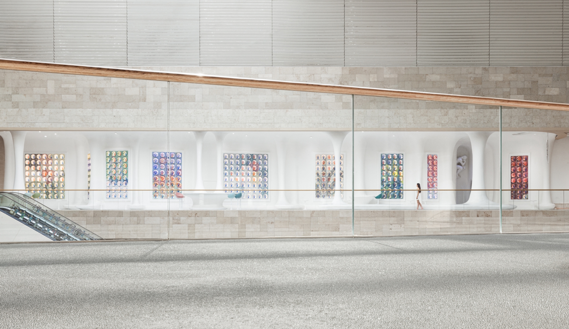
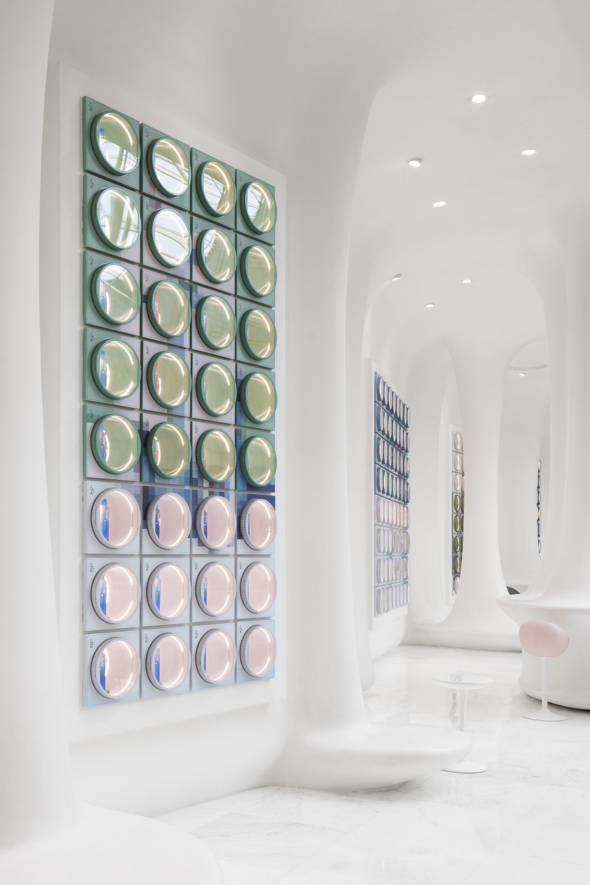
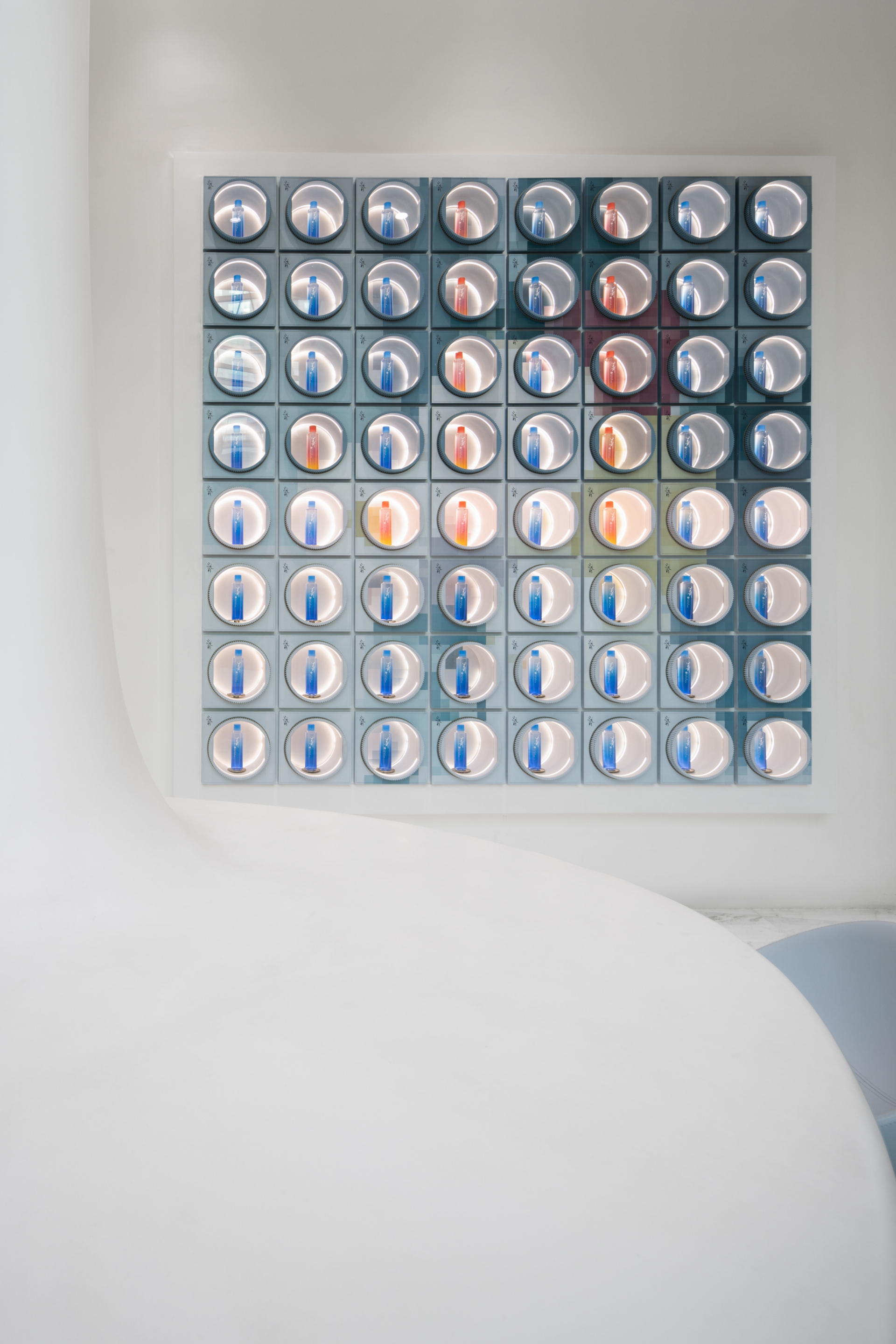
On the white wall, colourful pick-up containers like puzzles piece together into a giant painting. The colours are divided and then woven into the painting with separate brushstrokes. Stepping back a few yards, the gradient colours suddenly fall into the right place, condensing into a shimmering and vibrant flower, the impression of the painting refracting through the hazy texture with the light. Higher grids that are difficult to reach are cleverly used as concealed air return outlets or simply as windows for display. The masses of colour swoon like flowers in the heart, and an infinitely radiant spring blooms in the silence. It is in the most ordinary moments of life that art sprouts, lying dormant beneath the surface of our daily consciousness. A special painting on the gallery wall and the light and air in the space create a light mood, deepening our feelings towards the world.
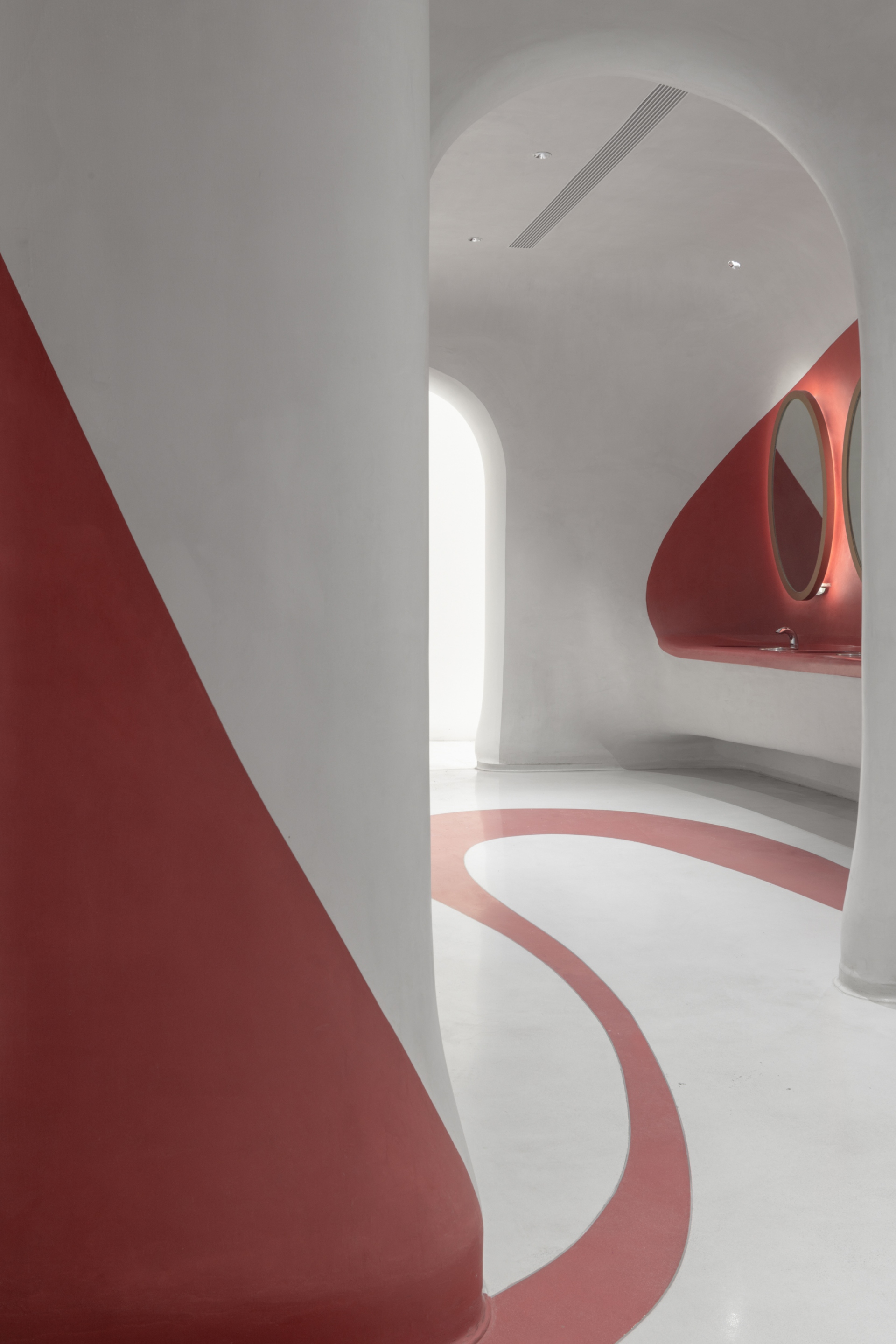
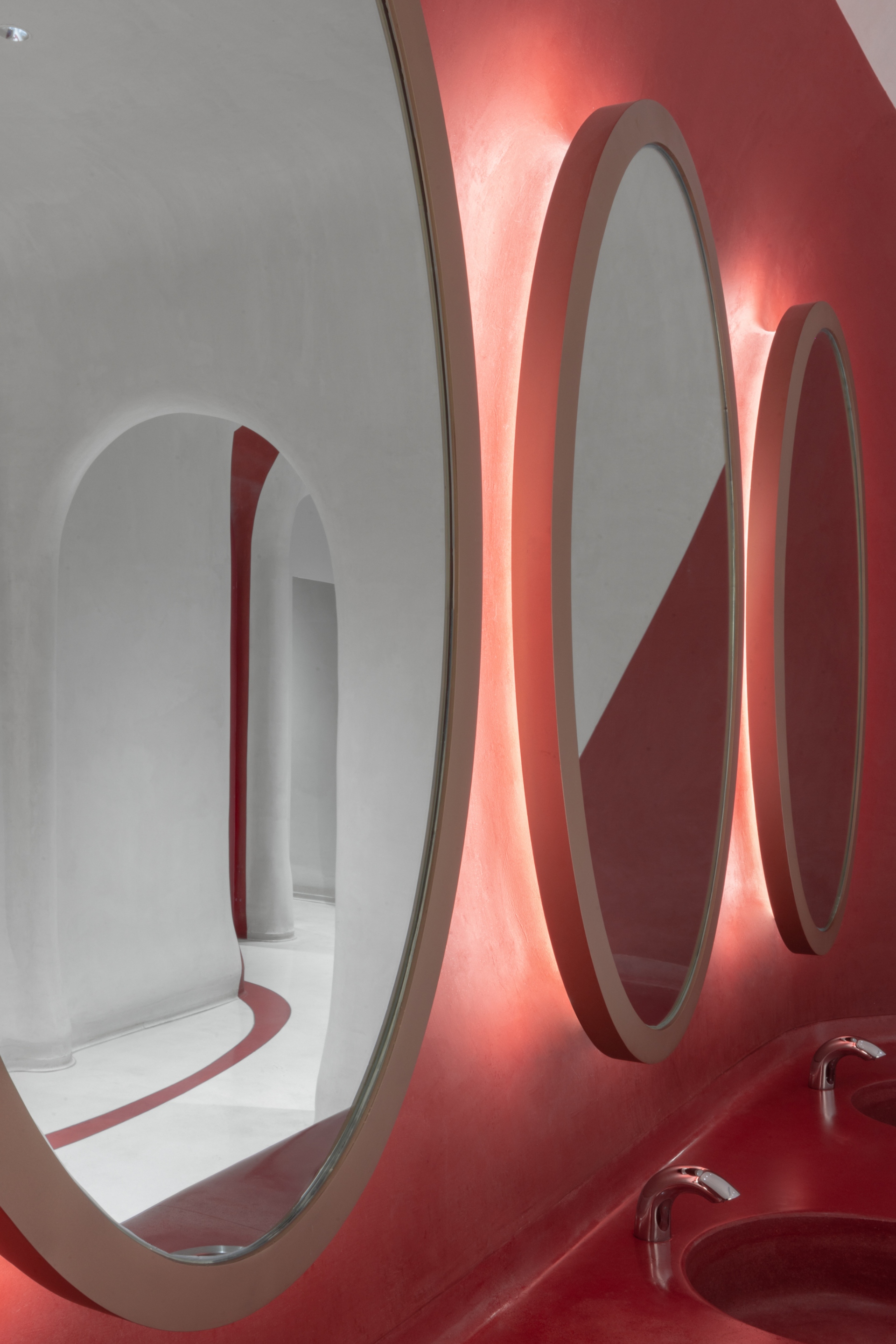
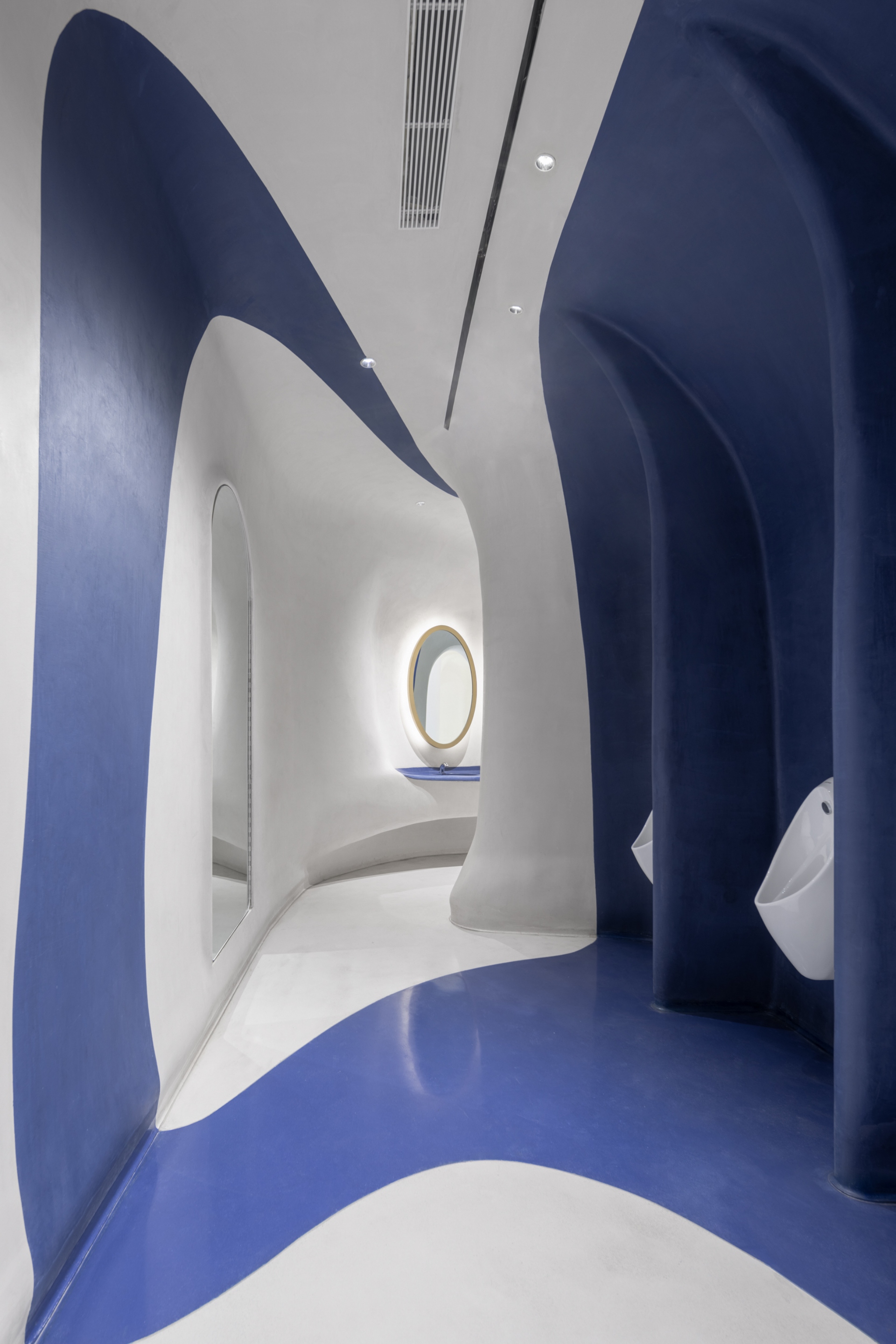
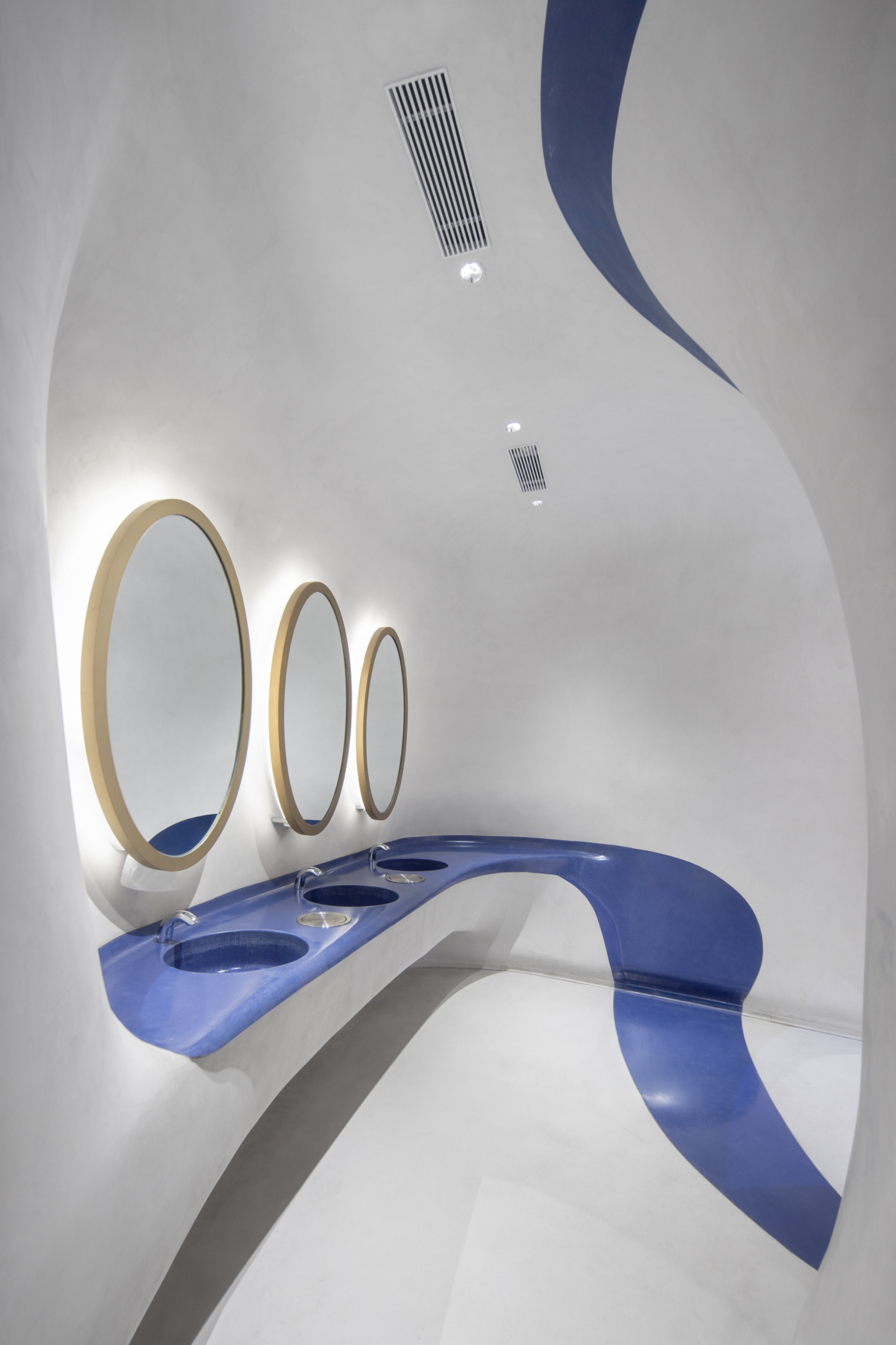
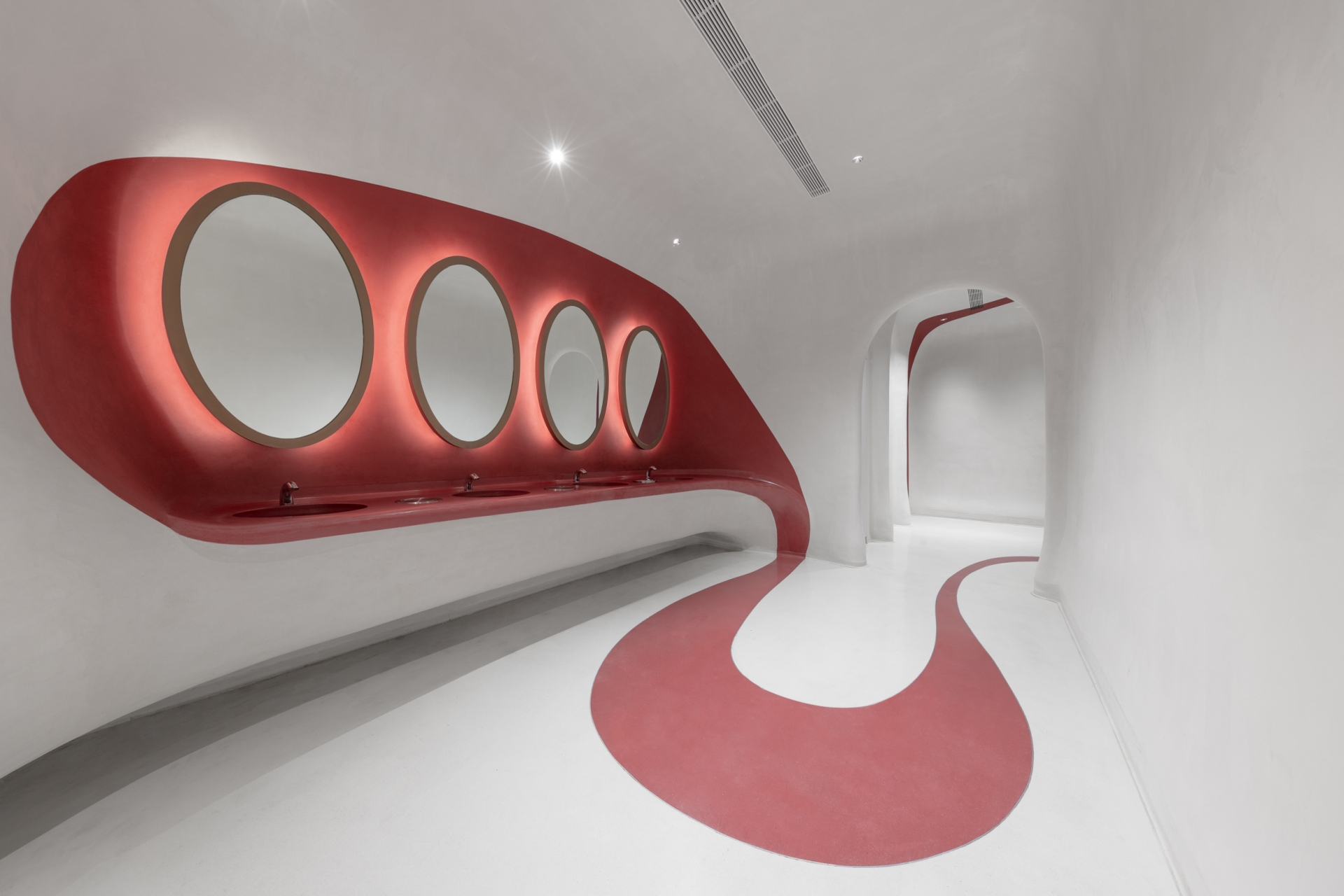
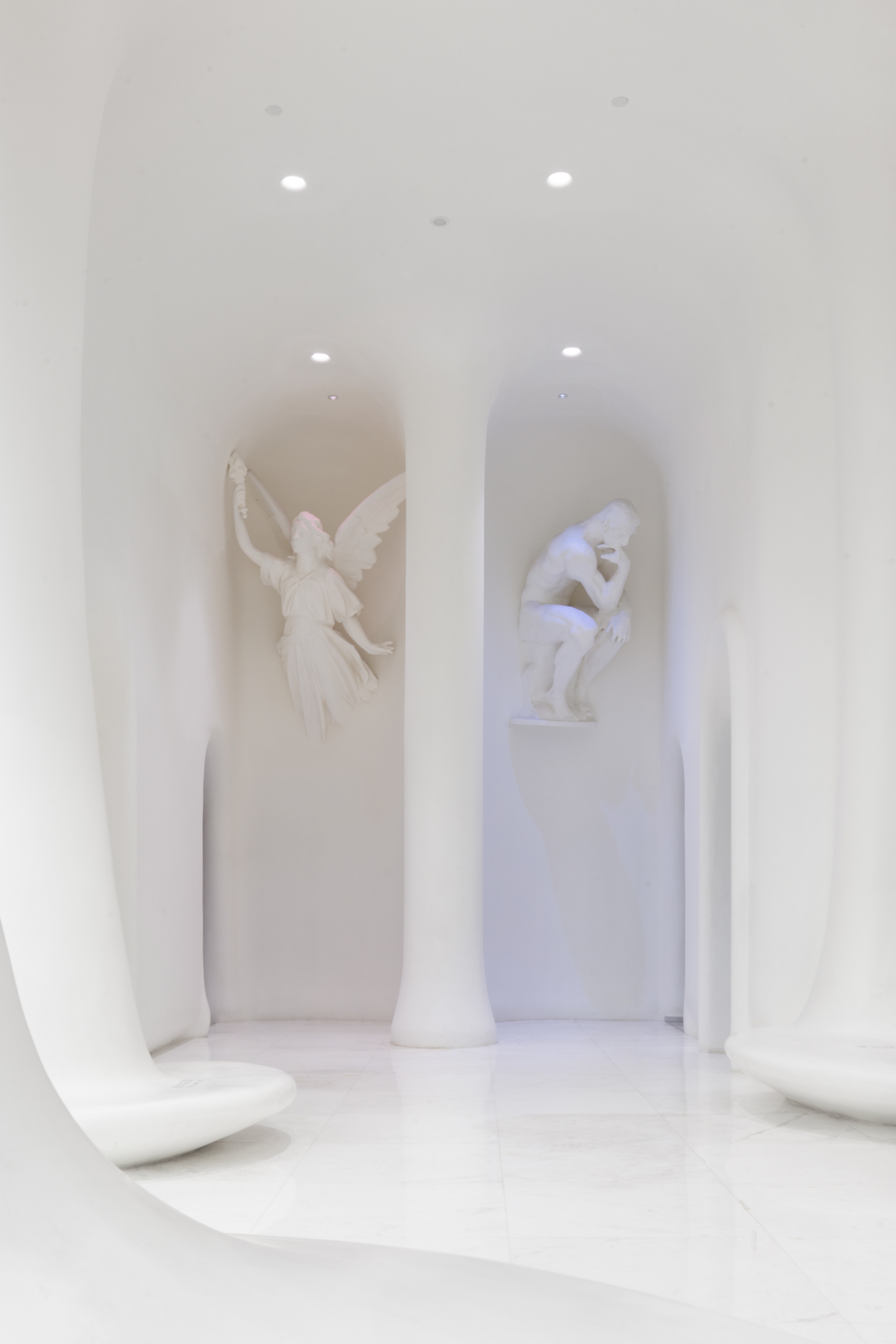
Meanwhile, delicate doorway sculptures of Athena and the Thinker hang on the wall at the entrance to the washroom. The light climbing up its elegant silhouette creates a full sense of ritual. The designer made clever use of the twists and turns of space to retain the privacy of the interior. The door pillars and washbasins have a soft curvature, which is in line with the aesthetics of the retail area. The men's and women's rooms are in different primary colours, with meandering reds and blues painting an abstract and comfortable field on a white background.
The designer has used art to create a distinctive conceptual retail space, with a composite approach that gives the space a more varied function and meaning. You can feel "the trembling of light, the rippling of water, the transparency of air and the twinkling of leaves". Between the gorgeous paintings and the pure white trees, a deep river of aesthetics flows silently, creating the first impression of the B.C. glacial water brand aesthetics. By exploring the extraordinary in the ordinary and revealing the hidden romance of life, the space invites people to stop, rest, observe and feel.
