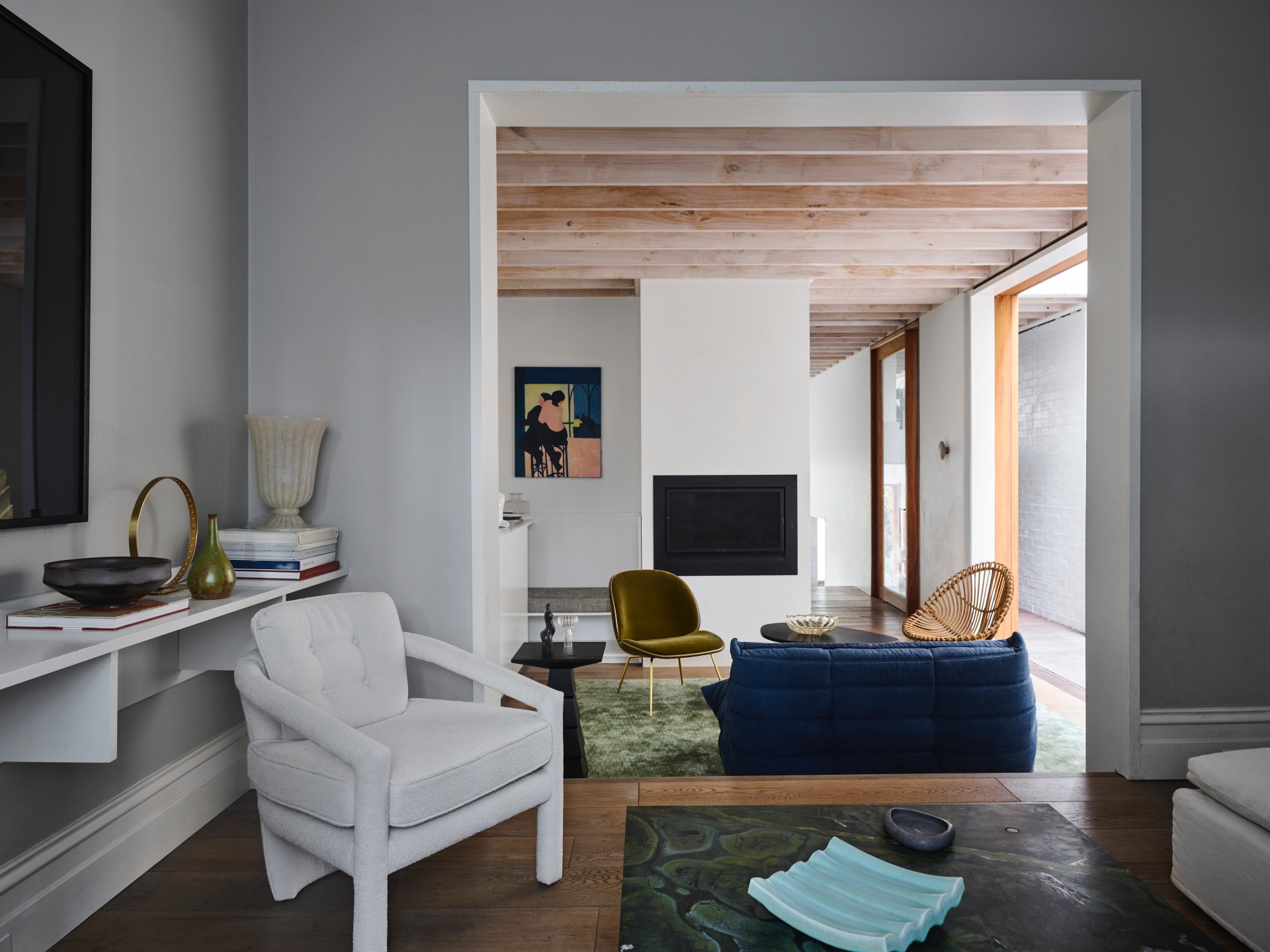
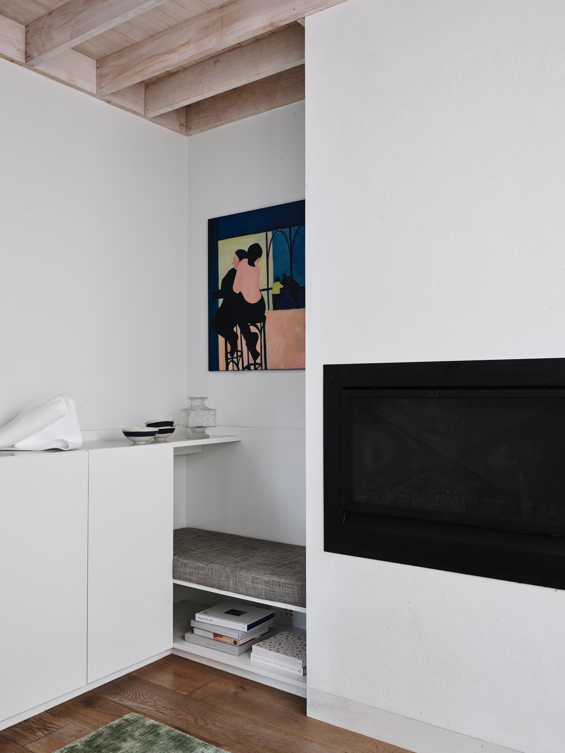
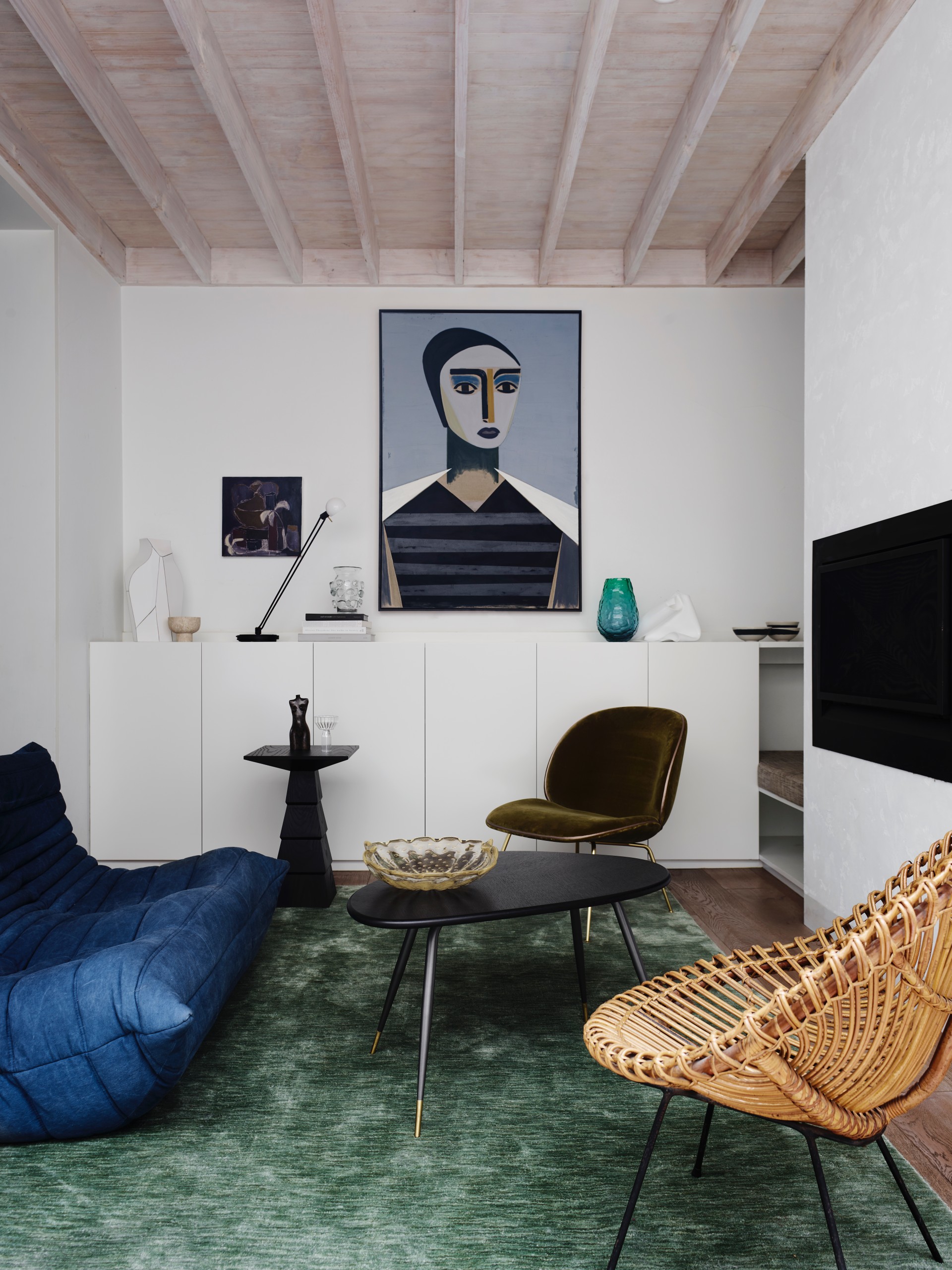
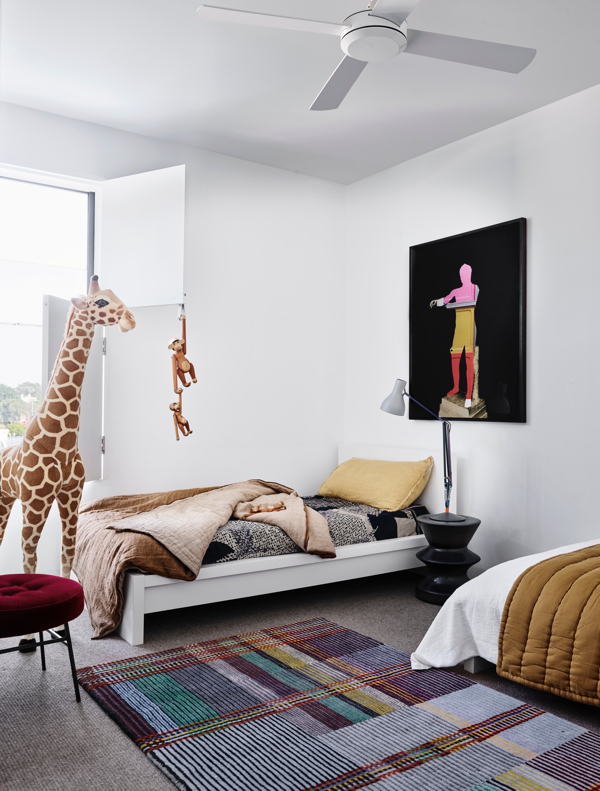
The statement is epitomized succinctly in this personal project in Bondi Junction – the home of Alexander & Co.’s principal, Jeremy Bull and his partner, marketing director Tess Glasson, with their four young sons. Purchased as a semi original Victorian terrace, highly dilapidated and poorly planned, a defining force within the design was maximising space and exploiting the site footprint wherever possible. Bull and Glasson wanted their abode to be expressive instead of minimalist, and to be specific to the quirks of the family. At the core of its philosophy, they wanted the home to teach the children what architecture could be - it should show its materiality and imperfections, the humanity of construction trades. The house minimises circulation space in favour of rooms, where even hallways are an opportunity for a seat, or a view to the garden trees. With three renovations in seven years, the project is evidence of the role of architecture to amend and to remain in a state of the non-static.
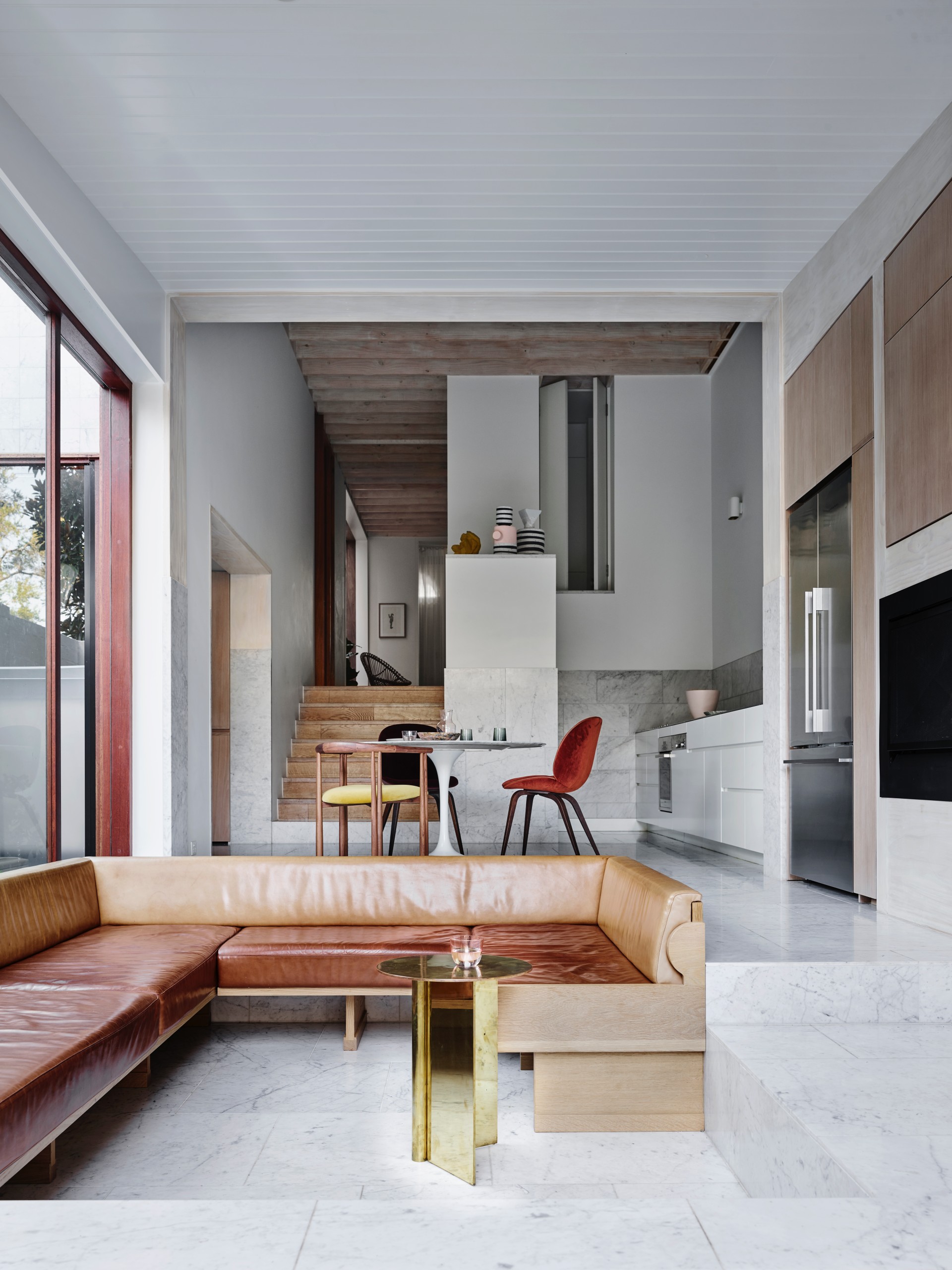
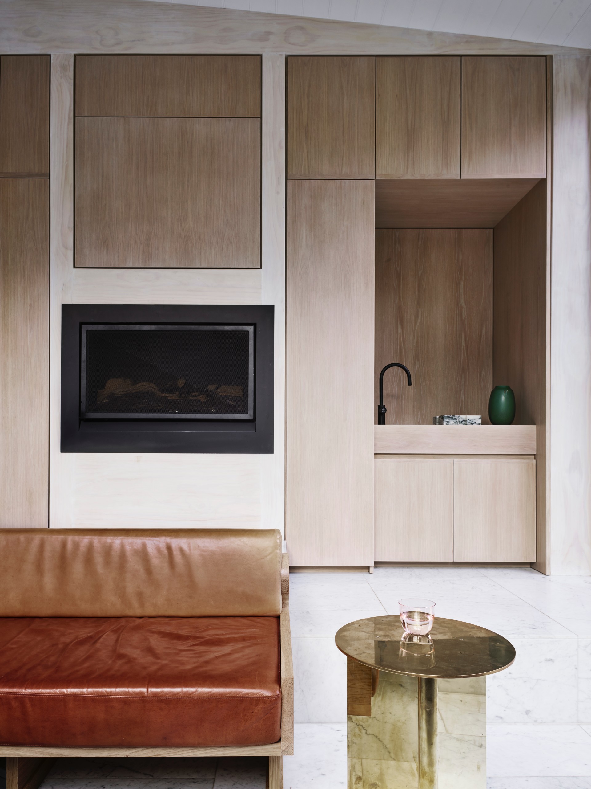
The first renovation was a major alteration and addition which required the re-planning, substantial re-construction and new internal refurbishment. Planned initially around an old gum tree in the rear garden and a due west garden aspect, the building’s interiors have been orientated to maximise views to the tree from each public space, whilst various window shutter devices help to reduce solar impacts from the westerly aspect. The second included the building of a loft space, which was a fourth bedroom and rumpus space required for the growing needs of twin sons and the birth of the fourth baby. The loft is entirely built from plywood with caged mast lights, a football safe space that could have relative privacy from the remainder of the house. Reminiscent of the upturned hull of a yacht, the room’s uniquely slanting walls provide a sense of seclusion and intimacy. The final renovation was an extension of the kitchen area to include a new laundry, sunken lounge and dining area joinery, as well as a ‘garage’, the external mezzanine store room tasked with housing the many skateboards, surfboards and bicycles of the family. The old timber floors from the first renovation replaced with stone tiles, stone skirting boards and stone door thresholds added along with new joinery, the room was matured to provide robust finishes which could cope with the intense wear resulting from four children.
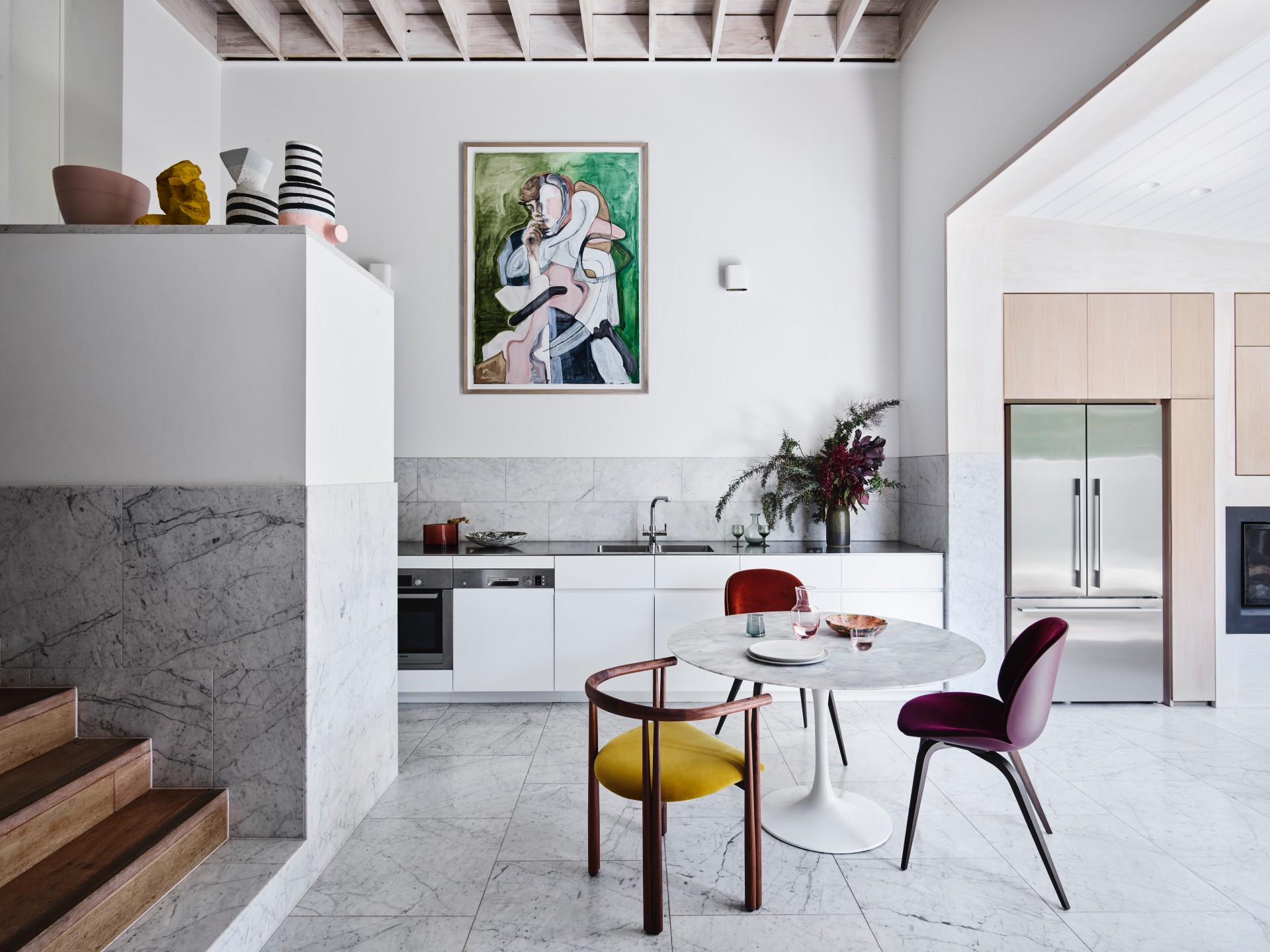
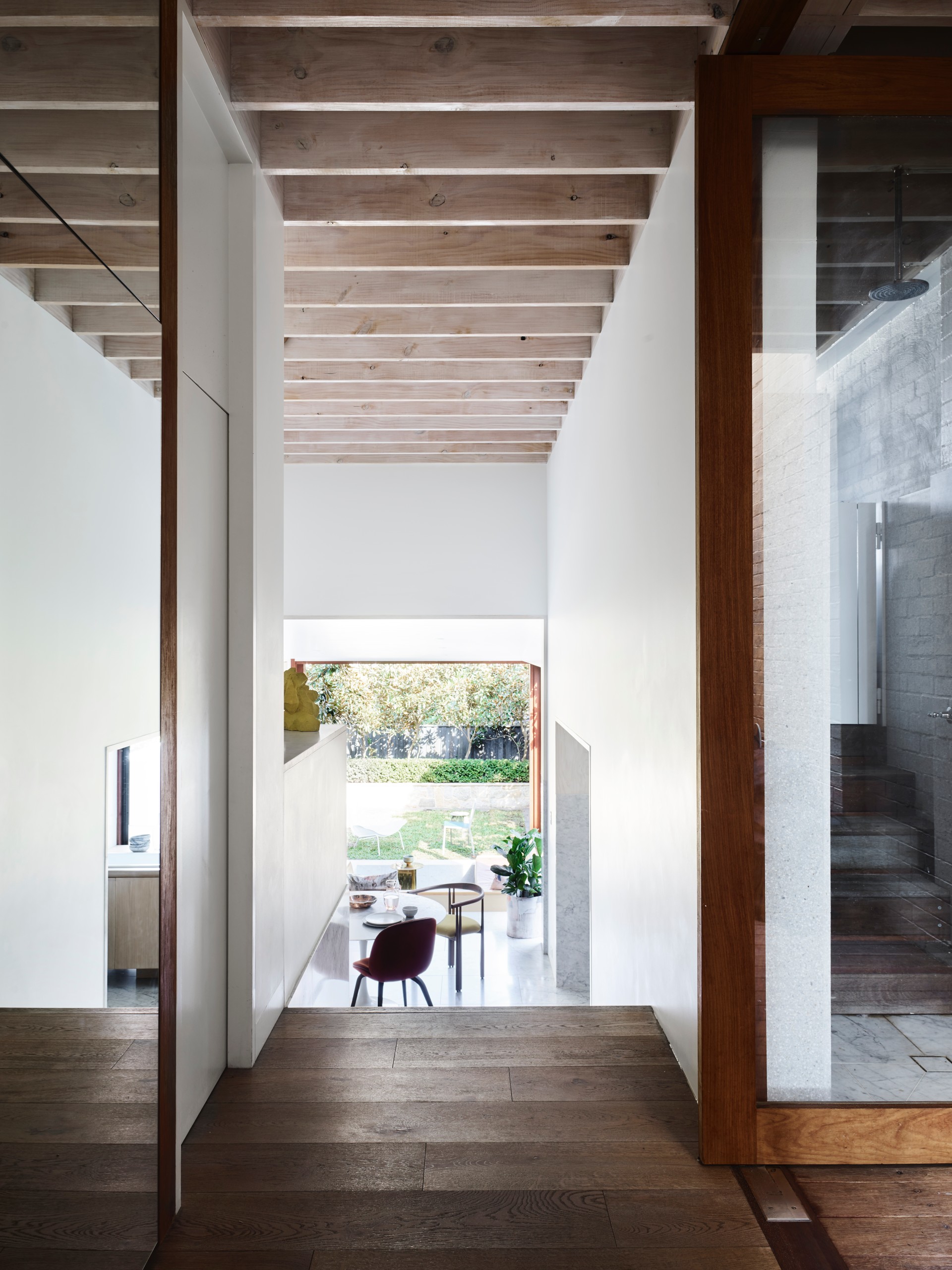
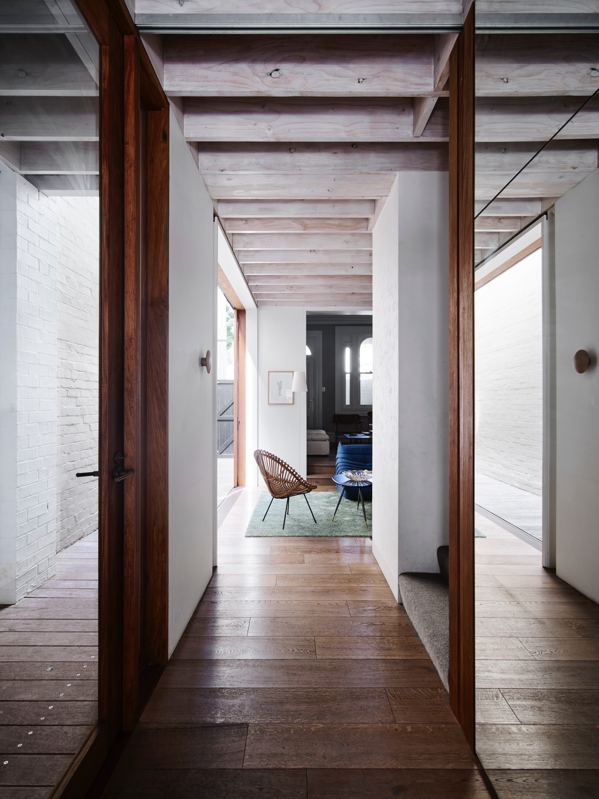
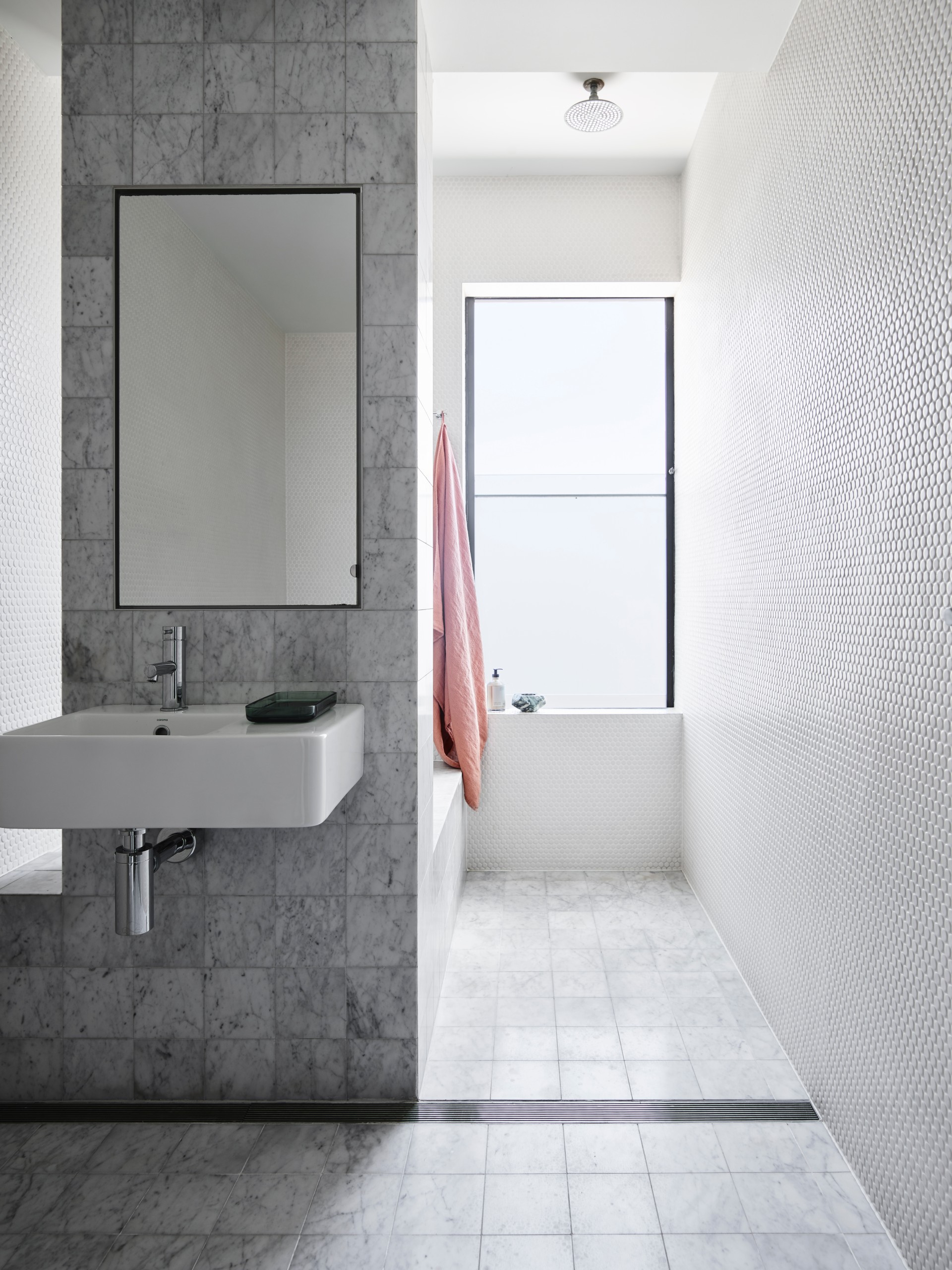
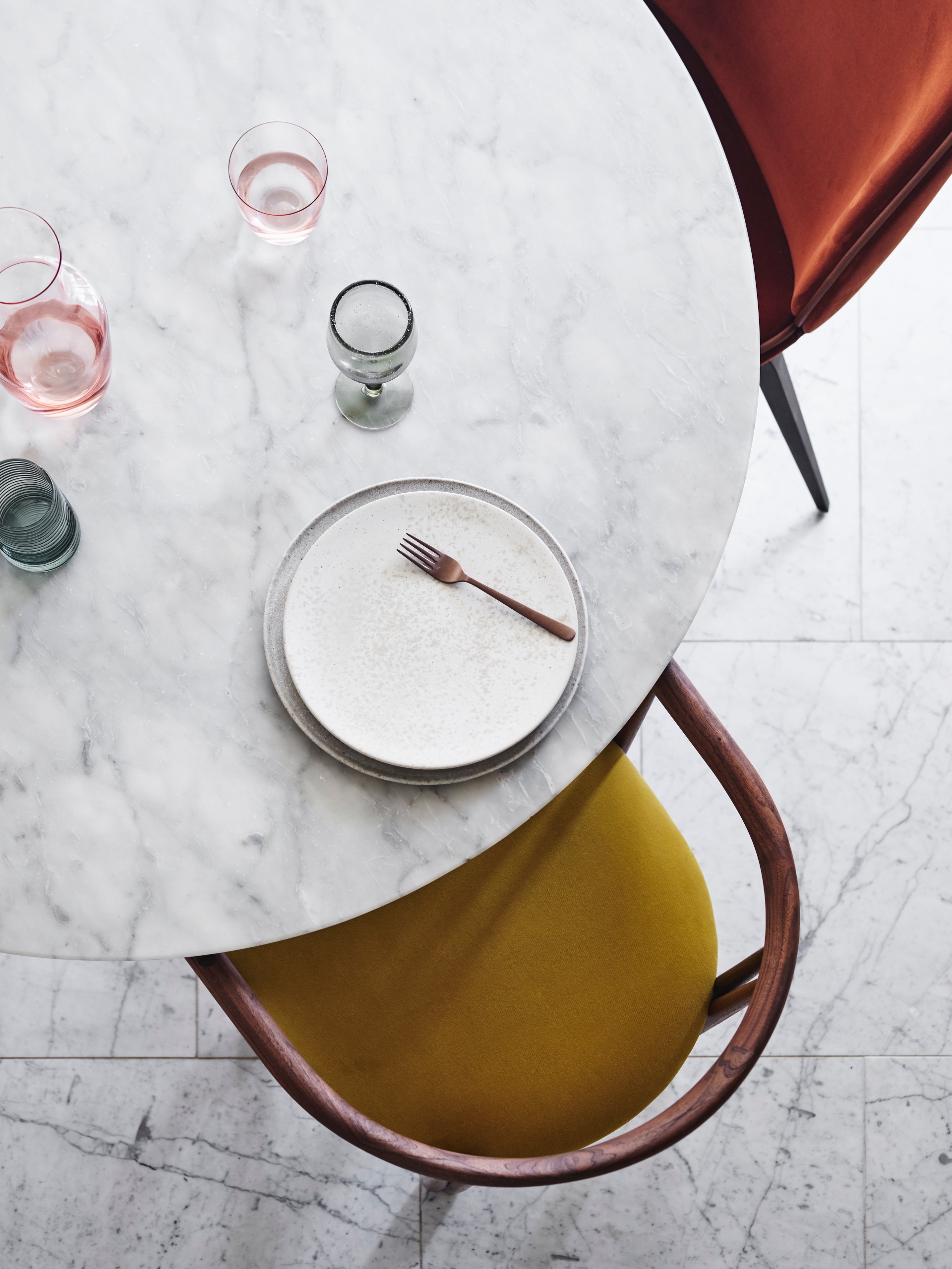
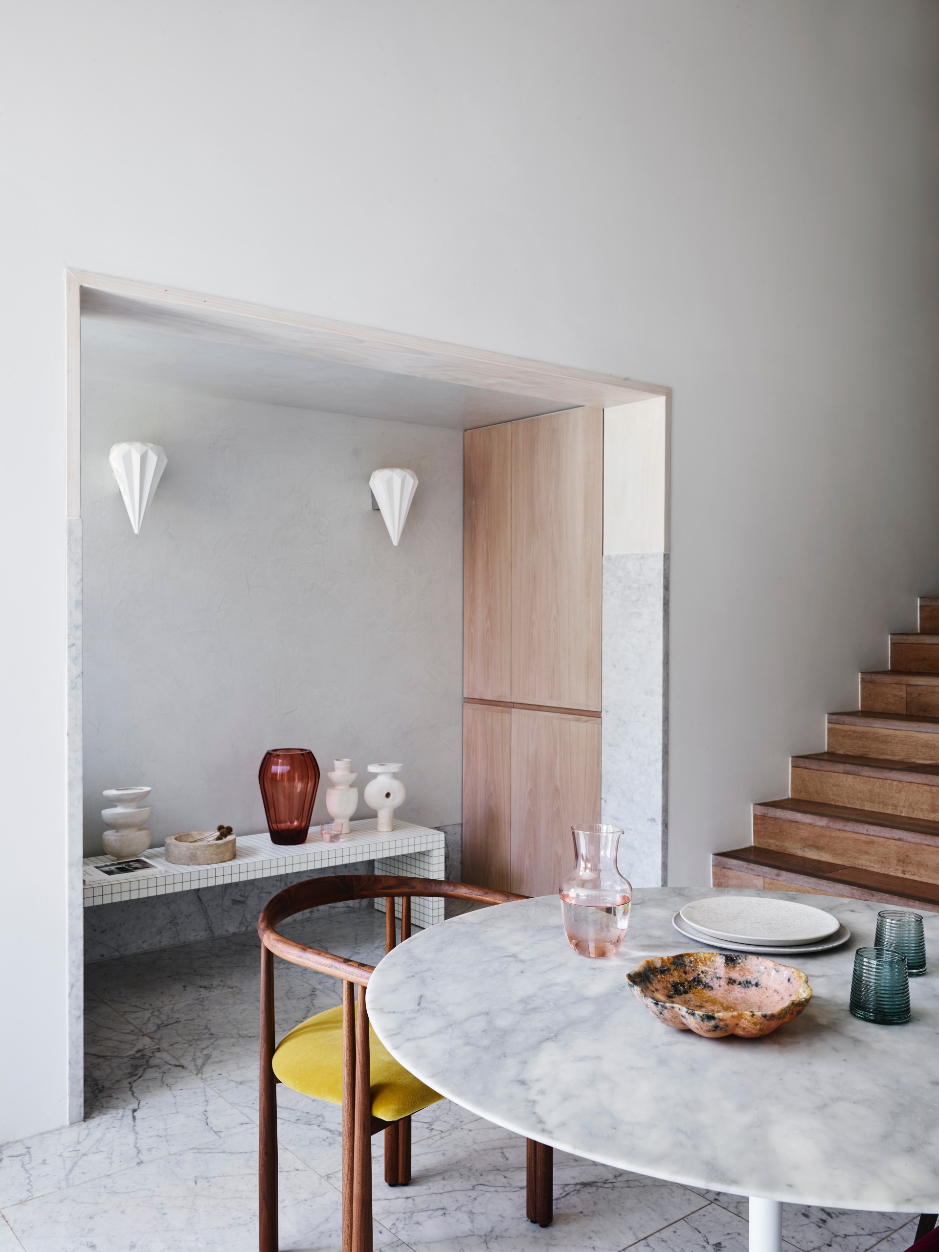
In effect, each gyration of the project represents another ‘incomplete’ end point, which the family has relished in. The interiors reflect this also, with various finishes, materials and furniture continuing to evolve, as do the tastes and needs of its occupants. The palette is a contemporary interpretation of a Scandinavian style. Low cost pine structures and exposed pine ply sheeting makes up the majority of internal finishes, with various uses and formats of Carrara tile to bathrooms, kitchen splash backs and floor surfaces. The home is quirky, infused with the unique spirit of the family and its progressive domestic evolutions. Not surprisingly, it is the integrity of imperfect, inert and budget-friendly materials which gives the home so much of its spirit.
