Born in Canada's coastal mountains with a harsh environment, ARC'TERYX is an industry leader in high-performance outdoor apparel and gear. With a restless commitment to precise design and production, the brand has been dedicated to improving outdoor adaptability and encouraging the evolution of exploration for decades.
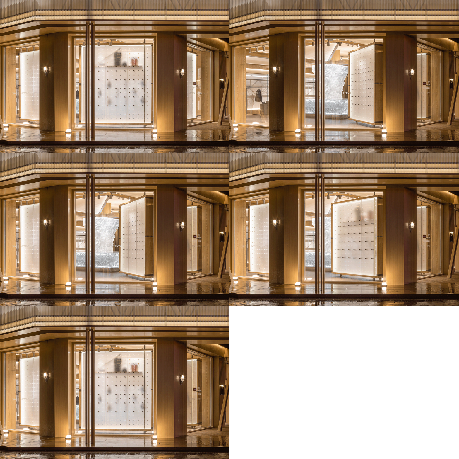
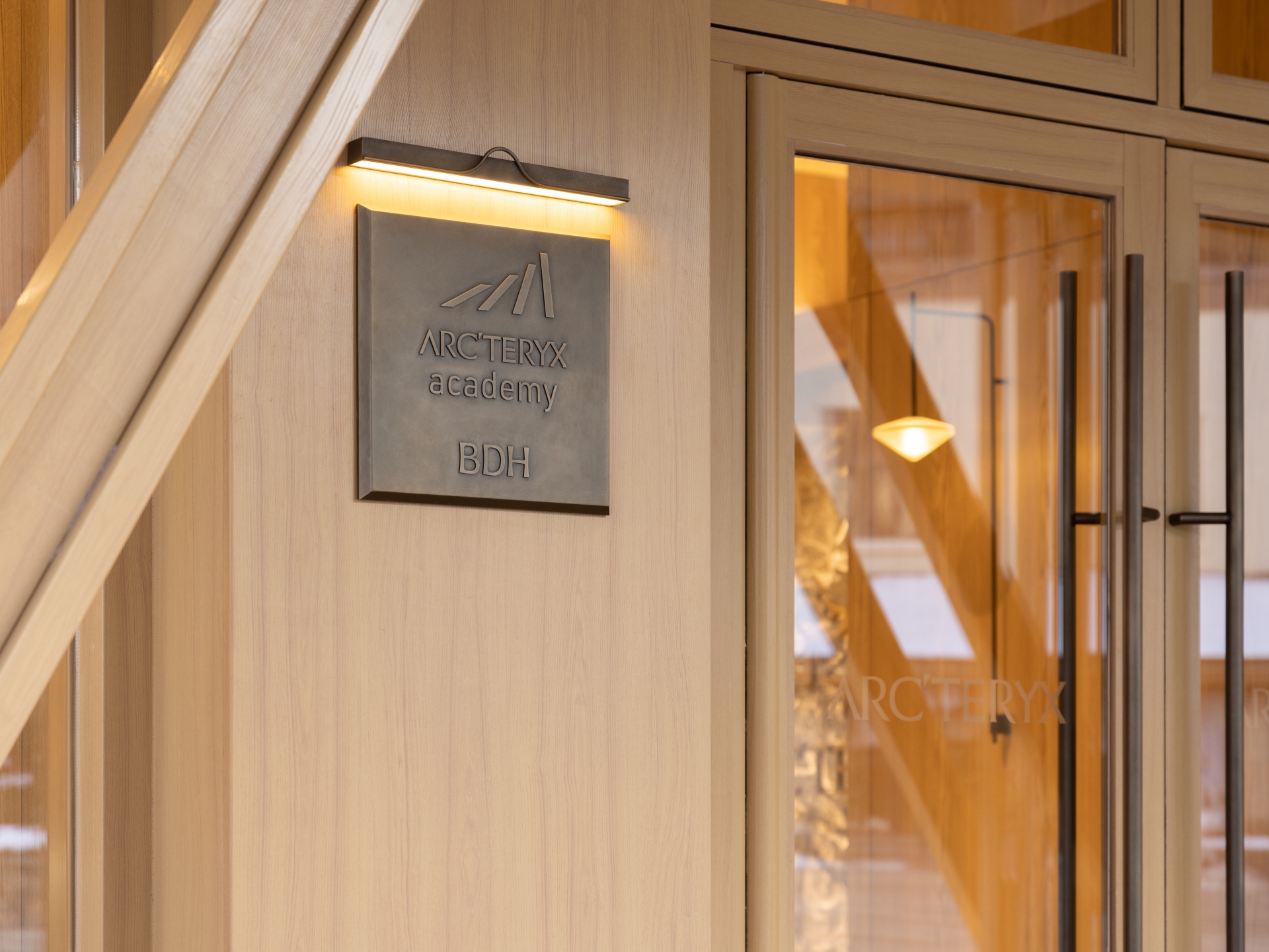
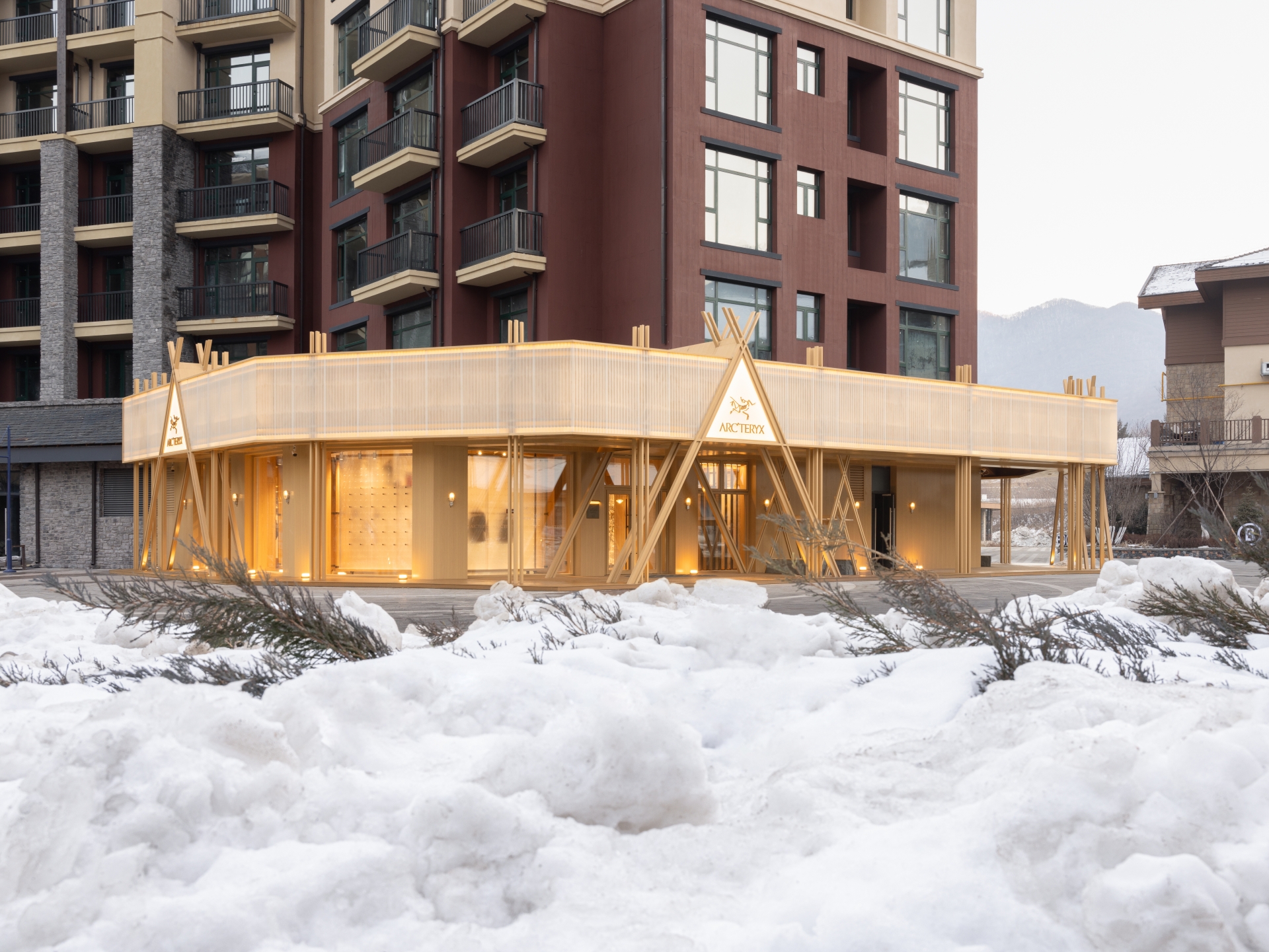
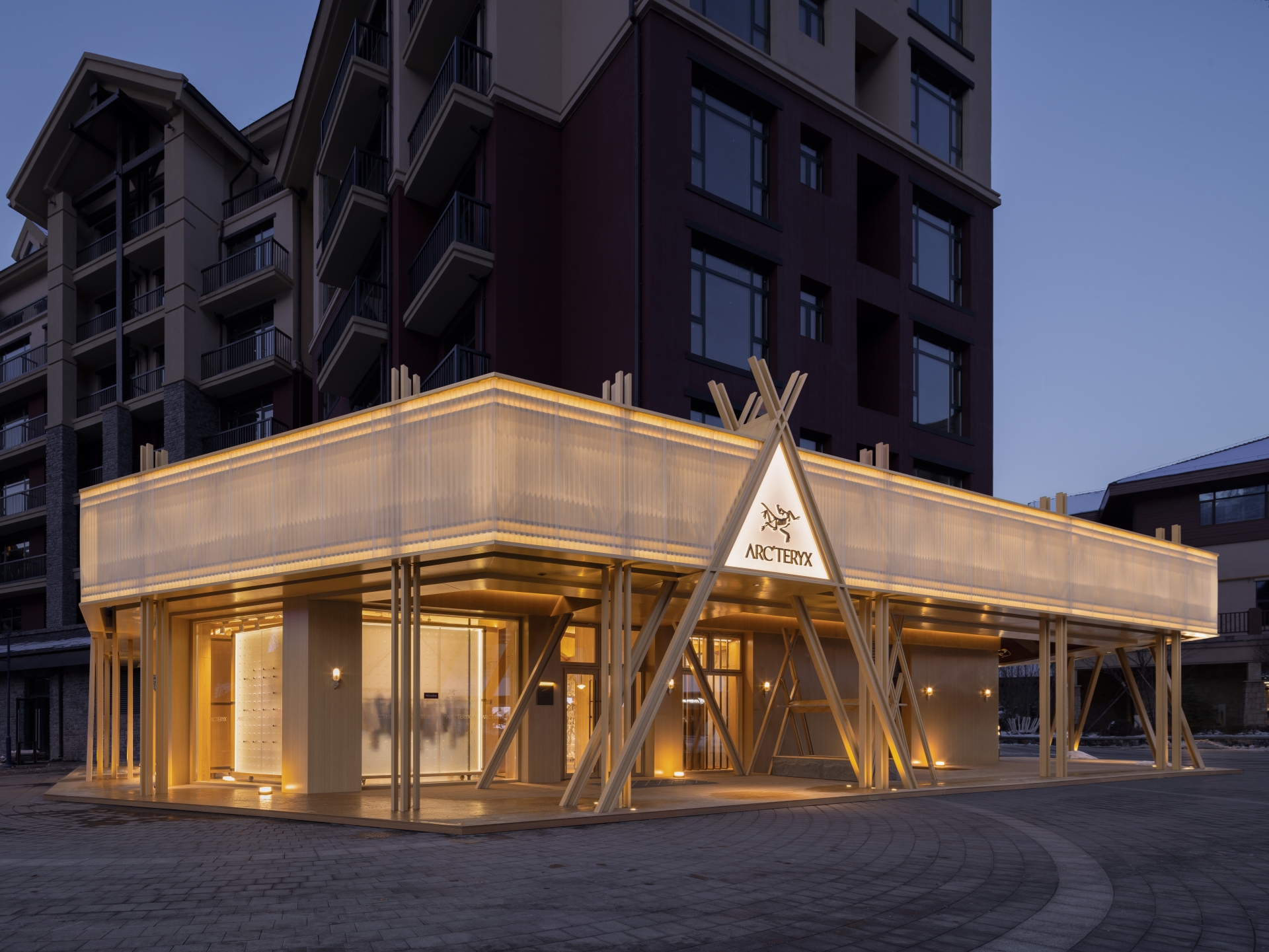
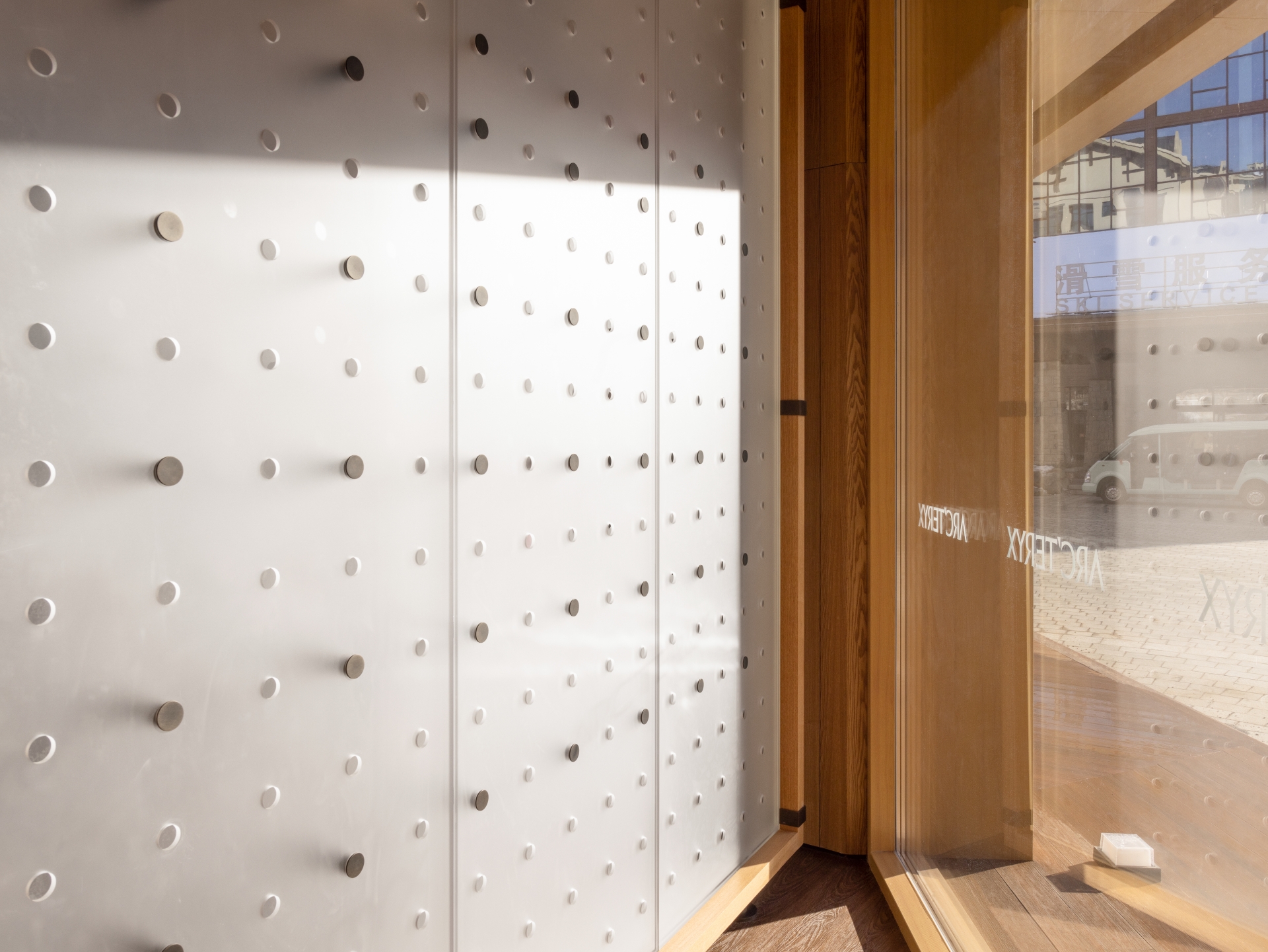
The design concept of the store was based on “a campfire in the snow”. As snow falls down, it turns everything white and brave adventurers get fully equipped, taking this as an opportunity to start a new journey of exploration. A warm-toned building glows gently like a campfire, brightening and warming up the snowy night. This also sets the tone of the spatial narratives. A large area of natural wood endows the construction with a rustic appearance, and distinguishes it from the surrounding cool-toned environment. The store occupies a corner on the ground floor of a multi-story building, but appears to be separated from it through a protruding facade. Solid triangular structures, either with a strong presence or slightly visible through the translucent corrugated sheets, strengthen the symbolic image of "campfire". Differentiated from traditional retail spaces that mostly adopt cool lighting, a warm yellow glow extends from its interior to the outdoor corridor and downwards to the floor. The restraining yet intimate warm lighting envelopes the store, making it appear crystal clear and ethereal in the snow.
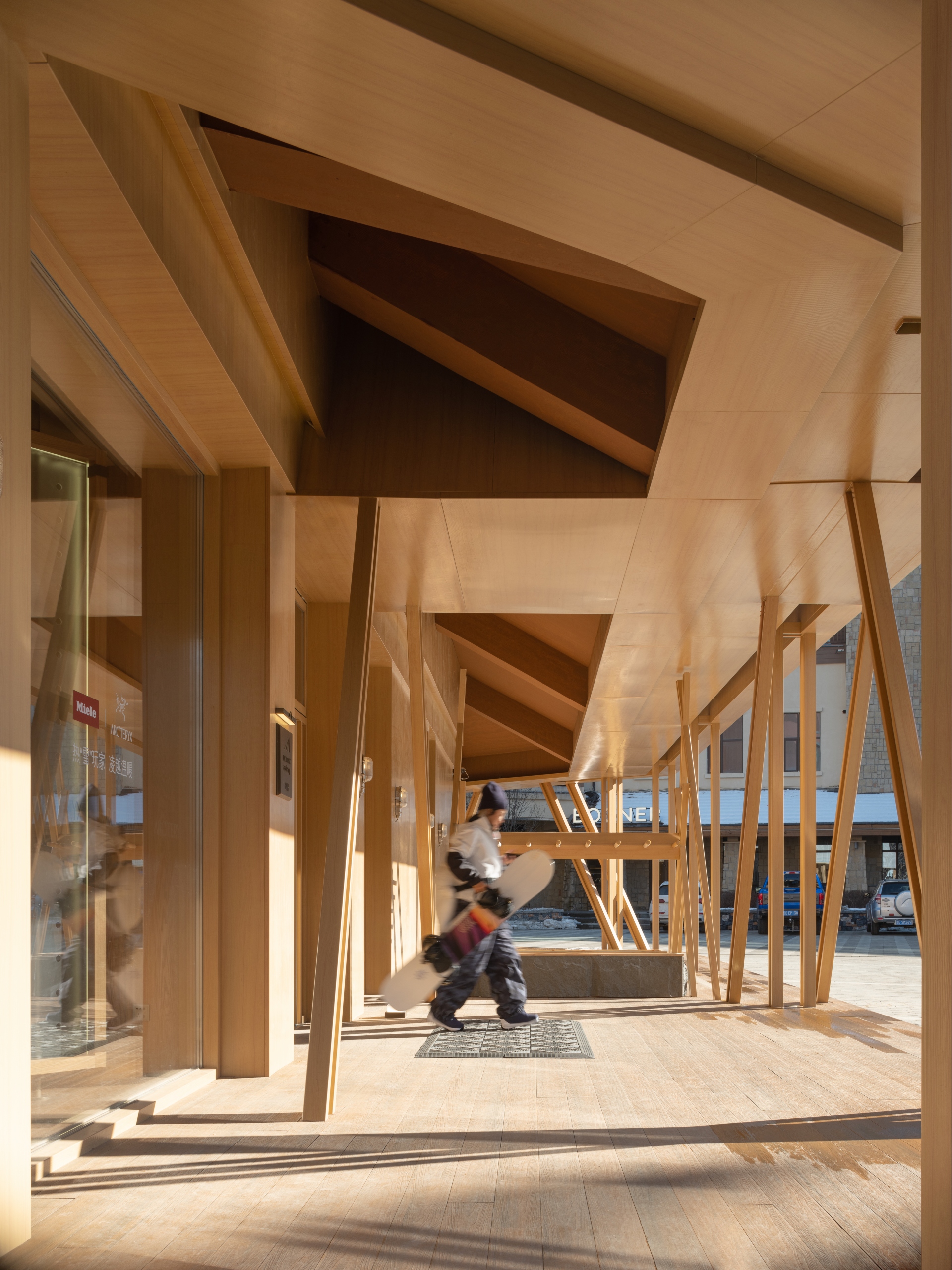
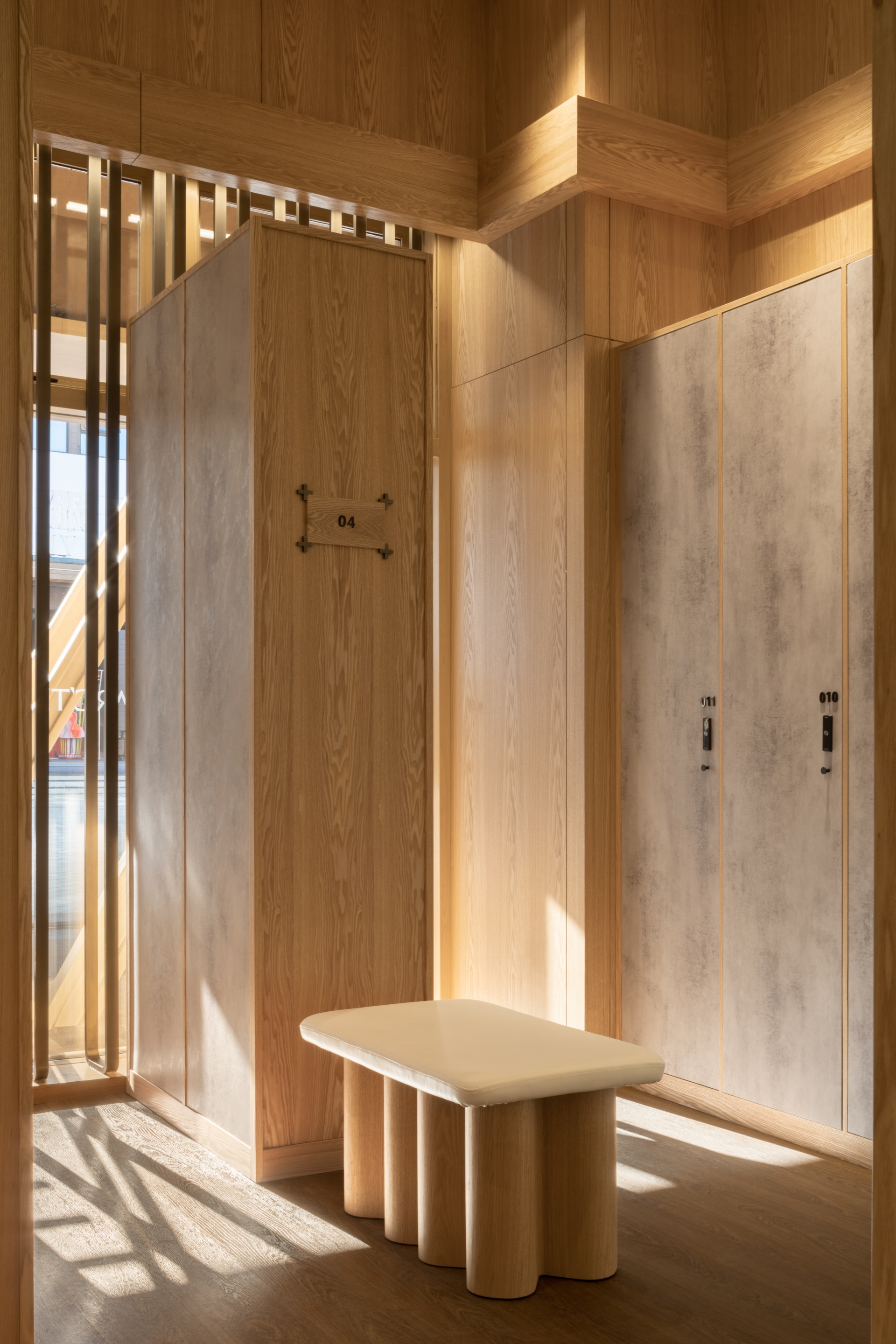
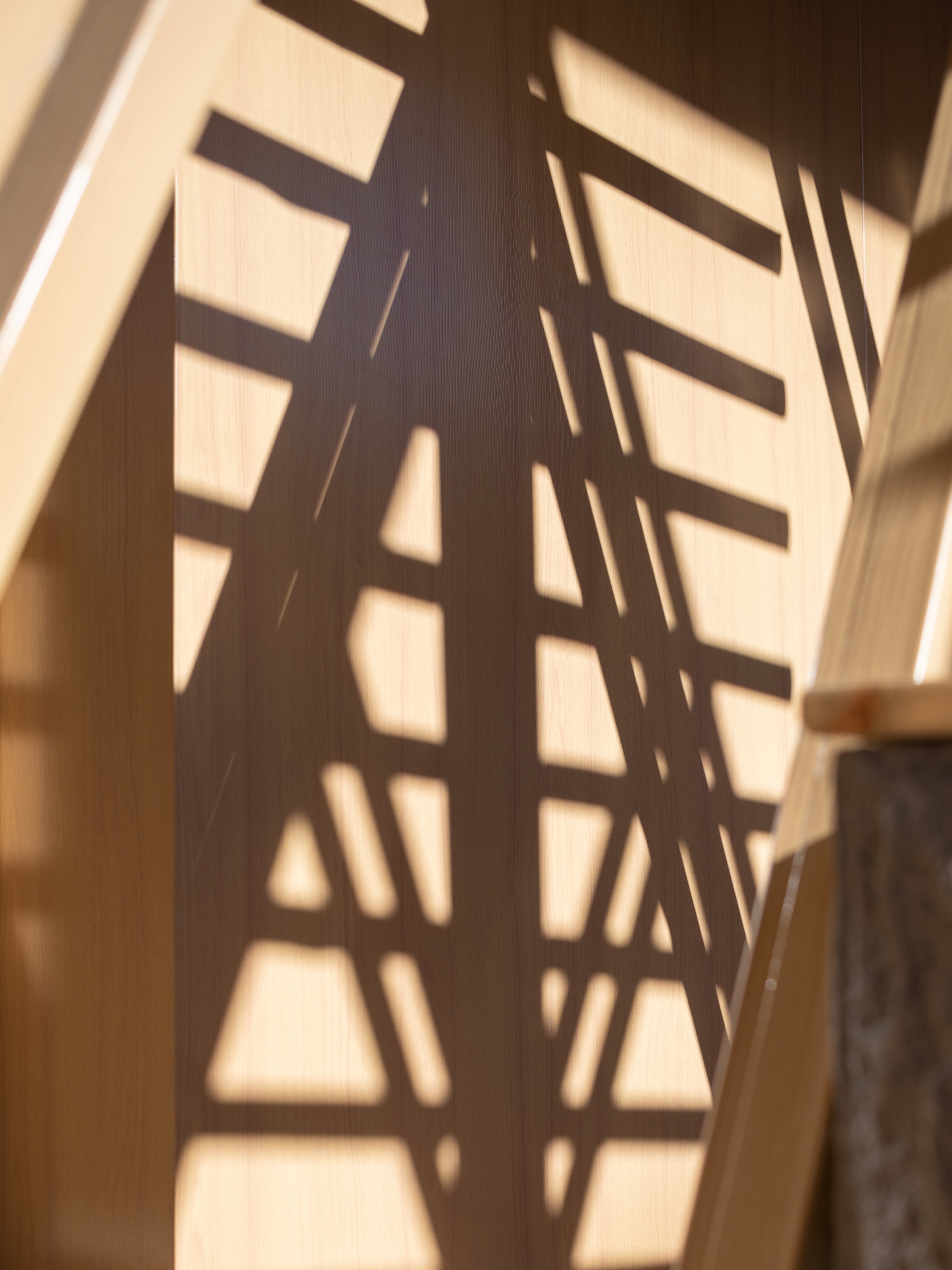
Natural light randomly moves in between wooden components, and casts a poetic scene of scattered light and shadows onto the walls. The circular veranda is a transition between the indoor and outdoor spaces, helping block out the freezing winds and snow from the outside and meanwhile bring in the varying natural views through a large area of French windows. Warmth and coolness, brightness and darkness, nature and the artificial are separated yet connected by the veranda, which blurs the boundary of space. The veranda also performs practical functions, offering a buffer zone between the dry area and the outdoor wet snowfield, to enhance customer experience. A hanging wooden shelf is set beside the entrance, for the purpose of placing snowboards to dry off. The corridor also provides customers with a shelter from piercing cold winds when waiting at the entrance.
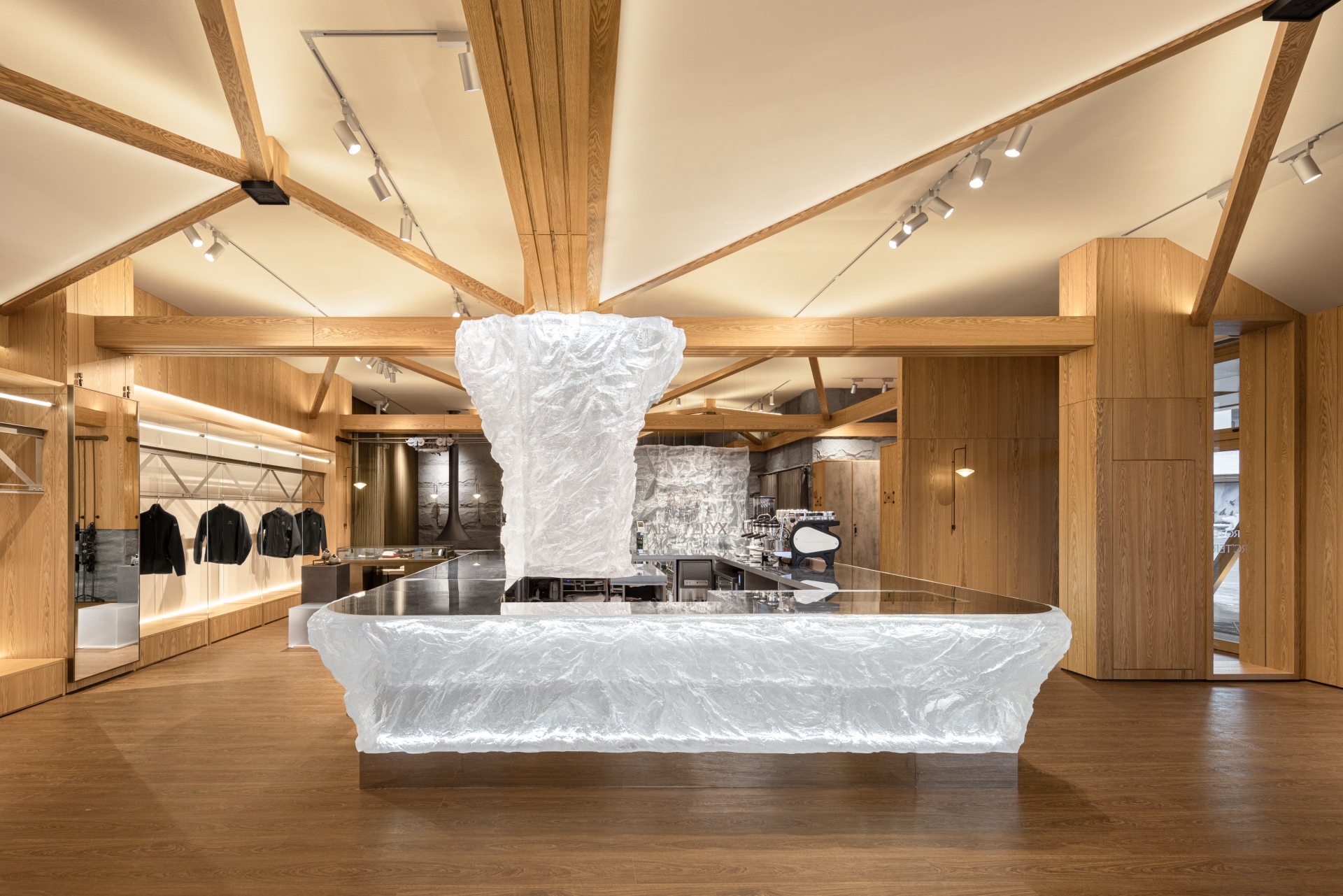
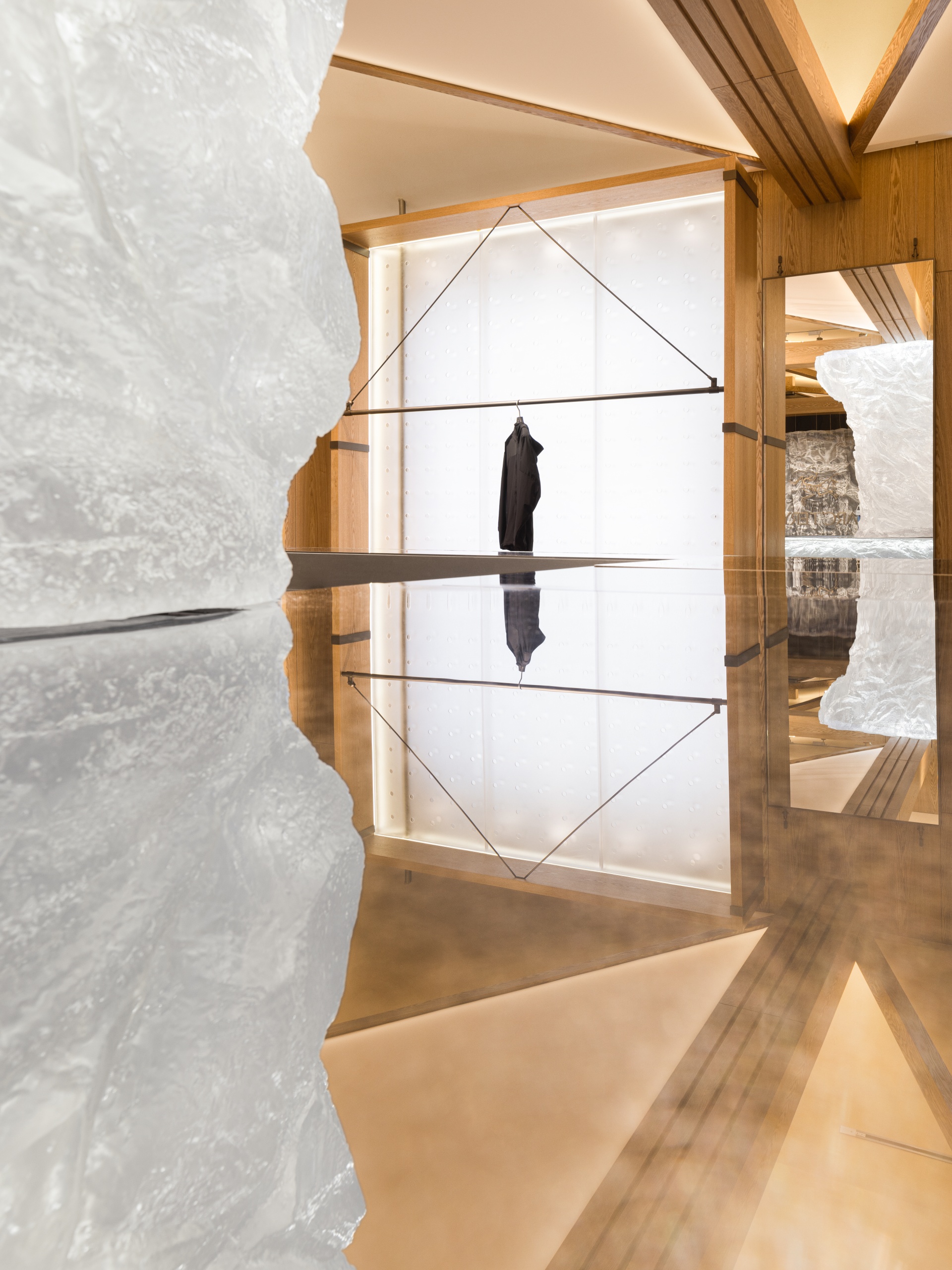
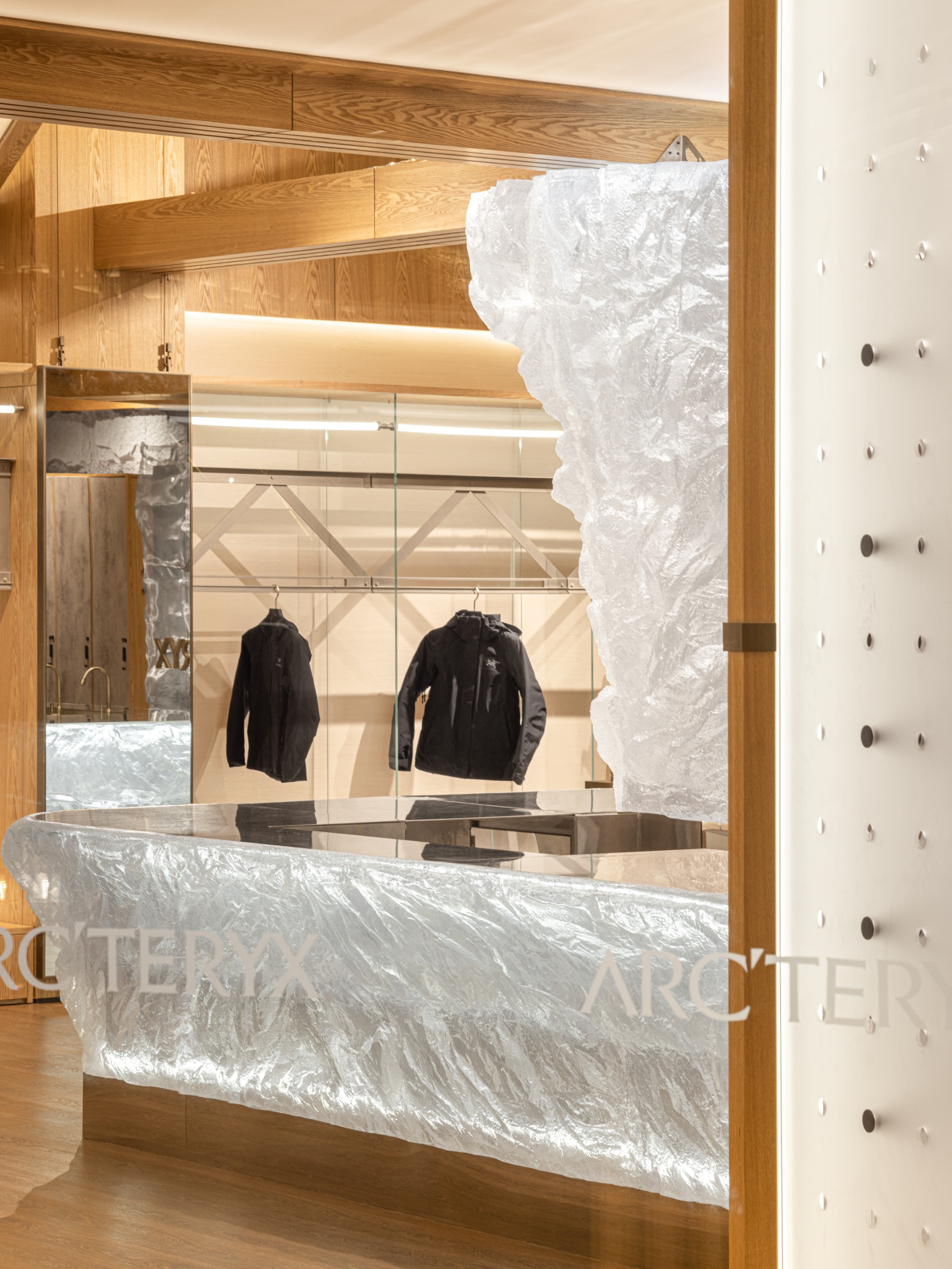
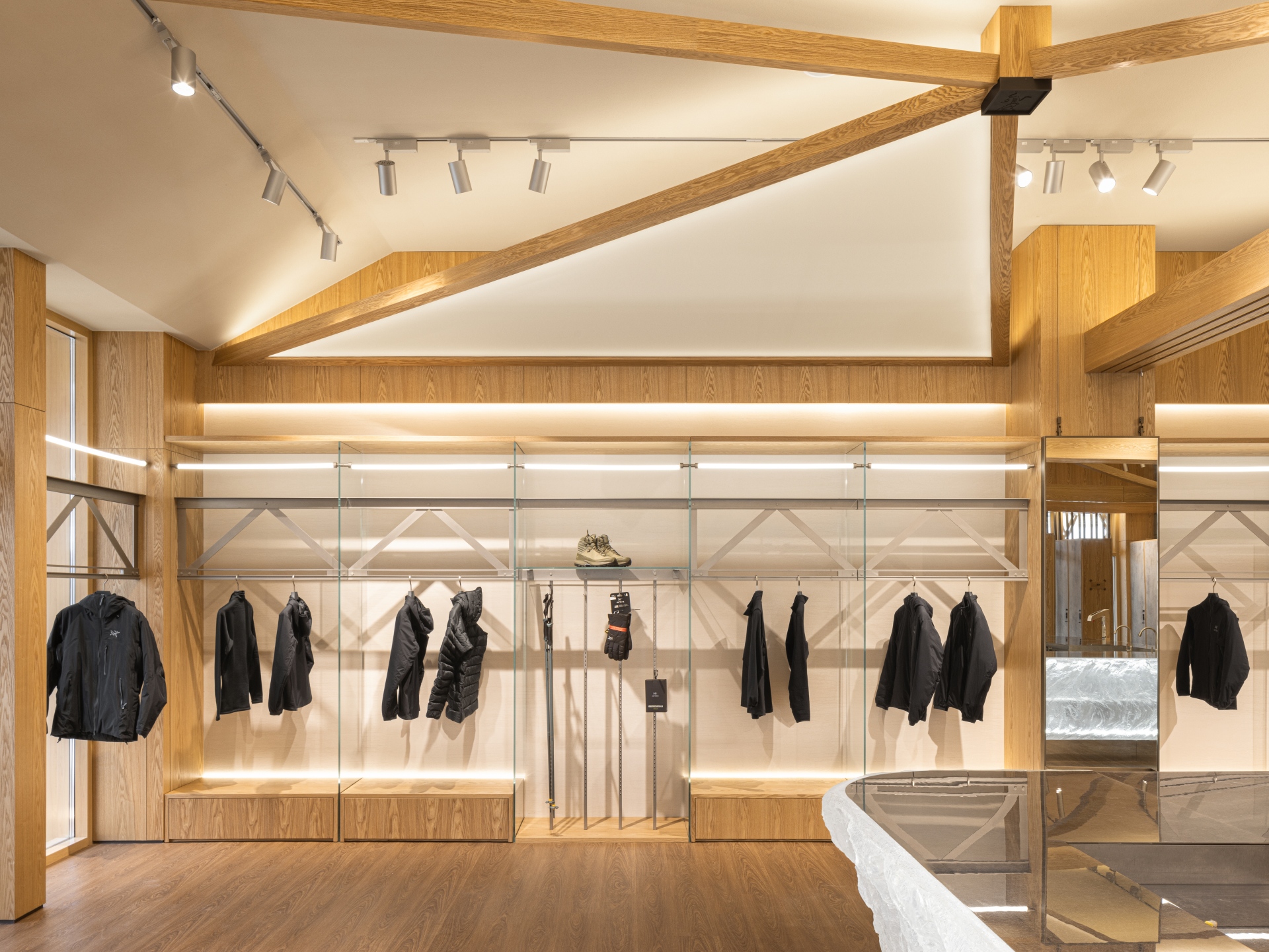
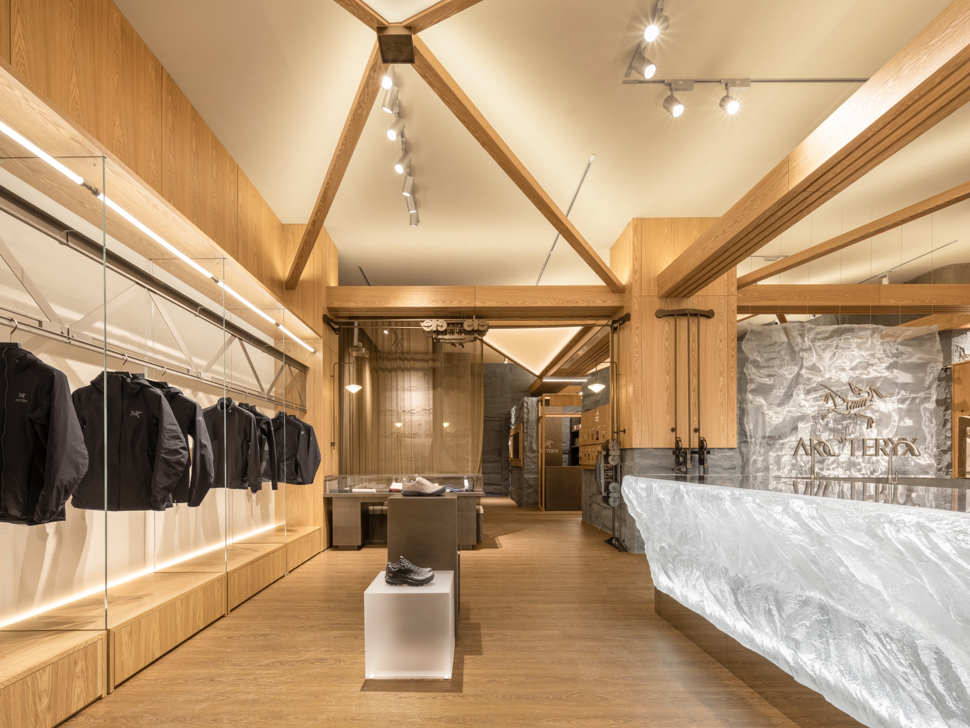
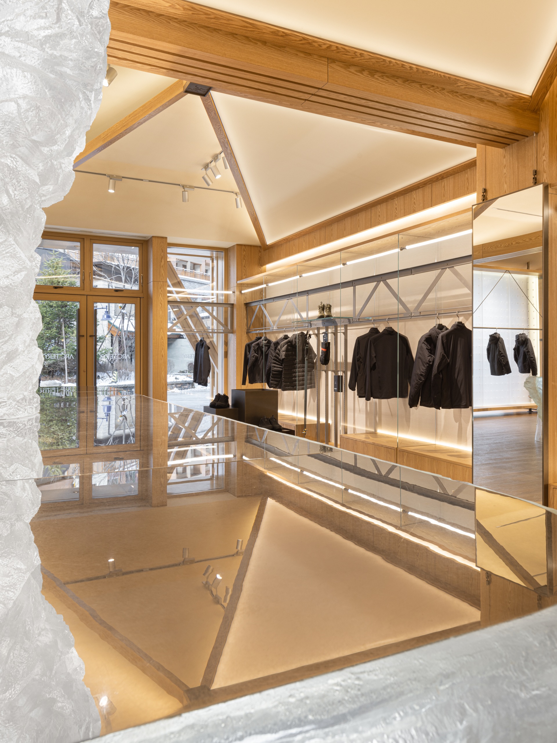
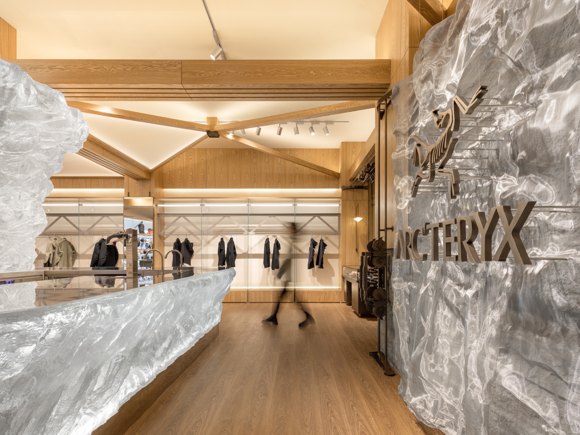
Stepping into the store, a large eye-catching "glacier" installation comes into sight. With its crystal texture neutralizing the warm spatial tones of the space, it becomes a visual focus. The installation builds a connection between the interior space and the outdoor natural environment, whilst also adding a gentle, artistic touch to the store. The enclosed bar counter acts as a hub for interaction - irregular organic lines stretch from its middle upwards to the "glacier", revealing sophisticated craftsmanship. This "glacier" installation is made of acrylic. The design team firstly carved a model with foam, and repeatedly adjusted it and tested the light effect, to obtain a natural, authentic form. The last step was the pouring process, which needed to minimize bubbles and voids. The finished work was transported northwards from a factory in southern China to the site, where it fully integrated into the snowy setting.
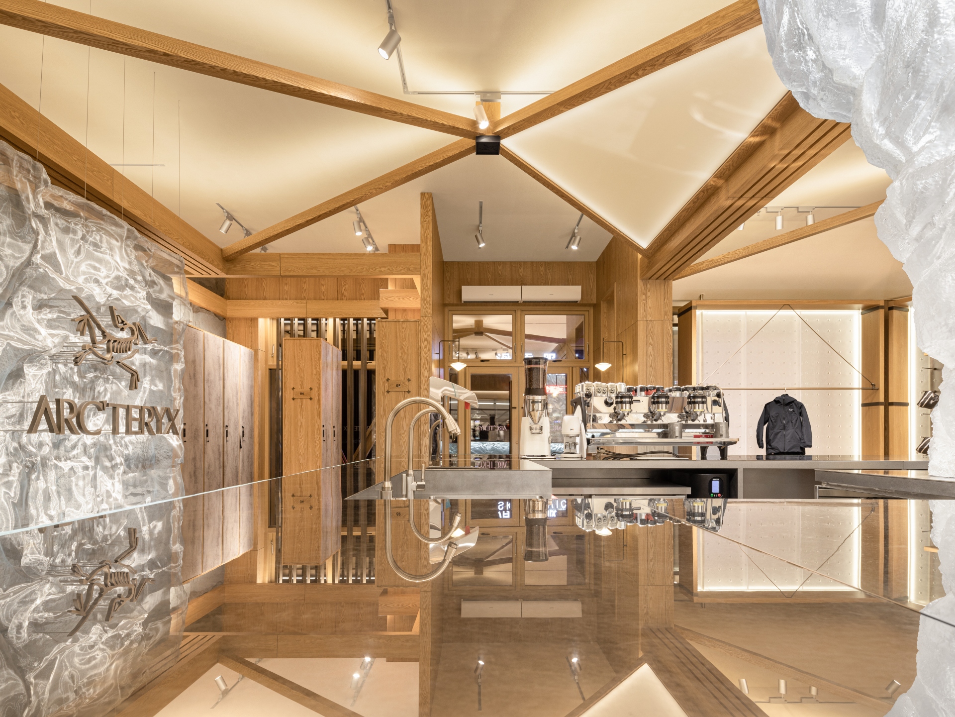
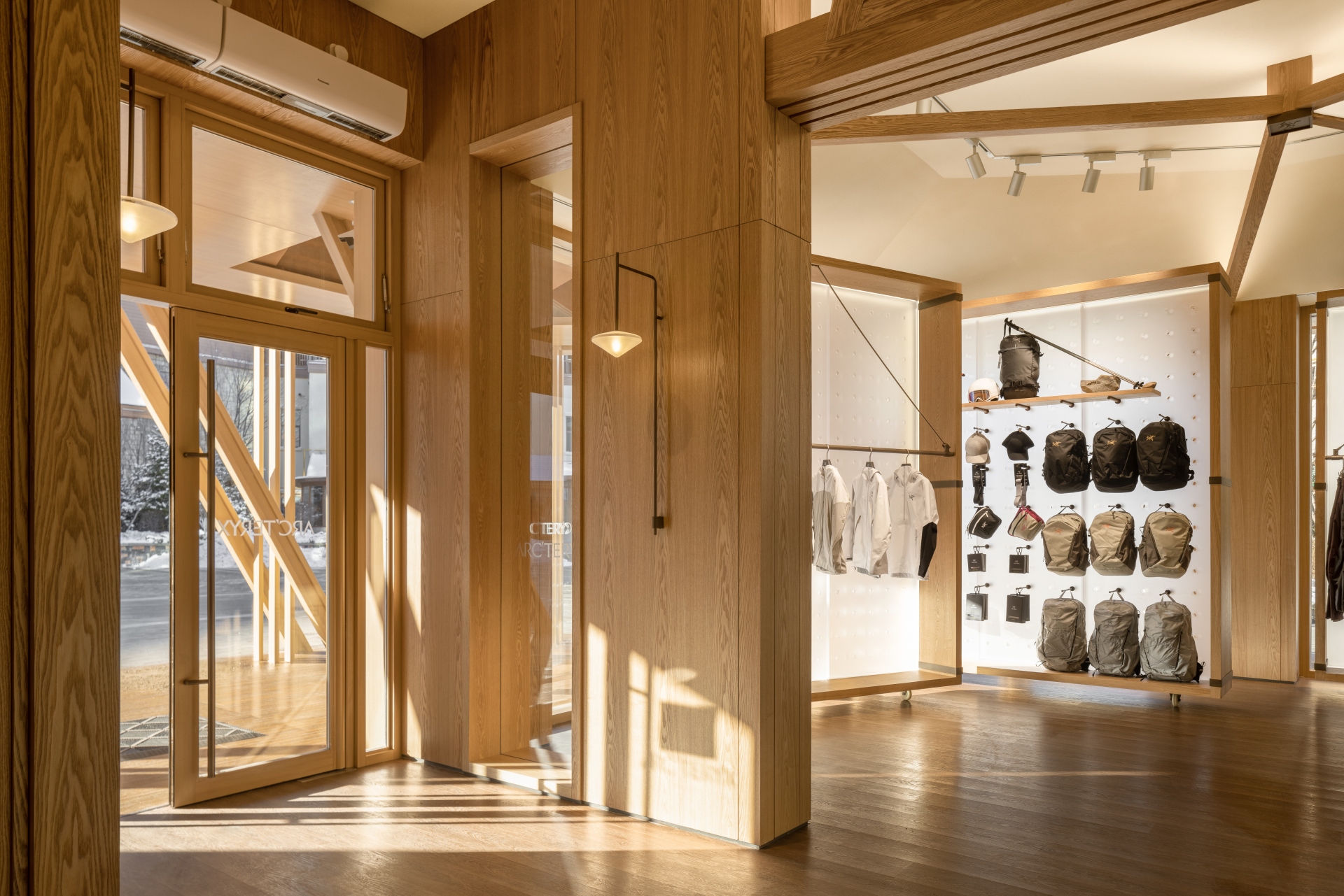
The interior space continues the wooden texture of the facade. It's also defined by neat lines and blocks, as well as contrasting materials and colours, which together produce a sense of order and blur the spatial boundaries. This warm tone generates a welcoming atmosphere for snow sports enthusiasts. The three-dimensional folding ceiling structures and the pale-hued fabric curtain that simulates the texture of camping tents soften the light in the space, and create an easeful experience like resting in a tent outdoors.
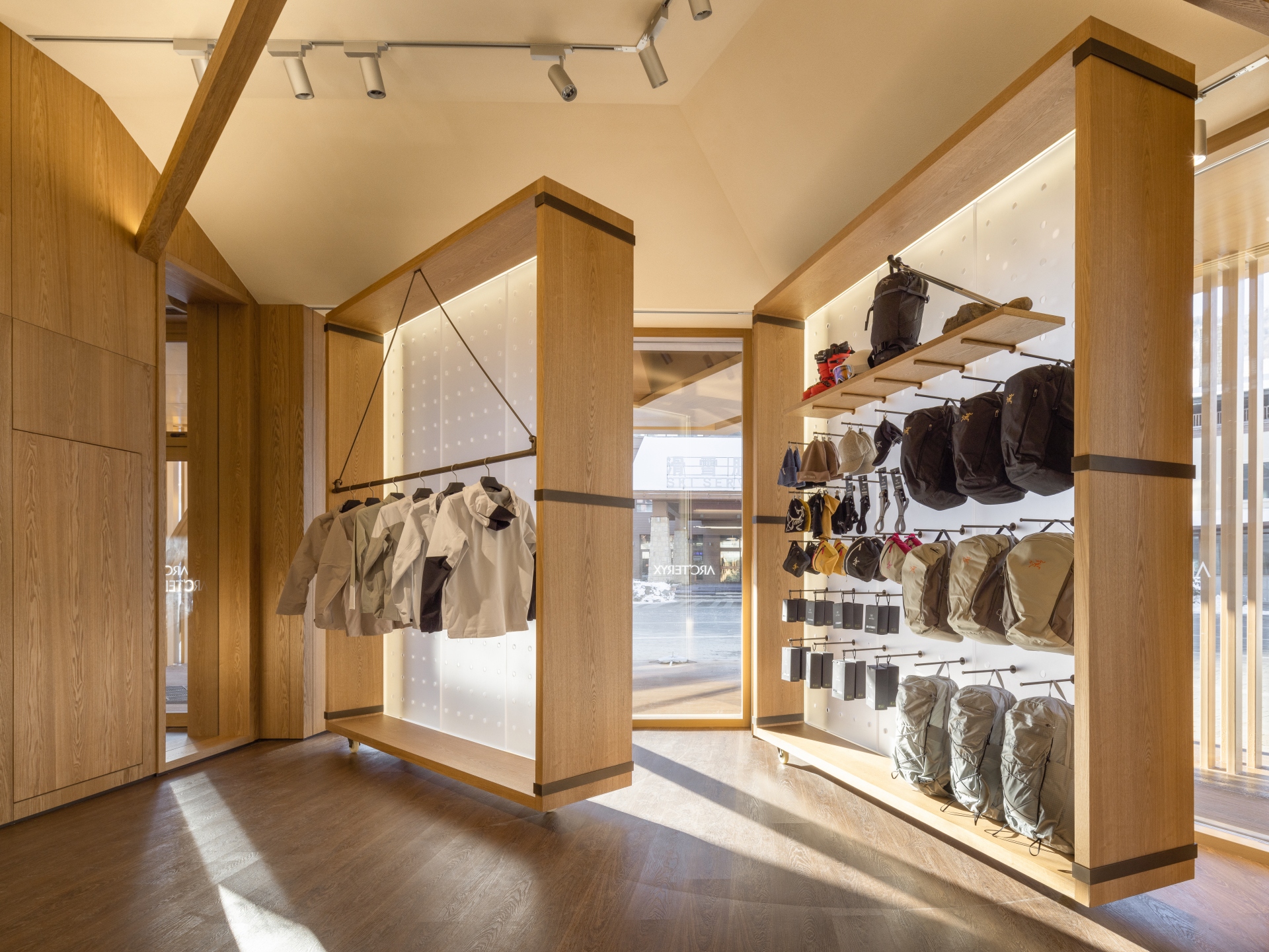
With the "glacier" installation as a boundary, the space features a smooth and clear circulation route. The area from the entrance to the foyer is a retail zone. Unlike most retail stores that seek maximized sales per square foot, the client insisted that no more than one third of the site should be used for sales, hoping to leave more space for customers to experience the brand. Acrylic partitions refract the light, creating a soft effect. The hanging racks refer to the unique design of the brand's factory in Canada, with their industrial metallic texture balancing with the spatial tone. The customized cabinets are movable, making it possible to adjust the spatial pattern according to light conditions and create changeable scenes flexibly.
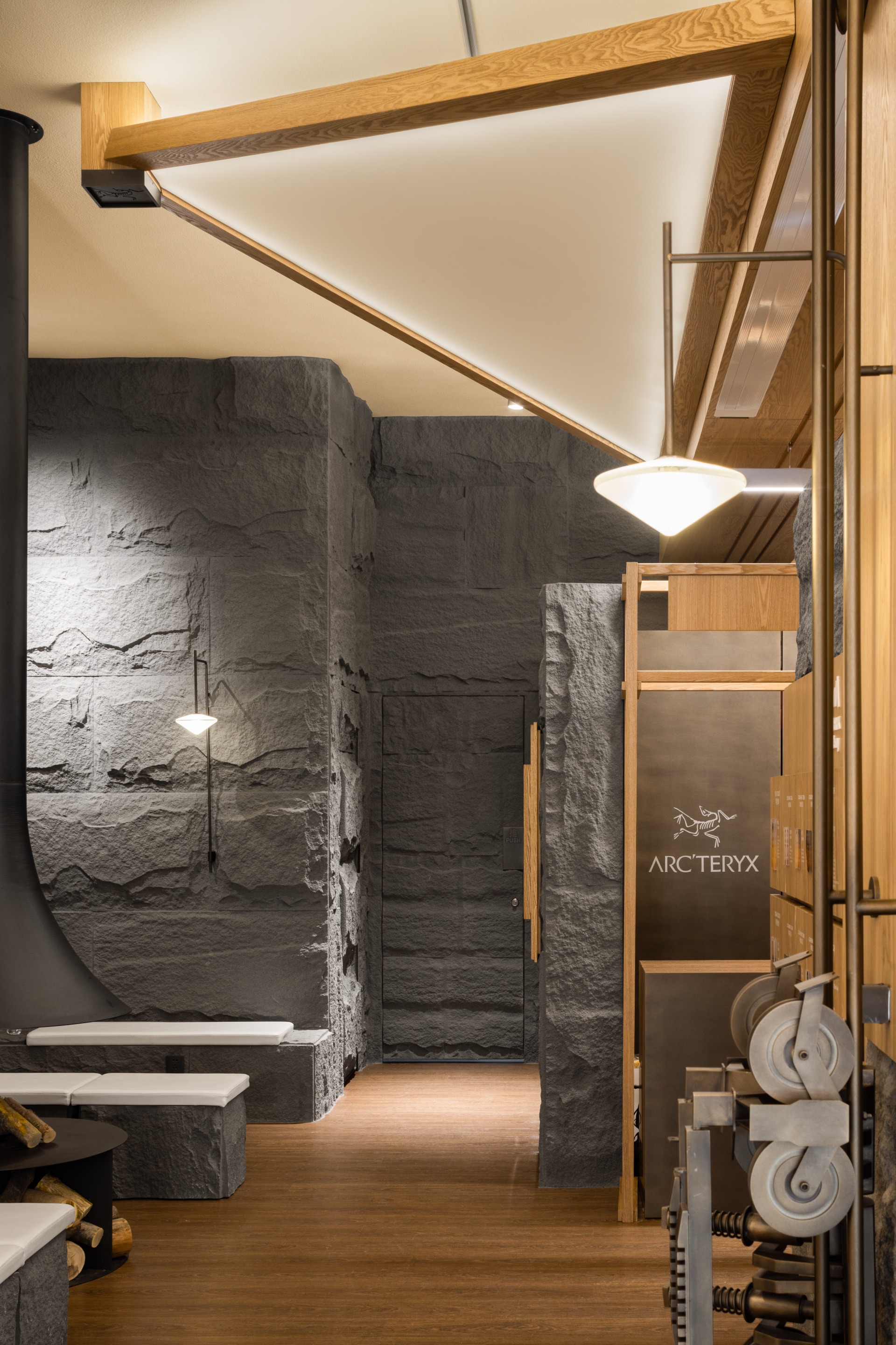
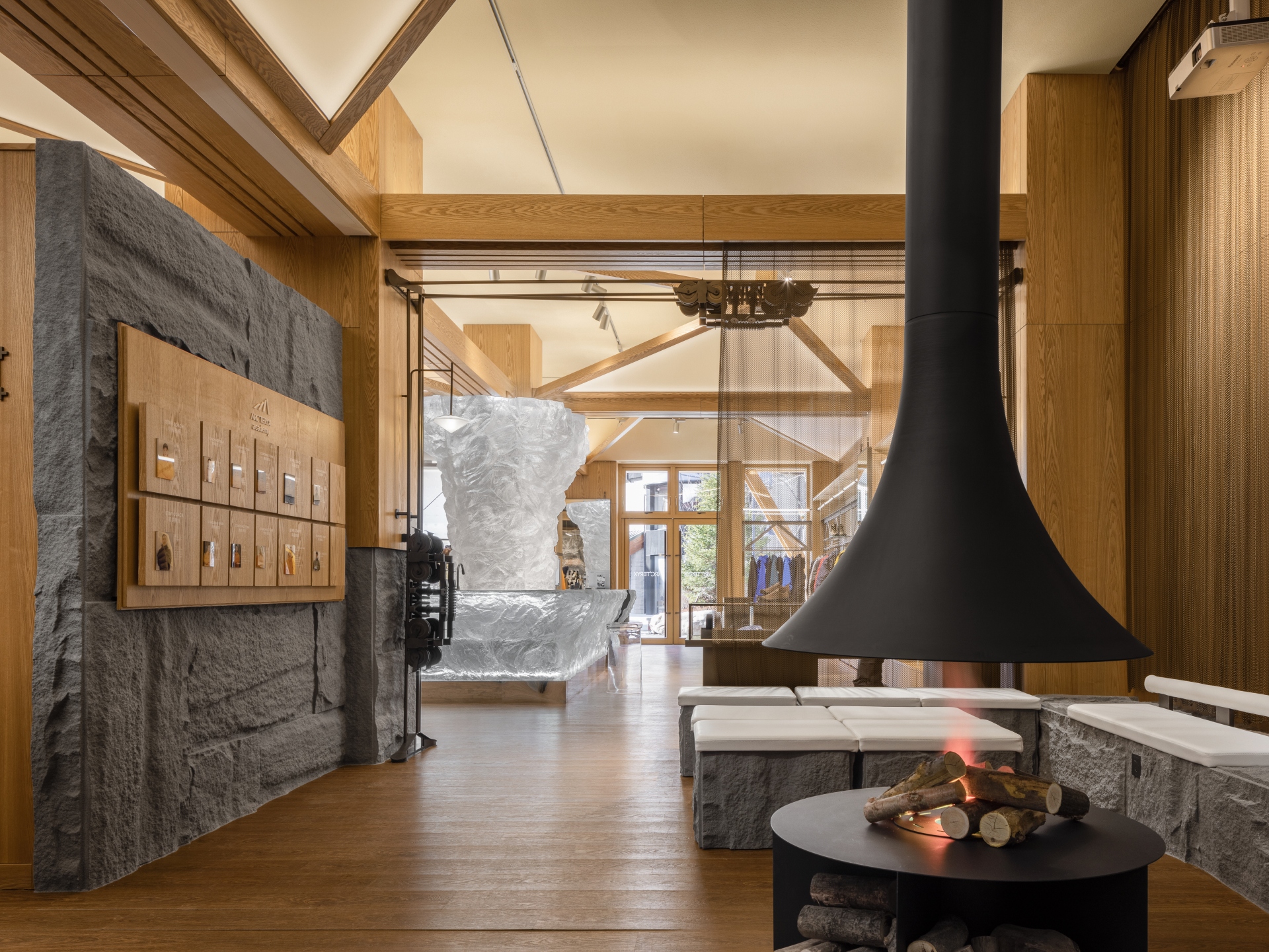
The mountain skills training zone set behind the retail area is infused with a rustic atmosphere created by dark gray stones. Irregular stone textures and the neat wooden lines contrast yet harmonize with each other. Mechanical pulleys sourced from cable cars and the hanging fireplace in the middle create an enclosed hub for communication.
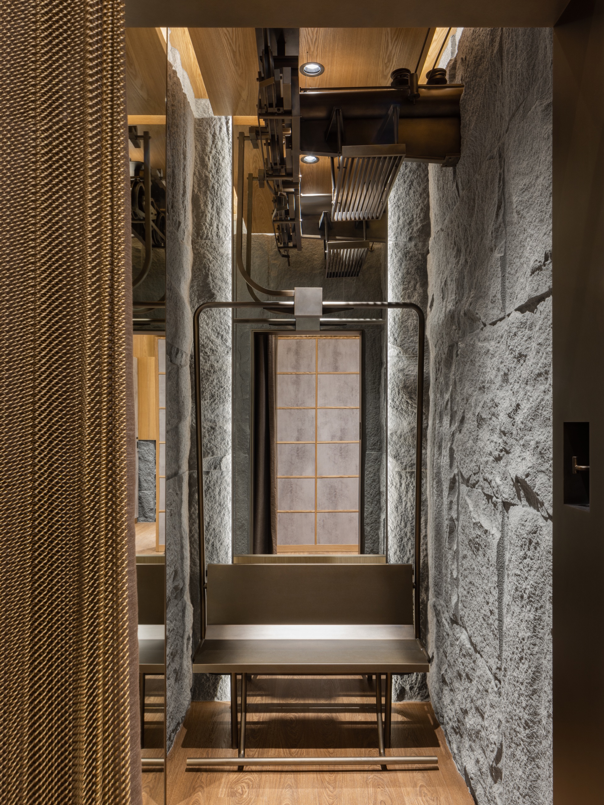
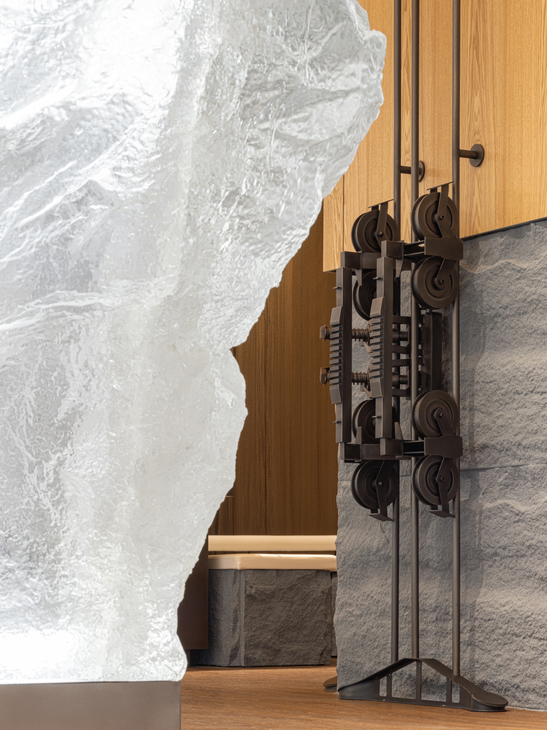
No detail is left attended to - even the design of the rental and storage zone centers on functionality, with full consideration into the needs and habits of skiers. It continues the mountain-like visual effect at non-retail areas, while incorporating diverse details. The locker cabinets are equipped with casters, to make it easier to move them around and add extra storage space. The washing machine and dryer are set up alongside fitting rooms and lockers to create home-like convenience for users, which is a thoughtful design beyond functional considerations.
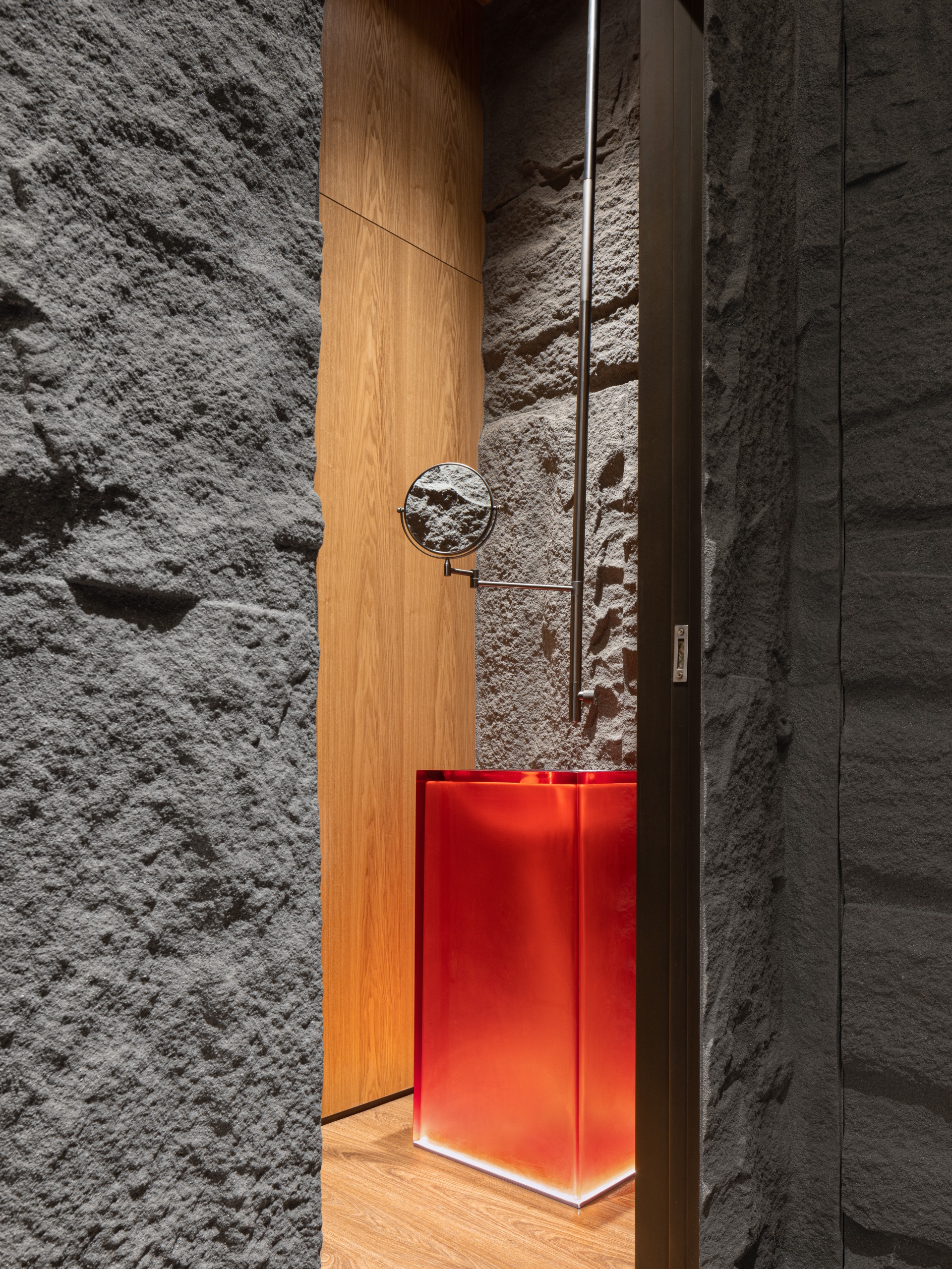
From the campfire-like appearance to the veranda that connects the indoor and outdoor spaces, the crystal clear "glacier" installation that creates a visual focus, the training zone centering around a fireplace, and elements of tents, cable cars and rocks, the design not only brings an unconventional retail space, but also creatively echoes the brand's values of nature exploration. With respect for nature and aspirations for the better, the design expands the boundary of wilderness and lights up a glowing campfire in a boundless land, guiding every explorer to find their "spiritual" destination.
