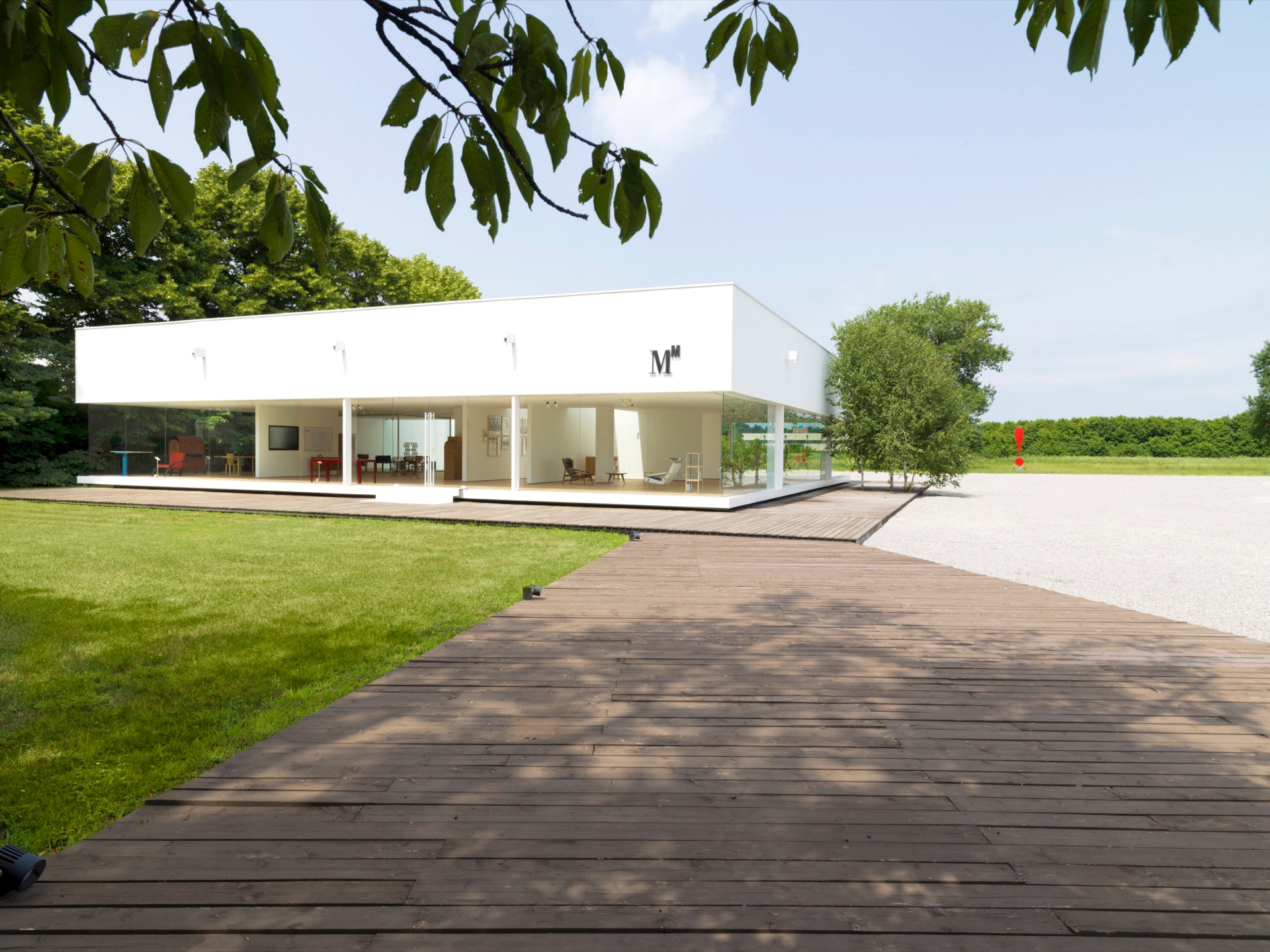
In 2021 the Molteni Museum was moved to the Glass Cube space located in the Molteni Compound gardens, and was totally revamped by Ron Gilad. The space showcases the company’s achievements – products, prototypes, stories and images - as well as its identity and its values, by telling extraordinary stories of the men and women that have invented, produced and built objects, work and social relationships. Over these last five years, the museum has welcomed hosts of people – professionals, clients, architects, students, design enthusiasts, from all over the world and from the best international design schools – wishing to immerse themselves in the history of a Group that has successfully fostered great empathy between the visitors and the company, consolidating its reputation and interest in its work, products and the way it communicates the Group’s four key companies, Molteni&C, Dada, Unifor and Citterio.
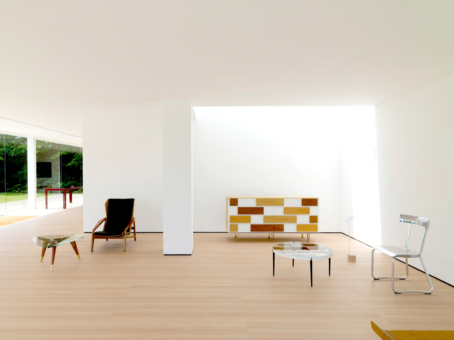
The Museum hosts a permanent collection of approximately 50 iconic products and original prototypes belonging to these key companies, as well as an area destined to host temporary exhibitions and special initiatives. But it also tells the unflappable story of an Italian enterprise, founded in 1934 by Angelo and Giuseppina Molteni, which developed from the 1950s with the cooperation of Italian and international architects and designers, such as Luca Meda, Afra and Tobia Scarpa, Aldo Rossi, Werner Blaser, Richard Sapper, Foster + Partners, Jean Nouvel, lvaro Siza, Pierluigi Cerri, Michele De Lucchi, Hannes Wettstein, Rodolfo Dordoni, Dante Bonuccelli, Patricia Urquiola, Ron Gilad, Ferruccio Laviani, Michael Anastassiades and Vincent Van Duysen, right through to the re-edition of a collection of furnishings designed by Gio Ponti between 1935 and 1970.
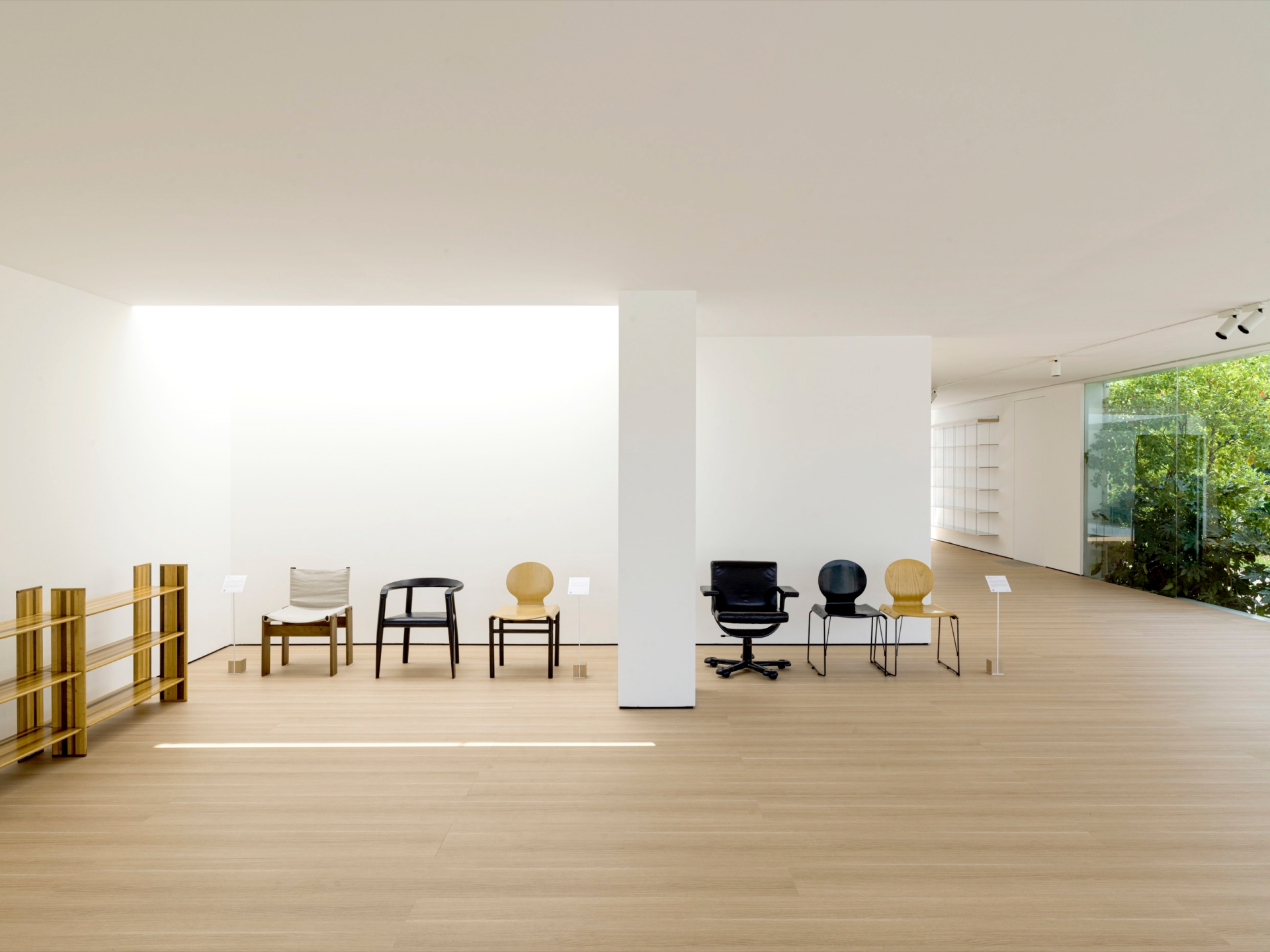
Since its first steps as an artisan workshop, so many things have changed: production, now industrial; distribution, now international; the ability to innovate, with constant investments in research and development. One thing, however, has remained constant: quality, the fil rouge that for three generations has been the hallmark of the Group and that has accompanied its rise among the world’s leading names in the furniture design sector.
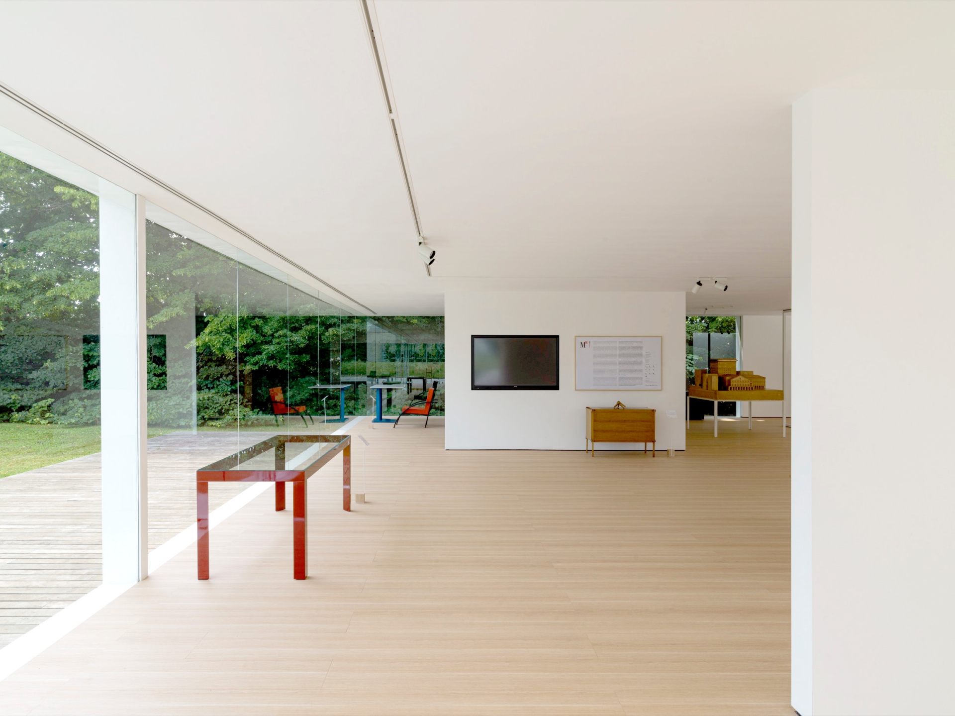
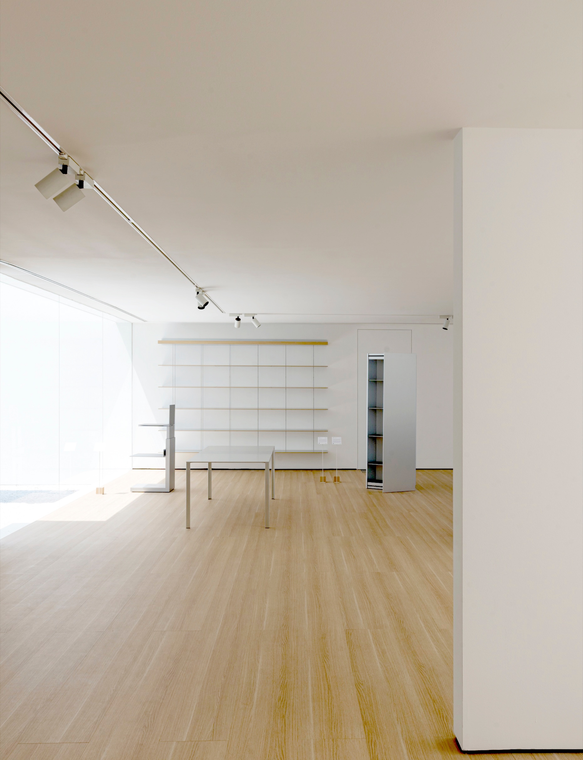
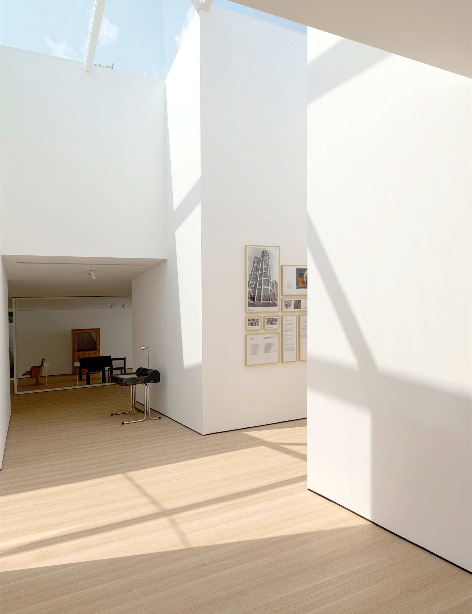
The experience gained in managing the Museum provided the stimulus for creating a new multi-functional project. The permanent Collection is still the nucleus of the project, re- arranged and reorganized by Ron Gilad according to new criteria. It is flanked by special initiatives, thanks to the flexibility of the spaces, such as temporary exhibitions ranging from architecture to photography and art, with the creation of a programme of events linked to the Museum.
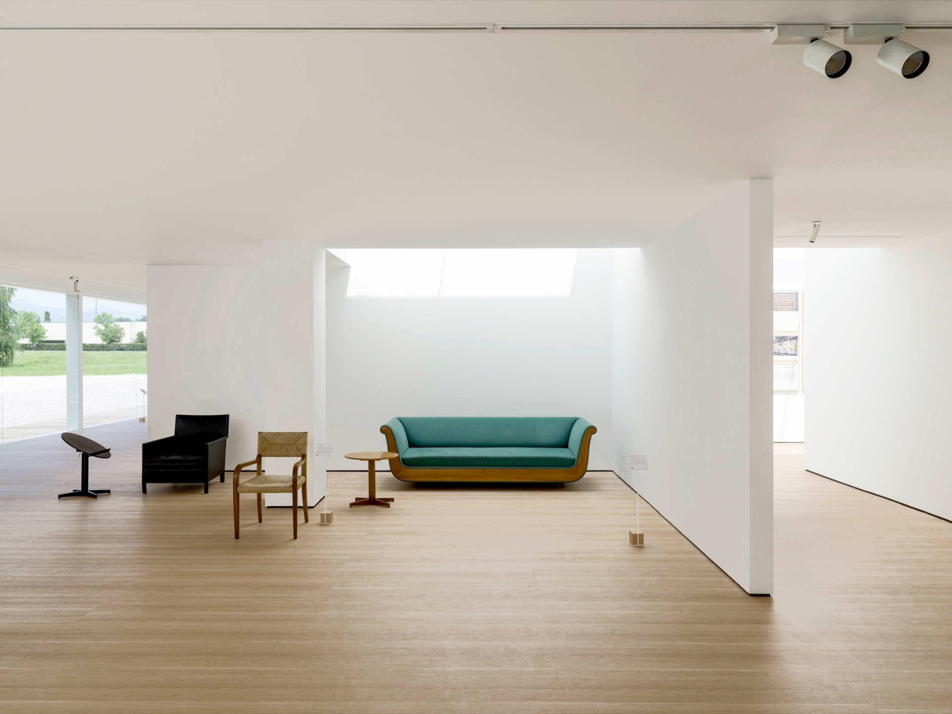
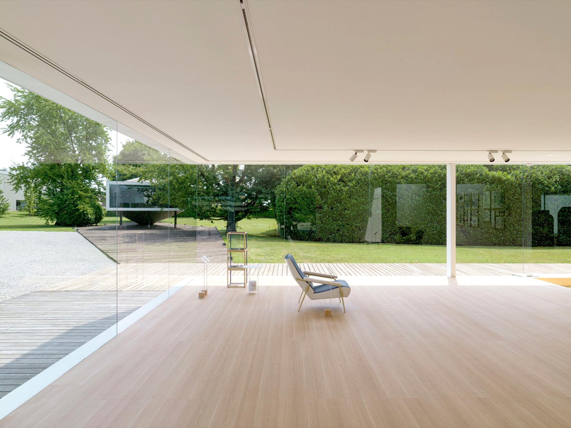
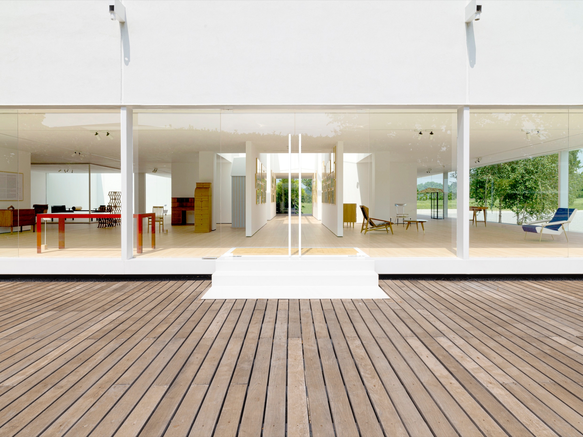
The pavilion that hosts the Museum enhances and bears witness to the Groups’ history. Built in the early years of the 21st century, was initially used as a photographic studio, then as a showroom and lastly as a space for temporary exhibitions, is now hosts the Molteni Museum. Inside the pavilion, the new lay-out is dictated by angular and specular walls that generate two distinct exhibition spaces designed to host different objects: centrally a gallery, mostly contained within the skylight and dedicated to displaying wall-mounted objects; in the rest of the pavilion larger spaces in which to display big objects and works of art.
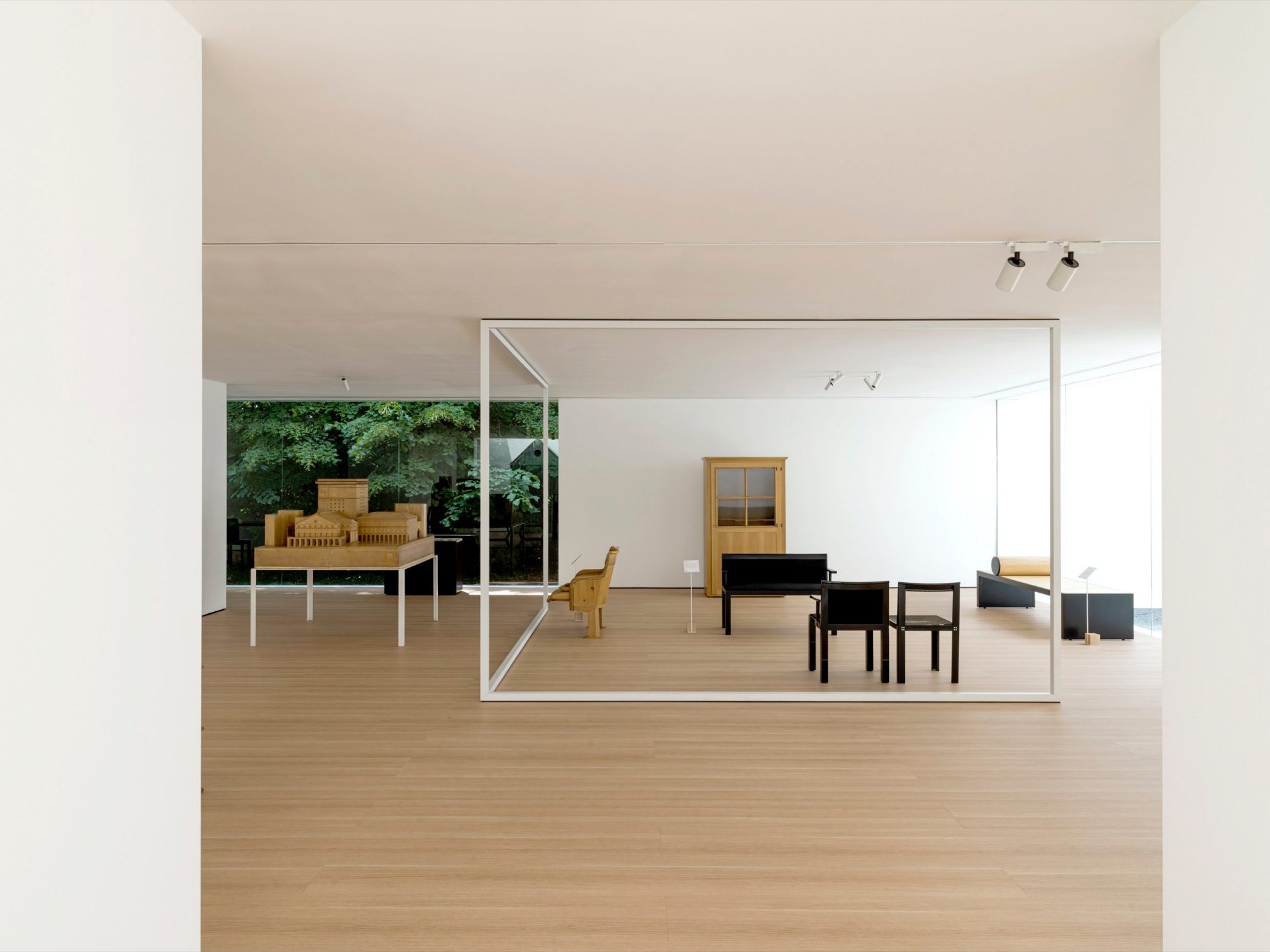
The distribution of the exhibition spaces was a functional decision resulting from the relationship between the geometric space created and the objects to be displayed: the solid corners - generated by the way in which internal architectural surfaces meet - define the spatiality and the best volumetric proportions for displaying large, three-dimensional objects or, as in the central gallery, two-dimensional works displayed on the wall, such as graphics, posters and photographs of the company’s history. The transparency of the pavilion is one of the architectural features that the project exploits to greatest effect: the new internal layout, arranged over orthogonal axes, suggests standpoints and perspectives outdoors and creates movement and surprise in the internal pathway.
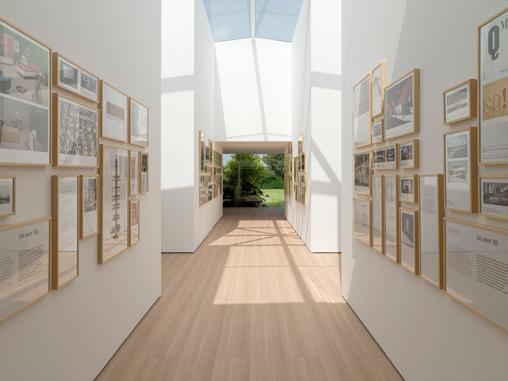
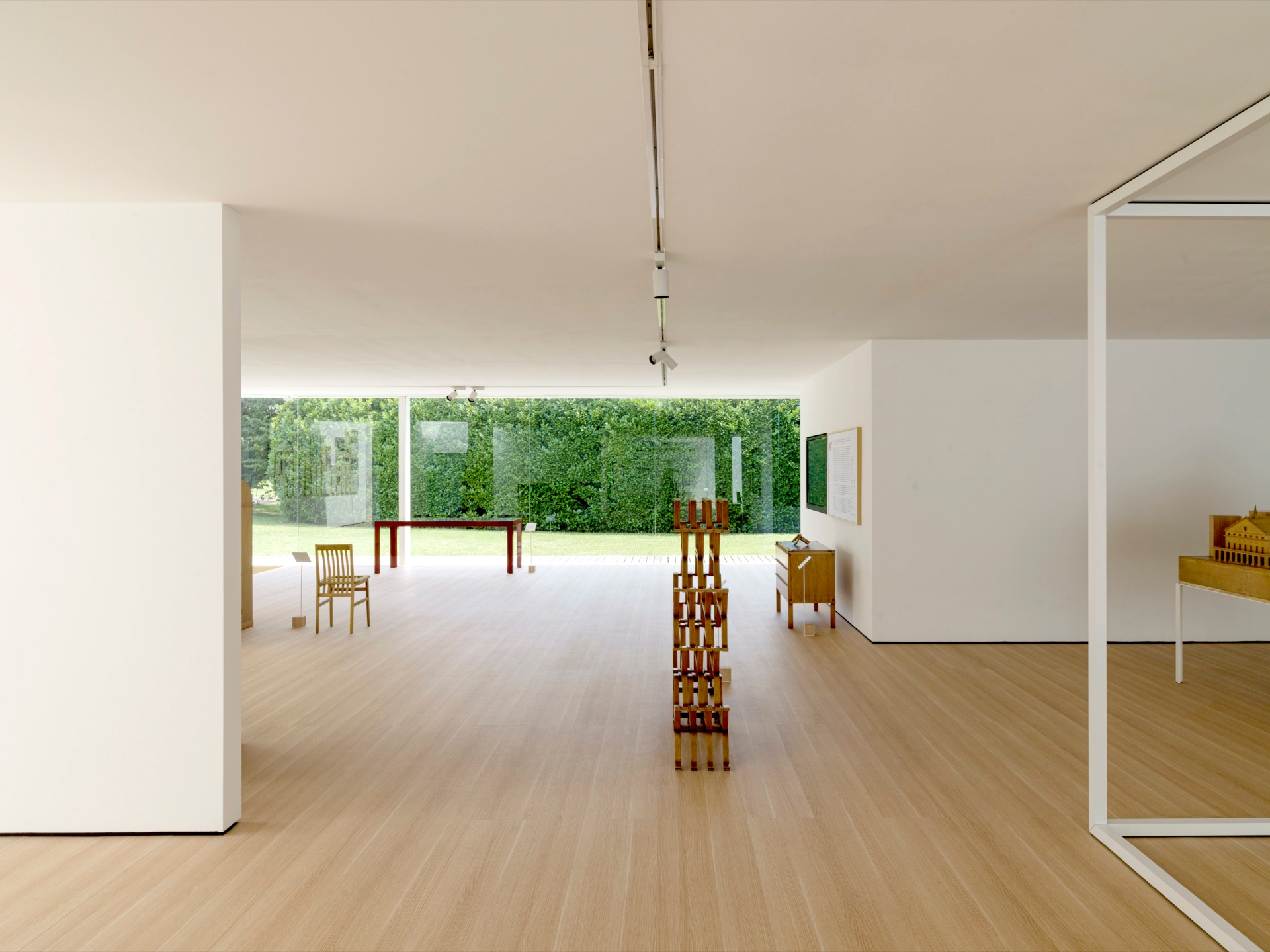
The only exception to the perimetral transparency is an angular courtyard which, closed from the outside and glazed within, completes the rectangular floor plan. This space, a sculpture garden, consists of two walls ‘floating’ above white gravel, without ever touching the ground. Light, a metaphor of the museum itself, is the material of which this building is made and which shapes its spaces: it floods in from the perimetral windows, from the central sky- light and from the new inner courtyard, spaces designed to let in a generous and even flow of daylight from several points. The architectural design of the museum encourages visitors to reflect on physical perception and on the ways in which man relates to space, to light and to the objects displayed.
