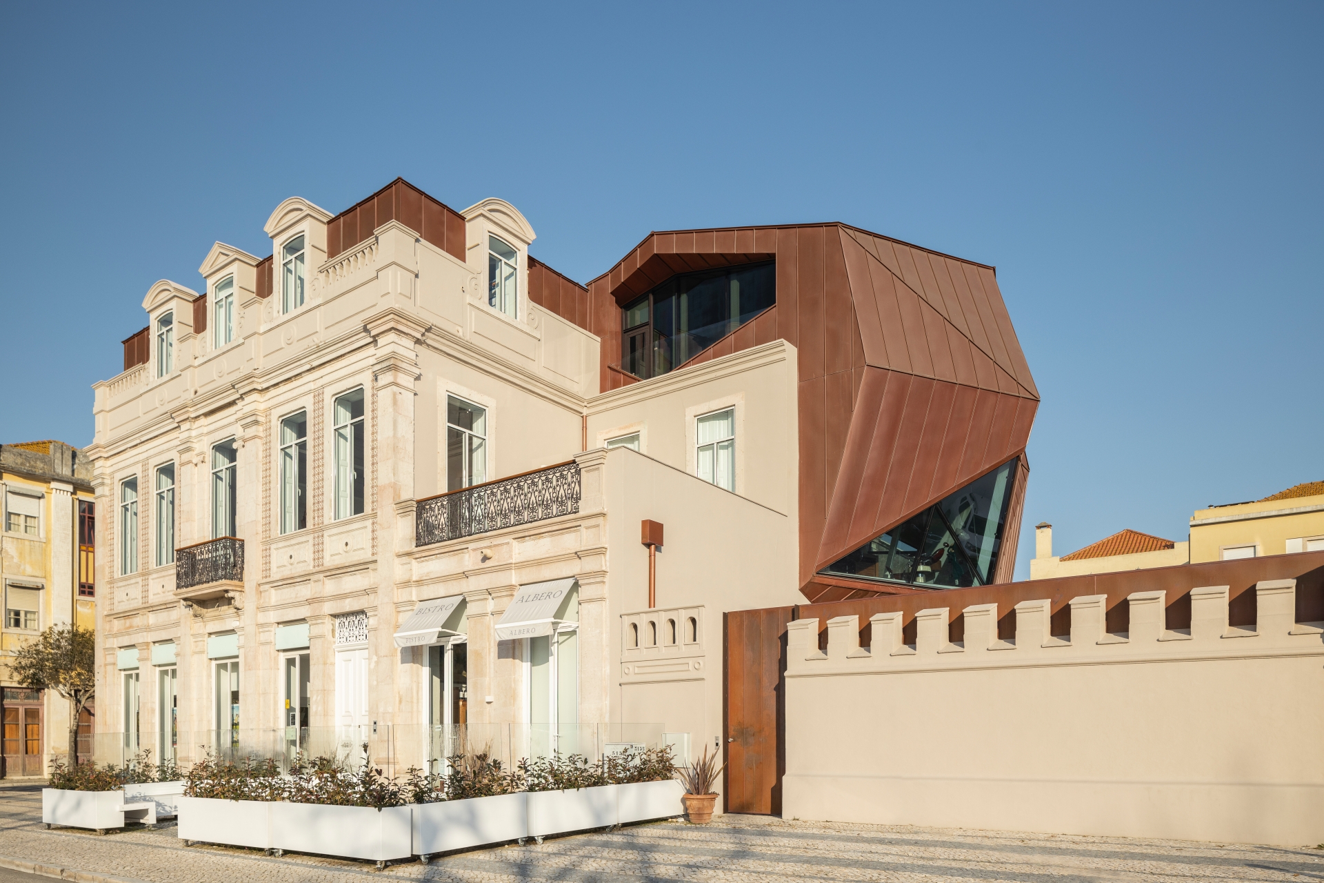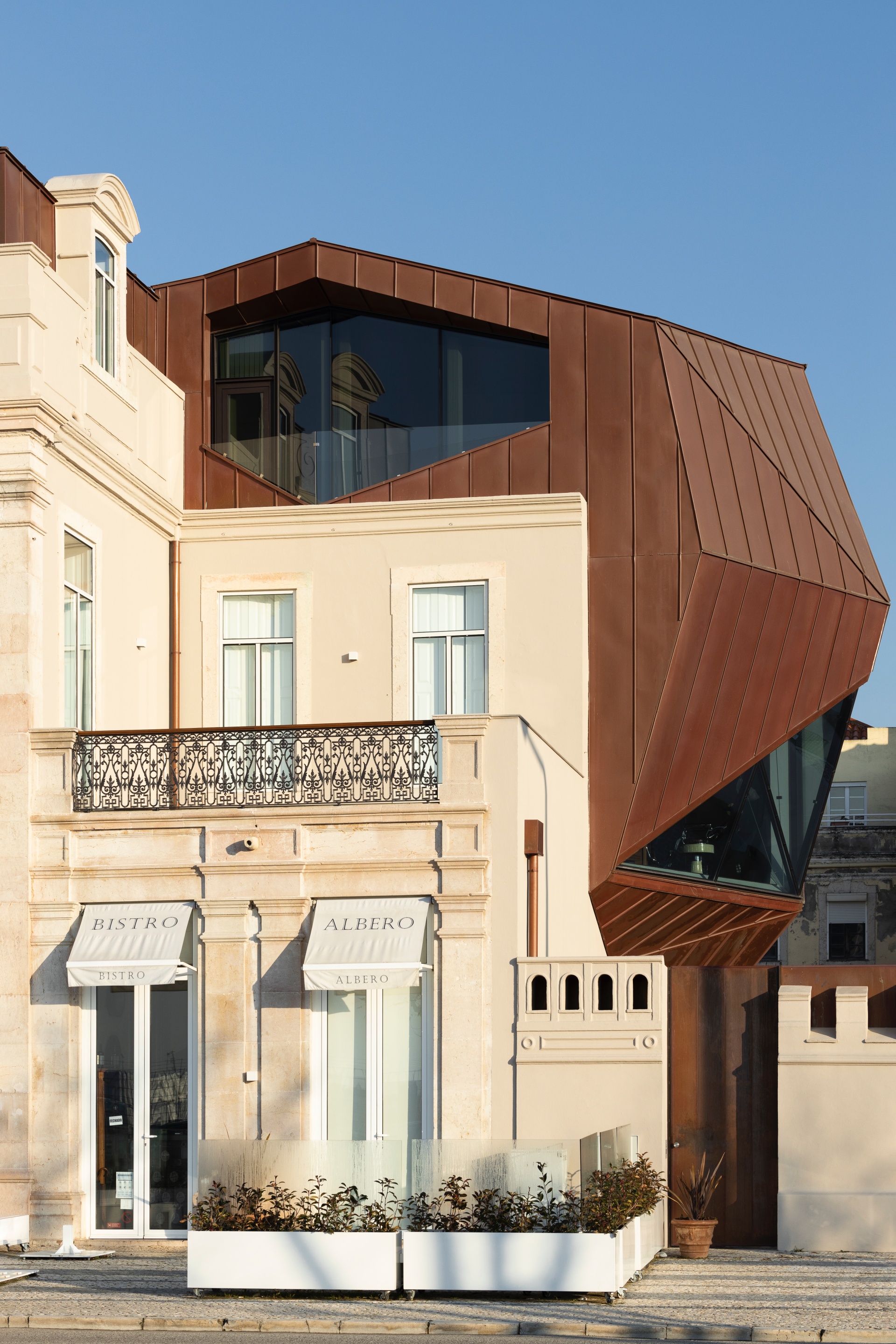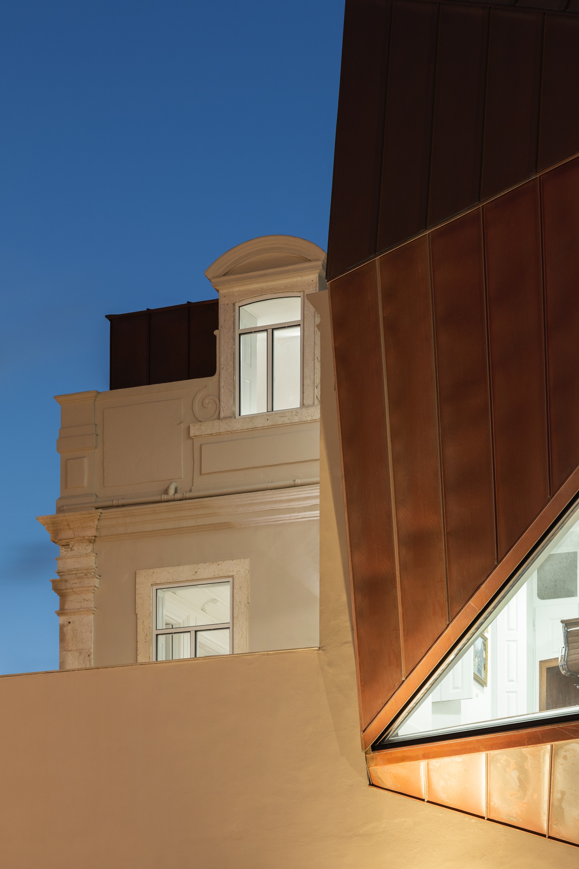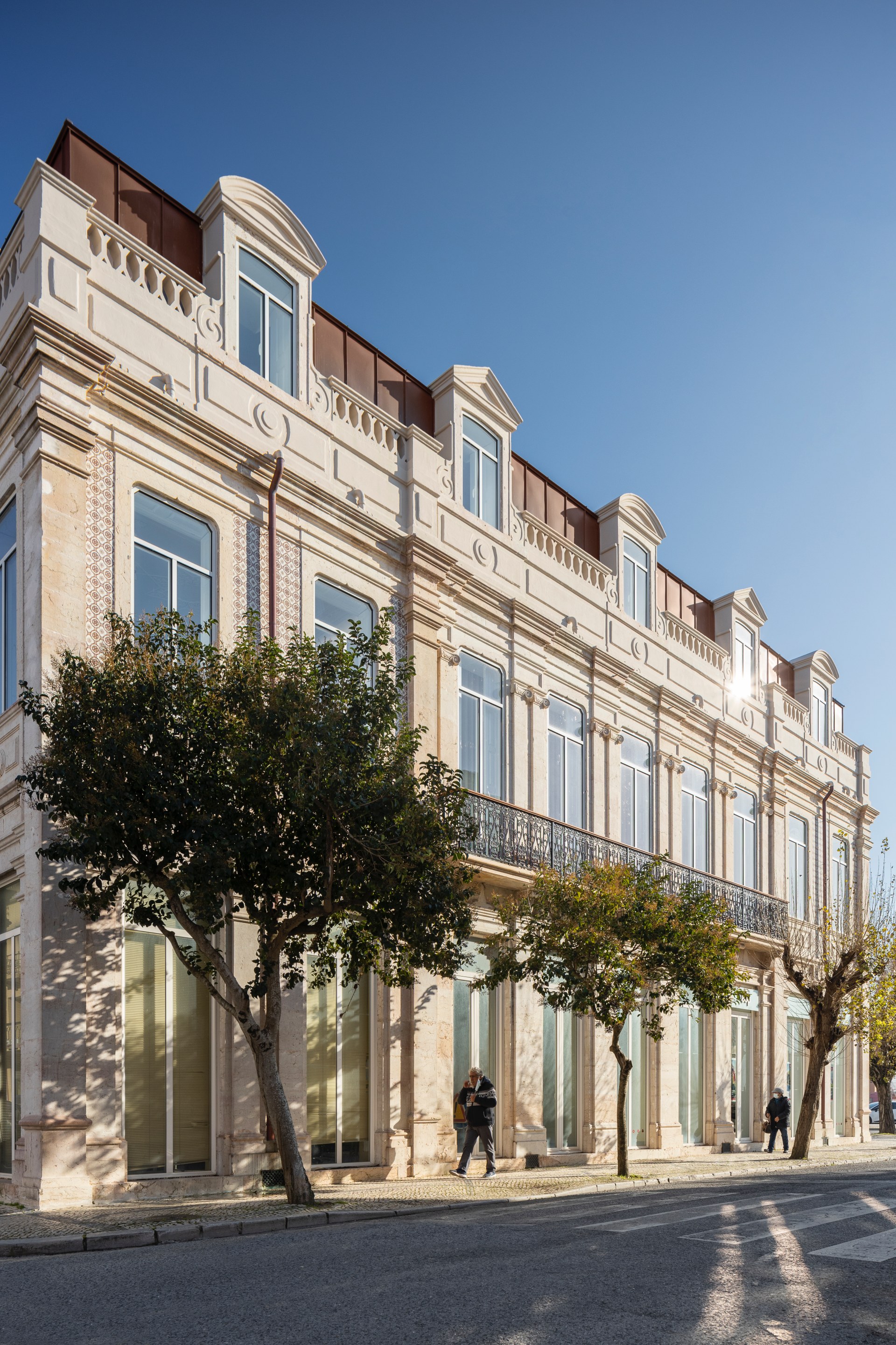
Two centuries after being brought up, a new challenge comes to this riverside building that was once a manor house and hosted Municipalized Services. Pedro Daniel Santos, the architect of this rehabilitation project, embraced the adventure of preserving the character, beauty, history and brand of the building, adapting it, modernising it, and empowering it to live new stories. This reinterpretation resorts to a bold language that confronts the existing without, with that, overlapping it. Thus, a new building that preserves the past and assumes the future emerges, introducing a new reality and philosophy, as a reaction to new social and urban paradigms.
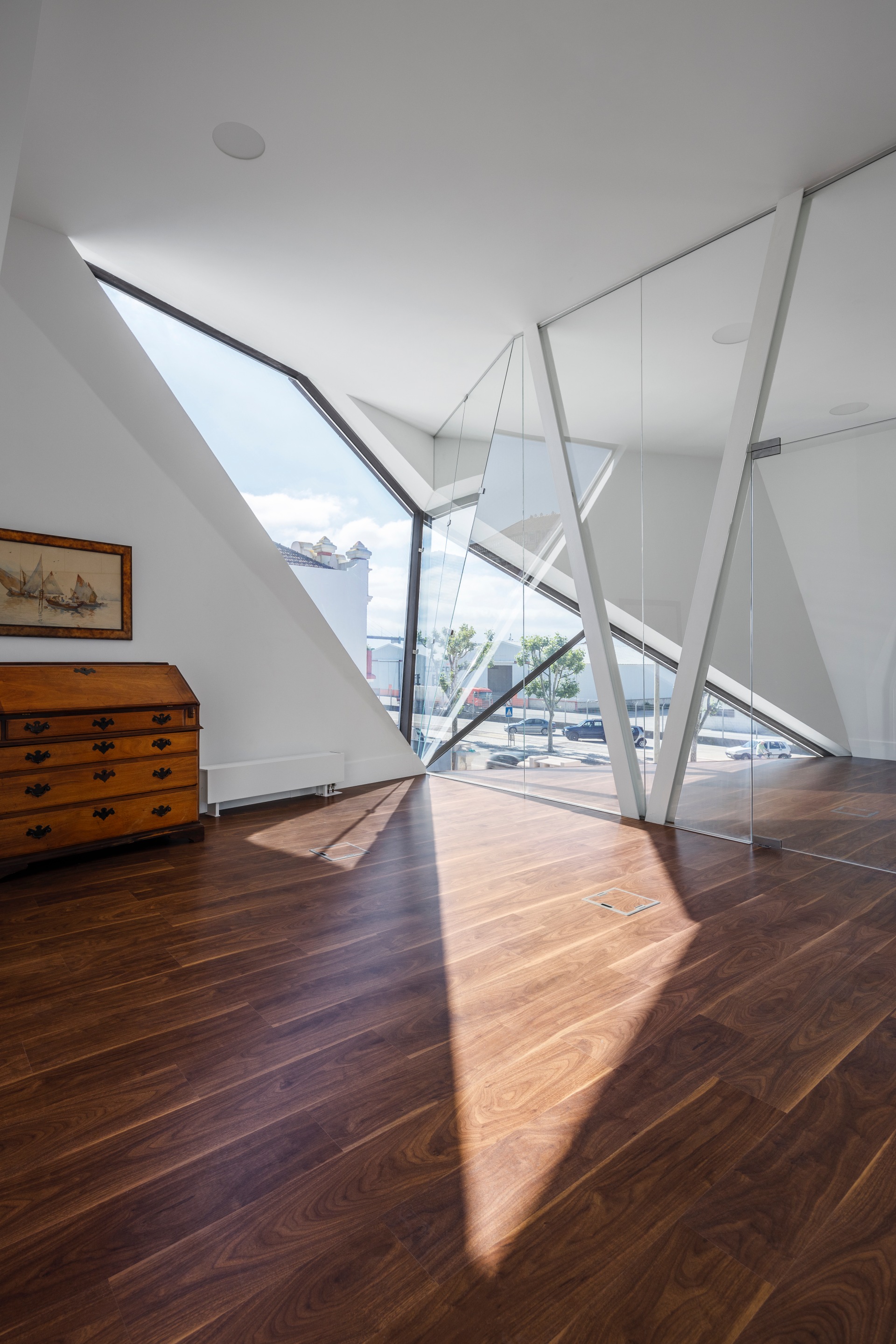
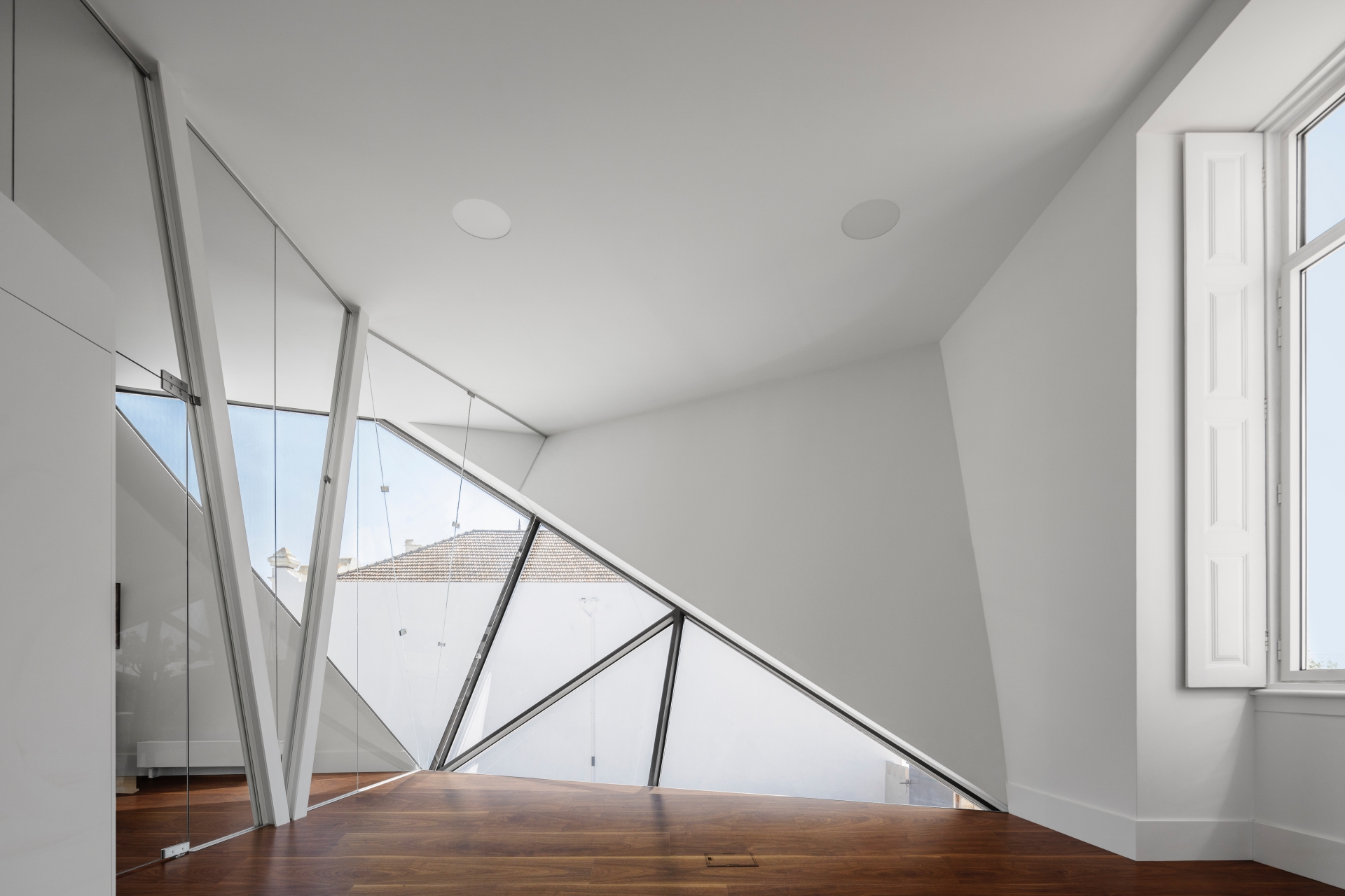
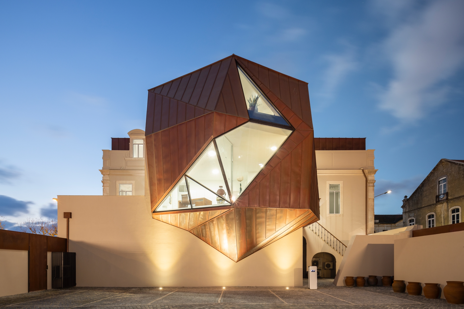
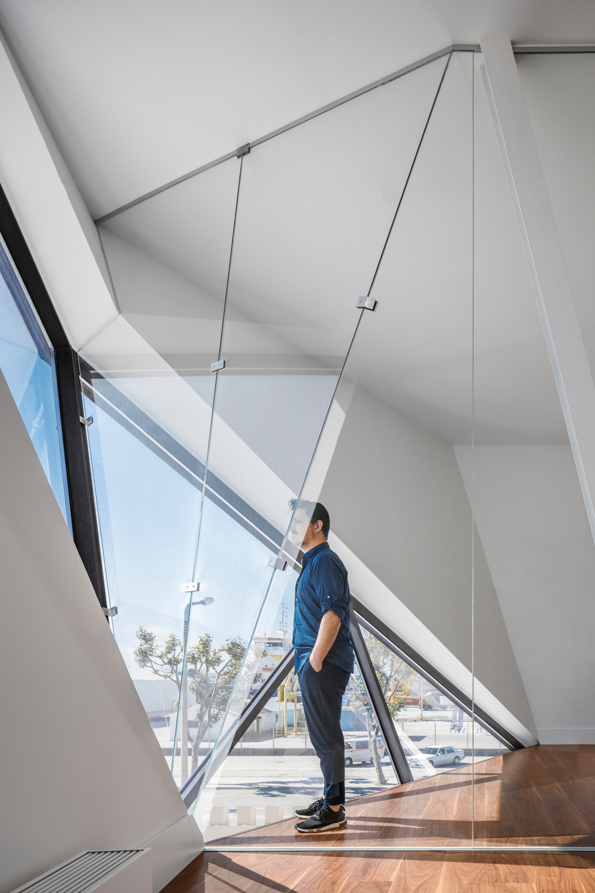
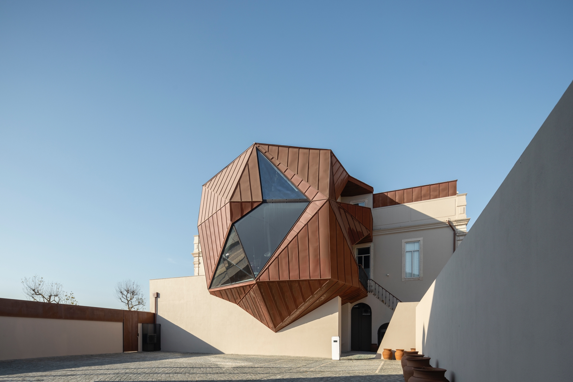
Copper stands as the link between the existing and the new, enveloping the entire building, sometimes adding a touch of contemporaneity with bold and angular shapes, others incorporating its essence, assuming itself as a whole, which extends, wraps and involves. Cantilevered over the patio, the "bubble", as it is affectionately called the most visible part of the new intervention, not only gives a new (and irreverent) front to the building, standing out and showing itself as the focus of the street, as it is the new welcoming element of the building, assuming the functions of reception and main office.
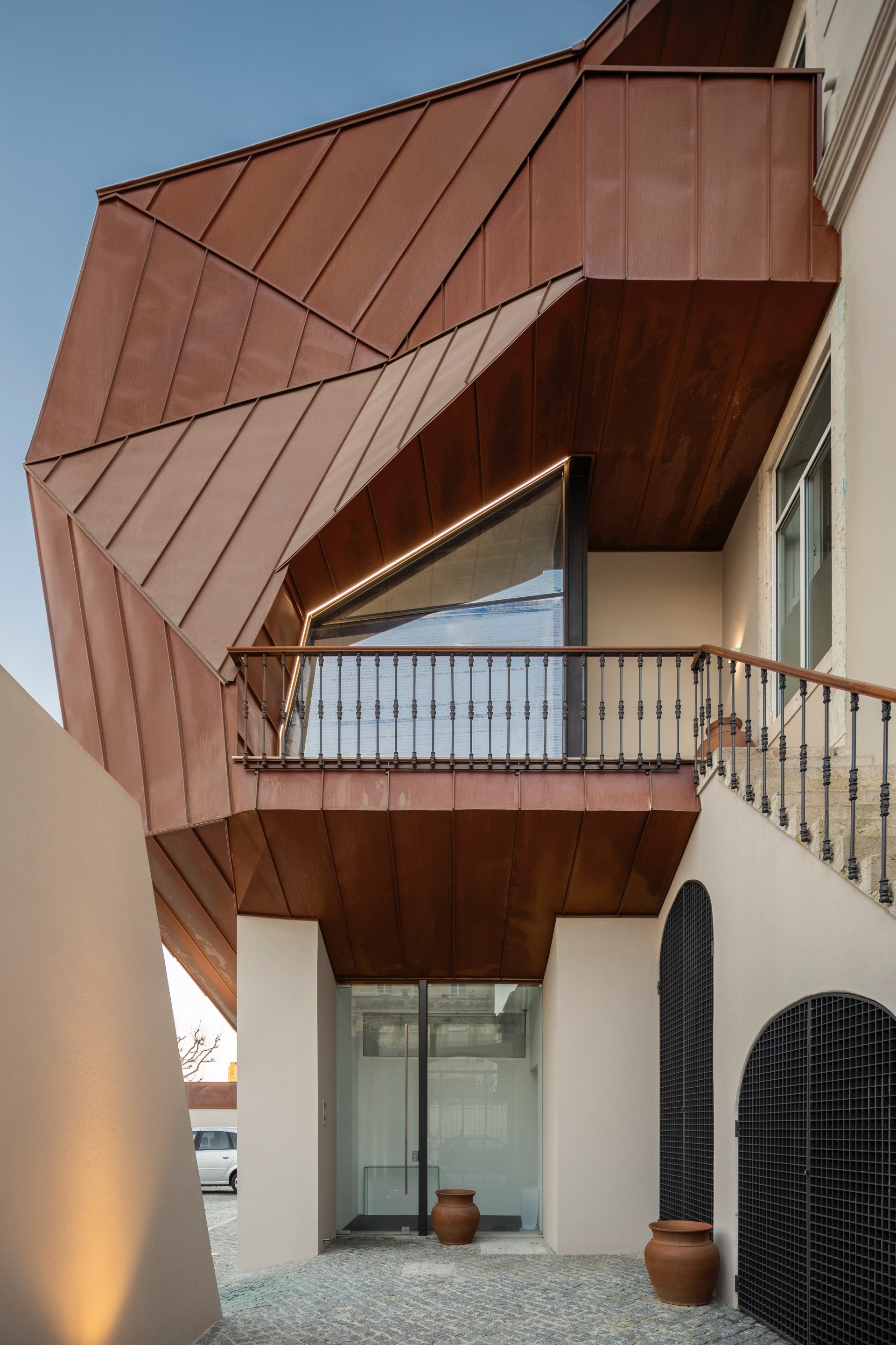
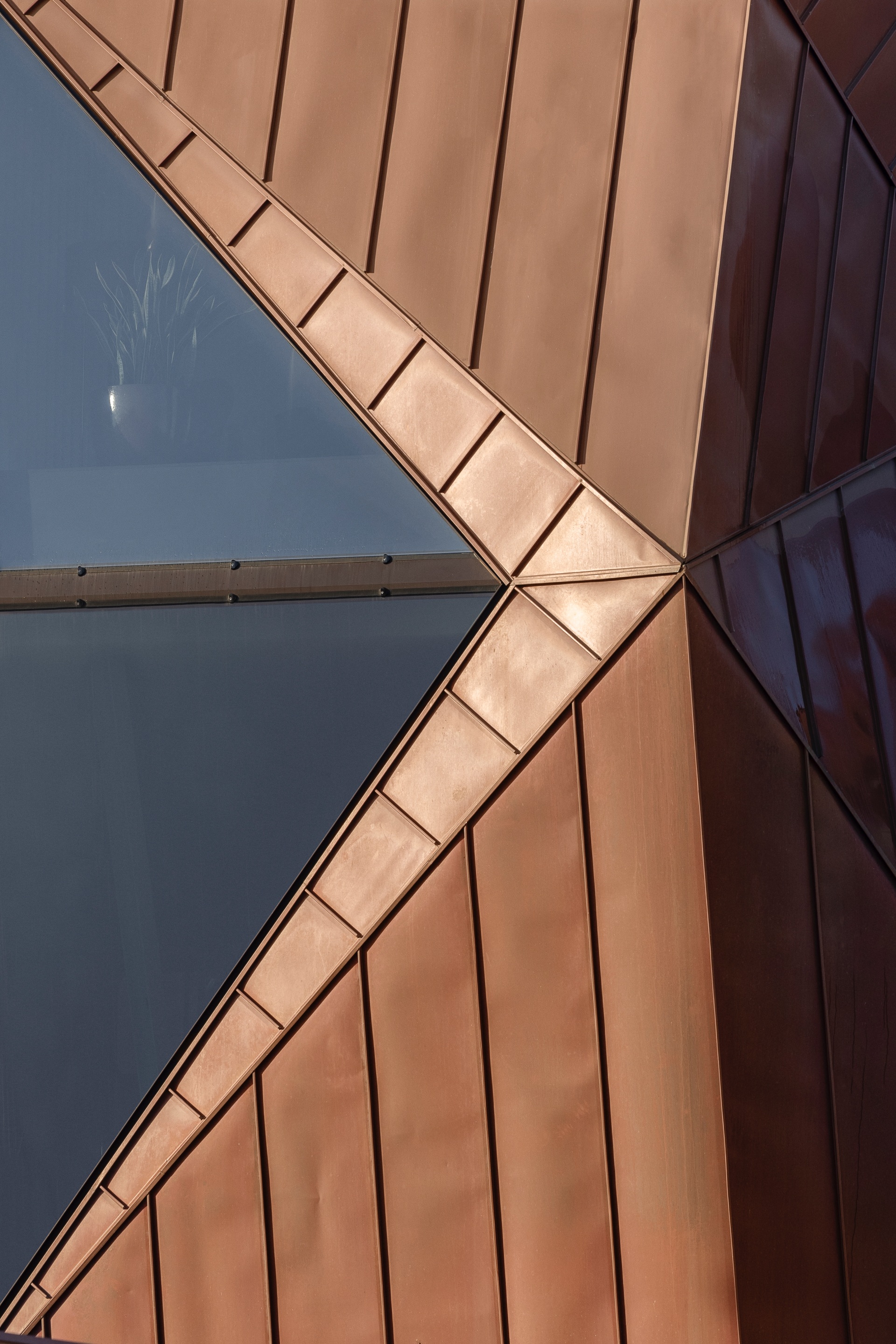
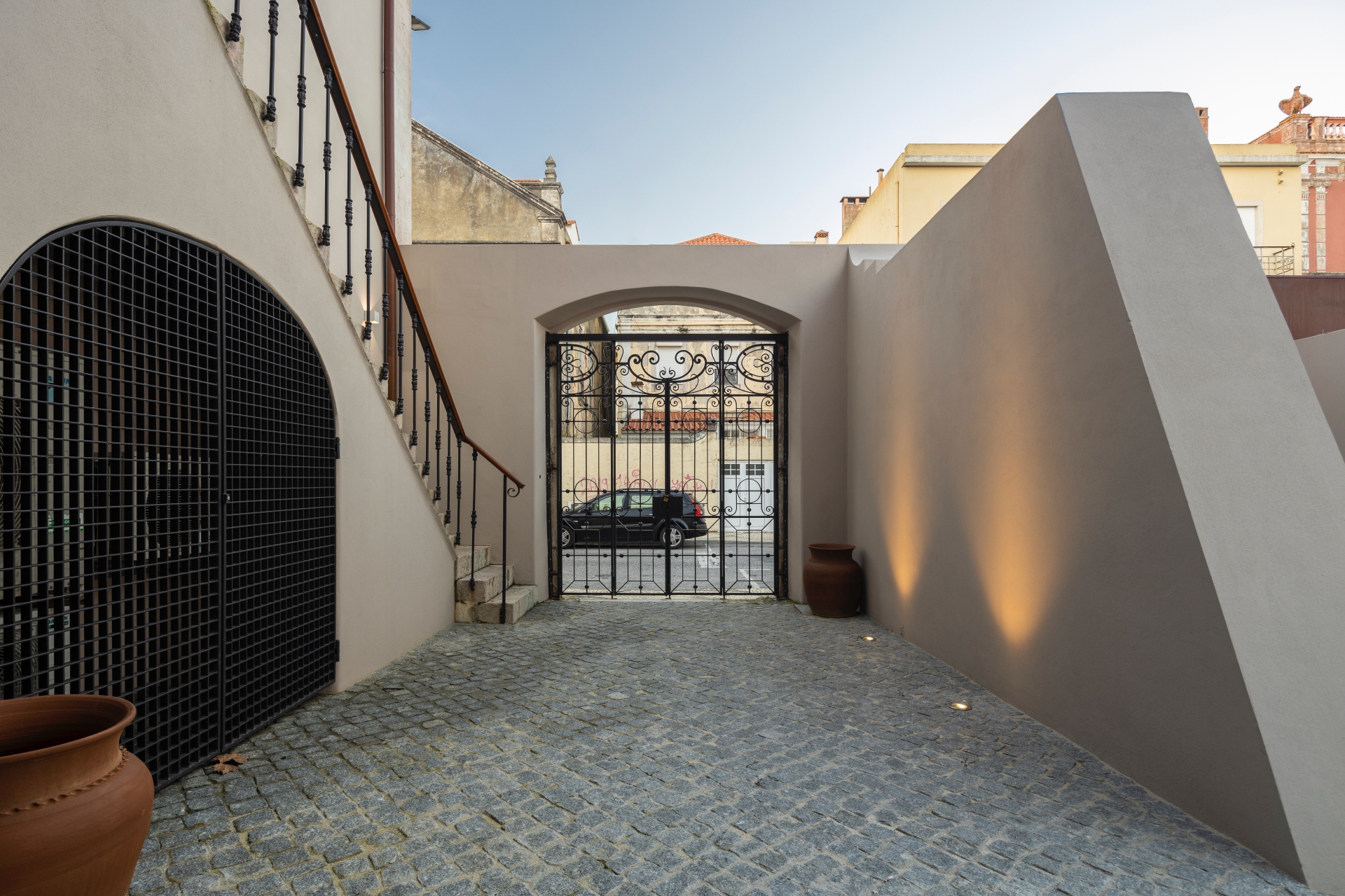
The space use paradigm was rationalised and maximised, having achieved greater accessibility, being able to receive people with reduced mobility, with direct access to the building now taking place through the east patio, by elevator or staircase. In addition to providing a space for parking vehicles with an electric charging station and a technical area/engine room, the patio is now the main entrance to the building, promoting the way the building is accessed. The new relationship between the building and the street was greatly benefited: there is no longer a disfigured gable and another prominent element was created, a new heart, which gives new life to the building that supports it.
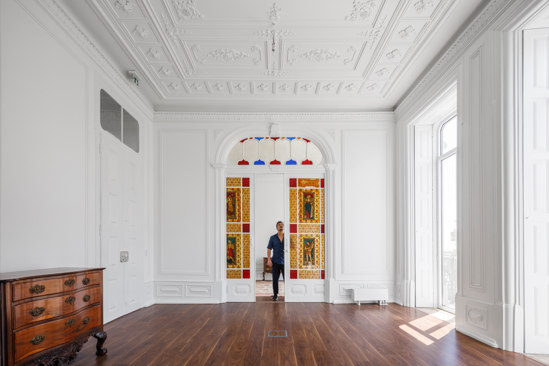
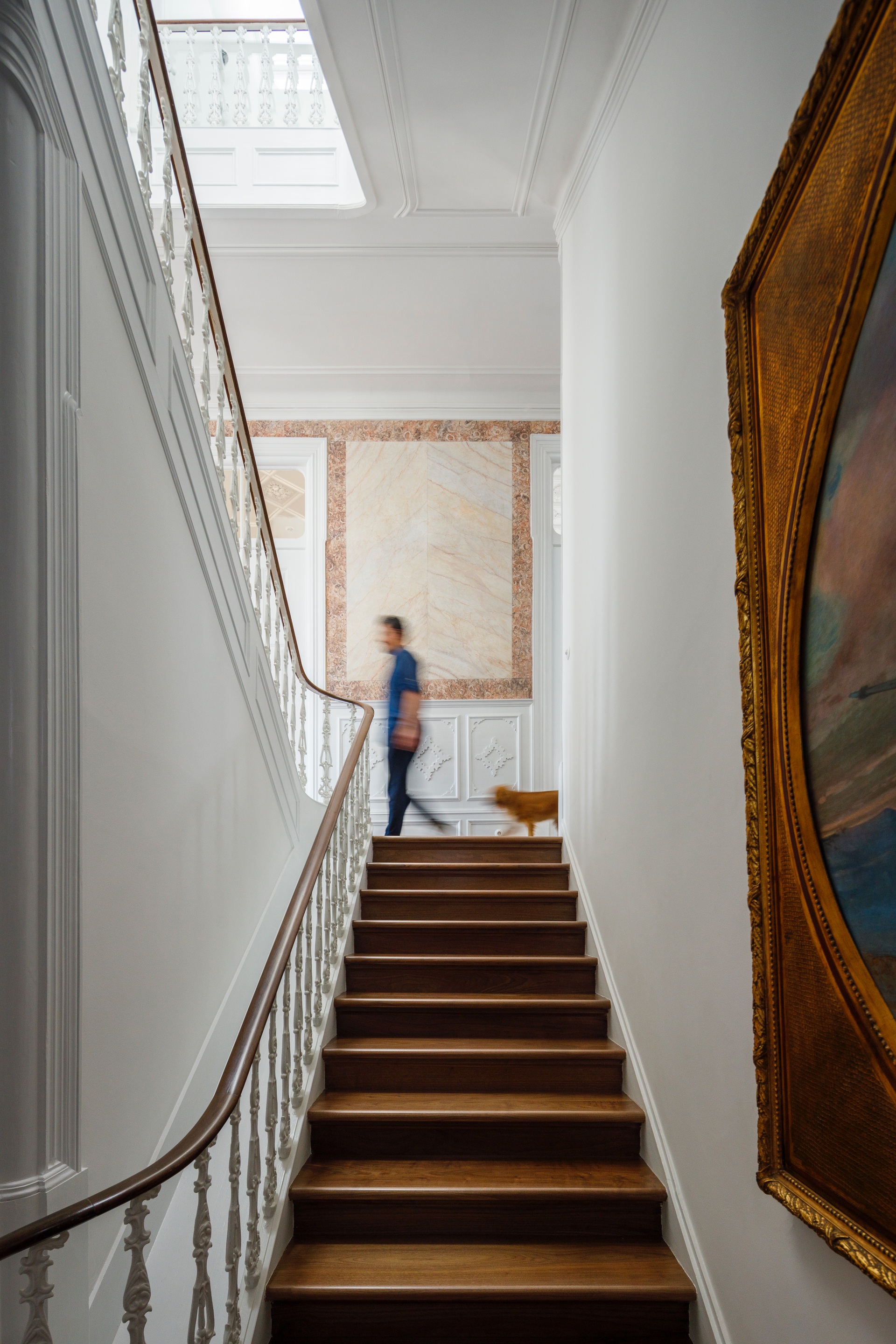
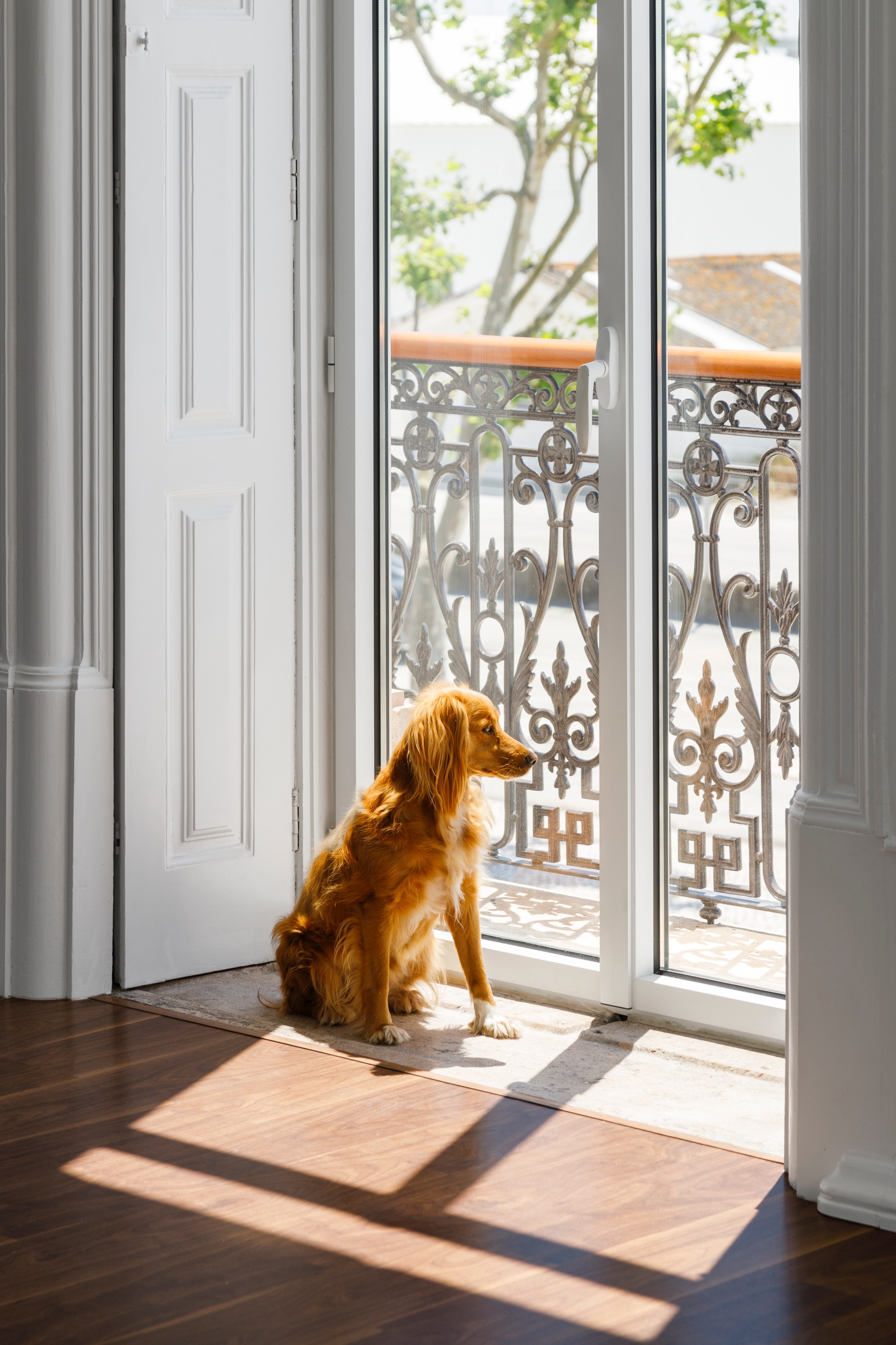
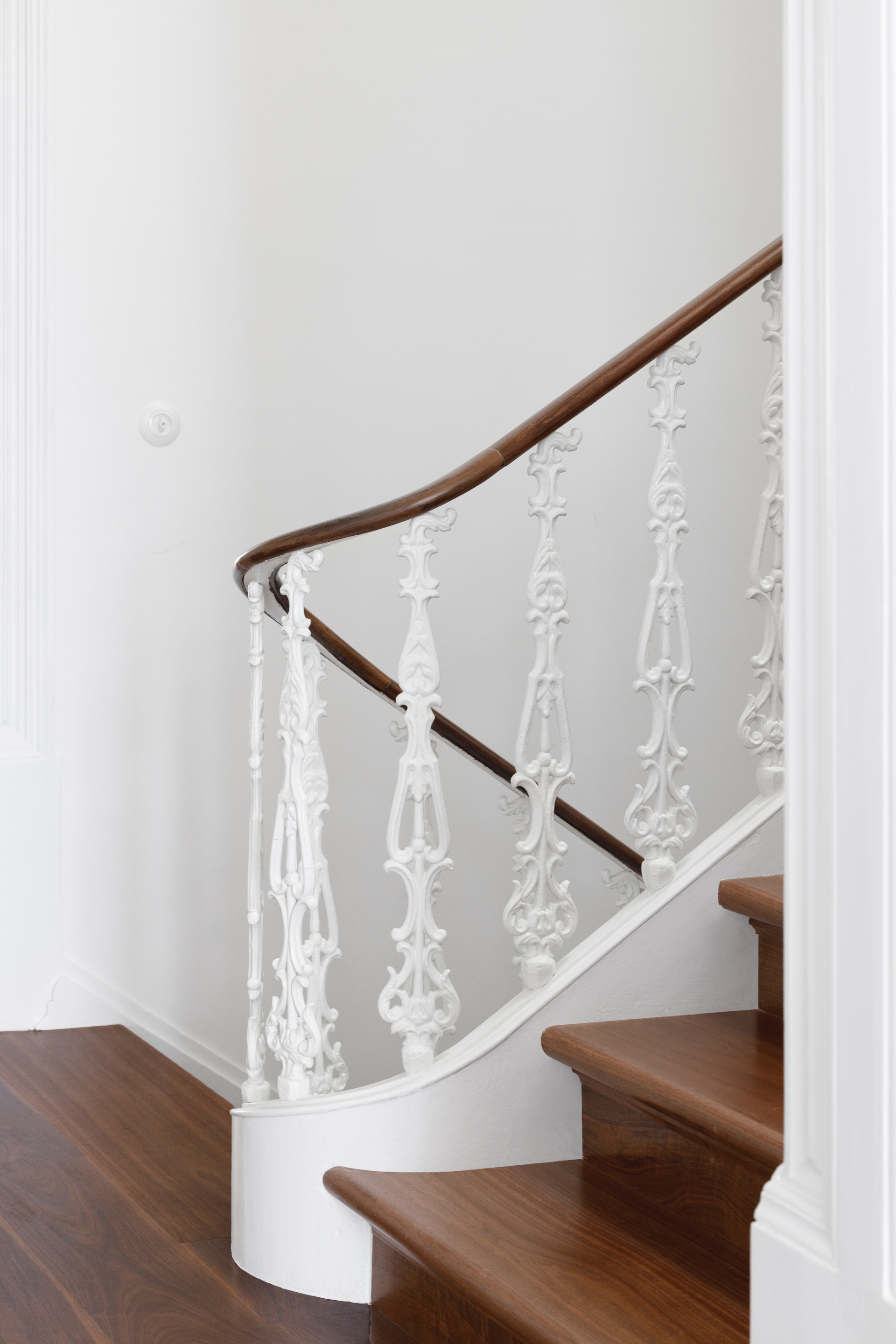
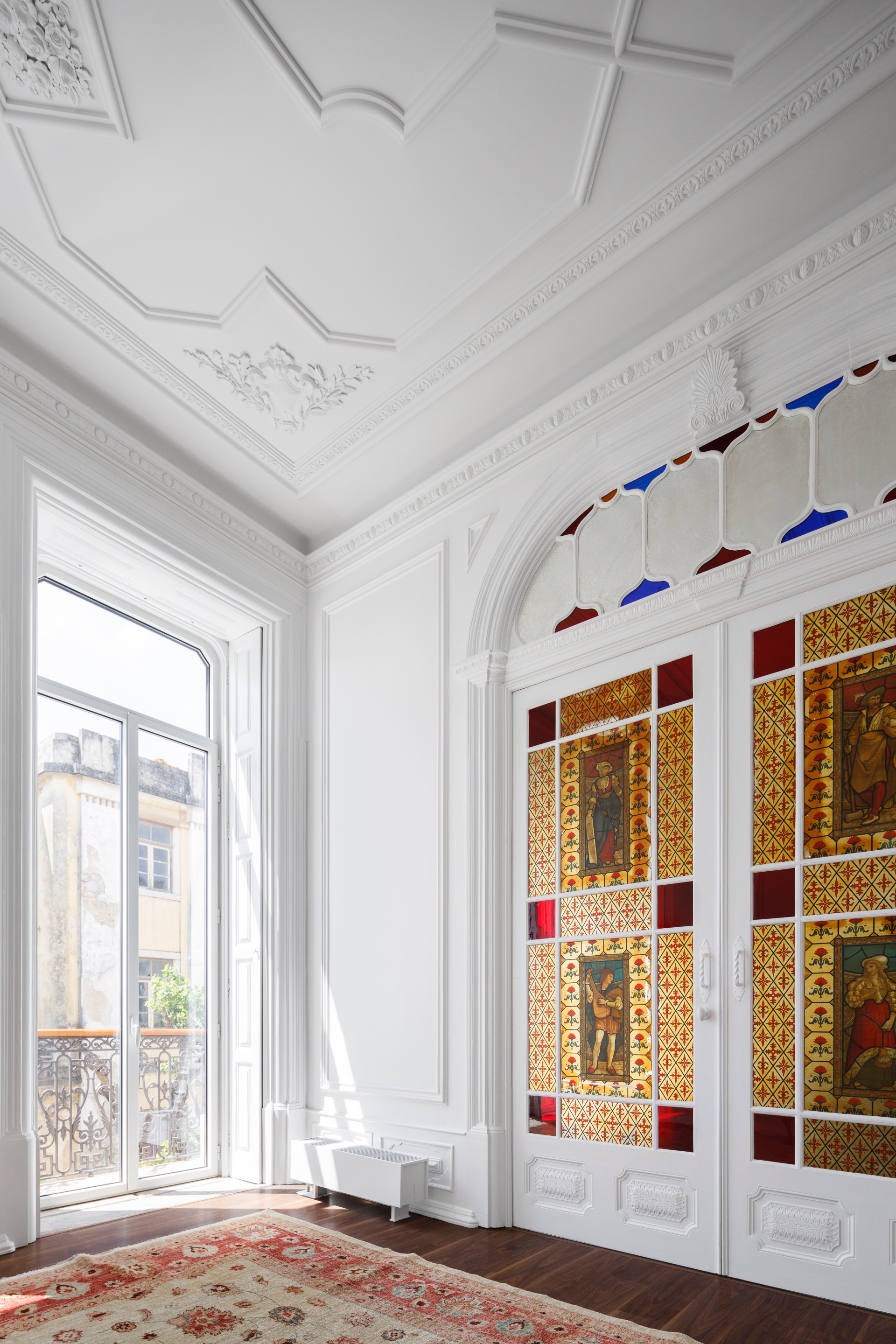
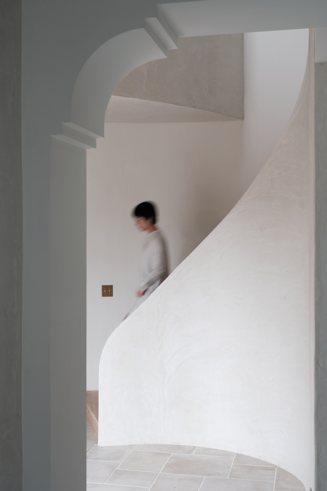
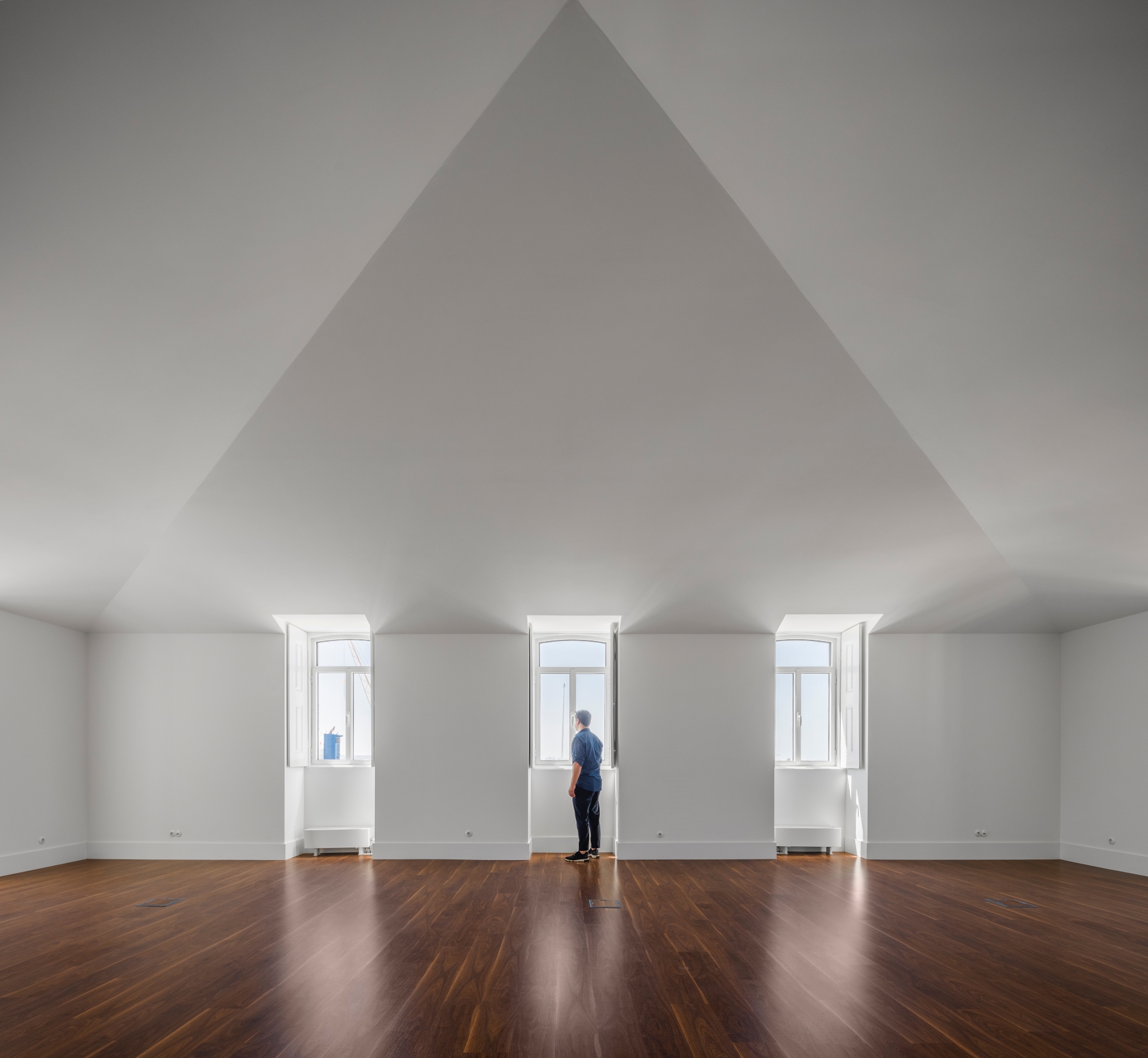
For an adequate use of the second floor, a slight increase in the rooftop was carried out in the peripheral areas (the ridge kept the same level), so that, in addition to rationalising the use of the existing space with the use of the attic of the roof between the roof windows, the interconnection between the old and the new was promoted by giving a contemporary look to the building without interfering with the urban landscape around it. At the interior level, the intervention adapted the building to the new use concept. Despite being profound, with a new organisation of the interior areas and the creation of new valances, the rehabilitation sought to be minimalist, in a subtle fusion between the contemporary, the usability and the preservation of the timeless character of the building.
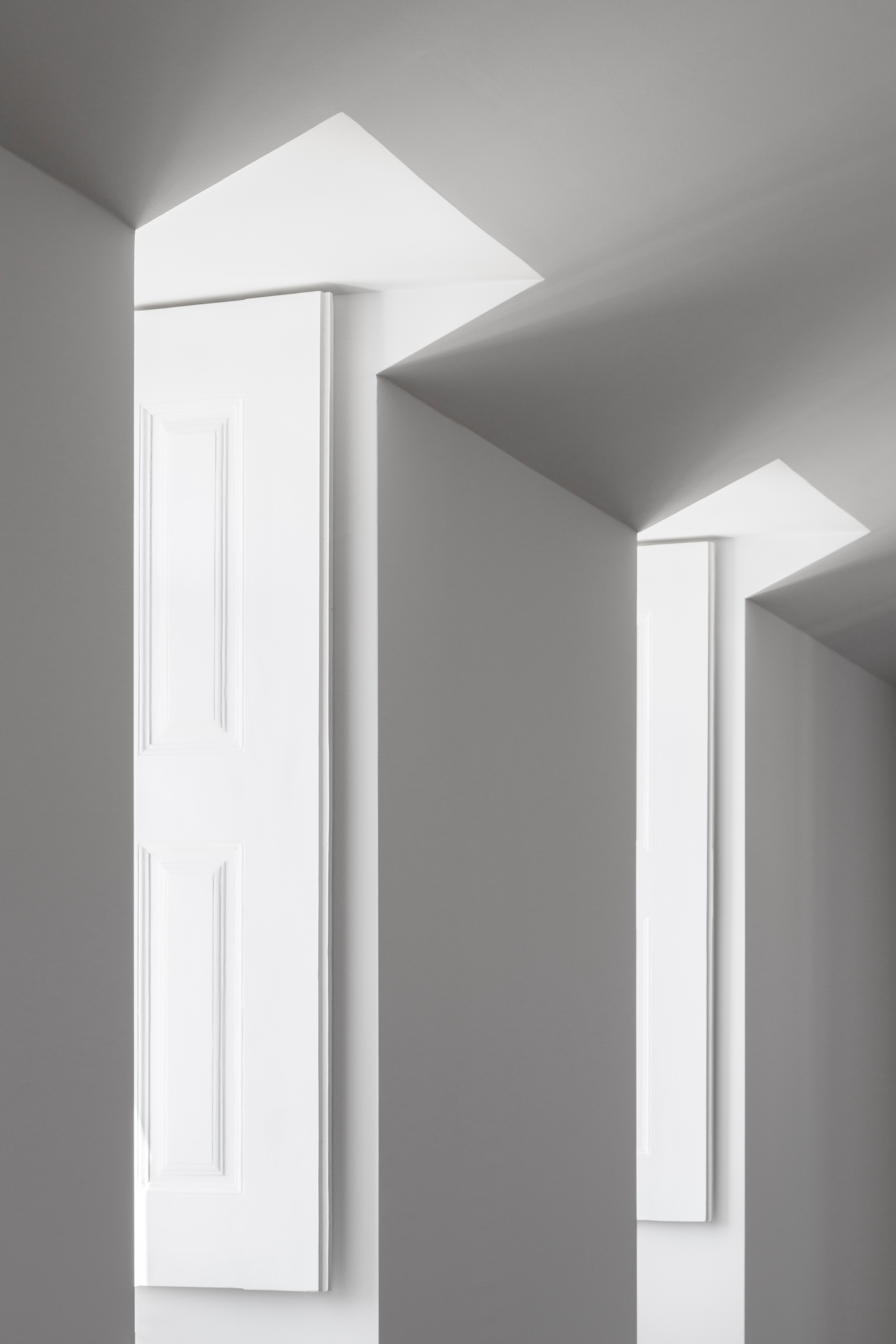
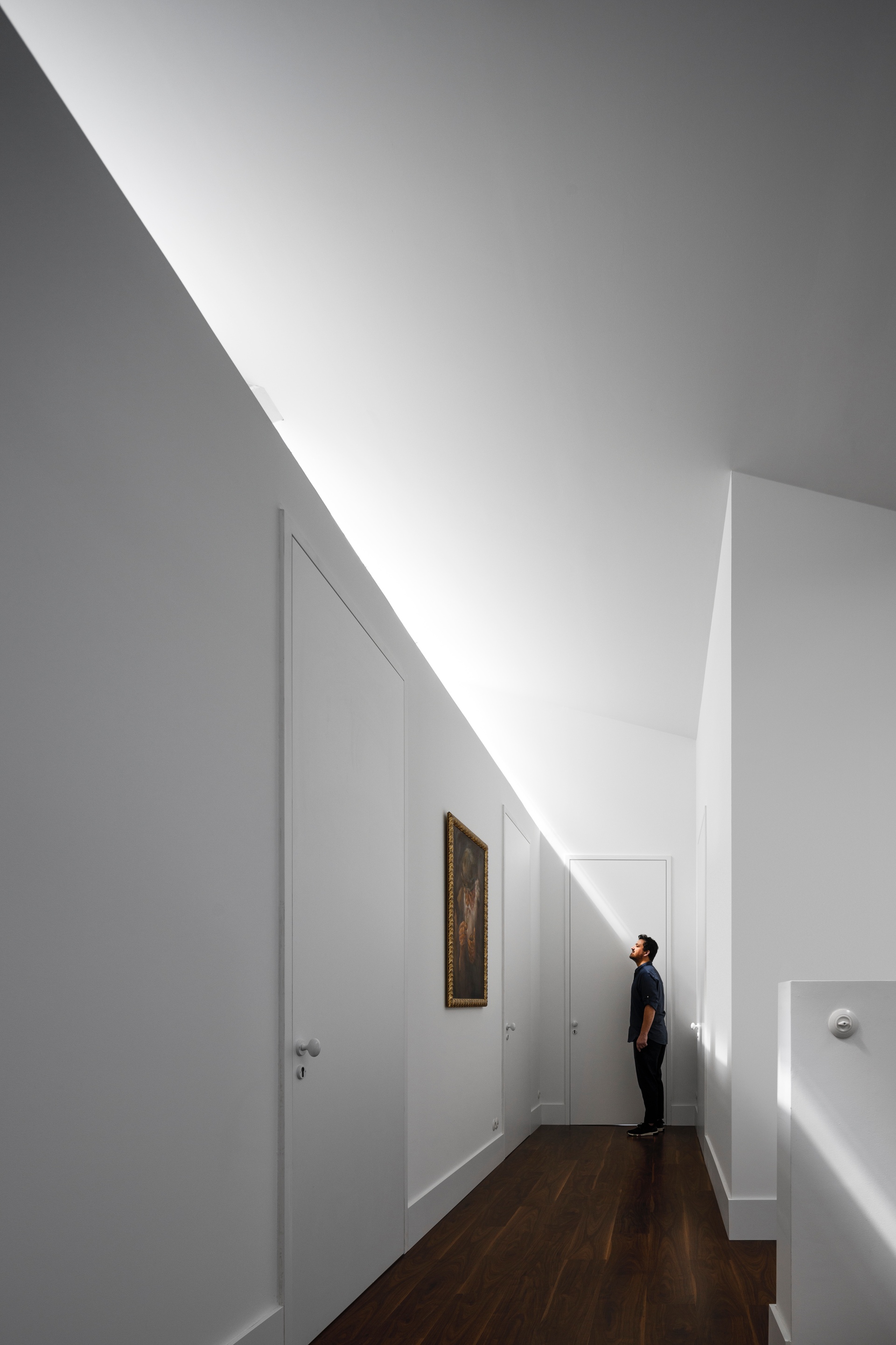
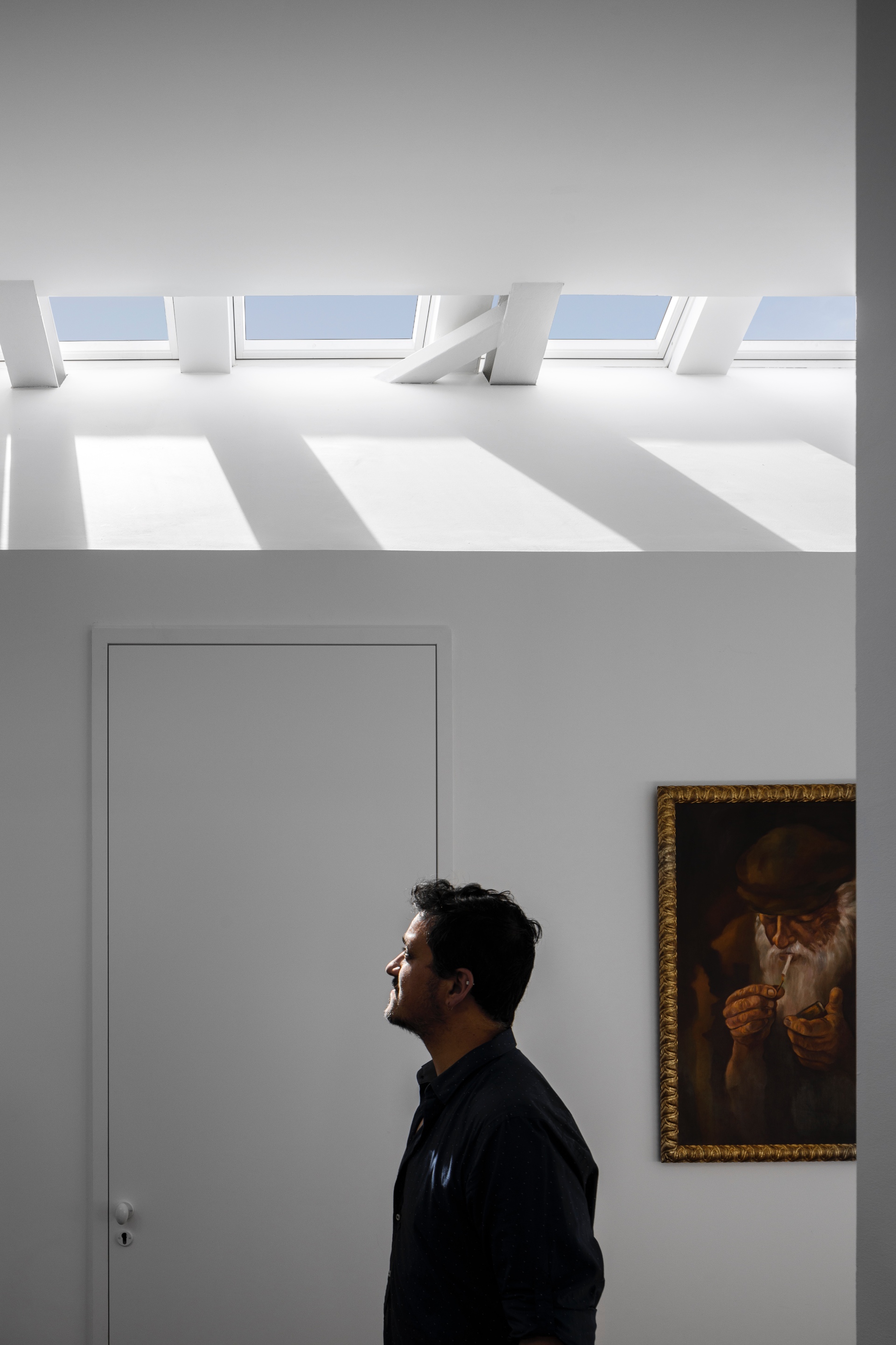
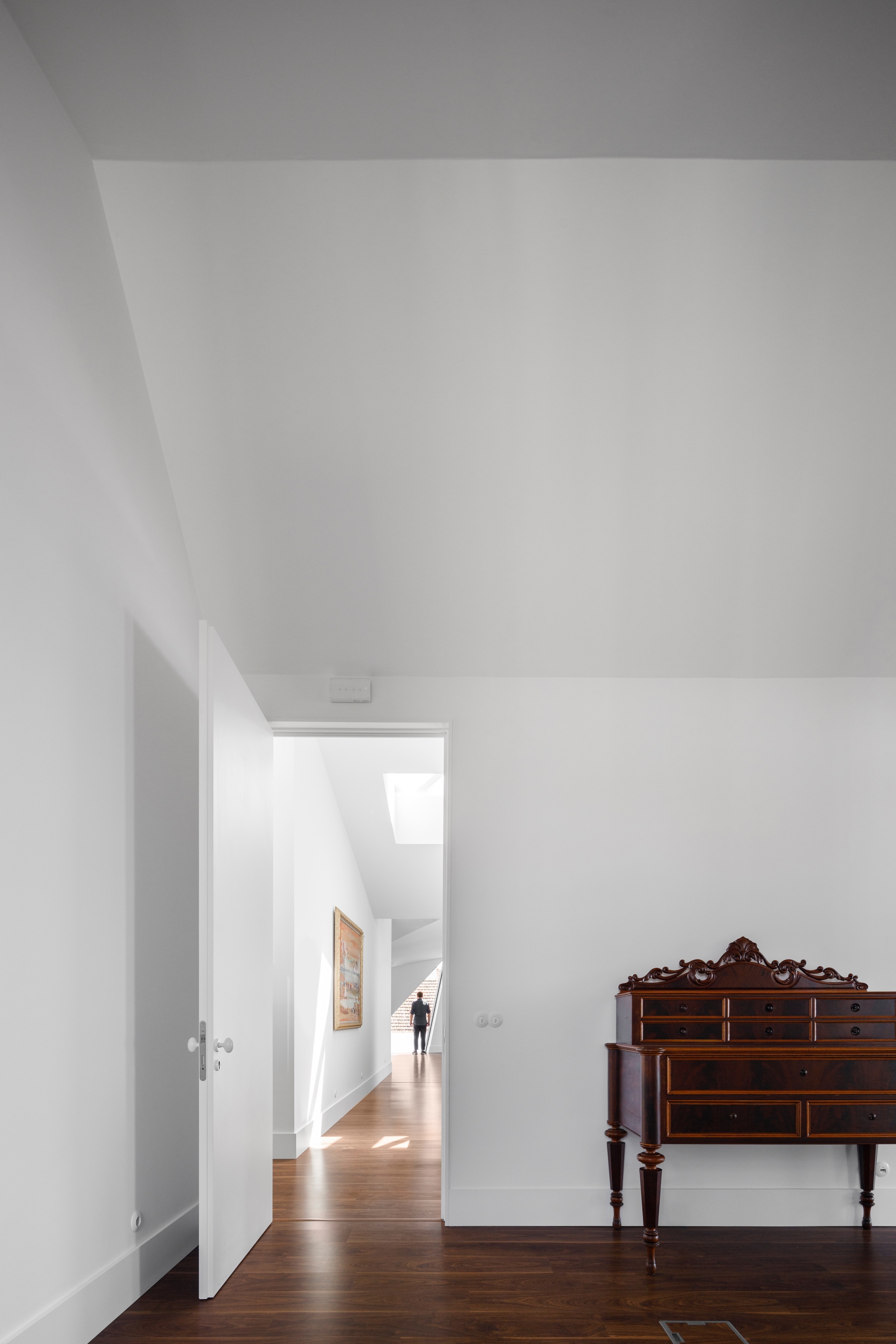
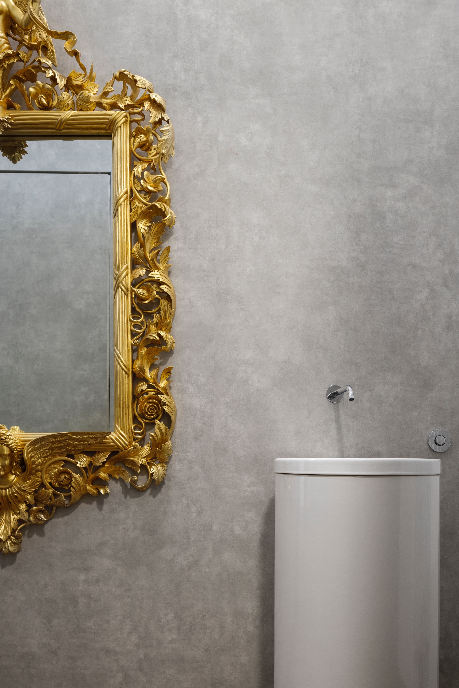
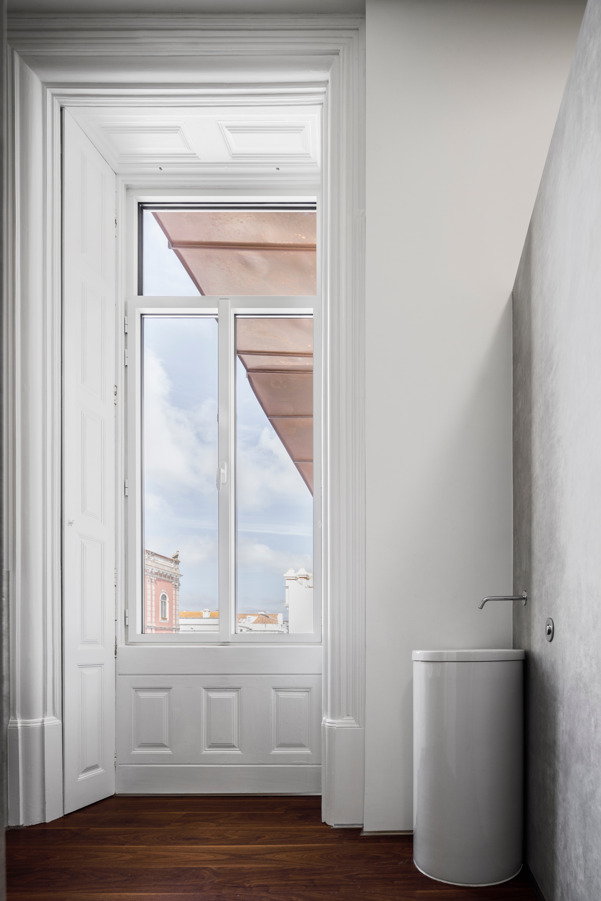
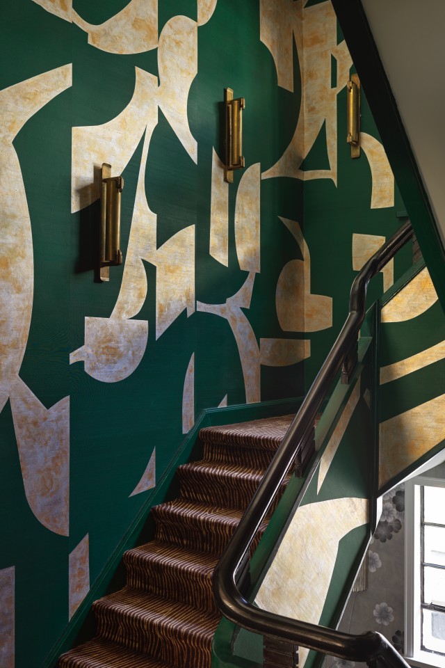
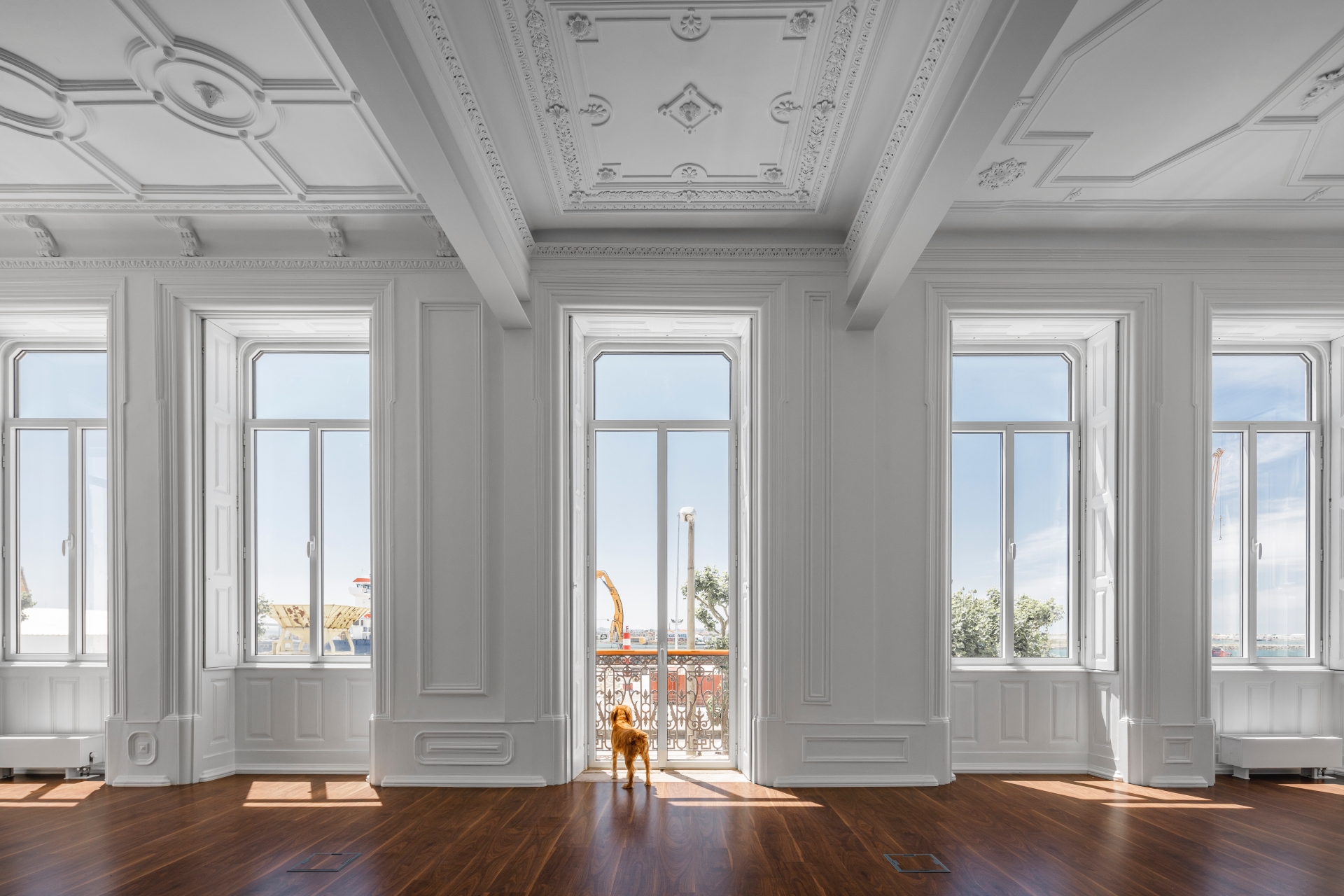
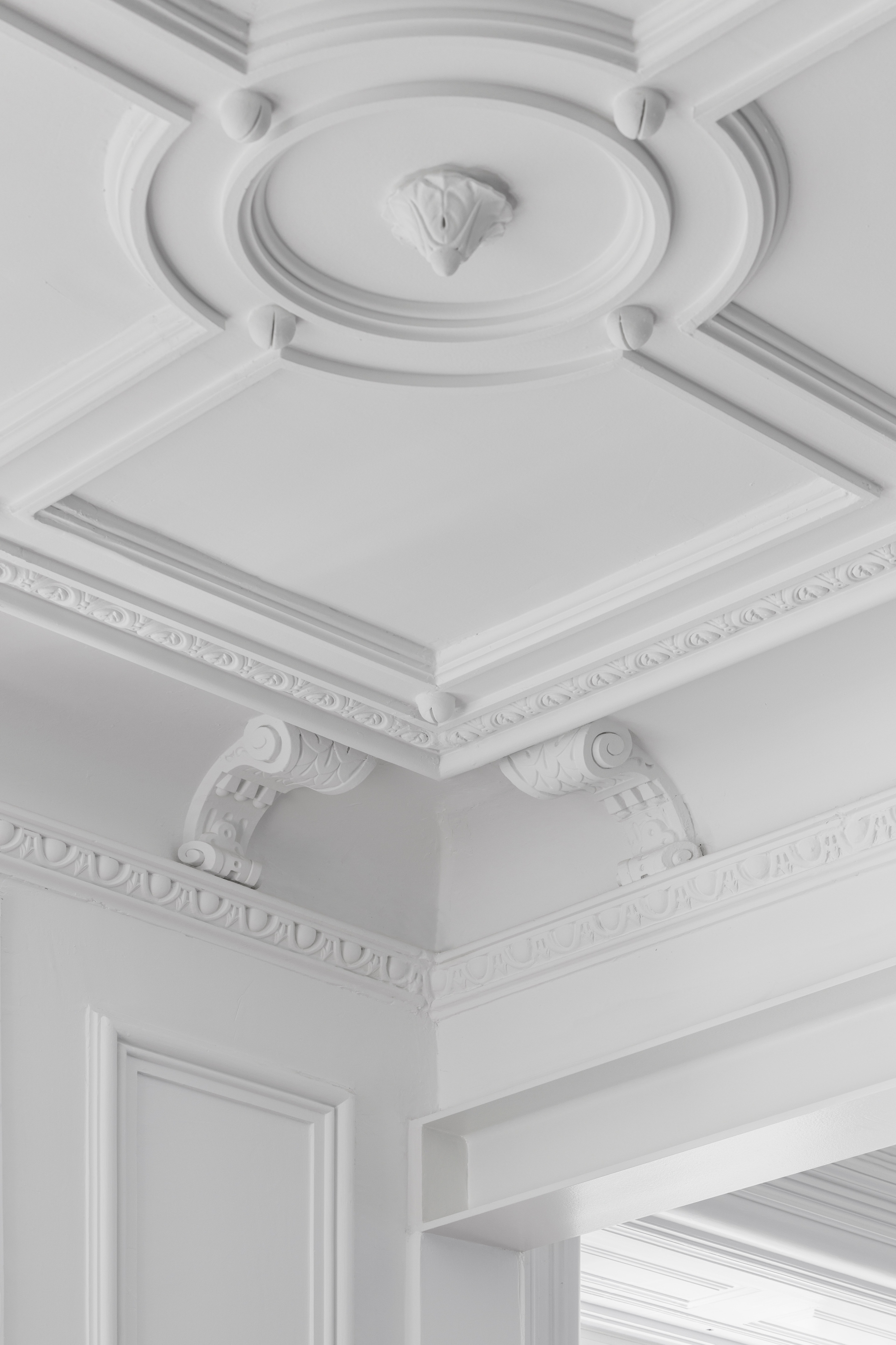
The original aspects and construction techniques, sometimes exuberant, sometimes handcrafted, now gain a new stage with the conservation and recovery of the impressive plaster ceilings that adorn the entire first floor, the marble-effect paintings in the corridors or the partition, now a feature wall in one of the sanitary facilities. The palette of interior tones was intentionally chosen to simultaneously create an environment conducive to work and highlight the eclectic collection of art and furniture that punctuates the various spaces of the building. The building, which already had a close relationship with light, now gains a whole new luminosity, achieved not only by subtle features, but also with the imposing spans of the new intervention and the choice of materials and colours.
